(Click title to go directly to the review)
CAPTAIN AMERICA: STEVE ROGERS #10
CURSE WORDS #1
MOON GIRL & DEVIL DINOSAUR #15
JUSTICE LEAGUE VS. SUICIDE SQUAD #5-6
HULK #2
BIFF TO THE FUTURE #1
AVENGERS #3.1
DEATHSTROKE #11
THUNDERBOLTS #9
WONDER WOMAN #15
THANOS #3
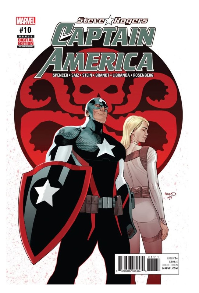
CAPTAIN AMERICA: STEVE ROGERS #10
Writer: Nick SpencerArtists: Jesús Saiz; Ted Brandt & Ro Stein; Kevin Libranda
Publisher: Marvel Comics
Reviewer: Professor Challenger
“I may not have what it takes to fulfill my mission. I am just one man—and the world is a terrifying place. But I still have to try—no matter what the cost.” -- Captain America (as he is about to murder former partner Jack Flag)
It’s literally been at least 2 years since I’ve even glanced at a regular monthly Marvel comic. However, thanks to the mass media coverage of comics these days, it’s pretty easy to keep up with most major developments. One of the most controversial being the revelation that Steve Rogers/Captain America is a secret Hydra agent and has always been. The *spoiler* is what the world-at-large seemed incapable of comprehending, but comics fans certainly could have easily predicted—a Cosmic Cube (Tesseract in the movies and somehow a sentient version named Kobik for the purposes of this story) rewrote the timeline so that Rogers was recruited from a very young age to serve Hydra and become the recipient of the super-soldier serum.
Jumping right into the pool without any hesitation, here we are with issue #10. It’s not a ground-breaking comic but it is a substantial chapter to this ongoing storyline. We jump back and forth between the present-day and the past so that we get a detailed retelling of certain event leading up to the origin of Captain America as revised by Kobik.
In the revised history, Rogers is not driven by his innate patriotism to keep trying to enlist in the war effort but rather part of Hydra’s plan for him. He catches the eye of General Phillips and Dr. Erskine (creator of the super-soldier formula) by those enlistment efforts but also by a staged event in which he could demonstrate his heroism by recovering a waitresses’s stolen handbag and allowing himself to get beaten up. All of this in furtherance of the goal of being chosen for the super-soldier project and, ultimately, murder Dr. Erskine.
In the modern-day storyline, we see SHIELD Director Maria Hill removed from her position, Rogers lobbying to have his lover Agent 13/Sharon Carter instated as Director, some sort of nonsense forcing Hill to interact with Carol Danvers/Capt. Marvel – a scene that felt shoehorned in for the purposes of increasing Capt. Marvel’s visibility in the comics as a precursor to her upcoming appearances in the films. Speaking of that sort of forced synergy, they also forced a couple of panels and references to Selvig, a member of the THOR films’ supporting cast obviously and pointlessly added to the comics. The Red Skull appears as well but only as a holographic projection bossing around Rogers and pushing him to murder his former partner, Jack Flag, who is near death in a hospital and apparently knows too much. I won’t reveal the one big development that happens regarding the SHIELD Directorship. For that, you can read the comic or look elsewhere.
I gotta say this comic was a mixed bag for me and hard to recommend all on its own. It’s a real art of storytelling to be able to write soap-opera style with an ongoing narrative but to make each installment stand on its own as well. I don’t think this stands on its own. So, I have to try and take it on the merits of the ongoing narrative which, as I mentioned up top, I am only peripherally aware of. So, let me just address the storyline itself and the artwork.
For a number of recent years, there was always one thing I could depend on. In a showdown between DC and Marvel, Marvel always seemed to be able to maintain the stronger artists. It was frustrating at times to pick up a DC comic and the art was actually doing a disservice to the writing. On the other hand, for the most part, even with the weakest of writing it seemed like Marvel could elevate it with some pretty good and even excellent artwork. But judging by this and the other couple of Marvel comics I decided to review this week, there has been a substantial drop in the quality of the art.
Now, that’s not a dig at Jesús Saiz, who did the art on the flashback to the 1930s. Those sequences are excellent in every way. He knows what he’s doing and he does it well. Strong figures and backgrounds with an understanding of place and movement. His ability to move the narrative along is clear and solid. The fact that he does his own color work also adds a nice consistency to the art as he adds dimension and details with his shading and color work. The disappointment comes with the 3 other artists credited with the modern sequencing. I don’t know who is who so I don’t know who to give credit or blame to but there’s a distinct lack of consistency in approach. There were a couple of times where just the coloring work on Carter’s hair was cringe-inducing. I don’t know if the line art, the color work, or any of it was rushed for deadline but it seemed only halfway to the finish line. There is a Dollar Tree coloring book feel to all the art with no sense of weight or shadow. 1-point and 2-point perspective is way off throughout. There is also a noticeable lack of detail in the surroundings that prevent that feeling that these people are real within their own world. I was also struck by the lack of any real sense of drama or movement. Rather than Cap moving with intention, he appears to just be lollygagging about. There is no sense of urgency or action. In a Marvel comic starring Captain America, even an Agent of Hydra Cap, this feels like almost a crime of waste.
As to the storyline itself, I think a year or two of this revised history version of Cap as an Agent of Hydra is a pretty interesting approach. Again, the fact that it’s a Red Skull scheme involving a Cosmic Cube was pretty obvious but it’s still a good springboard for stories. I’m just disappointed that the stories appear to be so visually dull and mundane. To me, it felt like wasted potential. I also like the new Cap costume design right now, but not as visualized by the people who worked on this issue. I would love to see Jesús Saiz take on the entire comic. I also think it’s pretty funny the degree of deus ex machina needing to be utilized to prevent Hydra Cap from actually following through on his assassination orders. But I can see why the editorial approach doesn’t want to go that far and have to deal with on-panel sequences of Captain America assassinating former partners and such. But it does seem to me that if you’re going to have a corrupted Steve Rogers then you’re going to wind up having to deal with those sorts of things. For me, I would probably approach it from a perspective that says even though Rogers came under the influence of Hydra, his innate goodness would have still been there and prevented him from going quite that far. Maybe that’s where it’s heading. I don’t know.
This comic was not terrible, but the only thing really memorable to me was the flashback sequences.
Prof. Challenger is Texas artist and writer, Keith Howell. You can read his stuff here and over at profchallenger.com or follow him on Facebook @artistkeith and Instagram & Twitter @profchallenger.
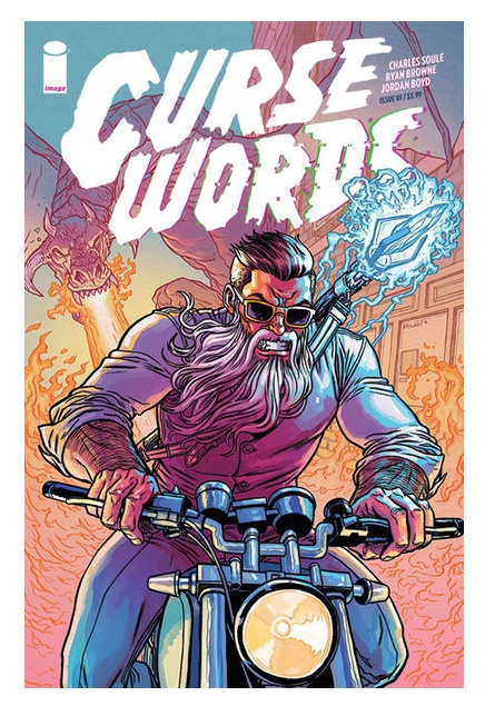
CURSE WORDS #1
Writer: Charles SouleArtist: Ryan Browne
Publisher: Image Comics
Reviewer: Humphrey Lee
I fucking love curse words, I really fucking do. Curse words the profanity, that is, as you would know by our policy of going the all caps with book titles like CURSE WORDS from Image Comics here, which I really fucking dig after just this debut issue. CURSE WORDS not only represents an excuse for me to beat a joke into the ground by inserting random fucking profanity in all of these sentences, but a return to Image for the first time in a long fucking time (okay okay, I’ll cut that shit out now) for Charles Soule since his book 27 kind of leapfrogged him into writing probably 20% of your pull list. It also represents what I really dug about the man’s approach to his own books like 27 and LETTER 44 and that’s running wild with a premise that at its core is very simple conceit, and the result here is yet another book that is highly entertaining package wrapped with an insidious bow.
Basically at the heart of CURSE WORDS is a classic case of hiding in plain sight but taken to the nth degree. High up in the towers of NYC is a man with a magnificent beard that goes by the possibly too cute name of Wizord who will grant you pretty much any wish you want if you have the goods and they don’t violate three certain criteria. He’ll even turn your dumbfuckingass (sorry, hand slipped) platinum like the Bieberesque pop schmuck the book intros with requests of Wizord, right before both he and Wizord are blown right out of the building by an old rival. This really kicks off an absolutely frenetic pace by Soule’s script and artist Ryan Browne’s pencilwork that I find very admirable. Soule and Browne accomplish a hell of a lot in this first issue, from the oddball and somewhat sardonic humor it sets forth with almost immediately, the vicious and hyperactive duel he has with this other magician (called Cornwall), and giving a pretty admirable origin story crash course in the midst of it all. Even with all these aspects being juggled, it never feels like Soule and Browne lose their focus on what and how they want to present in this book in content and tone. They present a lot of information and visual pinache without ever missing a beat or overwhelming.
And as for the story at the heart of CURSE WORDS, like I said before, it’s another classic case of Soule working some of his own magic taking a simple idea and multi-faceting the hell out of it. Basically, while Wizord is bestowing his “gifts” upon a world that has seen nothing like him before, he’s taking advantage of that latter part by also hiding from this world that doesn’t know him that he’s a real shitbag back where he’s originally from. And not in a, like, John Constantine-esque manner where he’s just got a bent moral compass but it still happens to point north, but in that he was going to raze this bitch to the ground before it dawned on him he could take advantage of the situation. It definitely raises the level a little bit in the realm of characters who play the hero more for selfish reasons, like a Booster Gold and his quest for celebrity, but there is also a bit of an actual emotional response to this new world that causes Wizord to present himself and act like he does that the book touches on and thickens the plot admirably. He’s still also totally a reckless shitbag at heart whose irresponsibility at his newfound and self-declared responsibility makes for some absurd situations, as the last couple pages of the book exemplify and set a precedent for sequential issues.
Overall, it’s just a blast of a debut for the book by Soule and Browne. Soule’s scripting is as tricksy and playful as very and Browne provides a very detail packed art outpouring with a sort of “Saturday Morning Cartoon” kind of vibrancy to it that really helps the energy of the book. Also, there’s Margaret, who I didn’t even mention yet which is a shame because Margaret is awesome because Margaret is a talking Koala who used to be a talking Rat and is magically sarcastic and fantastic and so on. Really, she’ll probably be as big a hit as this book will assumably be given the Image pedigree and Soule’s reputation in the industry now. As well they should all be; CURSE WORDS was as good a time to read as it was an excuse to up my f-bomb quotient for this review. It’s a book that plays by its own gleefully bent set of rules and has amoral machinations ramming against catastrophic machinations that promise to be sadistically fun in their own way. And let us not forget, motherfucking Margaret the talking Koala sidekick and social media darling #teammargaret.
Humphrey Lee has been an avid comic book reader going on fifteen years now and a contributor to Ain't It Cool comics for quite a few as well. In fact, reading comics is about all he does in his free time and where all the money from his day job wages goes to - funding his comic book habit so he can talk about them to you, our loyal readers (lucky you). He's a bit of a social networking whore, so you can find him all over the Interwebs on sites like Twitter, The MySpaces, Facebookand a blog where he also mostly talks about comics with his free time because he hasn't the slightest semblance of a life. Sad but true, and he gladly encourages you to add, read, and comment as you will.
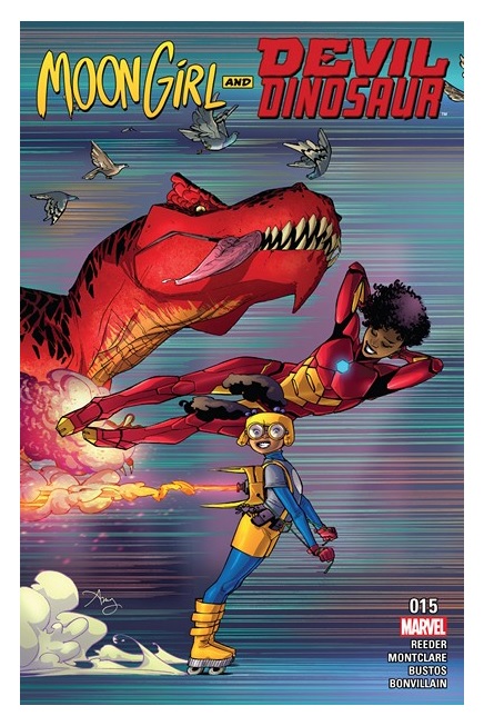
MOON GIRL AND DEVIL DINOSAUR #15
Writer: Brandon Montclare & Amy ReederArtist: Natacha Bustos
Publisher: Marvel Comics
Reviewer: Professor Challenger
“I always wished something would happen in science class. Be careful what you wish for.” -- Moon Girl
What. The. Hell. Did. I. Just. Read?
I don’t want to drop an “LOL” into a review, but….LOL.
I’m seriously wondering where in the world this comic book came from. It’s clearly entrenched in Marvel continuity, but it operates pretty boldly in its own reality. Perhaps they could take a page from DC’s Plastic Man post-Crisis where they would present one-page “reality checks” to let the reader see what the “real” world looks like rather than the world through Plas’s insane visors.
The concept is already complicated but basically you have a young girl who is a genius, and based on solving some puzzle created by Bruce Banner, she’s “officially” the “smartest person in the world.” (How does THAT work???) So, of course, she would decide to be some sort of super-hero calling herself Moon Girl? I don’t know why she calls herself Moon Girl. Maybe it’s because of the big yellow circle on her costume’s chest. I really don’t know. I am assuming that since she is partnered up with a time-displaced Devil Dinosaur (from the old Jack Kirby series from the 1970s) who used to run around with a caveboy named Moon Boy that this is the practical reason why. But I’m not clear on the in-story reason why.
This comic drips with Marvel name-dropping. We have Hulk (both Banner and Cho, Thing, Ms. Marvel, Dr. Doom, and special guest-stars Ironheart and Dr. Strange. The comic starts with what appears to be disembodied flying drone versions of Doc Ock tentacles attacking Moon Girl’s public school science class.
I don’t know why.
So, she does some clever science stuff to fight them off along with the help of teenaged super-heroine Ironheart who arrives on the scene. I don’t know how or why out of all of New York City, Ironheart was able to show up at just the right time. But yay for super-heroes I guess. Oh, and it turns out the drone tentacles were apparently sent there by Dr. Doom from his castle in Latveria. Damn those communication satellites and their ability to let villains robo-control tentacles from across the world!!! Of course, based on the dialogue between Moon Girl and Ironheart I am under the impression that Dr. Doom is supposed to be dead again in the current Marvel continuity. If so, then this is probably not Dr. Doom but one of his legion of Doombots or maybe that crazy little kid, Kristoff, from the John Byrne years on the Fantastic Four comic. This would make sense because it would pit our young Moon Girl against someone around her own age. But I don’t know.
What I do know is that Moon Girl has the same sort of psychic link with Devil Dinosaur that the original Moon Boy had, so there’s that going on. Eventually, Devil shows up in all his red Tyrannosaurus beauty. But he looks a lot cuter than when Kirby was drawing him. He was kind of badass back then. Now, he’s coming off like a giant puppy. I’m not sure how a T-rex in New York City is able to be hidden by a young girl, but I guess I’m supposed to just go with it. Ultimately, in the end, their search for….I’m not even sure what the Maguffin was—mebbe tracking the mystical energy trail left behind by Doom’s blink-and-you-missed-it appearance in New York? Whatever it was, it leads Moon Girl to Dr. Strange’s Sanctum Sanctorum in another moment of movie character shoehorning. Btw, I sure hate whatever choices were made to outfit the current comics version of Dr. Strange like this. Either go back to the classic look or just straight up use the movie design because this is lame.
The art was the best of the 3 Marvel comics I decided to read this month. However, apparently one of the writers is also credited with the art on the front and inside cover, so I’m going to assume she’s probably the co-creator and set the artistic style. This would be Amy Reeder and her stuff is fantastic. Very much in the flavor of Amanda Conner with a real confident and solid blend of cartooning and realism. So, I was slightly disappointed to see she wasn’t handling the full interior work, but the artist Natacha Bustos does a good job and the color work really helped support her art. I think she’s still working on grasping how to best portray Devil himself, but she clearly understands how to tell a story, even an insane and busy story, with a real sense of weight, line, perspective, and setting. It establishes a consistent world you believe in and is a light touch lending a comedic tone to the whole thing. I would feel good about giving this series to young girl to read.
I like the increased presence of females, girls, and younger people in general within the Marvel universe. I also appreciate the increased presence of people of color and other cultures. I think this is nothing but positive for new readers who are just now climbing on board the comics train. I’m not so keen on the current state of costume design at Marvel overall. Ironheart would benefit from a much sleeker and less cumbersome armor design. Dr. Strange, as mentioned above, is just lame. It needs some more color and make better sense in design and function. I don’t know what was going on with Moon Girl’s costume in the comic. It seemed very different than how she looked on the cover. I liked the cover costume. I was unclear what she was actually wearing in the comic. So, the comic felt like it was outtacontrol and off-kilter but that became charming as it went. Really, my only encouragement would be to improve some of the clarity on some things like her costume and Devil, but keep Bustos and let her and the writers keep doing their thing…
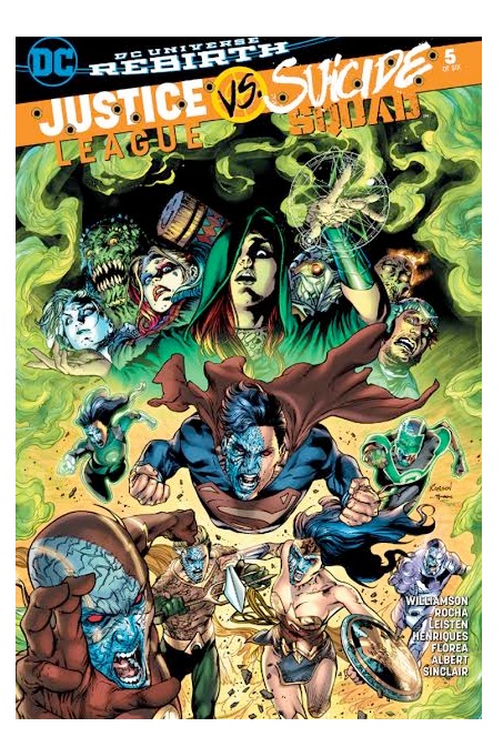
JUSTICE LEAGUE VS SUICIDE SQUAD #5-6
JUSTICE LEAGUE VS SUICIDE SQUAD #5Writer: Joshua Williamson
Artist: Robson Rochn (#5) & Howard Porter (#6)
Publisher: DC Comics
Reviewer: Masked Man
DC's two biggest teams have joined for a mega crossover, with Joshua Williamson ( GHOSTED, BIRTHRIGHT, NAILBITER) in the writer's chair. Each week a new artist joins him, for this weekly series, this week it's Robson Rochn. A fairly new artist, who has done a ton of one-offs for DC since the start of the New 52.
As we're coming to the end of this crossover-event, it kind of reminds me of Geoff Johns' “Darkseid War” in the JUSTICE LEAGUE. In that they use a lot of characters who have rich histories in the DCU. But the those histories have been erased, as this is the first time we are seeing them, post-New 52. So it feels like, “Hey remember this cool character? Well he's in this story! Check-it out! Although we've changed everything about him, and we don't have time to explain it all now- but ya like him right!? That's why this story rules!” It's all just a bit confusing and unsatisfying.
Ok, on to the spoilers. With the Heart of Darkness (aka, the Eclipso Diamond), Maxwell Lord has taken over the Justice League (although, it has taken over Max, as well). Within 13 minutes (they timed it for us) Max has taken over the country. Meanwhile, Batman and the Suicide Squad are pulling themselves out of the rumble that was Belle Reve (SS HQ, where $h!t went down last iss, and Max got the Heart). As often is the case with people who get everything they want, Max needs someone to brag to. So he has Superman collect Amanda Waller for him. As they talk, Amanda starts to get him to realize the Heart of Darkness is using him. As seeming people all over the country are falling under the influence of the Heart (no explain how).
Back to Batman and Cyborg (which is confusing, since they mentioned he is working with Max, but didn't leave with the rest of the Justice League. He does mentions that his computer mind is helping him fight off the effects of the Heart, but it's clear he's helping Max too. But Max let him at Belle Reve, or something?) and the Suicide Squad (although, the Enchantress has seemed to disappear from the story). Batman takes control of the situation, and declares that they are all Justice League members now (wait, really!?) and they go attack the White house. Where Max and the mind controlled Justice League are holed-up (FYI- Batman wasn't with the League when Max mind controlled them, and Max didn't think mind controlling the Squad was worth it). Big fight breaks out and Maxwell Lord becomes Eclipso (Am I suppose to use my Pre-New 52 knowledge to get excited by that or what?).
Again, I'm reminded of another story, another recent Geoff Johns' story: FOREVER EVIL. Where Batman teamed-up with a bunch of villains to take down the villain Justice League. Either way, JLVSS is shaping up a lot like the SUICIDE SQUAD movie. Which had nice action, nice scenes, but the over plot logic was rather weak. Then minute you stop and think, “wait ,why is this happening?”, you realized it's no good reason.
There are also a lot of weird storytelling sequences in here. Like four panels that show Deadshot turning on a flashlight!? I don't get it. Plus Superman's attack on the White House is odd. First he flies right, then he flies left, then he stops, and then he flies some more. And was he carrying Max the whole time he was busting through all those walls and gun fire? It makes me think this new lot of DC artists aren't very good story tellers (or maybe the writers have too much control). They are all pretty marvelous with their backgrounds, figure work, and faces. But laying out a compelling story doesn't seem to be something they are interested in. Mind you, I'm not saying they are awful, but closes-ups, shadows, and angle shots don't make for good drama, unless it serves the story.
Overall, JlvSS is all pretty textbook. We are getting some good slugfests, with a reasonable amount of story logic. The artwork has been above average, across the board. But for a crossover-weekly-comic book-event with two of DC's hottest teams, you'd think it would have been more interesting.
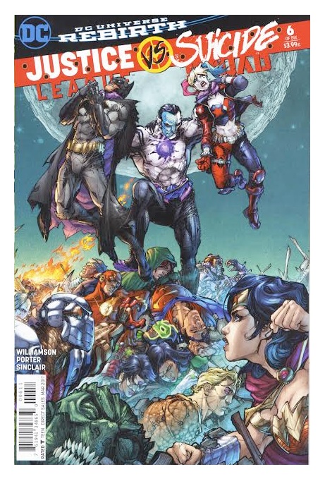 JUSTICE LEAGUE VS. SUICIDE SQUAD #6
DC's latest crossover-event comes to a close, as former JLA artists Howard Porter pencils the final issue. Being a weekly series and each issue had different artist. While that messed with the cohesive feel of the book (especially Porter's), DC did get them all out on time and that is saying something.
How about those spoilers. OK, Maxwell Lord, former Checkmate director, had hopes of saving the world. So he stole the Hear of Darkness (a.k.a. Eclipso Diamond) from Amanda Waller, and used it to mind control the Justice League (that seems to be the extend to his plan). Upon stealing the Heart and mind controlling the League (except Batman, who wasn't in the room at the time), Max became corrupted by the diamond, as did everyone near it- including all of Washington D.C. Killer Frost, Batman and the Suicide Squad then team-up to defeat Max/Ecilpso/the Heart of Darkness (why did I single out Killer Frost, you ask?). So the third battle royal of the series takes place. Batman figures out sunlight weakens the Heart, so Killer Frost makes an ice prism, Batman tricks Superman into shooting his heat vision at the prism, this creates sunlight and frees Superman, and the League, from the Heart's control. Again, Superman shoots his heat vision at the ice prism (you getting this), which creates more sunlight and defeats the Heart. The League then figures the Suicide Squad ain't that bad (!?), and Batman recruits Killer Frost and Lobo for his Justice League of America team (!?). Lastly, Max figures out Amanda Waller set all this up. She leaked the info to Max about the Heart, knowing her would do all this (!?). She figured this would causes the Justice League and the Suicide Squad to team-up. Then after saving the world, the Justice League would come to respect her Task Force X (Suicide Squad) and leave them alone (!?).
Wow, that is a lot of plot points to swallow right there. First off, I now get why the Prelude, was all about Killer Frost meeting the rest of the Suicide Squad, because in some way this story was all about Frost joining the League (much like how FOREVER EVIL was all about getting Lex Luthor to join the League (weird how many parallels Williamson had with that story)). Mind you, Lobo, joined the League too, but I guess Williamson didn't think that was as important as Killer Frost joining the League. So I get that Killer Frost had to save the day, but her being able to create an ice prism strong enough to withstand Superman's heat vision (which can burn him), that's a bridge too far to me. Also, not so sure how the Heart of Darkness works. Williamson never showed it's powers in a consistent manner. Sometimes it would corrupt people miles away with no effort, sometimes it took a page of action, sometimes it didn't want to corrupt people, and then it couldn't corrupt Killer Frost because her deep secret was that she wanted to be good. In all, it just seemed to do whatever was convenient for the plot.
The final corker of it all, was this was all Amanda Waller's plan! That's where I feel this house of cards really came down. Max's plan barely made sense as it is, but learning Waller's set everyone up, knowing they would act this nonsensical makes even less sense! But hey, Killer Frost got a chance to shine as a good guy and joined the Justice League, so I guess it was all worth it.
Now, back in the day, I was somewhat of a Howard Porter fan. He was clunky, but his work was interesting enough to be cool. Not so much anymore. He's covering everything with these ugly squiggle shiny lines and it just kicks up the unappealing aspect of his work. He's work also doesn't match the style of the previous five artists (who all worked in the same style), so that doesn't help the story as a whole either.
So sure, JLVSS had some decent punch-ups, but in the end it was just as ludicrous most superhero vs superhero book. The tired old format of “we fight, we team-up” didn't help much either. Still, I totally thought this series was going to score a solid Decent on the Masked Man's scale of Crap, Poor, Decent, Good, Great; but this incredulous ending knock it back to score: POOR.

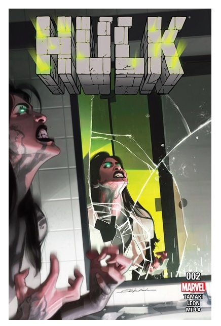
HULK #2
Writer: Mariko TamakiArtisits: Nico Leon & Dalibor Talajic
Publisher: Marvel Comics
Reviewer: Lyzard
A word of cation: I’m not an avid reader of HULK. So yeah, I may get some facts wrong regarding continuity in this review, but Marvel (or any major publisher for that matter) can’t just rely on their dedicated fan base alone to financially support them. Especially with a property like the Hulk which lacks a non-comic presence in comparison to its other MCU Avengers counterparts. They need new readers and it would be hard to argue against the fact that Marvel has been trying to garner more of a female audience lately. I’m reviewing this issue from that perspective. If you don’t care what someone of my background has to say, fine. I’m sure my fellow @$$holes would be willing to give you their opinions in the talkbacks. But if you want a review that’ll help you convince your casual-reading friends to check this serious out, then continue on.
HULK now focuses on Jennifer Walters, not Bruce Banner. It is tempting to compare this to Jane Foster’s THOR, another famous mantle being picked up by a female character, but the similarities are slim. Both runs work as good starting points for new readers, but THOR required a bit more background knowledge to follow its events. There were multiple storylines at play, not all focused on the titular Thor. The HULK keeps the story strictly on Jen and new readers need know less about how the Hulk died to understand her sorrow (though the title page gives you a decent backstory).
HULK #2 places Walters in increasingly stressful situations. She must deal with a dickish landlord, a nosy reporter, and some children’s’ (who are annoying on their own) antics triggering a PTSD episode. But Jen isn’t the only one having a crappy day. Her newest client, an inhuman named Maise Brewn, also has the SOB landlord to face and is in a panic. Can Jennifer pull herself together in time to keep her promise to her client?
I’ll admit, it’s a sloooow read. There isn’t much plot development or action in the first two issues. You are left waiting for Jen to “hulk out,” but that moment never comes. However, both issues do end with a creeptastic moment. The overall tension, the sense of chill and dread that pervades throughout all the pages, is finally broken at the conclusion of HULK #2. Just not by whom you would expect. All of this makes the series well worth the trudge.
That and the art team. Nico Leon & Dalibor Talajic are capable artists, I particularly love their character design of Mr. Tick who looks like he just walked out of Vice City. But I truly appreciate the coloring by Matt Milla. His choices for the use of green may seem like no-brainer, but some of the best creative efforts should be made to look easy. If it was so simple and obvious, then there would be way more comics of such quality.
I’m particularly a fan of grounded superhero stories, focusing less on external chaos and more on inner turmoil. There are so many other books out there I could read to get my traditional superhero fix that I appreciate series that take the time to focus on just how ordinary these characters with extraordinary powers can be.
Lyzard is Lyz Reblin, a graduate student at Michigan Tech pursuing a doctorate in Rhetoric, Theory, and Culture... which is just a fancy way of saying she plays a lot video games, watches far too many horror films, and then tries to pass it all off as "research."
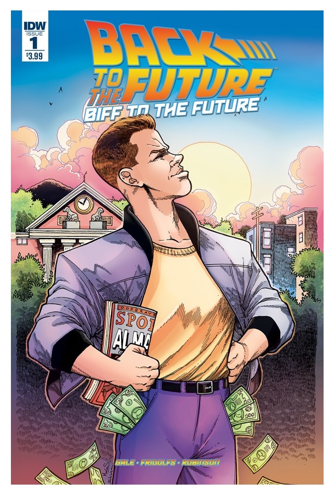
BIFF TO THE FUTURE #1
Writers: Bob Gale, Derek FridolfsArt: Alan Robinson
Publisher: IDW Publishing
Reviewer: Justin Burkhardt and @justinburkhardt on Twitter
You’ve got to hand it to Robert Zemeckis & Bob Gale. Both have spurned lucrative paydays by saying that a remake/reboot of the BACK TO THE FUTURE movies will never happen as long as they’re alive. The contracts both signed with Universal/Amblin in 1984 states that the two men do have control over any BTTF movies until their deaths. So I truly don’t believe we will ever see any BTTF movies as long as they’re still alive. Why am I so sure? First, both have been so adamant against any future movies. Second, if they haven’t done/considered it yet, I don’t think they ever will. And that’s a good thing.
Now I’m not one of those people who are completely against remakes/reboots. There are a few movie remakes that are actually better than the original. A few that come to mind are: SCARFACE (1983), THE FLY (1986), CAPE FEAR (1991), OCEAN’S 11 (2001), and TRUE GRIT (2010). When a movie is remade well, it can be superior over its predecessor. Bad remakes however can be disastrous and damaging to a character or film’s legacy. Updated remakes such as PLANET OF THE APES (2001), THE KARATE KID (2010), and CONAN THE BARBARIAN (2011) were awful messes that set their original properties back (However, the most recent Apes films have done a great job at not only redeeming the franchise, but taking it to new/different heights).
BACK TO THE FUTURE premiered July 3rd 1985, almost a full three months before I was born. I grew up on the franchise also including the animated series, video games, and Universal Studios ride. While I believe there ways to make positive improvements on some movies I loved as a child (I think a third GREMLINS movie could be really awesome); BTTF, in my opinion, is a perfect film that will never require a remake. There are many ways to expand a movie franchise without taking it to the big screen, and comic books have become one of those mediums. From STAR WARS DARTH VADER to THE LOST BOYS, there have been quite a few successful comic sequels recently (I’m also really excited about BOOM STUDIO’s upcoming Dark Crystal sequel BTW). BTFF has been another recent success.
In October of 2015, IDW Publishing released its first issue of the still on-going BACK TO THE FUTURE comic series. With original screenwriter Gale at the helm, the series has dug into stories from different BTTF timelines. In addition to this, IDW also released the mini-series CITIZEN BROWN, based off the hit TellTale BTTF video game. As a long-time BTTF fan, I recommend catching up on the BTTF comics as soon as you possibly can. The fact that the BTTF comic isn’t regularly on Diamond Comic Distributor’s Top-100 list is why we as comic book fans can’t have nice things. This series deserves way more love and respect than it’s currently getting.
This week, IDW released BIFF TO THE FUTURE #1, which I recommend checking out as well. BIFF TO THE FUTURE will be a six-issue series that digs more into the story of the rise and fall of Biff Tannen, popular villain of the BTTF series. As a kid, Biff was always one of my favorite villains and the guy you truly loved to hate. As an adult, I would have never imagined that his character would be used to help describe the current president of this great country, but hey here we are. It is written by Gale (BTTF, THE AMAZING SPIDERMAN) and Derek Fridolfs (WOLVERINE, LOONEY TUNES). It also features art by Alan Robinson (BTTF: CITIZEN BROWN, V-WARS) and colors by Maria Santaolalla (BTTF: CITIZEN BROWN, GHOSTBUSTERS INTERNATIONAL).
The story starts with younger Biff receiving the Grays Sports Almanac from the older Biff on November 12th 1955. We then learn more about Biff’s back story and what he decides to do with the Almanac. This first issue starts to turn Biff into a more sympathetic figure by showing you how he is treated by his grandmother. Biff is still the jerk we love to hate, but you start to understand him a little bit more.
Robinson’s artwork is very similar to his work on Citizen Brown, which continues to maintain a playful and comedic feeling. BTTF isn’t meant to have a serious or dark look to it, so Robinson's pages work exceedingly well in terms of the overall tone of the franchise. There is tons of potential here in regards to storytelling in the final five issues. One of the questions I have always had about Biff in BTTF II was what exactly happened once he got that almanac? And how exactly did Biff rise to the wealthy and corrupt leader of Hill Valley that we see in the movie? I believe this series is going to show us all that and then some.
Gale continues to show us that he still has a bunch of fun and interesting stories left to tell when it comes to our favorite residents of HillValley. While you won’t be able to see any of these new BTTF stories on the big screen, you do have some pretty awesome comics to check out instead. BIFF TO THE FUTURE, like BACK TO THE FUTURE and BTTF: CITIZEN BROWN, is a must read for all fans of the BTTF franchise…..Remakes? Where we’re going, we don’t need any remakes!
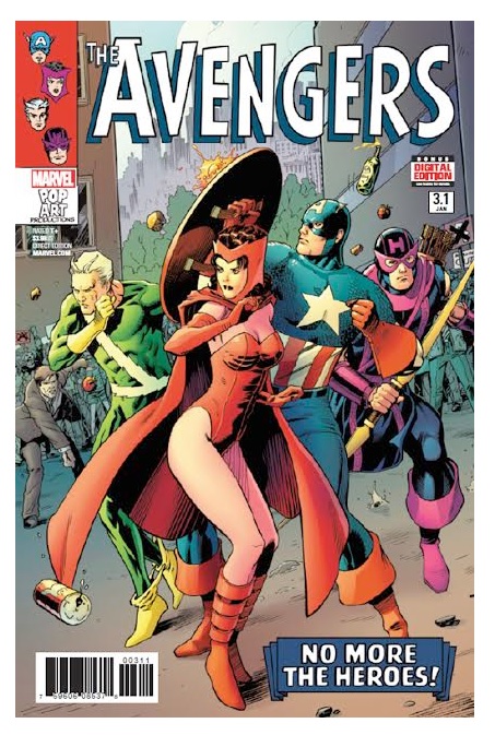
THE AVENGERS #3.1
Writer: Mark WaidArtist: Barry Kitson
Publisher: Marvel Comics
Reviewer: Masked Man
Mark Waid is a very busy man, and why not, he's a top talent writer. Not only is he writing THE AVENGERS, the next-gen CHAMPIONS, but the old school Avengers as well with THE AVENGERS 0.1. Which is a modern take on the first Avengers line-up change: Captain America, Hawkeye, Scarlet Witch and Quick Silver. When I first wrote about this series, I mentioned how Waid and Kitson had success with this concept before with JUSTICE LEAGUE YEAR ONE (of course, who knows anything about DC's history these days). So it seems very fitting that they are at it again.
Getting into the spoilers, the world is not too happy that Iron Man, Thor, Giant Man and the Wasp left the world saving to Cap and three former supervillains. There's even a protest rally (which is funny, because as I write this, there actually is one going on around the world today). Most of it stems from the new Avengers getting their @$$ handed to them by the Frightful Four in issue #1.1. Then they discovered Cressida, aka, Avenger X (FYI- she is a new character created by Waid). Cressida has the ability to increase a person's power and abilities. Giving a power boost to our heroes, they whip the Mad Thinker and his growing army of awesome androids within an hour. Now the protesters are starting to think they had it wrong (hopeful this will be the case in real life too). But of course, things are not so simple. As around New York City, old people are being mysteriously drained of their life energy and dying (jumping ahead, I'm curious how Cap will feel about this, once he learns of it). Second, Cressida has just sown the seed of discontent into the Avengers as well. And to make it absolutely clear she is a bad guy, she gives a power boost to the Spider-Man villain Ox, who then breaks Quick Silver's leg.
For us old time readers (well maybe not that old), this is a great look at this Avengers line-up. As you would expect from Waid, he really knows these characters, from this time period. All the little verbal jabs Hawkeye is constantly giving Cap is amusing. It's a wonder Cap never just flattened him like Batman did Guy Gardner. Overall though, this is just classic superhero stuff. You got goodguys and badguys, and a little intrigue to keep it all interesting (although, I'll go out on a limb right now and say, Kang- hopefully not because I feel he's overused, but that's my hunch).
On the negative side, while this is nice, it isn't particularly amazing or awesome. And the same can be said for Kitson's artwork. Mind you, it's fine, it's good work. But it's not a the level I've come to expect from Kitson's. It's almost like he's phoning it in (though nowhere as bad as Bryan Hitch's 'phone-in work'). So, it's nice, but not particularly amazing or awesome.
Anyone missing their 'old Marvel comics', should be buying. For anyone else, it's a good book, try it.
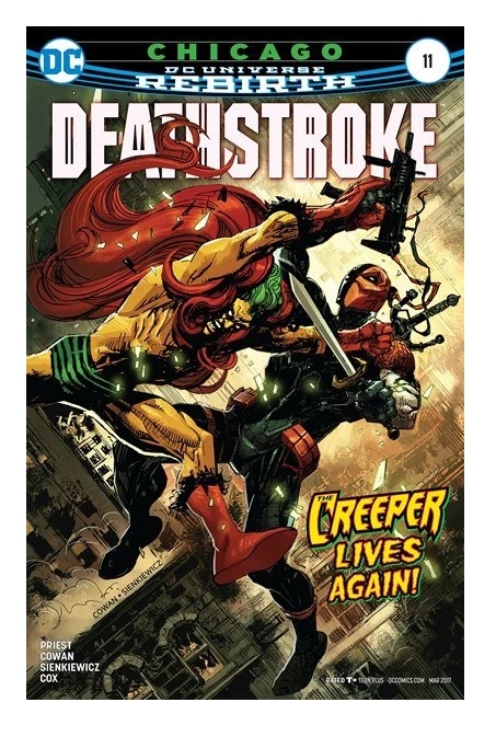
DEATHSTROKE #11
Writer: Christopher PriestArt: Denys Cowan and Bill Sienkiewicz
Publisher: DC Comics
Reviewer: Humphrey Lee
This Rebirth run of DEATHSTROKE, thus far, has about exemplified why Christopher Priest is so ahead of the game when it comes to structuring and layering his storylines. Everything adds something to big delicious plot cake and even if it doesn’t necessarily show its hand up front, sometimes he just comes out of nowhere with a gut punch of a story that holds a mirror up to the real world we live in while telling a tale in one of our favorite fantasy worlds.
DEATHSTROKE #11 is exactly that kind of issue. Framed around the mystique of the ruthless assassin, this issue comes packing heat about escalating gun violence and the community and morality toll it takes. It’s not exactly what you expect of a Deathstroke tale but as it plays out you see just how perfect a vehicle he is for the conflict of righteousness and corruption that is presented here in all its reflective glory. It’s a brutal punch of cynicism meant to draw questions about one’s self and highlight the almost pure amorality of Deathstroke himself that makes him such a riveting character despite his mostly villainous machinations.
And it exemplifies why this book is at the top tier of mainstream super “heroing” today.
THUNDERBOLTS #9
Writer: Jim ZubArtists: Jon Malin
Publisher: Marvel Comics
Reviewer: Professor Challenger
“What do you want to do with these weirdos?” —Mach-X
I was a huge fan of the original THUNDERBOLTS and kind of kept in touch with them a little bit after the first CIVIL WAR events. But stepping back into the fold to check out the latest issue and incarnation didn’t really feel quite so much like going home as walking in the front door of the wrong house.
It’s not just that there are some new characters on the team and that the paradigm is different, but even the characters I should feel comfortable around don’t feel the same. Unfortunately, I can only place the blame on the writer not capturing the voices right and the art not capturing a visual that works for them.
The basic set-up for this issue is the return of Songbird, from the original T-bolts. Before this issue, she apparently ran into a conflict with SHIELD that has resulted in her becoming a blacklisted hero. So, here she is trying to reconnect with her old teammates, which also puts her back in contact with ex-boyfriend Mach-X.
The story starts with team leader, Bucky/Winter Soldier, testing out his new bionic arm provided by The Fixer. The new arm has extra features he’s never had before and includes T-Bolts logo on the shoulder. Introductions are made and expositions are delivered so Songbird and any new reader (like myself) can get caught up on all the whos, whats, and whys surrounding the new team. Their new mission? “Keeping the planet safe from threats other people don’t even know about.” The strangest new member is Kobik, which some of you might know from my CAPTAIN AMERICA review. Kobik is the sentient Cosmic Cube that rewrote the timeline so that Steve Rogers has been a closet Hydra agent since before he even became Captain America. For some reason, here in the T-bolts Kobik has take the form of a slow-witted young girl.
Fixer intercepts an alien transmission that results in the team taking off to track down the source. It’s a trap, of course, and they promptly come face to face with some angry green insectoid aliens, the Zn’Rx, who are wearing bizarre things like pink bras, lumberjack hats, bows in their hair, trash can lids, along with slobbery teeth like DC Dominators and tongues like Venom. Basically, they look like they were kind of made up on the spot without much thought. Which brings to mind this question I have when reading a fight scene like this, but how exactly are these aliens talking with those mouths when they have no lips and their 18-inch tongues are always hanging out? They’d have bitten through their own tongues after 2 syllables.
Anyway, the story was serviceable at best. The art was amateurish. And I hate to say this because I know what it usually takes to land a gig like that, and I have to at least credit the artist with having mostly a style of his own. Unfortunately, that style looks like a teen who wants to draw like the worst of the mid-90s Image books, with occasionally dashes of a Mike Mignola figure tossed in and little bit of Manga wannabe. Backgrounds are practically nonexistent, empty space is filled with action lines even when nobody’s moving, proportions and anatomy appear to be completely fluid, and the little girl, Kobik, gives off a serious impression that the artist may have never seen a real little girl in his life. However…on the positive side, I do think he has a good sense of how to flow the story and would say that my impression is that every page needed a second-round of work. Like, these were find first-drafts, but then he needed to go in and tighten up the detail and add in those backgrounds. As younger artists are gearing towards digital pencils, I think there’s a noticeable loss in the quality of the art simply by removing the embellishment stage where a talented inker would add those line variations, shadows, and details that give the art real impact and weight. I’d like to see what Jon Malin could do if he knocked out a comic like this and then went back to panel one and did a second pass on the whole thing. I have no complaints on the color art. It seemed pretty solid to me, but it also seemed like a lot of empty space to slap a color down on and that’s got to be a challenge to keep interesting.
In the end, it’s a passable comic, but I wouldn’t go so far to recommend it. I would love to see a better redesign on Moonstone because the outfit they have her in right now is embarrassing. Also, the notice of the lack of substance artwise in this issue was perhaps exacerbated by the advertisement on the last page for the T-bolts 20th Anniversary Special featuring artwork by original T-bolts creator Mark Bagley. Bagley always delivers the goods.
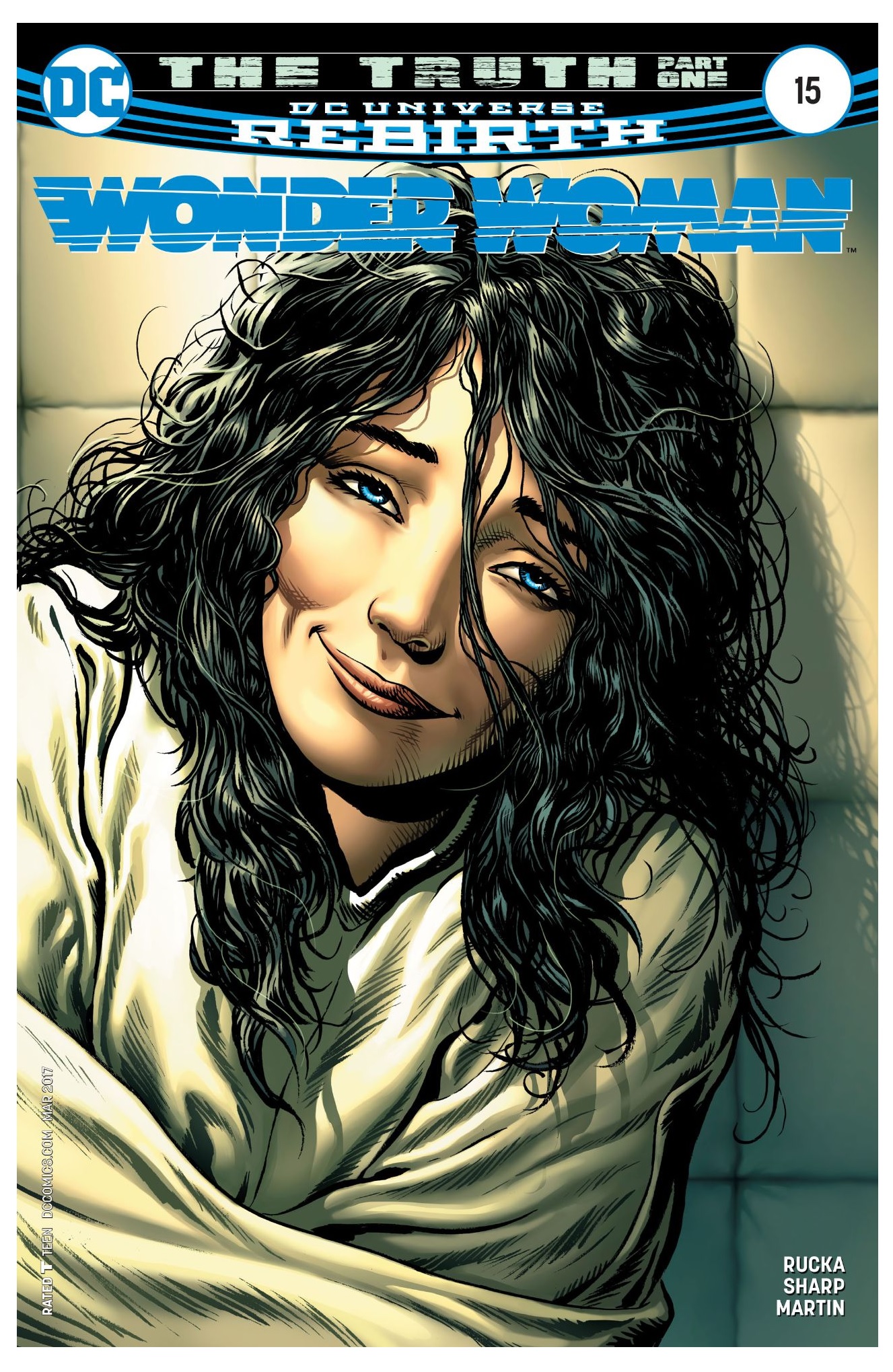
WONDER WOMAN #15
Writer: Greg RuckaArt: Liam Sharp
Publisher: DC Comics
Reviewer: Humphrey Lee
Given the rapid release of these books, it wasn’t too long ago I was here talking about this very book, both singing the praises of how Greg Rucka knows how to project the mystique and majesty of Wonder Woman as a character, but that how the back and forth story arcs between the bi-weekly shipping issues and the slow start to both of them was really kind of a drag.
Now that we are officially kicking off round two of this approach to the book with part one of “The Truth,” I’m pretty much doubling down on that opinion. The presentation in WONDER WOMAN is still top notch but it’s a little bit of a buzzkill to go and reset into that back and forth format, especially when one of the preceding storylines was “just” an origin reshuffling. And now the opening salvo of these new arcs is basically just Rucka and company moving a bunch of the supporting cast into place, which somewhat cuts off the momentum those previous arcs had reached by their conclusion.
I’m not giving up the book by any means, everything this team of Rucka and Liam Sharp and so on get right about Princess Diana and company they really get right, but at some point something in this formatting is going to have to give a little bit.
THANOS #3
Writer: Jeff LemireArt: Mike Deodato
Publisher: Marvel Comics
Reviewer: Humphrey Lee
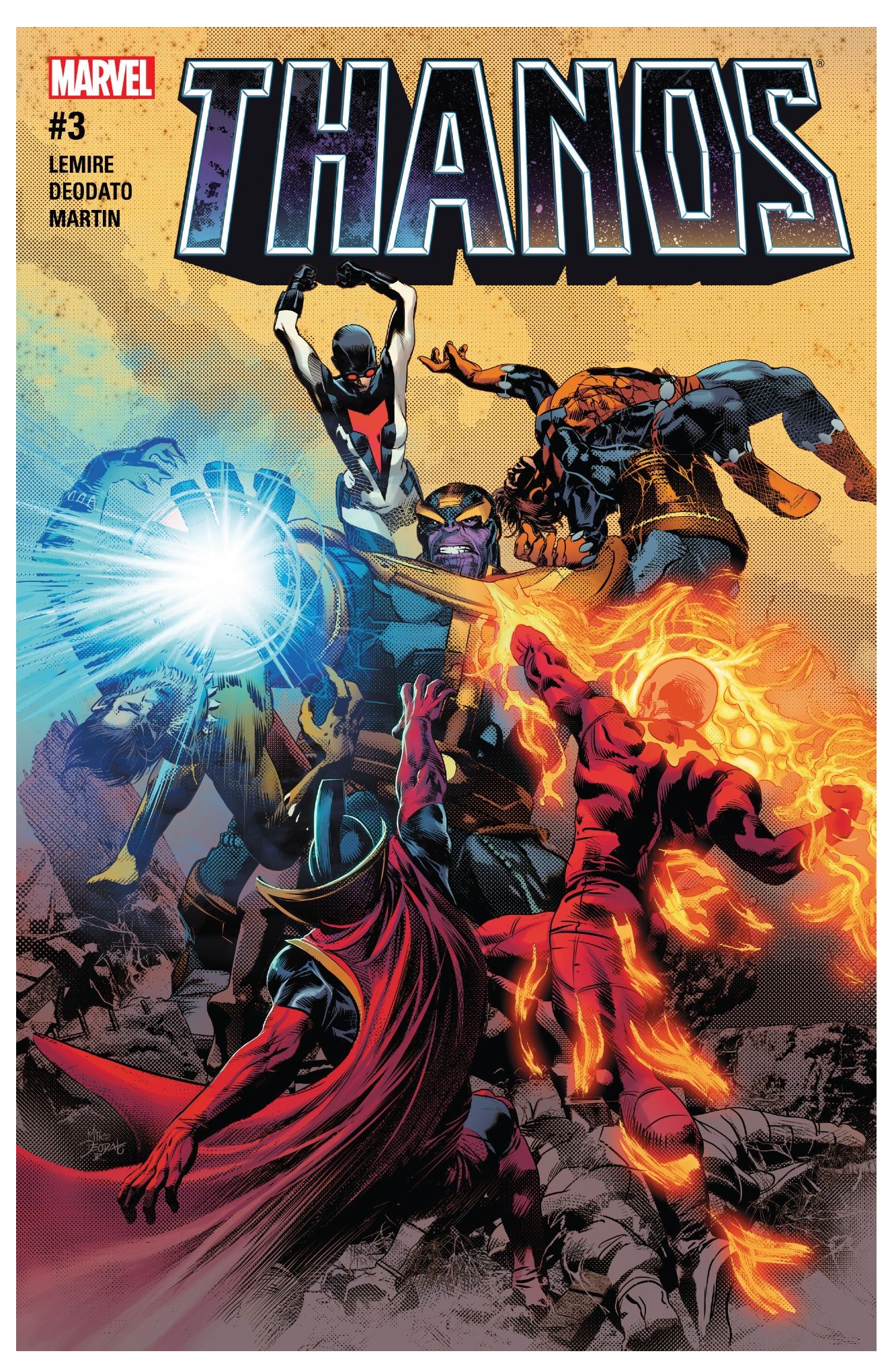
Not that this series has been lacking in any way so far in its short-lived run, but this is exactly what I was waiting for when it comes to a comic book featuring the Mad Titan of the Marvel Universe.
So far, Jeff Lemire and Mike Deodato have really done an amazing job of encapsulating the sheer amount of awe-into-terror that Thanos as a character instills into any environment he is in, but with the central conceit of this series being a focus on the mortality of an ailing Thanos, a big conflict calling that weakness into play had to happen. But Lemire and Deodato emphasize that even a diminishing Thanos is a fucking force and a half to behold, and this knock down drag out between him and the current incarnation of the Shi’ar Imperial Guard is the material of what superhero comic dreams are made. It stands as a testament to the determination and power of Thanos and also to the story that Lemire and Deodato are crafting with him as they tow that line of slowing him down from his near god-like status to the being starting to see his mortality creeping in at the edges.
This book is already so damn good and it’s just begun to start chugging along.
Proofs, co-edits & common sense provided by Sleazy G
 The next level of comic book excellence is a click away at BLACK MASK STUDIOS!
 Want more in all things Geek?
Check out our friends at PoptardsGo for podcasts, reviews, and more!
 And if you still need more geek in your life, check out Part-Time Fanboy for more geeky goodness on comics, movies, and more!
Finally, check out AICN COMICS on Facebook and Comixpedia!
