
(Click title to go directly to the review)
Advance Review: JUSTICE LEAGUE OF AMERICA #7
Indie Jones presents THE LOST CAT OGN
X-FACTOR #260
QUANTUM & WOODY #2
Indie Jones presents FARLAINE THE GOBLIN BOOK 1: THE TINKLANDS
TODD THE UGLIEST KID ON EARTH VOL.1
DETECTIVE COMICS ANNUAL #2
Indie Jones: MEN’S FEELINGS VOL.1
BUCK ROGERS #1
BATMAN ’66 #6
Indie Jones presents MONSTROSITY VOL.1
DAREDEVIL: DARK NIGHTS #3
Indie Jones: COPRA #8
Advance Review: ASTRO CITY #3
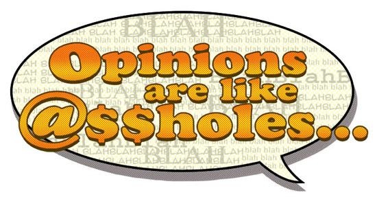
Opinions Are Like @$$Holes: The Matter of Power Girl’s Chest by Masked Man
 Advance Review: In stores today!
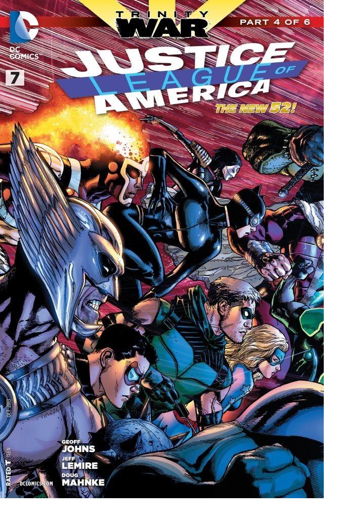
JUSTICE LEAGUE OF AMERICA #7
Writer: Geoff JohnsArtist: Doug Mahnke
Publisher: DC Comics
Reviewer: Optimous Douche
“Shit, meet the fan.” As expected, week 4 of Trinity War punts us downhill past Freytag’s pyramid climax at a 90 degree angle. Years of lies and deceit become real, an old foe is almost given the keys to controlling Earth, and while we still wait for the grandmaster to be fully revealed a few more of his players are beginning to crystalize.
In buildup, DC truly had me believing Trinity War was going to be a slapsy fest between the love-stricken Wonder Woman and Superman versus old Batty boy. Yes, I know Pandora and her cosmic conundrum boy toys were hinted at being a “thing” since her “Where’s Waldo” level of book-crashing during the New 52 launch, but I didn’t buy it. I was wrong, I am sorry. This is more about Question, Pandora and Stranger than that other oh so mortal trinity.
I give most of the cohesive credit to the co-mingling of JL teams. JL and JL DARK have been in need of a grander plot compass for a while now; Trinity War gives it to them. JLA, let’s face it, was created for this crossover; the question for its future is can it survive being the building one day and not just the keystone. JL and JL DARK need to have more impact than they have across the whole DC universe. I’m not asking for a crossover every three weeks, but some integration into the larger whole is sorta what makes comics comics. Trinity War is delivering the experience without bludgeoning a ton of cross titles down our throat. It’s impact without an egregious money grab. The CONSTANTINE story a few weeks ago could have been read and enjoyed with or without the Trinity connection. A certain company named Schmarvel should take a note from how unobtrusive DC is being while still delivering an impact (no BATMAN 23 T.W. on the stands this week).
So, what do we learn this issue? For starters, Dr. Light: he never pulled out with Sue Dibney--this is Baby Light from that unholy union. Sorry, I couldn’t resist, but it’s really hard to be reading this series when the last time I saw the guy he was committing an act so taboo and vile that even the raunchiest of comedians won’t touch it. “Oh no, Superman killed Dr. Light!” “Good, I hope he punched his junk so hard his great grandchildren are now sterile.” I mean, what the hell else can you say? I know that’s the old Dr. Light, and this guy is different--he’s a family man. Still, we didn’t really learn a hell of a lot about the guy before he became plot fodder. OK, he’s not a filthy rapist; he keeps pictures of his kids on his desk…and now he’s dead. Well, now he’s even deader as our mysterious figure guides a character named Plastique to blow up Light’s corpse. Again, I wasn’t overly moved, but this scene did help cement the popular theory that our unknown grand master of villainy is no other than Earth 3’s Alfred, a member of the old Crime Syndicate. As a fan of alternate reality I say good. As someone who doesn’t want comics to be confusing for new readers, I simply caution: handle this outcome with care, DC.
The other big reveal of this book was Lady Atom spilling the beans about the reason for the inception of the JLA. This takes Superman and his grab bag of Justice Leaguers right to Waller’s doorstep.
The final reveal is Pandora trying to give Luthor her coveted box…well, I mean skull. He doesn’t get it, but who does get it will surprise and astound. I don’t expect the new box…damn it…skull holder to be too affected, but this moment was important because it spells freedom for Luthor to unleash this villainy this fall.
Despite my tongue in cheek tone, I really liked this book and Trinity War as a whole. This issue had a few hokey missteps (like the new box…skull…wielder’s closing line), but this is comics, after all, and Mahnke’s gorgeous pencils more than compensate.
Optimous Douche has successfully blackmailed BottleImp to draw purty pictures for his graphic novel AVERAGE JOE coming out in 2013 from COM.X. When not on Ain’t It Cool, Optimous can be found talking comics and marketing on robpatey.com and just marketing on MaaS360.com.
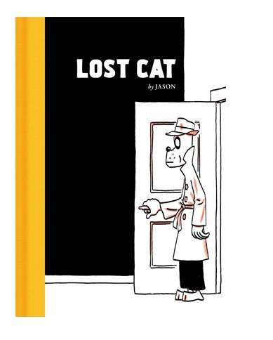

THE LOST CAT Hardcover OGN
Writer: JasonArt: Jason
Publisher: Fantagraphics Books
Reviewer: Ambush Bug
It’s doubtful that there is another artist out there like Norwegian artist/writer Jason and if you’re read his stories, it’s doubtful you’ll ever forget them. The artist has a way with telling a tale in the simplest of ways, using the simplest of characters, and making them resonate between your brain and your soul. I’ve covered a lot of Jason’s work in the twelve years I’ve reviewed comics for Ain’t It Cool News. From I KILLED ADOLF HITLER to WHAT I DID to LOW MOON to my personal favorite WEREWOLVES OF MONTPELLIER; all of these tales have stuck with me through the years as other comics have faded to the back of my mind never to be thought of again. Jason’s new release is called THE LOST CAT and in many ways it is one of his best and most entertaining works.
The story is simple; a detective finds a cat under a car in the rain and seeing a lost cat sign on a lamppost, returns the cat to its owner. This event, as mundane as it is, sparks a series of events which lead to a conspiracy, a lost love, a lost painting, a faked death, and an alien apocalypse. The combination of the details of that last paragraph may read silly, but told in the blasé manner by which everything happening in Jason’s stories are taken in stride, it all makes a wonky kind of sense.
Once again, Jason tells this tale in his own unique way with his own special brand of imagery. Anamorphic animals wearing suits, jackets, and skirts litter the streets of his tales. But while this may suggest that this is a happy kid’s tale, the inscrutably blank faces of all of his characters suggest a depth most detailed humanistic art fails to capture. The juxtaposition to the extremely sad and lonely tales Jason tells with the blank slates of faces of his characters give his stories depth unimaginable—a kind of soulfulness you only find in the most skilled jazz or the most delicious of pastries.
I hate to get all emo here, but reading the work of Jason hits me in places few other artists and writers could ever dream of doing. THE LOST CAT, containing all of the best elements of noir films such as THE BIG SLEEP and THE MALTESE FALCON, yet never forgetting to make us laugh with lines like, “That was straight out of the Rockford Files.” THE LOST CAT is another masterpiece in story and art from a true creator in the comics biz. If you’re a fan of powerful storytelling, strong characters, and moments that both caress and smack the soul, you should do yourself a favor and introduce yourself to the works of Jason. Start with THE LOST CAT and you’ll be hooked for life.
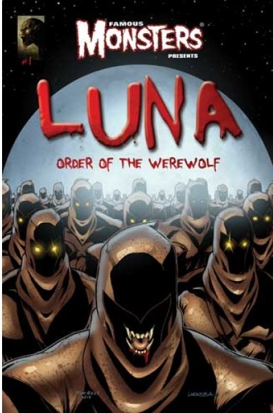
 Ambush Bug is Mark L. Miller, original @$$Hole/wordslinger/writer of wrongs/reviewer/interviewer/editor of AICN COMICS for over 12 years & AICN HORROR for 3. He has written comics such as VINCENT PRICE PRESENTS THE TINGLERS & WITCHFINDER GENERAL, THE DEATHSPORT GAMES, & NANNY & HANK (soon to be made into a feature film from Uptown 6 Films). He has co-written FAMOUS MONSTERS OF FILMLAND’s LUNA: ORDER OF THE WEREWOLF (to be released in October 2013 as a 100-pg original graphic novel through Hermes Press). Mark wrote the critically acclaimed GRIMM FAIRY TALES PRESENTS THE JUNGLE BOOK from Zenescope Entertainment & GRIMM FAIRY TALES #76-81. Look for GRIMM FAIRY TALES PRESENTS THE JUNGLE BOOK: LAST OF THE SPECIES available in February-July 2013 and the new UNLEASHED crossover miniseries GRIMM FAIRY TALES PRESENTS WEREWOLVES: THE HUNGER #1-3 available in May-July 2013! Follow Ambush Bug on the Twitter @Mark_L_Miller.
X-FACTOR #260
Writer: Peter DavidArt: Neil Edwards
Publisher: Marvel Comics
Reviewer: BottleImp
I was always a big fan of Peter David’s X-FACTOR from his first stint on the title back in the early 1990s. So when I found out that he was planning on bringing the series to an end this year, I was understandably sad. What has made me even sadder, however, is the fact that David seems to be ending X-FACTOR not with a bang but a whimper. Despite being built up to for nearly a year (or perhaps BECAUSE of the slow-burn foreshadowing) the series’ last story arc, the “Hell On Earth War,” fell flat in terms of both character development and overall emotional impact—qualities which, up until then, had been the hallmark of David’s writing for this troop of mutant misfits. And thus far the whimpering has continued as David and each unremarkable artist-of-the-month have depicted where each member of the group winds up after X-Factor dissolved. I had higher hopes for this month’s issue, as the cover teased a confrontation between the magnetically-powered (and recently revealed spawn of Magneto’s loins) Polaris and her half-brother Quicksilver.
See, it was Peter David who first gave the super-speedy son of Magneto a personality aside from just being a dick. I mean, Quicksilver was still kind of a dick, but as written in the pages of X-FACTOR he was given a logical reason for his penis-like attitude. David rounded out the previously one-dimensional mutant and made him one of the more interesting members of his original X-Factor lineup, so I was looking forward to David returning to write Quicksilver and delving into his psyche once more.
Instead what I get is a drunk-ass Polaris wrecking shit up at a bar, with Quicksilver only coming in to talk her down, ensuing in a brief and uninspired fight scene between the two. No snappy dialogue, no deep revelatory insights—nothing about what makes David’s work on this comic book so great to read is on display here. Polaris is shuffled off the series, Quicksilver leaves as abruptly as he came…the whimpering continues.
If nothing else, the artwork here by Neil Edwards is a big step up in quality from the art on the previous few issues, and the reader is teased as to the next incarnation of the mutants to bear this series’ name. I just wish that Peter David and Company were giving this title the send-off that X-FACTOR is due…and giving the reader more bang for the buck.
When released from his bottle, the Imp transforms into Stephen Andrade, an artist/illustrator/pirate monkey painter from New England. He's currently hard at work interpreting fellow @$$Hole Optimous Douche's brainwaves and transforming them into pretty pictures on AVERAGE JOE, an original graphic novel to be published by Com.x. You can see some of his artwork here.
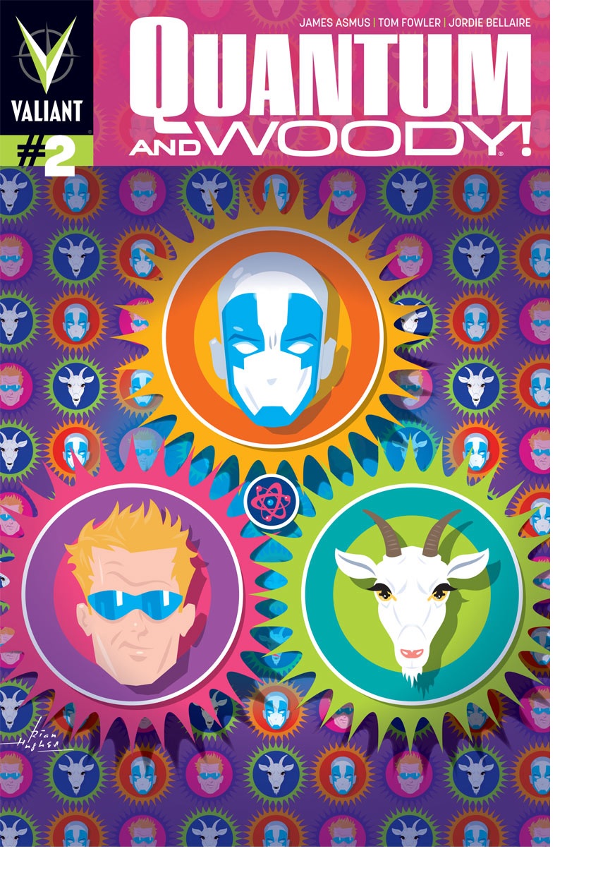
QUANTUM & WOODY #2
Writer: James AsmusArtist: Tom Fowler
Publisher: Valiant Entertainment
Reviewer: Humphrey Lee
As I tend to do so often when I kick these reviews off, it’s disclaimer time. Despite a run of the original QUANTUM AND WOODY sitting in a mound of long boxes big enough to pack a car in if stacked right, I actually did not start reading the things until about two days after the first issue of this reboot hit stands. And I laughed, of course, though I found it pretty uneven and not as polished (of course) as the Christopher Priest works I was actually familiar with growing up – BLACK PANTHER, his DEADPOOL run, even the short-lived THE CREW – but it has some absolutely classic moments and I get why it was as beloved as it was and revered as long as it has been. So here I come to this new series, with no real nostalgia for the original material as it did not have that extra decade of rose tinted syndrome for me as I imagine the original carries for a lot of its fans, particularly considering the quality of the material surrounding it back in its day. And to that end I can officially say about this brand new run two issues in: yeah, I chuckled.
Keeping the comparisons between the original run and this one going – and, yes, I’m going to judge this series on its own merits throughout this review so don’t worry– right off the bat I honestly have to say that this new incarnation is flowing a lot smoother. Part of this is having groundwork already in place for those who read the source material to already have a foothold in this world, sure, but the scripting in Q&W Part Dos is a little more cogent in how it has adapted the signature style of the first series, a big reason why comparisons are going to inevitably keep being drawn. Flashbacks were a big part of the storytelling then and they are now as well, but I feel Asmus with his scripting doesn’t lean on them as much as the original material, though in fairness it does not have to, given the existence of said product. The current construct at hand is telling a much more streamlined tale, as the origin story of the dysfunctional duo here is a present tense thing, unlike the original, and the flashbacks are pulled out occasionally for either comedic or emotional effect, not to fill in storyline gaps. It all plays out in a more satisfyingly modern fashion because it lets the reader fill in the gaps for their relationship and do some more work connecting the dots instead of continually jumping and transitioning back and around to those dots.
Now, as for the quality of which those dots are pointed and lines are put on the page, it’s a well-executed comic in its own right but stumbles occasionally in its own way as well. Like I said earlier, the relationship of Eric (Quantum) and Woody continues to play out really well actually, as it moves from a first issue of being reunited, punching the crap out of each other, and then investigating their father’s death into this issue of its own brand of dysfunction now that they have their superpowers and the drawback that comes with it. And it’s this dysfunction that brings the BWAHAHA for the most part, and the humor is very much in line with what someone familiar with the original run would expect. The majority of it runs through Woody’s eccentric and reckless behavior and his selfish attitude and how Eric always gets the short end of whatever shenanigans in which this puts them. This includes highly awkward situations such as the pair hiding behind some debris whilst being fired upon by the cops post-powers getting and accidentally bumping Lil’ Quantum and Woody together, a pretty vintage example of the kind of humor this book contained.
I guess if there’s any place the storytelling in this issue loses me a bit it’s down the stretch. The interaction between Quantum and Woody is there, and the flashbacks have just enough bite (especially during a one page snapshot of young Woody being scolded by his foster dad) but the merry-go-round of villains that show up at the end comes so rapid-fire I don’t really get who they are outside of their unique appearances and why they are there outside of standard villain machinations. And then some poor bastard gets torn from the inside out as he transforms into some giant albino spider comprised of clown faced stumps, which is almost as horrifying as the last handful of pages are somewhat confusing with all these new characters. Basically, the ending just kind of loses some steam other than Woody doing and saying some very Woody-like stuff is what I’m getting toward. There’s a lot of new faces that pop up, and we don’t really know what they’re doing except EEEEEVIL, and then there’s the spider clown of death thingy and it’s just kind of cacophonous than anything.
Outside of that little bit of a momentum slip at the end, this is a really fun book that is admirably living up to the standards its original version set, surpassing them at times even. There has yet to be a fit of hilarity on the level of the “Noogie” issue in the previous series, or the issue where Q&W first switch bodies and are getting used to the situation, but it’s still early and those are once in a blue moon bits that you just can’t replicate and are the reason that version is such a classic run. But Asmus has a really good grasp on the characters, why their relationship works despite the dysfunction, and a hell of a great artist backing him up. Seriously, I cannot think of a better pencil-holding choice for a book of this level of quirk than Tom Fowler with his slightly exaggerated, cartoony style. The embellishing it does to sell the comedic bits combined with the expressiveness it occasionally unleashes just to sell the odd emotional beat is a great fit for the book, a book that can proudly hang its hat on being really good at those two things: ridiculous and oddly sentimental. Whether this version of those adjectives will live up to the levels its forbearer set remains to be seen – that is a high ceiling to reach for – but this incarnation has shown that its floor is pretty damn high itself, even if the humor occasionally comes (delightfully) from the basement.
Humphrey Lee has been an avid comic book reader going on fifteen years now and a contributor to Ain't It Cool comics for quite a few as well. In fact, reading comics is about all he does in his free time and where all the money from his day job wages goes to - funding his comic book habit so he can talk about them to you, our loyal readers (lucky you). He's a bit of a social networking whore, so you can find him all over the Interwebs on sites like Twitter, The MySpaces, Facebookand a blog where he also mostly talks about comics with his free time because he hasn't the slightest semblance of a life. Sad but true, and he gladly encourages you to add, read, and comment as you will.
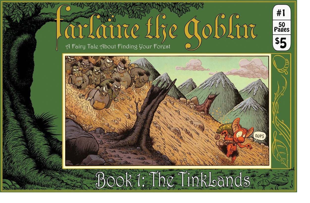
FARLAINE THE GOBLIN BOOK 1: THE TINKLANDS
Writer: JArtist: J
Publisher: Studio Farlaine
Reviewer: Corey Michael Dalton
If FAIRLANE THE GOBLIN was a recipe, it would go something like this: Mix 1 part Peyo's THE SMURFS with 2 parts Jeff Smith's BONE, toss in a liberal amount of A BOY AND HIS BLOB and a pinch of Disney's ADVENTURES OF THE GUMMI BEARS, then bake for 45 minutes in an Oz-manufactured oven. Because I love all of those ingredients, the debut issue of this new all-ages fantasy comic (written and drawn by the anonymous "J") should have been like Coreynip to me. Unfortunately, by the end of the issue, I hadn't yet fallen in love with the comic—but I still want to.
One thing I did love about this issue was the all-around package. First off, it's a great value—$5 for 50 black-and-white pages of story. Take that, Marvel and DC! The full-color cover (colored by the great Jean-Francois Beaulieu, the colorist on Marvel's OZ books) is simply beautiful. In fact, as much as I like the black and white interior art, that cover makes me want to see the rest of the art in color as well. The unconventional landscape format is great, too, allowing J to show panoramic vistas that really bring the various fairylands to life. The floppiness of the cover stock paired with the width of the pages does make it difficult to hold the book upright, however; I had to put it flat on a table for the best reading experience. Perhaps if the cover had been a bit thicker, that wouldn't have been an issue. While I'm nitpicking, I might as well mention the interior paper, too, which was very glossy. Personally, I think the ink art would have looked better and more organic on a rougher paper, something approaching newsprint, even. Overall, though, I was impressed by how professional the issue looked. Let's face it: we've all seen self-published comics that looked like self-published comics. This is not one of those. I noticed no typos or errors in the text and the overall product showed an attention to detail and care that is admirable. This anonymous writer/artist obviously cares a great deal about his labor of love.
As for the content of the issue itself, I'd say the art was its main strength. The lead character is cute and well-designed (although I could have done without the spiky skirt thing), and seems appropriately animated when running from monsters and falling down cliffs. The other creatures are interesting, too, especially the robotic Tinks. The level of detail on trees and rocks and creatures is impressive; there has clearly been a lot of time and effort put into each page and no skimping on backgrounds. Although lovely in general, the art did become a little awkward at times. J is clearly an artist still developing his style and feeling out the characters of this world. It's kind of like the early days in a sitcom when the characters show potential, but just aren't 100% there yet. The artwork is not yet effortless-seeming, but it's on its way.
So the art's good, but what about the story? There isn't really much of one. This is definitely a comic that gets by on its charming atmosphere, gentle sense of humor, and expressive art rather than the strength of its narrative. Writing-wise, J makes two choices right out of the gate that make maintaining a compelling narrative difficult: 1. the episodic nature of the story makes for a lack of urgency and drive, and 2. the absence of supporting characters gives Fairlane no one to talk to, keeping us from getting to know him as a character and making plot exposition awkward. The basic set-up of the comic is inherently episodic: Fairlane, a goblin shaman, is wandering a fantasy world with a little tree named Ehrenwort (or "Ehr") strapped to his back in search of a new forest to call home. A quest for a home is not a bad motivation (it worked for ELFQUEST), but we're never really given a reason to feel invested in Farlaine's search. We don't even know why he's on this journey. Was his previous forest destroyed? Was he exiled? Is this a normal right of passage for goblins (like when Australians wander aimlessly around Europe growing dreadlocks)? Or maybe he's an oddball and is pulling a Bilbo Baggins by bucking the system and traveling? Or perhaps Ehrenwort is dying and needs a different kind of soil? We just don't know, which makes the plot hard to invest in. To make matters worse, we're told that Fairlane's already wandered through almost 300 lands looking for a new home with only 10 left. I'm all for starting a story in media res if it adds a sense of excitement and energy, but this doesn't do that. In fact, it takes away any sense of urgency because we know Farlaine's already been on walkabout for years and still seems pretty chill. There's no ticking clock here. The lack of secondary characters is nearly as big of a problem as the lack of tension. In fiction, a character's personality is often revealed through his or her interactions with other characters. A secondary character can also allow plot exposition in a non-obvious way through funny or tense or witty dialogue. Unfortunately, the only person Farlaine has to talk to in this comic is an inanimate tree strapped to his back, which means we get lots and lots of soliloquies from him to explain the plot, explain what he's thinking, explain what he's planning, etc. It felt a lot like watching all the scenes from the STAR WARS movies where Luke Skywalker talks to R2-D2 joined together in a loop.
But there were strong points to the writing, too! As I mentioned earlier, there is a gentle sense of humor that comes through in every line of the comic. When Farlaine says that Ehrenwort had "jealousy issues" in the Banyanlands, for example, or when he happily declares, "Let's go find out where we've lost ourselves this time," you can't help but smile. There were also some clever sound effects that added levity such as "pleasant breeze," "dull leafy sound," and "lotsa bubbles." Some of the action scenes where Fairlaine runs into less-than-helpful creatures were exciting, too. In many ways, the comic reminded me of the fun I had playing early Nintendo video games: Ehrenwort functioned as a "special power," allowing Farlaine to escape scary predicaments with convenient abilities (like FLUDD did for Mario in SUPER MARIO SUNSHINE); the antagonists were throwaway baddies meant to be defeated en masse; and there was even a little shop with icons of swords, shields, and potions where Farlaine bought supplies for his journey that was straight out THE LEGEND OF ZELDA.
Overall, this issue felt like a first draft of a comic that's going to be really good with some more tinkering. All the ingredients are there; they just need adjusted and maybe prepared in a slightly different way. A little longer in the oven, perhaps? Or maybe some icing on top? There is an innocence and charm to both that the art and the storytelling that makes me root for it to succeed. The work of this anonymous creator shows a lot of promise, and I'm going to stick around for the next couple of issues to see if that promise is fulfilled. My fingers are crossed!
Corey Michael Dalton has written and/or edited trade books, magazine articles, short stories, novels, comics, plays, reviews, websites, blogs, and more. You name it, he's probably written it. Except religious scriptures. He hasn't gotten around to those just yet.
TODD THE UGLIEST KID ON EARTH VOL.1
Writer: Ken KristensenArt: M.K. Perker
Publisher: Image Comics
Reviewer: Optimous Douche
Satirical horror isn’t a new genre, but I’ll say that Perker & Kristensen have positioned themselves as the new masters of uncomfortable and downright dark guffaws.
Regular readers know that my soul is a dark abyss of re-re jokes and laughs at the expense of others. The one thing I often forget, though, is to let my moral base shine through. In those reviews where I hide my humanity, the fervor I stir is warranted. TODD THE UGLIEST KID ON EARTH would suffer the same fate of public ire as the supporting cast confuses Asian nationalities, regresses to Bush era Republicanism and revels in the flaws of others if not for one simple thing: Todd, the ugliest kid on earth. Because while Todd’s outer visage is a reminder why most animals eat their less than genetically favorable young, it’s also a cautionary tale of the human spirit triumphing over a stacked deck of inborn adversity.
Todd’s message would be a bludgeoned cliché if not for the honesty and originality with which this team clubs the baby seal of life. In a world of ridiculous and horrific people, Todd’s ugly on the outside, beautiful on the inside being keeps this book terrific instead of a trope. I stayed away from this paper bag-headed unknown comedian harken back because I simply didn’t know what to make of the title from the cover. I thought it would be another slice o’ life book that seems to permeate the pet project circuit. I was wrong – so fucking wrong. TODD is a slice o’ life, but it’s utterly fantastical enough to live in the world of comics.
VOLUME 1 follows the first arc of Todd and the freakshows that drive his eternal optimism and can-do attitude. Todd is appropriately never in on the joke, much like Mr. Magoo. While Magoo suffered from literal blindness, Todd is blinded to how terrible a place the world is. This ability to mire in filth yet allow Todd to take another meaning from his parents, the school bully and the psycho beheading children in town shows an adept use of the English language on the part of Kristensen. Not puns, per se; more a rude subtlety to all jabs.
The plot of this first volume is simple, yet woven together intricately. The connective thread is a Ken doll banging Barbie doggie style after the town bully glues their hermaphroditic bits together. Once Todd is framed for this deed, it’s easy to pin the murder of a little girl whose nationality is never quite articulated correctly. She’s Korean, but in the world of Todd she’s also every other form of Asian country when being talked to by the town folks. From this one event, we get a series of mishaps that ultimately lead to Todd being put on death row. The logic is actually there on how A+B=C and it always comes back to those sticky-crotched dolls.
While Todd is our moral beacon and narrator, it’s really the ancillary characters that make this world shine...or tarnish, depending on the depths of your depravity. The reason is that Kristensen and Perker pulled no punches in pummeling typical American stereotypes. It also helps they flushed out rich back stories for everyone. Todd’s Dad is an armchair activist, believing and following the latest TV fads of the moment. From Bush Republicans on FOX News to a rabid interest in celebrity, Todd’s dad is that person we all hate at parties who tries to talk philosophically after watching 10 minutes of a subject on TV. Todd’s mom is a woman who placed all of her value on her looks. As she approaches the wall of thirty she’s realizing gravity is a bitch and men lose interest once the saddlebags start showing. Even the aforementioned serial killer in town was once the executive producer of KIDS Incorporated before he started his nefarious ways (sadly for all of us, he couldn’t have started when he was the actual producer – that way we could have missed both Martika and Fergie’s solo careers). It’s little cultural infusions like this that make Todd even funnier if you’re in on the joke.
The art is cartoony, but that only helps to make the wrong wronger in my opinion. When you see a roll call of the various sub-Aryan nations inside prison, it just becomes funnier when they look like they stepped out of a Saturday morning TV slot. I’ll admit it was also funny they put a child on death row simply because he’s so damn ugly.
There was not one page of TODD THE UGLIEST KID ON EARTH where I broke my smile. I laughed and laughed hard at almost every other page. I don’t mean those conciliatory titters we give writers when they try to make a joke, I mean outright belly-aching guffaws. However, I’m a sick fuck. I find humor in the awfulness of mankind. If you’re squeamish or overly sensitive about…well, anything…go read MY LITTLE PONY: FRIENDSHIP IS MAGIC, because TODD doesn’t need fantasy to make one believe that the world isn’t bad – he shows us it can be good no matter how bad the world actually is.
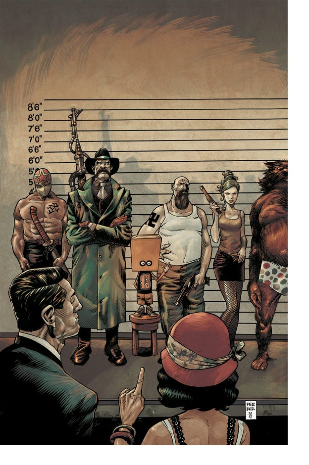
DETECTIVE COMICS ANNUAL #2
Writer: John Layman & Joshua WilliamsonArt: Scot Eaton (pencils), Jamie Mendoza (inks)
Publisher: DC Comics
Reviewer: The Kid Marvel
DETECTIVE COMICS has been a series I’ve been following off and on for the last year, depending on my interest in the storyline. I have recently picked it back up again towards the tail end of the lackluster ending and nerfing (nerfing: to take something really bad a$$ and awesome, then turn it into the equivalent of a squishy nerf toy) of the Emperor Penguin arc. So I’ve been paying attention to the Wrath story--not closely, but enough to understand the premise of the recent storyline. However, with the way this ANNUAL edition of DETECTIVE COMICS was written, Layman and Williamson keep the book to only referring to the current DETECTIVE COMIC storyline but, still keeping the usual ANNUAL style of larger or integrated stories, making the book an enjoyable read whether you’re following the current story or just picking up the ANNUAL for funsies.
The DETECTIVE COMICS ANNUAL issue two follows three different stories, tying into one much larger one, while following along the book’s current Wrath arc without taking away from it. The book focuses mainly on Jane Doe and Harvey Bullock. I’m working on not summarizing the books I review to leave some surprises for those interested, so I’ll tread as lightly as possible. This ANNUAL follows Harvey Bullock’s relationship with an upcoming psychologist, Abigail Wilburn, and how their relationship is directly connected to a string of police murders, relating to the current Wrath arc. These murders are being committed by the villain Jane Doe, who has an almost superhuman ability of mimicking another individual, almost like a chameleon. Jokes aside, the murders being committed by Jane Doe ends up directly affecting Bullock’s and Wilburn’s relationship, and being pivotal for the overall story of the book.
I’d say that DETECTIVE COMICS ANNUAL #2 was a pretty solid and an enjoyable issue. I like how the story was simple and enjoyable, while the art flowed neatly together with the writing. This wasn’t a ground-breaking work of comic genius. The issue was just overall enjoyable and entertaining, which is obviously the goal of these books. The villain Jane Doe was a new character to me, so it was a bonus to have a pretty interesting character added into the story, especially, because most of Batman’s enjoyable characters are extremely mentally unstable. Also, having an unstable person mimicking people to the degree Jane Doe is able to was pretty rad and definitely helped the entertainment factor. With Jane Doe’s specific type of crazy, the psychological end of character interaction definitely increased the quality of the book. The way Jane Doe affected Harvey Bullock and Abigail Wilburn physiologically definitely added to the book and the story. But aren’t mentally unstable crazy people usually what makes Batman stories so good? At least for me they are.
The book’s art was pretty spot on, too; from the drawing to the coloring, both Mendoza and Eaton did an excellent job on the book. Batman was drawn how Batman should be, athletic but not bodybuilder bulky. Dark, menacing, and holding a presence against his criminal foes, not the Zap Zowie Adam West Batman of the 60’s (sorry, guys--I know I’m way too young to appreciate the series). The artwork of the book fit perfectly with the story, adding to the overall reading experience and creating the immersion a comic fan wants between the writing and artwork.
I’m not sure if there is much else for me to say about the book, other than it was definitely worth the read. DETECTIVE COMICS ANNUAL definitely lived up to the title of detective. Also you should read it because it’s Batman (The “because it’s Batman” answer applies to all things).
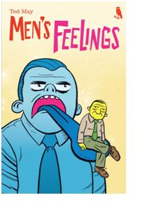
MEN’S FEELINGS VOL.1
Writer/Artist: Ted MayPublisher: Revival House Press
Reviewer: MajinFu
MEN’S FEELINGS kicks things off with some good ol’ fashioned toilet humor, and right off the bat I knew this would be the definitive comic of 2013. It’s not even the last time you get a poop joke in this issue, yet there’s a kind of profundity when it comes to any discussion concerning successful bowel movements, especially if it’s transcending generations. Shitting is one of mankind’s most intimate, infinitely sharable secrets and how we choose to address our stool can say a lot about our character, just as our stool can say so much about what we’ve had to eat that day. This book isn’t afraid to portray doodoo from a variety of perspectives. There’s the connective poop, the kind we discuss with a stranger as a way of reaching out. Then there’s the grounding poop, savagely reminding us of our fragile mortality. Finally, there’s the divine poop which allows us to ascend to a state of bliss. MEN’S FEELINGS creator Ted Mays fearlessly relays these poops with gusto.
It’s not all about shit, though. There’s something about two schmucks conversing over the torment weddings belie, a lucky poker game, and an especially absurd story about this schlub who gets heimliched by a magician and has to learn to let it go. Most of it is humorous in a “funny ‘cause it’s true” kind of light, except for that last one which is just so ridiculous I couldn’t help but smile at the end and pine for a jalapeno popper. Perhaps the best story, called “Reception”, depicts a guy completely engrossed in his television after turning on a football game in media res. The framing, the composition, and the totally accurate commentary combine to create a perfectly humorous gag piece, and I’m not talking about no S&M props neither.
The toilet stuff is the doody glue that bonds the package together, but the other stories are no less apt in their portrayals of contemporary masculinity. Last July I praised SUPERMAG for its pumped-up portraits of the modern man when it was mostly a callback to the hyper-masculine figures of yesteryear (still fun, though). This book, while also fun, is perhaps a far more realistic peek into the notion of men today. One particular strip, entitled “Earthlings”, simply depicts a number of passersby as they silently observe one such example before drifting off again. It’s perfect: it’s the reader, and anybody else, just watching the simple sad contentedness of suburban life, then fading away into the darkness.
MEN’s FEELINGS is grand without becoming verbose, inhabiting that awkward fart-scented space in the elevator between life and death. Illustrated in stark black and white, creator Ted Mays doesn’t waste a single line or resort to any excess. Nothing feels wasted, and each subtle mark or carefully posited gesture is a testament to why this book works. It works. Read it. You’re welcome.
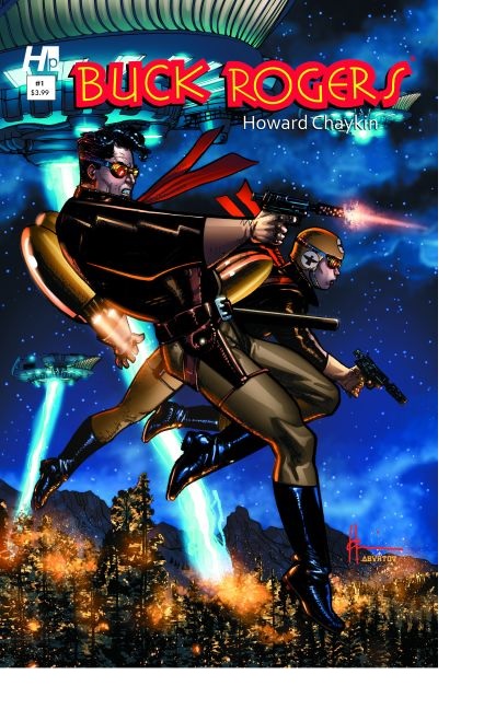
BUCK ROGERS #1
Writer & Artist: Howard ChaykinPublisher: Hermes Press
Reviewer: BottleImp
One of science fiction’s earliest iconic characters, Buck Rogers is experiencing something of a revival these days. First there was Dynamite’s revamp of the character a few years ago, and now writer/artist Howard Chaykin is bringing his own vision of the time-flung adventurer back to comic books. But while the Dynamite series modernized the conventions of the original strip, exchanging Buck’s jodhpurs and leather headgear for glowing Tron-lines—
(Just an aside: I am so, so glad that the glowing Tron-lines fad for comic book costuming seems to have dwindled down to a scattering. There was a brief time when nearly every superhero book was brimming with these Photoshop effect substitutions for competent costume designs. Thankfully, that fashion has gone the way of feathered hair and shoulderpads.)
—Chaykin has fully embraced the classic pulp-era origins of the character. Unfortunately, this makes his version of Buck Rogers a slightly ungainly amalgamation of modern storytelling and vintage conventions that doesn’t quite gel in this premiere issue.
Part of the problem is that Chaykin pushes the classic feel of the characters so much that he winds up losing the whole futuristic motif. His Rogers and Wilma Deering are clad in earthy leather jackets and boots, wearing tan pants, scarves and aviator goggles. His futuristic airships are bloated battleships with wings grafted onto them, resembling dirigibles more than our current collective notions of sleek aircraft. The overall visual aspect of the comic feels more like a retro-series set in an alternate WWI-era Earth than it does an Earth of the 25th Century.
Perhaps this wouldn’t be such an issue if this comic had been drawn by a different artist. Not to belittle Chaykin’s art—I actually like his chunky style, usually—but for the first issue of this series his artwork doesn’t convey the scope of this new world Buck Rogers is fighting in. We know that it’s science fiction, because people are flying around in jet packs and such, but we could really use something more dramatic on the visual end to really punch the SF element more. Retro style is fine, but it really needs to read as retro-future rather than retro-past.
I have to give Chaykin credit for trying to build on Buck Rogers’ character of two-dimensional heroic goodness, though. His Rogers was a union man back before sleeping through to the 25th Century, fighting against the machinery of corporate greed and class inequality. Seeing as how the themes of class warfare have come to the fore again in recent years, I’m intrigued as to how Chaykin is going to fold these ideas into the rocket-firing, laser-blasting world of vintage science fiction.
I’m willing to give this series a few more issues to see if Chaykin’s ideas and artwork coalesce into a meaningful whole. Hopefully the futurism of the vintage comic strip will supercede the vintage-ness of the comic strip—after all, no matter what Chaykin wants to say with the character, it IS “Buck Rogers in the 25th Century,” NOT the early 20th.
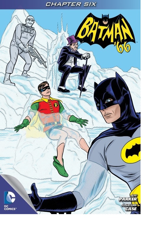
BATMAN '66 #6
Writer: Jeff ParkerArt: Jonathan Case
Publisher: DC Comics
Reviewer: The Writing Rambler
So here's the thing with BATMAN '66. If you grew up enjoying the so awful it was awesome “Batman” TV series, you can't help but love this book. I myself didn't have the experience of watching it when it was first on air, but thankfully my childhood was filled with the glory of TV syndication and I was able to experience the "POWs" and "BAMs" of Adam West's adventures as the Caped Crusader every day after school. That being said, I was pretty sure I was going to love BATMAN '66 when it first launched a little over a month ago. I was thrilled at how the book (exclusively a digital release from DC right now) felt like new episodes of the classic series. Everything I remembered, including the innocent charm of the show, was there.
The first 3 issues were a fun introduction to the series, following Batman and Robin chasing down the Riddler, all while interacting with regulars like Commissioner Gordon, Chief O'Hara and Catwoman, to name a few. Besides the classic nature of the books, what made them really shine was how these issues were clearly maximizing the digital format that they were designed for. Each issue had an added depth to the story, like watching panels unfold and even adding some comedic timing to the delivery of certain lines. BATMAN '66 quickly became the type of book that makes me love digital exclusives. It pushes the boundaries of traditional storytelling in comics and gives people a completely new experience.
Unfortunately, with the 4th and 5th issues the title actually lost its digital coolness. Gone were the optimized panels that added to the story, instead replaced with a typical digital version of a print comic. I enjoyed the story as I would any episode of the classic show (this particular one revolving around a team up between Penguin and Mr. Freeze) but the missing effects that I had been spoiled with in the first 3 issues left me with a bad feeling that within only a few issues, something fresh and new had been replaced with something easier and (I assume) cheaper.
This past week as I downloaded BATMAN '66 #6 I hoped that maybe the last two issues' lack of digitally optimized panels had been a fluke--that somehow the story would return to what I loved in the first 3 issues--but to my disappointment it was more of the same. On top of this disappointment, it further bothered me to now find the cover page of the issue still showing the same artwork from issues 4 & 5 featuring Penguin and Mr. Freeze again, despite issue 6 being a new standalone story about Chandell, the reformed criminal pianist once portrayed by Liberace on the TV show. These are small nitpicks, granted, but to see this continuous step backwards in such a short time doesn't have me very hopeful for the future of the series being a true expression of what digital comics can be.
Negative thoughts aside, the story and the artwork are the core of this book, and Jeff Parker & Jonathan Case (who handled the art for all but issues 4 & 5) have a true gift bringing the heart and soul of the old TV series to life within each page. This current issue is another fun throwback to the days of a fun-loving Batman, free of the darkness and brooding storylines we embrace today. I also liked that he chose to tackle a lesser known villain like Chandell as it opens up the idea that this series will be more than just a "greatest hits" of villains like Joker, Riddler, Penguin etc.
BATMAN '66 may not be the showcase of why more comics need to be optimized for the digital format that I had hoped it would be, but regardless of that it is one of the most fun comics I am reading today and I highly recommend it to anyone who has access.
Larry Gallagher is a freelance writer from Jersey City, NJ. He can often be found across the wide expanse of the interwebs writing under his alter ego “The Writing Rambler”. He is a simple man who believes we’d all be better off if we just read more comics and shared a burrito once in a while. You can follow The Writing Rambler on his blog here and follow on Twitter @Writing_Rambler !
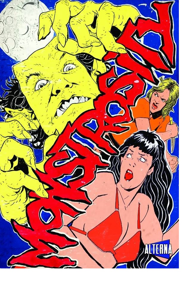
MONSTROSITY VOL.1
Editors: Phil McClorey and Brian EvinouWriters: Various
Artist: Various
Publisher: Alterna Comics
Reviewer: The Kid Marvel
MONSTROSITY was something sent in to the Ain’t It Cool headquarters, otherwise known as Head Geek Harry’s email, for a review of this monster-themed book. I only read nine stories from MONSTROSITY, but from the ones I did, I was actually surprised at how much I enjoyed them. I’m personally not much of a horror fan or someone big on Halloween themes (other than the lovely costumes females dress in), but I found the nine short stories to be very entertaining. Each comic story ranged in size, author, and artist, so I’ll be giving a quick review of each of the nine stories I read.
The first story of MONSTROSITY is by Fabian Rangel Jr., with art by Austin Rodgers and letters by Editor Phil McClorey entitled “Jack Manzo in Junk Food”. It’s a short couple page story about a badass werewolf hunter who orders the biggest, baddest burger with a bite that Frankenburger has to offer. It turns out, however, that the burger’s bite is that it becomes a giant sandwich monster. The main character Jack Manzo then battles the giant sandwich with fisticuffs and comedic one liners. Overall, this was one of my favorites of the nine stories I read. Austin Rodgers’ artwork definitely worked with the story, which had a very season one “Venture Brothers” feel to it.
Story number two, done by editor Phil McClorey with artwork by Jim McMunn, was entitled “The Brain”. It focuses around a character named Aries, who’s trying to right wrongs he committed under the influence of the main villain, The Brain. The story is a short one, following Aries’ quick journey to facing off against The Brain and finding his redemption. This was an entertaining read and I liked Jim McMunn’s artwork--I felt the it had the right style and amount of detail to fit the style of story.
The third story of MONSTROSITY was done by J. Bone, entitled “Summer Summoning”. “Summer Summoning” follows two nerdy-looking characters trying to summon a succubus by following procedures outlined in the Labyrinths and Legends Demon Handbook. Once summoned, things do not go as well as the two boys had originally planned, filling the bulk of the short story. I thought overall the story was just average; however, the artwork did fit the simple style of the “Summer Summoning”.
The fourth story, called “Witch Grifter General”, done by Sloan, was another one of my favorites of the nine stories I read from MONSTROSITY. The story revolves around two witch hunters collecting rewards for capturing and executing witches. “Witch Grifter General” had an excellent storyline for the short story and had some pretty good comedic elements, with an amazing surprise ending. Art wise, I thought it went great with the story and resembled the old Rocky and Bullwinkle style artwork.
The fifth story was done by James Turner, with artwork by Noel Tuazon, and entitled “The Boggart”. This story was my least favorite. It focused around a computer programmer who’s a shape shifting Boggart, eating all of the interns. I thought “The Boggart” had average artwork and was a lackluster story. I really just couldn’t find anything I liked about it.
Story number six, called “The Grizzly Rider”, done by Jason Loo, follows a genetically modified former circus bear turned superhero. The Grizzly Rider has the eyes of a night owl, heart of a raging bull, and gorilla arms to make it easier to reach the handles of his Harley. This story was very entertaining and one of the top stories I read. I was also very much a fan of the artwork’s fine details, shading, and overall quality.
The seventh story from MONSTROSITY was written by Shawn Aldridge with art by Rob Croonenborghs, called “Kingu Tora”. “Kingu Tora” was definitely a nod to the old Godzilla movies and old Japanese giant monster movies in general. In the story, humans have created a giant robot that was supposed to protect them, but ends up destroying their city. They must summon Kingu Raion, a giant monster, and put their faith in him to defeat their own creation. I felt the artwork had a manga style to it, which obviously works with this story, but may not have worked as well in any other kind. If you’re a fan of giant monster movies then you’d definitely like this short story.
Story number eight entitled “Astro Jaq in: No Way, No How” was done by Editors Phil McClorey (Story) and Brian Evinou (Art and Letters). “Astro Jaq in: No Way, No How” is about a female space hero saving a space ambassador named Wuhl, who is kidnapped by the Chungarri. This comic was filled with multiple sci fi references, including “Star Wars”, “Star Trek”, and maybe a few others I am unaware of. I loved the artwork of “Astro Jaq in: No Way, No How” because it reminded me of Spaceman Spiff from “Calvin and Hobbes”.
The final story I read, and the ninth from MONSTROSITY, was a story called “Stones on the Shore” by Ricky Lima, with art and letters by Rodrigo Bravo. It was a tragic love story about a male living giant who has found the only other living giant he knows. The giant Grendel will be asking this female giant to spend the rest of his life with him. This giant is accompanied by his human friend Mary, who happens to live on his head. I thought the story was ok. I felt kind of confused by the ending, not being sure if there was background information I should be aware of, or just a random tragic ending. I did like the artwork, which gave off a very free-flowing feel.
After reading the nine stories from MONSTROSITY, I was very much surprised at how much I liked them. As I mentioned earlier, this is usually not my thing. If I hadn’t received this through AICN, I would never have even considered reading them, but I’m glad I did. For anyone who is a fan of sci fi- or horror-related short stories, this is defiantly something you should check out. If the book is anything like the nine stories I read and since I only disliked a few of them, it’s probably worth the purchase for those that enjoy monster related stories. I’m sure the book is filled with a ton of more tropes, nods, and references throughout the 200 pages. For those interested, the book is a comic anthology featuring 20 original stories using ‘monsters’ as the overarching theme. MONSTROSITY will be located on page 241 of the August preview of Alterna Comics 14.99.
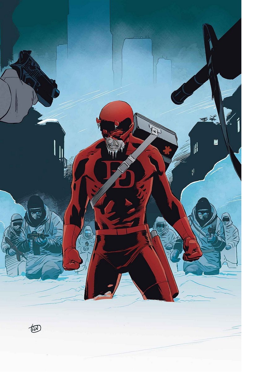
DAREDEVIL: DARK NIGHTS #3
Writer: Lee WeeksArt: Lee Weeks
Publisher: Marvel Comics
Reviewer: Mighty Mouth
I don’t know any other way to put this, so I’ll just say it: DAREDEVIL: DARK NIGHTS #3 concludes one of the finest stories I have had the pleasure of reading in a mainstream comic for quite some time.
It didn’t take a reimagining of the character or a fancy-shmancy fold out poster to make this story so compelling. At the end of the day, all it took was plain old fashioned good (no, make that great) storytelling, courtesy of Mr. Lee Weeks.
Sure, we all enjoy seeing or favorite superheroes throw down with the big bad of the month to avert a citywide or even cosmic scale disaster. Still, titanic tales sometime end up feeling ill conceived and end up lacking any real depth or heart. DAREDEVIL: DARK NIGHTS is all about heart, and I mean that in more ways than one.
In case this little gem slipped by you, let me bring you up to speed.
The story takes place during one of the worst blizzards New York has ever seen. A car accident leaves a young girl in critical condition, gravely in need of a heart transplant. An emergency transport crew attempts a desperate delivery, but is swallowed up in the terrible storm. The rest of the story is one of the most profound and entrancing examples of what heroism is all about, as Daredevil races again time, malefactors and the elements.
In addition to the mesmerizing writing, Lee Weeks also provided the masterfully crafted pencil work on this book. The weight of this story is felt panel after panel. The reader can almost feel the chill of the unrelenting cold and the strain of endurance as Daredevil struggles to retrieve the precious organ to save little Hannah.
The story also does a remarkable job of showcasing the complexity of the human condition. The inclusion of supporting characters, some noble and some devious, adds an additional dimension that plays out in the fashion of a true morality tale.
Comic books can be a fun diversion for sure, but make no mistake: it’s also a business. Like any business, the comic industry is looking to turn a profit. Often the big publishers will rely on gimmicks such as major events, character cross-overs and renumbering schemes to bolster sales, but the best stories come from a place where the emphasis is placed on a passion for character and story. These are the stories that sustain one’s love for the medium.
DAREDEVIL: DARK NIGHTS is the kind of tale that will remind older fans why they fell in love with comics while offering a new generation of readers the same opportunity.
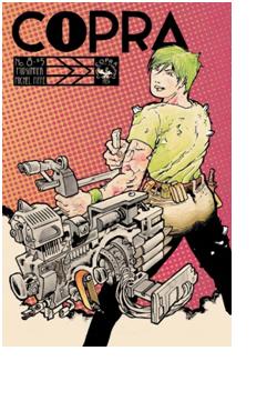
COPRA #8
Writer/Artist: Michel FiffePublisher: COPRA Press
Reviewer: MajinFu
If the last issue was the smoke break, this one must be the explosion that follows flicking the cigarette into a pool of gasoline. I literally cannot recall a pair of issues that contrasted so completely as to complement each other better than issues 7 and 8 of Michel Fiffe’s COPRA. While the former was entirely dedicated to the recuperation of the Suicide Squad-reminiscent COPRA team via carefully formatted character moments, the latter’s opening is pretty much one tremendous action sequence, once again exhibiting the incredible kinetics which Fiffe excels at portraying--not to mention it looks fucking amazing.
This issue, entitled “Outros Mundos”, opens with the team already in the shit, battling numerous goons on the surface and among skyscrapers of an alien world, narrated this time by Rax, the Kirby-esque beardo with some kind of cosmic power vest who is out hunting Dy Dy, Empress of Crime. Dy Dy is a brain in a jar topped with googly eyes and a cute little bow, with a rocket butt and a penchant for vaporizing just about any poor sucker to piss her off. She’s after some kind of secret weapon, the same unpronounceable macguffin the last arc was centered around and the same one from which Rax’s vest draws its power. Dy Dy escapes and while Rax is determined to find her, the rest of the team is simply trying to get back home. Teammates with differing objectives are not new to the genre, but the plot point is handled here with a bit of refreshing aggression. Make no mistake, some of these folks have a mean streak.
Michel Fiffe is obviously working really hard to make this book look spectacular, and he’s clearly kicking the shit out of just about every other team book on the stands in terms of raw energy. Then again, I don’t read any other team books because COPRA pretty much singlehandedly satisfying my every need for this kind of thing ever since SECRET SIX was foolishly cancelled years ago. There’s a moment where Guth loses her cool and the pages look like they’re about to rip themselves apart, lending a visceral touch to a potent character moment that while I figured was coming eventually, did not expect to go down in such an insane manner. Then, oh boy, there’s that double-page spread about halfway in…that is just jaw-dropping. This book is telling the kind of story comics were simply made for, telling it like only comics can. The variety of formatting from the aforementioned spread to the pages of nine-panel grids works to seamlessly carry the reader through to the cliffhanger ending, wrapping up an almost-perfect single issue reading experience. I am so ready for more.
If my reviews this week seem overwhelmingly positive it’s because I decided that reading books I was on the fence about just weren’t worth it. It’s getting harder and harder to enjoy anything that feels like it’s merely pandering while it has become so much easier to read comics that are simply made by people who are creating the kind of stuff they would probably like reading themselves. COPRA is an example of the latter. So thank you, Michel Fiffe, for keeping it real and making this for yourself. The comics industry is better off for it.
 Advance Review: In stores today!
ASTRO CITY #3
Writer: Kurt BusiekArtist: Brent Anderson
Publisher: DC Vertigo
Reviewer: Optimous Douche
I reserved reviewing ASTRO CITY at its new home, Vertigo, till now because the first issue threw me with its meta omnipotent narrator. I didn’t dislike the issue; it was simply a far cry from the ASTRO CITY I once knew. I understand why Busiek chose this route since it has been a long time since anyone has visited the birthplace of his homegrown heroes; it’s just not what an old timer like me was looking for.
For the uninitiated, ASTRO CITY is about people, not heroes, and how their lives are affected by a world with super beings. It’s the natural extension of Busiek’s groundbreaking work on MARVELS oh so many years ago, except the sandbox is his own with ASTRO CITY and it’s a playing field where Golden, Silver and Modern Age collide. ASTRO CITY is about the dreams of mortals and how the Gods among them either squash or enable those aspirations.
Issues two and three have quickly corrected course. Another tenet of ASTRO CITY is that it serves to reflect our own societal woes or wonders. For the past two issues, Busiek has pointed a laser sight at our failing economy, specifically the new job market where college grads are asking “Would you like foam or no foam on your megafrap deluxe?”
I’m being a bit hyperbolic with that last statement since our protagonist, a recent college grad named Marella, opens issue two applying for what she believes is a job in a call center. In my mind someone with a programming degree shouldn’t be hocking low interest credit card loans, though, either. Fortunately for Marella (and us readers), her job becomes far more interesting once she says yes.
The call center is a front…sort of. Once she enters the door of the building and then the trans-dimensional portal inside, she is whisked away to the sub-command center of Honor Guard. This is THE team in the Astro City universe--basically the Justice League before they were wrought with so many problems and inexperience that seem to plague their current incarnation.
Marella isn’t being hired to hock anything; she’s actually been hired to be the front line of calls for help and triage what should be brought to Honor Guard’s attention. It’s not her ideal job, but certainly a far cry better than the alternative. Even in our world you’ll find much higher job satisfaction from someone working a 9-1-1 line versus asking people if they want to buy cheap real estate in Florida.
Another reason I’ve always been enamored with ASTRO CITY is that time is elastic. Often Busiek plays with entire decades of history, like his last outing in DARK AGE. For this story, though, we’re only talking the course of a year.
But what a year it is. Again, ASTRO CITY is about people. So while the heroes are always omnipresent as Marella skills up, the true beauty of this story lies in a young woman finding herself and her place in the world. Here the story transcends to an all relatable tale as Marella gains confidence in her job skills, makes new friends with co-workers, deceives her family about what she does all day, and even develops a crush on the cute guy in the command console next to her.
Until it all comes crashing down.
Like any job Marella has metrics to meet, if you don’t triage correctly you waste precious escalation resources chasing ghosts. After being chastised a few times, her team becomes gun shy about escalating issues to the next level. This proves to be a fatal move as one improperly diagnosed call gives a villainous group names the Skullcrushers the ability to obliterate a South American town.
I think I’ve described enough to entreat those who, like me, insist their stories be as much character development as carnage. I will say, though, issue three is a story of redemption for Marella. She learns that mistakes don’t define a person; rather, it’s the lessons we learn from those mistakes.
I’m thrilled ASTRO CITY is back, and under the spearhead of a publisher known for a tight schedule. There have been lapses with past series that diminished a bit of the joy trying to recollect months prior. I’m also thrilled Anderson is in the pencil seat again. He’s been a staple of this series for a long time, and truly gets how to make the characters look exactly like Busiek intends from an emotional perspective.
This isn’t just another pastiche--Busiek’s world is rife with originality even though it borrows from tropes we all know and love. I really believe new fans will dig this series, and Kurt provides enough Easter egg fodder so that old time fans feel once again welcome in ASTRO CITY’s bombastic and beautiful boundaries.
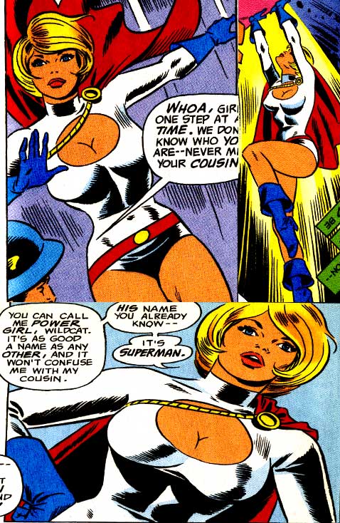 Today, class, I wanted to talk about a popular and sometimes controversial topic: superhero boobs. More specifically, Power Girl's boobs, the so-called queen of superhero mammary glands. Now, it's often been quoted that Wally Wood, Powergirl's co-creator (with writer Roy Thomas), was secretly increasing her bust size with each issue of ALL-STAR COMICS during its relaunch in the mid 70's (starting with issue #58, where Powergirl was introduced). But as much as our bosom-infatuated industry would love to believe, it simply isn't true. During Wood's eight issue run on ALL-STAR COMICS, Power Girl's bust was not much bigger than any other superheroine of the day, or at least under Wood's penmanship, that is. Back then Wally Wood was definitely known as one of the best 'female' artist of the day--the equivalent of Adam Hughes, if you will (though Wood was renowned for much more). So it's fairly easy to see why this rumor gained legs. Wally Wood was also known for drawing some softcore and adult comic books in his career, too. Plus he was known for butting heads with all his editors, so it's easy to see why so many people believe this tale. But if you want to know the truth about Power Girl's brassiere (have I used the euphemisms yet) it’sbest to just look at the comics themselves (hard work, but somebody has to do it).
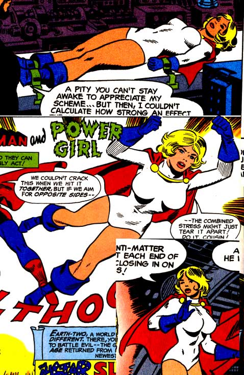 Fig 1 shows Wally Wood's first drawings of Power Girl in ALL-STAR COMICS #58 (her first issue). As you can see, she is already well developed.
Now Fig 2 shows Wood's drawings of her in his last issue, #65. Not a heck of a lot of change is there (so much for him drawing her bigger in each issue).
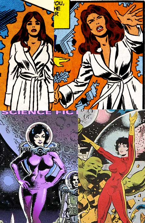
Fig 3 has some other females draw by Wood, including Hawkgirl out of costume in a robe (from the pages of ALL-STAR COMICS itself). Seems to me Wood just liked drawing curvy women (check out CANNON and SALLY FORTH for more proof, though neither are work safe).
So what happened to Power Girl after Wally Wood stopped drawing her? Well, artists like Kerry Gammill,
 Dick Giordano, Joe Staton, Dick Dillion and Chuck Patton all drew her with pretty much a typical superheroine physique, as you can see in Fig 4. Now, I'll totally go out on a limb here and say this is because none of them thought Power Girl was well endowed (as opposed to everyone accepting that Barry Allen is thinner than most heroes, or that Wolverine is short). That was just how Wood drew women, and not a statement on the character herself.
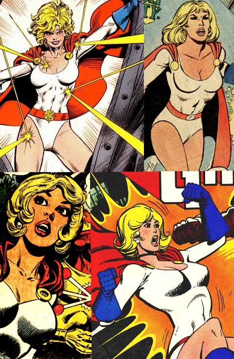 So who started the rumor? Well, I can't rightly say, but I do know who actually turned Power Girl into the bosom queen we all know and love- Bart Sears. Back in 1989 Power Girl was tapped to be part of JUSTICE LEAGUE EUROPE (as the JUSTICE LEAGUE INTERNATIONAL had become popular enough under Giffen, DeMatteis and Maguire to warrant a second series). In Fig 5. you can see from the first issue Bart was set on making Power Girl's chest one of her main superpowers. Even when he gave Power Girl a less revealing costume (the white and gold one in Fig 5.), he still wanted the world to know she needed custom underwear (on a side note, I gotta say I thought Sears drew the ugliest Power Girl l I'd ever seen- look at that jaw- yikes).
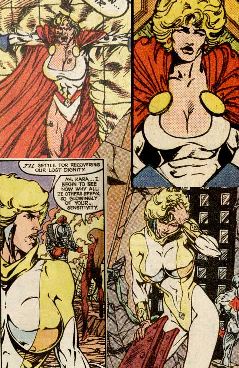 From then on from Adam Hughes, to Mike Turner, to Amanda Conner it seemed to be a contest on who could draw her chest the biggest and get away with it, as you can see in Fig 6. Seems that Mike Turner did push it too far, as DC reduced her chest size on his cover, in Fig 6. Amanda Conner's topless Power Girl in Fig 6. seems to reveal that Power Girl has had some surgery, too, because I'm willing to bet that Conner knows womens’ breasts don't look like that naturally. Of course, this is nothing compared to an unfiltered internet search.
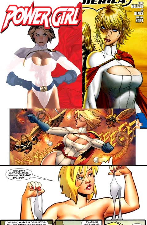 So the next time you hear someone claim Wally Wood drew Power Girl's boobs bigger and bigger each month you can cry bull$h!t on them (twice, because the comic was bi-monthly)! You've seen the pictures and Bart Sears is the man to thank for Power Girl's oversized _________ (I'll let you fill in the blank this time).
Learn more about the Masked Man and feel free check out his comic book CINDY LI: THREE OF A KIND and CAPAIN ROCKET at www.Toonocity.com
Proofs, co-edits & common sense provided by Sleazy G
 Find out what are BLACK MASK STUDIOS and OCCUPY COMICS here and on Facebook here!
 Want more in all things Geek?
Check out PoptardsGo and on Facebook here!
 Get your copy of highly-anticipated anthology TOME by 44FLOOD here!
Check out AICN COMICS on Facebook and Comixpedia.org!