
Nordling here.
I can't draw to save my life. My dad could, and he was quite good at it, but it skipped a generation or something because I can't do much better than stick figures. It's a shame, because I think I have some whacked out visions in my head that I'd love to see on paper.
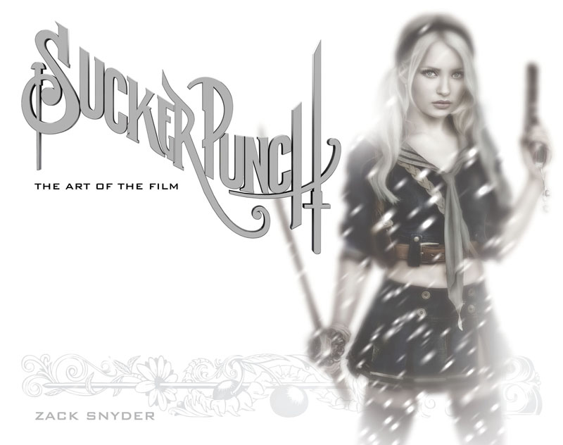
Alex Pardee has some amazing visions as well. Check out his blog for some of his artwork at http://eyesuckink.blogspot.com/. He's designed album covers for In Flames and The Used, as well as a really kickass alternate INGLOURIOUS BASTERDS poster design for the Weinstein Company. When Zack Snyder approached Pardee to help with the concept art for SUCKER PUNCH, after seeing some of his fan art, Pardee jumped at the chance, and many of the visions we see in the genre mash-up that is SUCKER PUNCH come straight from his pen. I was able to ask some questions to Alex regarding SUCKER PUNCH and the SUCKER PUNCH: THE ART OF THE FILM book, which can be purchased at Amazon here at this link. After the interview, I'll have some information on how to enter a contest for an exclusive Ain't It Cool News limited edition copy of the book! But without further ado, here's Alex:
With Zack Snyder's "kitchen sink" approach in SUCKER PUNCH, did you try to find a commonality or a balance between the various influences and genres being tossed together with your concept art?
Zack has an amazing way of working with his creative team, which is simply bestowing us with confidence, trust and even a sense of comfort. Like he’s this cool-headed excited life-coach that just happens to also be an amazing visual wizard in his spare time. He’s very positive and passionate, which just led us to feed off of that passion. He definitely had his own vision of all of these new worlds in Sucker Punch, but as a visual artist himself and a fan of every form of art, he thrives off of seeing other artists expand on his visions. So yes, there was an overwhelming amount of inspiration and direction to absorb in the beginning, but there was never pressure to find some common visual thread. We were encouraged to just do what we do without limits and he assured us that he would worry about weaving it all together in a cohesive manner, and he did.
What's the one rule Zack Snyder gave when coming up with different art concepts?
There was a general unspoken vibe of making a little visual stew from different eras and genres, like adding some current pop-culture and manga-influence into some old classic fantasy ideals, but if there WERE any real rules set in stone regarding specific direction, I completely missed that class, and I think all of us did. There definitely were influences, artists and references that were mentioned. I mean a lot of the worlds that were created for Sucker Punch are an amalgamation of what Zack and us artists involved all thought were cool as kids: GI Joe vs Cobra, Kurosawa, Dungeons & Dragons, Frazetta paintings, robots, steampunk, Jessica Rabbit, Isaac Asimov’s “Foundation” & “Nightfall” dealing with characters trying to escape an inevitable oncoming darkness, The Goonies needing to find enough jewels to escape their “evil suburban landlords”, Lone Wolf & Cub, Final Fantasy, and so many other cool experiences that we all shared as kids who loved imagination and imaginary worlds. But given all of those influences, as I said before, there was no set rule. It really was “take inspiration from these and do something original with it. Something cool. We’ll start from there.” And from that point on it was a true collaboration to fit what was in Zack’s head, but also push those boundaries past the norm and past what might have been expected.
What's your inspiration for the various art designs of SUCKER PUNCH - the robot, the dragon, the mechasamurai - and what one piece is your favorite?
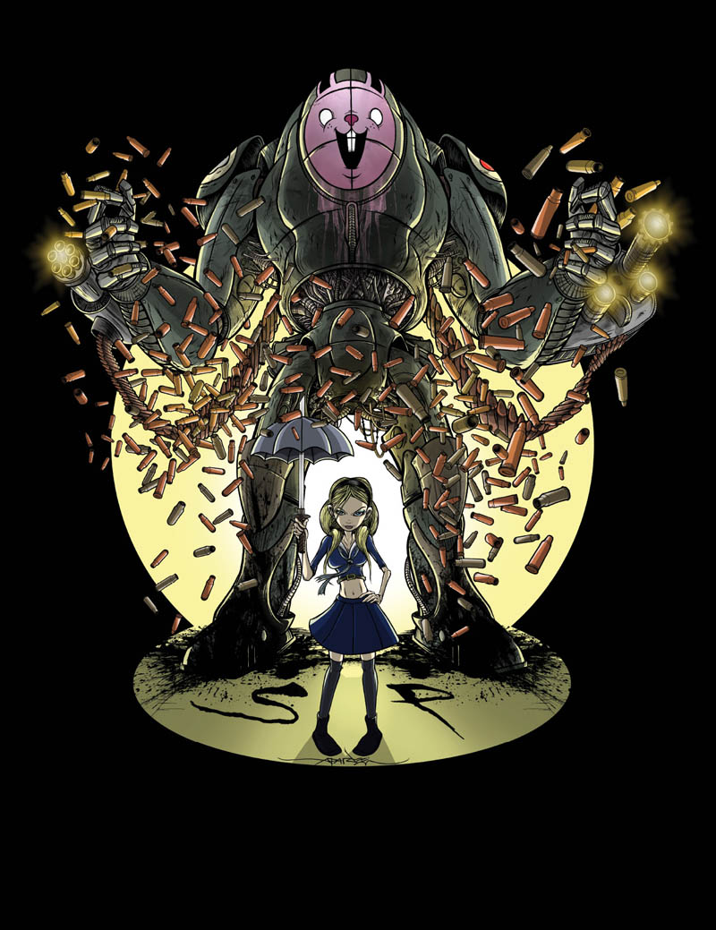
I have two favorites, which is a cop-out I know, but I am so close to the project I’ll explain my enthusiasm. At an immediate first glance you might think you have seen some of these Sucker Punch worlds before, but within a few seconds you will notice that they all have an original twist to them that is so fun. For example, one of my two favorite pieces, which I can hardly take any credit for at all is the huge 25 foot tall Bunny-Faced flying mech-suit that Amber (Jamie Chung’s character) pilots in the film. That’s just so insanely ridiculous and awesome. It was like “OK, what if there was some advanced steampunk technology implemented into World War 1, maybe we could make a mech-suit! OK, so what would that mech-suit look like if a 19-year old girl who loved stuffed animals designed it?!” It’s nuts, but it works so well because not many odd visual chances like that have been taken on such a high-scale production before. And though I didn’t create the actual design for that mech, I DID design the Bunny-face that is painted on its cockpit, and I think it’s ironically more intimidating than a snarling shark mouth and the traditional military fighter plane paint jobs. And to see something that I drew that HUGE on all of the ads and the screen? That feels incredible!
Now regarding my other favorite, I got to design BabyDoll’s main weapon, her katana, completely from the ground up. Zack wanted to respect the design aspects of a traditional katana, but it was up to me to figure out a way to still give it some “wow” original spin that had never been done before. So on top of learning all of this history about katanas and what a “tsuba” is (it’s the circular metal guard at the base of the blade) or a “menuki” (it’s the small sculpted charm that is wrapped in the handle of the blade to create a better grip), and getting to fully design all of those parts with Zack, I had to come up with a cool way to make the sword iconic. Well, when looking at a lot of traditional katanas I noticed that a lot of them had small personalized and artistically stylized kanji characters inscribed on the base of the blade, but none of the inscriptions went beyond a few inches. When I looked into why that was, it was because it was actually too hard to engrave the blades farther down without damaging the effectiveness of the blade. So that gave us a challenge. I wanted to engrave like ½ of the entire length of the blade. And then Zack said “That’s cool, but why not the WHOLE blade?!” So then were destined to do that. So, because the engravings were personalized, I took the entire story of BabyDoll’s journey throughout the film, and broke it down into symbols, which I then wove together in an old fashioned style and created this design that basically told the whole story of the film along the entire length of the blade. And I can honestly tell you that there are a handful of engravers and blacksmiths that probably HATE me. We ended up breaking tools, experimenting with metals, and redesigning the graphic for weeks because it was really difficult to do. And Zack is so awesome because at any time we could have just made a fake sword! But he was NOT going to do that. He wanted a real sword made, and so did I. And eventually we got it and it turned out beautiful.
How did you become involved with the project?
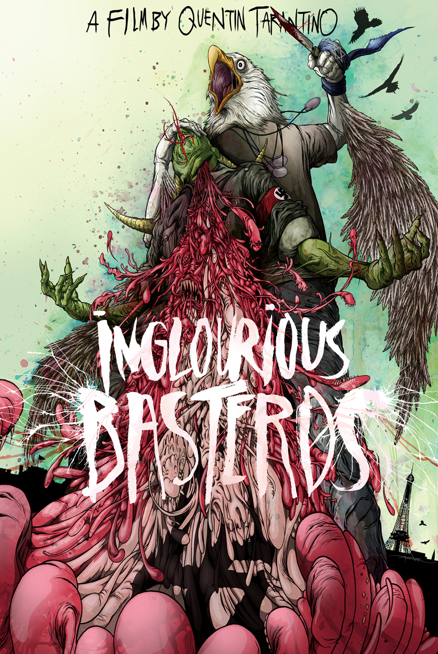
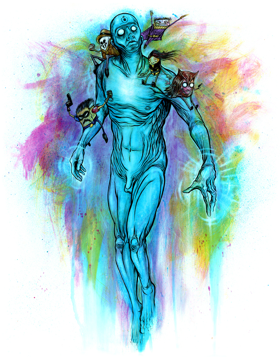
Whoever created me must have rolled like a 4d6 when giving me my “luck” stat I think! In addition to that though, it’s one of my favorite “origin” stories. In addition to commercial work, I have been creating personal fine art for years, along with now owning an art-based clothing and print company called Zerofriends where occasionally we do small licensed things and pop-culture inspired art and products. Well, WATCHMEN is one of my favorite stories of all time, and I was a huge fan of Zack’s previous films (say what you want about remakes, but the first 10 minutes of Zack’s “Dawn of the Dead” are TERRIFYING) so naturally I was looking forward to see his adaptation. I ended up creating this limited Watchmen print for my company, Zerofriends that sold out almost immediately. Not expecting anything more than that, I unexpectedly got notified from someone at Cruel & Unusual (Zack’s production company) that Zack had seen the image and wanted a print. Unfortunately, the print was long sold out, and so I was a little bummed to tell them that, but as I was on the phone with them I was looking at the original painting hanging up in my house that I had made that the print was based on, and I got an idea. “I have a better idea!” I said. And I ended up driving from San Francisco to LA the next day and hand delivered the painting to Zack for his birthday, which coincidentally was that week. That was how we had met, and quickly formed a friendship and mutual respect for each other’s crafts and kept in touch. Months later, I was involved in some extra marketing work for Inglourious Basterds where myself, and 10 other artists created these alternate movie posters in conjunction with the Weinstein Company for charity, and mine was so COMPLETELY over the top in the gore and visceral department that when Zack saw it, he said, “You HAVE to do something like this for my next movie!” So, instead of saying “No way, you didn’t put the squid in Watchmen! I hate you!” and then punching him, I politely obliged and we started talking about my future involvement with Sucker Punch.
If you can comment, are you involved in Zack Snyder's SUPERMAN, and if you are, can you talk about the general aesthetic you're going for with any concept art?
I WISH! No, as of right now I am not involved in anything Superman-related, and as much as I would love that, I think there are so many artists who have breathed some amazing life and blood into Superman over the past years, I wouldn’t really feel worthy of it.
What was the one piece of art, or film that made you say, "That's what I want to do for the rest of my life?"
Sam Kieth’s “The MAXX”. Easily. I loved superhero comics growing up, but I lived in a small suburban town so I was never was exposed to any indy comics at all. With the exception of some horror comics and war comics, I thought comics were only SUPPOSED to be about superheroes. So I was always trying to draw superheroes, but in secret I would draw all these fucked up deformed sad people and monsters. So when Image comics published all of those new titles back in the early 90’s, I saw The Maxx and picked up a few issues because it LOOKED like a superhero comic. There was a big muscular purple guy with a mask on the cover. But the book itself was in disguise. Because as soon as I started reading it, I was confused. The art was really cool and expressive but in comparison to “normal” comic art, it was a mess! There were splashes of ink, and big cartoony faces next to fully rendered oil-painted panels. And the story wasn’t about a superhero at all. It was focusing on things like depression, girls having their periods, homeless people struggling to stay sane, loneliness, things at the time I could relate to! And I thought to myself, “Wait a minute. You can actually draw bizarre weird things and express real emotions and write about what you feel and you can be SUCCESSFUL? Sign me up.” So from that moment on I allowed myself to never really stick to a standard and just draw and write and paint what I want to see, however good or bad it is or however many people like it or hate it. Since then it’s always been about the journey to success through the freedom that art allows me to have. And I don’t require much to stay alive and happy, so I’m going to keep going.
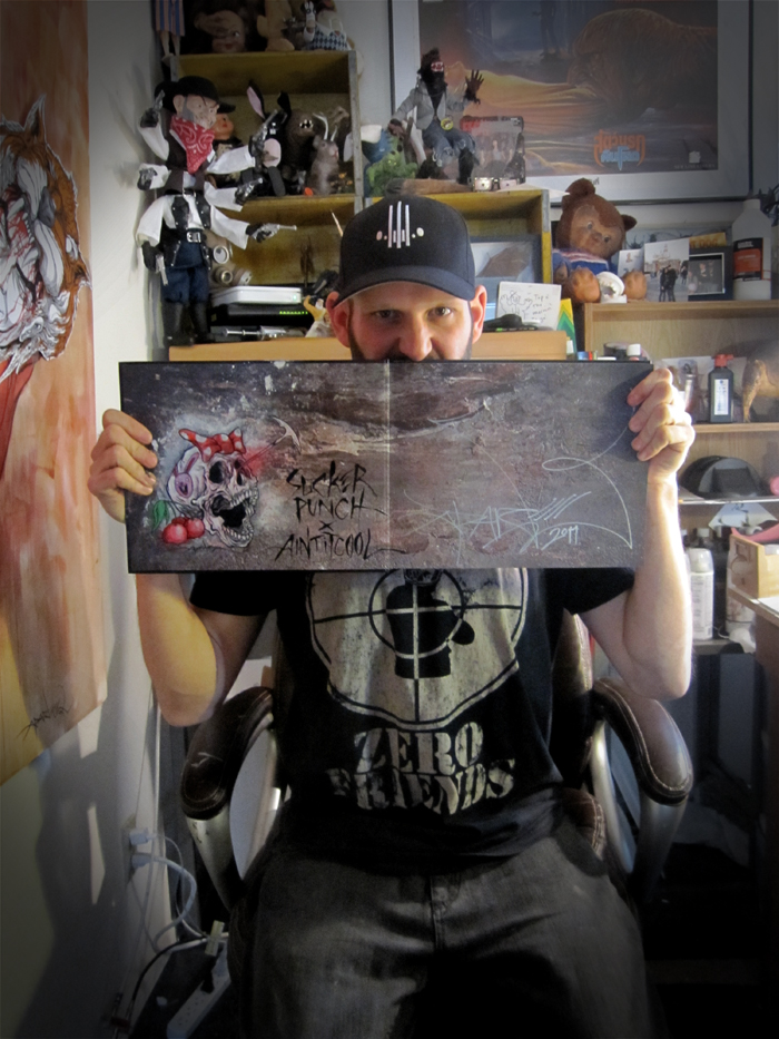
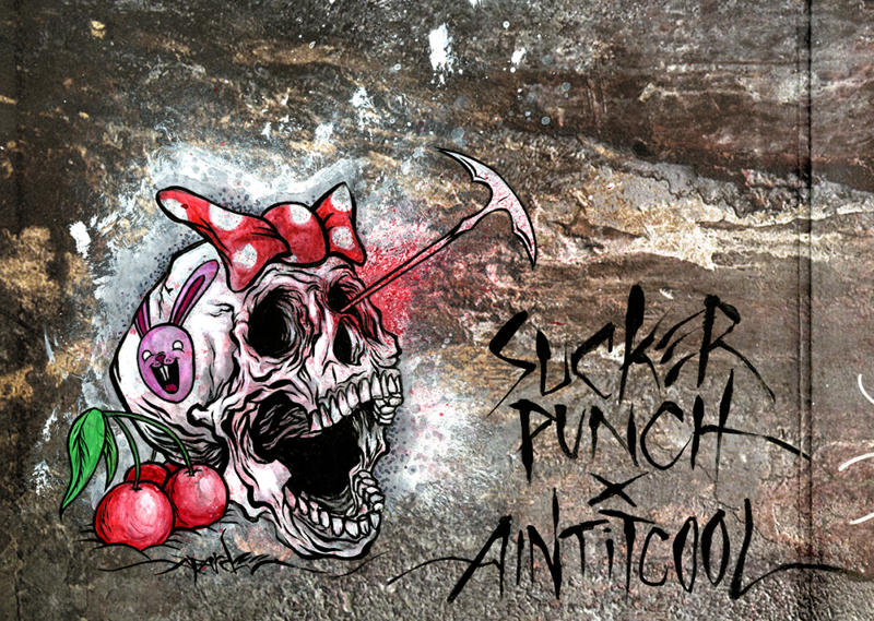
Thanks, Alex. And for all the fans of SUCKER PUNCH, of Alex Pardee, and for Ain't It Cool... a contest! We're giving away one exclusive copy of SUCKER PUNCH: THE ART OF THE FILM, with inner sleeve artwork by Alex Pardee himself! This is a one of a kind item, but here's a couple of pictures to whet the appetite:
What do you have to do to enter? It's simple. In the spirit of Zack Snyder's SUCKER PUNCH, I want to see your best genre mashup. You can have cowboys vs. zombies vs. Giger Aliens; you can have the Knights of the Round Table fighting Road Warrior-type apocalyptic vehicles; how ever many genres you can fit into one picture of your design. You have until Saturday, April 9th to send in your artwork to suckerpunchmashup@gmail.com. This must be your artwork, and not copied from some other source. It doesn't matter how well you draw - we're looking for something interesting, and you can design it any way you like - as a movie poster, as a simple drawing, anything. But send it in by midnight Saturday, April 9th. We'll post the winner here at AICN, including the more interesting pieces we get in. I won't be judging anything until after April 9th, so don't feel the need to rush in a picture until you feel comfortable with it. Good luck!
Nordling, out.