
AICN COMICS has a brand new sponsor: Things From Another World—also known as TFAW!

Please support AICN COMICS by clicking the Things From Another World banner and checking out all of their amazing collectibles! TFAW carries everything from comics to toys and any kind of collectible in between. You just might find something you can’t live without, like that breathtaking Margot Robbie Harley Quinn statue up there!
(Click title to go directly to the review)
Advance Review: VIKINGS #1
DEPT. H #1
POWER MAN & IRON FIST #3
FAITH #1-4
JAMES BOND #6
DARK SOULS #1
SUPERMAN: AMERICAN ALIEN #6
SPIDER-MAN/DEADPOOL #4
HUCK #6
 In stores today!
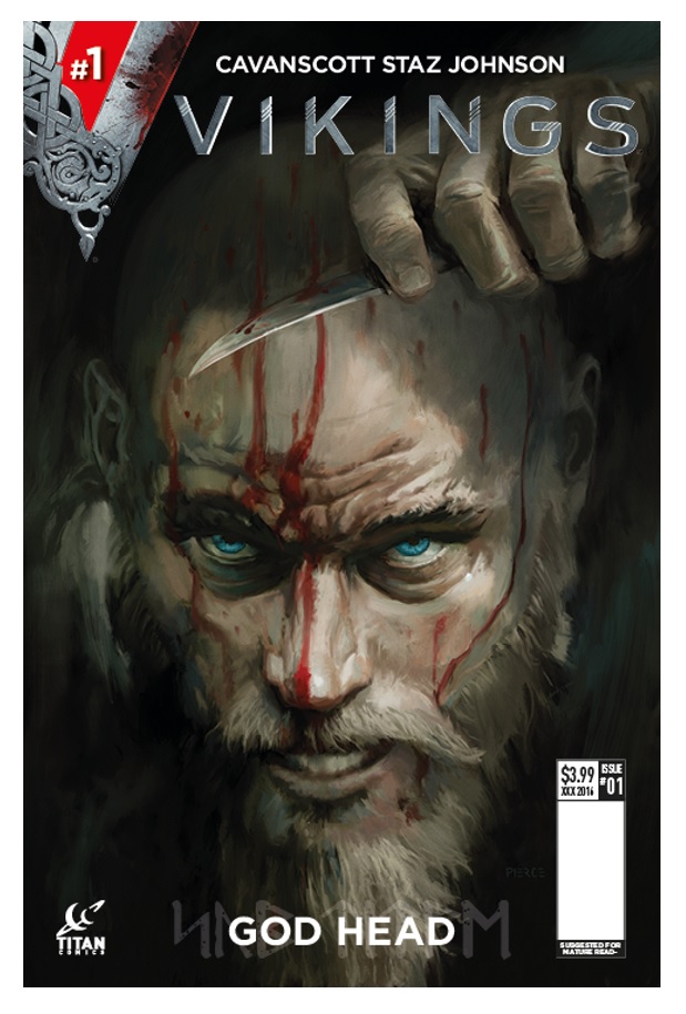
VIKINGS #1
Writer: Cavan ScottArtists: Staz Johnson with Richard Elson
Publisher: Titan Comics
Reviewer: Lyzard
Back in 2013, VIKINGS was a respite for me when it came to The History Channel’s programming. While I lament and wish for the days when actual experts presented reputable theories rather than alien conspiracies, scripted period pieces were preferable to the reality schlock that was clogging up the airwaves. It doesn’t surprise me that four seasons later the show that I most admire for its strong gender and ethnic casting remains at the top of The History Channel’s ratings. What does surprise me is just how poorly the show translates into a comic book series.
While the comic does feature an element or two that initially attracted me to the show in the first place, such as an emphasis on strong female characters, the comic glosses over the brutality of the Viking people. Where the show opened near the tail end of a fierce battle scene, the land strewn with bloody bodies and more brutal action to unfold, the comic begins with an almost tame chase sequence. There is no fire, no spirit as a horde of Vikings descending upon a coastal English village.
This sense of pacified action comes from the sanitation of the artwork. Everything is just too clean--not just in that there is hardly any blood and the little that there is isn’t visceral, but in how muted the colors and details appear. To make matters worse, you can clearly tell that two artists worked on this book. There are drastic changes in character design and linework between the different storylines.
Where are the thrills of guts and gores that are so heavily associated with the Northmen? I wanted pages full of action, bloody scenes of battle. Instead, we are introduced to the comic world of VIKINGS through politics and religion. Regardless of how closely this lines up with the narrative of the show, with the comic taking place between season two and three of the television program, it is hardly an enticing introduction for new readers.
If your local comic shop were to get plundered this week by cash-strapped readers, I wouldn’t be surprised if copies of VIKINGS were left behind.
Lyzard is Lyz Reblin, a graduate student at the University of Texas pursuing a master's degree in Media Studies... which is just a fancy way of saying she plays a lot video games, watches far too many horror films, and then tries to pass it all off as "research."
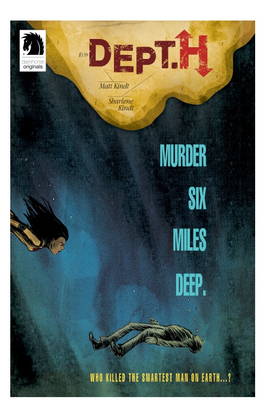
DEPT. H #1
Writer: Matt KindtArtists: Matt Kindt w/ Sharlene Kindt
Publisher: Dark Horse Comics
Reviewer: Humphrey Lee
Hot off a different Dark Horse project that I thought was a bit of brilliance in MIND MGMT, writer/artist Matt Kindt is back at it again with more of his special form of atmospheric storytelling. Mr. Kindt has had such a high level of output the past handful of years that I honestly preordered DEPT. H without once reading a solicit or noting what the book was about literally up until the minute I peeled back the cover, so I had no legit idea what this book was going to be about. Especially since my stupid human brain never put two and two together and moved the ‘H’ in this books’ title over a space (DEPT.H) to realize we were going under the sea, down where it’s better, down where it’s wetter. And that is an exciting notion that one, even just in generic terms, because as I said before, when it comes to crafting an atmospheric, almost dreamy tale there may honestly be no one better in comics right now than Matt Kindt, and that is what you have to absolutely nail when presenting a deep sea tale. In that regard, and many others, this debut for DEPT. H is definitely a success.
What this premiere issue really does, though, besides laying down that sense of tranquil terror the concept of being in these depths provokes, is set a deliberate tone. As our protagonist, Mia narrates to us almost immediately “It’s not the descent that bothers me. What’s overwhelming is the fear of never making it back up.” We find that Mia is somewhat of a stoic type who has her own convictions and trepidations--mainly pertaining to what it is that Dept. H and its parent organization USEAR do in the realm of science and the personal connections she’s leaving behind by heading into the watery abyss to aid in solving a murder. The main thrust of this first issue, besides letting the backdrop soak right in on the reader, really is to info dump a good bit of insight into Mia’s background and what is going on with Dept. H and its characters. And on the front end of the book this does come off as a little plodding in showing bits of these relationships, but it really does pay off as the issue comes to an end and the mystery really opens up.
My main critique with this debut is that it is somewhat uneven. Earlier I quoted that line of Mia’s about fear and her never making it back up, which is a prime example of how Kindt starts to really make you feel the weight and claustrophobia of the station she is going to. There are a good sum of phrasings like that that really emphasize a sense of loss creeping in as Mia departs on this mission of hers and you start to realize that Kindt is not implying a base fear about where she’s going, but what she will find and leave there given a very personal reveal about the nature of the murder. All of this, though, is kind of sliced into those world building scenes in the front half, so it gets a little lost in the shuffle of flashbacks introducing characters in her surface life and the present day narrative stuff getting you somewhat acclimated to the moody cast of miscreants she’ll be rubbing claustrophobic elbows with down below. It all pulls through in the end – boy does it ever – but if I have to knock this book for anything it is all of that above and losing that undercurrent of dread as Mia reminisces and we learn a bunch of new names and faces.
Otherwise, this is a pretty excellent comic book. Just because all that information tends to overwhelm this starting issue does not mean it’s not all interesting material setting an interesting history and cast. The second half alone really sells just how grabbing this book can be, when Mia finally gears up in a cool looking diving almost mech suit to go examine the wrecked area of the station where the murder took place. Between that detached and moody sense of loneliness and perseverance that has been building in Mia all issue and a genuine grip of suspense over the who, how, and whys of the murder at hand, DEPT. H really envelops you by the time the issue concludes. Matt Kindt has already proven he’s a master of these types of personalized and ethereal tales and DEPT. H is looking like no exception to his standard.
Humphrey Lee has been an avid comic book reader going on fifteen years now and a contributor to Ain't It Cool comics for quite a few as well. In fact, reading comics is about all he does in his free time and where all the money from his day job wages goes to - funding his comic book habit so he can talk about them to you, our loyal readers (lucky you). He's a bit of a social networking whore, so you can find him all over the Interwebs on sites like Twitter, The MySpaces, Facebookand a blog where he also mostly talks about comics with his free time because he hasn't the slightest semblance of a life. Sad but true, and he gladly encourages you to add, read, and comment as you will.
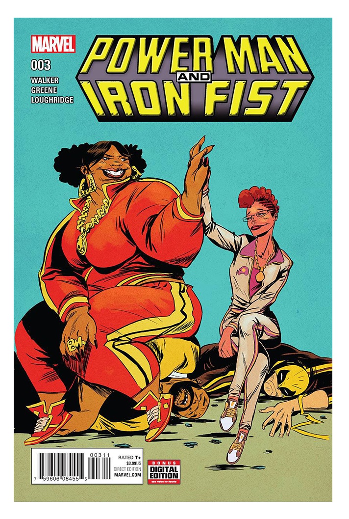
POWER MAN & IRON FIST #3
Writer: David WalkerArtist: Sanford Greene
Publisher: Marvel Comics
Reviewer: Masked Man
Marvel’s favorite duo that’s not a duo, they swear, continues to build steam. Seriously, if Walker can keep this series as strong as it is now for a while, Disney will be kicking itself for sending them to Netflix instead of developing POWER MAN AND IRON FIST is a buddy action movie.
Getting up to speed on the plot, our heroes have been fooled into stealing the magical Super Soul Stone from Tombstone, thinking it belonged to Jennie, their former office manager, back when they were an official team. Black Mariah promised Jennie that this was a great idea, but Jennie is being controlled by the magical Stone now. While Jennie is whipping holy @$$ in the neighborhood, Luke and Danny still don’t know who the bad guy is. Until the last page when, as people say, things got real.
Walker has been doing a great job keeping this comic light, breezy and fun, and most of the humor works, too. I laughed out loud when Black Mariah had to school Jennie: “Okay Boo-Boo, that’s nasty--you can catch diseases that way.” I won’t say it’s quite at the level of JUSTICE LEAGUE INTERNATIONAL, but it’s getting mighty close. Only bad thing in the book is Jessica Jones, who is just the bitchy girlfriend. While I have no real love for the character, she does seem to be getting a raw deal here so far.
Greene’s artwork is inventive and, dare I say, indie looking. For the most part I enjoy his work, but I don’t think he pushes it enough. He’s got some butt ugly people here, and I’d recommend he study Peter Chung’s work (the guy behind AEON FLUX) just to get some more insight into his layouts. This will make his work more than just ugly or different.
So if you are not getting enough fun in your comics, POWER MAN AND IRON FIST is waiting for you.


FAITH #1-4
Writer: Jody HouserArtists: Francis Portela, Marguerite Sauvage
Publisher: Valiant Entertainment
Reviewer: Henry Higgins is My Homeboy
The Ice Cream of Comics!
There’s nothing wrong with ice cream. It’s simple, it’s pure. You’ve had bad ice cream, you’ve had mediocre ice cream, but a solid bowl of ice cream is still always a good option. Superhero comics are much the same way. While there may be other stories that have more ambition or scope or finesse, there’s something to be said for the pure fun of a well done superhero story. It’s the sort of thing that makes fun books like POWER GIRL or INCREDIBLE HERCULES remain cherished while other “major” events from the same years have been all but forgotten.
It’s the kind of tone and emotion, that pure enjoyment of seeing someone fly and stop bad guys, that Jody Houser and Francis Portela aim for with the newest continuation of Faith. And they succeeded. The only things that don’t work here also don’t work in bad books from DC and Marvel (think over-reliance on thought boxes and a tendency to use talking head panels frequently).
Faith lives the life of a superhero, but with just enough wrinkles to keep with the standard tropes of the genre. She’s living a double life in a major American city, but in the relatively untapped weirdness of Venice Beach instead of a metropolis. She works for a news organization trying to write snappy and buzz-worthy articles for a Stepford Smiler version of J. Jonah. There’s the typical assortment of supporting characters around the office, but what could be one note personalities actually feels like worn in tics. Faith is new to the office herself, and the story is very good about getting everything we need about these characters at a quick pace.
She even goes through the basic tropes of the general superhero story, including romantic entanglements with other heroes, government conspiracies, and even a few experimentation subjects. And Faith is made of the same cut as the other classic superheroes – she’s not the most complicated person on the planet, but she doesn’t need to try to be. All she wants to do is to help people.
Francis Portella lends everything the sort of dynamic, Saturday morning action that the best superhero comics exhibit, and everyone moves with the perfect amount of that exaggerated, cartoonish emotion that reminds you of the good side of 90s DC comics. Meanwhile, the color work by Dave Sharpe is fantastic, on point in surprising ways.
At its core, FAITH is the classic superhero story of a person exceeding all limitations using their strange powers for good. It adheres to the tropes of the structure, but not to a fault – on the contrary, it’s pure super heroic escapism, just like any issue of SPIDER-MAN. It doesn’t reinvent the wheel, but it doesn’t need to. The wheel is already pretty damn perfect. This is just a really fun example of this kind of story in action. It’s like drinking a nice cold glass of Classic Coke.
There’s nothing wrong something sweet and enjoyable now and again.
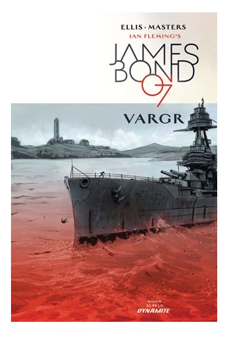
JAMES BOND #6
Writer: Warren EllisArtist: Jason Masters
Publisher: Dynamite Entertainment
Reviewer: Masked Man
The great Warren Ellis, the man who gave Marvel’s MOON KNIGHT a real shot in the arm, has come to Dynamite to write about one of his country’s greatest exports: James Bond. And with issue #6, he wraps up the first story arc, “Vargr”. All six issues were drawn by Jason Masters, who has done some work for DC and Marvel. Masters’ cinematic yet cold and clinical artwork totally fits the tone of Ellis’ Bond.
Using the book series (as opposed to the cinema series) as a jumping off point, Ellis’ Bond is not much more than a man who kills people. Thankfully, he does it all for the right reasons. In between killing, he’s just biding his time being bored and drinking. When he is killing, he’s a ruthless shark with no thoughts aside from getting on with it, although he does keep his eye on the prize, as in solving the greater problem, which may or may not be the mission’s stated goals.
Getting into the spoilers, Bond has tracked down Kurjak to his floating drug lab, which is creating a very lethal form of cocaine, and the whole issue is Bond coldly murdering everyone he sees until everything blows up in typical action movie style. That’s about it.
Recently, I’ve complained about the new BLACK WIDOW comic book for being nothing but one issue fight scenes. I don’t have the same complaint here, because the difference is this is the climax. This is where we know everything and everyone and a balls to the wall, drawn out fight scene is our reward as we cheer the fall of the villain. Do this in a first issue or even a second, it becomes more like “why should I care about any of this and when does the story start(?)”.
So what are my complaints here? Well it’s just that Ellis gave what he wanted: cold and clinical story and climax. He does try to give Bond a little sense of humor, as he bitches about gun free zones that even 00 agents must obey. There’s even a little humor in his nonchalant attitude towards everything--especially killing. Overall, I think he needs a little more Roger Moore in him. Not joking with a county sheriff, but sarcasm in the vein of “do you believe this $h!t?!?”
Masters’ artwork also helps to neuter this story, as it is just as cold and clinical as the writing. He does try very hard to get some pages like Frank Quitely, but he lacks Quitely’s storytelling skill. Mind you, that doesn’t mean I want him to stop trying, as it’s often his best work. Other pages and panels are like stills from a movie--often lifeless and sometimes hard to figure out what happened. Back to the positive, he has a great eye for detail, though I feel some of it is traced CGI models. If he could get more life into his panels and tighten up his storytelling, then he will become a bigger asset to this Bond series.
So it was a reasonably good Bond plot, but a bit too sterile in execution. Ellis and Masters are hangin’ around for another story arc, so I’m curious if they were just managing their sea legs here. On the Masked Man’s Crap, Poor, Decent, Good or Great scale, JAMES BOND “Vargr” #1-6, just slips to a POOR.
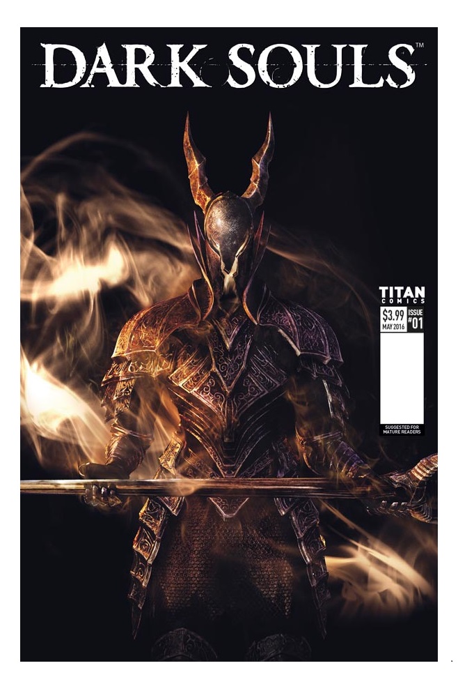
DARK SOULS #1
Writer: George MannArtist: Alan Quah
Publisher: Titan Comics
Reviewer: Lyzard
I’ve been reviewing a multitude of video game-comic book adaptations for the past several months, and after every issue I ask myself the same question: “why would I choose to read this story versus playing it out myself?” Interactivity is a key separation between video games and other artistic mediums. It is not a passive experience, and while you could arguing turning a page, the tactile element of comic book reading, lends itself some sense of immersion, at the end of the day all of these publishing houses aren’t attempting to replicate this.
That being said, DARK SOULS is the first of these video game adaptations that I’d rather read than play. If you haven’t played DARK SOULS or its various sequels, then let me explain to you not the plot, but the DARK SOULS experience. If some game designer attempted to encapsulate the anguish of Nietzsche and Kafka’s writings (and perhaps a bit of the torment of reading their works) DARK SOULS would be the result. The only enjoyment I have gotten out of DARK SOULS the video game has been the schadenfreude euphoria of watching others failing to succeed at it.
I know that the universe of DARK SOULS is vast, that FromSoftware has spent years creating a detailed and well-developed world. But it is hard to truly appreciate its dark beauty when you are too busy throwing the controller halfway across the living room. Reading DARK SOULS finally allows me to appreciate the artistic and narrative aspects of the franchise.
Earlier I said that comic book publishers are not (or rather should not) duplicating the experience of playing the games their material is based on. But somehow DARK SOULS does just this, as the comic starts you off with a similar disorienting experience as when you begin any of the games. DARK SOULS isn’t regarded for its clarity, much of the game’s difficulty rising from its lack of direction and objectives. The comic just throws you into the middle of the action as well, with a quick prologue as to what has transpired to turn the world you have entered into such a miserable place.
Basically, in the kingdom of Ishra death is no longer a forgone conclusion and the living would only be so lucky. Fira, a knight whose memories are fleeting, has put what little is left of her sanity into believing a prophecy of redemption. With the “help” of the scryer Aldrich she aims to free her land from the undead curse. But in order to do so, she must face down demons of both magical and mental means.
Not know what a scryer is? Why the dragon Augerer is such a big deal? Welcome to playing DARK SOULS. Honestly, the comic’s narrative makes much more sense than any introduction to any of the game’s installments up to this point. I have never been so thankful for expository dialogue.
The artwork is hardly what one would expect for an adaptation of a game entitled DARK SOULS. Nothing about it is dark. You’ve got a few grays and purples, but nothing really black. Gold is the most predominant color, which is accurate to the color palette of the most recent, DARK SOULS III. While aesthetically pleasing and faithful to the source material, visual brightness is not one level of clarity I ever desired from DARK SOULS.
DARK SOULS sold out last week, and this comes as no surprise to me. It was utter marketing genius to release the comic at such time with the newest game’s premiere. The question is whether or not over the next few months, while the heat dies down from DARK SOULS III release, will interest in the comic wane as well?
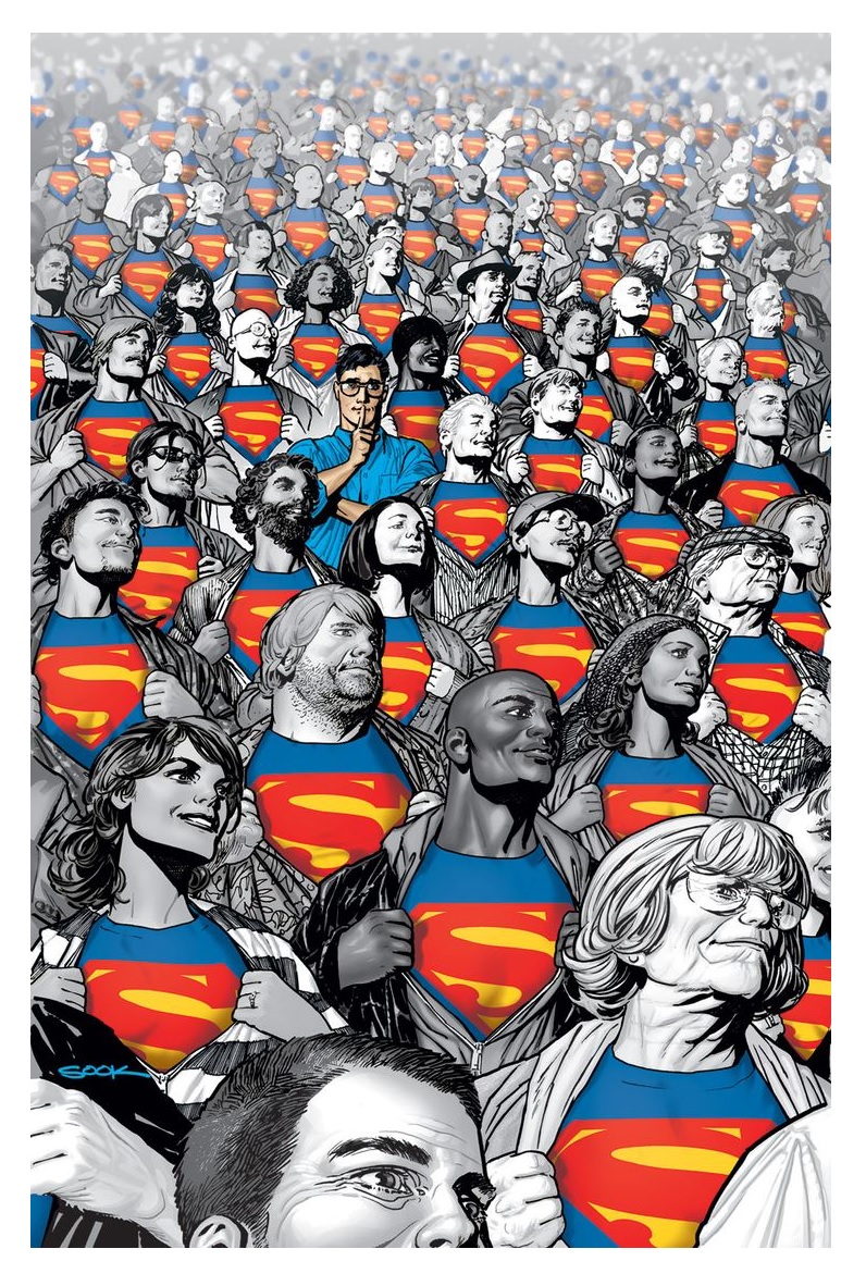
SUPERMAN: AMERICAN ALIEN #6
Writer: Max LandisArtist: Jonathan Case
Publisher: DC Comics
Reviewer: Lionel Putz
SUPERMAN: AMERICAN ALIEN delivers its penultimate issue this week with Clark fully embracing his role as Superman, though still very early in the process. We have yet to actually see Clark in the familiar red and blue suit (and we don’t see it this issue, it’s only referenced, so I can’t tell you if he’s wearing the underwear or not; I can tell you I don’t care, though), but we know from this day in the life featuring a visit from Pete Ross that Superman has quickly become a national/global phenomenon--and it’s making Clark’s friends very nervous.
The brilliance of this book really shines this week, as it ties together a number of disparate threads from previous issues while deepening and updating the Superman origin story in clever, subtle moments. Author Max Landis manages to put a fresh spin on his dual identity and the eyeglasses as a disguise (“You know what everyone tells me? ‘You look just like Superman!’”), his cape (“I need it to turn!”—I would love for an aerospace engineer to chime in on the practicality of this one), and why he would put his only known symbol of his alien homeworld on his costume, and by extension, on screens and images around the world (“I thought if…if it gets beamed out there into space…somewhere…maybe they might see it…”). And these points all come up organically in an ongoing argument between Pete and Clark about what Clark is doing and why he’s doing it. Does he want to be famous? Does he want to be known as the nicest guy on the planet? And most importantly: does he have any idea how much those who know him best worry about him while he’s doing these things?
It’s a wonderfully mature conversation between two still very immature people, and it ends the way a lot of arguments between twentysomethings end: with a drunken Clark flying out into space by himself. As a metaphor, it actually works pretty well. Clark even gets “pulled over” by Abin Sur and Tomar-Re before later waking up on his roof naked (his clothes burned off as he breached the upper atmosphere) with only hazy memories of the events of the previous night (in addition to the hangover, Abin Sur erased his memories so as to not reveal the Lanterns). Oh, and no phone (“I think my phone is in space. I think I need a new one.”). The issue closes with Clark and Pete reconciling and agreeing to go get breakfast, but not before Pete warns Clark that “monsters are coming.”
Artist Jonathan Case does admirable work in this issue, lending the issue a nostalgic, 50s-throwback styling, and Landis—in addition the above-mentioned moments—nicely brings together a lot of elements of this young DC universe in anticipation of what I suspect will be a pretty epic and dramatic conclusion.
This is still a not-to-be-missed series, and I hope that it will live alongside such evergreen tales as ALL-STAR SUPERMAN, SUPERMAN FOR ALL SEASONS, and RED SON as one of the very best Superman stories ever told. In a word, it’s super.
Lionel Putz is a lawyer by day. He watched “Matlock” in a bar last night; the sound wasn't on, but he's pretty sure he got the gist of it. Email him at lionel.putz@gmail.com
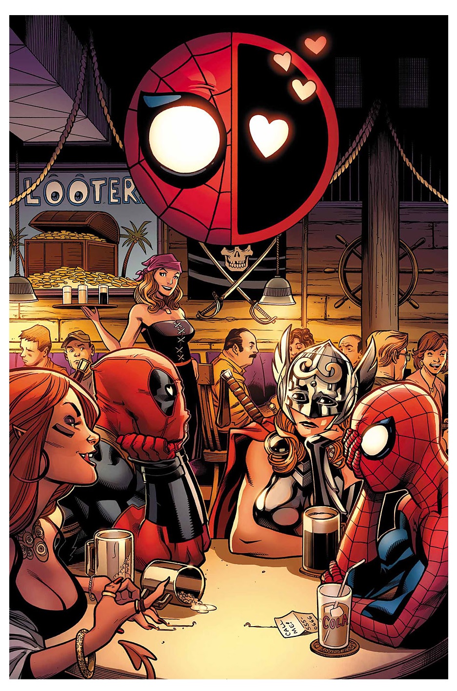
SPIDER-MAN/DEADPOOL #4
Writer: Joe KellyArt: Ed McGuinness
Publisher: Marvel Comics
Reviewer: GalaxyGirl
We all know Spider-Man and we all know Deadpool. The two biggest mouths in the Marvel Universe. You could say “arguably,” but we all know that isn't true. So imagine these two fast-and-quippy talkers in one book. Yes, the puns are overwhelming.
This uproariously funny book (written by Joe Kelly with pencils by Ed McGuinness) started out strong with the first issue, sort of went a little strange in the middle but has yet again found it's traction in the fourth issue of the series. Spider-Man has finally caved to Deadpool's charms and invites him to hang out. Naturally, Deadpool takes this opportunity to take Spidey out on a blind double date.
Since this is Deadpool and Spider-Man, you can imagine how horribly this date goes. Kelly and McGuinness do not disappoint. The art is vibrant, expressive and easily captures the fun of a night on the town with our two favorite spandex/kevlar-clad heroes while Kelly's witty repartee keeps us hanging on for more.
As with any Deadpool book, you are liable to get a little lost in the logic somewhere along the way, but Kelly manages to bring it back just in time for a shocking ending that will leave you on the edge of your seats. Let's just say that Deadpool's in trooooubbble when he figures out his next big boo-boo.
So if you haven't already, I suggest you check out this majorly awesome team-up (with way-too-many poo and pelvis jokes to shake your head at). I'll be in line at the comic book store on May 25th for issue #5!
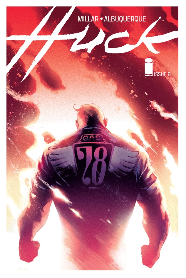
HUCK #6
Writer: Mark MillarArtist: Rafael Albuquerque
Publisher: Image Comics
Reviewer: Masked Man
‘Elevator pitch’ Mark Millar’s first try at a kinder, gentler comic book hero comes to a close. The man who gave us NEMISIS, KICK ASS, KINGSMEN, and WANTED now gives a hero who has no desire to hurt anyone. Artist Rafael Albuquerque, who has worked on BLUE BEETLE and AMERICAN VAMPIRE, brought all six of these issues to life, aided greatly by Dave McCaig’s color.
Getting into the spoilers: the Russian scientist Orlov, who found Huck’s mother and experimented on her to discover a way to replicate her powers, tricked Huck with a robot posing as his brother to track her down and then captured both her and Huck. Now in this issue Huck and his mother are breaking free from Orlov’s lab and battling it out with his robots. As BATMAN V SUPERMAN: DAWN OF JUSTICE proved, it’s all about mothers, so we get to see Huck unchained, but still not doing anything Silver Age Superman wouldn’t do. Then to wrap up the tale in a nice bow, Huck’s mother uses her ‘command power’ to destroy any data on her and her son and makes sure Orlov doesn’t bother anyone ever again.
As nearly everything Millar writes, Huck is a poor man’s movie script. It’s always kind of: What if this? And then this happened?!? A basic, although clever, story that can be finished in six issues or so. I was curious if Millar could actually write a story without his usual violent/pandering flair, and he did. Huck stayed true to his vision of a kinder gentler hero, though I’m sure someone will have him break a villain’s neck one day, because that’s comics.
Albuquerque’s art throughout the series has been very well done. It captures the rustic, homey town feel of where Huck grew up, and does well enough to illustrate the other locals of the story. And while I don’t want to take anything away from his fine artwork, colorist Dave McCaig is the real hero of these six issues. Each page of action or quiet time just pops with vibrant or moody colors, turning Albuquerque’s expressive ink work (or maybe it’s just pencils, not sure) into paintings.
While there is still plenty on the table for Millar to come back to with Huck, these six issues come to a satisfying conclusion with a nice balance of character moments, action and karma, if you will. Overall it’s just a solid clever story, which is what Millar has always excelled at. The flip side to this is that’s all it is, which makes it feel like fluff as well. You’ll enjoy it, but probably not really remember it next year. So on the Masked Man’s scale of Crap, Poor, Decent, Good or Great, HUCK just manages a GOOD.
Proofs, co-edits & common sense provided by Sleazy G
 The next level of comic book excellence is a click away at BLACK MASK STUDIOS!
 Want more in all things Geek?
Check out our friends at PoptardsGo for podcasts, reviews, and more!
 And if you still need more geek in your life, check out Part-Time Fanboy for more geeky goodness on comics, movies, and more!
AICN COMICS has a new sponsor: Things From Another World—also known as TFAW!

TFAW carries everything from comics to toys and any kind of collectible in between. Show your support for AICN COMICS and TFAW and click the pic above. You just might find something you can’t live without such as Cullen Bunn’s excellent Southern Gothic Horror Tale from Dark Horse Comics!
Finally, check out AICN COMICS on Facebook and Comixpedia!