
Hello ladies and gentlemen, Muldoon here with a fun look into filmmaking. "Muldoon! Where has MEET THE CREW BEEN?" The short simple truth: working 12-13 hour days on a TV show, then also chipping away at a hundred or so VFX shots for my own no budget film... I've had difficulties balancing it all out and while SATURDAY SHORTS has gone strong (with fewer detailed intros), I've been dying to kick MEET THE CREW back up. So when the opportunity to have a quick Q&A with a world-renowned artist fell in to my lap, I jumped at the chance.
I'd like to welcome artist and Title Designer Jakob Trollback to MEET THE CREW. While I'm most certain you've seen his work in front of some great films and TV shows, you might have seen his TED Talk about Music Videos. His work is also featured front and centered in Tom Hammock's THE LAST SURVIVORS, which came out just last week on Blu-ray. Jakob is an artist in every sense of the word and has designed quite a few incredible visuals - hopefully I've designed a decent set of questions for him. You can certainly be the judge.
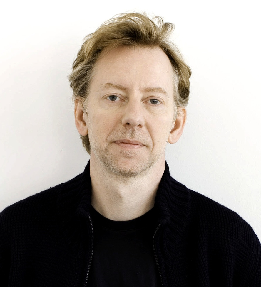
JAKOB TROLLBACK - TITLE DESIGNER
So when exactly are you typically brought on to a given project? Is it after the film has completed principal photography or much earlier than one might think?
Most often it is not until after the film is shot and post production has started. It does happen though that you meet with the director early on and all that exists is a schedule and a script.
What exactly is it a Title Designer’s responsibilities? (Yes, the title feels a little self explanatory, but I’m curious what goes into your job, the design, the back and forth, the ownership you have over what you do for a living.)
There are a few categories of titles. There are the ones that are almost purely contractual. There has to be credits but the director want them to be un-intrusive. Traditionally it used to mean type over the first scene. Later, this turned into main-on-end which is in a way a funny compromise: -“I want to have a real title sequence. But I also want to start the movie right away and not use two minutes in the front.” It works pretty well, but obviously, if you have a designer with a big ego (which always equals a small self-confidence), you would want your titles to be big and up front. Then there are the titles that totally sets the whole mood for the film. My old friend Kyle Cooper is who comes to mind here. Then there are also titles that sets up the plot in some way. And then there are the titles to ‘Bullit’. Amazing.
Of your responsibilities, which are the most mundane and conversely – which ones excite you and keep you passionate about your art?
Relative typesize is 100% mundane and sometimes inane. Egos at work again.
Making something new is the only thing that drives me. I mean, if your stuff is great in general, you can obviously get mileage out of it on the market, but it would bore me to pieces to repeat things.
Do you work alone, or do you have a team of artists under your watchful eye? If you do have an assistant, what do you typically have them do and when are you able to hire them?
I have a studio with several creative directors and many great designers. I’m less involved in the things I’m not involved with. Does that make any sense? I obviously watch over everything that happens in some way, but I’m happiest when there is a lot of creative autonomy under our general premise.
What drew you to creating titles? In a vague way, was there a specific film’s title sequence where you went “Holy hell! I need to do that!!” What was the path that led you to be a go-to title designer, years of interning, a design school, teaching yourself and working on friends’ films? (What was the process of getting to where you are?)
I was a DJ in Stockholm. I started to make flyers. I wanted to live in New York and the first job I was offered just happened to be at R/Greenberg Associates (R/GA). Once there I realized that they had done the titles for The Untouchables, and those titles had made me see the movie twice, despite Kevin Costner. As soon as I started working there, I realized how well animation aligned with my sense of rhythm from spinning vinyl.
R/Greenberg Associates: A Film Title Retrospective from Art of the Title on Vimeo.
Was there are individual who specifically made a point to give you your “first break?” If so, are you still in contact with them?
It goes like this: Lucy Sisman was an art director at Allure Magazine. She was a friend of a friend of mine in Stockholm. She couldn’t hire me but sent me to talk to Tom Geismar of Chermayeff & Geismar. Tom wouldn’t hire my but thought that I should talk to someone at R/Greenberg Associates. There, I was hired by Kyle Cooper. A few years later, when he moved to LA, I took his job in NY.
What were some of your favorite title sequences you’ve created? Ideally, what are the top three and why do you feel they represent you best?
Unfortunately, we haven’t been doing a lot of titles lately. I still really like the titles I did in 1996 for Night Falls on Manhattan. I wanted to bring Art into an opening sequence and that was pretty rare then. Many of the things I’m happiest about is openings that we have done for three different conferences. The opening for TED8 was very hot when it came out. PopTech 2008 is great too. And a couple of the openings for World Science Festival. They all feel different and unique.
You did Tom Hammock’s THE LAST SURVIVORS title sequence. Tom was actually one of the first individuals featured on MEET THE CREW and I genuinely can’t wrap my head around how you did those titles. Can you share a little bit of how that sequence came together and what inspired your decisions?
It just had to be about water, and we spent a lot of time thinking of how we could make water disappear. We ended up doing long time-lapse of water on our office floor. We shot it with our own iPhone app Step.
What are you currently working on?
One of the coolest thing we are doing is branding the Sustainable Development Goals for the UN. We have re-named them "The Global Goals” and created a whole design system. We are working on a media campaign for 7 Billion people. As for film, there has been a lot of documentaries lately. We just did the titles for the Mavis Staples and Peggy Guggenheim documentaries. We are working on one about Lee Morgan. It’s all good.
For the folks out there who might want to get into title design – or perhaps filmmakers in the audience in general – do you have any advice when it comes to bringing (essentially) text to life?
I could probably write a book about it —the thought has actually crossed my mind— but it’s hard to put it down in a few sentences. But Rhythm, pulse and heartbeat has to work together. I love syncopation and I love the intersection of two different voices or tempos. What is the taste and smell of the movie? How do I want people to feel when they are watching it? It’s basically about manipulation and seduction. I mostly use sans-serif fonts since serif fonts have so much more emotional baggage.
Boom! There we go, folks - a little insight into the mind of an artist - a man who's in charge of taking text and bringing it to life while incorporating it into the much larger project at hand. I can't tell you how much I respect those out there who can discern what different fonts can imply... I fully realize it's not just about "picking fonts," but personally that's a tricky beast as you wouldn't think "Oh this looks off due to the font being the wrong choice," but it has everything to do with production value and feeling like you're watching something crafted and well thought out versus a random selection with no real meaning behind it.
I'd like to truly thank Jakob once again for taking time out of his incredibly busy schedule to shine some light one what he does for me and the folks of AICN. It's a real treat to get to hear from the talented individuals who help bring our favorite stories to life.
If you work in film or television and feel like shedding some light on what exactly your position entails, then please feel free to shoot me an email with the subject line "MTC - (Your Name) - (Your Position)." I'm not here to get scoops or dirt on anyone, simply here to educate and ask for advice to any of our filmmakers in the audience.
If you folks are interested in finding out what other positions on a film are like, then check out any of the links below:
Robby Baumgartner - Director of Photography
Thomas S. Hammock - Production Designer
Seamus Tierney - Cinematographer
Brian McQuery - 1st Assistant Director
Shannon Shea - Creature/VFX Supervisor
Christopher A. Nelson - Special Makeup Effects Artist
William Greenfield - Unit Production Manager
Jeff Errico - Storyboard Artist
Monique Champagne - Set Decorator
Arthur Tarnowski - Film Editor
Justin Lubin - Stills Photographer
- Mike McCutchen
"Muldoon"
Mike@aintitcool.com
![]()