
(Click title to go directly to the review)
BATMAN #39
SPIDER-GWEN #1
JOHN CARTER: WARLORD OF MARS #4
SUICIDERS #1
THE BLACK HOOD #1
JUNGLE BOOK: FALL OF THE WILD #3
EFFIGY #2
KING: PRINCE VALIANT #1
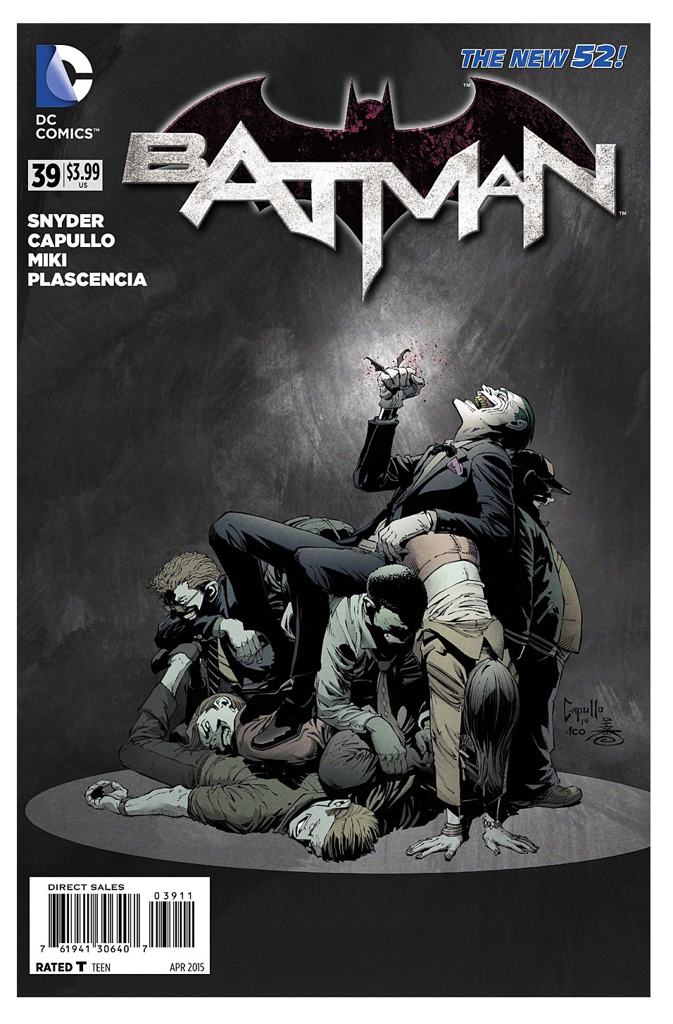
BATMAN #39
Writer: Scott SnyderArt: Greg Capullo
Publisher: DC Comics
Reviewer: Optimous Douche
When people ask me why I collect comics the simple answer is, “I don’t collect comics, I collect creators and their stories.” Why? Because since trade pacing, fracturing the publishing universe (and at times the bedrocks of heroes’ character) for greater market appeal, and the current “Reboot Age” allowing both Marvel and DC creative to get fucked out of TV and movie salaries even though they are writing TV and movies…the one constant is talent can not be transformed by these forces.
Sure, we all shit the bed and have bad days, but the basics of a storyteller’s hold on you will follow them to their next fictional universe. Love for a character and continuity is simply an exercise in pain, and frankly beyond the control now of those that give a fuck for any hero who trademark is more lucrative as a toy than on the page.
I am here to praise BATMAN #39, but also earnestly asking the community of fans and creators to look at why I choose to herald this penultimate chapter so we can all find some piece again instead of feeding ire back and forth about what sucks. Love a creative team and look more myopically for constants and change in story. If you speed up your internal fiction clock, blind yourself to outside shenanigans, and understand that fewer titles doesn’t breed lesser commitment for creator or fan, then from Paradox to Convergence, I got my entire childhood comic reading experience back in basically a 4 year arc.
It’s a fucking epic omnibus of bat-awesome if you think about it, which becomes downright Shakespearean when adding the efforts of other story purists like Morrison and Tomasi to the mix. With one Scotsman’s declaration that no man shall kill Damian except a declarative Scotsman, from Paradox to Convergence BATMAN never missed a note of comic excellence.
Now, whether you agree with the story path becomes another question all together. From one skinned face, an entire unexplored mythology has been opened up for the Clown Prince of Crime, and a fuckton of scrutiny for Scott. To give puddin’ back his pudum, Scott took his panache for history and his current love of mysticism (see Image’s Wytches for more) and postulates that the Joker simply is and always has been. It’s the other side of the bat-totem story coin, that says a protector…or patronus…or Matt Dillon…watches over all cities and people. Now in Gotham we learned the bat through history was simply those pesky Omega Beams of Darkseid’s playing Bruce Wayne’s travel agent, the Joker being a “pale man” of eternal sociopathic zeitgeist in the air is the boldest ret-con yet for man who has made that his primary bat-mission.
Our greatest strength is always our greatest weakness, because quite frankly the coup-de-grace is so easy for our enemies to execute because we don’t usually need to shield strengths. Snyder loooves history, see AMERICAN VAMPIRE, GATES OF GOTHAM, THE WAKE…just everything he writes.
The New 52 gave Scott the chance to let his mind run unfettered to change the early events of Gotham responsible for evolving her into the only pile of shit with a zip code. Purists couldn’t bitch about any changes or oversights because writer absolution was found in their savior Barry’s asshole insistence to keep exponentially increasing his infection rate of Rebootitis. Then, guys like me didn’t give any guff, because I prayed everything would change as I naively so new threats beyond the silly silly rogue’s galley of another age could rise. A protagonists’ universe should grow organically. The New 52 has proven, some heroes, no matter who writes them, are simply too damn reflective of what was to hold emotional resonance. Not every character is Batman and as much as I love Booster Gold, he is a 70s and 80s dream that worked with a Bwa-ha-ha team, bit not today.
Snyder gave me my universal wish of freshness with villains and sidekicks reflective of now: “The Court of Owls” gave Batman a 1% of oppression to rail against as their unfair manipulations sent rested away control of his own destiny. While not a new villain, “Gates of Gotham” infused the Penguin with the clout of pedigree to drive his parasol psychosis farther than ever before. A legitimizing done 1000x better than the hatchet job Michael Corleone got in GODFATHER III.
Despite all of these home runs, across almost every dam book I get more and more concerned about this change above all others. However, as my credo of creator adoration dictates, my judgment will be reserved until I see the final blow next issue. This one was merely an exercise of getting the chess pieces in place between BATMAN ETERNAL ensemble and the leading cast of BATMAN. But as I watched Red Robins and Blue Robins and Pennies of worth both antique and shiny new take their issue 40 places I couldn’t let go of one that must be fulfilled before I giving a standing ovation instead of mere applause.
Was this planned? Plain and simple, was a skinned face brought back by magic and mumbo jumbo in the cards from the get-go? If planned from day one to use the face as a catalyst for the Joker to be the totem of killer clowns, then I guess that’s cool, but it makes no sense at all. It won’t negate my enjoyment of the past three years, but nostalgia will be a little les sunny. Were Tynion’s misleading paths in the back-up story truly necessary if it is revealed that the fact finding autobiographer could be right and so could the eternal killer concept. Alan Moore did it with the KILLING JOKE and despite the title’s mastery, I was still annoyed by the tease.
When Optimous isn't reviewing comics he is making the IT words chortle and groan with marketing for MaaS360, Enterprise Mobility Management. He also has a comic coming out sometime soon, for updates head to robpatey.com.
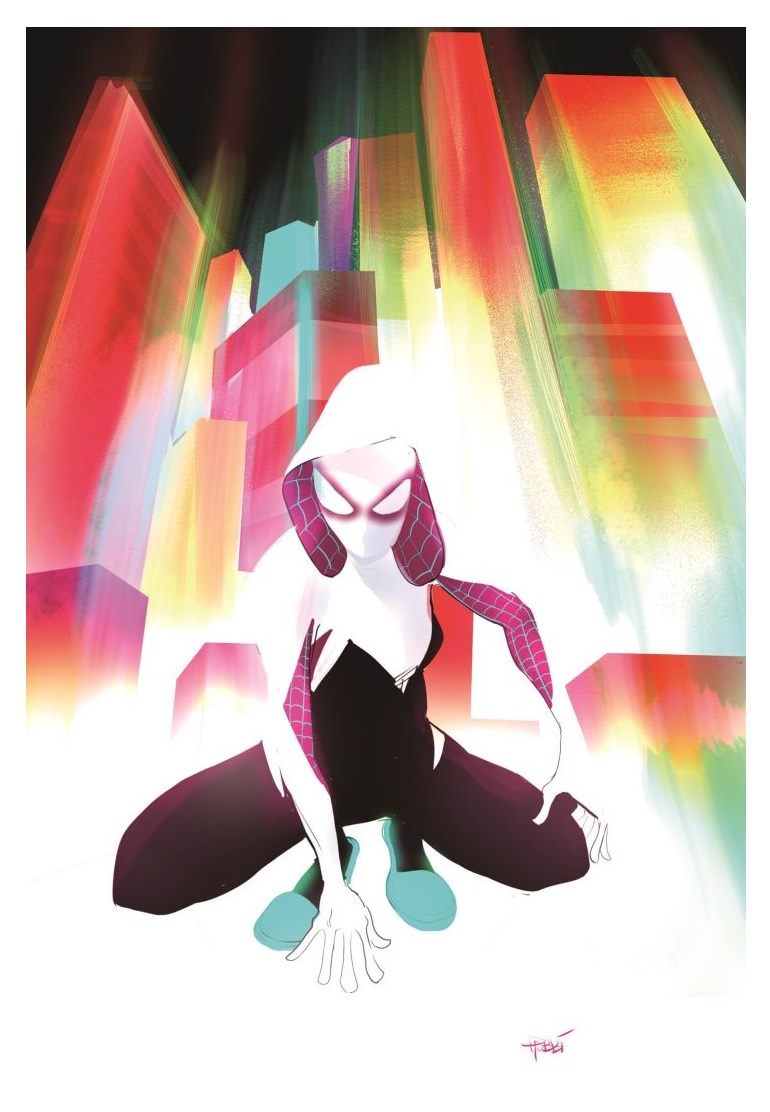
SPIDER-GWEN #1
Writer: Jason LatourArt: Robbi Rodriguez
Publisher: Marvel Comics
Reviewer: DrSumac
Just last week I sparked a debate with some friends of mine about the trending news story of an 11 year old girl named Rowan who wrote DC Comics a letter to complain about the lack of female characters. Perhaps the saddest part of the story for me was that the many people who have had the same complaints for years have been ignored, but the fact that even an 11 year old sees the problem suddenly made people take notice. The best part, however, was the fact that DC tried to placate Rowan with some tweets, a picture of herself as a hero, and promises that things would change, but she didn't fall for it.
What I found most interesting about our debate was that while all of my friends had different opinions on the topic, none of them were inherently wrong. One wanted things to be better, another argued that there has been a lot of progress and things are pretty good now, while another stated that he preferred male characters and so does the audience at large. To resolve the dilemma I did some research on comic sales statistics and discovered that while there aren't a lot of female-centric comic titles, the ones that existed did sell relatively well. Sure BATMAN and SPIDER-MAN were always on the very top, but THOR, HARLEY QUINN, BATGIRL, WONDER WOMAN, and even SQUIRREL GIRL outsold titles like IRON MAN, FLASH, DAREDEVIL, and HULK, many of which by large margins. Based on those statistics it seems clear to me that Rowan was right; the problem isn't that female super heroes don't sell, but rather that there aren't enough of them and they aren't promoted enough.
Fortunately, unlike DC, Marvel Comics actually seems interested in making some changes. Captain Marvel, Ms. Marvel, Storm, Squirrel Girl, and particularly the success of the new Thor show that not only are they invested in developing great female characters, but that they sell. With any luck SPIDER-GWEN will be their next hit.
Like many, I fell in love with Spider-Gwen the moment I saw her costume. I can remember carefully checking the new comics each week to see if EDGE OF SPIDER-VERSE #2 finally came out, and the excitement I felt when it finally did. Ultimately that issue was interesting, but something of a mixed bag for me. I loved some aspects of this alternate universe, such as Matt Murdock working for the Kingpin and Gwen being a drummer in an all girl band lead by Mary Jane Watson. On the other hand, I found the summary that the Peter Parker of this world turned himself into The Lizard because he wanted to be a superhero only to subsequently die to be rushed. It would have had a lot more impact if we actually saw that play out.
As for the actual SPIDER-GWEN #1, it's much of the same. Gwen's Spider Woman manages to be both refreshingly new, and yet familiar in that way that alternate universes are supposed to be. I also love seeing the alternate take on Matt Murdock and Frank Castle and want to see where this series takes them. My biggest complaint about the story itself is the drama of Gwen quitting the band while Mary Jane is too much of a prima donna to ask her to come back. They have a whole new universe with some interesting things going on in it, and it doesn't make sense to me to waste pages on that plotline, particularly since Gwen herself doesn't seem to care all that much.
The art in the book is stylized and interesting in a way that certainly makes it stand out, but there were some problems that I had with it as well. I like how the sound effect words pop on the page with movement and striking colors; however, the backgrounds used a lot of graffiti as well that looked very similar. In one of the very first panels of this issue there was a sound effect right next to graffiti that was almost the exact same color, which I found incredibly confusing. If it had come later in the issue when I was more used to the style it probably wouldn't have been that bad, but the colorist really dropped the ball either way. There is also a later panel where Gwen sprayed graffiti all over the city, but instead of looking like part of the buildings it seemed like a cheap aftereffect. There was also a blonde-haired girl wearing a white hoodie in the very beginning that I naturally assumed was Gwen, and was confused to find that it wasn't. Maybe these are little complaints, but they are also easily noticed and corrected. Hopefully as the creative team continues on the series we won't see as much of this.
In the end, SPIDER-GWEN is a fun read with a lot of potential. Even though the comic medium is over saturated with alternate universes, this one shows promise for a lot of reasons. The last page of the issue is a thank you letter that gives credit to the creators and fans alike for making the series a reality. It makes it clear that this series exists because the fans demanded it, and that is what we need from the big publishers like Marvel and DC. SPIDER-GWEN was popular before she ever appeared in a comic because the audience is hungry for characters like her, and now that she has proven that she is more than a pretty face I think she is going to be around for a long time.
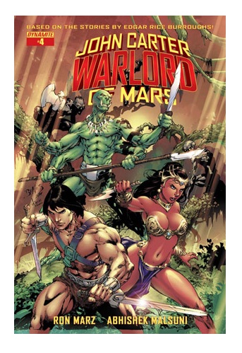
JOHN CARTER WARLORD OF MARS #4
Writer: Ron MarzArtist: Abhishek Malsuni
Publisher: Dynamite Entertainment
Reviewer: Masked Man
Unfortunately, I'm of two minds when it comes to this new WARLORD OF MARS series. Half of it is really good and half of it is really dull. As a smaller company, Dynamite often employs smaller or unknown creators, the results of which are pretty predictable. They are mostly still learning their craft, although some are surprising talented. Recently, Dynamite has managed to get their hands on name talent--mostly writers like Mark Waid, Warren Ellis, and here Ron Marz. So it's pretty amusing to me that Abhishek Malsuni, who I've never heard of, is killing this book and Ron Marz is kinda phoning it in.
As with the first issue, Abhishek Malsuni just continues to impress me. This guy is the total package: storytelling, figures, action, backgrounds--he handles it all great. If the bigger houses are looking for fresh new talent, this is the guy! The first few pages of the book are a flashback to the civil war, and I can't tell you how many times I've seen artists cheat these type of scenes, trying to avoid all the hard work involved. Not Malsuni; he jumps at it and just kills it. He does such a good job of it, I'm curious if he has a passion for the American Civil War. If he doesn't, then I'm even more impressed with his work. I'm also impressed with his Dejah Thoris (commonly known as the hottest piece of @$$ in sci fi), who is very hot but still looks more like a woman than just sex fantasy ('cough' Ed Benes's cover 'cough'). The only bad thing I can say about this issue visually is the decapitation panel--it's just stupid. It may have been played for laughs, but there really aren't any laughs in this issue. The panel is so dumb, compared to the other panels, that I'm inclined to believe it was Marz' idea. Malsuni is just too damn good to do that.
Again, as with the first issue, Ron Marz has not impressed me. To be fair, it's not poorly written or bad writing, just unimaginative writing. With the villain being another man from Earth who was a Union soldier (as John Carter was a Confederate soldier), it's such an obvious choice for a bad guy and Marz does nothing to make him any more than that. And for the sake of presenting John Carter as the good guy, Marz does a completely stereotypical role reversal with this Joshua Clark. From his look to his attitudes to his undying sense of honor/revenge against John Carter, it all comes across as stereotypical Southern Officer. John Carter, meanwhile, always comes across more like a stereotypical heroic Yank than a slavery-loving southern gentleman. Marz even attempts to make John Carter more palatable by having him state that he hates slavery in any form, which on some level isn't necessary, as we pretty much already buy Carter as our hero, and stating it brings into question his position on the war and why he fights--which is a bit pointless for a guy now living, loving and fighting on Mars.
Overall, this issue dives into Joshua Clark more, and give us his reason for wanting revenge on Clark (why there's a flashback), but doesn't do much to make him interesting, or make us crave the showdown between him and John Carter. Also, the way he was picked up by aliens, the Kahori, then went on to ravished planet after planet before coming to Mars makes me wonder how they missed ravaging Earth instead of Mars (which is right frick'n next door) first. Oh well.
So yeah, very torn with this series. Ron Marz really needs to step up his game. I'll probably keep reading it for Abhishek Malsuni’s artwork, and hope that the next story arc is worthy of it.

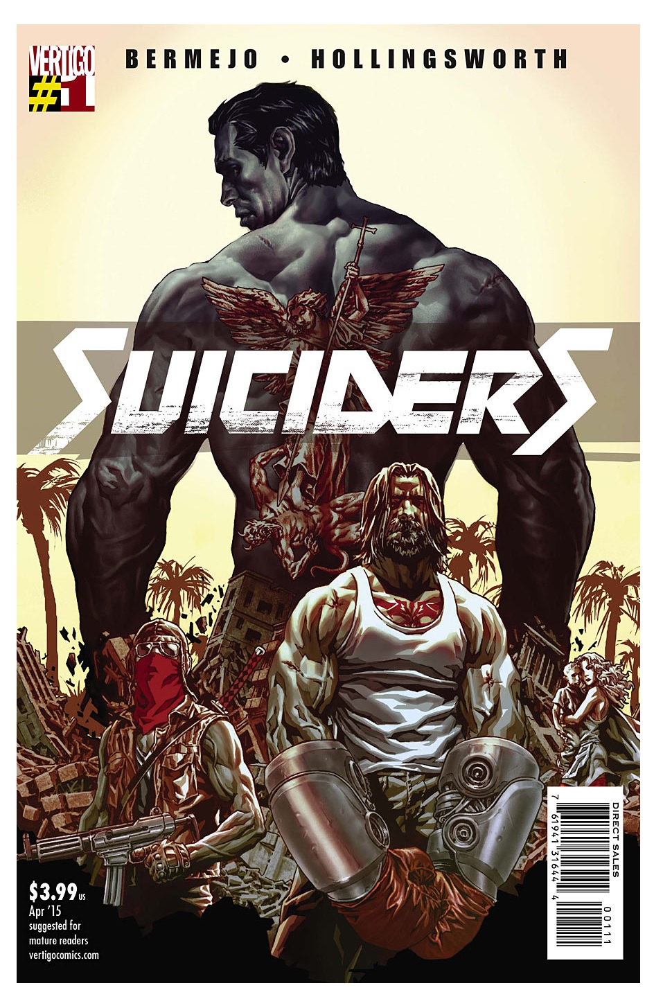
SUICIDERS #1
Writer: Lee BermejoArtist: Lee Bermejo
Publisher: DC Vertigo
Reviewer: Humphrey Lee
I’m going to make a prediction with this review right here and now, that it will begin here and end in about four paragraphs with me typing this simple, profanely stated truth: my god can Lee Bermejo draw the fuck out of a comic. I don’t want to pigeonhole the man and his writing ability, but considering we had plenty of previous examples of his drawing the fuck out of comics and none of his writing said fuck out, his draw of his art was the beginning and end of my decision-making process toward ordering this first issue of SUICIDERS. As far as the other major aspect of the creation process, the writing, it got help from the solicit that was at least interesting with baseline topics that can sell a book; a crumbled society meets a futuristic Death Battle Arena setting always has potential in the right hands. But obviously there’s only one way to find out if the Bermejo’s wordplay matches his awesome skill with his pencils, and that’s to buy that ticket and take that ride.
Where that ride takes us is to the somewhat near future and the walled off city of New Angeles, because San Angeles was taken by “Demolition Man” and we simultaneously do not want to piss off but want to invoke that masterpiece (I hope even just a tiny bit of that is actually true). New Angeles is a city reborn, thirty years to the day in this particular issue, from a massive earthquake that brought the City of Angels down to earth and left it having to become harder than it has ever been to survive and rebuild itself. It became home to the “Suicides”, or fights to the death by augmented humans in a battle arena that makes “Deathrace 2000” look like “Friday Night Sissy Fights” from that old “Chappelle Show” skit. And our protagonist, of course, is the biggest, baddest Suicider of them all, known as the Saint of Suicides, and he’s as hardcore as he is handsome.
Now, of course you would expect a debut issue featuring a backdrop such as this and a man of Bermejo’s talent to be primarily dedicated to a visual bonanza of watching these Suicides in action, and yeah, that is the bulk of this issue for sure. A good half of these pages are pure adrenaline as we watch the Saint go steel-plated toe-to-toe with another Suicider who looks like a mix between a “Hellraiser” fetish and an “Attack on Titan” cosplay while neon-adorned towers of bullet-raining death attempt to bring them to an end before the other man can. And it is an absolute visual feast that I will actually just leave at that so as to not undermine my next point about this issue, and that is that we actually do get a little more depth in the plot than just televised eviscerations. And that insight that we get, and what may bring down the world of our Saint of Suicides, is that New Angeles and its recreated self is not particularly friendly to those outside the walls.
This feud or whatever you will call it rears its head as Bermejo uses some cut to’s of an elderly Latino company making a deal with some shady gents with assault rifles and menacing looks to get into New Angeles through a tunnel system of theirs. Bermejo also uses these cuts to not-so-subtly point out some of the cultural points that take place in NA, like how the gentleman of the pair is missing two fingers at the knuckle, and that’s a dead giveaway because the average person behind the wall has as much augmentation surgery as your average “Real Housewives” cast member. And then all subtleness goes out the window when, upon heavily ironic happenstance, our better life seekers are discovered by armed guards and not even given a moment before they are gruesomely cut down by gunfire instead of detained and sent back to whence they came or what have you. Combine this vicious disgust (and thinly veiled reference to our current level of discourse over immigration in this country) aimed at these refugees and some also not so sly acknowledging that the Saint’s youth around the time of said big one is not exactly public information, you can kind of see the writing on the wall where things are probably going to start leading from here.
Pound for pound, SUICIDERS #1 is definitely a heavyweight in the visual department (because let’s not forget Matt Hollingsworth, who can color the fuck out of a comic too) and put in a solid middleweight performance in writing chores, I would say. Honestly, it’s rare that I would be fine with this in a debut since I feel that’s so important to laying in your hooks, but if this issue had been just nothing but the gorgeous and kinetic deathmatch panels, I’d have been fine with laying my four bucks on the table for this issue. I’m much more a story guy, but visuals like this are worth turning your brain off for occasionally. That we got some not so deftly presented pieces of sociopolitical plot nudging as we watch the Saint do what he does best and have it pretty well integrated in all the adrenaline is definitely a sign that Bermejo’s got the scripting chops as well as sequencing talents of a, uh, guy who draws really good and stuff. Between those brutal yet beautiful visuals and an interesting all or nothing attitude this scrappy but heartbreaking world presents tonally, I think SUICIDERS has the heart to be something significantly more than a guilty pleasure. And, of course, it helps that Lee Bermejo can draw the absolute fuck out of a comic book.
Humphrey Lee has been an avid comic book reader going on fifteen years now and a contributor to Ain't It Cool comics for quite a few as well. In fact, reading comics is about all he does in his free time and where all the money from his day job wages goes to - funding his comic book habit so he can talk about them to you, our loyal readers (lucky you). He's a bit of a social networking whore, so you can find him all over the Interwebs on sites like Twitter, Facebookand a blog where he also mostly talks about comics with his free time because he hasn't the slightest semblance of a life. Sad but true, and he gladly encourages you to add, read, and comment as you will.
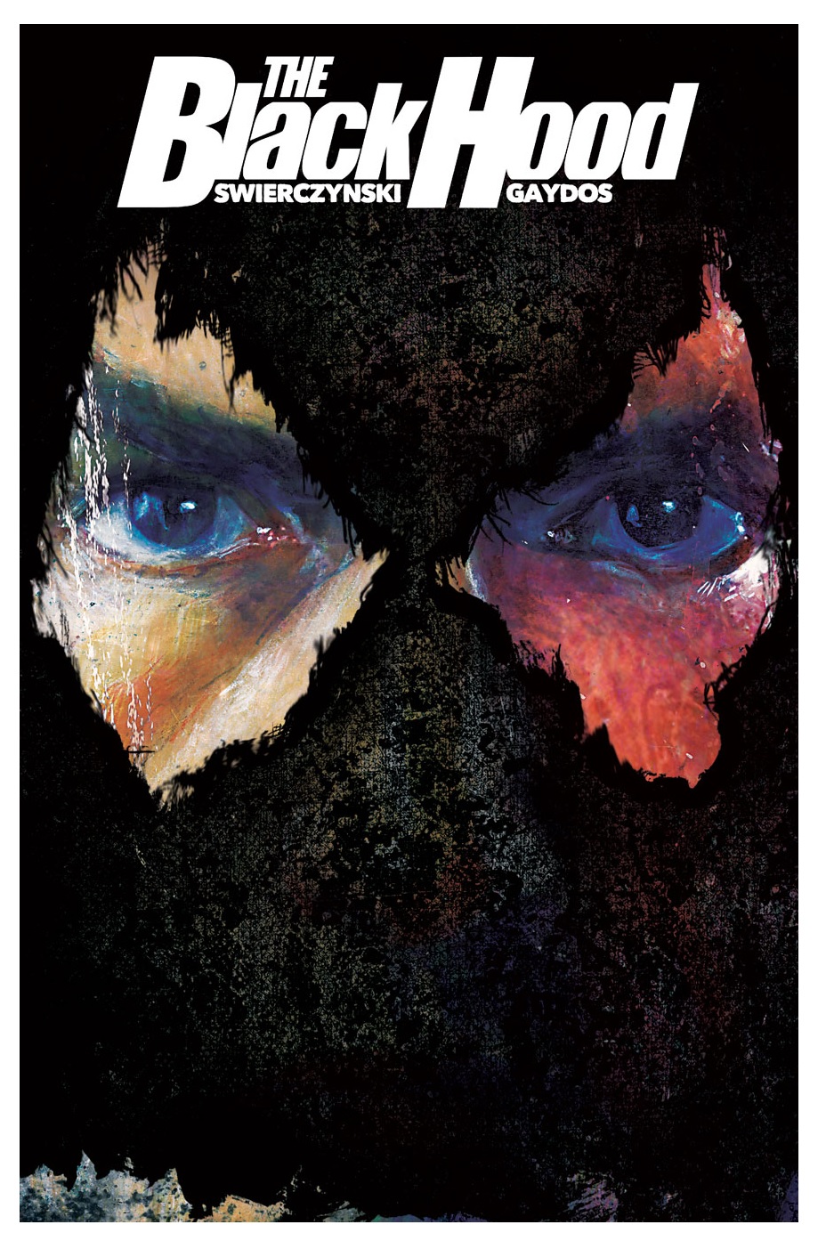
THE BLACK HOOD #1
Writer: Duane SwierczynskiArtist: Michael Gaydos
Published by: Archie Comics/Dark Circle Comics
Reviewed by: BottleImp
Back in 2012 Archie Comics decided to take another stab at revitalizing their long-dormant line of superheroes, and the result was the supremely entertaining NEW CRUSADERS. Under the revived Red Circle imprint, the long history of classic characters such as The Shield, The Fly and The Comet was simultaneously honored and given a makeover for a new millennium. This series hearkened back to the heyday of Marvel comics, when books could be read and enjoyed by readers of all ages. In fact, I loved this series so much that I made NEW CRUSADERS my pick for Best Series in our annual @$$ie awards of 2013, saying “For a long time comic books fought against the label of juvenilia, but at a cost of making most titles palpable only to the older readers. NEW CRUSADERS thankfully brings the medium back to its roots with story and art that can—and should—be enjoyed by readers of all ages.” I eagerly awaited the next installment of the series…and waited… and waited…
Now it’s 2015, and the Red Circle imprint is no more. Instead, Archie has oh-so-cleverly created a new imprint: Dark Circle. Comics that are fun for all ages? Fft—who needs ‘em? Stories that will inspire newer and younger generations of comic fans? Ah, fuck those kids. Archie knows who reads comics—and more importantly, who has the cash to plunk down four bucks a book these days—and it ain’t the kids. No, comics are a medium for thirty-something-and-older fanboys, so let’s give ‘em what they want, right? And that means no bright and cheery stuff; we’re making that clear from the get-go with our new imprint name. Comic readers aren’t into pussy bullshit that has a sense of childlike exuberance and genuine fun. Get with the times, wuss! This is 1985—er, I mean 2015—and what readers want is sex, violence, murder, naughty language, violence, grittiness, violence, darkness, violence and, above all, “maturity.” So Archie—excuse, me, Dark Circle (it’s so badass because it’s DARK)—is giving you fucking fanboys what you want with THE BLACK HOOD.
Am I editorializing just a bit too much? Well, maybe I am, but that’s just because your old Uncle Imp is so incredibly disappointed in the Powers That Be at Archie. The Red Circle line gave promise to the idea that comic books could be for kids again, that not every superhero on the stands had to be “dark” or “edgy” or have their adventures dominated by blood and murder—which is somewhat ironic, since NEW CRUSADERS began with many of the original Crusaders being killed by their archnemesis. But the difference was that while violence played an important part in the introduction of the series, violence did not become the sole defining characteristic of the series’ young heroes. Now it seems as if Archie is playing follow-the-leader with the Big Two (especially looking at you, DC) and abandoning the notion of all ages books, beginning with the decidedly inappropriate-for-all-ages THE BLACK HOOD. Okay, fine, if that’s what you want to do, Archie. Now I’m going to try to divest myself of my feelings and review the first issue in a clear and analytical way. So, what’s THE BLACK HOOD all about?
Philadelphia police officer Gregory Hettinger is called to an incident involving four men with guns—and one of them wearing a mask—and arriving on the scene he’s hit with a shotgun blast to the face. Wounded and disoriented, he fires back at his assailant, striking and killing instead known vigilante and wanted man Kip Burland—otherwise known as The Black Hood. Left with a badly scarred face, a speech impediment and a growing addiction to prescription painkillers, Hettinger finds himself sinking into a pit of corruption (he ends up stealing a bag of drugs from a bust) and depression. Finally, out of desperation and fear of his crimes being discovered Hettinger takes to the rooftops of the Philly streets, his mutilated face covered with a black rag. Stumbling across a crime in progress, he decides to act—and becomes (dum dum dum DAHH!) The Black Hood.
As far as comic books of this sort go, blending the superhero and crime genres, THE BLACK HOOD is okay. The story certainly hits all the right beats, and writer Duane Swierczynski has made sure to make his protagonist a deeply flawed individual, as tends to be the norm nowadays. But so far, there’s very little here that hasn’t been done dozens of times before, starting with Marvel’s Punisher and culminating with Alan Moore’s vigilante-to-the-Nth-degree Rorschach (in my opinion, every grim ‘n’ gritty hero to come after has fallen somewhere in between those two archetypes). Michael Gaydos’ scratchy and textural artwork is a good match for the book’s tone, although I have to say that I’m getting tired of comic book backgrounds created by running photos through the “poster edges” filter on Photoshop. But at least Gaydos’ drawing style melds well with this technique, which is more than I can say about some of its other practitioners.
If it sounds like I’m having a hard time mustering enthusiasm for this issue, that’s because I am. THE BLACK HOOD looks to be another in a long line of competently-produced yet ultimately forgettable “dark” superhero comics. For anyone looking for a more interesting and entertaining take on the character, I would suggest DC’s revival from the early 1990s under their short-lived Impact imprint. That version of The Black Hood, at least, wasn’t drowning in a miasma of dark—excuse me, “mature”—storytelling sensibilities. But hey, if you still haven’t lost your appetite for sloughing through the grim ‘n’ gritty and can stomach yet another serving of the same, Archie’s Dark Circle will be happy to have your four bucks.
When released from his bottle, the Imp transforms into Stephen Andrade, an artist/illustrator/pirate monkey painter from New England. He's currently hard at work interpreting fellow @$$Hole Optimous Douche's brainwaves and transforming them into pretty pictures on AVERAGE JOE, an original graphic novel to be published by Com.x. You can see some of his artwork here.
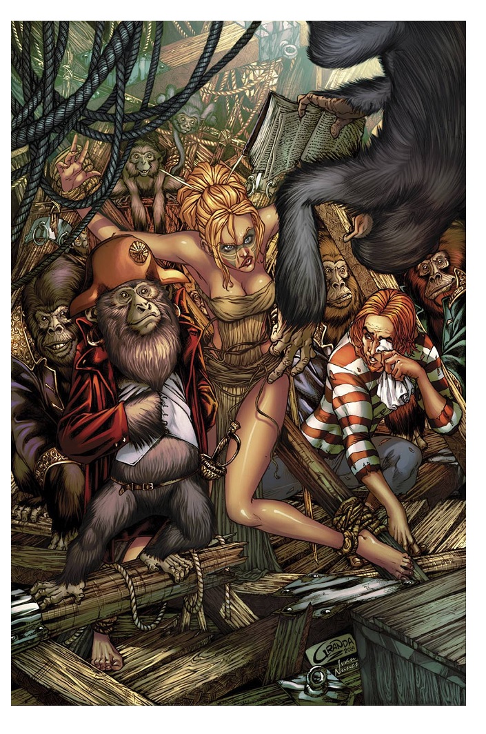
JUNGLE BOOK: FALL OF THE WILD #3
Writer: Mark L. MillerArtist: Michele Bandini
Publisher: Zenescope Entertainment
Reviewer: Matt Adler
With the third issue of its last miniseries, Mark L. Miller’s JUNGLE BOOK saga is running headlong into what looks to be a (literally) explosive conclusion. We’ve been following the war between the animal tribes of Kipling Isle since the first JUNGLE BOOK miniseries, but one of the chief unanswered questions has been the origin of the four human children who were stranded in this mythical place and each adopted by different animal tribes.
We’re not there quite yet, but no worries; in the meantime we can enjoy the wall-to-wall action of this issue, starting with the impending threat of monkey-lovin’ that Akili, the adopted daughter of Tribe Tavi, is facing at the hands of King Louis, leader of the apes. Louis and his clan (and their adopted son Dewan) are welcome comic relief amidst the bloodshed and catastrophe that is afflicting Kipling Isle, and the way Akili deals with them is clever.
And Miller’s take on Kaa, the proverbial serpent in the garden, gives artist Michele Bandini the opportunity to draw a truly horrific monstrosity, and wonderfully gory scenes of the fight against him.
I’m very much looking forward to learning more of the background of this rich and intriguing world Miller has built, and the cliffhanger ending, with the kidnapping of Mowglii by a madman and the sudden appearance of a pirate ship, strongly hints we’ll be getting just that in the final two issues.
Don’t miss out.
Matt Adler is a writer/journalist, currently writing for AICN among other outlets. He’s been reading comics for 20 years, writing about them for 7, and spends way, way, too much time thinking about them, which means he really has no choice but to figure out how to make a living out of them. He welcomes all feedback.
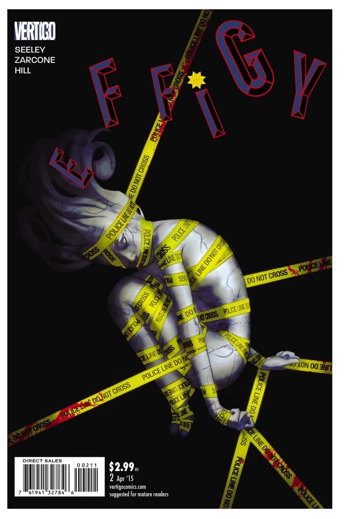
EFFIGY #2
Writer: Tim SeeleyArtist: Marley Zarcone
Publisher: DC Vertigo
Reviewer: Morbidlyobesefleshdevouringcat
With the rise of more progressive ideologies and movements it can be difficult to discern honest intent behind art, besides of course wanting to actually have the art sell. Comics is definitely a medium where these progressions keep doing just that, move forward, but it’s getting to a point where it’s hard to differentiate what’s placed on shelves simply because of marketability or if these writers and artists are only creating stuff to pander to the current demographic. In many of these cases, because of this the story lacks substance, but Vertigo’s EFFIGY is not one of them.
Set in Effigy Mound, Ohio, EFFIGY follows Chondra Jackson, a former child star now turned amateur cop, and pairs her with Detective Grant Moore, where the two become involved in a morbid murder case. Found in a literal effigy mound, a raised pile of dirt usually moulded into a specific shape or symbol for religious purposes by local Native American tribes, is a completely dried up female body. The only clue thus far to the girl’s identity is the back tattoo she dons, a star that was prevalent on the show that Chondra used to star in herself.
Leaving off from the introduction of Officer Jackson to Detective Moore and the new body, issue two jumps right in with smart, quirky dialogue. Without giving too much away, the comic incites current political transgressions without being brash or in your face as the two roam around looking to piece together the victim’s identity. David Simon, creator of THE WIRE, is also mentioned by Detective Moore while conversing with Jackson, making EFFIGY the more intriguing and exciting, because if you’ve seen THE WIRE and are aware of its lack of hand-holding, something not really seen from a crime show, then we can only hope that EFFIGY continues on aptly on a similar route.
What initially grabbed me, though, was the art--more specifically Ryan Hill’s coloring. It’s flat, but doesn’t feel that way with the warm pastel palette that is occurring. They're oddly bright, especially during the initial introductory crime scene--a complete contrast to the dark and morbid plot, and honestly makes the comic something like a black comedy. It’s disturbingly lighthearted in a way.
At the same time, Marley Zarcone’s inks are prime as his character placements are intriguing, with composition that ensures the eyes are constantly moving; they never feel dull. The backgrounds are well thought through, either using background to focus on the average mundane of what the characters are doing or completely disregarding it at all to focus on the dialogue or incredibly expressive reactions to what is about to happen. What surprised me most about the art was that Zarcone stayed away from gore. Rather than draw attention to the dried up body, Zarcone engages the audience through character reaction. He is also superb at introductory scenes, making sure each one has a sort of foreshadowing to the upcoming events.
The only real complaint I have with the comic is the covers thus far. They don’t do any real good for promoting the comic as what its contents may be, which is a shame because W. Scott Forbes is a fantastic cover artist--TWENTY SEVEN, anyone? Those were fantastic. The covers for EFFIGY just don’t do either the comic or Forbes any justice.
Otherwise, this is a comic I definitely would love to see more of.
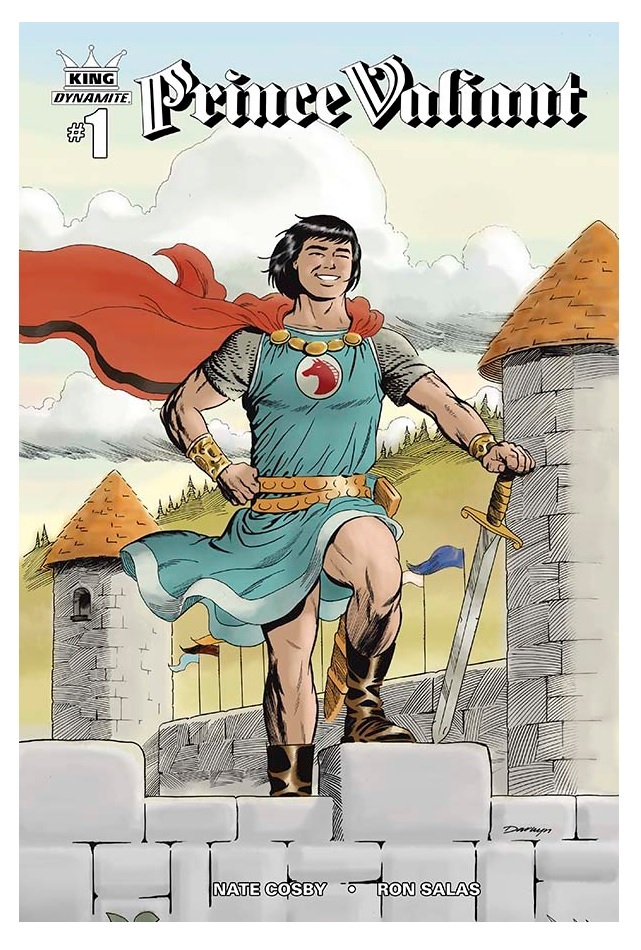
KING: PRINCE VALIANT #1
Writer: Nate CosbyArtist: Ron Salas
Publisher: Dynamite Entertainment
Reviewer: Masked Man
There is perhaps no more revered comic strip to illustrators, and fans of illustrators, than PRINCE VALIANT, mainly because of its creator, Hal Foster, who wrote and drew it from 1937 to 1970 (health issues slowly prevented him from working on it altogether by 1975). Foster is one of those artists people refer to as an artist’s artist, as in an artist most artists wish to draw like. And while many artists today might barely know Hal Foster, chances are their artistic idols worship at his feet. So there is no way to overstate Hal Foster's impact on the comic book world. Oddly enough, Valiant himself has never made much of an impact in comic books, but with Dynamite's new working arrangement with King Features (Prince Valiant's rights holder), well, they'd be crazy not to try it!
To quickly get people up to speed, although I'm no expert, PRINCE VALIANT is a King Arthurian adventure of a young Prince who is a squire to Sir Gawain, Arthur's nephew. Gawain is one of Arthur's real bad@$$ knights, so Valiant is always around the action. And like THE YOUNG INDIANA JONES CHRONICLES or JOHNNY QUEST, he often finds himself in the heat of the action, and without the duties and restrictions of more important characters, it often falls to him to get things done. While not a full knight, his life's ambition, Valiant can handle himself like a pro in any battle. As the series progressed, Foster would push to make this fable more and more realistic with his epic and elegant artwork and historical knowledge.
In 2015, Nate Cosby brings us a fresh new take on Prince Valiant, making him a foolhardy adventure lover and hothead who often leaps before he thinks. Unfortunately, none of it comes across as anything particularly interesting, although he does have some kind of mysterious subplot going on which could grow into something worthwhile (note--this series is supposed to be part of the great KING line, which is based on the KINGS WATCH series where Ming the Merciless attacks Earth in the 21st century), but it's way too early to tell what Cosby has planned.
I'm not sure what promises were made when Ron Salas was hired as the artist. His website is covered with some awesome looking art. Unfortunately, none of it makes it into this comic. Many of the layouts, storytelling and scope of the panels are great, but the finished artwork looks rushed and inelegant. The final page looks more up to speed, so there might be a storytelling technique being employed to go with the mysterious (floating eye and all) angle of the story.
Lastly, I'll mention the fine cover by Darwyn Cooke, who even employed a little fine hatching technique, in homage to Mr. Foster, I assume (I can't imagine why anyone would want the variant Rob Liefeld cover, though to be fair it's better than his FLASH GORDON cover (yikes!)). So not a killer first issue; some improvement is needed in the next issue before I recommend this for anyone's pull list.
Proofs, co-edits & common sense provided by Sleazy G
 The next level of comic book excellence is a click away at BLACK MASK STUDIOS!
 Want more in all things Geek?
Check out our friends at PoptardsGo for podcasts, reviews, and more!
 And if you still need more geek in your life, check out Part-Time Fanboy for more geeky goodness on comics, movies, and more!
Finally, check out AICN COMICS on Facebook and Comixpedia!