
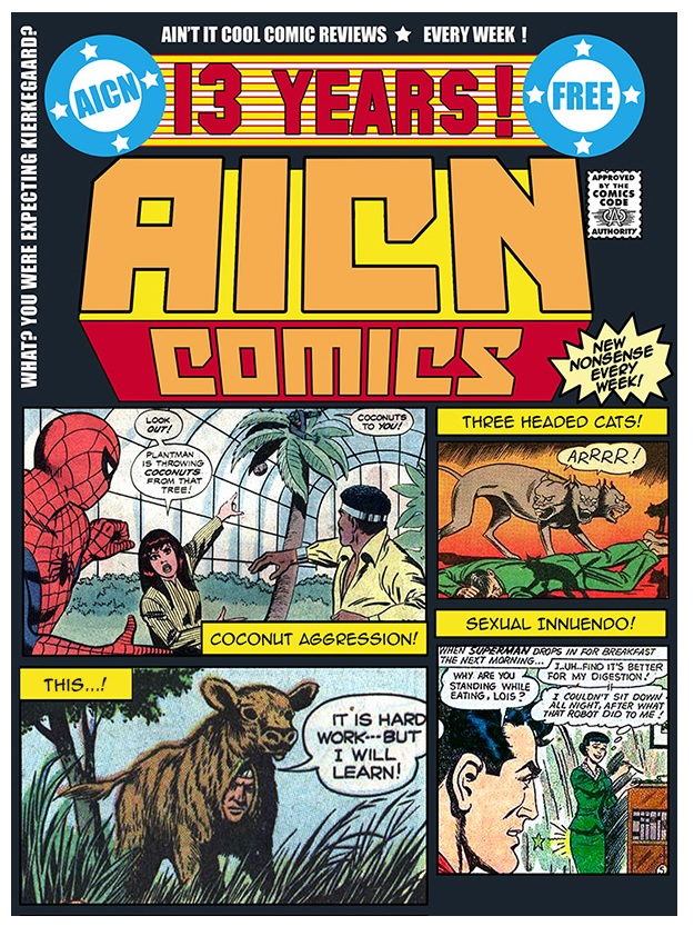
(Click title to go directly to the review)
Advance Review: GRIMM FAIRY TALES PRESENTS THE LITTLE MERMAID #1
STAR WARS: DARTH VADER #1
FATHOM: KIANI #1
Advance Review: DINO D-DAY #1
SECRET SIX #2
DEEP STATE #4
THANOS VS THE HULK #3
Advance Review: SHERLOCK HOLMES & HARRY HOUDINI #4
 In stores next week!
GRIMM FAIRY TALES PRESENTS: THE LITTLE MERMAID #1
Writer: Meredith FinchArtist: Miguel Mendonca
Publisher: Zenescope Entertainment
Reviewer: Lyzard
When I heard that Zenescope was releasing GRIMM FAIRY TALES PRESENTS: THE LITTLE MERMAID, I couldn’t wait to see how they would ruin it. I guess that sounds a bit harsh because I don’t mean to say I expected them to churn out a piece of crap comic. Instead, I was anticipating a series that would scar my image of the Little Mermaid. After all, I’m a child of the 90s and even after reading Hans Christian Anderson’s version, the Disney classic is still canon for me. Surprisingly, Zenescope decided not to go in a direction that would mutilate my childhood.
In this version of THE LITTLE MERMAID we’ve got a bit of a gender bender, and mad scientists, but the diva villain remains. Twenty years ago, Ms. Fisher (yeah, they went there) was rescued at sea after a tumultuous storm, saved by a mysterious merman. Presently her daughter Erica is stuck in a prison/lab, forced to undergo grueling experiments, but her mother is unaware of her whereabouts--that is, until she gets a visit from an old multi-limbed acquaintance.
I actually found the storyline rather refreshing. Recognizable, yes, with a bit too much familiarity to the abomination that is the Disney sequel, but the references aren’t as corny as the names and there are a few dark twists up writer Meredith Finch’s sleeve.
And we can’t talk Zenescope without talking about the art. We all know how this goes. The women are drawn with as little clothes on as possible and placed in suggestive positions. THE LITTLE MERMAID is no different, but frankly, if there was any fairy tale that wouldn’t be hampered by this “design” choice it would be one in which the main character’s already more than half naked. But let that not distract you from Miguel Mendonca’s layouts. Nearly every panel has wavy curvature. Sometimes it is something as simple as curly strands of hair or the frame of a boat. However, there are more interesting uses like the clouds in the sky that resemble the crest of waves, the bend of a palm tree, arched ceilings, the concave walls of surveillance videos in the evil lab, and even the shape of several panels. It’s little details like that which should be mentioned when you talk about the artwork in this Zenescope book. Speaking of detail, with the help of Ivan Nunes’ perfect color blending, Mendonca’s impressive linework in each and every layer from foreground to background and reflections is worth a second or more read-through to truly appreciate what they have done here.
In the creator interview featured at the end of the issue, Meredith Finch admits that Walt Disney’s LITTLE MERMAID is her all-time favorite movie. I much prefer BEAUTY & THE BEAST, but at least this allows me to draw as many references as I want to the animated version. For instance, the depiction of…well, a lot of the characters are referred to by name in this issue, so I’m just going with “Deepwater Diva.” She’s got the attitude, the sass we all recognize, but with the Zenescope treatment when it comes to character design--though here, again, it works. The contrast of personality to look in the Disney film was a grand choice, but a witch with flair is effective as well.
I’ve never disliked issues of Zenescope’s GRIMM FAIRY TALES in the past, but I’ve never been particularly fond of the series, either. THE LITTLE MERMAID is the type of comic I wouldn’t be embarrassed to have found lying around my apartment…though with it open to the first page so as to entice my male friends to actually read it, not just stare at the cover with a kooky smile on their face.
Lyzard is Lyz Reblin, a graduate student at the University of Texas pursuing a master's degree in Media Studies... which is just a fancy way of saying she plays a lot video games, watches far too many horror films, and then tries to pass it all off as "research."
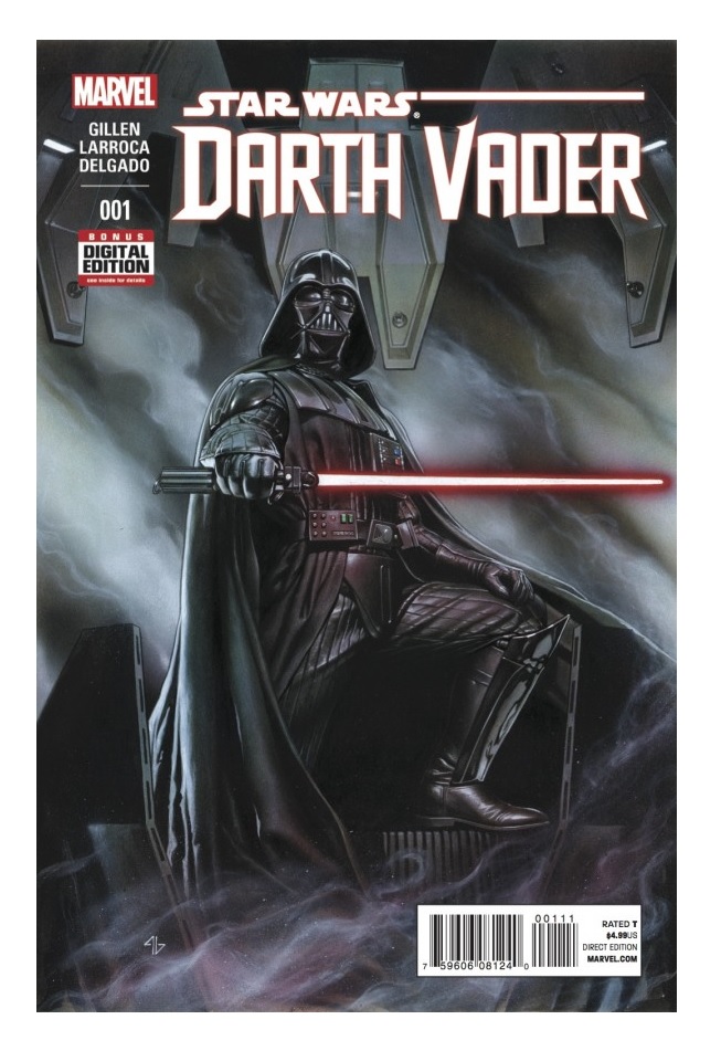
STAR WARS: DARTH VADER #1
Writer: Kieron GillenArtist: Salvador Larroca
Publisher: Marvel Comics
Reviewer: Mighty Mouth
Unless you just woke from a coma or something, you know that Star Wars recently made its return to Marvel Comics in a big way. With the Star Wars comics homecoming various solo titles featuring characters from this galaxy far, far away were announced. The first of these to be published focuses on the Dark Lord himself, Darth Vader.
First I just want to say that I am sooo glad this latest batch of Star Wars titles is set between “A New Hope” and “The Empire Strikes Back”. If you cast your memory back (or just pop in the Blu-Ray), “Episode V”’s crawl tells of a dark time for the Rebellion as Imperial troops pursue them up and down the galaxy, causing them to scatter before establishing a new base on the frigid planet Hoth. This is easily the best era in the Star Wars canon to explore.
The story opens with a sequence paying homage to Luke’s meeting with Jabba the Hutt, only this time it’s Vader who seeks an audience with the slug-like crime boss. Jabba warns that “mind trick won’t work on him”, and Vader makes it clear that his negotiating methods are…well…more absolute. The exchange between Jabba and Vader is easily the highpoint of this issue. The rest of the story is told in a nonlinear fashion, I guess as an attempt to make it more interesting, leading up to Vader’s visit.
Gillen manages to articulate a level of complexity to Vader and Palatine’s relationship not seen before. With the destruction of the Death Star, Vader’s quickly climbing Palpatine’s shit list. Badass as he may be, Vader knows better than to challenge his master. Though Vader may seem obedient, it’s clear he’s not wholly content being the emperor’s lapdog. It appears the early stages of Vader’s diverged psyche, or “the conflict” as Luke refers to it in “Return of the Jedi”, is set in motion. Larroca’s art pleases and sets the right tone. The splash page of Vader’s meeting in Jabba’s palace is most impressive, and by the final page there can be no doubt that Vader still detests the Tusken Raiders.
The thing that’s problematic with this tale is that for all intents and purposes, it’s still a prequel story. Expanding upon how things came to pass can always be entertaining, but when not handled properly, it can be incredibly anti-climactic. Then there is the whole business of this story immediately following the events of the newly launched STAR WARS issue #2. This essentially makes it as much of a tie in as it is a standalone story.
DARTH VADER #1 fuses just enough innovation while also remaining faithful enough to the source material to make me care slightly. I’m not entirely convinced DARTH VADER merits or will even sustain a monthly title, especially with the new STAR WARS comics featuring Vader as the primary antagonist. But hey, this is Star Wars, and full-on saturation has been the name of the game since 1977.

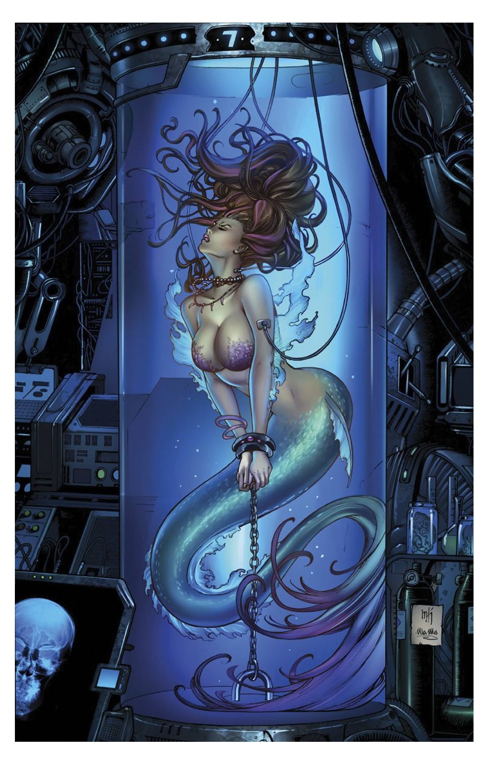
FATHOM: KIANI #1
Writer: Vince HernandezArtist: Giuseppe Cafaro
Publisher: Aspen Comics
Reviewer: Masked Man
Here we go with volume four of KIANI, the hot blood warrior from the Blue (a secret/advanced society of water-breathers) who seems to do nothing about get into fights with the surface world. Oh, and if you were looking for Aspen, the character we all think about when we think about the late Michael Turner's FATHOM, she's not in this, just so ya know.
Building on the last three volumes, Kiani has come in contact with her long lost sister Anika, and in some ways they are trying to figure out what to do with their lives now. As they ponder this while hanging out in Somalia, the US military attacks Somalia (and the girls), because that's what they do.
As a first issue, Hernandez does a fair job for bringing everyone up to speed with the background and setting up the latest plot, which is a bit of more of the same, aqua-heroes at war with the US military, the difference here being…well, there is no difference, except that Kiani is now with Anika.
Giuseppe Cafaro is a fine cover artist, and a good interior artist who really captures the feel of Michael Turner's art style, although, he does seem to get lazy sometimes (hey, I'm not making him get crazy detailed—besides, you don't see George Perez going “ah, screw this unimportant panel”). His storytelling could be stronger too, as in staging panels better to more clearly and with more emotional impact tell the story. But overall he does a good job, and can draw the attractive women required by in series.
For the most part the story is engaging enough, with the two sisters getting to know each other, dealing with what a poor village thinks of their godlike powers, plus what the US Military will do to their perceived 'threat level', although while I'm fine with making the US military the villain, it does come off rather heavyhanded and rather illogical. I mean, when Scott Snyder was doing this in SUPERMAN UNCHAINED, he didn't just have the army come in with tanks to shoot at Superman thinking “well, tanks can't hurt Superman, but maybe this one will.” The slightly canned drama aside, the best thing the story has going for it is the overall clash between the mysterious Blue and the surface world, which has fueled the FATHOM series (well, that and hot women).
Any FATHOM fan, of the world more than Aspen herself, should enjoy this title, and anyone looking for something different would probably enjoy this too, even though at its heart it's pretty standard fare.

 Coming soon in March!
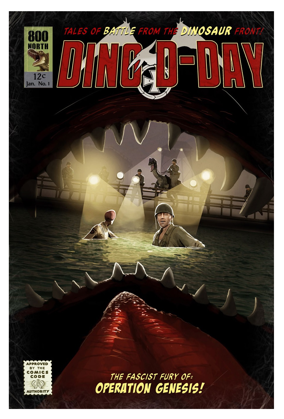
DINO D-DAY #1
Writer: Gregory R. LittleArtist: Brian L. Ulrich
Publisher: 800 North
Reviewer: Lyzard
While we all wait for what craziness “Jurassic World” has in store for us, DINO D-DAY brings us some old-timey lizard mayhem.
Pretty self-explanatory. Dinosaurs. D-Day. Pop culture has attributed everything from vampires, werewolves, and robots to zombies to being the Nazis’ secret weapon, so why not prehistoric monsters? In this comic series we follow Colonel Nigel Blythe-Crossley and Captain Jack Hardgrave as they investigate a mysterious Nazi compound on the French coastline. What nefarious plot can the Krauts be planning this time that is more deadly than raptors armed with machine guns and triceratops with tank cannons on their backs?
The video game of the same name is in the vein of Team Fortress 2--just Axis versus Allies rather than red versus blue and with the addition of dinosaurs, of course. Dinosaurs that can spray you with acid, snipe ya, and just overall are pretty OP in the game. Compared to others of its ilk on Steam, DINO D-DAY is pretty raw. It doesn’t have the distinct visuals like the cartoony style found in TF2 or Loadout, though the gameplay is solid.
The comic, on the other hand, feels much more developed artistically. The full-color layouts were done by Tommy Lee Edwards and while they are composited well, credit has to be given to artist Brian L. Ulrich for bringing Edward’s work to life with such verisimilitude.
If you’ve played the game you’ll recognize the props, characters, and environments which were taken directly from the title. The transition from 3D video game to 2D virtual comic book is incredibly seamless, and with the comic being presented in a digital format, the reader is given the ability to switch between Edward’s work and the finished product.
This first issue is only eighteen pages, but they are a long eighteen pages. Writer Gregory Little has a knack for dialogue, but is at his best when jesting with one-liners and rat-a-tat-tat exchanges rather than packing dialogue bubbles till they nearly burst. Imagine a video game with a long cut scene you can’t skip. The break will contain important information and could be well-written, but you just can’t wait to move on and start killing stuff.
The humor present in the game can be found here in the comic. With goats that are essentially red shirts and sneak attacks a-plenty, reading DINO D-DAY is a rather similar experience to playing the game, except that Little has a much wider and more mature vocabulary than what your teammates will probably use.
The downside is the current release format of the comic requires purchasing the game as well. Depending on how many issues are written, though, you’ll probably come out ahead financially as compared to the cost of other indie series.
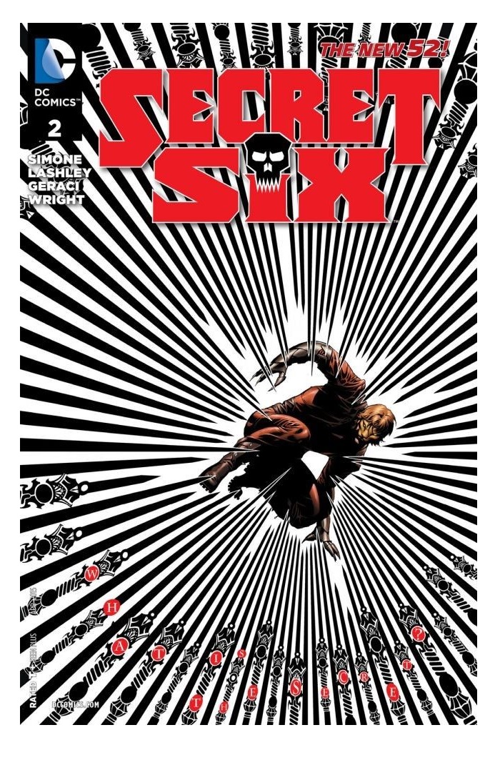
SECRET SIX #2
Writers: Gail SimoneArt: Ken Lashley
Publisher: DC Comics
Reviewer: DrSumac
The pre-New 52 SECRET SIX was probably my favorite comic series that I've ever read. It may not have been as artistic or high art as a lot of independent books, and it may not have been the most popular title out there, but as far as comics that could invoke a response from me there are few that come close. It was not uncommon for me to laugh out loud on one page only to gasp in horror a few pages later, and that doesn't even get into the strangely emotional relationships the series had, plus the characters were very different from anything else out there and for the most part they were each lovable in their own way.
I'll admit that I resented the New 52 for canceling the original series and effectively banishing some of my favorite characters into nonexistence. Fortunately, the return of the Secret Six also heralded the return of two my favorites: Catman and Black Alice. Since it's the New 52, though, everything has to get changed a bit and we still don't entirely know what that means, but with Gail at the helm I'm still confident it will turn out well.
Issue #1 of the new SECRET SIX went way too quickly for me. I'll admit that it didn't seem to have the same spirit as the original series, but it was also more of a story and character set up than anything else. The art was probably my least favorite part as it was kind of muddy, which made it hard to tell what was actually happening from time to time. All of the girls on the team also looked very similar when they weren't at the forefront of the page, which made it hard to tell who was doing or saying what. Catman even seemed like he was some kind of were-cat, which would be disappointing.
Number two is much better by comparison. I almost wonder if the two month delay between one and two was because they wanted to change things in response to criticisms of the first issue. It's more likely they wanted to release it at the same time as the first volume of the new collected editions of the old series, which you should check out, by the way.
Compared to the first issue, the art seems to be much more straightforward without losing the unique and stylized approach that worked previously. We also got some background on this new version of Catman and got to see the others in action, including Black Alice. Ventriloquist even officially took over Ragdoll's role as the disturbingly weird yet charmingly humorous team member. Gail has also teased that Scandal may come back in this series, and I think we may have gotten some hints on that here as well.
Suffice it to say if you were a fan of the old SECRET SIX you'll probably like this issue. If you didn't like the first issue for any reason I would urge you to give it a second shot. I myself felt apprehensive at first, but it looks like Gail isn't going to let me down.
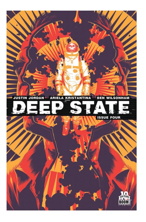
DEEP STATE #4
Writer: Justin JordanArtist: Ariela Kristantina
Publisher: BOOM! Studios
Reviewer: Morbidlyobesefleshdevouringcat
I had the opportunity to dissect the previous issue of DEEP STATE, and now I get to squeal about the comic all over again by doing the same thing with the latest release. I was fairly certain that the third issue was the prime comic, the one that really made it for me, but now, now I’m not so sure because issue four has me ignited and honestly wishing for the next one to be released. Not going to even bother with hints here: if you haven’t already, you need to start reading DEEP STATE.
The first thing of note is the pace: it moves fast--almost excruciatingly fast, as a slew of events are uncomfortably but intentionally condensed within it. Of course, with page limitations it’s sometimes difficult to achieve full audience participation with just basic literary and visual art techniques, and so Jordan and Kristantina have adjusted the plot movement to intuitively coerce us into feeling the dirt and grime situation that Harrow and Branch are currently in. It’s frickin’ great.
So let’s backtrack: where are they now? Harrow let himself be captured by the foreign organism that is currently turning the inhabitants of Pennsylvania into radio-controlled zombies, and Branch is left to investigate the radio tower that could possibly be controlling said zombies. Without getting too spoilery and revealing too much, let’s just play a basic run of the current issue: back history of the alien revealed, there is some great exposition focusing on Harrow, Branch kicks some zombie ass using her supposedly useless electrical engineering degree, and well, unfortunately this is where we do have to get spoilery, but the pair are able to destroy the alien and the first arc of DEEP STATE ends there.
Unfortunately, this does feel slightly abrupt as it is only the fourth issue, and I do sort of wish that they hashed out the battle with the creature for a bit longer, perhaps imbued some more human experiments, or, you know, something along those lines. But that doesn’t deter how much more is to come, as the ending, which as a decent human I will not reveal, is fairly gut-wrenching. All I can say is that it’s a gooder.
This issue isn’t any different when it comes to quirky, organic dialogue while still pushing philosophical nuances without getting too preachy or pretentious. Once again, Kristantina really outdoes herself when it comes to deep, stimulating environments. Although her sketchbook style art may at first glance appear offputting and amateurish, once you actually start delving into the comic you will understand that it’s far from it. Her panel choices and composition are still my favorite, as it’s clear that is where her expertise lies, and when you throw in Wilsonham’s colors, the space and action scenes are mesmerizing while at the same time completely terrifying.
Overall, the DEEP STATE crew currently have me sitting idly, slightly anxious wondering where Harrow and Branch are going next. I just hope you decide to join in.
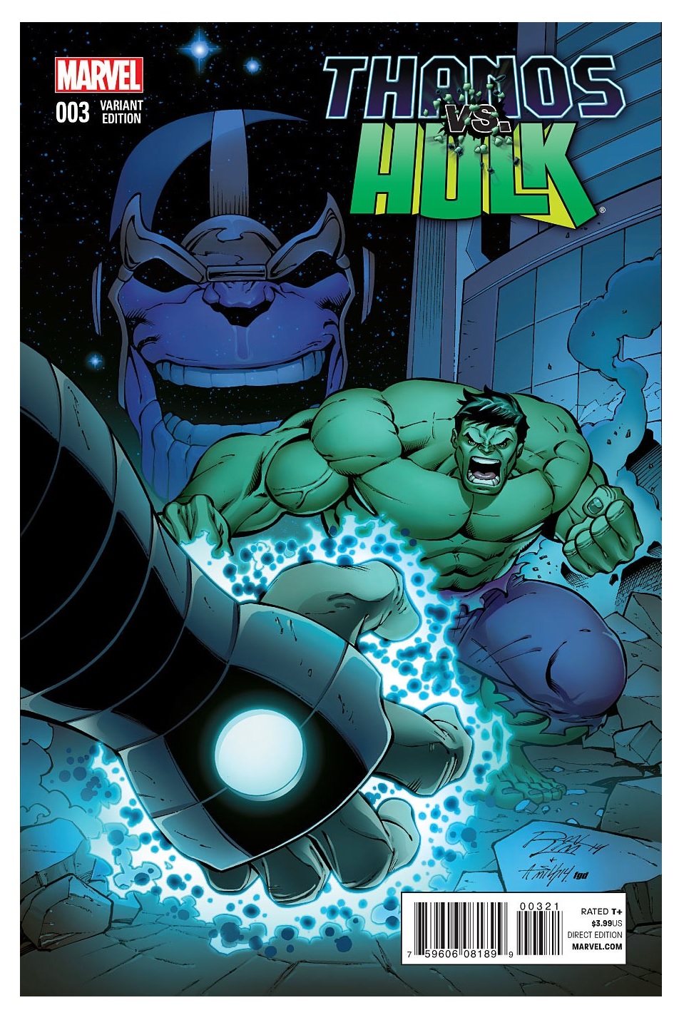
THANOS VS HULK #3
Writer / Artist: Jim StarlinPublisher: Marvel Comics
Reviewer: Masked Man
Well, I suppose it shouldn't be too surprising that THANOS VS HULK isn't much more than a fight book. It reminds me of the animated DVD HULK VS. movies, which were more about watching The Hulk fight someone than actually telling a story about The Hulk fighting someone. The lack of story usually robs the fight of any meaning and fond remembering.
Breaking this miniseries down, the first issue set up the situation. Then the following issues had The Hulk slugging it out with someone. Issue #2 had the slugfest with Thanos, this issue is a slugfest with Blastaar, and the next issue is a slugfest with Annihilus. And that's about it for this series—heck, top-billed Thanos isn't even in this issue.
At best, I suppose this is another set up storyline for Starlin, just as THANOS: THE INFINITY REVELATION's main goal was to set up Thanos and Adam Warlock in the Marvel U the way Starlin wants them. Now Starlin has Annihilus the way he wants him (spoiler time--as he grows a new super bad@$$ body from Hulk physiology (since he was tired of being in a teenage body (see ANNIHILATION))) too. Which, hey, I'm down with, Thanos vs Annihilus is a much more interesting fight card to me than Thanos vs Hulk. I just hope Starlin gets to really tell that story.
So what happened with all the set up from issue #1--Pip the Troll kidnapping The Hulk for Annihilus, telling Thanos about it to set up a fight between the two, so Pip could then rescue The Hulk (effectively playing both sides for his benefit)? Well it all just really, really slowed down, and with the plot not moving, we can have our big fights. So let's talk about this issue's fight: Hulk vs Blastaar! Overall it's nice and everything, but part of me can't help but compare it to a Jack Kirby fight. Mind you, Starlin has done some awesome fights, but here everything is just too clean--clinical. Kirby would have had these two brutes just really ripping into each in a much more satisfy manner, rolling around like an old black and white POPEYE cartoon, destroying everything in their wake. I'm also not a fan of Blastaar's new look (which is not Starlin's design). He looks too civilized, with his braided hair and all--what happened to the “Living Bomb Burst”?!? Even his energy blasts look wimpy here. Now, it is still a good fight, but as the focus of the book, it should have been better. Lastly, pet peeve time: Starlin makes a big deal to point out Blastaar is wearing jet boots, and even draws little jets on them. Fine, but then you have to have them behave like jet boots--as in, if the boots are pointing one way, then Blastaar has to be traveling the other. They just don't give Blastaar the ability to fly like Superman.
So as with HULK VS., I was a bit disappointed with this issue and series, though I'd still recommended any rock 'em-sock 'em Hulk fan pick it up. For the record, the fight with Thanos in issue #2 was better, so I'm hoping the Annihilus match with be better too. I'd also like to see Starlin do more with the story, or at least hint on where this is all going next- so we can know it's all worth it.
 In stores next week!
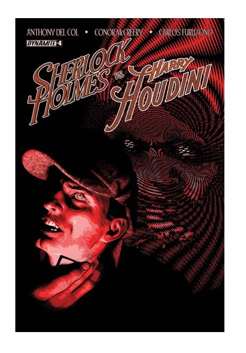
SHERLOCK HOLMES VS. HARRY HOUDINI #4
Writers: Anthony del Col & Conor McCreeryArtist: Carlos Furuzono
Publisher: Dynamite Entertainment
Reviewer: Lyzard
The penultimate issue of SHERLOCK HOLMES VS. HARRY HOUDINI has arrived and where the last book left us on edge, this time the story finally jumps. The pacing has sped up, the banter is faster, and the action outweighs those moments of witty talking heads.
SHERLOCK HOLMES VS. HARRY HOUDINI #4 starts out with Houdini stuck in prison, his wife in the hospital, and Holmes on a bender. Their inability to put their two genius minds together and stop Rasputin has led to multiple deaths and loss of faith from local law enforcement. It is time for them to put their egos aside, not to lower themselves to the status quo, but to accept that both of them are far superior in their own unique ways that most mere mortals and even more so working side by side.
This time around there is much of the same. McCreery and del Col rarely pass up an opportunity to be witty, and Furuzono still shines best in close-ups and action shots rather than darker panels and those in deep focus. While the fourth book in the series contains all the elements that can be found in past issues, it moves along with such propulsion that the writing never drags and the pages lacking detail are fewer and farther between. There frankly isn’t time for any waste.
With such momentum I expect nothing less than a typical McCreery and del Col conclusion: one that leaves me wondering why I ever questioned the quality of the comic in the first place.
Proofs, co-edits & common sense provided by Sleazy G
 The next level of comic book excellence is a click away at BLACK MASK STUDIOS!
 Want more in all things Geek?
Check out our friends at PoptardsGo for podcasts, reviews, and more!
 And if you still need more geek in your life, check out Part-Time Fanboy for more geeky goodness on comics, movies, and more!
Finally, check out AICN COMICS on Facebook and Comixpedia!