
(Click title to go directly to the review)
Advance Review: SECRET SIX #1
JUSTICE INC. #4
DEATHSTROKE #2
Indie Jones presents FIGHT LIKE A GIRL #1
DEAD LETTERS #6
SECRET ORIGINS #7
Indie Jones presents THE ADVENTURES OF TRACK SUIT MAN #1
 In stores today!
SECRET SIX #1
Writer: Gail SimoneArtist: Ken Lashley
Publisher: DC Comics
Reviewer: Optimous Douche
SECRET SIX was always a dalliance for me. The series had its heyday when I was a regular ol’ comic collector before this review gig started in late ’07. While I love Miss Simone and long-term artist Jim Calafiore, my promise to Mrs. Douche of mortgage work before comic work left SECRET SIX out of my secret pull stash each week.
I met up with Calafiore at Wizard World Philly last year. He was there pushing the book MEGALOPOLIS, a tale that he and Gail Kickstarted as retribution for the New 52 stealing away their fertile playground of villains on missions. I have never asked for a comp in my life and I never will, but this was one time I was willing him to show interest in Ain’t It Cool or li’l ol’ Optimous Douche’s take on the title. Alas, he cared about neither, but he did drop the bomb that there were rumblings of a SECRET SIX resurgence despite the fact SUICIDE SQUAD was clearly the darling of the dastardly side of the New 52.
I am so glad I missed out on the magic of SECRET SIX in its prior form. Gail has never disappointed me on a book, and I know my fervor for SUICIDE SQUAD would have been squelched were I comparing the SECRET SIX of yore to Waller’s band of villains.
Why does this trump the current DC black ops team? Mystery, for starters. Waller’s Suicide Squad had their Machiavellian mission in life splayed across the table from issue one. SECRET SIX opens with a very violent and funny abduction of Catman at a honkytonk while he is trying to unfold Flo’s “yellow rose”, and that’s the most transparent part of the mind-fuck that awaits some of DC’s best B tracks.
Gail is also the only writer who can make the setting of a flawless metal box interesting. Three quarters of the issue was spent with Catman coming to as he is surrounded by his new teammates Porcelain, Big Shot, Strix, Black Alice and Ventriloquist. The way Catman meets the Batgirl transplant is Simone at her finest conveying one part icky, one part intriguing and one part WTF is under that hospital gown with a scant few words.
Of course, Lashley was another source of instrumental enjoyment in this piece and his Murphy-like loose lines are a perfect juxtaposition to the other hyper-stylized affairs we have seen in main continuity. Honestly, I thought I was reading a Vertigo book for many panels.
Masks are doled out and the team has at least determined that their confines are, as Sebastian once said, “unda da sea.” That’s it, though. Generally I would rail on a book for being so scant on details, but Gail gave each character such authenticity, I am fully vested in the outcomes of their fate in the first arc and very intrigued to see if they can be integrated into the New 52 without being appropriately neutered to entice showrunners.
All of my anger about BATGIRL losing her Yahweh to breathe her life are now a scant memory wrapped in a secret I am thrilled to see promised as brand new inside the back cover letter column. If you like your DC dark, don’t be fooled by the word simply being on the cover. SECRET SIX is where the truest house of mystery lies at DC right now.
When Optimous isn't reviewing comics he is making the IT words chortle and groan with marketing for MaaS360, Enterprise Mobility Management. He also has a comic coming out sometime soon, for updates head to robpatey.com.
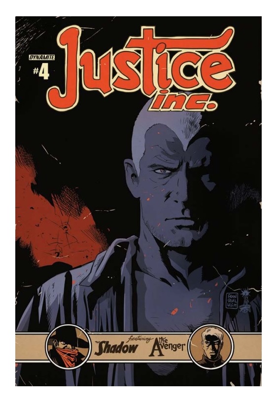
JUSTICE INC. #4
Writer: Michael UslanArtist: Giovanni Timpano
Publisher: Dynamite Entertainment
Reviewer: Masked Man
Dynamite has done a lot of good bringing the pulp heroes back to comics. After the big crossovers MASKS and THE SHADOW/THE GREEN HORNET crossover (by Michael Uslan), I was really looking forward to JUSTICE INC. featuring the first time ever team-up of The Shadow, Doc Savage and The Avenger. Unfortunately, as you may have guessed from my wording, it’s a messy misfire.
I'm not even going to try and bring you up to date with the story, because honestly Rick Remender's UNCANNY AVENGERS was easier to follow. In a nutshell, though (spoilers, fool), 2014 Doc Savage creates a wormhole back to 1939 with the Universal Quantum Machine and meets his younger self. 1939 classic Doc Savage villain John Sunlight has enlisted the help of Shadow villain The Voodoo Master to steal the UQM and conquer the world. Along the way they have corporate dealings and kill the family of rich businessman Richard Benson and launch a preemptive attack on The Shadow (since they knew this would all happen or something). Doc Savage and The Shadow train Benson to become The Avenger and the three hope to defeat the bad guys. That's a nutshell?!?
Ok, let's mention a few things not needed in this story. The Universal Quantum Machine from 2014, Doc Savage from 2014--basically the whole 2014 angle can and should have been dropped, as all time travel stories can get massively confusing if they aren't well thought out. Next let's dump The Avenger’s origin, as it makes little sense in the grand scheme of the plot (as I barely understand it). It just slows down the story as we have to spend time getting to know Benson, his family and reason to be. Save that for the spin-off series or a one-shot crossover I would have gladly bought.
Another point of confusion, I believe, is Uslan's special sauce--that is, historical and nerd facts dropped through out the story. Where this worked great in THE SHADOW/GREEN HORNET: DARK KNIGHTS, here, I feel Uslan is working too hard fitting in Albert Einstein, Howard Hughes, the Huns, the Hotel Astor, a Coney Island ride, etc. If the plot is confusing then all this will make it more confusing.
Now as we've crossed the halfway point of the story, we've settled Benson as The Avenger, and have had our first battle royale with the bad guys in Doc's fortress, which confuses me because I thought Doc only had one fortress--the one of solitude. So which one is this? The fight is all rather confusing and poorly choreographed. It ends with the villains claiming victory (literally saying we won), taking the UQM and telling the heroes they can gather any equipment they need and leave before the villains blow up the fortress. The heroes of course agree to this…wait, what?!?
Timpano's artwork for the series started pretty strong, but it's been getting weaker as it goes. I'm curious if the scripts are just as hard for him to read as us. For some reason, The Shadow is dressed in a swami outfit and Doc Savage is seriously jacked on ‘roids, being very short, thick and covered in veins. His layouts did little to clarify the big fight scene, and his two page spread on pages 10 and 11, which are quite Frank Quietly-like, is just some odd looking dimension doors and floating people.
Quite simply, Michael Uslan (and Giovanni Timpano) are better than this. I suppose Uslan (who was very excited to work on this series) was just trying too hard to make this story all that and a bag of chips, and it got away from him. While I still look forward to the next project from him and Dynamite, with these characters JUSTICE INC. itself really disappoints.

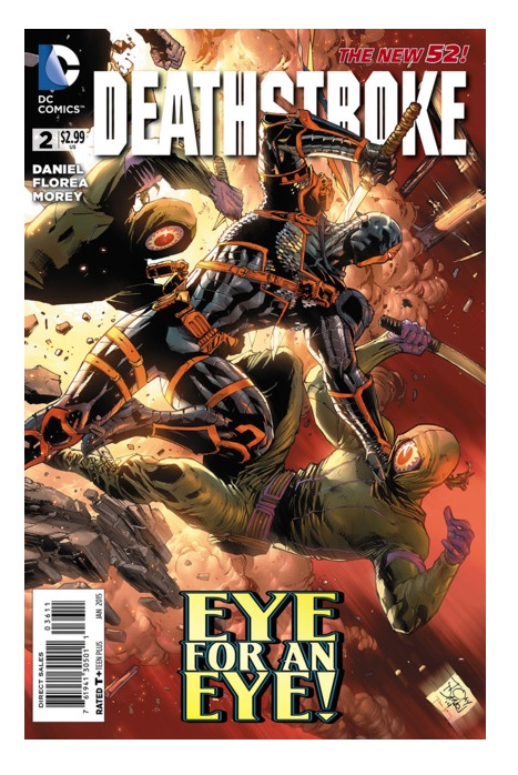
DEATHSTROKE #2
Writer: Tony DanielArtist: Tony Daniel
Publisher: DC Comics
Review: Mighty Mouth
Slade Wilson is back. He’s got a new body, new foes and, much like me, no idea as to what the hell is going on. Handled well, a story that unravels can be a very effective way to hook a reader. When not handled properly, it comes off a bit ham-fisted. Two issues in and I’m still not sure which accusation is more appropriate.
Last issue, Slade found himself abroad to fulfill his latest contract. After being set up and knocked down courtesy of an old acquaintance, Wilson wakes up to find himself in a much younger and regenerated body. Issue #2 of DEATHSTROKE picks up with our antihero searching for answers—oh, and he slaughters a private army, too. Yay!
I like to always include some positive in my reviews whenever possible, and there are some props deserved on this book, namely for Daniel’s art. It’s a beautifully drawn book. The action practically leaps off the page, and the color provided by Tomeu Morley is equally impressive. Only a couple of panels disturb the visual flow of storytelling. For instance, in one scene Slade is wandering around in nothing but a waistcloth and in the very next panel, like magic, he is armed with two ginormous swords. Another scene displays a band of mercs launching an assault with Slade still in nothing but his ragged undies and, once again, poof: next panel he’s in full Deathstroke costume. Even with those minor grievances, the art in this book is absolutely gorgeous.
Unfortunately, as great as the illustrations may be the narrative thus far is not up to par. I don’t think all of the blame should rest on Daniel’s shoulders. I think the problem is more central to the mistaken presumptions of the powers that be. They think Slade is a badass assassin (they’re right). They think Slade is a ruthless gun for hire (right again). The problem with this line of thinking is Slade should be more than just that. Once again Slade’s characterization is cared for with the grace of an 80s action film. There’s plenty of gratuitious violence and, okay, that’s part of what you’d expect from a character called Deathstroke. But what about the legendary tactical mind and twisted sense of honor that propelled Slade Wilson to popularity--where are they? The short answer: not here.
After reading the first issue, I expressed my concern with this N52 direction. So why did I bother with another issue? Simple: I love this character and want to believe that the good folks at DC will mend this mistake before it’s too late. But I’ve got to tell you; I’m already walking the ledge with this book. Hey, if all you are looking for is stunning visuals and a protagonist that shoots massive holes in bodies, then look no further; Daniel and company have you covered. It’s a pity, really; were Daniel’s artistic talents applied on a DEATHSTROKE book that treated the character properly, you wouldn’t be able to keep me away.
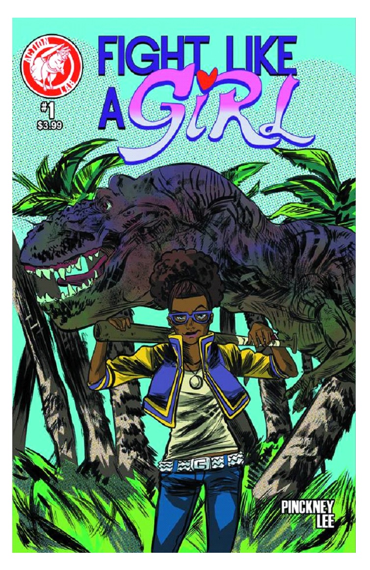
FIGHT LIKE A GIRL #1
Writer: David PinckneyArtist: Soo Lee
Publisher: Action Lab Comics
Reviewer: MajinFu
Look at that cover and tell me this isn’t exactly what the comics community needs –nay- deserves at this juncture. In an industry teaming with masses of masked vigilantes and numerous licensed and/or copyrighted characters being dragged kicking and screaming from antiquity only to be shoved back into relevance in a desperate attempt to supplement box office sales, it’s a feat just to behold a book that looks a little different. Not just a new face, but a young one reflecting a broader spectrum of readership than ever before--one that occasionally wears thick purple glasses. Her curly poof of an afro is tied just in case you still didn’t know she’s ready for some action. The bat she’s brandishing lays across her shoulders, framing her stylish outfit as she momentarily pauses to pose before the color-coded Tysannosaurus Rex grinning fiendishly behind her. Like Miss America (Chavez) from the Young Avengers, FIGHT LIKE A GIRL’s protagonist Amarosa represents the less-acknowledged demographic of geekdom, and hopefully a wider acceptance of strong leading ladies as well as more prominent female readership in general from an industry notorious for its sexism. While it’s awesome to see a new character that embraces the ever-expanding audience in the world of American comics, Amarosa’s debut would have considerably less impact if her comic was a dud.
As a matter of fact, FIGHT LIKE A GIRL (henceforth FLAG) is a by-the-numbers action adventure comic clearly intended for anybody who likes mythology, T-Rexes, and/or battling monsters with blunt weapons. It begins with a council of deities from various theologies and mythologies discussing whether or not Amarosa may face eight trials in order to earn the right to visit an unseen wishing well. Her wish is simple: her brother is terminally ill and she wants to help him feel better. So the gods give her the okay and she’s transported via magical door to an exotic setting where she contends with some intimidating beast. Nearly every element of the text draws from an earlier source, whether it’s comic books (Loki here is very similar in design to the Marvel version) or video games (Amarosa is accompanied early on in her journey by a pixie advisor ala Navi from The Legend of Zelda, and her struggle is similar to Wander from Shadow of the Colossus), but the strength of the story comes from the lead’s universal struggle, endeavoring to tell an exciting story without dwelling too much on the pathos.
FLAG also has minute similarities to another one of my favorite comics from last year, Paul Pope’s BATTLE BOY. Like BB, FLAG is the story of a young person facing insurmountable odds in a world steeped in mysticism and fraught with danger. But unlike the titular Boy’s rite of passage, Amarosa’s journey to restore the health of her kin is a struggle that appeals to a wider audience than just adolescents who want to be accepted by their fathers. Who hasn’t had a loved one they wish could feel better, someone you care for dearly and would go to any end if it would just ensure their good health? So while the story isn’t exactly original, the heroine’s simple act of selflessness is immediately endearing--a plight even the gods would honor.
So the energy is there and the heroine’s struggle is a worthy one, but it’s not all sunshine and rainbows (although it is very colorful). As I’ve already touched on, the content here is downright derivative, and the thrilling meat of this first issue’s story is sandwiched by a fairly stale beginning and ending. The last panel is meant to dwell on Amarosa’s internal conflict, but we still don’t know enough about the characters outside of the lead’s very basic motivation to really know how to feel. Soo Lee also does a bang-up job with the art for the most part, detailing Amarosa’s scrap in this issue with some hefty exuberance, but some of the framing of the action makes for some awkward transitions, and it’s not always clear how one panel leads into another. Sometimes it feels like they skipped a beat or didn’t pause on that pivotal moment of impact. The illustrations pop nicely thanks to some really bright colors and bold, if sometimes wily, linework. It’s a little Paul Pope here, a little Stuart Immonen circa NEXTWAVE there. Not quite as precise as either of those, but the looser illustration style is well-suited to the story’s occasionally manic energy.
So here we have the conundrum of an interesting and unique new heroine seemingly trapped in a somewhat unoriginal and predictable story. At the same time, the story is only just beginning and I would be all too happy to eat crow and look forward to being proven wrong with upcoming issues. It’s nice to have a book again where I actually want to read the next issue just to see where Amarosa’s headed next and what perilous trial awaits her. Perhaps she doesn’t have the compelling psychological complications like Barbara from Joe Kelly’s fantastic I KILL GIANTS, but Amarosa still brings a healthy dose of diversity to the comics page, if not in personality then at least by design.
Perhaps I’ve been a bit too soft on FLAG #1, but that’s only because I can see the potential here, and I’d like to encourage the book’s creators to strive to make this as great a story as its leading lady deserves. Should future issues prove to develop Amarosa’s character further while upping the ante on the action and world-building, this could be an exciting time indeed for readers in search of a healthy dose of girl power.
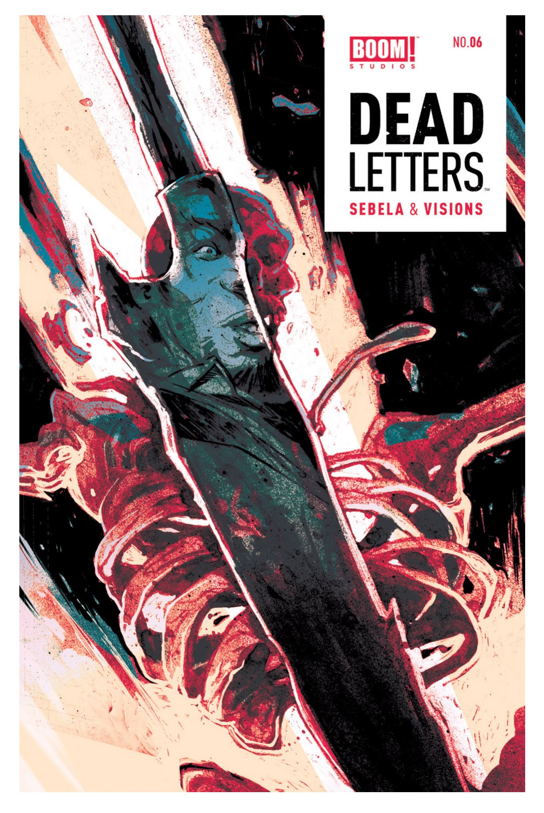
DEAD LETTERS #6
Writer: Christopher SebelaArt: Chris Visions (pencils/inks), Matt Battaglia (colors)
Publisher: BOOM! Studios
Reviewer: Morbidlyobesefleshdevouringcat
Holy kit and kaboodle, what has been happening in the DEAD LETTERS universe? A buttload, apparently, and we’re only at the sixth issue. That’s DEAD LETTERS’ style for you: fast, in your face, and with no means of slowing down.
If you, like myself, are new to the world of Chris Sebela, then look no further than DEAD LETTERS. There’s a reason why Sebela is being listed as an up and comer. This guy isn’t shy, nor is he the type to slyly sneak you into the mystery. DEAD LETTERS is the precarious aftermath of several bottles of gin and a few hits of acid later. The acid would actually be Chris Visions doing what he does best, combined with Matt Battaglia’s colors. And these guys have absolutely no problem with tormenting you with almost lymphatic color palettes complemented with strong inks and an overly bold plot; this sixth issue simply furthers that.
Let’s recap: everything has changed. Except Sam. Maia is no longer God’s right hand, and now has somehow found herself as Sam’s partner. Sam’s brother Easy aka Walter is now in the picture, seemingly having been in Here for an indefinite amount of time. A new terror haunts the city of Here: a group calling themselves The Saints of Nowhere are sending any and all new souls into the after after life, and Fante, the replacement, has no time for reason--only results. And with all that, Sam is still somebody’s, now Fante’s, desk jockey, and still with only a minimal amount evidence of how he actually died. Poor guy.
This issue takes Sam’s smooth skills as talker to avert death (again) into an unfortunate struggle. Sam is finally able to get a small lead on the Saints through Jude, a female friend of Walter/Easy, who, like the rest of the Boroughs, despises Sam the Snitch just as much. She lures Sam into following her, supposedly introducing him to the Saints, but instead has set a trap. Sam finally meets one of the Saints, but not without blood splatters and torture. What ends is a dead Saint and a slightly frustrated Sam with little information about the group, but Sam, being the sly, intuitive snitch that he is, has a plan brewing, calls his brother for back up and pulls out Charnel’s decapitated head from the back of his trunk.
We’re finally also able to get a bit of a backtrack into Sam’s death in this issue. Not much, but something. Maia also appears to be planning something. It’s always something with these characters, making it difficult to fathom not having the next issue in my hands.
Once again, Vision’s art is sublime. His inks are clean yet sporadic—fierce, really. They don’t stray too far to either side of the spectrum, and in combination with Battaglia’s watercolor and graffiti -like crossover splashes, it really makes for a beautiful comic.
Let’s also not overlook the fact that there are some incredibly strong female characters and a person of color as a lead without all the gender and racial stereotypes. C’mon boys and girls and all you comics kids who don’t fit into the gender binary: get your hands on DEAD LETTERS--you won’t be disappointed.
SECRET ORIGINS #7
Writers: VariousArtists: Various
Publisher: DC Comics
Reviewer: Masked Man
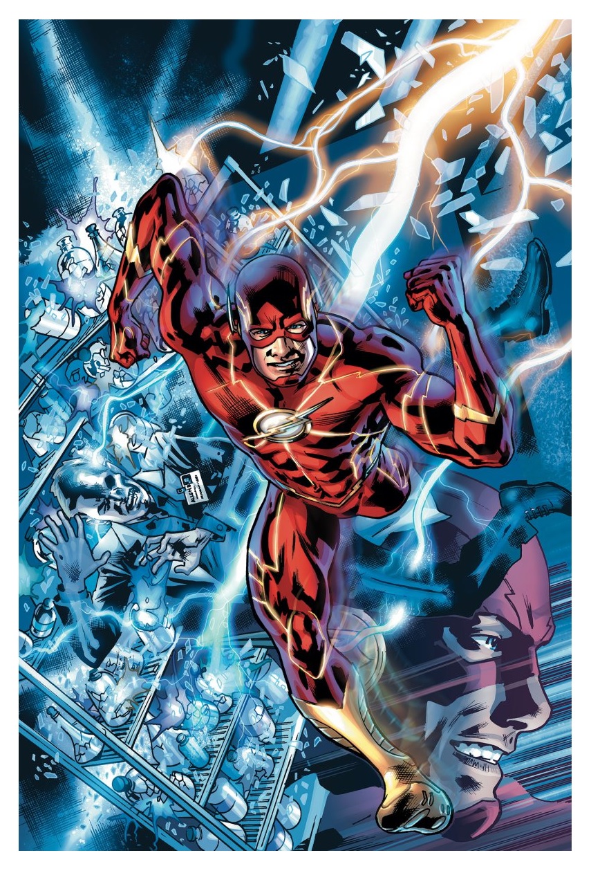
It's time to learn more about the heroes of the New 52! Mind you, as of yet I haven't read anything from this series remotely as good as the series from the 1980s. One reason may be the shortness of these stories and the lack of established creators, although there have been some--like this month's cover artist superstar Bryan Hitch, who drew one of the most awkward drawings of the Flash I’ve ever seen--yikes. Anywho, this issue had three stories, starting with:
The Flash, by Robert Venditti and Van Jensen. First off, I'll state Geoff Johns killing off the Flash's mom was the worst thing he's done at DC. It’s too over the top (mom dead, dad blamed and in jail), it doesn't make him more relatable, and actually having two living parents would make him stand out in the DCU. It's just a cheap, unnecessary, soap opera gimmick. Ok, on to the issue, which I must say is rather poorly written, with lines like “After Mom died, I had to grow up fast. I missed out on being a kid…but that's the thing about growing up. You can't just have fun.” Yeah, we kinda got that the first time--lots of round and round dialogue in here. The main focus of the story is how Barry spent his whole life becoming a cop to track down his mother's real killer, but then he states becoming a superhero was about the greater good--huh? Then he talks about how being a superhero is like being a cop--wait aren't you already a cop?!? Want to tell us why you're not a cop with superspeed, since being a cop was your goal in life? No? Barry also says he never wanted to use a gun, but he doesn't say why. The best is when Barry's dad (in jail) tells Barry to quit coming to see him because “It won't do either of us any good.” WTF?!? Did his dad really just say “Seriously, son, I don't enjoy seeing you and you don't enjoy seeing me, end of story”. Meanwhile, artist Miguel Sepulveda does a good job drawing the story at least, though his storytelling is often uninteresting. I also found it amusing when the colorist couldn't tell which character was which on the last page.
The Huntress, by Paul Levitz, who by the way all but created her way back in 1977. In this new-new take on The Huntress, she is back to being the daughter of Batman and Catwoman (on Earth-2). For the most part Levitz does a fine job laying out who Huntress is and how she got here, although since I don't read EARTH-2 or WORLD'S FINEST, I wish he got more into how she wound up on Earth-1. I also couldn't tell if Catwoman died in the story. As for the artwork, Jonboy Meyer clearly has drawing skills, but his style is a bit overbearing. All his women look the same, and they all look like overly sexed fashion models. This sledgehammer style may work well for pin-up, but it distracts and weakens the story. One odd drawing has Helena (aka Huntress) standing in front of Kara (aka Supergirl), but her black hair somehow manages to wrap around Kara's back to blow in the wind (at least that's what I and the colorist think).
Superboy, by Frank J. Barbiere. Now this is a bizarre origin, as in it doesn't really tell Superboy's origin. It states he's a clone. Made by who, for what and what of (seemingly the point of the story)? No mention. Now I'm really torn by Barbiere's writing, as he has Superboy says things like “Teenagers--we're always struggling to figure ourselves out. Me? I'm just a bit different. I'm still trying to figure out who I am...” Was he supposed to sound pretentious? Then there's this: “The others like myself (Teen Titans). I acted out. Refused to accept that I wasn't one of them.” Yeah, what? So you acted out because you conformed? Then of course at the end, Superboy claims he doesn't want to be Superman, and being Superboy is good enough for him. Wait--what teenager is fine with that? Reading the logic of this story really hurt my head, so either Barbiere really knows how to write a teenager, or he writes like a teenager. Artist Robson Rocha was the best thing of this issue. He really goes after an Ivan Reis vibe, and it's hard to do worse than that in superhero comics.
Basically if you aren't a real superhero nerd like me, you probably shouldn't be buying this, and even if you are, you probably should reconsider buying this. The writing and art really isn't worth the $5 cover price, and you'll learn more about the characters on wikipedia.
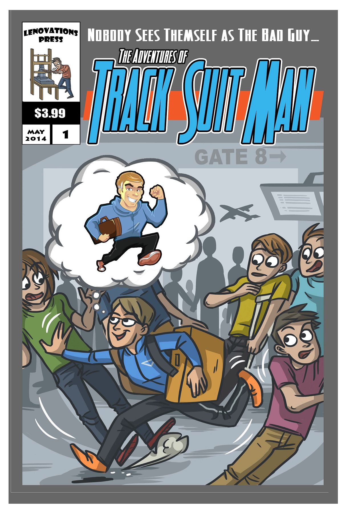
THE ADVENTURES OF TRACK SUIT MAN #1
Writer: Len MihalovitchArt: GB & Michael Kelleher
Find out more about this book at its website here!
Reviewer: Ambush Bug
I love comic books. Just when you think you’ve seen it all, something comes along and proves that it really is the best medium out there. There really are no limits as to what a story can be about. If you can write it and put pictures to it, it can be a comic.
That’s what frequent airline passenger Len Mihalovitch did when he noticed another frequent flier wearing a track suit to the airport as if he were preparing for a relay race rather than a flight. But the track suit is not what piqued Mihalovitch’s attention. It was the utter rudeness and insincerity of this particular passenger that prompted the writer to make this comic. Weekly, Mihalovitch would make posts about this rude passenger, pushing past people in line, tossing out others’ bags, and generally being a complete asshole to others.
So does Mihalovitch trip the guy as he leaps past him in line? Does he punch him in the nose, or plant a knife in his gym bag as he passes through security? No--instead, Mihalovitch does something constructive with his frustration and makes a comic book about it. One of the things I often tell people I work with is that you really can’t change other people – just how you react to them. So instead of sitting this track suit-wearing asshole down for a swift talking to, Mihalovitch entertained the Twitters with his weekly posts of this jerk and then, when he had enough material, made a comic out of it.
The book itself plays out more like a picture book than your typical comic book, but what works is that Mihalovitch threads together an engaging story of a man who seems to be a horrible human being. He may be a doctor saving lives by the day. He may be a humanitarian bringing food to the poor or flea collars to stray cats. But place this guy in an airport and he’s a complete jerk, and Mihalovitch paints that picture well, aided by cartoonish artists GB and Michael Kelleher.
You might be in Mihalovitch’s shoes and know someone like Track Suit Man. Hell, you might even be Track Suit Man. But this comic is great in that it is a positive, entertaining, and creative way to air ones’ frustrations. Hopefully some day Mihalovitch will be able to present Track Suit Man with this comic to show him how much of an ass he is. The tagline of the book is “Nobody sees themselves as the bad guy” and that’s true, but if there were more people like Mihalovitch pointing out the bad guys and making something creative about it, I think those people would lessen substantially. Here’s hoping eventually Track Suit Man comes around and realizes he’s an ass. Until he does, it seems like it’ll be great fodder for more ADVENTURES OF TRACK SUIT MAN.
 Ambush Bug is Mark L. Miller, original @$$Hole/wordslinger/writer of wrongs/reviewer/interviewer/editor of AICN COMICS for over 13 years & AICN HORROR for 4. Follow Ambush Bug on the Twitters @Mark_L_Miller.
Be sure to tell your comic shop to order his new comic PIROUETTE (out now!) from Black Mask Studios!
Proofs, co-edits & common sense provided by Sleazy G
 The next level of comic book excellence is a click away at BLACK MASK STUDIOS!
 Want more in all things Geek?
Check out our friends at PoptardsGo for podcasts, reviews, and more!
 And if you still need more geek in your life, check out Part-Time Fanboy for more geeky goodness on comics, movies, and more!
Finally, check out AICN COMICS on Facebook and Comixpedia!