
(Click title to go directly to the review)
Advance Review: MULTIVERSITY: PAX AMERICANA #1
DRIFTER #1
SUPERIOR SPIDER-MAN #1
GRENDEL VS THE SHADOW #3
THOR #2
DAY MAN VOL.1 TPB
AXIS #5
 In stores today!
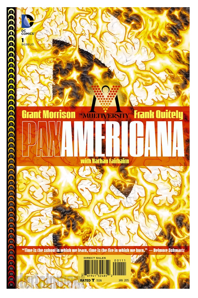
MULTIVERSITY: PAX AMERICANA #1
Writer: Grant MorrisonArt: Frank Quitely
Publisher: DC Comics
Reviewer: Optimous Douche
MULTIVERSITY continues to defy the Elseworlds expectations most of us mistakenly attributed to this series during those long ago days when this series was the heir apparent God particle resurrecting the entropy of the dying DC universe.
Then came the New 52. After reading PAX AMERICANA, my conspiracy theory on how Warner Brothers shitcanned artistic integrity to make DC more crossmedia friendly makes me quake with anger. No, not because they sought money, I’m firmly a believer in leading the unobservant lambs to the slaughter.
No, my rage stems from the short-sightedness and lack of structural imagination from my business counterparts. MULTIVERSITY would have given every aged DCiphile the stockpile of stories we deserve, a series of tidy bows reimagining new landscapes for a new generation. If I have learned anything from the New 52 reboot, it’s that heroes change with the times, and we have changed as fans. Comics are supposed to be the well of imagination, the place where the page transcends all other media. MULTIVERSITY will never be a movie. It’s not an IP as every douchebag who made cards at Staples that say “Producer” on them like to gobble up for pennies on their actual creative dollar, and it was a mistake on the part of Warner Brothers to not give us fans the credit we deserve in fessing up to the revenue wizard behind the curtain.
They could have had their fangeezer adoration and continued to nom nom nom on toys, cartoons and a plethora of other kiddie fare all at once, because as MULTIVERSITY has pointed out in just a scant four issues, we long ago accepted that the comics world was fractured and the idea of a continuity that spreads across generations is ultimately unsustainable or just plain dull.
I know you all want me to get to the plot of PAX AMERICANA, but the industry of comics, the entropy of imagination in society, and our inability to see a brighter future over next horizons because we can’t quite yet determine how to make scalable ROI for our travels are all the indictments of MULTIVERSITY. You get a meta review, because let us not forget the meta nature of this series, a point I have railed against and will continue to lament despite adoring every story. Actually, I abhor the concept of the danger coming for me because I do adore this return to Elseworlds with exacting societal mirrors reflected on the page. Morrison has so successfully excited my imagination neurons I have been taken away by story, until he reminds me that by April instead of a new universe, I will be in the universe that is nice for kids, but even a Walter Mitty fool like me can only allow so much of a break from our shared perceived reality. I would rail less if this book was actually for kids, but you little bastards got your easily digestible stories and pretty splash pages in New 52.
Most of you have heard PA is the Morrison & Quitely WATCHMEN. I won’t argue the comparisons in form of the patterned panels, art that is meticulously sequential in movement and story for cinematic seamlessness, and word balloons not afraid to consume these literal story beats with the glorious subtext, a beckoning to the reader to bathe in subtext that can only stem from natural and real dialog instead of a lazy and spoon-fed scene setting call-out boxes.
Morrison is often accused of skipping story beats with this technique, and my own martyr complex simply lives to refute this statement. We are all simply not always along for the ride. I hate myself for my disdain with FINAL CRISIS more than Grant or DC for birthing the piece. Logic dictates I missed something versus an entire industry passing a bad egg.
PAX AMERICANA I get through and through; its surface level WATCHMEN pastiche is a joy. Morrison’s updates are spot on for launching the disillusionment age of heroes with a middle-aged Gen X team of heroes versus a middle-aged set of aby Boomers. The Comedian is darker and less openly confrontational with his bloodlust, Dr. Manhattan is a douche knowledge-dropper with irony-laced unraveling of the universe, Silk is the Veep’s daughter and way more empowered by the hard work done by Baby Boomer ladies wearing big shoulder pads to kick in doors of opportunity and The Question, along with Blue Beetle, provide a comic relief. Thank you, DC, for tossing out the 1986 branding standards that made WATCHMEN have to use a freaking owl. There’s more, but read the book.
The series is also once again as much social pulpit as it is homage to epochs of comics, this time highlighting the world’s rage against our false promise for a gilded and glorious American Empire of idealism that would be the catalyst towards our next stage of understanding the eternal question of “why”, whether you believe the promise has been shitting the bed delivering that potential since either the shooting of Lincoln or the Great Depression. The one-two combo of America having two kings fall in basically ten years did little to triage disillusionment or offer the promise for a Caesar to burn down DC in our world. This is where our WATCHMEN tether deepens because of how the source postulates tricky Dick manically guiding capes was the key to an American dynasty.
PAX AMERICANA focuses on an opposite approach, in that the empire rose to greatness despite the black eyes of the Union succeeding and the financial fall. The true stroke that initiates America’s end days is actually meticulously planned, steeped in high concepts of future formulas that predict events all the way to infinity, a twist I have desperately wanted to see in comics since I read the concept in book form in Isaac Asimov’s FOUNDATION novels.
PAX AMERICANA is the WATCHMEN but with more permanence; relevance in the shit-canning of cold war conventions, and one of the best-paced books in recent memory from start to finish.
If you are shunning PA, stop now. You are missing out on the book that will finally deliver on the promise of new universal direction status. I keep this to myself. Stop fighting things like the upcoming CONVERGENCE series--at least it bluntly doesn’t hide the story of diversification we have seen since as far back as when Terry McGuiness was crafted. It has simply become a more egregious and common practice now that marketing and PR are guided by suits squeezing blood. Embrace the upcoming CONVERGENCE for what it is: a necessary contraction for necessity, a reboot of worlds instead of Simonize on outdated characters in a time cluster that is focused on giving us imagination not meant for the masses, and the possibility of one day saying these are the #1’s that launched the _______ age! I pick sanity or personal choice.
When Optimous isn't reviewing comics he is making the IT words chortle and groan with marketing for MaaS360, Enterprise Mobility Management. He also has a comic coming out sometime soon, for updates head to robpatey.com.
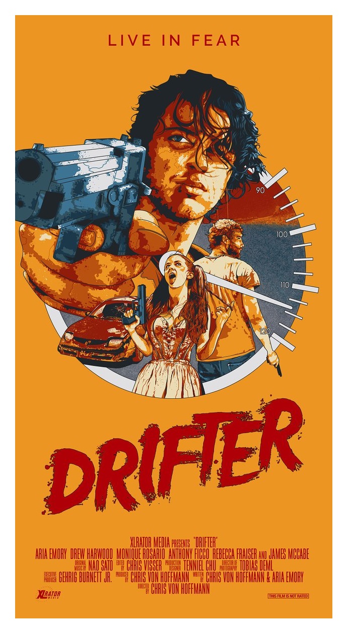
DRIFTER #1
Writer: Ivan BrandonArt: Nic Klein
Publisher: Image Comics
Reviewer: Morbidlyobesefleshdevouringcat
Not entirely sure why I picked up the first issue of DRIFTER. It might have something to do with the compelling art, with its exuberant colors, emotive character depictions and complex background scenery, but more than anything, it has to do with the fact that it’s done by the creative duo that brought us VIKING.
A take on the midwestern sci fi genre, DRIFTER stars Abram Pollux. Orbiting in deep space, Pollux finds himself grasping at the ends of what might be left of his life while his ship crashes through an unknown planet’s atmosphere. After Pollux’s disastrous introduction to the planet, he somehow is able to get out of the wreckage, only to be shot from behind by an unknown man.
An obscure amount of time has passed as Pollux wakes up in an infirmary, disoriented and slightly unstable. It appears that Pollux, after being bandaged up by local medic and makeshift marshall Lee Carter, has found himself in Ghost Town, a shoddy little midwestern place. Not much is known of Pollux. His esoteric nature doesn’t provide much, but it is clear that he has some deeply rooted regrets with an almost apathetic attitude towards his own existence. Hell, Pollux’s name isn’t even revealed until much further into the narrative, simply adding to the man’s precarious history and the comic’s overall dark theme.
Lee Carter, though, balances out Pollux’s heavy-headed attitude. Just as strong-willed as Pollux is and as quick to action, she is able to think logically about her actions, mostly due to her desire to shape Ghost Town into something more than its less-than-ironic name. Thus far it seems that Carter’s characteristics are to play the stereotypical strong, silent type, while still being incredibly articulate in order further Pollux’s own story along. But this being the first issue, it is still far too early to tell.
Introduced with a strong, introspective monologue that is relatable without being cliché, DRIFTER coruscates as Klein’s art and Pollux’s monologue play off each other. But unfortunately, as that monologue continues, the art and the panels themselves begin to separate and become readable without the need to rely on the other. The narration starts to lose its strength as it patters on, but then, whoop, is brought back up again just as the last page opens.
Although DRIFTER plays off as a fairly dark, introspective comic there are a few quirky moments to keep the comic balanced, as well as a local priest with dialogue and movements that are slightly similar to the characteristics of a jester. The first issue of DRIFTER isn’t entirely compelling enough to want me to keep it on my pull list, but I wouldn’t write it off completely. Klein’s art, at least for myself, is what convinces me to continue reading DRIFTER. The characters are fully emotive and almost feel embraceable. Their movements appear slight and heavy, an emphasis on a cruel and heavy past and, of course, demonstrating the weight of their current situation on the planet, as well a result of the planet’s harsh environment. The complex colors and sheer vastness of Klein’s full page spreads are astonishing, and simply envelop you into the surroundings. If DRIFTER’s plot doesn’t entice you, the art sure will, so if anything do yourself a favour and bask in some amazing comic art.
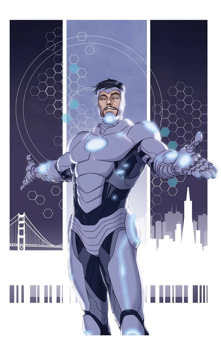
SUPERIOR IRON MAN #1
Writer: Tom TaylorArtist: Yildiray Cinar
Publisher: Marvel Comics
Reviewer: KletusCassidy
"It has a chrome finish and it lights up in ways that please me...it's sexy as hell." -Tony Stark
I haven't been this excited for a new book in a while. I'm not sure if it's because I love Ylidiray Cinar's art or if it's the possibility of getting a fresh take on the golden (now platinum)-armored Avenger but man, this book did not disappoint. I had no idea that this series was going to be a direct result of AXIS; I just figured this comic was going to take Iron Man in a new direction...and holy shit did it. Remember the old “Demon in a Bottle”, first half of the Iron Man movie, selfish prick Tony? Yeah, well, this Tony is way worse, which makes this comic a unique fun ride with awesome art.
If you aren't familiar with what is going on in AXIS, allow me to fill you in: Red Skull has Xavier's brain inside his head, which he was attempting to use in order to enslave all mutants and people that oppose him (claaaassic Red Skull). One of the plans the heroes had to stop him was to use an inversion spell to allow Xavier to gain control of his brain, thus trapping and defeating the now named Red Onslaught--only the spell went wrong, everyone who was on the island has had their personalities inverted and Tony is now an even bigger dick than ever before.
We start this issue engaged in a pretty typical team up with She-Hulk and Iron Man versus Kid Abomination, until we realize that Tony's head may not fully be in the game (heh heh). This book is chock full of hilarious Tony-isms and plenty of that asshole billionaire playboy we rarely get to see these days from Mr. Stark. We also get to see Tony's new Endo-Sym suit, which looks awesome and is kind of a mix between Extremis and a certain otherworldly substance that is devious enough to make Venom and Carnage jealous...and angry. Not only is this issue a lot of fun, but it also comments on society's reliance on/addiction to technology and vanity as well as touching on how the distribution of superior technology can contribute to the further separation of the classes. I wonder if you can guess which San Francisco hero comes to the aid of the new underclass. This book is smart, funny and a hell of a debut issue.
The art by Ylidiray Cinar is fantastic--I mean really good. There are some panels that remind me of George Perez and a few panels that I swore Phil Jimenez jumped in and drew. I remember Cinar's work for DC, such as TEEN TITANS, THE FURY OF FIRESTORM and I think he did SUPERGIRL for a minute after the new 52 and the art in those comics really stood out. It wasn't until I started following him on Instagram that I really got excited about this book. Cinar's art seems very refined--like he's been drawing for a very long time and I didn't see one page with a flaw in it. This is one of those books where the art itself is well worth the cover price.
I really liked this issue and all of my friends that I let borrow it, even folks who only read DC (I know, weird right?) and some that don't read comics at all, were able to get into this issue. I thought this book would be a slow burn that would result in us realizing that Tony was acting different in issue 5 or 6 but nope: this issue goes right for the throat, right away, no time wasted. The art by Ylidiray Cinar is great, and is mainly why I was excited about this book, and it paid off--seriously, the art is awesome. If you ever wished for the old Tony back, this book grants your wish, only in that twisted monkey’s paw way that turns your request into a 'be careful what you wish for' cautionary tale. Marvel has done a great job with its solo hero books, and this comic is another example of Marvel not being afraid to push their heroes in radically new directions. I know things will go back to status quo in due time but for now, I'm enjoying the ride!
If you’d like to hear more from Kletus Cassidy (I know, why would you right?), you can listen to him and his good buddy Steve discuss comics, comic news and more on the SANCTUM SEQUENTIAL podcast now on iTunes. Email questions, comments and hate mail here! Thanks!
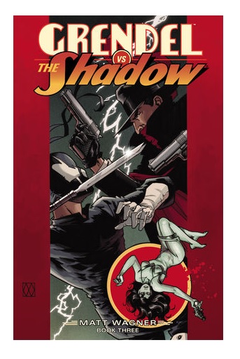
GRENDEL VS THE SHADOW #3
Writer / Artist: Matt WagnerPublisher: Dynamite Entertainment
Reviewer: Masked Man
All good things must come to an end, but boy I wish Dynamite could have squeezed one more issue out of Matt Wagner. Despite some lackluster work for Dynamite in the past, Wagner finally proves what a talent he is with this crossover, as GRENDEL VS THE SHADOW gets back to what he excels: simple bold action drama, driven by strong characters. Add to that his own bold dynamic artwork, and this series hit.
Let's talk about the this last issue first. For those who came in late, Grendel, the ninja crime boss of the 21st century, discovered a MacGuffin (as in don't think to hard about it) that transported him to the 1930s. Once there he decided to have fun and take over. Unfortunately for him, the 1930s has a rather powerful crime fighter in The Shadow. As the two clash, with New York's gangster landscape hanging in the balance, they discover this could be the biggest fight of their lives. Each one learns the other’s secrets as the fighting becomes more intense, and both men fall victim to their surroundings as they become too focused on their goals. After a clever plot twist Grendel finds, perhaps too late, that he may have bitten off more than he can chew here in the 1930s.
The best thing I can say about this book is it's just a solid straightforward action book. Wagner does attempt, fairly successfully, to layer it with a comment about obsession and relationships, using Margo Lane and the women in Grendel's life. But the bulk of the series is the collision course between The Shadow and Grendel as both men are equally driven to their goals: destroying evil and proving to be unstoppable. I often felt Matt Wagner was maybe trying too hard with his previous work for Dynamite, like he had something to prove, but with GRENDEL VS THE SHADOW he sits back and lets the story tell itself, which is more of what I'm used to with his work and is what made me a fan of his work.
In many way this reminded me of his great GRENDEL/BATMAN crossovers of the 90s, as they both have the same writing conundrum: neither Grendel or Batman or The Shadow can lose. And unlike other team-ups, where the characters are both heroes, Grendel and The Shadow can't just team up at the end. Grendel is a villain, and the heroes (especially Batman and The Shadow) never lose. But if you think Matt Wagner is just going to let Grendel (his own creation, headliner of his own comic, and franchise IP) get bounced in jail at the end, you're crazy. So in an effort to appease both sides, Wagner has both characters really bring their A game, which makes for a great read.
And just to chat about Wagner’s artwork, it really seems to get better as he ages. How often have we seen artists over the years lose their creative edge? They claim it's artistic growth, but they are really just getting sloppier and more lazy, forgetting that the best artists use equal amounts of freedom and control to deliver spectacular imagery. So cheers to Matt Wagner for working hard to make his work better.
In no way does Matt Wagner disappoint with this series. It's just as good as you would want it to be. As for the Masked Man's scale of CRAP, POOR, DECENT, GOOD, and GREAT, I'll stop myself short of giving it a great (as that puts it up there with BATMAN YEAR ONE, KINGDOM COME, and ALL-STAR SUPERMAN, and I'm not sure I'm ready to go there yet) but I'll give it a much better than GOOD score.

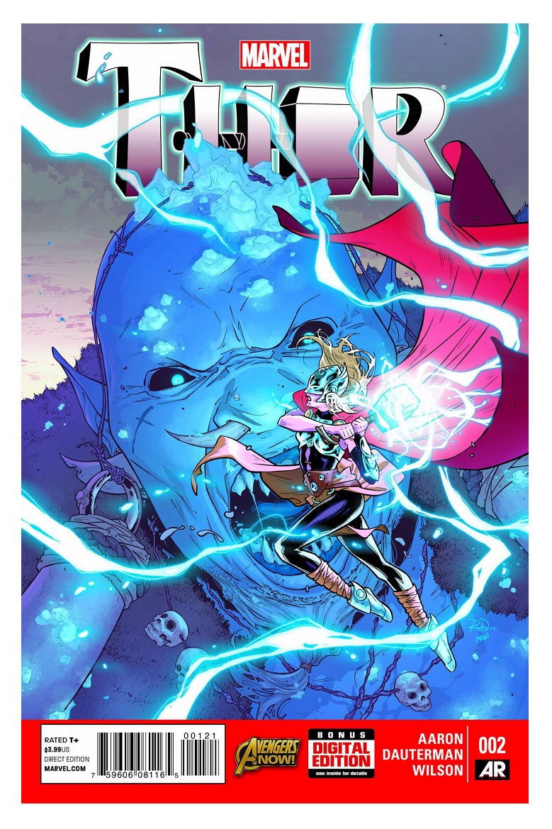
THOR #2
Writer: Jason AaronArt: Russell Dauterman
Publisher: Marvel Comics
Reviewer: The Kid Marvel
Even with Thor no longer the primary focus of THOR, Jason Aaron still puts forth a quality comic, and Dauterman doesn’t disappoint in the art department either. I know certain people were upset with the change, but I’m here to say there is nothing to fear with Aaron at the helm.
THOR #2 begins with this new female “Thor”, by name only, first lifting Mjolnir and, I’m assuming, also wielding Asgardian magic for the first time. During this first experience, Aaron does a nice job of switching between FT (we’ll call her) speaking in essentially regular, everyday English in her mind to speaking the Shakespearean-like English of the Asgardians when talking verbally, leading me to once again assume this character is not of Asgardian origin and this is a first time event. It’s actually a great touch throughout the book, with Mjolnir almost being a separate entity guiding FT with her new abilities. Once back on Earth, FT was led to an ice cave by Mjolnir, leading to a battle against ice giants and continuing the current Roxxon arc involving Malekith and Dario Agger.
I can honestly say there has been no falling off between Thor Odison as the lead of the series and female Thor, as we know her for now. Aaron is an excellent writer and all of the awesome and spectacular of THOR: GOD OF THUNDER is still felt in this title--just a different main character. The story moves smoothly, the dialogue is solid, especially the addition of FT’s speech mentally being different than her verbal. Along with the fact, THOR has not missed a beat from the previous Roxxon arc from THOR: GOD OF THUNDER. This is still one of Marvel’s best books currently.
In the art department, once again no complaints, and it’s hard to notice the change of artistic style from THOR: GOD OF THUNDER, which I guess if you were hoping for originality would be a bad thing, but I like the fact the basic feel of the art hasn’t changed over the course of Aaron’s run. This gives a visual sense of continuity when reading, never noticing anything different from the story. Again, some may not like that feeling and would like a change of pace; in that case, that’s the only way I would call it a negative, because otherwise the art is excellent and on point. It’s clean and still gives the sense of Nordic divinity, plus the action sequences are excellent. THOR #2 has some beautifully drawn fight scenes and Dauterman knows how to perfectly capture the size difference between FT and the frost giants, adding to the appeal of the artwork.
In conclusion, I don’t really have much to say, because THOR 2 is pretty solid all around in my opinion, not really leaving much to review. Personally, I’m curious to see who they reveal as the female Thor, because originally I thought it may be Gaea from what seemed like hints in prior books. Now, I’m leaning towards maybe Captain Marvel? I can’t think of a blonde female character who would fly to the moon, knowing that was where Thor’s hammer was located after the events of ORIGINAL SIN, so I am very interested in the reveal when it happens. Overall, I like the book. I may not love it currently as much as some of the previous arcs, but it’s still a really good title when it comes down to it.
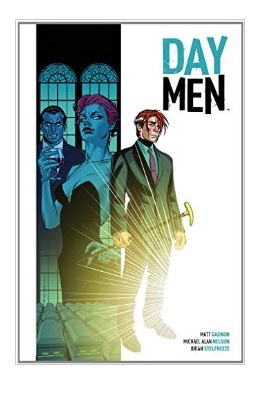
DAY MEN VOL. 1: “Lux in Tenebris”
Writer(s): Matt Gagnon and Michael Alan NelsonArtist: Brian Stelfreeze
Publisher: BOOM! Studios
Reviewer: Humphrey Lee
So, vampires: let’s talk about them. I don’t even know where the genre stands today in the geek culture zeitgeist we have created. Obviously we’re fresh off a strong stretch for the long-toothed ones when 16 year old girls and their 40 year old moms were running up the scotch guard bills at theaters nationwide during the nigh-apocalyptic Twilight Years, and then I know “True Blood” was a thing people were actively boner-watching until they were actively hate-watching and now that it has finalized all I see in the wide, wide entertainment swath are some random Dracula-based offerings and somehow that “Vampire Diaries” thing is on its one millionth season. Personally, I have no attachment to the genre other than they cross over into themes I like in my works of fiction such as the power quotient they have and the wrestling with buried humanity and what have you. Basically, it falls in my “good stories” purview; I just want to read good stories and some tickle my fancy more than others and good vampire fiction can hit the right spot given how it is approached. Catching the solicits (and a good intro price of $9.99 for the first volume), DAY MEN looked like it could hit that spot like Ron Jeremy in his prime, and a bullseye it did make.
Fancy-tickling, spot-hitting, whatever you want to call it, DAY MEN actually surprises and succeeds in its genreness because it plays to the strengths of what vampire lore can bring but doesn’t drown you in tropes. Immediately the opening issue thrusts you into a day in the life of David Reid, our protagonist and titular lead, I guess you would call him, since he himself is a Day Man. You could basically say a Day Man is synonymous with bagman, as these individuals are kind of like special forces-level badasses bred and trained to do the daytime dirty work that their fanged employer cannot achieve either due to their combustible tendencies or simply because it’s beneath them. Regardless, the series debuts with a literal bang as David detonates a vamp and his boat over some business that seems innocuous enough – the “fang trade” – and eventually lays itself out as a turning point in the story that Gagnon and Nelson have to tell here.
That story in question does come a little fast and furious over the four issues collected here, which is one of the few little knocks I have on this overall highly enjoyable collection, but I like the combination of premises new and old that the team puts into place here. The vampires of DAY MEN, being the ancient, greedy and almost godly beings that vampires tend to at least think themselves to be, are more or less set up like long-running mob families. They each have their territory, they run their own trades, they have their agreements and rules (written and un) and in the midst of all of this they have men such as David Reid here to run things while they’re at their most vulnerable. It’s somewhat odd to find myself typing, but the best part of this vampire series, so far, is probably the politics propping it up. It’s great to have that niche to fill inside of a genre that could easily get tired if it does not watch itself, like AMERICAN VAMPIRE does with its emphasis on Americana and the power that wields in contrast to a race that spans millennia.
There’s a pretty solid cast of characters populating these pages as well. David as a lead is charming enough, and has a bit of an underdog reputation built up around him. It’s not that he isn’t a badass, but that he’s a fledgling badass as he’s somewhat new to this world and has a little bit of naïveté to still grind out as he’s, brace yourselves, still cutting his teeth at the gig (oh god, it burns!!!). A couple other characters do stand out, such as the grizzled veteran Day Man for rival family Ramses and David’s main obstacle, Jacob the Burner, and there’s the sexy and sophisticatedly alluring Kellen for David’s House Virgo that is more protective of her daylight errand boy than you would think, but for the most part the pacing on these is so quick and rife with concepts such as the aforementioned “fang trade” and showing the day-to-day ops and then tackling the Day Men themselves that you do not really attach yourself to anyone but David, and even he remains a little bit of an enigma as all we know of his past is that he as an adolescent scamp who fell under the tutelage of a legendarily regarded Day Man named Blackwill. It’s probably a good problem to have though, having so much in the air and a character that’s got the uphill battle he does currently in front of him and a most likely troubled past to slowly roll out as everything develops around him.
Lastly, and this I’ll put bluntly, DAY MEN looks fucking fan-tastic. It seems almost criminal that there isn’t an exponential amount more of it in the world. His lines are so soft and expressive and just full of life. Everything done in these pages just seems so effortless, whether it’s commanding attention with the swift but brutal sequences of violence we get here, or doing a 180 to the seductiveness you expect from a vampire work, and sprinkling in some lost innocence in the moments when David realizes things may be a little beyond his years and grasp of the situation. And I’m super-happy that this book is colored the way it is here by Darrin Moore. It would be way too easy to go ultra-noir and have this book dance the night away in the gallows, but its brightness gives it a better emphasis on what it really is as opposed to what it could be. The book is called DAY MEN for a reason, and even though some dark and borderline insidious shit goes on in its pages, its main operator is still doing his dirt with that big yellow globe overhead. This book would be worth the price tag alone just to soak up the art chores.
We’re probably a couple years away from vampires being the hot genre commodity again – this stuff is all cyclical anyway and we all know it – and hopefully it’s work like this that will kick-start that trend if and when it’s time for it to reignite. There’s just enough of tradition here to keep the blood flowing through those old veins what with the old power plays it presents – physical and political – and the inherent seductiveness of the fanged ilk to feel right at home if you are indeed actively looking for blood-drinker goodness. But DAY MEN expands on the mythos in just the right ways to set itself apart. The success of what Gagnon and Nelson and Stelfreeze are doing here is that they are not trying to drastically change a genre we’ve seen literally hundreds of iterations on; they are just forming a sensible structure using ideas we’ve seen before and building on them natural expansions, and that they’ve grounded it with a stylish, hard-edged yet shockingly identifiable and ultimately fragile lead like David is what really keeps its blood pumping. We may be years off from that fanged reemergence, but I have no doubt that DAY MEN will still be proudly sinking its teeth into new veins while the entertainment gurus are trying to inflate all the old pathways like a junkie in relapse.
Humphrey Lee has been an avid comic book reader going on fifteen years now and a contributor to Ain't It Cool comics for quite a few as well. In fact, reading comics is about all he does in his free time and where all the money from his day job wages goes to - funding his comic book habit so he can talk about them to you, our loyal readers (lucky you). He's a bit of a social networking whore, so you can find him all over the Interwebs on sites like Twitter, The MySpaces, Facebookand a blog where he also mostly talks about comics with his free time because he hasn't the slightest semblance of a life. Sad but true, and he gladly encourages you to add, read, and comment as you will.
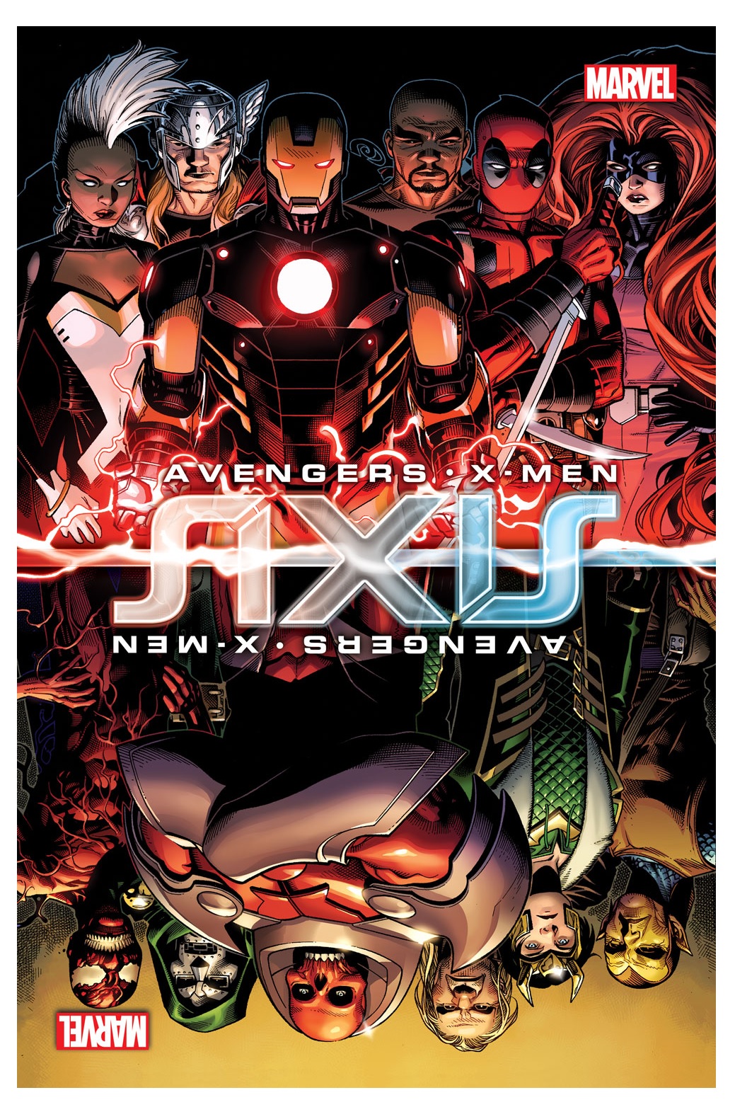
AXIS #5
Writer: Rick RemenderArtist: Terry Dodson
Publisher: Marvel Comics
Reviewer: Masked Man
After one of the worst starts to an event crossover, Rick Remender is slowly pulling this series out of the mud. We've crossed the halfway point and The Avengers are now a group of selfish thugs, and the X-Men have become a vengeful army. With new art team Terry and Rachel Dodson, AXIS is finally looking like a good series as well.
Quality-wise, this is how the series should have started, and it really makes me question what the heck happened with the first three issues (“Book One: Red Onslaught”). It was just an empty-headed climatic battle which probably should have been told in two issues. This would have cut out a lotta the repetitive fat, which in turn probably would have helped prevent a lot of illogical plot direction. I’m curious if someone told Remender the story had to be longer. Likewise, I wonder how much time Adam Kubert had to draw these issues, as they all looked really rushed--Francis Yu's pages, too. I speculate because if this is what Remender and Kubert really wanted, if this was their A-game, then to quote Jack Nicholson in MARS ATTACKS--“Yikes!”
So whats better about this issue? Everything. There's some great character moments, like Spider-Man hanging out with the new Nova, which actually feeds the plot and is not just a throwaway scene. All the now 'evil' heroes are actually executing plans that make sense in their new warped sense of morality, and the fact that they are actually aware of being turned evil is pretty cool too. With their new world view, they now believe they are better off. Let's face it, being a selfless hero is a suckers game--right? Lastly, the Dodsons’ artwork is fresh and exciting to look at. With Nova and Spider-Man on the run, and the wrath of the X-Men, the look of the book is far superior to what it had been, though it does look rushed at times too, as not every page has fine finishing details. The old man reader in me also wonders why Nova is shown to fly like Cannonball, the old New Mutant, instead of the classic Nova flight.
Getting into the story itself (i.e. spoilers), let's talk about stuff I'm actually looking forward to. The Avengers enjoy not being so damn selfless anymore, deciding to preemptively attack anyone would might be a threat to their new state of being, having been effected by the Inversion spell. Using their Avengers rep, they sucker-punch the rest of the hero community, leaving only a few let to oppose them (Spider-Man, Nova, and now old man Steve Rogers). Meanwhile, the X-Me, are mad as hell, and they are not going to take it anymore, so they decide to go after their biggest threat to world domination--The Avengers. Watching a growing full-on brawl between the self-righteous Avengers and self-righteous X-Men—well, this is better than anything in A VS X. Plus the other side of the coin is coming, teased last issue with a new heroic (if still crazy) Carnage. I also predict (which ain't too hard) that Professor Xavier is back among the living in the Red Skull's body, which should make for some fun.
As I've stated before about a lot of crossover events, it's not the concept that's the problem--it's the execution. So while the first few issues were executed poorly, Remender and company has managed two good issues here and the future looks bright (you gotta wear- ok, I'm sorry). So yeah--how about that? If you've dropped this series (and who the hell could blame you), I suggest you give this issue a try and then see how you feel.
Proofs, co-edits & common sense provided by Sleazy G
 The next level of comic book excellence is a click away at BLACK MASK STUDIOS!
 Want more in all things Geek?
Check out our friends at PoptardsGo for podcasts, reviews, and more!
 And if you still need more geek in your life, check out Part-Time Fanboy for more geeky goodness on comics, movies, and more!
Finally, check out AICN COMICS on Facebook and Comixpedia!