(Click title to go directly to the review)
Advance Review: PIROUETTE #1
GOTHAM ACADEMY #1
MEN OF WRATH #1
MOON KNIGHT #8
Advance Review: KILLOGY HALLOWEEN SPECIAL #1
THOR #1
GREEN ARROW #35
Advance Review: WYTCHES #1
GUARDIANS 3000 #1
BATMAN ’66 MEETS THE GREEN HORNET #5
Indie Jones presents AND THEN EMILY WAS GONE #3
UNCANNY AVENGERS #25
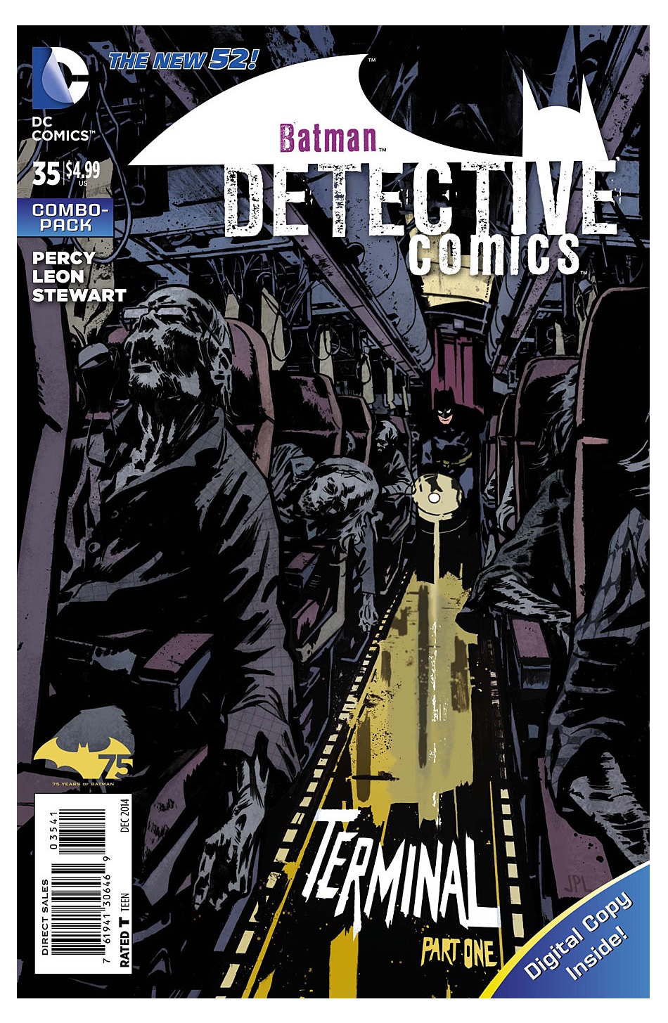
DETECTIVE COMICS #35
AMAZING SPIDER-MAN #1.1-1.5
Advance Review: PARALLELL MAN #1
 In stores today!
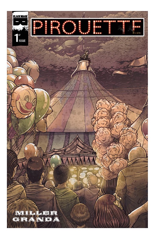
PIROUETTE #1
Writer: Mark L. MillerArt: Carlos Granda (pencils, inks), El Comic en Linea Foundacion (colors)
Publisher: Black Mask Studio
Reviewer: Optimous Douche
Dear Mark Miller,
(Not the one who wrote KICK ASS and should be running all of Fox’s comic book properties across DC and Marvel if we lived in a world where story trumped TradeMarks).
I just finished reading PIROUETTE #1. My reaction remains as steadfast and unchanging as when you first unleashed the news to us before we started taping a Spoiler Alert Podcast about 18 months ago. Vividly I recall your droopy dog Midwestern tone seeping out, “Hey guys, I’m doing another book for Black Mask. This one is about a clown.”
My New Jersey/Philadelphia caring tone soothingly replied: “Are you special? What the sweet shit is wrong with you? You have the opportunity to work with Carlos again, and you are wasting it on a profession that is merely entertaining to brains that haven’t developed past age 4 and instills either terror or blind rage in 80% of the population after age 4? Why do you hate fame?”
I have context for these questions; in the past 8 years I have known Miller as my editor on Ain’t It Cool, my Snyder as I played his Tynion on JUNGLE BOOK, and most importantly my friend through it all he has been there to shamelessly exploit these bonds for feedback and reviews whenever he has a new book coming out. One might think he is looking for favor or bias, but to the contrary his unwavering search for truth is actually masochistic in design. That’s why he asks the one friend he knows will not pull punches, but rather donkey punch the work into a coma out of love…and shit.
Let us look at a few of these past hooves to your bald head, Mark, so my feelings on PIROUETTE are seen as pure and golden as Pony Boy:
7 Years Ago: MUSCLES AND FIGHTS - This publishing house from Wisconsin has accomplished publishing a book. Mark Miller writes, and does a PhotoShop art thing that I frankly found scary. That’s it--MUSCLES AND FIGHTS is a horror book. WELL DONE.
4-5(ish) Years Ago; NANNY AND HANK is a much needed bite to the current defanging of the vampire genre. The idea of octogenarians finding new life, albeit undead, allowed Miller to infuse humor and heart into a COCOO- like revelry of rejuvenated golden years. This book would be an instant classic, if it wasn’t being churned out in the 7th layer of hell by Satan, and was given an artist who thinks humans should look exactly like Muppets.
3-4(ish) YEARS AGO; JUNGLE BOOK: Miller has successfully breathed new life into the tale of Baloo and Mowgli. Yes, the once concave-chested boy is now sporting a B-Cup, but the D-Cup on the cover is merely a ruse, folks. Miller and Granda skipped the cheesecake for a substantive diet of story and words.
JUNGLE BOOK 2: I could not review for ethical reasons Mark told me I should have since I was co-writing the back stories. It was nice to learn ethics.
Last Year: OCCUPY COMICS: Mark actually trusted me to review OCCUPY COMICS without letting my personal politics bleed into the review. Well, his liberal claptrap is delivered pleasingly with a fun pirate theme. The words are melodically written and the art is a nice cloudy haze. This was still a more useless movement than a “Too Fat to Live” subject being given laxatives.
So with that trip down memory lane, you should take your next pull quote with an extra ounce of pride good sir:
PIROUETTE is Miller, Granda and Black Mask’s first book to challenge Big 2 quality in art and form, without sacrificing the indie spirit of shuddering social commentary.
This book is not about clowns; it is about servitude of the soul with no escape. It’s not even about the circus, but more the social structures that oppress us all.
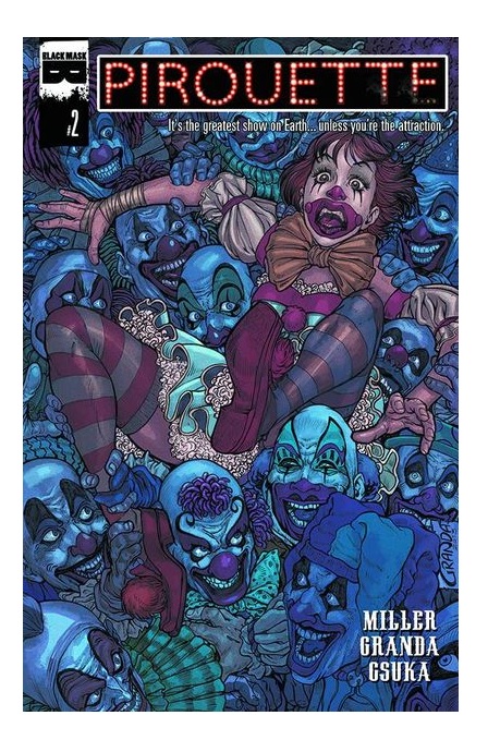
You and I are a bit of Pirouette, even though she is a fifteen-year-old girl riding through the Midwest in a time when America was starting to thrive post-WWII. Miller really doesn’t define a time, but Granda does with dress, décor and little wisps of machinery and cars in the background. Honestly, you really have to look to see these details because Granda made the foreground so absolutely gorgeous. Time, like reality, is purposefully and wisely left ethereal.
After the horrifying realization on page 1 that Pirouette’s clown mask never comes off, we see the resilience of the human spirit to play the roles we are given. How many of us are truly what we do each day to feed our families or to simply play a part on society? She dutifully entertains patrons with antics, which were surprisingly not as annoying as I find usual clown games.
Also like us, Pirouette dreams of a grander existence: why toil in the sweat of the masses when she knows she has the talent to soar above on the trapeze? Some cunty blonde Ukrainians is why. These oppressors remind her why she can not fly until she reminds them that clowns are evil creatures with a sabotage to their act that leaves neither profits nor Pirouette unscathed. Who among us has not tried to usurp our oppressors at least once?
Power, struggle and the horrors of loneliness are Pirouette’s true burdens; the circus is merely a myopic mechanism in which Miller clearly finds a safe haven to expose some very raw nerves of the human experience.
For the less esoteric plot and hero’s journey, we learn that Pirouette might not be the child of the clowns who claim to own her, and that her real life might be found in Lima, Ohio. Personally, I’d rather stay in a nightmare circus than ever visit Ohio again, but I am not a native son nor lover of either.
As we see AMERICAN HORROR STORY: FREAK SHOW about to capture TV audiences with the same exact themes of family and freaks in post-Hitler America, I can’t help but think that I am the oddball in my initial aversions to PIROUETTE. Miller captured a zeitgeist, an air of the public consciousness once again to explore our darkest eternal fears through grease paint and silly fucking noses.
If you can’t find it at your store, you can order PIROUETTE #1 from Black Mask Studios and on Amazon here!
When Optimous isn't reviewing comics he is making the IT words chortle and groan with marketing for MaaS360, Enterprise Mobility Management. He also has a comic coming out sometime soon, for updates head to robpatey.com.
GOTHAM ACADEMY #1
Writers: Brenden Fletcher, Becky CloonanArt: Karl Kerschl
Publisher: DC Comics
Reviewer: Frida Gurewitz
May I preface this review with even though I was a teenage girl not too long ago, I’m not currently one at the moment, though when I was technically a teenager, I outgrew what is considered appropriate teenage girl reading once I outgrew my braces? I will admit here on the internet for all you delightful people to read that I did read all the GOSSIP GIRL books before the age of 15, so I know a teenage girl-oriented or young adult-oriented piece of work when I read it. Now when I look back on what lies in that dreaded corner of the bookstore known as the young adult section (though I know that typically boys don’t go read the books in the young adult section), I see a lot of similarities in tone. GOTHAM ACADEMY is something that would very much dwell in that realm. It’s not necessarily a bad thing, but it is pretty apparent.
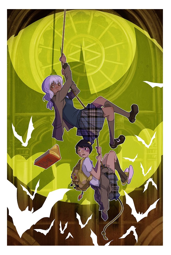
GOTHAM ACADEMY, written by Becky Cloonan and Brenden Fletcher with art by Karl Kerschl, explores a new fragment of the Batman universe not actually focused on Batman. Our narrator is Olive Silverlock, a fifteen-year-old girl attending Gotham Academy, a shadowy, prestigious boarding school in Gotham City funded by Bruce Wayne. She is an outcast, not like the other kids. She has a dark and mysterious past. Typically in young adult books, our protagonist is a girl who’s “not like the other girls”. She isolates herself from others and broods. She’s picked on by a group of obviously mean girls. Olive fits this archetype to a “T”. In fact, GOTHAM ACADEMY is basically a young adult novel, give or take a few elements. As of the moment I have yet to tell if there is the ever-successful and ever-present love triangle which haunts this genre. There is Olive’s ex-boyfriend Kyle, who there seems to be unresolved issues with. We’re never really told what the drama is. It is only the first issue. There seems to be something strange happening with the Academy, and I’m assuming that question will be answered along with the Kyle question. It does integrate that question nicely with Olive’s main storyline. I have nothing bad to say about the art. Everyone has sharp chins and large eyes. It’s almost anime-esque. That, combined with the coloring of greens and purples done by Geyser with Dave McCaig, provides a spooky yet approachable effect. It suits the voice that’s being portrayed. I have to say that it’s interesting to see Gotham from new, non-crime fighting eyes.
I can see a lot of girls liking this and running to the comic store to pick it up. I think it’s going to do well with the audience of girls it’s targeting, and DC could really use some positive girl-oriented press. With the release of their new “Training to be Batman’s Wife” shirt and Superman winning Wonder Woman “He’s done it again” shirt DC has been in some hot water with the ladies this week. It’s reduced girls to the prize and not the hero. I’m not saying that GOTHAM ACADEMY is a solution to winning over the girls in their audience entirely, but it is a step on the right track. It’s a good read, though overall it’s not necessarily my thing. I personally prefer my Batman universe a little grimier and more violent, though like I mentioned in the beginning, I’m not a teenage girl. This seems to be targeted at a different audience than where my tastes reside, but it seems to be the beginning of a fun series and I would recommend it.
MEN OF WRATH #1
Writer: Jason AaronArtist: Ron Garney
Publisher: Marvel Icon
Reviewer: Humphrey Lee
It seems that these days we get a lot of those “in flux” argudiscussions about what it means to be a “real man.” The subject is not always at the forefront of the socio-cultural talking point-a-thon that is our media cycle, but in a world of skinny jeans, manscara, and spending time in front of the TV rebuilding a video game character layout instead of building a car engine, occasionally it is decided the male gender is either neutering itself or letting itself be neutered. Our testosterone levels are dangerously low – as Sylvester Stallone and the “Expendables” crew comes around to remind us every couple years – and we need to do something about it, daggummit! Or something. I don’t fucking know, it’s always been a weird, nebulous concept to me, this statute of limits on masculinity, as I’ve always just been an “I ams what I ams” type regardless of how my actions may be construed. I spend a probably excessive amount of time getting my grunt on at the gym working on my pecs (and using phrases like “getting my grunt on” to boot) but I also have approximately 758 pictures of my cats on my phone. I used to work as a bouncer where at any given moment I was ready ram some grabby asshole’s face through a table and now I pay my bills by working in weddings and making sure brides get a flawless execution on their Big Day. Sometimes I drink bourbon like a gunslinger, craft beer like a pretentious schmuck, and pumpkin spice lattes like a member of “The View.” I’ve never thought of Real Manliness as it applies to myself but, as one of those talking points, it definitely seems as though the subject matter has moved from an agreed-upon definition of Red Meat and Beer and Sports and Violence to a conversation of people who really don’t give a shit what the term implies to a group who think that we damned society to softness by not running it mostly from our scrotums.
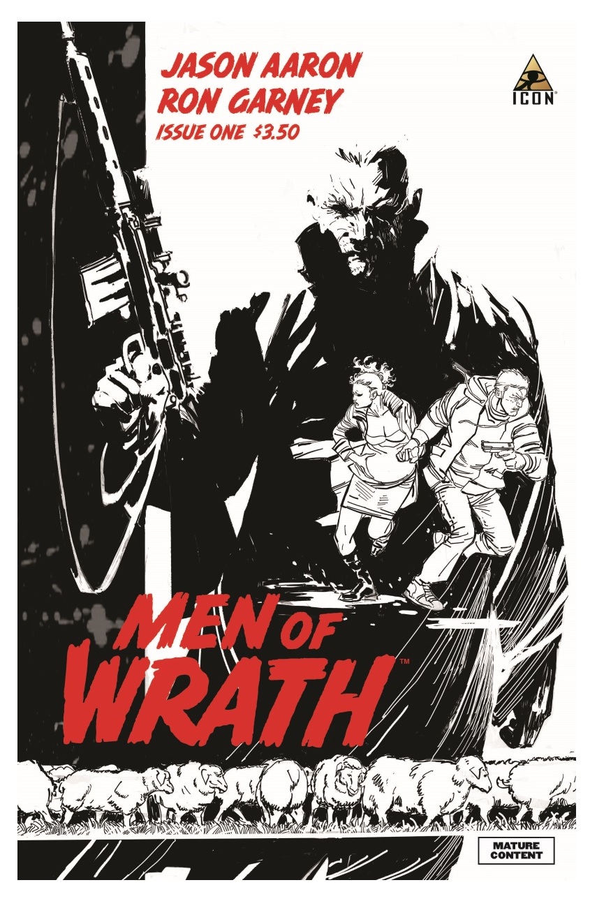
This topic comes to mind for this review of MEN OF WRATH because, obvious to those who routinely gobble up Jason Aaron’s creator-owned work, his material usually has a double rack of ribs of manliness to them. Each time from SCALPED to the recent SOUTHERN BASTARDS to this periodical right here there has been some incarnation of the male struggle for worth, accompanied with ever-escalating instances of sheer brutality. MEN OF WRATH, in its debut, plays with its own variety of masculine themes – and we’ll get to those shortly – but by god does it go right for the coldness and brutality up front, like a knife to the throat. The men that are wrathing here are of a bloodline actually named the Raths (which, okay, we’ll forgive that a bit for its kind of groan-worthy convenience, because it is a pretty badass title) and their descent from kindly farmers to jugular slitters over the past century. The issue starts with Isom Rath in a dispute over some sheep and essentially his family’s well-being and ends with him slamming a pocket knife in the neck of some bastard trying to lay claim to that which was not his and that would have ruined his family. This is an act that would ripple through the Rath gene pool until we are left with the present day representative of the Raths, Ira, a killer so cold he’s wiping out a couple and their infant child like a normal person wipes away mustard from the corner of their mouth.
Ira is a hard, hard man--the kind of man that the action stars of the 80s pretended to be for probably 95% of their films. He probably eats nothing but rare red meat, chews on shoe leather in between meals, and sleeps out on the gravel driveway when the floor gets too soft. He’s that man’s man, apex predator type that I imagine is what some of these “good old days” flashbacking types lament when they see a man carrying around a latte with their girl they bothered to let out of the kitchen. Regardless of the archetype that Ira inspires the testosterone junkies to be, he’s a man who is now knocking on death’s door with his shotgun barrel, courtesy of the Big C for Cancer, who gives no fucks what your body count is because its dick is way bigger in that contest. And this leads us to the final section of the book, where we are introduced to Ruben Rath, a complete turd of an outlaw by any standard of the word, let alone the one his cold-blooded dad sets.
And this is where my whole “conflicted male” diatribe comes into play, because it looks like Ira’s battle is of a life where he abandoned one of his gender’s primary duties: fatherhood. There’s lots of assumptions to be made as to where this relationship – or lack there of – could go, but it’s a safe bet that at some point in his death-dealing ways Ira cut ties with another one of those debatable “what makes a man” bullet points by removing himself from Ruben’s life. Aaron has played with this thread before between fathers and sons and encircled it with ultraviolence before and it’s always played to great results, so I am definitely intrigued as to how it will be tuned up here as MEN OF WRATH progresses. There is definitely more of a gallows humor here – Ira throws a fucking baby in a bayou for shit’s sake - and Ruben looks like a right fuck of a human being, let alone a criminal, so the potential upcoming misadventures look like they could be of a Garth Ennisian level. If Aaron can channel some of those “what is a man” philosophical questions while also fucking with how ridiculous that subject matter can end up being in our culture today, all while wrapping it in some entertaining bloodshed, well then we’re going to be in for a treat now, aren’t we?
Talking about treats, at least now visually, Ron Garney should from now on be forced to tout the word “grizzled” between his first and last name. What really helps this book along as it does its thing is that Garney really has a tension and a release when it comes to the flow of events unfolding. A simple, serene shot of some sheep in the open makes way to the manic panic of a man with a sudden, gushing neck wound and it masterfully just alternates between these polar opposite things to play up the terror and absurdity of the blood-filled history of the Rath family. On the overall, Garney’s stuff just carries an absurd amount of gritted teeth hardness to it that would make even Clint Eastwood’s jaw lock up, but he also knows just how to deflate a sequence whose tension is spilling over or drive it home with a solemn stare and so on. Aaron sings Garney’s praises at the end in the back matter for being a good sport hopping into the creator-owned world of comics after a career drawing some of the best-known tights and capes types, and he does indeed earn his stripes here with one of the best and most atmospheric exhibitions of his career.
I have no clue what is the measure of a man, nor do I ever fully dedicate cognitive resources to the debate. I’m more of the Popeye school of psychology in the matter under the “I ams what I ams” philosophical point. But to some, that measure of masculinity probably revolves around being a goddamned father and a force of nature to protect one’s own when the time calls. We can tell just by his demeanor that Ira is a hurricane in a fleshy wrapper, but it’s hard not to see that he’s a failure in some aspect at the paternal level. So that dichotomy of how a man can be so good at bringing death while being so bad at one of the most important fundamentals of a human life should provide a nice backdrop as Aaron and Garney put a buffet of death and carnage in the fore. I’d have been there for the latter regardless, but if we can get some solid black humor and a gender role commentary as well, then I guess MEN OF WRATH will be combating some SOUTHERN BASTARDS as my “walking tall” book of choice in my pull list. And even if it does not so much address the cultural stuff it’ll still be a great-looking piece of quality shit-kicking comic book, which is also worth the price of the admission on its own merit considering what these Ccmic book men of wrath have shown us before.
Humphrey Lee has been an avid comic book reader going on fifteen years now and a contributor to Ain't It Cool comics for quite a few as well. In fact, reading comics is about all he does in his free time and where all the money from his day job wages goes to - funding his comic book habit so he can talk about them to you, our loyal readers (lucky you). He's a bit of a social networking whore, so you can find him all over the Interwebs on sites like Twitter, The MySpaces, Facebookand a blog where he also mostly talks about comics with his free time because he hasn't the slightest semblance of a life. Sad but true, and he gladly encourages you to add, read, and comment as you will.
MOON KNIGHT #8
Writer: Brian WoodArtist: Greg Smallwood
Publisher: Marvel Comics
Reviewer: Masked Man
As you may know, this title was successfully relaunched by Warren Ellis and Declan Shalvey, who pretty much reverted to the old days of single issue stories with a modern flair instead of the typical six to eight issue story arcs which the industry is currently built on. Well, everyone held their breath as Ellis and Shalvey decided to move on, and Wood and Smallwood (really?) became the new creative team.
As promised, the new team has attempted to keep everything about the title the same: single issue stories, modern storytelling and cryptic undertones of who Moon Knight is now. It's pretty refreshing to see a new creative team not just throw out the baby with the bathwater as they come on board. Granted, I'm sure they were told not to touch a d@mn thing, at least until the novelty wore off (then it's right back to six issue story arcs, I'm sure) although Wood has established new recurring characters, reusing Marc Spector (aka Moon Knight)'s doctor that Ellis first introduced in issue one. Plus police detective Flint is still hanging around, although maybe not so much after this issue. As Ellis and Wood have worked together in the past, I'm curious if Ellis left him any notes about his Moon Knight concept, though I wouldn't bet on it--Ellis seemed to be enjoying the one and done method.
Getting more into the nuts and bolts of this issue (aka spoilers), Wood seems to be channeling DIE HARD as Moon Knight navigated a hostage situation in a high rise office building, hampered by the feds and assisted by his local cop friend, Flint. Reminds me of how Ellis channeled RAID: REMPTION (or DREDD, if you prefer) in issue # 5. It's all very well written as Moon Knight finally makes his way to the villain and delivers a vicious smackdown, something we've come to expect from MOON KNIGHT. In what seems to be an effort to pull away from the single issue stories, Moon Knight's doctor seems to be getting a bigger role in the series, looking like she may become a mastermind villain, but time will tell.
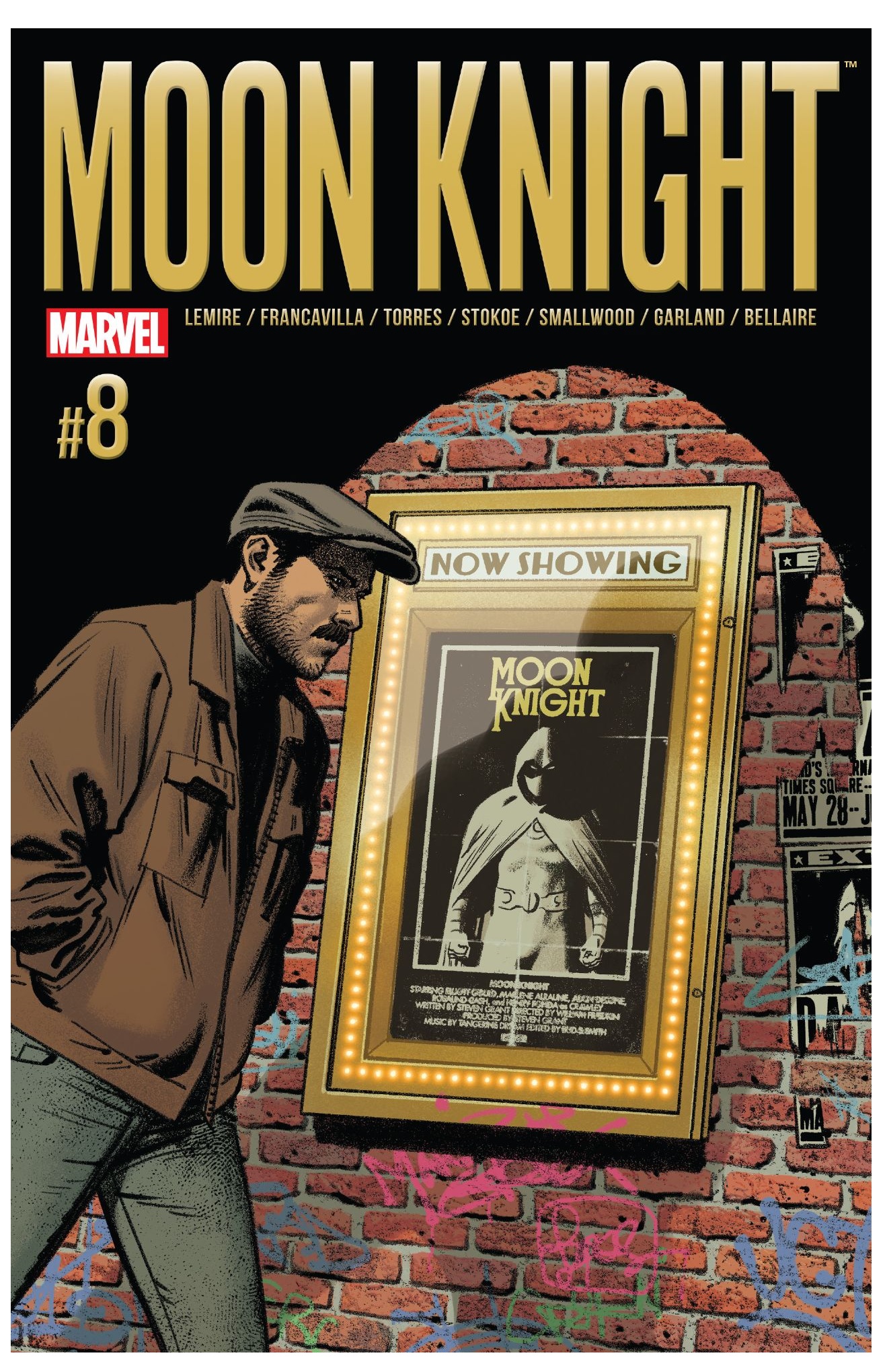
The art for this issue I found to be a bit gimmicky, though, as everything was made to look like it was shot on a cellphone or some other recording device--security camera, etc. (think the movie CHRONICLES). Mind you, the actual drawing--storytelling and figure work--are all very well done, but reading it through faux video screens added nothing to the story. Nor does it increase the reading experience, having everything crammed into tiny panels on overbearingly black pages. And since it had no story impact, it leads me to believe it was solely done to be cool and hip (or pander to the hip kids), which is never a good idea. If you are going to use an alternative storytelling device and want the biggest impact, make it part of the story. People love it when you have a reason behind the cool (see issue #2).
Overall, I don't think MOON KNIGHT has lost a step minus Warren Ellis and Declan Shalvey. Colorist Jordie Bellaire has remained on the book, helping to bridge the gap between the two creative teams with her fine work. Brian Wood and Greg Smallwood have managed to keep MOON KNIGHT the fine little gem it has been since the relaunch. Great for anyone looking a fresh (but not a hip or obviously gimmicky) take on superheroes.

 In stores today!
KILLOGY HALLOWEEN SPECIAL #1
Writer: Alan RobertArt: Alan Robert
Publisher: IDW Publishing
Reveiwer: Ambush Bug
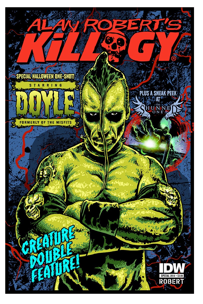
Spinning off from the end of the world romp starring real world entertainers THE SOPRANOS’ Frank Vincent, The Ramones’ Marky Ramone, and HEROES’ Brea Grant, Alan Robert (bassist and songwriter for the band Life of Agony) introduces a new cast member to the mix: Doyle from the Misfits. And while some outside of punk rock might not know who that is, if you’re a fan of the Misfits, this is something that is beyond cool as Robert casts Doyle as a Conanesque berserker roaming the wasteland in search of…something.
This story takes us on a journey through hell on Earth as the world has been overcome by a voodoo curse. If you believe the rumors, Marie Baptiste is the cause of the sea turning blood red, the dead rising, and civilization falling, but Doyle cares nothing of all of that. He’s just in search of…something.
While his motivations are vague, what Robert does well here is make the world he is roaming around in dangerous as hell. Imagine Mad Max on a blood red sea and it might be close. Robert also supplies the art, and being a fan of his previous works WIRE HANGERS and CRAWL TO ME, the biggest thrill is seeing Robert experiment with new styles as one miniseries tends to be miles different than the other in look and feel. This one has a more graphic, HEAVY METAL-esque vibe with high contrast and thick deep lines. But it’s the detail of this horrific world and the simple but brash coloring that makes it all feel like you’ve been whisked away to a darker place.
While the cast is obscure, there’s a quirky sense of cool, as if Robert has filled this world he is establishing with people he loves and respects in the entertainment business. KILLOGY is a unique concept and a unique execution; a horror experience like few others out there in comics today. With an animated series in the works and this special, it appears Alan Robert is just revealing the tip of the iceberg of this hellish world, and I can’t wait to see more of it.
Find out more about all things KILLOGY here!

 Ambush Bug is Mark L. Miller, original @$$Hole/wordslinger/writer of wrongs/reviewer/interviewer/editor of AICN COMICS for over 13 years & AICN HORROR for 4. Follow Ambush Bug on the Twitters @Mark_L_Miller.
Be sure to tell your comic shop to order his new comic PIROUETTE (out now!) from Black Mask Studios and on Amazon here!!
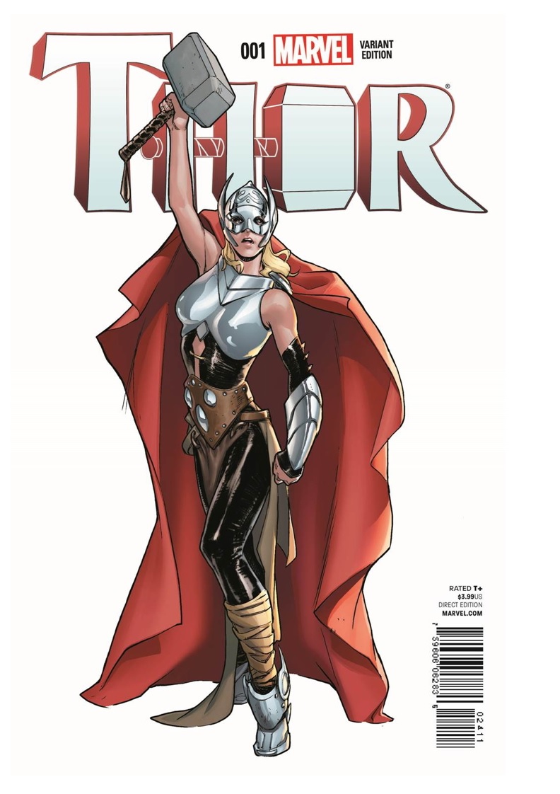
THOR #1
Writer: Jason AaronArtist: Russell Dauterman
Publisher: Marvel Comics
Reviewer: Lyzard
Was my interest in THOR #1 partially piqued by the fact that I'm a girl? Yes. But as the reviewer who named "women" as the best villains in last year's @$$ies, I'm hardly one to pontificate feminist views. My real interest in THOR #1 was less that the new hero was a woman, but more how Marvel marketed the comic. I mean, they released the news on “The View”. Clearly a statement was being made. Now, I usually feel that a #1 issue should be one which new readers should easily be able to jump right into. In this case, however, in order to understand the impact of this gender-bender, I went through and read some of the major THOR story lines of recent, mainly those written by Aaron. With this newfound knowledge, I can make the educated pronouncement that THOR #1 is not just another publicity stunt trying to lure new readers into LCS.
Regardless of this "major" change, whether or not you agree with Thor being portrayed as overly moody and Odin as wildly stubborn, THOR #1 is just a great comic. That's first and foremost. By page two you already have attack sharks. Need I say more? Well, yes, I have a word count to reach. So while Midgard has got attack sharks being destroyed by Frost Giants, on the moon we've got Freyja face-palming herself, shaking her head over how she could be cursed to live with such bull-headed men. Okay, that isn't actually in the comic, but she is still probably thinking it. Odin has returned to find his son unworthy to wield Mjolnir, and the timing couldn't be worse. War is nigh, as it is Malekith the Accursed who has brought those icy bullies to the Norwegian Sea.
But what about lady Thor? Where does she come into all of this? Nowhere, really. Her appearance is essentially as it was in THOR: GOD OF THUNDER #25. No, scratch that. She has even less presence than then. THOR #1 does imply, but never reveals, who our new THOR is. There are a lot of rumors floating around, particularly the idea of the former All-Mother Freyja. I'm probably paying too much attention to the change in her hair color (from reddish to blonde) compared to her first appearance, a change most likely attributed to different colorists between the issues. The point is, I doubt Thor’s new identity is an obvious choice.
I actually could care less who the new Thor turned out to be. Maybe it is Freyja. Perhaps Thor's sister from ORIGINAL SIN comes back into play. At the end of the day, I just care about Aaron's writing. Everything is so epic in this comic, exactly how a book about gods should be treated. Malekith just chews up the scenery in the best of ways, a fine replacement for the absent Loki. Aaron has had several artists bring his stories to life, and thus far I've enjoyed Russell Dauterman's drawings the best. His linework, along with the shading by colorist Matthew Wilson, bring true justice to the grandeur of this work. Inevitably, images from this comic will hold some weight due to their content and how it ties in to the Marvel Universe as a whole, but it is Dauterman's panel work that truly makes the reveal of Mjolnir's new "S" that much more spectacular.
So before you go spouting off about how this new angle disregards the mythos Marvel has set up with Thor, give the comic a chance. I promise you won't regret it.
Lyzard is Lyz Reblin, a graduate student at the University of Texas pursuing a master's degree in Media Studies... which is just a fancy way of saying she plays a lot video games, watches far too many horror films, and then tries to pass it all off as "research."
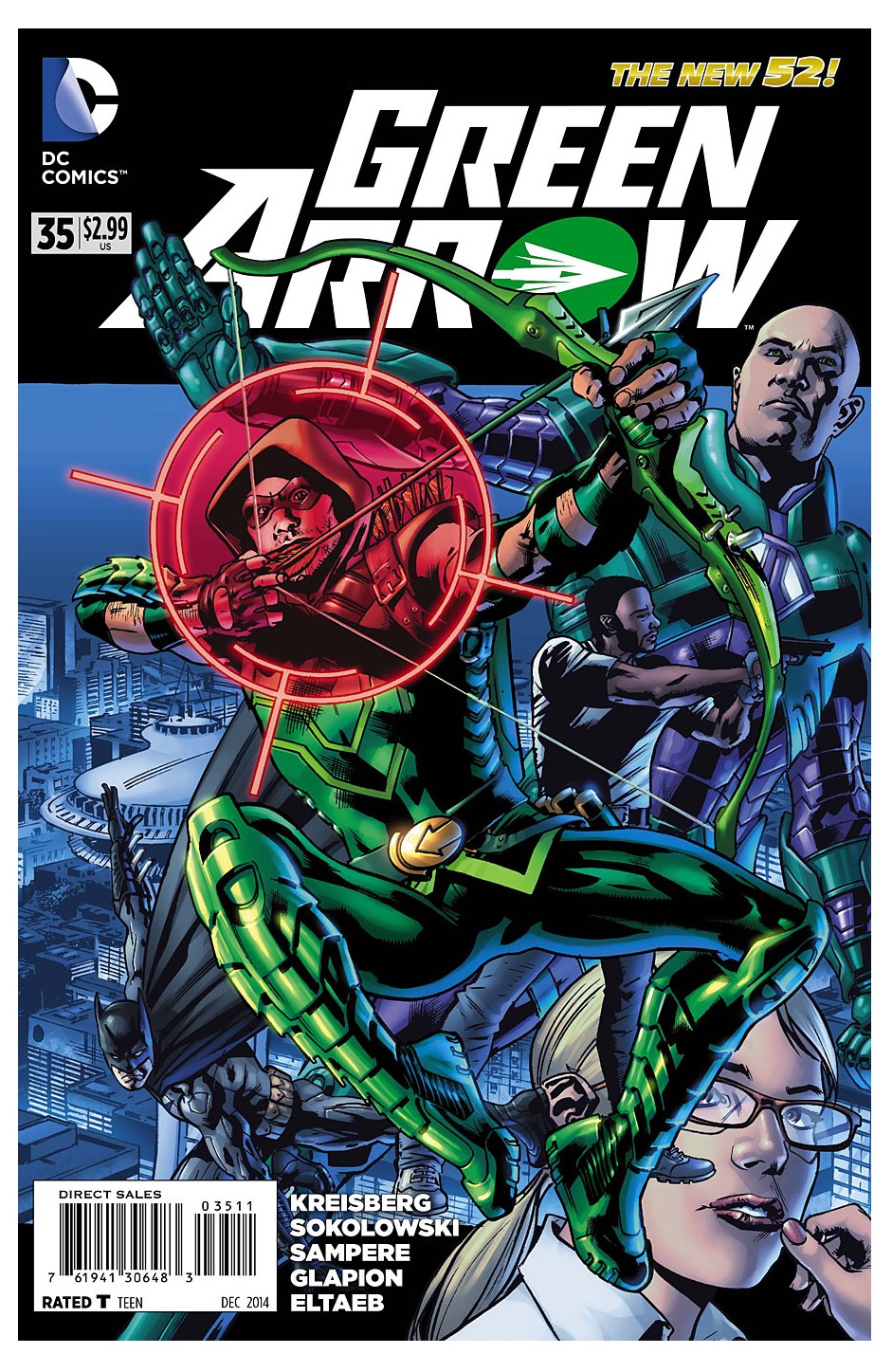
GREEN ARROW #35
Story: Andrew Kreisberg & Ben SokolowskiScript: Ben Sokolowski
Art: Daniel Sampere (pencils), Jonathan Glapion (inks), Gabe Eltaeb (colors)
Publisher: DC Comics
Reviewer: The Kid Marvel
Wow, can we get Jeff Lemire back on GREEN ARROW, like now? I’m sorry, but this book went from my favorite in the New 52 line to questioning shelling out 3 bucks for another issue. Maybe I’m exaggerating just a tad bit, but this book was a serious disappointment in comparison to the 34 books that came before it. GREEN ARROW #35 is the Meg Griffin of the series. Yeah, I said it.
Kreisberg and Sokolowski essentially tossed out everything that came before it simply to fit it in with the “Arrow” television series. Which, in theory, I don’t even mind; the only reason I picked up GREEN ARROW in the New 52 in the first place was because I liked the show so much. But geez, at least have a little but of creative difference between comic and show. I feel like they literally took everything Lemire accomplished with GREEN ARROW and tossed it out the window, basically just going screw originality, let’s just paste “Arrow” into written words and colored pictures.
Naomi and Fyff are simply written off to throw Diggle and Felicity into the mix, without even a natural progression at all. And Emiko--wasn’t it only last issue ago that she decided Oliver was taking her under his wing whether he accepted or not? Now she’s off training? I’m even ok with changing the Team Arrow of the comic to Diggle and Felicity, but at least slowly change the cast naturally.
Another thing is the geography and adding the Glades into Seattle, once again to be in line with “Arrow”. The best thing was seeing people on comment sections who are from Seattle, venting about how the “Glades” resemble nothing actually in Seattle. Like come on, if you’re going to force the comic and show to be identical, at least actually go all the way.
The only plus of this entire book was the dialogue between Oliver, Luthor, and Bruce Wayne, showcasing the difference between all three billionaires. GREEN ARROW #35 actually shines by displaying Oliver’s truly humanitarian side and only caring about helping people, without compromising in any way. This was a nice change of pace that is very often forgotten in the show and something the Lemire run hadn’t really focused on so much when I started.
GREEN ARROW #35’s artwork was such a letdown, too--it shows potential, but there were a lot of mistakes. Some of the body frames of characters fluxed in size and shape, sometimes with characters showing wider shoulders and more muscular bodies, and then in other panels leaned out. It was weird looking sometimes. Not to be extremely critical because these guys are employed for a reason, but I cannot count on one hand how many mistakes were made with eyes: so many f’d up eyes. Eyes went from not filled in, to too filled in, to one size bigger than the other, to cross eyes. The eyes ruined a lot of good scenes. The artwork could have been really, really good too. Some of the designs are awesome and resemble Stephen Amell almost to a T, but the mistakes really ruined this.
I’m generally not that picky and don’t ask for much. I understand the creative process is tough and these guys work hard, but this book is crap when compared to the predecessor or any other comic, really. DC had something really good going, for a reboot that most people still flame the internet in rage over. This was one of the titles that was generally well received and their top five in my opinion; now it’s completely out of top anything. I really wanted to like the new team. Look at MOON KNIGHT: creative team change with big shoes to fill, and Brian Wood was able to fill them while staying creative and adding his own take. This is when change is a bad thing, and forcing similarities to “Arrow”, that are over the top and are a slap in the face to something that worked. All I ask is to be entertained when I spend way too much on your comics; this was a huge disappointment and I’m only an issue or two away from dropping the book altogether.
 In stores today!
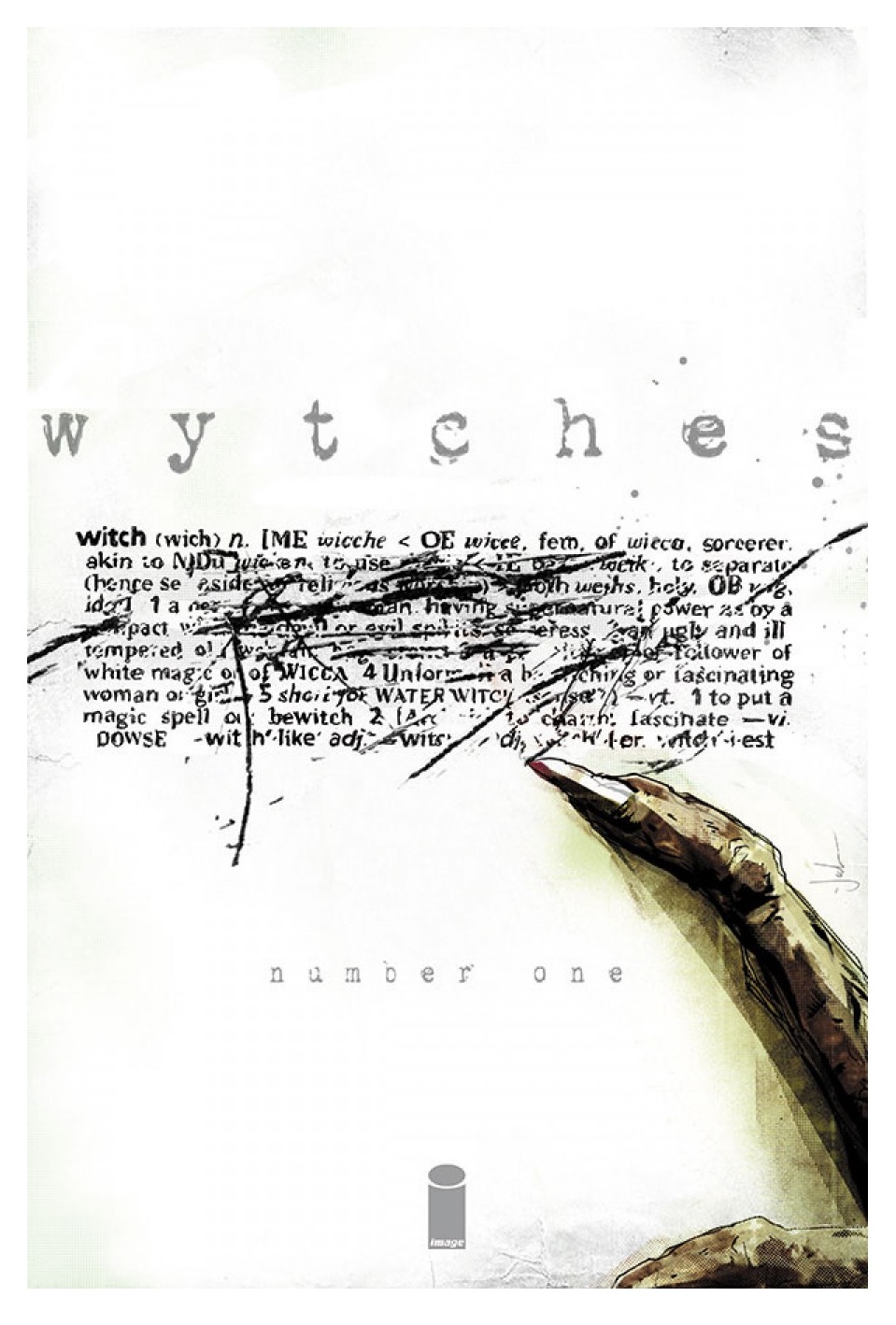
WYTCHES #1
Writer: Scott SnyderArt: Jock
Publisher: Image Comics
Reviewer: Optimous Douche
Before DETECTIVE and BATMAN, this upstart writing professor from NY (which even though I’m form Jersey I have never held against him) was entrenched in horror with a little title called AMERICAN VAMPIRE. Here’s a snippet from one of my reviews of issue 3:
“I originally came for King, but I have stayed for Snyder. As much as I will always love the master of macabre, his ability to bloat a word balloon is not the best fit for a visual medium. Snyder though, I think this guy has legs. Let’s see what happens when the King training wheels are taken off.”
So there it is, folks. Hate Optimous if you don’t like Snyder--I gave him his golden ticket (no, I’m not this arrogant, but I also predicted in 2008 Johns was headed for editorial leadership--just sayin’).
Horror with heart was Scott’s introduction to comics, and WYTCHES has brought him home. Thank God DC squashed exclusivity last year, because after reading issue one of WYTCHES Scott is about to give some gravitas to the “Hocus Pocus” idea of Salem’s daughters and this time he can actually own the friggin’ property, thanks to the lean Image corporate structure.
Of course, points and IPs are not the concern of us regular readers, so let me say that from a story perspective Scott is building a mystery, he strengthens the true meaning of witches before Hollywood makes it more flaccid with insipid “Secret Circle”-like shows, and he delivers it all through the package of human experience as a young girl realizes just how dangerous she can be.
WYTCHES will be nothing you expect, yet somehow everything you have been asking for in this mythos. I loved last season of “American Horror Story: Coven,” but I realize now how pretty and sanitary the proceedings actually were. For Snyder’s WYTCHES, the wills of the earth are power, not confidence or how many times you get banged by the Sax man.
The one staple Scott missed in this issue is his deep reverence for history, and making the time or place of the story as vibrant a character as any carbo- based life forms, or perhaps he has simply made it different this time around knowing that Jock is just as formidable with pictures as Scott is with words. While we don’t get any new history for Gotham or an exploration of the century we just lived, there is a primal introduction on page one as a woman is devoured by a tree. As Jock makes us more afraid of wood than a straight guy in a revival of “Anything Goes,” I believe Scott may be scratching under new surfaces of setting and letting his well-accomplished artist do the heavy lifting.
Because after this moment we shift back to normality, with a normal family on any normal weekday, waiting for the school bus to arrive. As middle aged dad and teenage daughter play the last wisps of games from childhood (like kill the Hippogryph), Snyder and Jock both convey the underpinning of a great horror that casts a dark pall beyond the simple separation of young womanhood blossoming before a befuddled father who now has a young woman instead of his tomboy buddy.
We find that the dark pall was the fact this young lady, Sailor Rooks, was the one who brought the lady-eating tree to life.
Maybe…
And there’s the mystery, folks: Sailor remembers the tree and bringing it to life to thwart an attacker, mom and dad say it was a delusion (but are most likely lying), and let us not forget the freaky bald guy who has come back from helping Wesley Crusher explore the galaxy to now fuck with the Rooks in some very primal and disgusting ways.
With Jock and Snyder, quality is expected. With Image, though, we all know that longevity is never a guarantee. Not to open the comics kimono too wide, but Image books get one arc to prove themselves on sales numbers; if they don’t make the mark, then hope you weren’t too attached to that story. Of course, with this baller marquee on the cover, I believe WYTCHES will have the current staying power of SAGA with the long draw editorial is letting Snyder play. He is letting points breathe instead of spewing them out en masse. This is not a critique; it’s a compliment to see what a creator who I admire and respect can truly accomplish when untethered from continuity shackles, family friendly mandates and larger story support structure.
The question of “do you like it, Optimous?” is moot and I still refuse to answer it point blank, so please stop asking, folks. I love this book, but that’s an opinion and opinions are like assholes in that they usually stink and are utterly invaluable. Make your own decision. Are you ready for an old look at a new favorite in the horror genre? Do you have room for one more book on your pull list? Do you want staying power of story and the slow doling out of story versus flashes of character moments? If yes, than get up on WYTCHES, bytches.
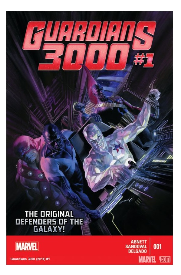
GUARDIANS 3000 #1
Writer: Dan AbnettArtist: Gerardo Sandoval
Publisher: Marvel Comics
Reviewer: Corey Michael Dalton
The last few times I’ve taken a chance and bought a Marvel comic I have wanted my money back immediately after finishing the issue. GUARDIANS 3000 #1 upholds that proud tradition. This is one of the worst comics I’ve read in quite some time—and I suffered through ULTIMATE FF #1. The writing in this issue was confusing, unfocused, and (worst of all) dull, and the art looked like someone trying to ape Joe Madureira circa 1994. Joe Mad’s pencils drove me away from UNCANNY X-MEN 20 years ago, and I haven’t grown any fonder of his style since then, let alone people attempting to copy it.
So, let’s just get the rest of this review out of the way. Believe it or not, I don’t like writing about bad comics any more than I like reading them. I shall begin, as always, with the writing. Starting a story in media res can be a great choice (it worked for STAR WARS!), but not when the action consists of characters we’ve not actually met yet getting shot at by generic aliens while screaming incomprehensible, just-invented space-y jargon. To illustrate, here’s an example of some of Charlie-27’s dialogue: “I big doubt that. Everyone’s beamer-bait today. I think the giant Kree head thing is garked. Maybe the Shi’ar dude, too, if you can believe that. I thought he was, like, immortalable. Sadistain and Annihilata have made slam-exits. As for the rest…nil data.” Yeah, that’s how the entire issue reads. Dan Abnett’s spellcheck program must have been sweating from exertion by the time he finished this script. There is an EDGE OF TOMORROW-like twist at the end that’s supposed to give the first two-thirds of the issue a bit of gravitas, but it just doesn’t work. In fact, that turn in the story disappointed me even more because it implied that we’d have to sit through the opening battle a second time—at least. So, this issue consists of characters we don’t know, boring battle scenes, silly sci fi dialogue, and an uninspired plot. I’ve read enjoyable comics by Abnett and his former writing partner Andy Lanning in the past (LEGION LOST as well as Marvel’s last GUARDIANS OF THE GALAXY series, which served as the basis for the extremely fun movie), so I was surprised by how much I didn’t like this. Maybe Lanning got the writing ability in the divorce?
And now the art. Oh, God, the art…I’ve never heard of Gerardo Sandoval, and I kind of hope I never hear of him again. Each and every character in this comic looks ridiculous. I mean, more ridiculous than people wearing spandex with fins on their heads should look. They are distorted and lumpy and forever grimacing or shouting with mouths you could bake a turkey in. On top of that, the designs for the new characters are utterly generic and bland. There are some monster-y creatures that look like every other monster-y alien bad guy ever drawn, and the main character girl looks like Jean Grey wearing one of those impractical but ubiquitous-in-sci fi comics full-body flight suit things that’s covered with pouches, straps, and shoulder pads. When Vance Astro screams “You sons of bitches!” with his mouth agape while hitting bad guys with Captain America’s shield, though, the art is, like, so totally extreme, man. Kidding. I feel like Marvel Comics is letting a 14-year-old boy from the mid-1990s choose their artists. Or a 12-year-old manga-loving girl from the mid-2000s. Either way, the art preferences of the person steering Marvel’s ship don’t seem to have much overlap with my own.
I hope GUARDIANS 3000 never again darkens my nightstand (that’s where I keep my to-be-read comics, y’all.) Of course, unless my reaction to this issue is atypical, I doubt the series will last very long, anyway. Not that I wish death on the series! It may not be my cup of tea, but surely someone, somewhere out there liked it, right? Right? To end on a positive: I did like Alex Ross’s cover, although I'm kind of irritated with him for luring me into buying this issue.
(By the way, I was hoping to review GOTHAM ACADEMY #1 this week because I really liked it! It was fun, unique, intriguing, and had great art. Alas, I was too late calling dibs, so now I get to look like the jerk who hates everything. Damn my procrastinating ways!)
,br> Corey Michael Dalton has written and/or edited trade books, magazine articles, short stories, novels, comics, plays, radio shows, reviews, websites, blogs, and more. You name it, he's probably written it. Except religious scriptures. He hasn't gotten around to those just yet. Soon ...
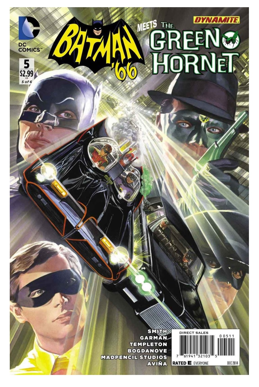
BATMAN '66 MEETS THE GREEN HORNET #5
Writers: Kevin Smith and Ralph GarmanArtists: Ty Templeton and Jon Bogdanove
Publisher: DC Comics/Dynamite Entertainment
Reviewer: Masked Man
It's getting near the end of this classic TV crossover between Adam West's Batman and Bruce Lee's Green Hornet (Ok, it's Van Williams, but even he'll admit Lee became a much bigger star than him). And just to get it out of the way, these covers by Alex Ross are just mother f'in awesome! Even if you aren't reading this, check out the covers online. Some of Ross's best work. I understand Ralph Garman (Kevin Smith's podcast partner as well) wet himself when Smith bought some of them, from Ross, for Garman's birthday.
To stay on the topic of artwork, I think this is Templeton's strongest issue, as if he finally got his sea legs and pages are just starting to click. Unfortunately, he only drew half the issues and a parade of artists came in to finish it (always disappointing). The main artist helping out is Jon Bogdanove, who I haven't seen much of since his THE MAN OF STEEL days (which never really impressed me). Here, his work is very hot and cold and looks nothing like his Superman days. On the one hand he's got great dynamic figures and panels, with some really nice likenesses of the actors (his design for General Gumm's face is really good). On the other, some of it lack cohesiveness, with some warping anatomy and perspective. Then with a truck load of artists handing the backgrounds and inks, well, it's all very inelegant (by which I mean nothing looks terribly wrong, but nothing fits together well). It also looks like everything was drawn in a computer and assembled later, helping to create the inelegant look as well. Still, they do manage to pull off a passing grade, so there.
Getting into the story, which remains very faithful to the old series, Batman and Robin have managed to incredulously escape a ludicrous death trap (shades of old Bill Finger and Dick Sprang issues). As the Green Hornet and Kato finally come up with a way to get Batman and Robin to work with them (without revealing they are actually superheroes (in case anyone still doesn't know, GH and K pretend to be crooks, only D.A. Frank Scanlon knows the truth (and secretary Casey (enough with the parentheses already!)))). Meanwhile, the villains, Joker and General Gumm execute the final part of their larcenous plan. Mind you, much like an old “Batman” episode itself, the plots aren't as interesting as the absurd tone and demeanor of the characters, which Smith and Garman do a great job of. As I mentioned in an earlier review, they are basically writing an episode as if it still was 1966 as opposed to taking a more satirical view. They have also crammed as many cool, classic bat-gadgets in each episode as they can. This issue features the Bat-noculars (though they should have been drawn smaller--things looked worthless on the show!), the Detect-A-Scope and the mighty Bat-zooka! Then stealing a bit from the BATMAN movie ('66 that is) they give Joker a new headquarters. The overall designs could have been better, considering what Penguin had in the movie, but the henchmen playing Twister was pretty awesome.
Without a doubt, you get what you pay for with this series. It's '66 Batman running around with '66 Green Hornet, and it's pretty much pitch prefect. My one slight complaint would be Joker's laugh. It just seems like random Ha's and Ho's, opposed to actually writing down the rhythm of Cesar Romero’s delivery (is that too nerdy?). With just one more issue to go, it's sure to end with a bang--Bat-fans (and Hornet fans) will not want to miss it.
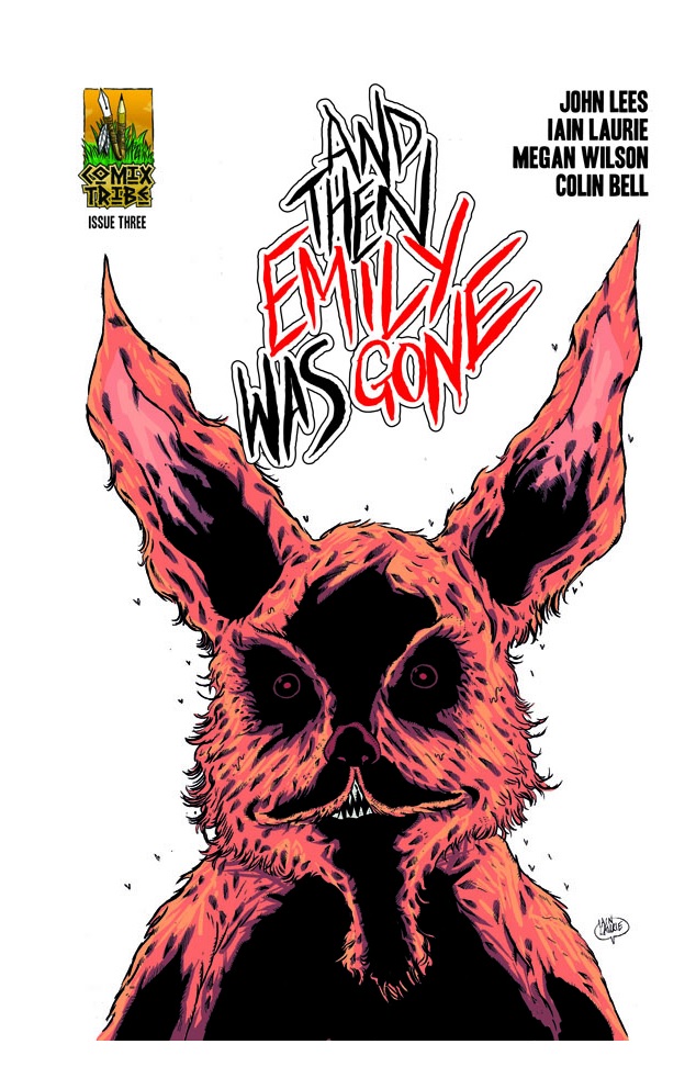

AND THEN EMILY WAS GONE #3
Writer: John LeesArtist: Iain Laurie
Publisher: Comix Tribe
Reviewer: BottleImp
Halloween is fast approaching, and though I’m always ready for a good horror story, it’s this time of year that my casual interest turns into an all-out bloodlust. And this October, the comic book that is slaking that thirst is the gruesomely bizarre AND THEN EMILY WAS GONE.
I’ve already sung my praise for this series’ first two issues—Iain Laurie’s grotesque and disturbing artwork, John Lees’ odd and strangely surreal story that blends crime thriller, folklore and supernatural horror—so I won’t belabor the point again here. I will say that this third issue takes the characters deeper into the mysteries that surround the home of the missing Emily, the island of Merksay, off the coast of Scotland. A chance encounter brings Detective Hellinger and young Fiona (and the reader) yet another facet of the puzzle surrounding Emily’s disappearance, the tiny island of Tallyman Holm. This island is home to the Circus of Night, a band of beings that may not be really human.
I’ve also brought up the wonderfully weird works of David Lynch in comparison to the last two issues of this comic, and though I hate to repeat myself, I must do so once again. Lynchian oddity is all over this comic, and I have to think that the series’ creators are intentionally paying homage to the eccentric director. This issue closes with a dream sequence that would feel right at home within the framework of TWIN PEAKS, right down to the visual parallels between the blood red walls that segue into a thick forest and the patterned black-and-white tile floor and Lynch’s iconic “Black Lodge” set dressing. But Lees and Laurie are not merely imitators; those readers without a prior knowledge of Lynch’s work will not have their reading experience sullied by this omission. AND THEN EMILY WAS GONE generates a heady helping of uneasy horror all on its own.
If you’re a horror junkie and dying for a good fix this Halloween season, take a hit of this wonderfully creepy nightmare narcotic. AND THEN EMILY WAS GONE is a fantastic reminder of the kind of out-of-the-box quality that the best indie comic books deliver.
When released from his bottle, the Imp transforms into Stephen Andrade, an artist/illustrator/pirate monkey painter from New England. He's currently hard at work interpreting fellow @$$Hole Optimous Douche's brainwaves and transforming them into pretty pictures on AVERAGE JOE, an original graphic novel to be published by Com.x. You can see some of his artwork here.
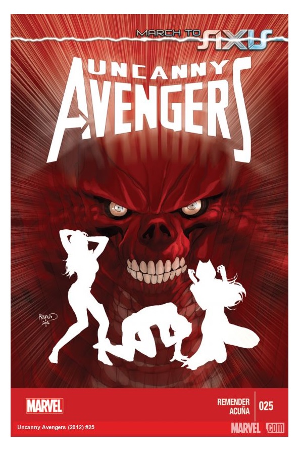
UNCANNY AVENGERS #25
Writer: Rick RemenderArtist: Daniel Acuna
Publisher: Marvel Comics
Review by: Mighty Mouth
Practically from its inception, Remender and his crew have been teasing fans with the coming of the Red Onslaught (wait, wasn’t he always red?). Anyway, UNCANNY AVENGERS #25 brings the coup de grace to the title while serving as the springboard for the next major Marvel crossover; AVENGERS & X-MEN: AXIS.
Remender’s work on this title has been nothing if not exemplary, so it’s no real surprise that his finale issue would follow suit. For this reviewer, the real joy of this issue is all in Remender’s characterization of Magneto. Over the years Magneto has fought on the sides of both angels and demons. Dichotomies aside, at his core Magneto knows he’s every bit the monster homo sapiens see him as, and no one appreciates this better than his very daughter, the Scarlet Witch. Wanda has always struggled with daddy issues and this story perfectly underscores her sentiments in a most intimate manor.
In the past Acuna’s art has been a bit of a precarious thing for me. Although I have always appreciated his layouts, I haven’t given him much praise up till now. Mostly due to how the coloring seems to drown out his pencils detail. However, with this issue it’s not the case. Acuna’s pencils stand out better here than in previous issues and I hope this trend continue; I may even become a fan.
With the march to Axis now realized, so concludes the UNCANNY AVENGERS title. These past 25 issues have been a blast. I can only hope that the aftermath of Axis will bring about an all new, all different Avengers/X-Men collaboration to regale us with more tales of human and mutant coexistence.
You muties have come a long way, baby--kudos!
Artists: Jon Paul Leon (pencils/inks), Dave Stewart (colors)
Publisher: DC Comics
Reviewer: KletusCassidy
Ahhhhhhh...you feel that? The crisp cool air, the browning leaves, the not-so-scorching sun, Saturdays filled with beer and football, the birth of autumn...the seasons are changing here in sunny Florida, and Ol’ Kletus couldn't be happier. Much like the coming of fall, this comic kind of gave me that same refreshing feeling after a month of future stories (a lot of which I enjoyed). In my opinion, while the new 52 has had some great series (WONDER WOMAN, BATWOMAN, BATMAN, NIGHTWING), I feel that some books spent a lot of their time trying to reestablish this new status quo (JUSTICE LEAGUE, TEEN TITANS) and because of that have missed out just having cool stories about our favorite heroes that don’t have to tie into something larger. So when this issue hit the stands with a new creative team, I was a little bit skeptical, but if you have a comic book cover that has Batman wading through the dark with a flashlight, I'll probably buy the issue out of curiosity alone…throw in a mystery airplane full of rotting bodies and I'm definitely in.
I really like this story because it's just a fun Batman story that actually plays up the detective side of the Caped Crusader. Back when Paul Dini was writing DETECTIVE COMICS, DC made a hard push (heh heh) to make each Batman book unique rather than having four Bat-books essentially telling the same story. It wasn’t until Manapul and Buccelato jumped on DETECTIVE that this title no longer suffered from having to play off the main BATMAN comic in showing how things have changed (or haven't), so having a story such as this where Batman can do his thing regardless of the reboot is a welcome change of pace. I also like that this story doesn't take place within the city of Gotham. I know it's the Gotham airport, but it was nice to see Batman work outside of his comfort zone in a different setting. I don't need to give you any details about the story because going into it blind and seeing the events unfold is part of the fun of this issue, plus the cover gives you basically all you need to know. This is a great Batman story that has humor, drama and the World’s Greatest Detective doing what he does best.
The art in this book isn't a style that I've seen in a Batman book recently (maybe Alex Maleev comes close), but it’s a style that Marvel seems to be using on a lot of its books. My buddy Steven and I refer to this trend as grounded art. This just means that the art isn't the typical style that we are used to seeing in a lot of superhero books but seemed very prevalent in indie books of the Nineties. There’s not only a lot of the detail in the main character, but there’s also an emphasis on detailing the backgrounds and surrounding areas, which gives the book a more realistic approach. The colors aren't as bombastic and bold; it kind of relies more on pastels and softer shades rather than the way a book like JUSTICE LEAGUE looks (not that there's anything wrong with that). Speaking of colors, they are done by the eight time Eisner award winner Dave Stewart known for HELLBOY, THE GOON, SHAOLIN COWBOY, UMBRELLA ACADEMY and many more, so I guess I shouldn't be surprised that the coloring in this book is so good.
This issue was a great way to get back to the new 52 post-FUTURES ENDS month and really was a fun detective story with a somewhat unique setting and concept (although it did make me think of that FRINGE episode). I hope this means DC will let their characters get fleshed out (heh heh) a little bit and allow for some smaller, shorter, more intimate stories instead having them run from big five-plus issue stories to the next multiple issue story. The art was great and showcased a different style than I'm used to seeing in the DC books, but it was a welcome change, and as I said the coloring is excellent. Also this story will only be two issues, so you can pick up this story, not spend an arm and a leg but still get your Batman fix...cause I know you’re jonesin’ for that sweet B-man action. So if you want to read a great Batman story with unique art that doesn't spend time establishing the new(ish) status quo, this book is for you!
If you’d like to hear more from Kletus Cassidy (I know, why would you, right?), you can listen to him and his good buddy Steve discuss comics, comic news and more on the SANCTUM SEQUENTIAL podcast now on iTunes. Email questions, comments and hate mail here! Thanks!
Art: Ramon Perez (pencils, inks), Ian Herring (colors)
Publisher: Marvel Comics
Reviewer: Steven Beebe
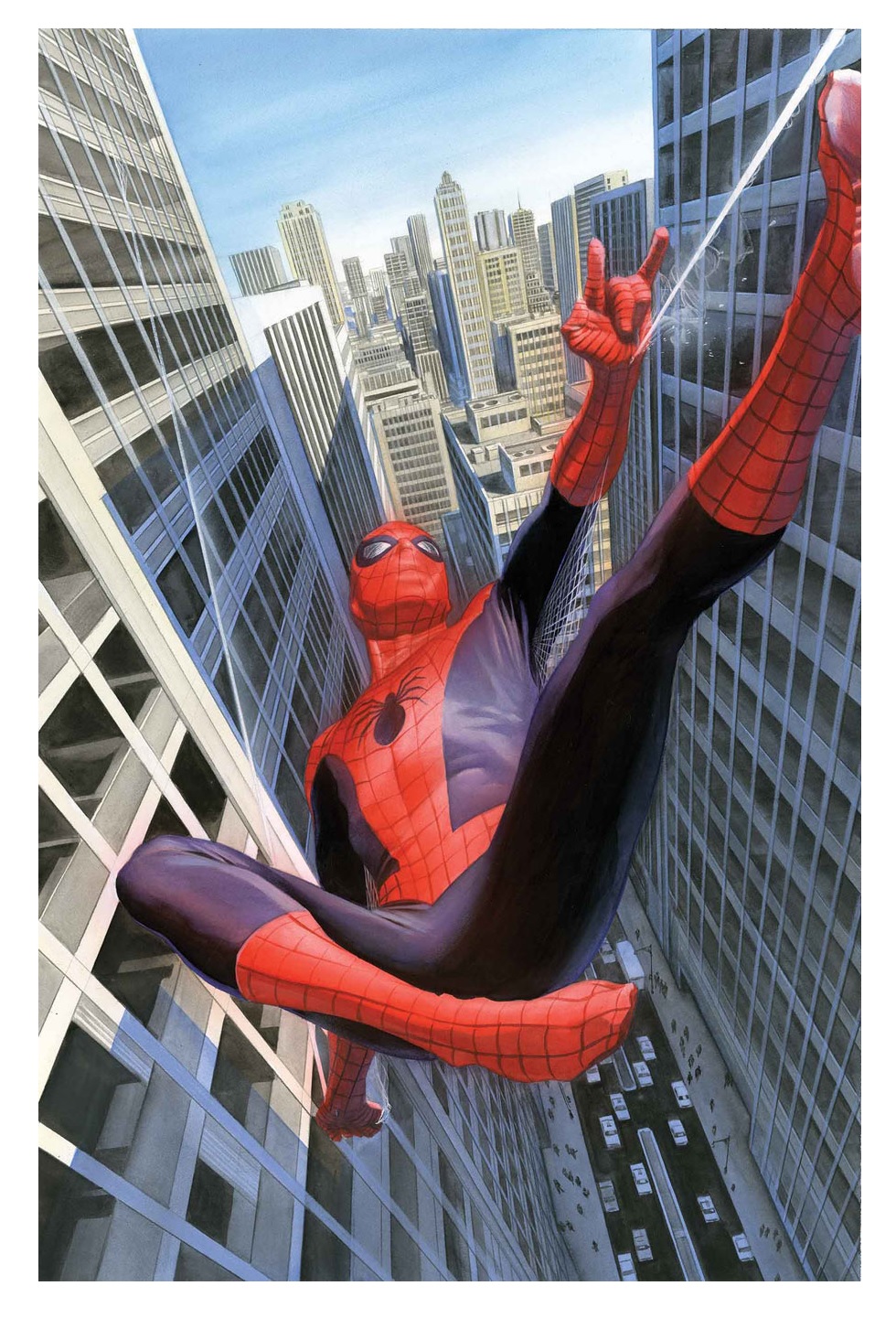
Now that we’ve reached the conclusion of Dan Slott’s five month diversion into the unused nooks and crannies of Peter Parker’s less explored early history, I feel somewhat vindicated in admitting that I only initially signed on for this story in interest of the covers. Yes, I must confess an idolatry for the work of Alex Ross almost Babylonian in scale, particularly when he gets to indulge in classic versions of characters. So I bought in, and resigned that at least I would have some pretty books and if it was a passable early Spidey story, then I could share it around with friends and new readers as an easily digested mini.
How pleasantly surprised I was, then, to read the story I did. Not only one bound in beautiful artwork, but month after month, a book near bursting with color and personality, and in the writing, an energy I previously felt had started to ebb from the author’s work in the main storyline. Slott launched into Marvel history with gleeful abandon, his enthusiasm for writing an unburdened take on classic Spider-Man readily apparent in the myriad weaving of iconic panels and moments with modern trappings that ensconced the story in the present while not intruding on the innocent tone of the plot. The lightness, in turn, serves the story, as Slott chooses to focus on the development of an aspect of the young Peter Parker character that is oft overlooked in the tragedy of his story’s beginning. By shying away from old chestnuts on power and responsibility, the author manages to develop a warm conclusion that not only is true to the character, but speaks to an honesty in the concept that rings as true today as it did in an uncertain Atomic Age decades ago.
However, Slott’s retro ride could not run on nostalgia alone, and even more credit for tone and atmosphere must fall on the art and colors of Ramon Perez and Ian Herring. The pseudo-realism of the Ross covers is gone as we descend into cartoon abstraction and a psychedelic color palette, but the reverence for the classic styles and trappings of the characters remains. Peter Parker looks the same as ever in his corny sweater vest, yet Perez manages to tweak designs just enough to cast the story loose from its moorings in the past, while the choices for details (like Spidey’s old, flat webbing) and poses (these are the acrobatics of Steve Ditko’s rookie, not the McFarlane elastic gymnastics) are unfailingly old-school in approach. The combination reminds of nothing so much as Chris Samnee’s seminal work THOR: THE MIGHTY AVENGER; and the storybook quality of the art proves just as effective in establishing the timelessness of the tale.
Ultimately, the success of "Learning to Crawl" lies in a unity of vision and purpose. The entire creative team was completely clear on the tone and style of the book they sought to create, and that enthusiasm shines through. Far from a disposable diversion, it should serve as a consistent character study that resonates its theme through fantastic art and design while still enjoying being a touchstone of comics history for old and new readers alike.
 In stores this week!
Artist: Christopher Jones
Publisher: Future Dude
Reviewer: Lyzard
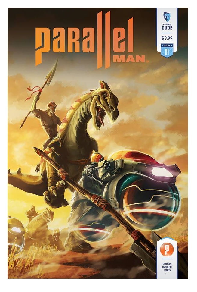
Dinosaurs riding dinosaurs. How much more bad-ass can a comic book cover get? An image like that is sure to get your attention, and even though it hardly is a snapshot for the plot within, it does let you know three things. PARALLEL MAN is a sci-fi romp. It is going to feature an action/adventure story. There will be dinosaurs riding dinosaurs.
It would be difficult to capture the actual plotline of PARALLEL MAN in a single image. It features layers upon layers of complexity, not due to multiple storylines at play, but just from the rules of the universe(s) in which it is set. Let's get something out of the way before delving into the nitty-gritty of the plot. We are dealing with parallel universes here, not time travel. To me both of these theories can easily be bunched into the same basket of theoretical physics, but the comic makes a point of establishing this difference. In PARALLEL MAN, there are infinite Earths and one of these variants has advanced enough to travel through the multiverses, but not learned how to expend their resources appropriately. I guess humans no matter when and where share that same trait. Rather than coming up with the technology to take care of their own Earth, the Ascendancy has decided to go after all of their other copies, "annexing" them in order to further their own survival.
Any and all time, space, and dimensional leaping forms of science fiction suffer from their inability to avoid timey-wimey paradoxes, lapses in logic, or find any form of continuity. If you’ve got an example that does, feel free to prove me wrong but I have no interest in reading any Primer complex diagrams. PARALLEL MAN, though filled with exposition on how its world(s) work, moves so fast that most discrepancies go by too fast to be noticed at first glance.
Much of this is owed to the artwork by Christopher Jones. Having a seasoned artist on board makes this independent comic stand out from the multitude of books created without the assistance of major publishers. There is an absurd amount of creativity in just one issue. Each new world traveled to has its own uniqueness. In just a few pages we go from a Blade Runner-esque world to variant Earths Jules Verne and H.G. Wells would be jealous of.
As I said earlier, the logic is brought to the forefront on multiple occasions. The dialogue is flooded with scientific babble. Jeffrey Morris may be my new hero for finding a way to combine his academic and entertainment pursuits, but PARALLEL MAN is at its most engaging when it doesn't read like a Carl Sagan or Feynman lecture. The back-and-forths between the protagonist Agent Morgan and his computerized assistance Atlas remind me ever so much of Robert Downey Jr.'s Tony Stark conversing with Paul Bettany's J.A.R.V.I.S.
It was almost a shame to find out that Lance Reddick would be voicing Atlas. PARALLEL MAN, the comic, is only the beginning to a vast multi-media experience. Along with a seven issue mini-series, Future Dude will be releasing a mobile game and animation pilot in December. From the trailer it appears that Jones’ artwork seamlessly transitions digitally, and though Reddick isn't how I envisioned the character sounding, you can't really be disappointed in a project that features him, John Cho, and Ming-Na Wen.
I've reviewed several projects that try to cover multiple entertainment platforms and mediums. Rarely is there ever a consistent level of quality. I will make no judgments as to whether or not PARALLEL MAN will be an exception to this case, but it does seem apropos for a comic that explores how little changes can produce such vast differences to try to tell the same story in varied forms.
Editing, compiling, imaging, coding, logos & cat-wrangling by Ambush Bug
Proofs, co-edits & common sense provided by Sleazy G
Remember, if you have a comic book you’d like one of the @$$holes to take a look at, click on your favorite reviewer’s link and drop us an email.
 The next level of comic book excellence is a click away at BLACK MASK STUDIOS!
 Want more in all things Geek?
Check out our friends at PoptardsGo for podcasts, reviews, and more!
 And if you still need more geek in your life, check out Part-Time Fanboy for more geeky goodness on comics, movies, and more!
Finally, check out AICN COMICS on Facebook and Comixpedia!
With the march to Axis now realized, so concludes the UNCANNY AVENGERS title. These past 25 issues have been a blast. I can only hope that the aftermath of Axis will bring about an all new, all different Avengers/X-Men collaboration to regale us with more tales of human and mutant coexistence.
You muties have come a long way, baby--kudos!

DETECTIVE COMICS #35
Writer: Benjamin PercyArtists: Jon Paul Leon (pencils/inks), Dave Stewart (colors)
Publisher: DC Comics
Reviewer: KletusCassidy
Ahhhhhhh...you feel that? The crisp cool air, the browning leaves, the not-so-scorching sun, Saturdays filled with beer and football, the birth of autumn...the seasons are changing here in sunny Florida, and Ol’ Kletus couldn't be happier. Much like the coming of fall, this comic kind of gave me that same refreshing feeling after a month of future stories (a lot of which I enjoyed). In my opinion, while the new 52 has had some great series (WONDER WOMAN, BATWOMAN, BATMAN, NIGHTWING), I feel that some books spent a lot of their time trying to reestablish this new status quo (JUSTICE LEAGUE, TEEN TITANS) and because of that have missed out just having cool stories about our favorite heroes that don’t have to tie into something larger. So when this issue hit the stands with a new creative team, I was a little bit skeptical, but if you have a comic book cover that has Batman wading through the dark with a flashlight, I'll probably buy the issue out of curiosity alone…throw in a mystery airplane full of rotting bodies and I'm definitely in.
I really like this story because it's just a fun Batman story that actually plays up the detective side of the Caped Crusader. Back when Paul Dini was writing DETECTIVE COMICS, DC made a hard push (heh heh) to make each Batman book unique rather than having four Bat-books essentially telling the same story. It wasn’t until Manapul and Buccelato jumped on DETECTIVE that this title no longer suffered from having to play off the main BATMAN comic in showing how things have changed (or haven't), so having a story such as this where Batman can do his thing regardless of the reboot is a welcome change of pace. I also like that this story doesn't take place within the city of Gotham. I know it's the Gotham airport, but it was nice to see Batman work outside of his comfort zone in a different setting. I don't need to give you any details about the story because going into it blind and seeing the events unfold is part of the fun of this issue, plus the cover gives you basically all you need to know. This is a great Batman story that has humor, drama and the World’s Greatest Detective doing what he does best.
The art in this book isn't a style that I've seen in a Batman book recently (maybe Alex Maleev comes close), but it’s a style that Marvel seems to be using on a lot of its books. My buddy Steven and I refer to this trend as grounded art. This just means that the art isn't the typical style that we are used to seeing in a lot of superhero books but seemed very prevalent in indie books of the Nineties. There’s not only a lot of the detail in the main character, but there’s also an emphasis on detailing the backgrounds and surrounding areas, which gives the book a more realistic approach. The colors aren't as bombastic and bold; it kind of relies more on pastels and softer shades rather than the way a book like JUSTICE LEAGUE looks (not that there's anything wrong with that). Speaking of colors, they are done by the eight time Eisner award winner Dave Stewart known for HELLBOY, THE GOON, SHAOLIN COWBOY, UMBRELLA ACADEMY and many more, so I guess I shouldn't be surprised that the coloring in this book is so good.
This issue was a great way to get back to the new 52 post-FUTURES ENDS month and really was a fun detective story with a somewhat unique setting and concept (although it did make me think of that FRINGE episode). I hope this means DC will let their characters get fleshed out (heh heh) a little bit and allow for some smaller, shorter, more intimate stories instead having them run from big five-plus issue stories to the next multiple issue story. The art was great and showcased a different style than I'm used to seeing in the DC books, but it was a welcome change, and as I said the coloring is excellent. Also this story will only be two issues, so you can pick up this story, not spend an arm and a leg but still get your Batman fix...cause I know you’re jonesin’ for that sweet B-man action. So if you want to read a great Batman story with unique art that doesn't spend time establishing the new(ish) status quo, this book is for you!
If you’d like to hear more from Kletus Cassidy (I know, why would you, right?), you can listen to him and his good buddy Steve discuss comics, comic news and more on the SANCTUM SEQUENTIAL podcast now on iTunes. Email questions, comments and hate mail here! Thanks!

AMAZING SPIDER-MAN #1.1-1.5 “Learning to Crawl”
Writer: Dan SlottArt: Ramon Perez (pencils, inks), Ian Herring (colors)
Publisher: Marvel Comics
Reviewer: Steven Beebe
Now that we’ve reached the conclusion of Dan Slott’s five month diversion into the unused nooks and crannies of Peter Parker’s less explored early history, I feel somewhat vindicated in admitting that I only initially signed on for this story in interest of the covers. Yes, I must confess an idolatry for the work of Alex Ross almost Babylonian in scale, particularly when he gets to indulge in classic versions of characters. So I bought in, and resigned that at least I would have some pretty books and if it was a passable early Spidey story, then I could share it around with friends and new readers as an easily digested mini.
How pleasantly surprised I was, then, to read the story I did. Not only one bound in beautiful artwork, but month after month, a book near bursting with color and personality, and in the writing, an energy I previously felt had started to ebb from the author’s work in the main storyline. Slott launched into Marvel history with gleeful abandon, his enthusiasm for writing an unburdened take on classic Spider-Man readily apparent in the myriad weaving of iconic panels and moments with modern trappings that ensconced the story in the present while not intruding on the innocent tone of the plot. The lightness, in turn, serves the story, as Slott chooses to focus on the development of an aspect of the young Peter Parker character that is oft overlooked in the tragedy of his story’s beginning. By shying away from old chestnuts on power and responsibility, the author manages to develop a warm conclusion that not only is true to the character, but speaks to an honesty in the concept that rings as true today as it did in an uncertain Atomic Age decades ago.
However, Slott’s retro ride could not run on nostalgia alone, and even more credit for tone and atmosphere must fall on the art and colors of Ramon Perez and Ian Herring. The pseudo-realism of the Ross covers is gone as we descend into cartoon abstraction and a psychedelic color palette, but the reverence for the classic styles and trappings of the characters remains. Peter Parker looks the same as ever in his corny sweater vest, yet Perez manages to tweak designs just enough to cast the story loose from its moorings in the past, while the choices for details (like Spidey’s old, flat webbing) and poses (these are the acrobatics of Steve Ditko’s rookie, not the McFarlane elastic gymnastics) are unfailingly old-school in approach. The combination reminds of nothing so much as Chris Samnee’s seminal work THOR: THE MIGHTY AVENGER; and the storybook quality of the art proves just as effective in establishing the timelessness of the tale.
Ultimately, the success of "Learning to Crawl" lies in a unity of vision and purpose. The entire creative team was completely clear on the tone and style of the book they sought to create, and that enthusiasm shines through. Far from a disposable diversion, it should serve as a consistent character study that resonates its theme through fantastic art and design while still enjoying being a touchstone of comics history for old and new readers alike.

 In stores this week!
PARALLEL MAN #1
Writer: Jeffrey Morris & Fredrick HaugenArtist: Christopher Jones
Publisher: Future Dude
Reviewer: Lyzard
Dinosaurs riding dinosaurs. How much more bad-ass can a comic book cover get? An image like that is sure to get your attention, and even though it hardly is a snapshot for the plot within, it does let you know three things. PARALLEL MAN is a sci-fi romp. It is going to feature an action/adventure story. There will be dinosaurs riding dinosaurs.
It would be difficult to capture the actual plotline of PARALLEL MAN in a single image. It features layers upon layers of complexity, not due to multiple storylines at play, but just from the rules of the universe(s) in which it is set. Let's get something out of the way before delving into the nitty-gritty of the plot. We are dealing with parallel universes here, not time travel. To me both of these theories can easily be bunched into the same basket of theoretical physics, but the comic makes a point of establishing this difference. In PARALLEL MAN, there are infinite Earths and one of these variants has advanced enough to travel through the multiverses, but not learned how to expend their resources appropriately. I guess humans no matter when and where share that same trait. Rather than coming up with the technology to take care of their own Earth, the Ascendancy has decided to go after all of their other copies, "annexing" them in order to further their own survival.
Any and all time, space, and dimensional leaping forms of science fiction suffer from their inability to avoid timey-wimey paradoxes, lapses in logic, or find any form of continuity. If you’ve got an example that does, feel free to prove me wrong but I have no interest in reading any Primer complex diagrams. PARALLEL MAN, though filled with exposition on how its world(s) work, moves so fast that most discrepancies go by too fast to be noticed at first glance.
Much of this is owed to the artwork by Christopher Jones. Having a seasoned artist on board makes this independent comic stand out from the multitude of books created without the assistance of major publishers. There is an absurd amount of creativity in just one issue. Each new world traveled to has its own uniqueness. In just a few pages we go from a Blade Runner-esque world to variant Earths Jules Verne and H.G. Wells would be jealous of.
As I said earlier, the logic is brought to the forefront on multiple occasions. The dialogue is flooded with scientific babble. Jeffrey Morris may be my new hero for finding a way to combine his academic and entertainment pursuits, but PARALLEL MAN is at its most engaging when it doesn't read like a Carl Sagan or Feynman lecture. The back-and-forths between the protagonist Agent Morgan and his computerized assistance Atlas remind me ever so much of Robert Downey Jr.'s Tony Stark conversing with Paul Bettany's J.A.R.V.I.S.
It was almost a shame to find out that Lance Reddick would be voicing Atlas. PARALLEL MAN, the comic, is only the beginning to a vast multi-media experience. Along with a seven issue mini-series, Future Dude will be releasing a mobile game and animation pilot in December. From the trailer it appears that Jones’ artwork seamlessly transitions digitally, and though Reddick isn't how I envisioned the character sounding, you can't really be disappointed in a project that features him, John Cho, and Ming-Na Wen.
I've reviewed several projects that try to cover multiple entertainment platforms and mediums. Rarely is there ever a consistent level of quality. I will make no judgments as to whether or not PARALLEL MAN will be an exception to this case, but it does seem apropos for a comic that explores how little changes can produce such vast differences to try to tell the same story in varied forms.
Proofs, co-edits & common sense provided by Sleazy G
 The next level of comic book excellence is a click away at BLACK MASK STUDIOS!
 Want more in all things Geek?
Check out our friends at PoptardsGo for podcasts, reviews, and more!
 And if you still need more geek in your life, check out Part-Time Fanboy for more geeky goodness on comics, movies, and more!
Finally, check out AICN COMICS on Facebook and Comixpedia!
