
Ahoy, squirts! Quint here. I started feeling all left out when all the other movie sites got to debut awesome rare John Alvin unused poster finals and comps, but before I could cry too hard into my Cheerios I got a nice stuffed email from Titan with some sweet stuff to debut for you guys.
All of this is in support of the pending release of The Art of John Alvin book, which I have actually gotten to read and it's awesome. In fact, it's a perfect companion piece to the great Art of Drew Struzan book they put out a few years back. It's done in much the same way as the Struzan book, with the late, great John Alvin's wife, Andrea, filling in the background text.
You get work in progress pics, unused comps and finished posters that were ultimately used or passed on.
Struzan was the king of this time period, in my opinion, but John Alvin was unquestionably a master. His iconic Spielberg work included ET, Empire of the Sun and both Goonies and Gremlins. There's also Darkman, Spaceballs and his Disney stuff, including Beauty and the Beast, Aladdin and The Little Mermaid.
I've got some good stuff for you below, but first here's a link to the book. Buy one for yourself and one for all your nearest and dearest loved ones:
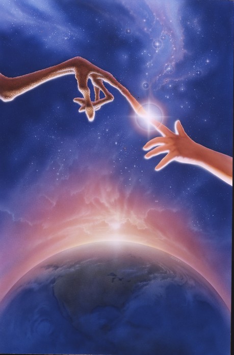
That ET poster is pretty legendary. Why not take a look at the original painting without all that nasty text getting in the way?
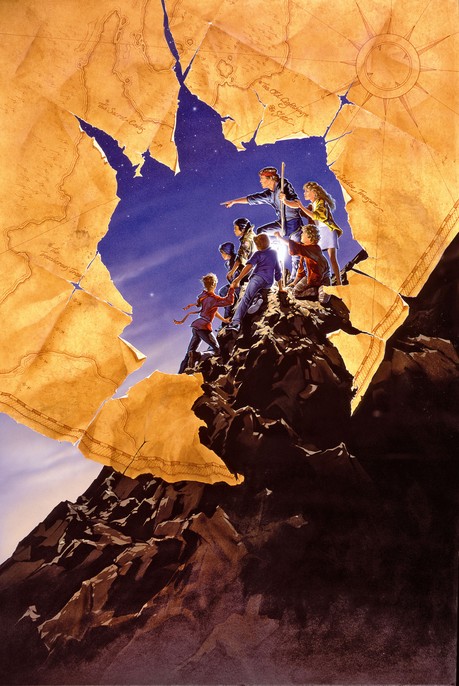
Keeping the Spielberg project influence going, here's a debut look at an alternate version of his Goonies poster? The finished poster has all the kids in silhouette. Not so in the original!
These aren't debuts, but I wanted to throw in a couple of the Jurassic Park posters Alvin worked on. I particularly like the first one, which is obviously a callback to Alvin's ET poster (debuted by IGN):
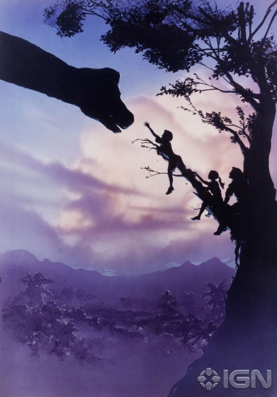
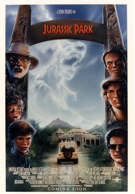
I can see why they didn't go with those posters (the second looks like a comp, which isn't as detailed as the final would have been). The marketing was in large part focused on the mystery of the movie. What would a Steven Spielberg dinosaur look like? So just using the logo in that instance was more than enough.
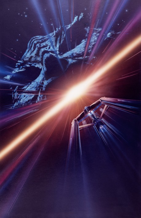
Here's a rough comp for a Godfather 3 poster:
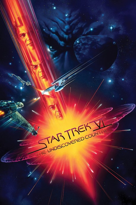
And I'll finish off with another debut: the alternate design for Star Trek VI: The Undiscovered Country. It's followed by the final version they ended up going with.
Very cool, eh? There's all that plus hundreds more you haven't seen yet in the book. Any geek woth his or her salt will love it, I guarantee. I mean, I don't back up that guarantee with anything, but you know what I mean. It's friggin' awesome.
-Eric Vespe
”Quint”
quint@aintitcool.com
Follow Me On Twitter
