
I’m here all week, folks!
Tough crowd. As I gaze at the not so busy streets of SD, it’s hard to imagine how crowded and busy this place will be in just a few short hours. I’m looking forward to popping in with bits if news and info throughout the week and I’ll definitely be bringing back some fun interviews from the con. But just because I’m at SDCC doesn’t mean we don’t have reviews for this week. Those @$$Holes have fired out a scad of reviews of all sorts of good stuff, so here’s this week’s pull!
(Click title to go directly to the review)
Advance Review: THE POSTHUMAN PROJECT Motion Picture (2014)
ORIGINAL SIN #6
THE WICKED + THE DIVINE #2
Advance Review: AFTERLIFE WITH ARCHIE #6
FABLES #142
SPIDER-MAN 2099 #1
Indie Jones presents PLAGUED: THE MIRANDA CHRONICLES #1
BATMAN ETERNAL #15
X-FILES ZERO YEAR #1
Advance Review: THE FOUR HORSEMEN OF THE APOCALYPSE Original Hardcover Graphic Novel
THE AUTEUR #5
TEEN TITANS #1
Advance Review: KILL SHAKESPEARE: THE MASK OF NIGHT #2
Raiders of the Longbox presents GREEN LANTERN #8 (1951)
 Premiering this week at Comic Con 2014!
THE POSTHUMAN PROJECT Motion Picture (2014)
Director: Kyle RobertsWriters: Matthew Price & Sterling Gates
Studio: Reckless Abandonment Pictures
Reviewer: Lyzard
Comic-Con is upon us! Hordes of angry nerds now descend upon San Diego to whine and complain about how the CCI has lost its way. That it is no longer about comics. Not that I could blame them--even I noticed the change that occurred once panels on “Twilight” and “Glee” became main attractions. It seemed that any form of pop culture that had a somewhat loyal fan base was welcome at Comic-Con.
But this isn't a post about how far CCI has veered away from its mission, for I find that to be an over-harped and exaggerated argument. I am here to point out that you can still find plenty of comics-related material during your four days in SoCal. Of course, there are all the big panels for upcoming studio blockbuster superhero films and various other big comic book adaptations. Sure, you can wait in line all day and/or night to possibly see a clip from a movie that most likely will be struck by the Comic-Con curse. Or you could head over to the film festival once you realize that you're not going to get a seat for the next big Marvel reveal.
I've seen a few flicks shown at the CCI Film Festival, mainly supporting old classmates of mine, and this year's lineup also features work from ex-college buddies, so I have an idea of the quality I expect when I head over to the Marriot.
Which is why I was surprised by what elements worked in THE POSTHUMAN PROJECT. Screening at 11:35 Saturday, as part of the festival's comic category lineup. THE POSTHUMAN PROJECT is a superhero origin story ala John Hughes. At least, that is when the film is at its best.
All of the promotional material I received made mention of the influential director, and one poster for the film even has the teens from POSTHUMAN posing in the manner of “The Breakfast Club”. You are making quite a statement, taking quite a risk, when you compare your work to the master of adolescent-portraying cinema. But director Kyle Roberts is rather on the money when he says that "this film is tonally influenced by John Hughes movies of the 1980s and Marvel’s X-MEN.”
THE POSTHUMAN PROJECT follows high school senior Denny Burke and his friends as they near graduation. Thank god these kids realize that high school isn't the best years of their lives, because for most of them the last four have sucked. Denny's younger brother, Archie, is bullied for more than just his name. Gwen Black has had to deal with the stereotypical abusive stepfather and must complete summer school before she can escape him. Then Denny, who use to be big man on campus, injured himself on a rock climbing incident and lost his girlfriend. Yet somehow these kids are able to look on the bright side of things and decide to celebrate early, going on one last camping/rock climbing trip before the big ol' ceremony. What they find upon the top of Mt. Dominic, however, is far more dangerous than what any normal collection of high school caricatures can handle.
When the film is focusing on Denny and the gang, it sings. The banter may not be as seamless as that of an 80s teen flick, but there are plenty of jokes that work. Talent may not be spread equally amongst the teenagers, but particularly actors Josh Bonzie and Lindsay Sawyer are able to bring the comedy or gravitas when needed. The moments where the filmmakers let the kids just be kids, those are what make this film worth seeing.
There are other great parts as well. Jason Leyva brings maniacal glee to the role of the creepy uncle...poor choice of words...uncle/mad scientist. His right hand man, played by Rett Terrell, would fit well amongst the rank of H.Y.D.R.A. agents. But these two, though their characters are well developed and believable, do not seem to be in the same movie as the kids.
THE POSTHUMAN PROJECT has in common a major issue I had with THE AMAZING SPIDER-MAN 2 there seem to be multiple movies playing at once. On one hand you've got the coming of age dramedy, on the other is a way over-the-top cheesy superhero flick filled with cliché and clunky dialogue that you would expect from a Syfy monster flick. Both work, just not together. At least you can say that there is something for everyone, because the film throws everything at us but the kitchen sink.
It features many of the major tropes from both genres, clearly showing off Roberts' love and understanding of comics. If you pick which storyline and tonal directional you prefer, ignoring the rest, there is an unpolished gem in there for you. The script, written by Price and DC Comics' Sterling Gates, is rough but clearly has potential. I'd like to think of THE POSTHUMAN PROJECT like 2003's SAW or 1994's BOTTLE ROCKETS. Yes, I got those dates right. I'm talking about the short films that laid the groundwork for better feature length movies. THE POSTHUMAN PROJECT does run at ninety minutes, but with its major pacing issues an easy fix would have been to make this film borderline feature length.
Usually what happens to an indie pic when it is remastered with studio assistance is a big change in visual quality. But if Kyle Roberts were to remake THE POSTHUMAN PROJECT, he wouldn't need to waste the increased budget on better-looking images. You gotta give it up to Red Digital Camera; they are the independent filmmaker's dream when it comes to easy to make higher quality shots. With Roberts editing and Samuel Calvin behind the camera, they are able to pull off more impressive, blockbuster-worthy shots compared to the static, in desperate need of better lighting look common to lower budget filmmaking.
The lack of funds becomes more and more apparent as the film comes to an end. The movie feels rushed, almost as if multiple shots and scenes were edited last minute. Just as I was getting impressed by the creative use of the superpowers, the story blazed right through them. I mean, the digital effects actually work without a big post-production house behind them and yet we barely get enough time to enjoy them, as the film starts late and ends early.
THE POSTHUMAN PROJECT doesn't feature any big names, really, in front of or behind the camera. It wasn't shot by some USC graduate with daddy’s money. This film was a personal project, for better or worse. You can feel the passion but see the flaws that come without support from above. Keep this in mind when you go to see it.
You may have noticed that I didn't put a link to any trailer. I waited until after viewing the film to watch either preview, and was in shock at how much was revealed in these two minute videos, so I'd advise you to give the movie a chance based on its premise and not spoil it for yourself.
You can catch THE POSTHUMAN PROJECT on Saturday at 11:35 in the Marriot and find more information about it and the film festival as a whole here.
Lyzard is Lyz Reblin, a graduate student at the University of Texas pursuing a master's degree in Media Studies...which is just a fancy way of saying she plays a lot video games, watches far too many horror films, and then tries to pass it all off as "research."
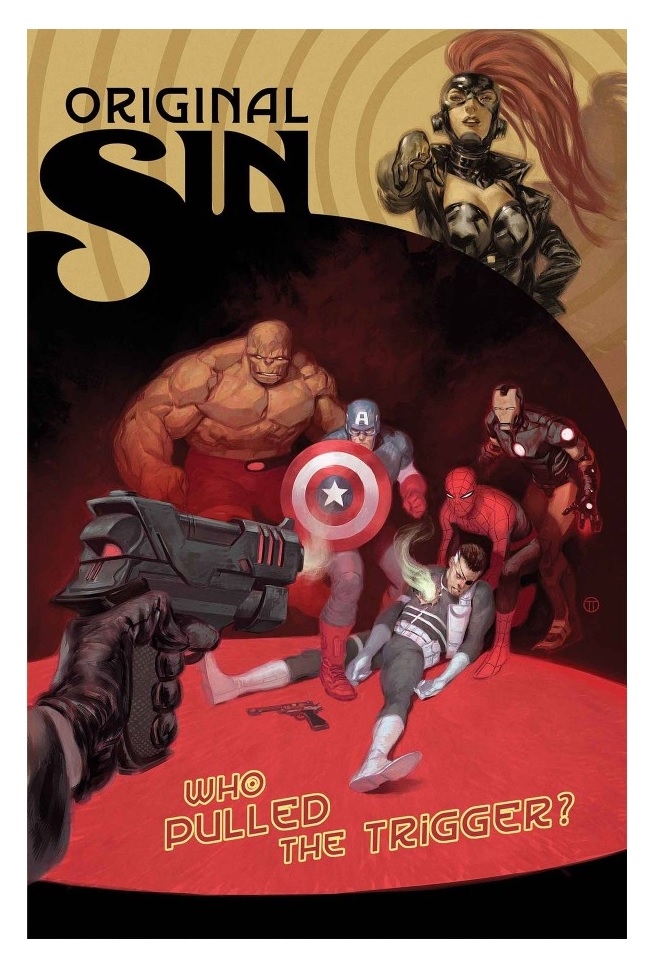
ORIGINAL SIN #6
Writer: Jason AaronArt: Mike Deodato
Publisher: Marvel Comics
Reviewer: Masked Man
Well, after two issues that nearly bored us to death with a slow motion sub-plot, Aaron is finally back on track with the main plot: who killed The Watcher, why, and what are we (all the different characters) going to do about it.
I'll admit that one of my guesses about the story was wrong- I had guessed the Watcher was bankrolling Nick Fury's extracurricular activities. Since that's not the case, Aaron better have a good answer who I,- so I eagerly await that reveal. Aaron typically does a great job crafting details into his stories and not blowing off plotlines (the whole Nick Fury flashback issue proves that), so the next two issues should be pretty great. I just wish the last two issues were condensed into one issue.
To get spoilery on ya, we get a better reason why this crazy cast of characters have been thrown together: Nick Fury wants one of them to replace him as the preemptive sniper for Earth. Though seriously, it's The Punisher--you can send the other guys home now. During all of this, the person I liked the most was the Black Panther: “Nick, this is the last time I ask you politely. Who killed The Watcher?” Nice! Nick doesn't get a chance to answer as The Avengers (remember them from back in issue #2?) finally show up and want to know what the hell is going on. Dr. Midas, Exterminatrix and The Orb all have fairly big roles here as well (again, characters dropped for far too long). And I guess it does make sense that Nick Fury wants to destroy The Watcher's eyes, because they hold so many secrets. The old spy in him just can't deal with info 'just laying around' like that. Still, the bigger question is who killed The Watcher? Fury? Dr. Midas? Aaron clearly put a lot of effort in this series, so hopefully the payoff will be good.
Artwork-wise, Mike Deodato is still drawing the hell out of this book. While I still think the panels are a little too jam-packed and detailed, that's just a style thing. The craftsmanship of each page is awesome. I've heard a comment about it having sloppy cross-hatching, but that seems mighty nit-picky to me. The book looks great.
With two issues left and the plot back on track, the next two issues should be a pretty awesome blowout between everyone involved in this series. That plus my faith in Aaron's ability to wrap this up right, and I'm looking forward to it.

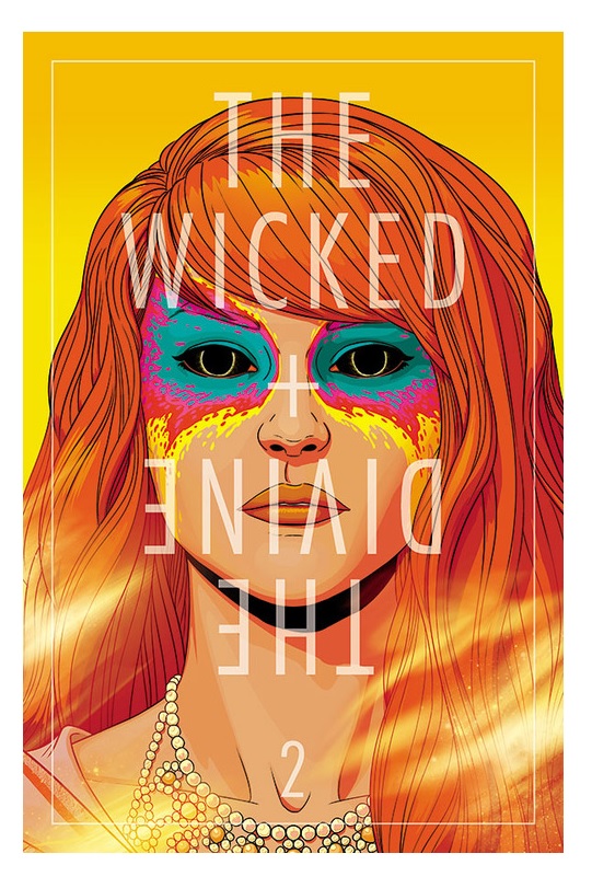
THE WICKED + THE DIVINE #2
Writer: Kieron GillenArtist: Jamie McKelvie
Publisher: Image Comics
Reviewer: Humphrey Lee
I start this review off by admitting, with a saddened and open heart, that I am a super white person. Like, the whitest. I’m a thirty-three year old male whose wardrobe of the past fifteen years has been jeans, a t-shirt with a band or geek reference on it, and some sort of long-sleeved shirt over the top that I basically just wear over and over again until it comes time to burn and release the demons within. I recently added a fedora to the mix, not because they look cool or anything, but because I’m bald--Ark of the Covenant, face-meltingly bald if the sun hits it just right. So what I’m saying is that I am in no way, shape, or form an ambassador of the words “style” or “hip” or really know them when I see them, except that I think these Gillen and McKelvie chaps have this shit down pretty pat.
That’s the thing about the projects these gentlemen do together; they’re full of pretty people doing amazing things with fabulous mannerisms and sharp wit. This is not (for me at least) a bad thing. In fact, ever since I was first introduced to this dynamic creative duo, like many others, in the pages of PHONOGRAM, I’ve found their storytelling absolutely captivating. THE WICKED & THE DIVINE takes this glamorousness to the next level as, instead of being in a world where music is magic or dealing with the drama of super-powered teenagers, we are now on an Earth where the Gods literally do walk among us, albeit only every ninety years or so. And when they’re here they make our heads explode. Yup.
So where we’re at with W&D is still in setup mode, but it is such a kinetic piece of material as it is assembling itself. Obviously it’s way too early in the run of a book like this to really get any answers on the what, why, and how, but there are sexy dots being posted on the celestial board. We know that every ninety years, for two years at a time before they die, incarnations of some very old gods inhabit human forms and do…god things. In this cycle, a handful of them at least seem to have decided to become pop culture/media whores, which is to be expected honestly, given the reverence these beings would be accustomed to and, well, how Gillen and McKelvie roll when it comes to their material composition. But this plays really well and cleverly because it gives a good in for the human element a book like this will be needing, and that element is a groupie named Laura.
Laura is a good catalyst here because she’s a believer, but I’m not even sure how much she cares about the “god” part so much as the “devilishly famous and basically pop star gods” part of what these incarnations represent. She wants into their lives not for miracles or reward but really out of, honestly, a bit of naïveté it seems. She would worship some of these figures as gods even if they weren’t actually such beings. Her doe-eyed adoration is both tragic and actually somewhat comical, considering some of the events that have happened in these first two issues – namely the aforementioned head kabooming that happened at the fingertips of Luci (i.e. Lucifer) in the debut. There’s a not-so-subtle commentary going on here about the nature of celebrity in this day and age using Laura as a cipher for it; it’s not overly brash about itself but it’s there. Really, that is the bulk of what these first two issues contain plo-t and contentwise: lots of little commentaries that can be drawn out but are never directly addressed and gathered around Laura’s excitable little head.
There’s so much more going on in this book, though, beyond just a little thing such as a generalized overview of a world that falls over itself for famous people that may or may not go beyond being exactly that. Genuinely intriguing questions are to be asked about the overall plot and story (backwards and going forwards) about this backdrop Gillen and McKelvie have decided to go with this time around. Why do these god figures come back almost every century? What do they get besides some jollies of spending two years alluring the masses again, or is that the whole point? Plus there’s a murder mystery going on here as Lucifer, very supposedly, was not responsible for the third head that went pop at a snap of the fingers. And, to add to the murder count, we end this issue with a beheaded Baphomet and her being replaced, maybe? Who even knows right now, because this is a really grand game being played and we’re just now starting to be shown the rules, which is as exhilarating as the highs Laura is chasing as she crowds her way into this magical world.
All of this comes together with just this undeniable sheen of glamour upon which the work of these two gents can’t help but manifest, especially McKelvie with his sublime art. Like I said, I don’t know “hip” from an empty can of PBR post-ironic consumption, but I think these guys have it in them and make it happen effortlessly. And it never in anyway makes the work insufferable, but brings connective tissue to the books while subtly undermining them, even. In PHONOGRAM it was the way the characters tended to have their heads up their asses about their music scenes even though the book was a celebration of being a part of one and its affect on your identity. In YOUNG AVENGERS it was just a byproduct of the generation starring in the book and as a means of separating them from the old guard most of them drew their namesakes from. With THE WICKED & THE DIVINE here, I think those concepts of celebrity in today’s climate and an interchangeability of it with godhood, and, hell, even if it isn’t or is just a small part of it, what does it matter? Such subtext would just be that proverbial icing on a cake that is already stuffed with intriguing takes on mythical figures, a mysterious setting surrounding them all, and an approach to it all that is so well grounded that I find myself surprised at the effortlessness of it all despite having no reason to be in such a state. Hip I do not know, but quality and potential I do, and this book has it all in stage-lit spades.
Humphrey Lee has been an avid comic book reader going on fifteen years now and a contributor to Ain't It Cool comics for quite a few as well. In fact, reading comics is about all he does in his free time and where all the money from his day job wages goes to - funding his comic book habit so he can talk about them to you, our loyal readers (lucky you). He's a bit of a social networking whore, so you can find him all over the Interwebs on sites like Twitter, The MySpaces, Facebookand a blog where he also mostly talks about comics with his free time because he hasn't the slightest semblance of a life. Sad but true, and he gladly encourages you to add, read, and comment as you will.
 In stores today!
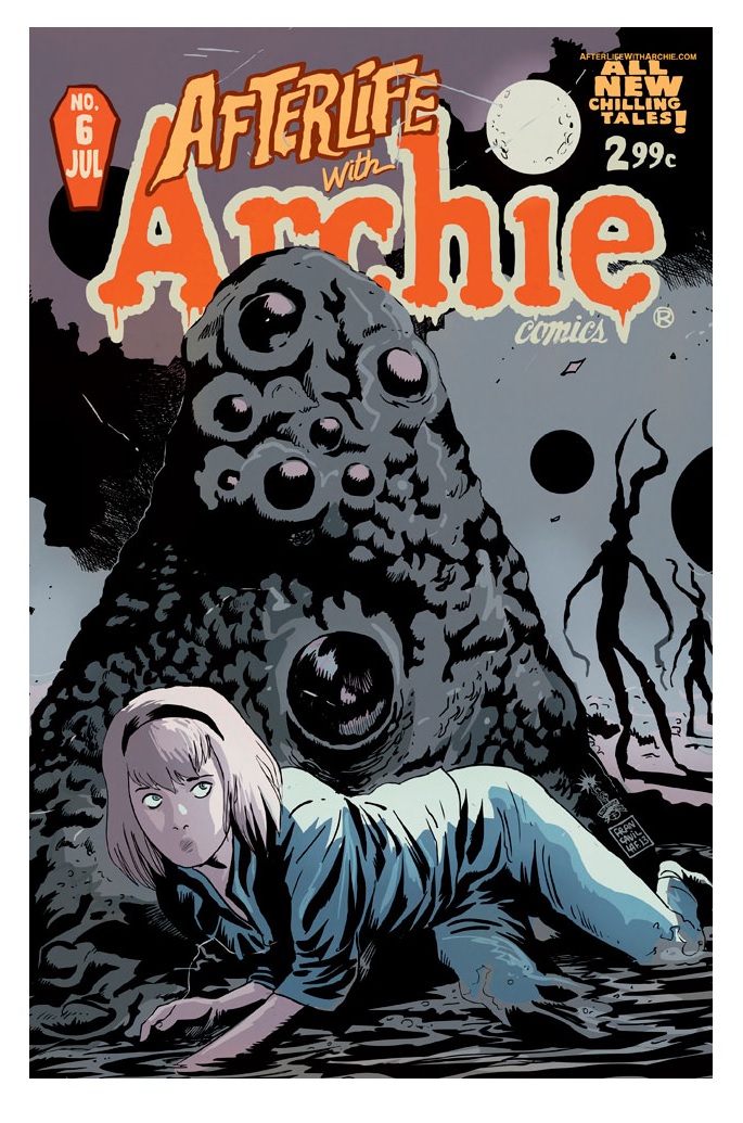
AFTERLIFE WITH ARCHIE #6
Writer: Roberto Aguirre-SarcasaArt: Francesco Francavilla
Publisher: Archie Comics
Reviewer: Optimous Douche
I really only profess to know two things in life: branding and marketing, and comic books. While both could be subjectively dissected by my work, I kindly ask you go along for the sake of the buckets of praise I'm about to heap on Archie comics.
AFTERLIFE WITH ARCHIE is one of boldest, brashest and most bodacious examples of reverence for and defiance of corporate brand I have had the privilege to see. Through the sincere love of what the Archie characters represent combined with a respect for horror that is beat by beat perfect, writer and artist have risen the Riverdale crew from their mausoleum shops and hobby socks.
Issue 6 kicks off Arc 2 for this macabre modernization. If you missed the first arc, quite frankly you are simply a fool. If you need instant gratification of Robert's 80s slasher flick take where a resurrection of Hot Dog by Sabrina not only zombifies Riverdale, but also razes the world, I and countless others have sung its praises many times over. Of course you'll miss the lesbian pussycats, Reggie's cowardice, Mr. Mantle's global connections and machinations, the infamous Archie meat in the Betty and Veronica sandwich for the first time rated PG-13 and, of course, motherfucking zombies.
When everything ended after arc 1, and I mean Everything, I thought this grand and glorious experiment was simply history. When a second arc was announced I thought for sure the gang would simply start anew with another tale about vampires or creatures from black lagoons and perhaps a sendup of beach blanket bingo. What I never expected was the greatest surprise of a greater issue...continuity.
That's right, while all ended on the mortal plane I had almost forgotten about the banishment of Sabrina the Teenage Witch to the nether planes as punishment for wielding dark arts to resurrect Hot Dog. Part of me wants to laugh at that sentence if it wasn't for the actual moment being so damn dark and creepy.
Issue 6, though, doesn't take us to the underworld or some other soft-handed trope - nay, the evil emanating from Archie will not be satiated until they completely devour existence.
Cthulhu, ladies and gentlemen, is the order for this next homage. Dr. Lovecraft plucked our dear witch from her initial penal colony and has been keeping her in the dream state of a psychiatric hospital where the inmates of this fugue state are all batteries for the end of...all.
That's enough for now; I can't do this book the justice it deserves. I'm an old fan of Archie and merely a passerby in things horror. Given the middle ground of my fandom, I think my passionate praise should be enough to entice true fans of either Archie or things that go bump in the night to try this skewed look at your passion. Those who are averse to either element in the mix of this title, but passionately love comics as I do, should simply pick this up to marvel at the originality and execution of a comic staple given brand new life even though it is steeped in death.
When Optimous isn't reviewing comics he is making the IT words chortle and groan with marketing for MaaS360, enterprise mobility management (link these three words to www.maas360.com). He also has a comic coming out sometime soon, for updates head to robpatey.com.
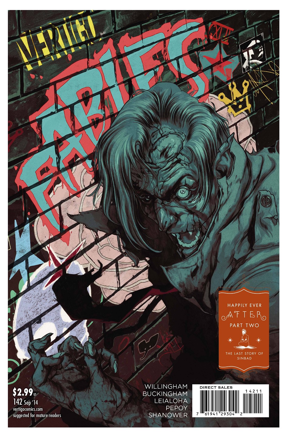
FABLES #142
Writer: Bill WillinghamArt: Mark Buckingham
Publisher: DC Vertigo
Reviewer: Henry Higgins is My Homeboy
IT’S JUST SO GOOD, YOU GUYS!
I’m banned from talking about FABLES. See, I really REALLY like FABLES. I sincerely consider it among the best work Vertigo has done, and one of the most engaging comics to ever be produced. In the same way I introduce SANDMAN to people who don’t read comics, I always give them the first three trade paperbacks of FABLES. It’s that good. And I am always talking about how good it is, so our illustrious editor told me no more FABLES reviews.
That’s fine.
I understand.
But it’s ending in a few months and I’m so into what’s going on currently. Because, guys? It’s great. It’s fucking great. This is a series that has evolved from a murder mystery into a full-on epic, with actual forces of nature collecting their forces around them in preparation for war. But that’s not the main story. It still focuses on the people behind the myths, about the dispute between sisters who are both right.
Bill Willingham finally does what he’s been promising all series. The real world has finally realized something strange is going on, thanks to a blood-crazy Bigby. And just like that, the end is revealed. The real world and Fabletown will have to confront one another, and all of this while Snow and Red both try to assemble forces for a war they don’t even realize is happening. They try to talk and realize they’re wearing armour. They don’t want to fight, but we’re two issues into the final big push, and you know they’re going to fight.
Look. A character dies this issue. Someone who was completely unimportant but, for someone like me who’s read all of FABLES five times, a really fun character. And he dies. Brutally. And the GRR Martin effect happened. It’s where a writer is so good about building his world that even the most bland red shirt in the entire cast still feels real. And I loved him, and that’s what makes it hurt. It makes the story feel real. I call it the GRR Martin effect because A) he does that a lot, and B) I consider him a great writer of character. It’s a compliment, one of the best I can pay a writer, and Willingham is amazing.
Mark Buckingham is fantastic, as ever. Perhaps the best thing Vertigo did with this title was end up with him on art. His character work is great, full of personality and little touches. But the man does grandiose like no one else. There’s no other artist alive who could make this series feel like a storybook. The banners between scenes shift to reflect the moment, and GAAAAAAAHHHHH I’m going to miss this book. When Snow learns something new about Bigby, the banners change to reflect that in a, swear to god, beautiful display of talent. As ever, the banner changes, but the page starts with Clara trying to tell Snow about her missing husband. The eye follows the panels (as normal) until, four panels in, Snow comes to terms with the fact that they’re talking about Bigby. And simultaneously, the banner reveals what was just out of eye sight this whole time – Bigby and Snow, sleeping and happy. It’s one of the most effective ways I’ve ever seen in comics to translate what exactly is going on in her head, and it’s NOT EVEN THE BEST EXAMPLE OF BUCKINGHAM BORDERS IN THIS SERIES.
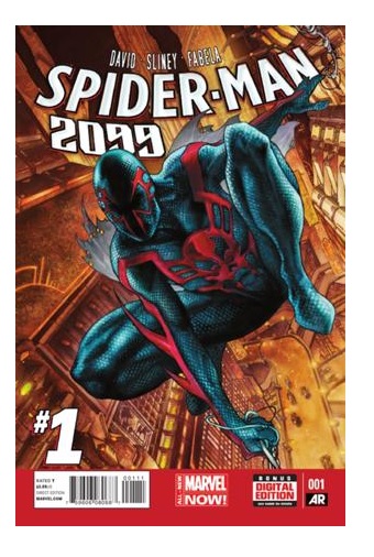
SPIDER-MAN 2099 #1
Writer: Peter DavidArtist: Will Sliney
Publisher: Marvel Comics
Reviewer: Mighty Mouth
Tell me, doctor, where are we going this time? Is this the `90s, or 2099?
Ah, the comics of the 1990s. Hot off the heels of revolutionary storytelling that prevailed in the '80s, the`90s represented a period that went for more flash than substance. Be that as it may, that decade did produce characters like Bane, Deadpool and much of what makes up the Valiant Universe, so it wasn't a complete wash.
Another character to come out of the era is the Spider-Man of the year 2099. Set 100 years in the future, the 2099 universe gave readers a possible future where an all new Spider-Man fights to depose the totalitarian corporation, Alchemax. In many ways the series was groundbreaking, from its cyberpunk fundamentals to its lead character being half Caucasian/half Latino (without feeling like a contrived PC machination). It was actually a pretty fun book, at least for the first 30 issues or so.
When it became public knowledge that SPIDER-MAN 2099 was getting his own monthly title again and that his creator, Peter David, was going to be scripting the book, I was excited, to say the least. So here we are $3.99 later and I have to say I was honestly anticipating a lot more out of this book.
After a temporal distortion strands Miguel O’Hara in the present day, he elects to keep his enemies closer and opts for a position as an executive assistant with Alchemax. Shortly after getting set up in his new downtown digs, an armored assailant claiming to be from the year 2211 shows up at Miguel’s place of employment and attempts to erase him from the past…or now…oh, whatever. The confrontation ends with Liz Allen (long time supporting character and CEO of Alchemax) suspecting that this new Spider-Man must be an employee of her company.
First issues can be a bit tricky. A well-crafted first issue should accomplish three things. 1) Introduce the protagonist and his world. 2) Hook the reader with some action and intrigue. 3) Hook the reader with action and intrigue. If I’m being redundant it’s because I can’t stress the importance of 2 and 3 enough. Now, I know Peter David is capable of producing high-quality work. I would even dare to say his work on the first issue of the original SPIDER-MAN 2099 series is practically a blueprint for how to kick-start a new comic. Unfortunately, I just didn’t get any real joy out of this book. I wouldn’t call it a dreadful issue; I would simply call it a meh issue.
And then there is the artwork by Will Sliney. While I have enjoyed Sliney’s art in the past and even more recently on SUPERIOR SPIDER-MAN TEAM UP, there is something off-putting about the interior pages of this book. I’m not sure if it’s due to the grouping of the character renderings against 3D background images, or just the bland color choices. Whatever the case, like the story so far it’s just not wowing me. Sorry, Will.
I really like Miguel O’Hara as a character, and the concept of having him trapped in the present can easily lend itself to some great confrontations and plots. Due to the quality of work that both David and Sliney have produced in the past, I’m willing to give this title another issue or two to build some momentum, but I’d be less than honest if I said the first issue wasn’t a bit of a letdown.
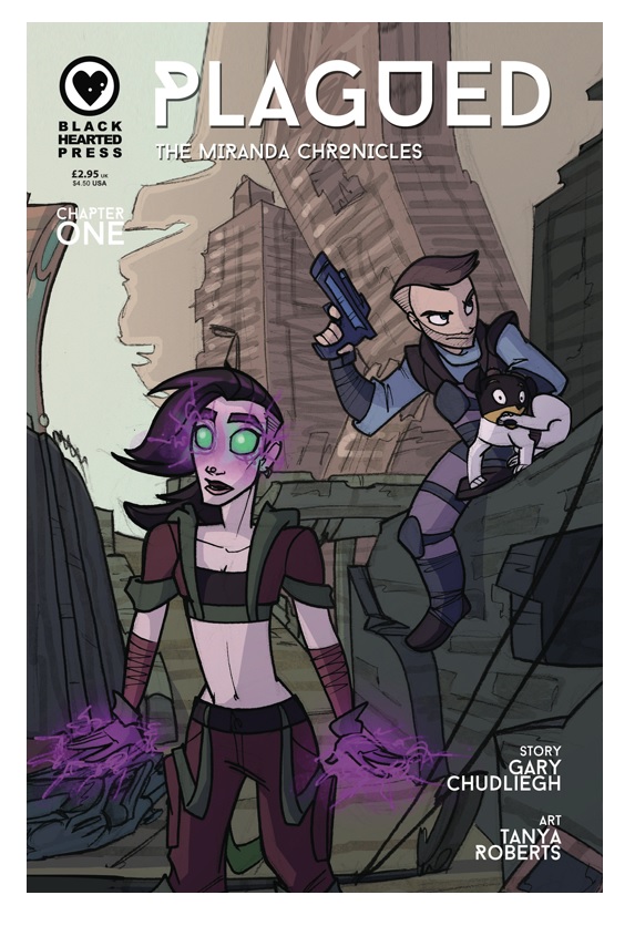

PLAGUED: THE MIRANDA CHRONICLES #1
Writer: Gary ChudlieghArtist: Tanya Roberts
Publisher: Black Hearted Press Reviewer: Lyzard
Never judge by its cover. It's a tired out adage, but first impressions are hard to overcome. PLAGUED's cover has multiple elements at play. There is the cuteness of a scared doggy contrasted with two characters who seem to belong in a world like “Borderlands”. Adorable is hardly a word I would use for that video game, so you can see how the disparity in tone from the outset caused me a bit of confusion.
PLAGUED's story is dark, almost post-apocalyptic. A plague has laid waste to a large part of the population and witches are to blame...or so witch hunter Thomas Mackie thinks. But he is about to find out that there is a much larger, more insidious, and real threat at foot rather than the magical Miranda.
Contrast that storyline with a sweet-talking dog and conversations filled with exposition and banter. I'm not saying you can't pull off the above plot comedically, but the execution features a lack of consistency to show that this is the intentional direction PLAGUED is wanting to take.
Except in the art, because Tanya Roberts’ work is on point. As I referenced before, the book almost has a “Borderlands” feel, but toned down. Miranda could easily be a siren and Thomas has that gruff five-o'clock shadow going. It is almost as if the video game was turned into an animated film, and I'm fine with that...not that I want it to happen, but Roberts’ style for this world works well when it matches the tone of the dialogue.
The comic reminds me of REED GUNTHER, with his bear sidekick and kick-ass Starla. That series worked because the characters completed each other. The focus was on them and how they would resolve the conflict, which mattered much less. PLAGUED needs to either embrace the relationship these characters have or have their interactions reflect the dramatic situation they are in.
Lyzard is Lyz Reblin, a graduate student at the University of Texas pursuing a master's degree in Media Studies... which is just a fancy way of saying she plays a lot video games, watches far too many horror films, and then tries to pass it all off as "research."
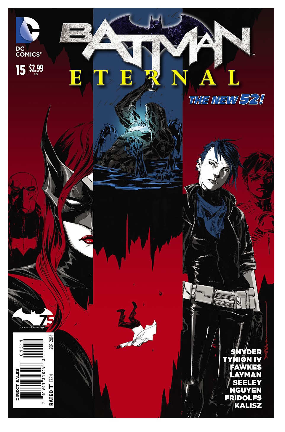
BATMAN ETERNAL #15
Story: Scott Snyder and James Tynion IVScript: Ray Fawkes
Consulting Writers: John Layman and Tim Seeley
Art: Dustin Nguyen
Publisher: DC Comics
Reviewer: The Kid Marvel
BATMAN ETERNAL #15, “The Common Limit”, is pretty much a “see where everyone is at” kind of issue, highlighting where each member of the Bat-Family is currently at in the BATMAN ETERNAL story. Red Robin has reluctantly allowed Harper Row to tag along during an investigation, Batwing and Spectre are continuing their Ghostbusters-like adventure underneath Arkham, Batman seems to be tolerating Lieutenant Bard a little more, and down in Brazil, Red Hood and Batgirl have stumbled upon Batwoman also in Rio De Janeiro. The only person missing from this issue was Stephanie Brown and what she’s currently up to.
Overall, BATMAN ETERNAL #15 feels like a clusterfudge of an issue. There is just so much going on and being attempted to cover in one book. The stories aren’t hard to follow or overwhelming, it just feels like they let an ADHD tween organize the structure of this particular book; it’s just too much with no focus. Which, honestly, I can say has become a running problem with several of the BATMAN ETERNAL titles--just attempting too much for the larger story, while never letting things breathe.
Granted, this BATMAN ETERNAL #15 does actually add to these mini-stories for the Bat-Family members and isn’t a filler book, but again, too much in too little time. This is a weekly book; it’s not like you have to wait a month for the next issue, which should allow for focusing on these smaller pieces in depth in order to pull together everything for the larger picture. The writing’s good in regards to scripting and the smaller story aspects, but because you never get a chance to actually engage in one aspect, the larger overall story gets lost and forgotten. I realize this series was and has been advertised as utilizing as many Batman characters as possible and combining them, bringing everything together. However, at this point I’ve forgotten or lost interest in a lot of the overarching problems, simply because as a reader I’m never given time or anything interesting to create anticipation for the movement through all these different threads in the giant web. The constant back and forth really kills the overall enjoyment these books should be bringing, because they are quite entertaining when on point.
When it comes to the art for BATMAN ETERNAL #15, I have no complaints. There is a nice array of colors used in order to get away from the monotony of black and grey generally associated with Bat-related titles. Nguyen has a great style of detail, with abstract art that does an excellent job of bringing certain aspects of the panel in focus while glossing over the background, giving a good “yin yang” feeling to the pictures. This style also does a wonderful job of mixing more cartoonish art with a gritty or dark element needed for a Batman title. The artwork is overall a good mixing of styles, designs, backgrounds, and character emotions.
I’d say overall, BATMAN ETERNAL is still an enjoyable title but it really needs to focus in more on how it tells the various stories. The back and forth is just too much and too often, leaving at least me, personally, unengaged to what I’m reading at certain points. This is a weekly title which is allowed to do more because of the frequency it’s released; you don’t have to wait a month for the next part of the story. Other than that, the series has been fairly solid with its bad issues here and there, but has had an overall generally consistency of quality books. Hopefully, in the future BATMAN ETERNAL will be less ADD and actually allow for things to breathe and make me generally care more.
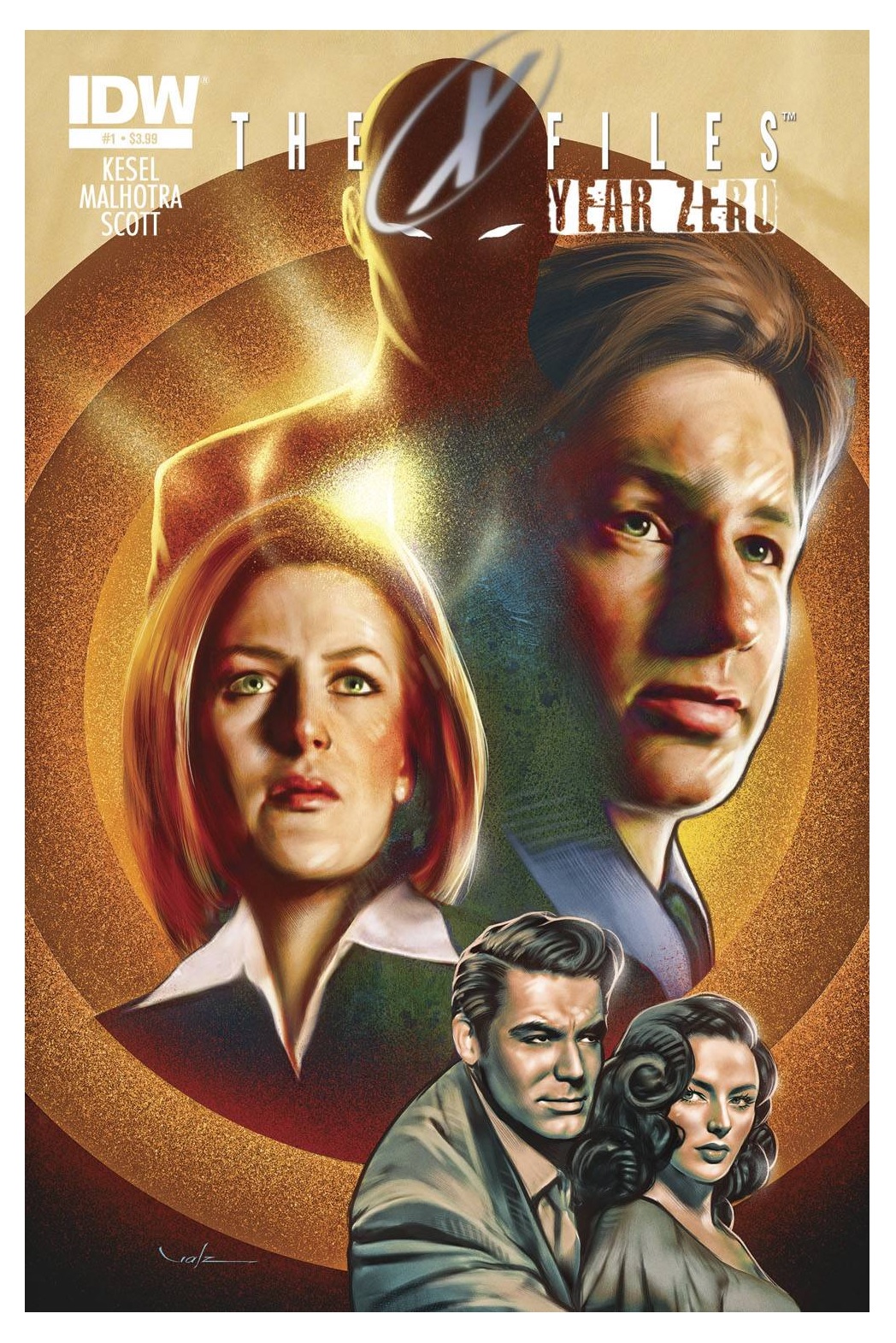
X-FILES: ZERO YEAR #1
Writer: Karl KeselArt: Greg Scott and Vic Malhotra
Publisher: IDW Publishing
Reviewer: Masked Man
I don’t know if there's anything the comic book industry loves more than #1 issues and zero years and issues--the story before the story. And with so many comic book runs for the X-FILES, it's a bit surprising it took this look to get one. I suppose X-FILES creator Chris Carter would never sign off on one before. But being the executive producer of IDW's X-FILES comics, I'm inclined to believe this is now the real deal, which is why I decided to check this five issue limited series out.
Unfortunately, like most X-FILES comics, IDW's main series just hasn't been really cutting it. Not bad, but not really good either. So at first I wasn't sure I wanted to check this out, but curiosity got the better of me and here we are. As first issues go, though, this was pretty strong. We got Scully and Mulder looking into a new X-file and discover it has a connection to the very first X-file from 1946. This leads us to a flashback with two FBI agents seemingly destined to create the X-files.
To get more spoilery for ya, Mr. Kesel does have a rather obvious cliché for the X-FILES as there is a boy agent, Special Agent Ellinson, and a girl agent, Special Employee Ohio (because ain't no way Hoover letting a girl be a Special Agent) in 1946 (and so the pattern is set, I guess). The set-up of these characters is pretty well done, though. Ellinson is on the $hit list and they want him gone. Ohio (the girl, not the state) is on the annoying female list and they pretty much want her gone as well, so Ellinson and Ohio need to join forces to save their careers (I hope Kesel remembers to write them from this specific angle, because I like it). In both cases, 2014 and 1946, the agents are on the trail of an X-File informant, Mr. Zero--who is he, how does he know what he knows, and why does he look like a lizard man? All questions to be answered in the typical X-Files way in the next four issues. Not to mention the bit about cat people.
So while Kesel does a good job setting up the X-File 'agents' from 1946, he also didn't write your standard boring set-up issue. The action flows off the bat. He also does a good job handling our heroes Mulder and Scully. I assume Carter is happy, because I am. The case at hand is very interesting as well, and one can see how this might lead to a lot of concept origins of the X-Files, because we are reminded, the true is out there.
Artwise, both Greg Scott and Vic Malhotra do a fine job, giving us the gritty and dirty feel we've come to expect from horror and mystery comics. Scott, of course, has the hard job drawing Mulder and Scully, which he does quite well, the actor likenesses have been some of the best, page to page, IDW has had. Malhotra handles the 1940's pages and he has no likenesses to worry about (I suppose Kesel and Carter should have given him some, to keep it fair). As well as doing a nice job, his art blends well with Scott. But just like the main IDW series, I'm not impressed with the coloring. It's just drab, which is the last thing you could say about the show. Sure the show was moody, but it was also very rich. I'm sure the pencilers are studying photos and stills of the TV show; I wish the colorists were too.
With a nice cover by Carlos Valenzuela, this might be the first X-FILES comic that actually delivers. And if anything else, it should be cool this see this new chapter of the X-FILES be written.
 In stores next week – 7/30/14!
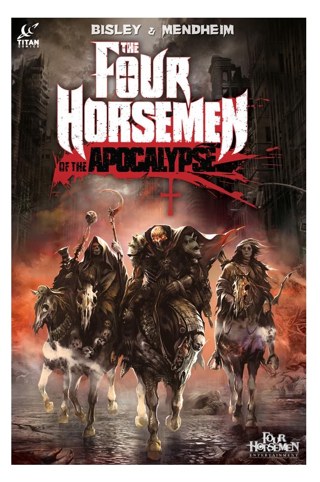
THE FOUR HORSEMEN OF THE APOCALYPSE Original Hardcover Graphic Novel
Writers: Michael Mendheim, Mike Kennedy, Sean JaffeIllustrator: Simon Bisley, Ivan Khivrenko, Joel Boucquemont, Vince Proce, Dave Devries
Publisher: Titan Comics
Reviewer: Mr. Pasty
So, uh, here's something I didn't know about Satan: He has a huge cock. Oh, and Pestilence has big, bouncy tits. She's pretty hot in her human form, but when she gets all biblical, she looks like that creepy old bag from the THE SHINING bathtub. Not hot. I bring this up right out of the gate because THE FOUR HORSEMEN OF THE APOCALYPSE (TFHOTA) is not fucking around when it comes to its end of days story. I always hated that the Hulk had to lose his dick when he transformed from Bruce Banner. Where did it go? Maybe the same place Wonder Woman's purse went when Lynda Carter would spin in a circle and become Princess Diana. These are the things you think about when you are lonely as a child. Anyway, getting back to TFHOTA, it's lonnnng, as any good graphic novel is, but those who are afraid of religious themes – and commitment – should steer clear. As for the rest of us, it's a pretty wild ride from start to finish.
Fans will likely recognize this work from its original run in HEAVY METAL, where it garnered critical acclaim for HELLDIVER. That, as well as the follow-up books, are all included in the final product, as is some necessary polish from creator Michael Mendheim. Call it a “Director's Cut,” if you will, in that Mendheim had a chance to go back and smooth out some of the bumps from the first run (and there were plenty). Originally conceived as a video game back in 2001, TFHOTA nearly became vaporware on two separate occasions, thanks to the financial collapse of two major backers. That's not uncommon in the video game industry, where you're always one bomb (or one piece of junky tech) away from closing your doors. That said, a good product will always find its way to the consumer, and this is one of those books you just can't help but stare at.
That credit goes to Simon Bisley of LOBO fame, who does an admirable job of painting the end of days as the awful experience you would imagine it to be. His artwork makes the pacing bearable, as I found it difficult to keep up with down the stretch. I understand that when the end of the world comes, you don't get any timeouts or coffee breaks, but still, trying to keep up with such an intense narrative was exhausting. Fortunately, the themes are familiar ones, which lightens the load a bit (no learning curve). Adam Cahill is one of a rare handful of highly-trained warriors bound by bloodline to guard the Seven Holy Seals and blah, blah, blah. The bottom line is, the aforementioned Horsemen are coming, and it's Cahill's job to kick their ass.
It took years to get this collaborative effort bound in one spot, and the results speak for themselves. Everything about TFHOTA is first class, and Titan even has the legendary Lance Henriksen narrating the trailer. I would personally prefer a little more soul in such an epic tale of good vs. evil, but that certainly wouldn't keep me from recommending it. But fair warning, it's rated R – and then some.
Web heads who can’t get enough of Mr. Pasty’s word vomit are encouraged to watch him operate as Nostradumbass over at MMaMania.com here. Love, hate and Mafia Wars requests should be directed here.
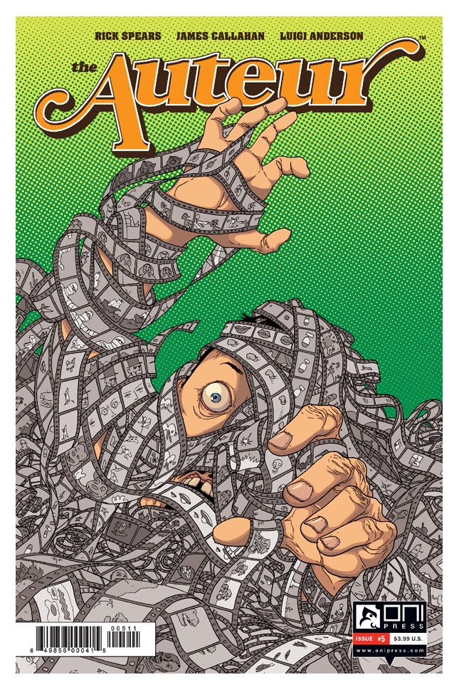
THE AUTEUR #5
Writer: Rick SpearsArtist: James Callahan
Publisher: Oni Press
Reviewer: Lyzard
Here we are. The final issue of THE AUTEUR. The climax. The grand finale!
First of all, I'd like to say that this over-achieving demoness fully agrees with Humphey Lee's review of THE AUTEUR #4 on all points and I hope y’all took his advice and bought the past four issues.
As for issue #5, it has every bit of wackiness and sicko humor featured throughout the rest of the series. You've got sex, drugs, and violence...yet a denouement that has very little of these.
Everything seems to be going Nathan Rex's way. He's got the girl, Darwin went an entire issue without killing anyone, and Rex finally finished editing his movie. Who knows if the film is going to work, but why not throw a big wrap party in Vegas? What could go wrong that already hasn't?
Well, that's the thing. THE AUTEUR #5 just goes to show how cyclical Hollywood really can be as Rex's past comes to haunt him, figuratively and literally. While Rex tries to show that he has changed, just from the number of remakes and sequels coming out of La La Land it is pretty clear that no one in Tinseltown ever really changes. Now, I'm not saying that THE AUTEUR's ending is contrived drivel, written in a paint-by-number format. Unoriginal is a term that could never be applied to this series. What I am saying is that the ending feels rushed--that in one issue all of Rex's problems appear at first solved, then fall apart, and somehow a few loose ends are tied up by the end.
It isn't to say that the journey to this odd destination isn't entertaining. There are plenty of scenes that push the line so far it goes off the edge. Now, I am not one that approves of the Lewis Carroll and Phillip K. Dick source of inspiration, but however the writers and artist of THE AUTEUR get their ideas, it works. Normal human beings don't think like this and I am so glad that there are freaks like these guys out there that create comics like THE AUTEUR. What is great about this issue is that the bizarre artwork doesn't even require the characters to be hallucinating in order to provide us with strange images, nor does violence and sex need to be involved for Callahan to go all avant-garde.
I don't know how much craziness I expected THE AUTEUR to bring come the end, and maybe a more reserved last few pages is for the best. After all, it is unexpected, and isn't that what THE AUTEUR and Nathan Rex have always tried to be?
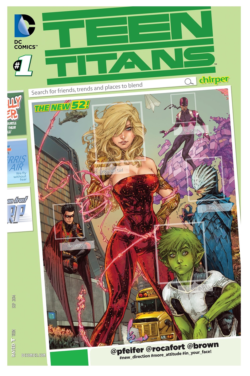
TEEN TITANS #1
Writer: Will PfeiferArtist: Ken Rocafort
Publisher: DC Comics
Reviewer: Optimous Douche
I only pander when warranted; Will Pfeifer (or @Pfeifer, as it is subtly typeset on the cover) has delivered yet another fast-paced resurrection for a title that was so aimlessly lost after…well…its last reboot.
TEEN TITANS is one of those titles where I simply cannot shed my usually thin fangeezer dermis against the book’s cover. My TEEN TITANS was written by Marv “for more mature readers” Wolfman; it was an older team, it was an efficient team, and under Wolfman and Perez’ pens it was almost a ready-made family since each character had their own rich history.
So please simply forgive my malaise towards the Muppet Baby reboot versions that followed that time. As always, I implore any experts to tell me of a series run that trumped my current zenith. Because, while it’s certainly too soon to tell, I am just as pulled by the lapels into this new TEEN TITANS #1, and Pfeifer didn’t even have to put Nightwing and Starfire in bed together (excuse me, I mean Grayson and Mrs. Speedy).
What was most alluring about this title was the complete bucking of current team trends at DC wherein some very important people discuss what important people should be on the team. This is a huge pet peeve for two reasons: One, this concept is about as exciting as watching kids discuss their favorite baseball cards before they trade the Cal Ripkin fuck you bat card for an A-Rod. Two, no team should just be;, they should come together for a purpose and then let circumstance, not design, deepen their tethers. It was a trend that started with Robinson prior to the New 52, and has stuck in most books.
One book that bucked the “need it, got it” trend prior to this issue was the new JUSTICE LEAGUE. Where TEEN TITANS makes that book eat its A-List shorts is one little word: “competence.”
When a bus full of schoolchildren is abducted by terrorists packing TNT and heading straight for the entrance at S.T.A.R. Labs, the Titans spring into action like a well-oiled spandex-wearing machine. Now, I understand this is a number 1 in the sense of making sales, which means this team has been operating together for the past three years. However, I have read only a modicum of those books, simply drinking in Titan fun when they appeared in my regularly collected books. Pfeifer holds reverence for this past, but doesn’t belabor this inaugural issue with that baggage. There are little Easter Eggs for fans in the form of Red Robin and Wonder Girl’s relationship, but those continuity touches are extremely light. Instead this is a talky-free exposition using action to introduce roles and powers for new fans, and simply rolls as yet another chapter for current fans. I sang similar praises last week for SUICIDE SQUAD, but in that book I was on the fan side of the coin versus the noob.
Red Robin calls the shots maneuvering each player into place as a good leader should, Wonder Girl does her wonderful best to save victims on the bus along with Raven and Beast Boy, while finally Bunker stops the bus with his bricklaying crime-busting. I’ll admit Bunker’s powers are a brick that would drown him slowly, but his cavalier attitude and cockiness are perfect to sully the overly nice Garth and Tim. Social dynamics, while not vitally important in an inaugural issue, are certainly something I will need to see in issue 2 to remain enamored. Bunker appears to be the proverbial and cocksure fly in the ointment.
TEEN TITANS continues to thrive in cartoon form, toys, and well, everywhere but comics. I think Pfeifer can change this sad reality, especially in light of Marvel’s recent announcement that the X-Men will cease to be at the same time they castrate Thor, urbanize Cap and strip Iron Man down to his primer. No, the muties haven’t all been kids for awhile, but with the two schools running since the last “NOW”ing the angst of teen years have returned. DC has needed TEEN TITANS to succeed simply for parity, but now I feel they have the chance to own Supes with acne.
 In stores this week!
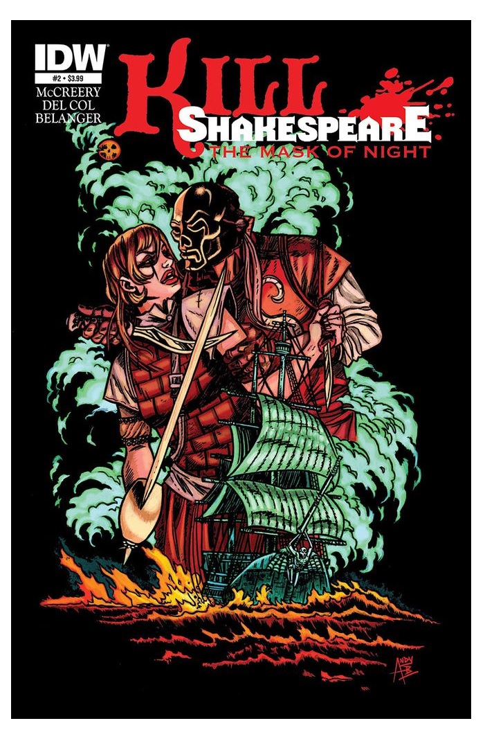
KILL SHAKESPEARE: THE MASK OF NIGHT #2
Writers: Anthony del Col & Conor McCreeryArtist: Andy Belanger
Publisher: IDW Publishing
Reviewer: Lyzard
Change is difficult for many. When a movie from your youth is rebooted, it can be hard to distinguish what is a mistake versus a personal dislike. While I feel that my criticisms towards the first issue of MASK OF NIGHT were justified, when reading the second issue I made it a point to distinguish between poor writing and art versus changes in material that I disapproved of based on favorable bias towards earlier material.
I doubt that I'll grow to like what they have done to Viola/Cesario, but it is a fact that I must come to accept if I am to continue reviewing KILL SHAKESPEARE. It would be redundant and, frankly, whiny of me to keep harping on this point. My disappointment in the art, on the other hand, was one based on quality and thus if need be I will continue to point it out.
But change can be good. TIDES OF BLOOD steered away from numerous aspects in the original KILL SHAKESPEARE run. It was more abstract in plot, writing, and artwork. I did not hold this different direction against the miniseries. As for MASK OF NIGHT, some of its alterations to the direction of the series are refreshing. After two different storylines that were heavy on the magic, especially TIDES OF BLOOD, it is refreshing to have a storyline feature very little supernatural aspects. This is a pirate tale full of blood and bitterness. I may not agree with how it is being executed, but there is potential here.
The Lavinia, captained by Lucius (Titus Adronicus' son, if the KS team is sticking true to the play) is nearly on top of the Boreas. Captain Cesario is confident his crew can outrun their enemies, but they have little confidence in him. Viola has planted the seeds of doubt and without everyone working together, they will surely fall into the hands of the cannibal Lucius.
Now we have been introduced to a new character I actually like. Well, hardly introduced but just the references are enough to have me looking forward to the physical appearance of Lucius. I have always felt that “Titus Andronicus” is one of Shakespeare's most underrated plays. It is atypical for the bard, with elements of his historical works and dramatic; it is almost the Elizabethan equivalent of today's torture porn. The play features cannibalism, rape, dismemberment, and just overall disgusting acts that I could see a director like Eli Roth or James Wan put to celluloid with glee. After the showdown with Prospero and Lady Mac, Titus and Lucius are a suitable big bad follow-up combo.
Though Lucius is brought up throughout the issue, this book is all about Viola and how she is a major b*tch. This isn’t a complaint about how McCreery and del Col are adapting her. Lady Mac is a b*tch, but an entertaining one. How Viola treats her "boyfriend" is reprehensible. She only cares about herself and her selfishness will inevitably lead to the death of others. This isn’t a character I love to hate. She isn’t Prince/King Joffrey. I just dislike her. Viola is missing that “it” factor that makes reprehensible characters enticing. Hannibal is suave, Krueger funny, but Viola has no particular quality to latch on to.
As for our heroes, little focus is put upon them, though I suspect greater attention will come the next issue and that is what keeps me going: hope. For MASK OF NIGHT #2 is an improvement of the last issue for one major reason. All the action it features plays into Belanger's strength as an artist. However, it is the use of shadow in this issue that yet again has the artwork outdoing the writing. Yes, shadows are a great way to add depth, but in MASK OF NIGHT they play into the story as well. They reflect the change in environment, the grittier nature of this mini-series, along with highlighting innocence. Cesario and Othello are rarely shown in shadow, but Viola and our recently-darkened Capulet are consistently shaded. It may be unfair to say that the writing was outshone by the art, because there is hardly any dialogue. Instead, the issue depends on visual storytelling with page after page of textless panels.
While MASK OF NIGHT may not be at TIDES OF BLOOD quality, it is a much easier pill to swallow than the prior book.
 <!—HEADING AND BODY-->
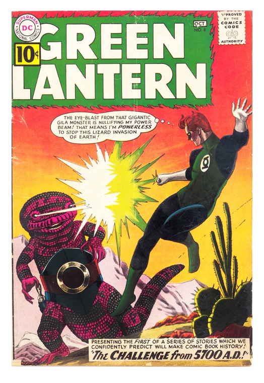
GREEN LANTERN #8
Release Date: July 25th, 1961Writer: John Broome
Artist: Gil Kane
Publisher: DC Comics
Reviewer: Masked Man
You know, sometimes I don't have great ideas. Sometimes I just do things because, well, I thought they needed being done or would at least be interesting. So here we go: 53 years ago, just over a half century, the Silver Age was starting to roll and this week in July GREEN LANTERN #8 hit the stands.
Summer 1961: the USA turned its back on Cuba, John F. Kennedy became the President of the United States and the Bay of Pigs happened. The three year old Grammies named Bob Newhart as the Best New Artist, WEST SIDE STORY won Best Picture, THE JACK BENNY PROGRAM beat out THE ANDY GRIFFITH SHOW and THE FLINTSTONES for Outstanding Comedy of the Year, and Irwin Allen had just unleashed VOYAGE TO THE BOTTOM OF THE SEA in movie theaters (and soon TV screens). In the world of comic books, the Silver Age was building steam. While sci fi, funny animals, westerns, and romance comics all sold well, superheroes were finally making a big comeback. The Marvel Age was still a few months away, but DC was leading the charge with JUSTICE LEAGUE OF AMERICA , THE FLASH, THE ATOM, HAWKMAN, and GREEN LANTERN.
A new GREEN LANTERN issue hit the stands this week--always hard to keep up with these bi-monthly books. Anyway, in this issue Julius Schwartz and company have decided to give us another issue-long sci fi story, as our man Hal Jordan travels to the year 5700 AD. While it might not be as interesting as the last issue, where we got the rogue Green Lantern Sinestro, this issue is typical DC sci fi goodness.
To get into spoiler territory, our hero is on his way to face a giant monster (straight from the pages of an Atlas comic (or as we know 'em today, Marvel)), but before he can engage in mortal combat with the beast, he is pulled into the future! In the year 5700 AD, the High Council of the solar system (since humans have colonized the other eight planets of the solar system, gaining bizarre physical attributes to boot) have decided to elect our Green Lantern Solar Director. Viewing history tapes, they figure he's the only guy for the job (I guess they didn't view the ones showing him go crazy and kill off the rest of the Green Lantern Corps, but that's all Post-Crisis, I suppose). Why GL? Because the Earth is under attack by highly evolved gila monsters who walk on two legs, live in cities and shoot eye beams. So far the people of 5700 AD are helpless to stop them, since their high-speed nuclear pistols have no effect (high speed nuclear pistols?!?). I'm not sure why someone on the planet Neptune would care what happens on Earth, but they agree to use their time-scope to snatch Hal from the past. The catch is, Hal will lose his memory as he comes to the future (he just does ok!). Instead of dealing with that, they embed some false memories in him to make him believe he is from 5700 AD (even gave him a girlfriend--she was willing to take one for the team!). So without batting an eye, Green Lantern gets to taking on these gila monsters called Zegors, which involves discovering what happens to their victims (too bad they didn't call The Atom), discovering the source of their powers (Broome didn't even really try here), and whipping them all the old fashioned way once he does. When all is said and done, they return Hal to the 20th century (all before his 24 hours of power is up, ain't that convenient—oh, and his new memory is wiped and his old one is restored- better living through science!) so he can finish fighting the original monster, which he does with a giant chemistry set--it's just a bit too weird for me.
My main issue with this issue is, even though they claim it's a single issue story, there are actually two stories in it! With the villains in the future and the villains in the present. Neither plot joins well, and personally I wish Broome skipped the whole business in the present, because with those extra pages he could have had some better explanation of how everything went down in the future. And while I also enjoy the editor Julius Schwartz jumping into the story every now and then to explain that this $hit is all based on real science, I feel Broome usually stretches the science to the point where it's barely recognizable anymore (just because something is more dense doesn't mean its atoms got smaller). So not one of Broome's best, but he promises more of this future world in the future, and I'm up for that.
Gil Kane, with inker Joe Giella, does a great job with this issue. Green Lantern himself always looks great, the monsters are all pretty cool and I always enjoy Kane's storytelling (viewing it with 2014 eyes, it's also interesting to see some of Gil Kane's patent style peek through Giella's heavyhanded inking as he tries to give it that house style). The big city shot was a bit of a letdown, though--just too many multicolored boxes, nothing really special looking.
DC's new superhero line is pretty fantastic. Even with a weaker issue like this one, I can't help but get excited for all this, epecially seeing all these solo heroes get together in the JUSTICE LEAGUE OF AMERICA every few months (the JLA was quarterly at this time). I really dig these modern takes on old 1940's superheroes. I sure can't see dropping GREEN LANTERN or any of these titles any time soon (so long as my wallet can handle it).
John Broome was a stalwart writer for DC throughout his career, putting the Golden Age to bed by penning the last GREEN LANTERN and ALL-STAR COMICS issues and helping give birth to the Silver Age by writing the relaunch of THE FLASH (with Robert Kanigher) and GREEN LANTERN. Writing at this time, it's not surprising he invented some popular DC characters like a grip of Flash villains, Per Degaton, and the likes of the Elongated Man, Captain Comet, Detective Chimp and the Phantom Stranger. After about 25 years of writing comics, Broome retired from writing and traveled the world, living in France and Japan. These days most fans have never heard of him, probably because he passed away in 1999, months after going to his first comic book convention.
Gil Kane lived his whole life in comic books, finding work at 16 (1942) and working all the way up until his death in 2000. It wasn't until the mid to late 60s that Kane fully developed his trademark style of very anatomical, dynamic figures accompanied by dynamic angles (where you could just look right up people's noses). In 1968 he created one of the very first graphic novels, HIS NAME IS...SAVAGE. Though he's far more famous for creating the looks for nearly all the classic Green Lantern villains, The Abomination, Captain Mar-vell (blue and red suit), Iron Fist, Adam Warlock, the silver skull version of Brainiac and drawing the infamous “The Night Gwen Stacy Died” arc in AMAZING SPIDER-MAN. His personal opus was THE RING OF NIBELUNG (1989), based on the Wagner opera. To this day many professionals still consider Gil Kane to be an artist's artist--one they all enjoy and inspire to be more like.
Proofs, co-edits & common sense provided by Sleazy G
 The next level of comic book excellence is a click away at BLACK MASK STUDIOS!
 Want more in all things Geek?
Check out our friends at PoptardsGo for podcasts, reviews, and more!
 And if you still need more geek in your life, check out Part-Time Fanboy for more geeky goodness on comics, movies, and more!
Finally, check out AICN COMICS on Facebook and Comixpedia!