Thanks to everyone who has kept this rollercoaster a-rollin’ through the years, from the reviewers to the Talkbackers and to all of you who just read and don’t post! Here’s hoping we have 13 more good years in us!
On with the reviews!
(Click title to go directly to the review)
Advance Review: BATMAN/GREEN HORNET ’66 #1
TREES #1
CLIVE BARKER’S NIGHTBREED #1
UNCANNY AVENGERS #20
Indie Jones presents PURGATORY PUB BOOK 1
DEADPOOL #29
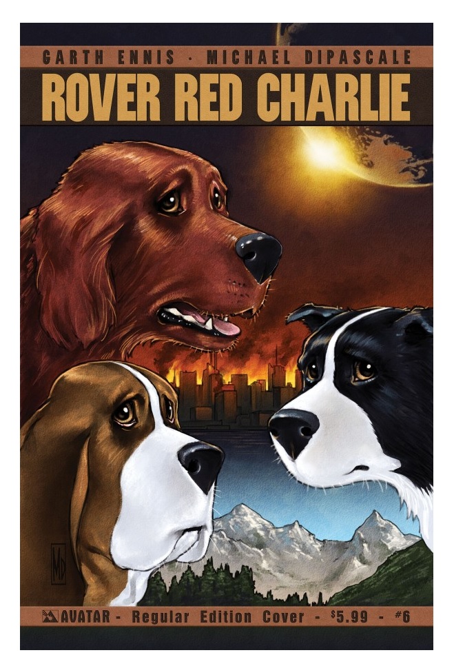
ROVER RED CHARLIE #6
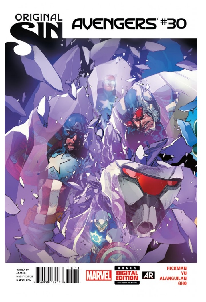
AVENGERS #30
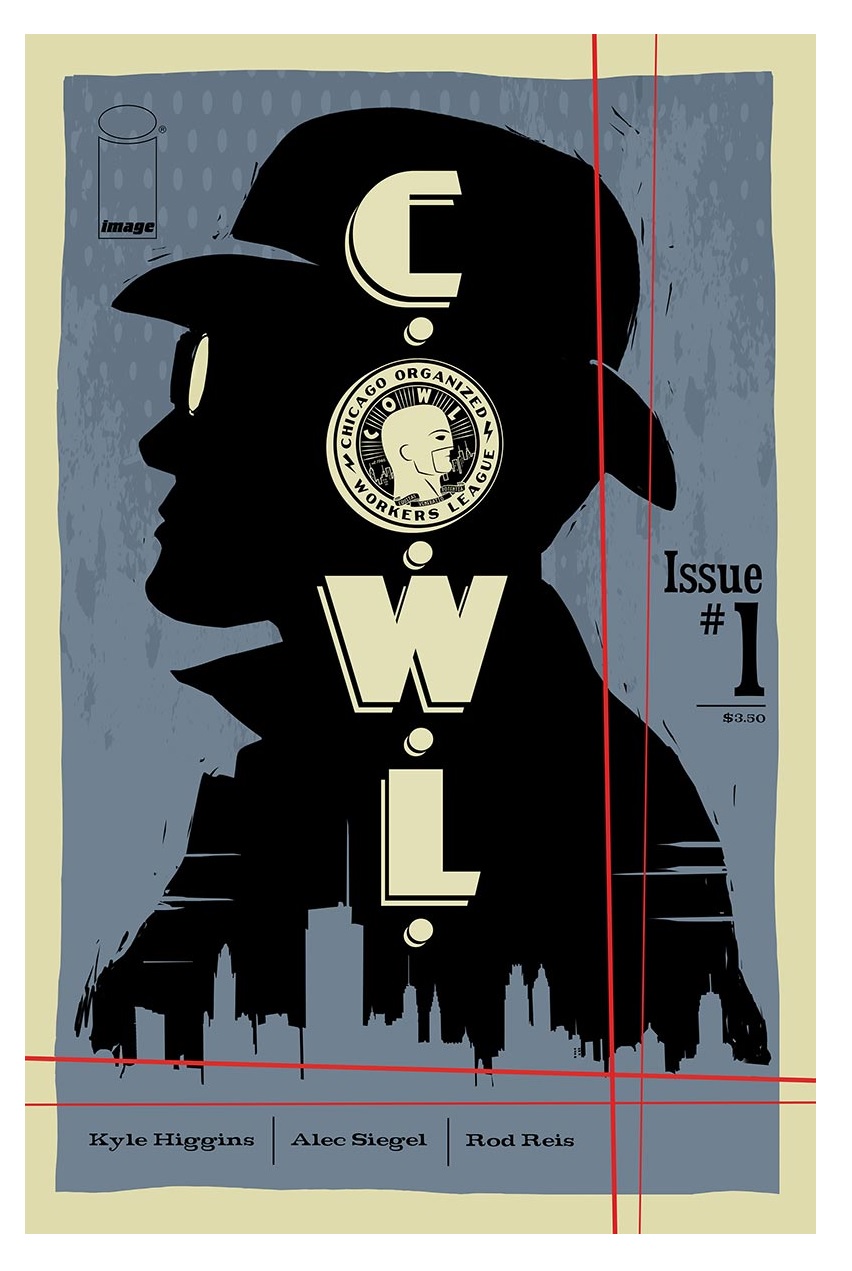
C.O.W.L. #1
Raiders of the Long Box presents DAREDEVIL #3 (1964)
 Advance Review: In stores today!
BATMAN/GREEN HORNET ’66 #1
Writers: Kevin Smith and Ralph GarmanArt: Ty Templeton
Publisher: DC Comics/Dynamite Entertainment
Reviewer: Optimous Douche
Given my malaise towards camp and kitsch, I thought for sure I would hate the BATMAN ’66 series that inspired this crossover. Wow, was I wrong. Jeff Parker and Richard Case worked the Bam and Kapow, while they delicately inserted today’s cynical sensibilities without ever compromising the camp.
Now, given my adoration of the prior ’66 effort and my love of Kevin Smith (Jersey boys stick together), I couldn’t see where this would fall off the rails. Well, now I know exactly where this title careened into a truck full of orphans was the complete lack of reverence for the original TV series, or the recent success of the comic book. Forced, muddled and an utter exercise in who gives a shit are the watchwords of this crossover that no one asked for.
To put prejudices at bay, I find Smith to be a .750 hitter on the comics front. I loved his DAREDEVIL and GREEN ARROW runs (before anyone wants to get on me for GA, look at how much was carried forward from his seeds). Now, I also know what the deal is 99.99% of the time when two writers are credited on a book. Generally the greater name is charged with plotting and editorial, while the lesser name does the heavy lifting on dialog. I actually have no problem with the plot that brings Britt and Bruce together on a train carrying priceless art. I also liked (in theory) Dick Grayson going on a date. So I’m not really knocking Smith; Garman, on the other hand, is more directionless than a Garmin.
The opportunities to play double entendres abound. I mean, these are big fat hanging softballs over the plate. Garman, the past host of the very funny “Joe Schmo Show”, is Stevie Wonder at the bat. Whenever there is a chance to zig, he instead zags with a deluge of dialog that is not funny, ironic, nor in tonality with the original TV show or the Parker book. I’ve met Adam West; he couldn’t have remembered this much dialog if he tried. The sentences are too long and too forced to truly be any iteration of Batman. Not once does he revel in this playground, but rather plays it very safe on the seesaw like an asthmatic fat kid.
Now, a prejudice I do have is the fact I hate Green Hornet, but I’ll say that Britt and Kato are probably the most likeable and realistic characters in this book. From the time the billionaires meet on the train to when they finally suit up and start fighting the bad guy, a man who shoots glue, I really found myself in the Hornet’s corner. That’s sad considering I’ve only half-read most Green Hornet books after some earnest initial tries, while I have about twenty-five longboxes of the Bat in my basement.
I was even less than impressed with Templeton, but that is more stylistic taste versus quality. Something about Case’s work on the original ’66 made me think of a cleaner and more detailed Mike Allred. Templeton draws some very HEAVY lines, almost to the point of distraction. We have to remember that these characters have deep rooting in the public zeitgeist. Too much deviation, as was the case when the heroes were in their civvies, can really loose the visage you’re trying to emulate.
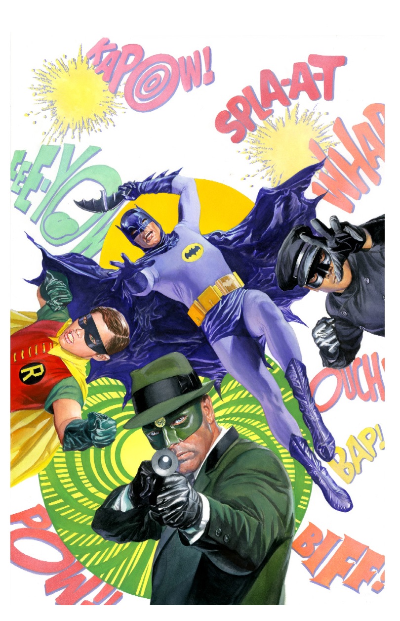
My editor always asks us to say something nice about a book. The Alex Ross cover RULED!!!! Would love to get a version of his ’66 Batman for my man-cave, assuming it is minus this book title, sans the Green Hornet and adds an in her prime Julie Newmar.
When not talking comics, Optimous Douche is the head of marketing for Work Zone, Project Management Software so powerful it could straighten out the New 52. To read Optimous other marketing, comic stuff and advice columns head to robpatey.com.
TREES #1
Writer: Warren EllisArtist: Jason Howard
Publisher: Image Comics
Reviewer: KletusCassidy
Do I even need to say that IMAGE is absolutely killing it right now?
Because they are. End of review--thanks for reading, folks. Right now I am almost buying as many IMAGE books as I am MARVEL books. Between the amount of awesome creators they have and the unique and innovative story ideas, IMAGE is taking all of my money and I willfully give it to them. Ed Brubaker, Steve Epting, Warren Ellis, Rick Remender, Robert Kirkman, Jonathan Hickman, Matteo Scalera, Kieron Gillen, Jamie McKelvie, Sean Phillips, and Ryan Ottley are just a few of the excellent writers and artists that IMAGE has on their roster and with names like those, how could I not be interested in damn near everything this company is putting out? Speaking of MARVEL, Ellis and Shavely’s MOON KNIGHT is a fucking gem, so much so that I bought this book without hesitation. I realized something after the first few issues of MOON KNIGHT: I need more Warren Ellis in my life, so I subscribed to his newsletter ORBITAL OPERATIONS (get well soon!), reread PLANETARY and bought this book (I still have yet to read TRANSMETROPOLITAN). I didn’t even speak to my comic book guy--I just looked at him and uttered “TREEEEEEEESSSmmmmm,” much like a newbie zombie looking for that sweet juicy first taste of brains. Thus my review of TREES #1.
I’m a nut for a good sci fi story (check out Remender and Scalera’s BLACK SCIENCE, also at IMAGE), so when I saw an advertisement for this book with nothing but a vague sentence and Warren Ellis’ name, I knew I had to have it. Sometimes less is more when it comes to advertising, and my curiosity would not allow me to sleep till I got my mitts on this book. The story is about an invasion of giant pillars landing all over Earth with no explanation, no little green men pouring out of them, no “take me to your leader”, no demands and no activity other than every once in a while dumping toxic sludge out of the base of these large obelisks dubbed “TREES”. This is pretty much all we know about the plot thus far, besides the fact that nukes and bioweapons shut down when they get close enough to the pillars, so destroying them is a no go. This story follows three separate people and their dealings with these pillars. What I like about this book is that while Ellis is still just teasing us in this issue, we get enough information to get the premise but not enough to overwhelm you with set up and exposition the way a lot of first issues can do. The mystery element of this story involving what these pillars are, where they came from and what they are doing is pretty strong and I imagine we will see the three separate stories converge as each of the characters unravel these questions in their own way, which will be a fun thing to watch come together. If you’ve ever read any of Ellis' books such as SECRET AVENGERS, PLANETARY, THUNDERBOLTS, NO HERO or SUPERGOD, then you know this man loves his sci fi and is going to put his all in to a book like this, and Ol’ Kletus will be right there waiting for that next issue to drop.
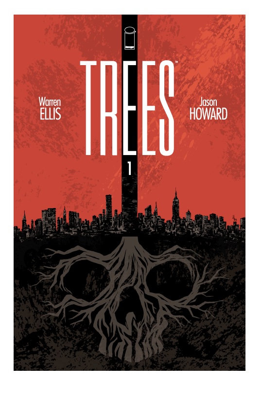
The artwork by Josh Howard is great. The opening scene with drones, robot police dogs, and ‘splosions looks great and was an awesome introduction to his pencils. Weirdly enough, his style kind of reminds me a lot of Declan Shavely, artist on MOON KNIGHT. They have very similarly drawn bodies and faces, but Howard uses more sketchy lines that work very well in giving the book a very kinetic feel. I feel as though maybe a few years ago I may not have liked this artwork as much, but Ol’ Kletus is getting up there in age and has started appreciating more varying styles of artwork than he has in the past. I thought I recognized Josh Howard’s name from something, but I realized I was thinking about the basketball player; nonetheless, I really like his art and I look forward to seeing his work in the rest of this series (and this issue’s cover is awesome).
If you like Warren Ellis, you probably have this book already because if you are like me, you have yet to read anything bad that this man has written. In my opinion, some sci fi stories are best when there’s only a vague premise but that premise is strong enough to get those rusty gears in your head turning to the point that before you even read a word of it, your tiny lizard brain is already frothing at the possibilities and implications this premise holds. The artwork is solid, and even though this Josh Howard doesn’t play basketball his artwork is a slam dunk...I know, I know, I’m rolling my eyes too, but I couldn’t resist. You know what, fine...I’ll just say it: IMAGE is kicking the shit out of DC right now (IMO). I’m basing this not only on the fact that I buy way more IMAGE books a month than DC, but I’m also way more interested in what IMAGE is doing right now. There, I said it...now I feel better. Also, I think there may be a woman with a penis in this book...see ya later!
CLIVE BARKER’S NIGHTBREED #1
Story: Clive BarkerWriter: Marc Andreyko
Artist: Piotr Kowalski
Publisher: BOOM! Studios
Reviewer: BottleImp
Though Clive Barker’s film NIGHTBREED has earned its place as a certified cult classic, I don’t think it’s unfair to point out that Barker’s movie (adapted from his novella CABAL) never quite achieves the same level of bizarre fantasy and horror attained by the superior HELLRAISER. Both the film and the book feel frustratingly unfinished; I always got the sense that there was much more that Barker wanted to tell of the underground city of Midian and its population of nightmares and monsters. So when I saw this first issue of a new NIGHTBREED comic, my first thought was “Great—Barker’s finally going to finish his story!” Unfortunately, Barker (along with writer Marc Andreyko) has decided to delve into his characters’ past rather than continue from the endpoint of the original “Cabal” story. As a result, this premiere issue will be a disappointment to fans of the source material and merely puzzling for the uninitiated.
The city of Midian is only briefly shown on the first two pages of this issue—it’s basically used as a framing device to tell the reader two seemingly disparate stories of the city’s nightmarish denizens. The first takes place in Louisiana in 1857, as two escaped slaves meet a danger worse than their masters in the form of the demonic Peloquin (remember him from the movie? He’s the one with the snakes/tentacles/dreadlocks and the red skin). The second story jumps ahead to Boston, 1945, as we see a well-respected senator take his pleasure in a brothel with a most particular, most monstrous, madam.
The problem here is that NIGHTBREED is clearly being written for those who have seen the movie, and ONLY those who have seen the movie. I’m all for maintaining a sense of mystery in a horror story, but in this case I fear that Barker and Andreyko are leaving too many details absent that are essential to the understanding of the story. Whether they’re doing this because they feel that showing only a hint of Midian adds to the story’s mystique or because they feel that readers will come to the book only because they have knowledge of the film, I don’t know. What I do know is that either way, drawing the curtain back a little more at the outset would have been beneficial to any reader, regardless of prior knowledge.
I also found it strange that the comic flitters between the two plotlines (and two time periods) seemingly at random in this first issue. So far there’s no obvious connection between them aside from the obvious inclusion of members of Midian’s people; the choice to try to tell both at once is an odd one. As a result, each storyline feels truncated, seeing as how both are vying for pages here in this single comic. I would have rather seen one plot given full attention for the span of the issue and save the second plot for the next one—not only would it make for a more satisfying read, a full-issue plotted story would also help make the four bucks spent on a single issue feel more well-spent than it does when reading plot fragments.
On the positive side, Piotr Kowalski is a very able artist, if not a particularly flashy one. His page designs are good and his figure work is fine; I just can’t help wishing that an artist with a more idiosyncratic style had been chosen for this series. Barker’s film, despite all its flaws, possessed a lush sense of visual style that helped the movie cement its place in the realm of cult horror and fantasy. Kowalski’s work is good, but feels slightly bland and inoffensive given the source material. While a different artist wouldn’t have been able to make up for the comic’s structure problems mentioned above, the work of someone like Ted McKeever or Travel Foreman—someone with a more surrealistic bent—would have gone a long way in giving NIGHTBREED the same dreamlike mood as its progenitor.
Though in the past I might have stayed around for a couple of issues to see where these stories were going, at $3.99 an issue I’m finding it hard to have that kind of patience anymore. The real disappointment here is that, for a comic based on a movie by Clive Barker based on a book by Clive Barker, NIGHTBREED has none of the wonderful eeriness that made those prior incarnations memorable. NIGHTBREED isn’t a particularly bad comic—it’s just sadly, unremarkably ordinary.
When released from his bottle, the Imp transforms into Stephen Andrade, an artist/illustrator/pirate monkey painter from New England. He's currently hard at work interpreting fellow @$$Hole Optimous Douche's brainwaves and transforming them into pretty pictures on AVERAGE JOE, an original graphic novel to be published by Com.x. You can see some of his artwork here.
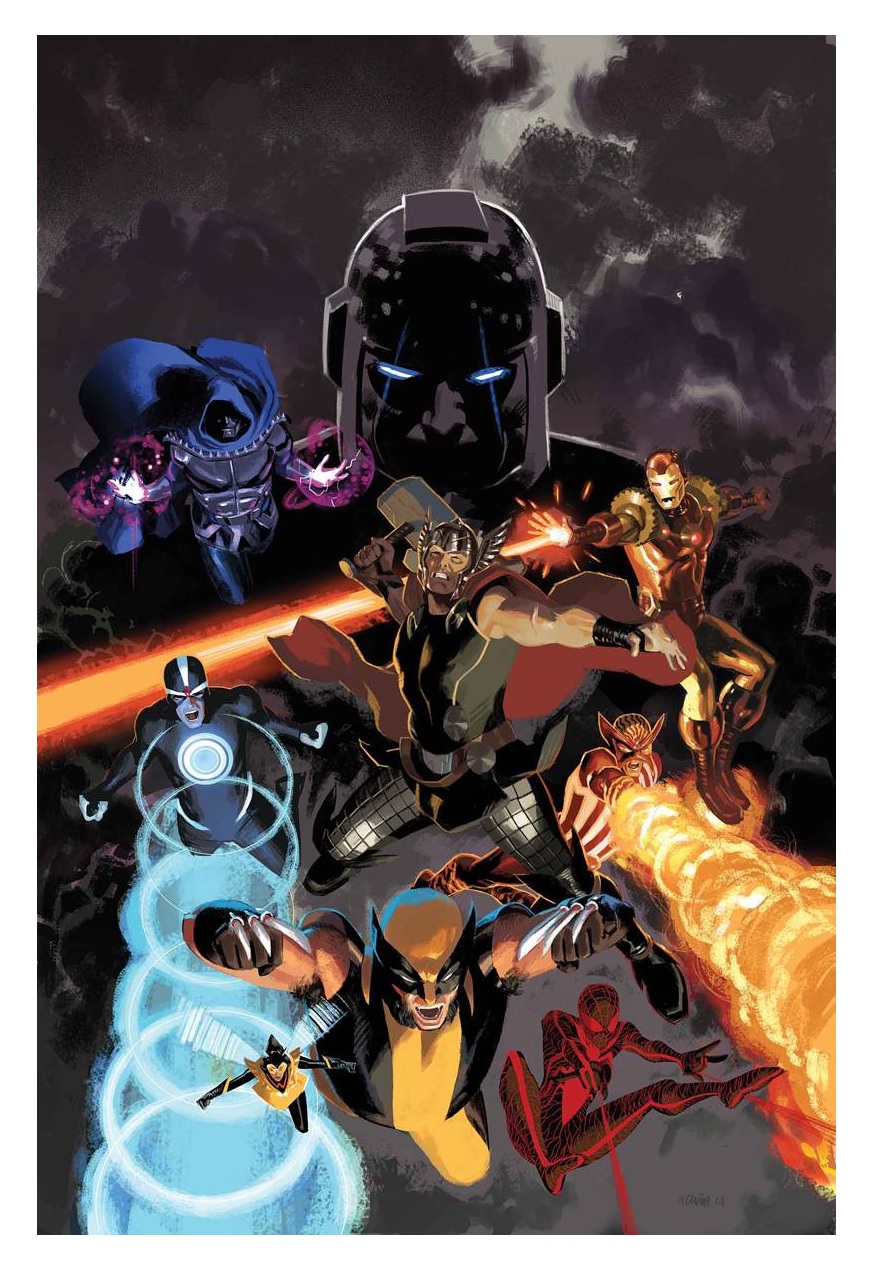
UNCANNY AVENGERS #20
Writer: Rick RemenderArtist: Daniel Acuna
Publisher: Marvel Comics
Reviewer: Masked Man
Because it must be mentioned every time we talk about UNCANNY AVENGERS, yes, the “Apocalypse Twins” story is still going on. And while I know this will scare a lot of new readers away from the book, if you are thinking about giving it a shot, this is a decent issue to do it with. Ever since the Earth was destroyed (oh yeah, didn't you get the memo? The Marvel Earth was destroyed several issues ago- fit that into you continuity, b!tches!) the story has become much more focused and easy to read. It was the build up and reveal of destroying the Earth which went on too long.
Time to talk plot, so look out for spoilers. You see, the Avengers' big baddie Kang raised Apocalypse's kids Uriel and Eimin to believe humans and mutants could never live together, so they decided to kill every human by destroying the Earth (they framed humanity in the eyes of the Celestials, who then got medieval on our @$$es). By playing the Scarlet Witch (and seriously, who doesn't?) they managed to teleport all mutants onto a space ark and set up a new life on Planet X, hence achieving two goals: One, no more ill-fated human and mutant cohabitation. Two, their a-hole foster father, Kang, no longer has a world to conquer. But when you're talking time travel and time dampeners, things can always change at the whim of the writer. This brings us to this issue, which is fairly straightforward, since it's a showdown between Magneto and his X-Force against the surviving members of the Uncanny Avengers, teamed up with Kang and a group of other displaced time villains (and May Parker). Magneto and company want to preserve their new life on Planet X by preventing Kang and company from going back in time to save the Earth. Amidst all this action, Remender never forgets to allow the characters to be who they are, as nearly every hero questions working with Kang. Also, certain members of the X-Force (namely former X-Men) start to question why they are not trying to save the Earth as well, especially Mr. Summers.
So Remender does a really good job putting this issue together, with character motivations and some butt-kicking action. Thor and Wolverine really cut loose here. Pretty much everyone gets a moment to shine in all this action. And as you may guess, Remender might not be quite done with us, as Kang had some curious words with his foster daughter Eimin, which could mean the last 16 issues were just act one! If so, I hope Remender has some good logic behind it, because banking on blowing up the world to unblow up the world just seems crazy! Assuming the logic is in place (and issue #6 does seem to back it up), I can't wait to see it.
As for the artwork by Daniel Acuna, well, he continues to turn in the best work I've ever seen by him. As I probably mentioned before, I wasn't a big fan of his when he first hit the scene with UNCLE SAM AND THE FREEDOM FIGHTERS for DC, but his work has really matured. I daresay he's finally able to craft pages (because he colors them as well) the way he always saw them in his head, but didn't quite have the skills yet. So in this issue we got great mood, great figures, great actions (ouch, Stryfe, ouch!) and some darn good storytelling to boot. It's also really nice that he's managed to stay on this story as long as could, meaning you folks waiting for the trades are going to get a good-looking book (he's done ten of the 16 issues so far).
So what about story fatigue? I won't lie, it's there--but only when you think about the arc. When you are reading the issues, especially now, Remender and company keep you in the moment and you don't mind at all. This is still my favorite Avengers title.

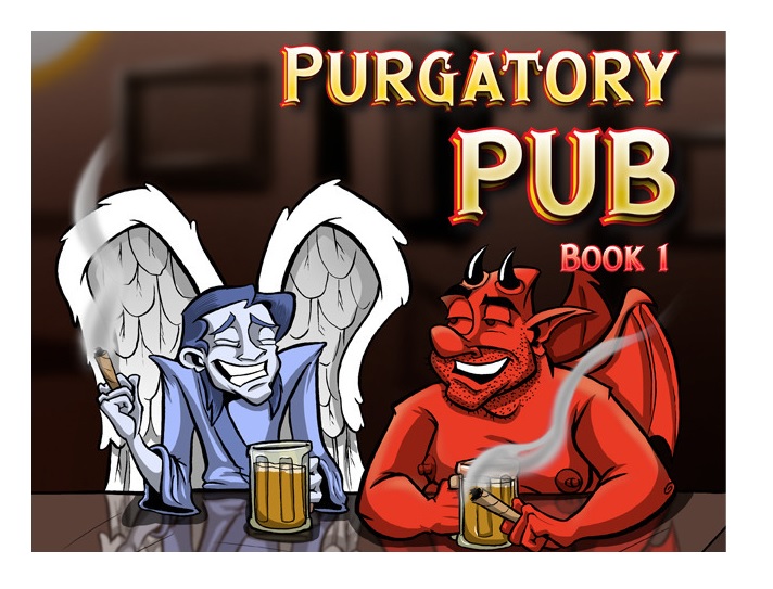
PURGATORY PUB: BOOK 1
Writer: Gabriel DunstonIllustrator: Gabriel Dunston
Publisher: Fire Lights Media
Reviewer: Mr. Pasty
It's not very often I pick up a book simply for the title (especially after getting burned by SKRULL KILL KREW), but how could I resist PURGATORY PUB? Simply for the fact that I worked in a pub for many years and, welp, it looked like purgatory. A bunch of bodies slumped over the bar every day with nowhere to go by Sudsville. This offering by writer/illustrator Gabriel Dunston is no different, and I found it unintentionally hilarious that his name is Gabriel (think archangel) when the book takes such an unflattering look at religion. And by unflattering, I mean “prepare to get your manties in a bunch.” I did, and I'm not even that religious, but that's the kind of knee-jerk reaction most people get when the subject matter is skewered by critics.
It's important to note that PURGATORY PUB is not a religious smear campaign or an excuse to air certain biblical undergarments, but it does ask some tough questions under the guise of cartoony relationships between the fictional angel and devil who sit on your shoulder when dicey decisions are to be made. I like that, because the soft pencil helps counterbalance the difficult subject matter, cleverly laid out in the construct of class systems and real estate. Essentially, the cast and crew are all from heaven and hell – and everything in between – but operate in sort of a faux-metropolis, which means you have uptown (utopia), midtown (middle class) and downtown (ghetto), and each character must find their own way in a world divided.
In short, it's kind of like what each and every one of us do each day as we navigate life, religion and purpose, which is likely to help readers navigate the material. I don't want to get too spoilerish with my review, but I think it's safe to say that even the heavenly bodies are just barely holding it together, so life in heaven and hell has all the ups and downs it does here on earth. Well, at least in Dunston's afterlife. I did so enjoy the way his art popped off the page on the book's face and sorely missed those vibrant colors – which add an extra layer of depth to his work – between the covers. Unfortunately, this work was produced via Kickstarter, so I understand there are certain sacrifices to be made.
The good news is, it doesn't affect the overall enjoyability of the book. The worst thing in comics is a writer who thinks he can draw – and vice versa – but I'm happy to report that Dunston has both sides of his brain firing on all cylinders. I suspect some beer and cigars were at play during the making of this product by the way they're so heavily referenced in the PUB. When all is said and done, we have a 130+ page book (plus some extra goodies) that looks as good as it reads. There's an homage to heavy metal right around the midway point and it's a fitting reference, because PURGATORY PUB knows how to rock. Thou shalt not miss it.
Web heads who can’t get enough of Mr. Pasty’s word vomit are encouraged to watch him operate as Nostradumbass over at MMaMania.com here. Love, hate and Mafia Wars requests should be directed here.
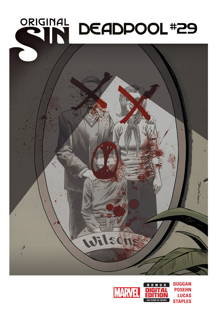
DEADPOOL #29
Writers: Brian Posehn & Gerry DugganArtist: John Lucas
Publisher: Marvel Comics
Reviewer: TheKidMarvel
DEADPOOL #29 kicks off the Merc With The Mouth’s ORIGINAL SIN arc and, at least from the cover art, I can only assume his original sin has something to do with Wade killing his parents, but again it’s only speculation from DEADPOOL #29’s cover art.
Going into DEADPOOL #29, I thought right away we’d be getting a little more on Wade’s past, the actual version and not the Butler-implanted ones. However, that’s not the case and Posehn and Duggan only give a very brief, tip-deep look at Deadpool’s “Original Sin” arc without actually jumping right into the story.
DEAPOOL #29 starts off with Dracula still pissed at Deadpool taking and marrying his former bride to be and honestly, I’m surprised there haven’t been any “Mr. Steal Yo Girl” jokes made at all since Wade’s wedding. It only seems fitting for the type of humor Posehn and Duggan use for the series, but I digress. With all Dracula’s vampires trying to kill Shiklah, Wade’s wife, and him too, Wade begins looking to SHIELD for some help, which then leads him to Dazzler. Dazzler ultimately declines when the events of the actual ORIGINAL SIN series cross over in this book, flashing points of Deadpool’s life into Agent Preston and Adset. Agent Preston sees the fate of Deadpool’s daughter, while Agent Adset witnesses Wade’s original sin. Deadpool, however, is nowhere near any of this as its happening. It seems he has decided to steal a piece of FF time travel equipment in order to visit Dazzler back in time and recruit this younger Dazzler to help him kill vampires.
Overall, I thought this was one of the weaker books of Posehn and Duggan’s run with DEADPOOL. Not to say it was bad; it was still an entertaining read, but it just wasn’t as good or solid as the previous DEADPOOL issues. The writing for the book was decent or pretty good, depending on who you may be as a reader. My lack of enjoyment for the book may, however, not be due to the actual writing but because of the unfortunately bad artwork. I mean, I just could not get behind it at all. Honestly, it felt sloppy and all over the place, just too wild and not meshing well with the story at all. I understand trying to take a more cartoonish take with Deadpool because of the character’s obviously more cartoony personality, but it felt as if Lucas just kind of threw this together. The panels felt like they lacked any structure or artistic aesthetic of any kind; it might have even ruined the book for me by completely distracting from the writing and actual story. Seriously, I don’t like saying things suck because obviously these guys have talent to be in the industry, but this book’s art sucked a mean one.
Minus the messy art, I am pretty excited to see what Posehn and Duggan have in store for this “Original Sin” arc. They’ve done such a good job with mixing the serious and humorous elements of the character. The duo know how to keep Deadpool as an obnoxious, hilarious, and over the top character while reigning in on the jokes in order to add elements of a darker history, creating more levels to Deadpool’s insanity. I’d recommend this book if you want to follow Deadpool’s “Original Sin” arc, but it doesn’t necessarily even add anything, kind of just sets the stage to setting the stage for the actual story. Other than that, this book could be a pass in comparison to how good the rest of the DEADPOOL books have been, plus the bad art—god, I hated this book’s art. So in conclusion, if you do purchase it, you’re getting a tad bit more info added to what Duggan and Posehn have been doing with Deadpool. If you pass or glance, you aren’t missing out.
ROVER RED CHARLIE #6
Writer: Garth EnnisArtist: Michael Dipascale
Publisher: Avatar Press
Reviewer: Optimous Douche
I want to review this book for one reason and one reason only--to send a clear message to reviewers and abstract writing hacks: STOP COMPARING “ROVER RED CHARLIE” TO “WE3.” You know who you are, and you know full well you are leveraging a lazy comparison in pursuit of an easy zeitgeist translation and Google juice. Comparing ROVER RED CHARLIE to WE3 is as egregious a sin as comparing WATCHMEN to TINY TITANS. Sure, both have superheroes in them, but that is where the comparisons end. Likewise, while WE3 and ROVER RED CHARLIE are about the sentience of animals, that again is where the comparisons end.
What should we talk about with ROVER RED CHARLIE? How about the fact that Ennis, a man who generally relies on shock and horror to enthrall audiences (as he has with books like CROSSED), actually created an endearing and sweet tale without ever pandering or forgetting his horror roots? We should also discuss that while ROVER RED CHARLIE is about our 4-legged friends, there is as much to learn about our demons through their eyes. Finally, we should discuss how ROVER RED CHARLIE is yet another eyegasm of artistic beauty that Avatar is somehow always able to keep on schedule.
Point 1: Ennis shocked the hell out of me with this book, and not in his usual fashion. The first couple issues were as expected: a horrible plague induces a fever frenzy of horrible actions people inflict on themselves and others to basically wipe the bipedal off the map. Where these actions deviate from the baddies of CROSSED is that the crazies are mere window dressing, and EVERY human falls victim to the disease. CROSSED is like a dirty WALKING DEAD. ROVER RED CHARLIE is like an R rated version of Disney’s “The Incredible Journey.” However, this is a journey of self-reliance and finding new purpose outside the belly rubs of the now deceased “feeders.”
Some will take issue with the anthropomorphic tone of the title, where each animal is our perception of their ilk. Charlie is a basset hound with a Cockney accent and the malaise people usually associate with the droopy face. Rover is a mutt with more herder breed than anything else. He’s a service dog, and as such is most in tune with dog’s God, man. Red is my favorite of the trio because I have one running through my house. The golden retriever is the neediest dog in the world. Their unending quest for approval and affection leads many to believe they are dim. Ennis caught the retriever voice perfectly, and throughout the series proved that naïve and deriving pleasure from pleasing others are a far cry from being dumb. At the end of the day, your willing suspension of disbelief for the personalities in this now dog world will rise in direct proportion to just how “human” you believe house pets truly are.
Point 2: Another deviation from WE3 is that humanity is somewhat redeemed in ROVER RED CHARLIE, despite the fact we tried to take out any living thing in our final moments as a species.
The trio truly lament our loss during their cross-country trek to see if any of us are still alive, but what they find is that they are in fact our progeny, not our slaves. Through Rover we see our ability to master the world around us. Charlie will carry forward our skepticism and sarcasm--the necessity to laugh at the absurdity of existence. Red is our reckless abandon, the caution to the wind to Charlie’s pragmatism.
They of course come across other personalities: a full of herself collie, a dogfighting pitbull who becomes the main antagonist of the tale, yet the one you feel the most for at the end (at least I did).
In WE3 we saw the absolute horror and pain of sentience; ROVER RED CHARLIE shows us that while life is tragic, it is most certainly worth living.
Point 3: Dipascale did an amazing job in capturing America and the spark of animal sentience. Let’s be honest, outside of a breed like golden retrievers most animals aren’t brimming with facial expressions (and even with retrievers, they are not smiling, they are simply breathing heavy). It’s a fine line for an artist to bring house pets to life with expressive faces without making them a fucking cartoon. Dipascale straddled this line as beautifully as Ennis did, with dialog bits that reminded us the trio still had their prehistoric wolf brain.
You can take my gushing adoration for ROVER RED CHARLIE with a grain of salt, because I am a dog lover and clearly Ennis is as well. However, I will not lead you astray in saying that this book is a complete 180 from the message WE3 was trying to deliver. If you want an example of the darkness of man, WE3 is waiting. If you want to see the best of ourselves carried forth after our demise…well, you know the rest.
AVENGERS #30
Writer: Jonathan HickmanArt: Leinil Yu
Publisher: Marvel Comics
Reviewer: Henry Higgins is My Homeboy
Future Talk.
This is an Avengers issue that is HEAVY on talking. There are two brief fights in the book, short and effective at establishing the future setting and at foreshadowing a clear upcoming divide. The tension from the past issue never lets up. The group is introduced to Hawkeye from the future (in a clever little scene) as an armored member of the Avengers who has vastly different opinions on the two leads of the team, Steve and Tony.
It's like Hickman looked at CIVIL WAR and said "Huh. That's not a bad idea. Now let's just make it actually good." The conflict between the two men feels thought out and legitimately real. Tony has his reasons, but Steve has reasons to disagree. Neither character feels shallow in their arguments, and it gives the story a real sense of depth.
Yu is a very specific penciler, and having him do such a high profile gig appeals to his talents, but also illuminates a few flaws. His character work is great, each movement being wonderfully fluid but still personalized. There's so much attention to the bodies that the faces are somewhat forgotten. It's usually screaming or some variation thereof, but the overabundance of shadows doesn't help either. There a few times Yu really gives attention to the faces, and that's where characters look like people, not really cool action figures. I like Yu, but the shadows are a bit too much. What we do see of the future is well constructed and engaging, but again is often more shadow then anything.
I've said it recently, but I've also been rereading his run as a present to myself, and I can't stress it enough: Hickman's AVENGERS/NEW AVENGERS is great, and this is another wonderfully written chapter. The little wrinkles in their lives just keep getting bigger, and it keeps getting better.
C.O.W.L. #1
Writers: Kyle Higgins and Alec SiegelArtist: Rod Reis
Publisher: Image Comics
Reviewer: Humphrey Lee
I am nothing but a sucker for high concept when it shows up in my art/media/entertainment/whatever the fuck. Part of it is that ego aspect of “I could never have thought of that because that is true genius”, and that helps me ease the pain of being an uncreative lump of bone and flesh. The other aspect of it is that it isn’t the dreaded “Oh FUCK! How did I not think of that shit?!?” moment that comes when you happen across a piece of work that is so simply intuitive it is just as brilliant as that top shelf ideas was in its own way. That was more or less my reaction when I caught the solicit for this newest Image jaunt, C.O.W.L. (the Chicago Organized Workers League), and its retro look at 1960s Chicago in a version of it where superheroes not only exist but are (TA-DA!) highly unionized. Feel free to slap yourself like the first time you saw a Snuggie and have no clue how you didn’t piece that together in your own brain space to bring to market. None of this means a damn thing, of course, unless the execution is up to snuff with the burst of inspiration that spawned it (have you ever wrapped yourself in a Snuggie? It’s like wearing the softest muppet) and this debut issue of C.O.W.L. puts a pretty good foot forward toward living up to its ambitious billing.
What I enjoyed most about this first shot, I think, is the way it unfolds and establishes itself. I feel like the writing crew of Higgins and Siegel know they have themselves a killer premise and a good backdrop for it, but do not want to beat the reader over the head with these concepts. Instead of being dropped right into a politicized world full of bureaucratic backbiting that may or may not become a focal point of this series, we’re put right into the thick of some pretty standard yet amusing superheroing. There’s a menace about named Skylancer – an ex-KGB agent and apparently the last of a pretty nefarious group of villains known as the “Chicago Six” – and a handful of members of C.O.W.L. use a combination of organization, innovation, and dumb ass luck to bring him down over the first half dozen or so pages. It’s a nice kinetic jolt to kick off a story I actually expected to be a significant slow burn in establishing the groundwork of a book such as this.
Things do escalate from there from the civil service front, but it’s still more of a dipping of the toe into the pool of superpowered paperwork. We meet Geoffrey Warner, a former hero turned founder and leader of the C.O.W.L. organization, who may also be banging one of the groups’ superheroines and that doesn’t exactly have the utmost respect of those who carry the C.O.W.L. union card. Meanwhile a couple other C.O.W.L. agents – working with approved overtime, of course – follow up a bit on some loose ends out of the Skylancer encounter earlier. These gentlemen again show a quirky, boisterous, and somewhat backbiting and even despicable side to the book and its rendition of superheroics, but it also puts some pins in the Skylancer case that will definitely affect the greater order of things in issues to come. There’s already a layer of subterfuge and deceit being forged around this whole Skylancer debacle, which is just good craftsmanship through and through. It’s a great framework for showing that this book will be more than just political drama given the healthy dose of action therein; it shows that said political drama will play out way in ways more subtle than you would expect given it involves people who shoot death rays from their hands, and it shows that Higgins and Siegel know how to weave these things in and out of each other and through the spaces in between with a deft hand. All things that get me excited beyond the jollies I get from a killer premise.
Moving onto the other hand at work, Rod Reis’s artwork has a special talent of its own. As is becoming a trend here, it’s not exactly what I would have pegged on book with this type of workings but it intrigues me. You would figure that maybe a book with this type of subject matter would maybe play it bright and shiny Golden Age with a hint of noir, but it’s the exact opposite. There’s a little bit of scratchiness and a lot bit of grays and dark shading that sets a lot of ambiance. It actually reminds me quite a bit of the late 80s/early 90s Vertigo styles when it came to the ones that were dark takes on the DC superhero crowd. I get a lot of Duncan Fegredo on KID ETERNITY in here, or even some Sienkiewicz – especially with the painted style on both accounts – and it actually makes perfect sense seeing it as the device for the story. I do think that occasionally the color and shadow tends to be a little too murky for their own good and some expression in the characters gets lost in the thickness of it all, but overall I like the atmosphere and the designs are damn excellent and everything comes alive quite well.
So C.O.W.L. does that magic combination of things that really makes me feel like the hack I probably am: it brings to life a premise that has pretty much dared someone to bring to life for years and does it with a great deal of craft. It throws a lot of concepts and characters at us in a relatively short span, but does so in a way that makes you work just a little bit and that all slides into place by the last panel. And it damn sure lets you know that things are going to get both bigger and deeper with its plotting and with genuine payoffs, as we explore this world and the characters that make up C.O.W.L. itself. It’s a great overall package with loads of potential that it very much insinuates it will live up to. Do yourself a favor and start paying your monthly dues to receive your monthly newsletter and learn all about the benefits that C.O.W.L. can bring to you. Cheers…
Humphrey Lee has been an avid comic book reader going on fifteen years now and a contributor to Ain't It Cool comics for quite a few as well. In fact, reading comics is about all he does in his free time and where all the money from his day job wages goes to - funding his comic book habit so he can talk about them to you, our loyal readers (lucky you). He's a bit of a social networking whore, so you can find him all over the Interwebs on sites like Twitter, Facebookand a blog where he also mostly talks about comics with his free time because he hasn't the slightest semblance of a life. Sad but true, and he gladly encourages you to add, read, and comment as you will.
DAREDEVIL #3
Originally published: June 2, 1964Writer: Stan Lee
Artist: Joe Orlando
Publisher: Marvel Comics
Reviewer: Masked Man
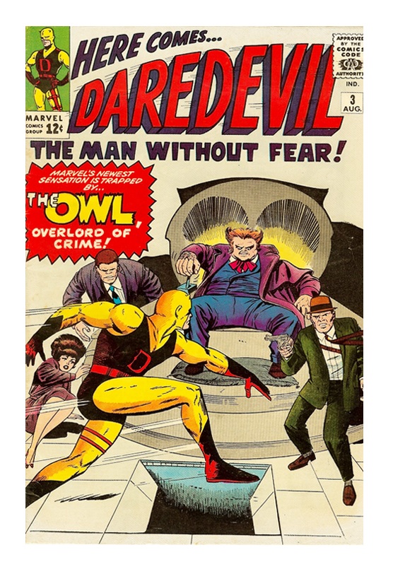
Those of you reading the current DAREDEVIL series by Mark Waid and Chris Samnee know that Daredevil's long time arch-villain the Owl has returned. So this week in comics I'll turn the clock back 50 years to 1964, when the Owl first appeared in DAREDEVIL #3!
As the summer started in 1964, the Beatles had hit the states on album and on Ed Sullivan, Ranger 6 had crashed into the moon, James Bond's second movie FROM RUSSIA WITH LOVE was released, Sidney Poitier became the first African American to win the Oscar for Best Actor, the BASIC computer language was born and nerds were still enjoying THE OUTER LIMITS on ABC from last fall. In the world of comic books, the Silver Age was in full swing! Superheroes were in such high demand that Charlton Comics had just re-launched the original BLUE BEETLE this week as well. DC was still king of the heap, but Marvel was making more waves as pretty much every single one of their new superhero titles was becoming a hit including their newest series, DAREDEVIL:
I don't know about you, but I'm enjoying Stan Lee's new goofy credits boxes, as Stan wrote this issue with 'Raw Realism' and Joe Orlando drew it with 'Daring Drama', though I'm not so sure 22 pages equals a 'Movie-Length Action Thriller'. Either way, Marvel's newest superhero still seems to be finding his way. As you would expect with a third issue, a new super villain has shown up to challenge Daredevil, and unlike the first two issues it's an original villain--The Owl! Whenever in doubt, just name a character after an animal, huh? And as Stan tries to make Daredevil unique, he works hard at making the Owl unique as well.
Ok, time for some spoilers: to start, the Owl isn't your typical bankrobbing costumed villain. Although crooked, he's still a respected Wall Street financier (a lawyer vs a financier—see? Unique). Despite his best efforts, the police finally get wise to him, so he decides to become a full-on supercriminal with a bid to take over New York City's underworld. Daredevil gets into the mix because the Owl decides he needs a lawyer. Believing he's so smart and that any dork lawyer will do, he randomly pulls Matt Murdock (aka Daredevil)'s name out of the phone book. This is the interesting thing about Lee (who is now more famously know as the old guy who has a cameo in nearly every Marvel movie)'s writing: while the logic to his scripts can be mighty flimsy, it's still pretty sound logic. I mean, what are the chances of the Owl pulling Murdock's name out of the phone book at random, right? But it could happen, and it moves the story long. Also, superhero tales should always be extraordinary anyway. In keeping with the genre, Lee also has the typical superhero romance troubles for Daredevil as well. Matt Murdock is in love with his secretary Karen Page, who is in love with him (not Daredevil, mind you), but Matt believe she could never love a blind guy. Therefore his demeanor makes Karen think he has no interested in her (what fools these mortals be). I really like this angle in creating romantic tension, even if Lee ham-fisted it nearly every time. Of course Matt's law partner, Foggy, wants to get into her pants too (was that too much?). But in this issue when Matt pushes him towards Karen because he needs an excuse to turn into Daredevil, well, you know it's not going to end well for anyone. Lastly, I'll mention even though I often appreciate Lee explaining how Daredevil can do what he can do, it doesn't mean he has to do it all the time. At some point we readers get it. Also, I don't care how good his senses and radar ability are, he's still not slapping a bullet out of the air with a stick (ok, it was his billy club).
Artwise, Joe Orlando (who passed away in 1998, and while perhaps his most famous drawing is that damn Sea Monkeys ad, modern readers might know him more for the work he did in WATCHMEN #5 with the Black Freighter comic) does a bang-up job as usual. I'll also give a shout out to inker Vince Colletta: when he's not turning in a rush job, his inking is very pleasant with great textures. Overall Daredevil (still in his yellow and red outfit) and the Owl both look great, but Orlando's backgrounds could use work. The Owl's dungeon lair (well, yeah, he has a dungeon lair) is rather empty and uninteresting looking. The building itself, the Owl's Aerie, looks pretty darn cool as a giant owl on a cliff side. To be unfair, I'll say Orlando doesn't have the power of Kirby or the overall elegance of Ditko. Still, it's a solid-looking book.
While Daredevil has yet to blow our minds like Spider-Man, the Fantastic Four or The Hulk, he’s proving to be another very interesting superhero from the very fertile mind of Stan Lee. And now that he is finally getting some of his own super villains to fight, things can only get better.
Proofs, co-edits & common sense provided by Sleazy G
 The next level of comic book excellence is a click away at BLACK MASK STUDIOS!
 Want more in all things Geek?
Check out our friends at PoptardsGo for podcasts, reviews, and more!
 And if you still need more geek in your life, check out Part-Time Fanboy for more geeky goodness on comics, movies, and more!
Finally, check out AICN COMICS on Facebook and Comixpedia!
