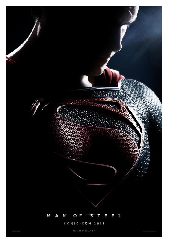
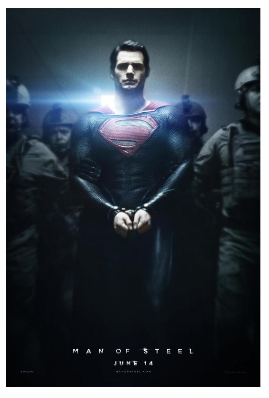
 A few weeks ago the latest trailer for the upcoming MAN OF STEEL movie made its rounds on the internet. Based on the general reaction I saw on facebook and other social media, the fan reaction to the footage is for the most part positive, and in many cases expressed excitement for this new version of Superman. Many comments cited the scope of action and spectacle indicated by the promo—qualities that were generally lacking in Bryan Singer’s earnest but flawed SUPERMAN RETURNS. It seems as if MAN OF STEEL is poised to bring the character back to the big screen in all his triumphant glory. And yet…
None of it moved me. While others were raving about the special effects, the flying, the look of Henry Cavill as Superman, I found myself surprisingly uninterested in the movie. Why was this? I’m a comic book fan; I love a good comic book movie. Like many others, I was slightly disappointed by Singer’s version of the character and hoped that the next film would do justice to the American—indeed, even worldwide—icon. So why doesn’t MAN OF STEEL feel like the Superman movie I’ve been waiting for?
 Part of the problem, I’ll freely admit, is that my feelings for the character and his live-action incarnations is inexorably tied to the Christopher Reeve Superman films. These were the movies of my childhood; I grew up with Reeve, Margot Kidder, Gene Hackman and Terrance Stamp emblazoned on the big screen, bringing to life the four-color adventures of their printed counterparts. A flawed life—I’ll be the first to admit that even the first and best two films of this series have moments that haven’t aged gracefully—but a life that conveyed the comic book wonder of a man who could fly. At the heart of these films was Reeve’s portrayal of Superman. Reeve intrinsically understood that the Last Son of Krypton should never strike a pose or try to appear strong or intimidating. The body language of his Superman was modest, almost shy, but with an inner strength that radiated out from his bearing and his eyes and made us believe that he could bend steel or run faster than an express train. Reeve’s Superman had a strength that was one of goodness—a quality that in today’s cynical culture has the unfortunate stigma of being synonymous with being a pussy—but this innate sense of right and wrong is really what lies at the heart of the character. For me, there’s no better moment in the Richard Donner Superman movie than when Lois Lane asks who he is. “A friend,” Superman replies… and we utterly believe him.
That’s the Superman that I want to see on the theater screen again, but from the looks of the trailer, it doesn’t seem that MAN OF STEEL will fulfill this wish.
 Right off the bat, this is a much darker Superman than we’re used to seeing. I’m not talking about the tone of the film (although this very well may be true as well), but simply the aesthetics. The color palette has been muted, trading the bright hues of the traditional comic book world for the digitally graded and desaturated grays, umbers and blues that have unfortunately become the go-to for science fiction, fantasy and action films. So right there, MAN OF STEEL is poised to blend in the ranks of all the other similarly colorless flicks that have been churned out of Hollywood the past few years. The design of the movie (from what is shown in the trailers) also suffers from that homogenized blandness. The shots of Russell Crowe in his Jor-El regalia look like they could have been lifted from THOR, or JOHN CARTER, or any number of fantasy/sci-fi movies. Likewise the images of Krypton are interchangeable with any other computer generated alien landscape that one could see, and has seen, in numerous big-budget films and low-rent SyFy channel originals alike. I remember a time when we comic book fans thought that CGI was the best thing that could ever happen. Finally we’d get to see our favorite superheroes on the big screen, doing all the things that they can do in the comics, thanks to computer effects! A few years and the GREEN LANTERN movie later, I think we’re starting to sing a different tune. Going back to the Donner movie, think about how unique his version of Krypton was. With practical, visual and budgetary restraints, that bizarre crystalline world came across as utterly alien, and indelibly imprinted itself in the minds of the viewers as another world. With huge budgets and the most up-to-date digital technology on hand, MAN OF STEEL’s Krypton looks eminently forgettable.
And then there’s the costume…
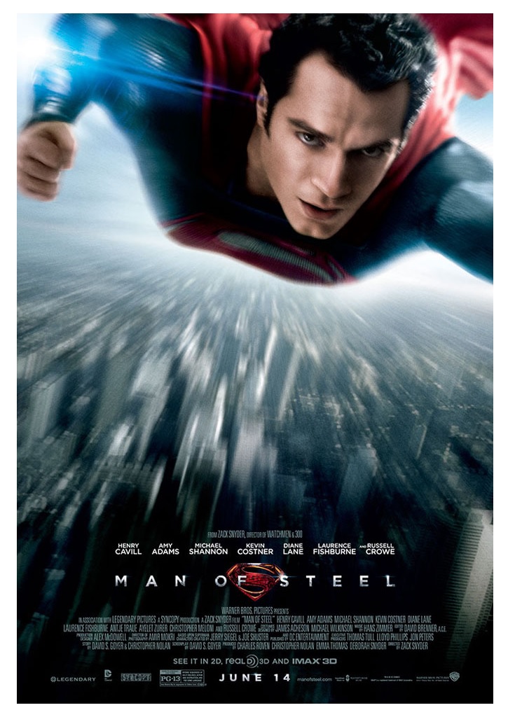
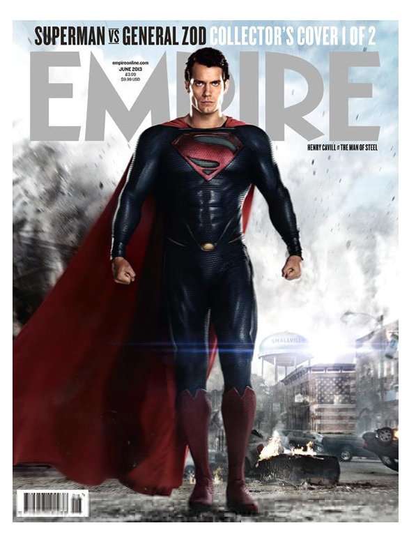 As we all know, with the launch of DC’s New 52 the powers-that-be decided that the best way to modernize Superman was to axe the red underpants. I’ll agree that the whole “underpants-over-tights” look is a bit dated and, if you stop to think about it, fairly ridiculous. But it remains that the red trunks are a key part of Superman’s iconic look. If you want to get rid of that element, you’d better do so in a way that doesn’t feel like it’s taking a hatchet-job to an institution. So in accordance with the New 52 mandate (I’m assuming), MAN OF STEEL features a panties-less hero… and the overall look suffers for it.
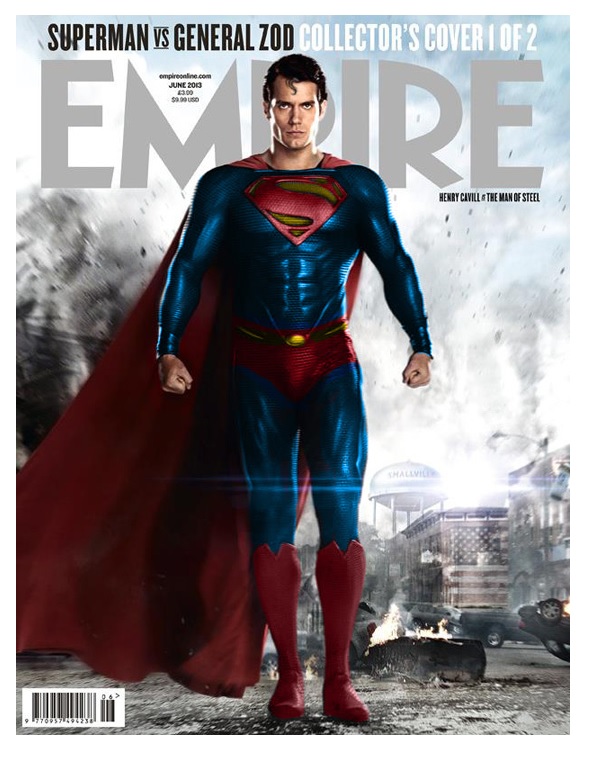 Look at this full body shot from the cover of EMPIRE magazine. Without the red color to break up the line of the costume, Superman looks like he’s wearing an oversized onesie. The high boots make his legs look shorter, making him look a little squatter overall. The costume team also elected to get rid of the red belt that Superman currently wears in the comics, substituting an oddly belt-less belt buckle. The costume colors have been so darkened—the blue almost black, the red muted to maroon—that the viewer’s eye immediately is drawn to the most high-contrast area on the body: namely that odd buckle. The strange detailing on the sides was probably meant to accentuate the V-shape of the torso, but instead only serves to reinforce the drawing of the eye down to that stupid belly button. And while we’re at it, where’s the spitcurl? Another integral part of Superman’s iconic look, the signature S-curl of hair, has been excised. With this slight modification Cavill’s Superman becomes harder and grimmer, looking more like a frat-boy date-rapist than a protector of the innocent. I’m not usually one to do this, but I’ve included a photoshopped version of the cover that puts back the red underpants and brings the colors a little closer to the classic look. Personally, I think it’s an improvement both in terms of visual impact and the overall tone of the character… what do you think?
Personal fashion taste aside, the most important thing about this new Superman movie in my mind is the pedigree of the filmmakers involved. Zack Snyder has proven that he can handle special effects-driven films, but he has a track record of embracing style over substance. WATCHMEN in particular showed me that Snyder could slavishly bring visuals from the page to the screen while totally missing the point of the story. Christopher Nolan has had great success with his Batman films, but even the best of these suffer from Nolan’s tendency to bring the fantastic material down to the real-world level in every way he possibly can. That approach worked for BATMAN BEGINS, but I felt that the follow-up film spent too much time trying to explain everything rather than just letting the movie breathe. If you watch THE DARK KNIGHT and then go back and watch Tim Burton’s BATMAN, the difference between the two directors’ approach to the material is striking. As good as TDK was (thanks mostly to Heath Ledger), it lacks that sense of larger-than-life spectacle that Burton’s sensibilities brought to the character. Superman, being an even LARGER-than larger-than-life character, will not do well if Nolan tries to ground him as much as he did with Batman. Plus, as many writers, directors, etc. have pointed out through the years, you can’t make a Batman movie and a Superman movie in the same way—the characters are just far too different. Given the tone of the trailers, my fear is that Snyder and Nolan have ignored this advice and tried to shoehorn the Man of Steel into the darker, grimmer world of the Dark Knight.
 Maybe all my fretting is needless—after all, I am simply basing this off a mere five minutes’ worth of footage. I am sure that when the time comes I’ll be standing in line with the rest of the fans, hoping that once again I’ll believe a man can fly, just as I did when Christopher Reeve glided effortlessly across the screen to save Margot Kidder from falling thirty stories. But mostly, I’ll just be hoping that DC and Warner Bros. have treated this iconic American institution with the dignity that he deserves, and not elected to sacrifice the ideals of truth and justice on the grim altar of jaded cynicism.
When released from his bottle, the Imp transforms into Stephen Andrade, an artist/illustrator/pirate monkey painter from New England. He's currently hard at work interpreting fellow @$$Hole Optimous Douche's brainwaves and transforming them into pretty pictures on AVERAGE JOE, an original graphic novel to be published by Com.x. You can see some of his artwork here.
Proofs, co-edits & common sense provided by Sleazy G
