
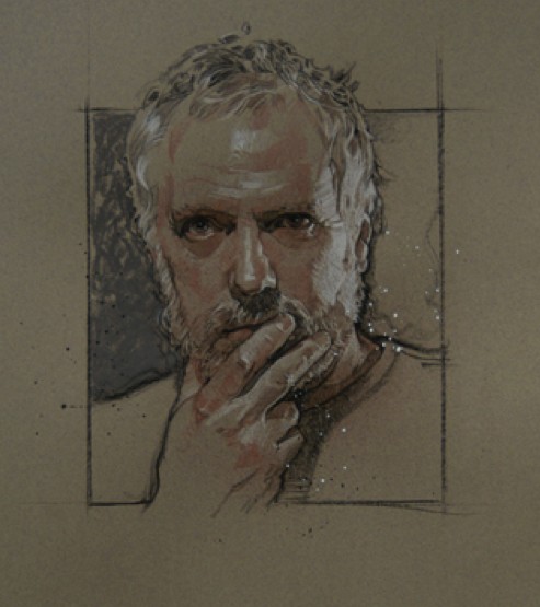
Ahoy, squirts! Quint here. I love Drew Struzan's work and in the small amount of time I've spent talking with him I can say he's a ridiculously sweet guy to boot.
So the fact that there's a documentary on the verge of coming out about the man and his amazing poster art has me giddy as a wee lass. His imagery has made a huge impression on me and the vast majority of movie geeks out there. Whether it's his work on Star Wars, Indiana Jones, Back to the Future, Harry Potter or The Thing... when Struzan has a chance to make the first impression it's always a good one.
So when you are making a documentary on the greatest living movie poster artist, that puts a lot of pressure on you, I would imagine, to create a poster image that's worthy of the focus of your docmentary. The guys behind the doc have released the poster image today and... well, take a look:
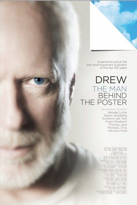
I really don't want to be a knee-jerk asshole here, but I don't see the logic in using a photo poster for a Drew Struzan documentary. With respect to Drew's son, Christian, who is a graphic designer and produced the poster, I think it's a huge misstep.
One, Drew looks like Richard Dreyfuss and that corner fold down looks like really bad photoshop. But more importantly the greatness of his father's work is in no way represented. That looks like it's one of those boring docs about an environmental scientist or some Nobel Prize winner, not one of the premiere pop culture artists of our time.
I'm not a fan, but I still can't wait to see the doc. What about you?
-Eric Vespe
”Quint”
quint@aintitcool.com
Follow Me On Twitter
