

(Click title to go directly to the review)
Advance Review: YOUNG ROMANCE #1
SUPERIOR SPIDER-MAN #2
Advance Review: INSURGENT #2
HIGH CRIMES #1
INJUSTICE: GODS AMONG US #1
Advance Review: FEARLESS DEFENDERS #1
THE SHADOW #9
BATMAN: THE DARK KNIGHT #16
Advance Review: SON OF MERLIN #1
MASTERS OF THE UNIVERSE: ORIGIN OF HE-MAN #1
AVENGERS #4
Advance Review: GREEN ARROW #17
 Advance Review: In stores this week!
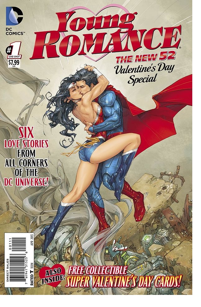
YOUNG ROMANCE #1
Writers: Nocenti, Castellucci, Fawkes, Milligen, Higgins, DiggleArtists: Lupacchino, Miranda, Gopez, Bisley, Greene, Rocha
Publisher: DC Comics
Reviewer: Optimous Douche
First: compilation books are not bad. I enjoyed the hells bells out of Vertigo’s recent GHOSTS short spooktacular vignettes.
Second: $8 is fine as long as it actually is double the content and it’s good.
Third: YOUNG ROMANCE isn’t bad, just wildly, wildly unfocused. One moment you think this Valentine’s Day-themed title is how a child perceives romance and then the next minute you are cock-slapped by the inclusion of a Taiwanese lady-boy.
Don’t get me wrong, I’m all for lady-boys since men are the ugly side of the species with our ass hair and protruding genitals. The more men that can look like women the more aesthetically pleasing the world becomes, I say. ‘Well, comics aren’t always for kids, Optimous.” Uhhh, they are if it comes complete with Valentine’s Day cards that are sized for grade school mass distribution (except to the fat and smelly kids, of course). Oh and the title is called YOUNG ROMANCE. Go kid, go adult, I don’t care. But I can say without reservation I don’t want to explain the shemale phenomenon to a 10 year old. I actually had to recently, and it wasn’t pretty.
As with most compilations, the quality is a rollercoaster in this title as well, ranging from pretty decent to not decent. Again, none are bad; it’s just the “not decents” were way too short for the creatives to flush out a full story. I think part of the problem is that DC jammed in too much, as you can see from the attribution at the top of this article.
All right, let’s get into these and hope the world doesn’t implode before I get to six.
CATWOMAN & BATMAN: Nocenti gets women, hands down. Her pacing, though, is still somewhat frantic, as exhibited in recent issues of CATWOMAN and this vignette. I’m also feeling zero sexual energy from the character since Winnick left. CATWOMAN was also kind of a bitch before the New 52 launched; she was robbing from the poor when she and Batman first met.
This was the tale where I really thought this thing would be for kids, since my grandmother exudes more sex and she’s been dead since 1994.
AQUAMAN & MERA: Best one in here. This takes place in two times as Mera uncovers a series of love letters from the 1800’s between the original lighthouse owner’s daughter and the love she lost to the sea. The panel placement was original and Miranda’s art is beautiful in both time periods. Kudos also go to coloring with sepia in the time gone by. Action and true heart prevailed in this vignette.
BATGIRL & THAT DUDE FROM THE ANNUAL: “What the sweet fuckity fuck is going on here?” was all I could think through the first two pages. Remember that guy Babs made out with in the Annual? He decides to break into a car in hopes Babs will show up and he can get another kiss. By the end this was endearing as the two discover how alone they are and how love, even unrequited, needs no logic. Still, though, in the beginning, Babs was in some poses that not only defied logic but physics as well (ever seen a Batgirl fused to a lightpole? I have).
VALENTINE CARD BREAK: There are 18 of them, each with a different character and they are adorable.
APOLLO & MIDNIGHTER: I felt no heart here, no love, but it did have ladyboys. Apollo ends up in Bangkok because he thinks it’s instructions…or some Asian city, I don’t remember or really care. Anyway, he goes looking for Midnighter and starts in gay-town. Midnighter is actually out fighting crime, though--you know, like we would all expect Midnighter to be doing. Apollo finds him, Midnighter’s a dick. Apollo goes back to bang a ladyboy. That’s amore, bitches!
NIGHTWING & URSA MINOR: Really good action and fun; not a waft of love, though.
SUPERMAN & WONDER WOMAN: Second best story hands down. I’m a big fan of this match up and it’s nice to see the two on a date just talking about how apart from the world they feel. Eros helps Wonder Woman get the date in a hot spot, but then pulls a double cross. Action, character insight and continuity consequences. Sold!
I don’t hate Valentine ’s Day; I’m a true romantic at heart, and that’s really the problem with this tale. These characters don’t have time for love in their lives, and this book drove that point home. Apart from the two stories where genuine affection was delivered, this will push all the lonely comic fans over the suicide edge this February 14th.
Optimous Douche has successfully blackmailed BottleImp to draw purty pictures for his graphic novel AVERAGE JOE coming out in 2013 from COM.X. When not on Ain’t It Cool, Optimous can be found talking comics and marketing on robpatey.com and just marketing on MaaS360.com.
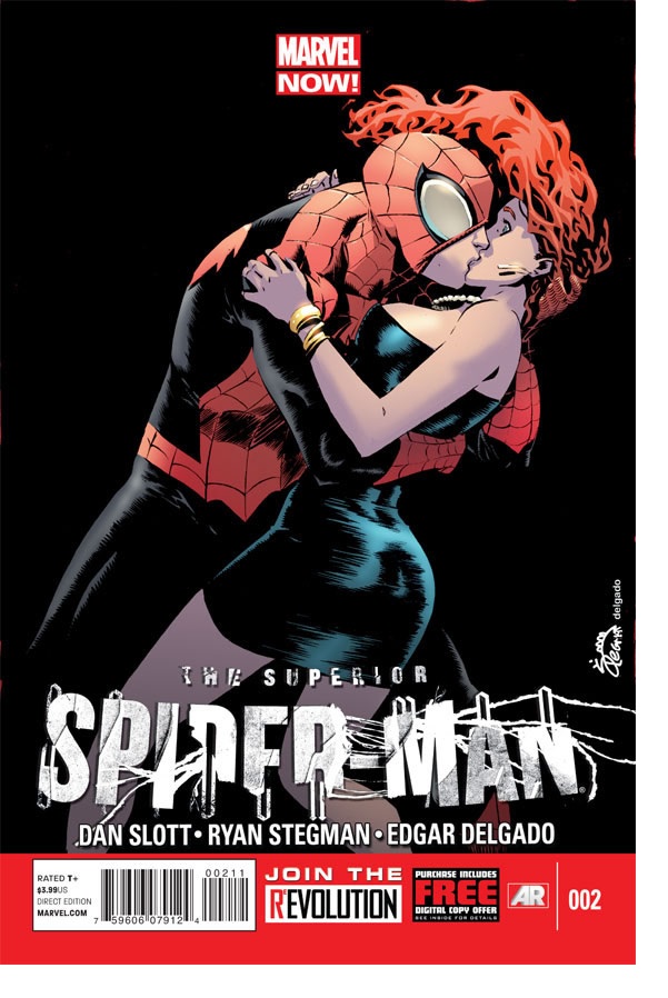
SUPERIOR SPIDER-MAN #2
Writer: Dan SlottArtist: Ryan Stegman
Publisher: Marvel Comics
Reviewer: Mighty Mouth
Spoiler Alert: If you passed on SUPERIOR SPIDER-MAN #1, be warned: there are some spoilers here.
Poor Peter Parker; it seems that life mocks him even in death. By now comics readers have learned that in the final issue of AMAZING SPIDER-MAN, Doctor Octopus claimed his final victory and now inhabits the mind and body of Peter Parker. In a move that was surely designed to pull Spider-fans back off the ledge, the final page of SUPERIOR SPIDER-MAN #1 makes it clear that while Peter Parker may no longer be counted amongst the living, he is very much with us in spirit…literally.
Those who didn’t approve of the idea of a Spider-Man comic sans Peter Parker can now relax. Peter’s still a major player in this series (see? All that nerd-rage for nothing). While Spider-Otto swings around enjoying the spoils of his most nefarious plot, Peter can’t help but witness events as a sort of disembodied spirit; this is simultaneously the joy and the problem with SUPERIOR SPIDER-MAN #2.
The prospect of having Peter’ consciousness trapped deep within Otto’s mind (or is that Peter’s mind? I dunno…) is an interesting enough notion, and at times is fairly humorous. A scene featuring Peter having a conniption as J. Jonah Jameson publicly apologizes to Spider-Otto for hounding him for all these years worked particularly well; it just resonates of the legendary Parker Luck. I also enjoyed Peter’s indulgence in Mary Jane’s repeated dismissal of Otto’s advances, insisting they “take things slowly”. It’s almost as though Peter is cock-blocking from the great beyond.
Don’t get me wrong; I’m happy to have Peter’s POV at times, but Dan Slott’s usage of this device is a little heavy handed. Spirit Peter’s insistent bellyaching converts from humors to tedious by the end of this issue. It’s a reasonable idea to give readers some of Peter’s viewpoint, but I think less would be more in this case. Ryan Stegman’s art does a lot for this issue. You can definitely feel the influences from various Spidey artists in his panels, yet Stegman manages to keep his art his own. Eyeing these pages, I couldn’t help but think his art would go nicely with other titles like DAREDEVIL and HAWKEYE.
With it now unashamedly clear that Peter will eventually return from …well, wherever he is, I’m a little puzzled by the inclusion of SUPERIOR SPIDER-MAN as part of the Marvel NOW! re-launch, especially since there are several ongoing titles that were excluded. It’s not a bad story; it just seems an odd choice for a move designed with the purpose of cajoling new readership.
I wouldn’t say that issue #2 of SUPERIOR SPIDER-MAN knocks it out of the park, though it is an entertaining enough read with a final page hook that did entice my interest to see what will happen next.
 Advance Review: In stores today!
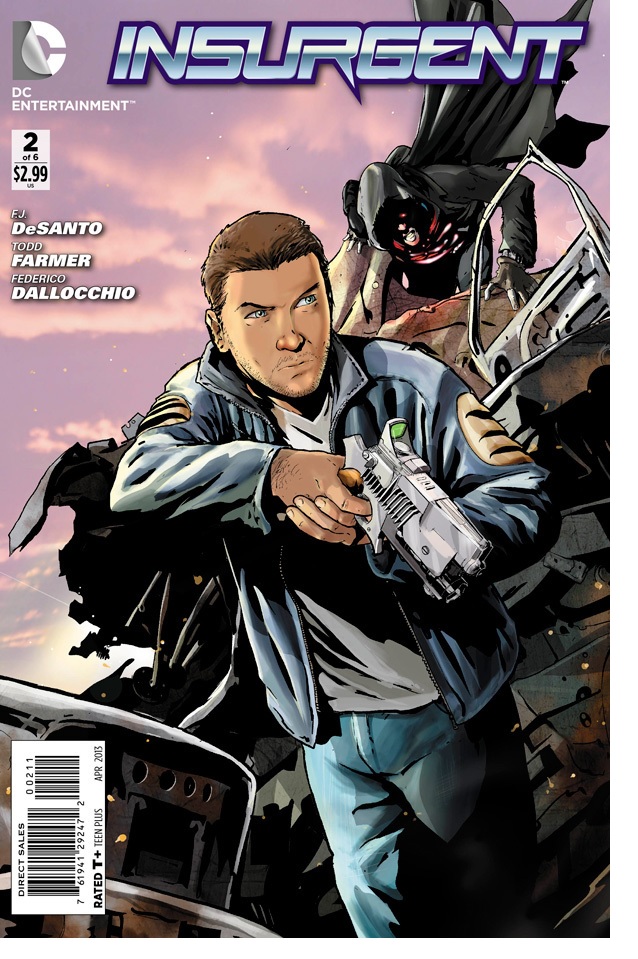
INSURGENT #2
Writers: FJ DeSanto & Todd FarmerArt: Fredrico Dallocchio
Publisher: DC Comics
Reviewer: Ambush Bug
I’m not really a sci fi guy. Yes, I love me a good STAR WARS…a good STAR WARS. And if the genre crosses over into horror, I usually dig it, but straight up sci fi is just not my thing. That said, I do love good sci fi. And with films like MOON, DIVISION 9, and LOOPER impressing the hell out of me and a plethora of sci fi films coming up in the next year, it looks like impressive and innovative sci fi is the new black. Along with SAGA, which feels like the modern equivalent of STAR WARS in graphic form, INSURGENT seems to be leading the way in a new wave of sci fi-induced comics.
Comparisons to BLADE RUNNER may be easy, what with automated and augmented life forms running amok out of control of their manufacturers. On top of that, these automatons don’t know they are part robot, which echoes Deckard’s questioning whether or not he is a replicant himself in BLADE RUNNER. But beyond those similarities, what intrigues me about FJ DeSanto and Todd Farmer’s story of the near future is the levels this story goes through. There’s a lot of politics involved here, as the President is the one who orders the making of the insurgents and is now trying to cover up his mess. There are also nice nods to how the media and therefore the world views this insurgent problem. With a rebellion of awakened insurgents on the rise it appears things are going to get a whole lot worse, and we get a snippet of this in this issue, which balances witty dialog, political intrigue, and most importantly some gritty action very, very well.
Artist Fredrico Dallocchio continues to do a solid job with the panels, reminding me of an early Mike McKone. Though his characters are somewhat uncharacteristic in look and sometimes look similar, he is an expert at showing us some fantastic action and makes the talky scenes interesting to read, too.
If you’re getting bit by the sci fi bug that seems to be biting everyone these days, INSURGENT will definitely be something you’ll be interested in as it is sci fi done right. Take it from a non-sci fi guy: it’s worth checking out.
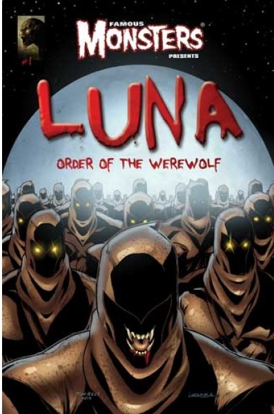
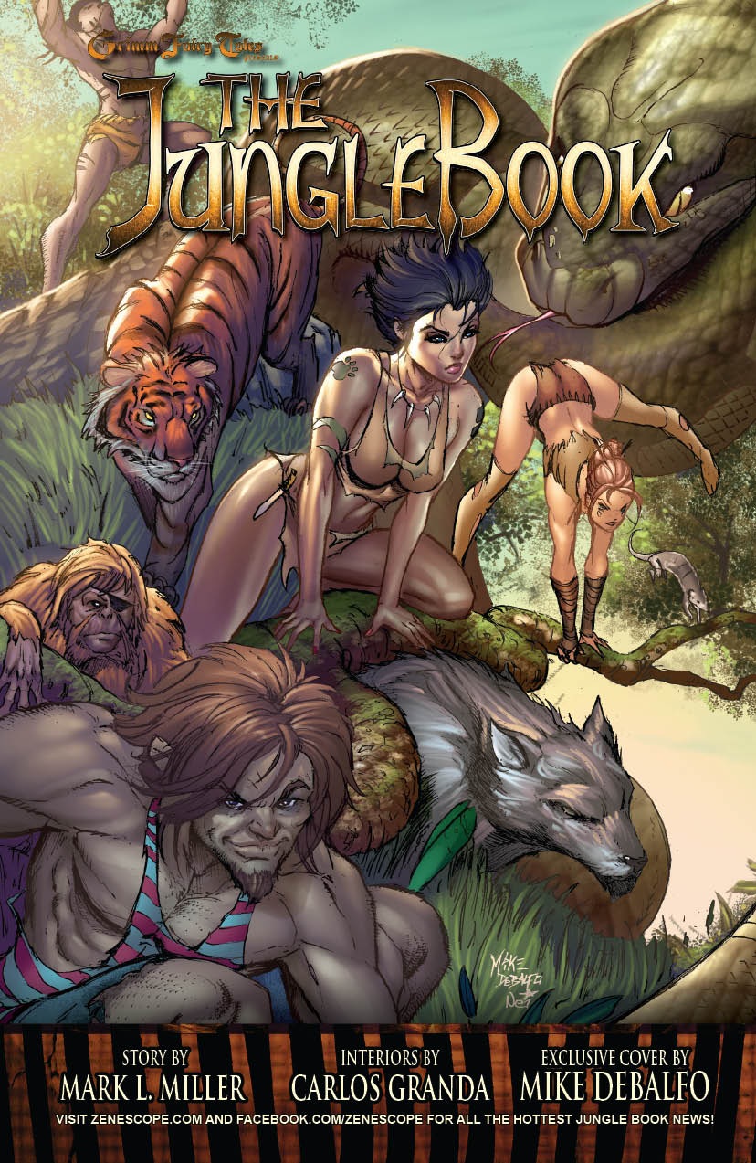 Ambush Bug is Mark L. Miller, original @$$Hole/wordslinger/writer of wrongs/reviewer/interviewer/editor of AICN COMICS for over eleven years & AICN HORROR for two. He has written comics such as VINCENT PRICE PRESENTS THE TINGLERS & WITCHFINDER GENERAL, THE DEATHSPORT GAMES, & NANNY & HANK (soon to be available on iTunes and soon to be made into a feature film from Uptown 6 Films). He has co-written FAMOUS MONSTERS OF FILMLAND’s first ever comic book LUNA: ORDER OF THE WEREWOLF (to be released in 2013 as a 100-pg original graphic novel). Mark wrote the critically acclaimed GRIMM FAIRY TALES PRESENTS THE JUNGLE BOOK last year from Zenescope Entertainment & look for his exciting arc on GRIMM FAIRY TALES #76-81 released August-December 2012. Mark will be writing GRIMM FAIRY TALES PRESENTS THE JUNGLE BOOK: LAST OF THE SPECIES to be released in February-June 2013. Follow Ambush Bug on the Twitter @Mark_L_Miller.
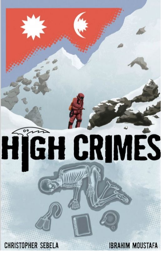
HIGH CRIMES #1
Writer: Christopher SebelaArt: Ibrahim Moustafa
Publisher: Monkeybrain Comics
Reviewer: The Dean
Feeling overwhelmed by the number of superhero titles I’ve been reading lately, I decided to try out the first new comic I saw without any last week: HIGH CRIMES #1. This new crime thriller from Monkeybrain Comics (a publisher I forget about far too often, considering how rarely I’m disappointed with their titles) kicks off promisingly with seeds of character and concept both cultivated enough in these first 21 pages to suggest a really great read ahead. The team of Christopher Sebela (SCREAMLAND: DEATH OF THE PARTY, CAPTAIN MARVEL) and Ibrahim Moustafa (THE POUND: GHOUL’S NIGHT OUT) is one I’m not at all familiar with, but so far, HIGH CRIMES presents a rich, potent chemistry between the two that I’m excited to see more of.
Opening atop Mount Everest, the story introduces us to Haskell Price, an adventure guide who uses his position to support his own, more absurd profession of robbing the many unfortunate bodies who didn’t survive the climb, and then hitting up their loved ones for a “finder’s fee” of sorts. His partner Zan Jensen, who seems destined to be forever on the run from her seedy past, brings to HIGH CRIMES what looks to be its more dynamic central character, whose story brings a personal drama into the issue. The two are great foils for each other, and bring the story much more depth to keep you invested beyond their peculiar business and a building mystery, which revolved around the discovery of a corpse that wasn’t supposed to be discovered.
Sebela and Moustafa have a clear gift for storytelling that is evident throughout the issue, and aside from a bit of clutter toward the end as the catalyst for the ongoing plot is revealed (a common side effect of putting as much as possible into a first issue) this chapter is a riveting and well-rounded start. Amidst the cold backdrop both in setting and tone, Moustafa captures a warmth and liveliness to Zan that makes her seem more endearing than she may have otherwise come across, and there’s enough panel variance here to suggest he and Sebela have got the basics down and aren’t afraid to play with technique, be it the considered motions of a man looting a corpse, or a man listening to voicemails in his office.
I’ve been fooled before by promising starts, but I’ve got high hopes for HIGH CRIMES (that was stupid--sorry). I’ll often fall for a cool idea with no real weight in character or story to support it, but so far this one seems to have the components needed to make it something more substantial and worth a regular buy. If I’m wrong I’m wrong, but I think it’s worth the risk, because its stories like these that remind me how important it is to check your peripherals once in while on Wednesdays, because HIGH CRIMES is probably just one of many good reads you might have missed last week.
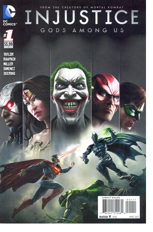
INJUSTICE: GODS AMONG US #1
Writer: Tom TaylorArtists: Raapack, Miller, Gimenez
Publisher: DC Comics
Reviewer: Optimous Douche
I received an early preview of this book, but I’ll admit now I avoided it like the plague. As soon as I read the slugline “From the creators of Mortal Kombat” I kept on keeping on to BATMAN & ROBIN ANNUAL 1.
Comics based on TV, movies, video games and any medium OTHER than comics are 99% atrocious. The 1% of good stuff is very few and far between, as math dictates. The last time I actually enjoyed one was DC LEGENDS ONLINE, and I’ve read a ton since. I stayed with that comic for months after I let my subscription from the game cancel out (I also got an iMAC, but I really was done with the game before that having level capped in less than 30 days). I gave that comic a chance because generally RPG games have a better chance of transcending to an engaging story and comic than fighting games.
Well, shut my mouth and call me Sally, because my prejudices almost made me miss one of the best damn DC comics to not only come out this week, but since the start of 2013. I always loved ELSEWORLDS, and that’s exactly how INJUSTICE reads. Like ARMAGEDDON 2001, INJUSTICE postulates what happens to the world if Superman becomes damaged goods.
The book starts with Batman overlooking a crime-free Gotham, an event we all would expect to make Batman grin wider than The Joker. His internal monologue on this page was just the start of some exceptional writing on Taylor’s part; he gets these characters to the core and puts more heart than I’ve ever seen into a comic port over. We realize Batman’s lament when the page closes with SS-like troops marching the streets brandishing the crest of El.
Flashback to five years prior, where we see an insomniac Clark looking at a sleeping Mrs. Kent. Remember back when those two were married and Lois didn’t treat Clark like gum on the bottom of her shoe? I do, and it was nice to venture back. Again, in a moment of great internal dialog Clark hears a second heartbeat coming from Lois. The scene that follows was simply endearing until Lois gets a call to report on a bribe handoff as it happens. It’s hard for me to quantify what I liked about the two, other than it felt real despite their drastically unreal existences.
What was thought to be a story ends up being a set-up perpetrated by The Joker, but we don’t learn this until another great characterization moment takes place between Supes and Bats. Bats immediately knows Lois is pregnant based on actual detective work looking at Superman’s demeanor, but is then bat-surprised when asked to be the godfather. I laughed out loud at his less than emotional response.
This book is rife with so many consequences you will wish it is main continuity. I love Jimmy Olsen, which is why there was so much weight and impact when he gets a bullet through his lens straight through to his eye. Artists and writer should be proud for the impact of this scene.
Once Superman and Batman realize The Joker is behind things, you see a Justice League scramble to find out where The Joker took Lois, and how the Scarecrow (who also ends up shuffling off his mortal coil) fits into the scheme. It’s good--really good. So is the Justice League. Flash, Wonder Woman, Batman and Superman all use their powers to the fullest appropriateness. In just a few panels, you again realize Taylor gets the characters. DC, let’s give this guy a real book soon, please: he deserves it.
I’m not going to spoil the final catalyst that pushes Superman to his dark totalitarian future. Suffice to say it’s clever, very comicy, and far more impactful than the accident that made him all Hitlery back in ARMAGEDDON 2001 when Lois died.
The art team also deserves a shout out. I’m sure part of this has to do with the game design, but these costumes are fucking awesome. Think everything that was great about the pre-52 costumes and the cool stuff from the New 52 and there you have it. Also, even though there are three artists, hand-off was seamless. I didn’t even really notice until I sat down to write the attribution for this review.
I won’t play the game because I hate fighters to the core of my being, but I will read every last mother loving page of this series.
 Advance Review: In stores today!
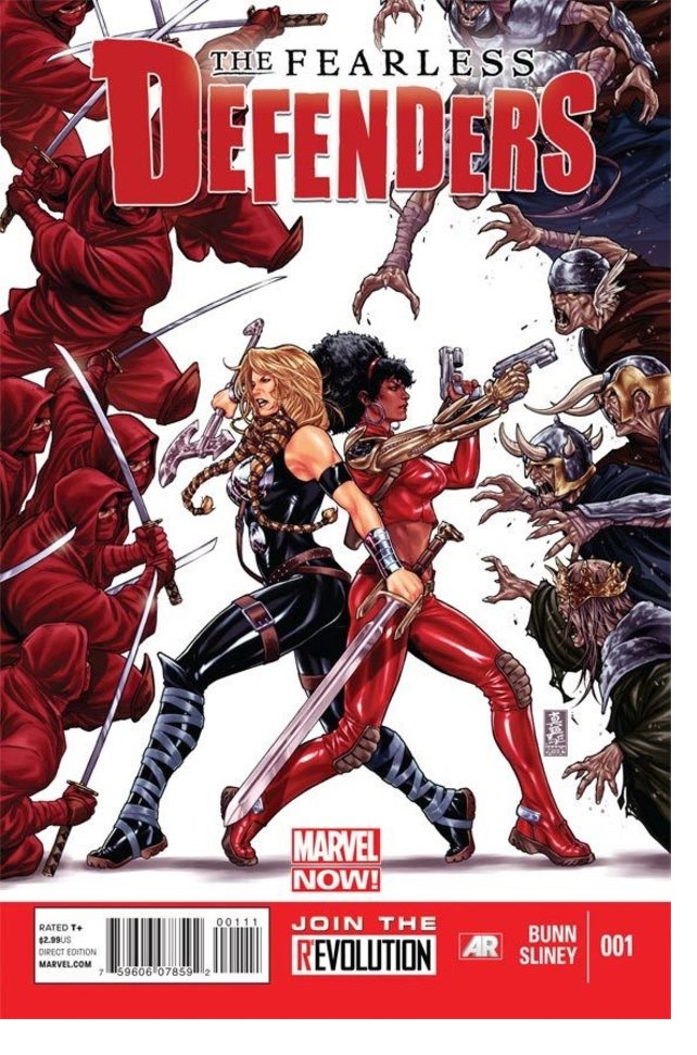
FEARLESS DEFENDERS #1
Writer: Cullen BunnArt: Will Sliney
Publisher: Marvel Comics
Reviewer: Ambush Bug
Having been a fan of almost every incarnation of the early DEFENDERS series (ok, not SECRET AVENGERS), I was looking forward to reading this newest treatment of the Marvel’s first non-team of random heroes. It’s interesting that so close after the most recent failed DEFENDERS series focusing on most of the original group plus Red She-Hulk and Iron Fist, Marvel was brave enough to toss another one out for us to digest. Usually the company seems to think it is the name that isn’t connecting with the fans rather than the fact that the writing or storytelling just wasn’t compelling. What this series had going for it for me was the appearance of Misty Knight, fresh off of her HEROES FOR HIRE series (which I dug a lot) and Valkyrie, straight from the FEAR ITSELF: THE FEARLESS (which I didn’t); two heroines that are as interesting to me as the pairing of such fun duos as Power Man & Iron Fist and, more recently, Hercules and Amodeus Cho. Add the fact that this book looks to be the Marvel version of BIRDS OF PREY and let’s not forget that this is a team book without the word AVENGERS or the letter X in the title, which to me, and it automatically gets cool points. Put it all together and it’s a book I was looking forward to reading.
After reading the book, I find myself intrigued but not completely impressed. The main thing that bothered me was the presence of Dr. Annabelle Riggs and why she is so prominent in this story. Sure there’s the added oompf of having a lesbian on the team who isn’t afraid to bust out a smooch on Valkyrie five second after meeting her, but as shocking as that was, I found myself asking the question one really shouldn’t ask in a fantasy super hero comic; that being “Would that really happen?” The answer, “no.” I know quite a few ladies of the lesbian sort and portraying them as driven by nothing but impulses and hormones as Riggs is in this issue really was distracting to me and would most likely be offensive to lesbians. With Riggs being what looks to be a central character of this series, I would hope she is played in a more realistic light in future issues or not focused on at all.
The fact that so much is focused on Riggs and so little on the interaction between Misty and Valkyrie was really disappointing as I feel Knight’s street level gumption would be entertaining as all get out set against the stoic Asgardian temperament of Val. But it’s Val and Riggs who have the wordplay in this issue with Misty merely commenting from the sidelines. Missed opportunity, if you ask me.
Still I have to hold out hope for this series. Will Sliney’s art is solid and the scenes of both Misty’s battle on a boat in the opener and the all out mêlée against an Asgardian zombie horde were all vivid and excitingly rendered. I also look forward to Dani Moonstar in the next issue and hope she joins the team. Given both her ties with the mutant world and Asgard, she seems the perfect intermediary between Knight and Valkyrie. So I see this as a book that could potentially be cool if the interplay between the characters works out. Cullen Bunn definitely has the writing chops to do this which was proven to me in the opening page of this book, filled with some nicely poetic captions as Valkyrie speaks of dangers to come. I wanted more of that in the rest of the issue though.
So I’m hoping for the best with FEARLESS DEFENDERS, a book that I feel has enough going for it to be a fun team book alternative to all of those X’s and A’s cluttering the shelves these days. Here’s to having my hopes realized because I’d love for this series to catch its stride and find its niche with fans. I can’t wholeheartedly recommend it, but I will continue to read and report back later if potential is realized or if this is going to be just another failed DEFENDERS series to toss into the pile with the rest of them.
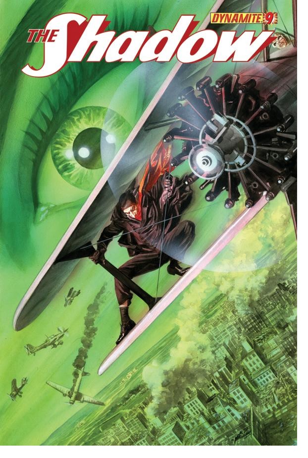
THE SHADOW #9
Writer: Victor GischlerArtist: Aaron Campbell
Publisher: Dynamite Entertainment
Reviewer: Masked Man
Well, after I spent a good deal of time bashing Dynamite for fumbling the ball with MASKS I felt I should give them credit where credit is due, because THE SHADOW was my favorite comic last week. I was lucky enough to score the Alex Ross cover- that always puts me in a good mood. I should also point out that Michael frick’n Golden did a variant cover. For you non-old schoolers out there, Golden was a hot comic book artist in the late 70’s and early 80’s. He usually worked on fan-fave-weird stuff like MISTER MIRACLE, MICRONAUTS and ROM. So if you missed the Alex Ross cover, you can’t go wrong with Michael Golden’s. Another note I appreciate about the Alex Ross cover: it actually reflects on the story in the issue! The Shadow does get into a bi-plane dog fight and climb out onto the wing (very cool). So often covers are just pretty pin-up, which is fine, but when they actually pertain to the story, it makes the whole book seem more connected- not to mention that it actually works as an advertisement for the issue itself, which is supposed to be the point.
Ok, moving away from the cover! Gischler is building up a really good story. At the get-go I was a little leery of The Shadow facing a villain with psychic powers. It always seems like an easy cop out: “I can’t think of anything interesting to do, so I’ll just have The Shadow face someone with powers like him, a la the movie.” Thankfully, this is not the case here, as Gischler is using it as only an element in the story. For the most part he’s creating interesting characters and using a bit of history to craft a rather engrossing yarn here. Esmeralda Aguilar, aka The Black Sparrow, is a superior black leather chick with a whip villain. She’s tough and all that, but she has a lot going on as well, and how she handles The Shadow in their first fight is very cool. The Shadow’s sidekick for the story, Miles Crofton (who I believe is a character from the original pulp stories), is an enjoyable character. Unlike Margo Lane (who was in Garth Ennis’ opening story), Miles has an attitude fitting for dealing with the Shadow and the adventures he gets into. Plus, being a pilot he has more of an active role here. This issue revealed the big bad as well, El Rey, who looks to be an excellent villain. And, lest I forget, George Orwell. Yes, the George Orwell writer of 1984 and a host of other well-respected books. You see, the story is taking place during the Spanish Civil War and of course The Shadow bumps into George Orwell. So add this colorful cast of characters to a well executed plot and you can see what you get: Gischler is writing a dynamite Shadow comic book (you see what I did there? Yeah, that was stupid).
Now I must throw some praise to Aaron Campbell as well. As always I feel I must reveal that I’m not fond of his style. That said, he’s doing a great job. He seems to be improving with each issue and this one looks great. His fight scenes are very cool and clean- I actually understand them! His wide shots are very interesting to look at, and again clean enough to understand what you are looking at--which makes you appreciate them! I have a slight suspicion that he is tracing photographs, but if he is, this is how you do it! He captures the realistic look, but still manages to make them look like complete drawings. This is trickier than you might think: add too much detail and you get a boring tracing, too little detail and you get abstract nonsense. So traced or not (I don’t know), Campbell is doing a great job on THE SHADOW. Even the bi-plane dog fight scenes were well put together; the save was great, too.
Oftentimes in comic books, or any type of genre writing, it’s not the ‘what’ as much as the ‘how’ that make them worth reading. So ‘what’ Gischler is writing might not be as Earth-shattering as WATCHMEN, but ‘how’ he’s telling is as impressive, and that’s the difference between good and bad comic books. Same with Campbell’s art; the ‘how’ he is illustrating things and ‘how’ he’s telling the story is what makes this comic work, and I’m very much looking forward to the next two issues of the story.
Learn more about the Masked Man and feel free to critic his own comicbook endeavors at www.Toonocity.com
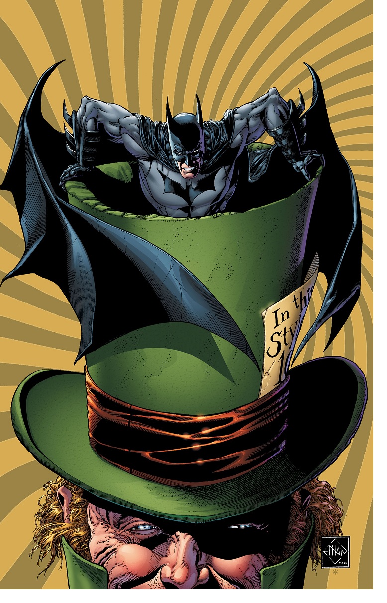
BATMAN: THE DARK KNIGHT #16
Writer: Gregg HurwitzArtist: Ethan Van Sciver
Publisher: DC Comics
Reviewer: KletusCassidy
“No, No, it’s fine. You spoke your mind. I appreciate your telling me how you really feel.” –Mad Hatter
One of the great things about Batman is that he is wide open to various interpretations. In my opinion, as long as certain key notes are hit, I'll probably enjoy the story. "But pray tell what are those key notes are, wise, brave and noble Kletus." Well, I'm glad you asked: I want to see Batman deeply analyzing his current case or situation, because one of Batman's best features is his mind and I love seeing it displayed in all its glory. Also, I'd like to see Batman doing some wild 80s action movie stunts, like jumping out of the window head first, only to grab the falling victim and shoot his Bat-grapple inches before becoming a stain on the Gotham streets: y'know, that impossible shit only the B-Man could do. I'd like to see him out of the cowl as Bruce Wayne, and last but not least I’d like to see some inspired artwork (I feel like Batman has to be one of the most fun characters to draw). Now yes, there a lot more things to enjoy in a Batman comic, but these are the ones I enjoy the most. Thankfully, this issue has all of these things and more…and thus...my review.
I'm going to start with the art, because when I picked up this comic my cynical brain said "Is this Van Sciver guy REALLY that good?" I honestly have no idea why that question came up, as I’ve always enjoyed his work in the past, but it did: it's like my mind has a mind of its own or something. Upon opening the first page all unwarranted doubts were quickly squashed...holy shit, this guy can draw a fucking Batman comic. The art is like if George Perez and Jim Lee had a love child, chained him to a desk and beat him repeatedly until every contour of a page was flushed with sharp lines, great detail and perfect layouts. Seriously, Van Sciver absolutely kills it in this book! Just wait till you get to the page with the piano keys. Which brings me to the writing: in the piano keys scene alone there is some of the best Bruce Wayne/random girlfriend dialog I've seen in a long time. In this part of the issue, Bruce Wayne isn't the dumb playboy that Batman's alter ego sometimes pretends to be; he's the dashing educated playboy that can defeat you in a battle of wits that will quickly dismiss you for prying into his private life. I love seeing this part of Batman's life where he's essential fighting two fights: the fight for the streets of Gotham and the one he fights to pretend to have a life outside of the cowl, only to realize his mission takes priority over everything (MONEY OVER ERRTHING…sorry). Hurwitz does a standout job of writing a fun story showing Batman doing what he does best: kicking ass, doing impossible feats with great internal dialog and an often looked over aspect of Batman (I’m looking at you Nolan trilogy*)--detective work--and it's all rendered perfectly by Van Sciver's pencils. For my money, this is a damn near perfect Batman comic book!
I really have no idea why I had a moment of doubt with Ethan Van Sciver; maybe it was because I haven't seen his art in a while, and since I'm making a lot less money now I have to be a little more discretionary as to what I buy these days, but that’s not gonna happen again. Van Sciver really delivers in this issue, and the Mad Hatter has never looked more crazy than in this book; I mean, he looks really fucking crazy (see the last page). Gregg Hurwitz has written some great comics including The VENGEANCE OF MOON KNIGHT and one my favorite post-Ennis PUNISHER stories, GIRLS IN WHITE DRESSES (pick up that trade, you won't be disappointed) and he brings his A-game to this issue. These two guys are a hell of a team, and I really hope they stay on this book for a while. If you are looking for a Batman book dripping with the things you love about the Caped Crusader, definitely pick this up!
*Hold your horses: I’m not bashing the Nolan trilogy, I just would have liked to have seen a little more detective work from the world’s greatest detective. I still very much enjoyed the movies.
 Advance Review: In stores this week!
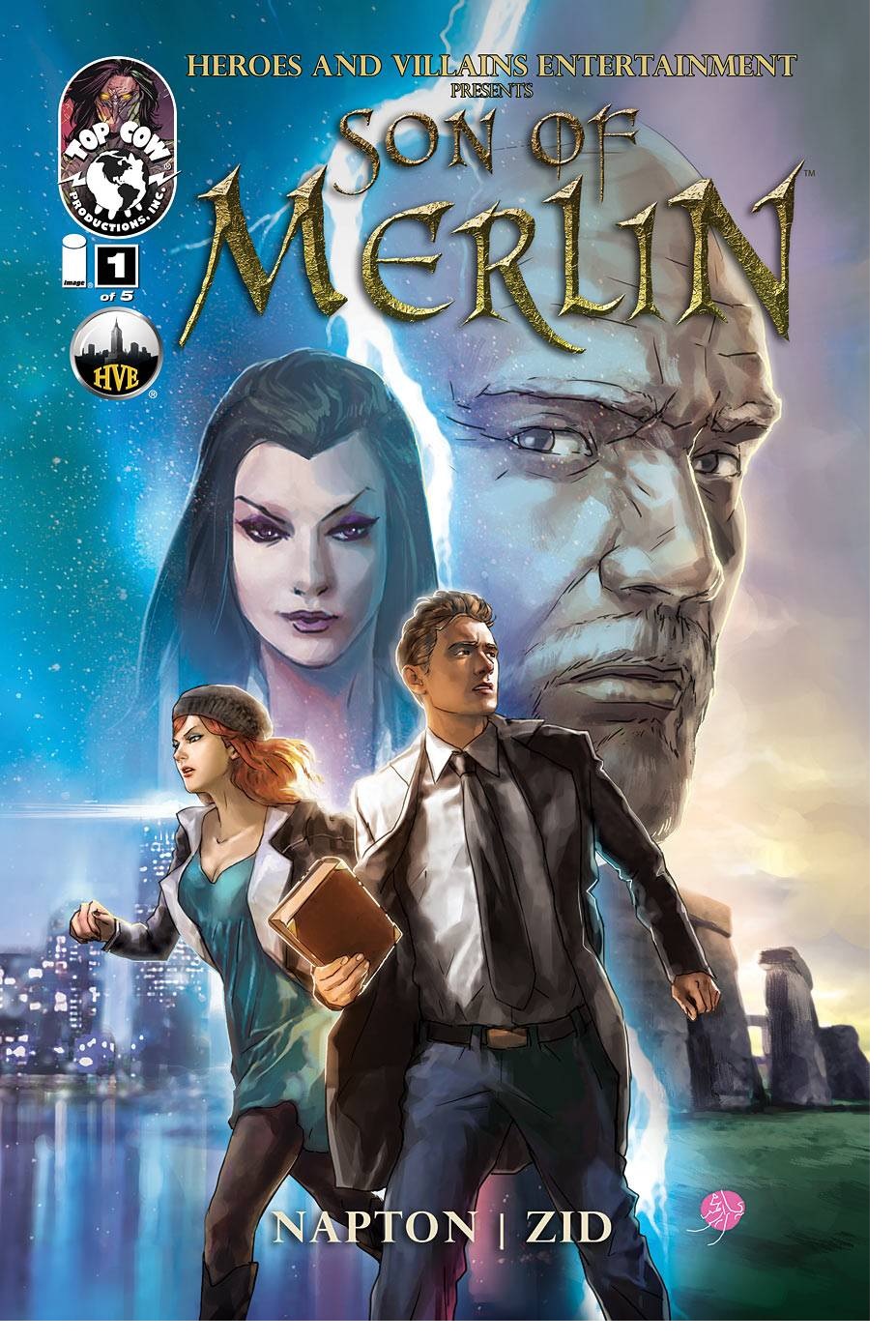
SON OF MERLIN #1
Writer: Robert NaptonArtist: Zid
Publisher: Image Comics/Top Cow
Reviewer: Optimous Douche
God damn it, why does everything I love in this world die? Yeah, I know this gorgeously painted homage to modern magic is called the SON OF MERLIN, but son-of-a-bitch it pissed me off when the Big M shuffled off his mortal coil halfway through the issue.
From page 1, Merlin exudes copious amounts of mystical badassery. From looks to demeanor, I want more of Napton’s take on Arthur’s apothecary in modern times. Gone are Merlin’s traditional robes and Alan Moore crazy beard; he not only looks like “the most interesting man in the world” draped in Brooks Brothers, he IS the most interesting man in the world.
Napton drops us head-first into the age old Arthurian feud that crossed the pond from merry ol’ England to the city that never sleeps, or tolerates outsiders (especially people from New Jersey), New York City. Zid’s visuals do the heavy lifting of interest entrapment as nary a word is spoken on the first few pages, but tell the tale of time passed perfectly.
Once Merlin does begin to speak, we realize this ain’t no cutesy Harry Potter magic at play here. From incantations to their ultimate effect, this magic is powered by pure testosterone. Not to gush over Zid’s visuals too much, the first time Merlin blows open a wall of bricks to rescue Lady Guinevere from her chains in an abandoned warehouse my jaw dropped.
Despite the chains, Gwen is no typical damsel in distress. She is Merlin’s Girl Friday, assisting him to keep his magic and some coveted artifacts that feed all magical power away from another Arthurian bad girl, Morgana le Fay. Issue one’s climax between Morgana and Merlin is a delight; her evil is eminently transparent. The panels contain as much energy as they do originality, with Zid literally thinking outside the panel box. Her goal is to not just put Merlin in the ground, but to also get the book that contains his power. She only succeeds on one point.
I can’t believe Merlin is completely dead, but for now that is the pervasive perception.
The falling action of this issue brings us to our true protagonist Simon Ambrose, a physicist trying to crack America’s power problems through fusion energy. Oh, I should also mention he’s Merlin’s illegitimate son.
Merlin’s book of power eventually (and magically) appears to Simon and we learn how a rational mind simply can’t accept the irrational. As Simon tries to open the book, burn it, hurl it out a window, and it keeps on keeping on, we see a man of science slowly lose his mind. Eventually Gwen finds Simon and explains the situation about his illegitimacy and how he must now carry forward this ancient battle between good and evil. Does he believe her, or have one iota of interest in tracking down all the magical artifacts? Hells no, he doesn’t believe her--until Morgana’s magical minions come to steal away Simon’s artifact birthright.
SON OF MERLIN is a perfect melding of lore and modern sensibilities. The harmonious nature between science and faith, and it’s also the culmination of a great idea, finding a great artist to bring it to life.
For anyone that felt this book took too long to get to market, keep in mind a few things: One, Top Cow announced the book when it was still being worked on. Two, art like this doesn’t come quickly; there’s nary a panel without background and everything is truly beautiful. Third, I have confirmation that all five issues of arc one are in the bag, so expect delivery to come like clockwork over the next few months. I know I’ll be waiting.
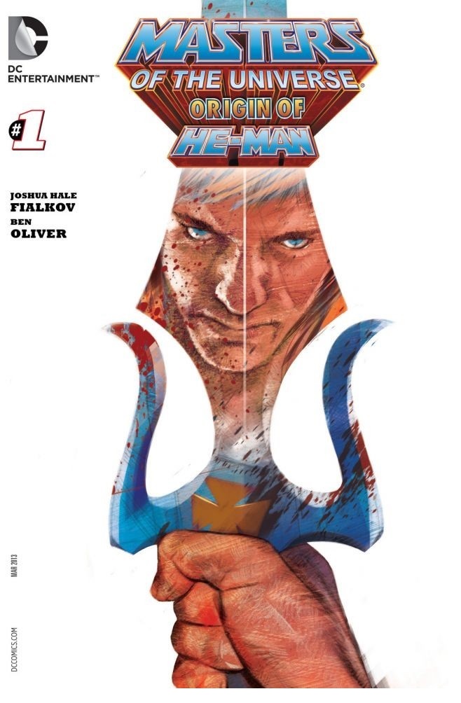
MASTERS OF THE UNIVERSE: THE ORIGIN OF HE-MAN #1
Writer: Joshua Hale FialkovArt: Ben Oliver
Publisher: DC Comics
Reviewer: Mad Mercutio
Let’s start off by saying that I am a fan of He-Man. I grew up on the show and the god-awful movie. As an adult, I think it is a very interesting concept. The juxtaposition of technology in a fantasy setting has the potential to work very well. I’m also a sucker for nostalgia. I think just about any comics fan who has collected since his or her childhood has a certain bent towards nostalgia; I think it is what makes comics so addictive.
With all of this in mind, I was ready to eat up this new He-Man series from DC. I thought it would be a great and a surefire thing with me. So far, I have been disappointed, though. It just seems boring. Now, I freely admit I only own the first one, but it did not keep me interested and flipping through the other issues at my local comic store did not convince me otherwise.
While MASTERS OF THE UNIVERSE: THE ORIGIN OF HE-MAN is not part of this ongoing series, it still feels a little lackluster. While at times the art was impressive, I just felt like it kind of all blended together. My eye traveled over the pages way too fast. Was it the composition? The shading techniques? The painted look? Kinda all of it, to tell the truth. I will admit, I kinda liked the cover. I’m a sucker for a mostly white cover with a startling image positioned front and center. That coupled with the old school Masters of the Universe font had me waxing nostalgic.
So the art did not do it for me. Was the writing going to be better? I’m afraid not. The writing was as bland as the art. It was a very quick read. Not really too much was said and expounded on for this to be the origin of He-Man. I understand the technique here: the sparse words were supposed to contribute to the darker and more mature look of the book, but for me it did not pan out. I also felt like there was some mighty cliché dialogue. Now, it’s comics, so you have to take cliché dialogue in stride, but there was something about the way it was handled in this book that made it really stand out. Maybe it was the use of cliché dialogue in such a sparsely worded book that made it glaringly obvious when it happened.
I wanted to like this book. I really did. On a whim, when I picked up this one, I went ahead and picked up the ongoing series to give it a whirl. I have merely flipped through it as of this writing, but it already holds my attention more than this one. I see that Keith Giffen has written this latest issue of the ongoing series, so maybe it has hit its stride. It looks more comic booky than this one shot, but it looks like I will feel it is closer to making me feel like my 2.99 was well spent. This one, sadly, fails to deliver on an interesting story or interesting art.
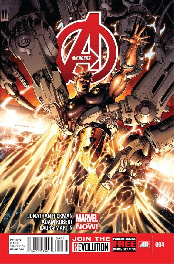
AVENGERS #4
Writer: Jonathan HickmanArt: Adam Kubert
Publisher: Marvel Comics
Reviewer: Henry Higgins is My Homeboy
Super.
Did everyone else hate The Sentry? I just want to make sure. He was a lackluster version of an interesting idea, bogged down by dull characterization and awful decisions. I have this argument with a friend all the time, where he tries to explain to me the intrinsic strength of “Superman in the Marvel Universe”, and the potential that has for creative storytelling. And I always tell him, yes, that does have potential. But that doesn’t mean The Sentry wasn’t a terrible execution of that concept. I’ve never been able to think of a way to best exemplify this to him until Jonathan Hickman had to come in, remind me that I’m in love with him, and then drop Hyperion into the Avengers.
AVENGERS #4 is perhaps the strongest issue yet of this series, newly minted and already bursting with great concepts, highlighting one of the more mysterious members of the new squad while also establishing his role in the team, and guess what? He’s Superman. He’s really just Superman, moved into Marvel. I won’t give away how he is brought over from his own world (as it ties in rather cleverly with NEW AVENGERS), but it’s Superman. He’s still adjusting to this new world, reevaluating the lessons he learnt in his own childhood. While the Avengers converse through a search, he’s off in the corner being Superman, analyzing the computer screens until he finds where the last pod from the last story has landed. He’s just Superman, and moreover, he’s Hickman’s Superman. It’s a terrific story idea, and Hickman, seeming to grasp the basic differences between the Marvel and DC universe, makes it work. (I realize SQUADRON SUPREME has existed for some time now and met Marvel characters before, but to my understanding this is a new Hyperion, another thing I really like about it). The best moment in the entire issue comes out of nowhere, a small character beat. Hyperion is enjoying the intensity of the sun in the Savage Land, while Thor complains about the extra heat. Thor withdraws an Asgardian liquor to parch his thirst, and offers some to Hyperion (“It’s like vodka, but for men.”). Hyperion gives Thor a brief explanation of his powers, and voices the opinion that liquor is beneath Thor. Thor doesn’t care; he still just wants to drink. And then Hyperion sees A.I.M. causing a ruckus, and then Thor and Hyperion go and beat up monsters together. Hickman is able to blend a very intriguing Superman story with the Avengers continuing plot line, and still have time for an old fashioned super hero team up/smash up. It’s a marvel to witness.
And having Adam Kubert on this issue…look, I’m not going to be fair and balanced on this one. I can’t even remember which comic it was, or who it involved save Wolverine and Spider-Man, but when I was a kid, one of my favourite comics had Adam Kubert on art. Ever since then, I’ve loved the way he draws movement and faces, with all the little touches he throws in. It took the third read through of this issue for me to spot that, during the fight against the risen monsters, Spider-Woman, Captain Marvel, and Hawkeye each blend into each others’ panels, until Thor appears behind Hawkeye. The next panel has Hawkeye getting out of the way (his bow leaving the frame and just being in the border), as Thor creates a bolt of lighting. Kubert makes each character stand out, and there will never be enough said about his ability to craft clear faces, each characters’ thoughts etched on their faces. I love Kubert.
Best Moment: “It’s like vodka, but for men.” I bet Thor only drinks Dr. Pepper 10.
Worst Moment: I got nothing.
This issue was fantastic. Hickman and Kubert, great. The story, great. The art, great. A very wonderful issue, and you know this issue is only going to get better with time.
 Advance Review: In stores today!
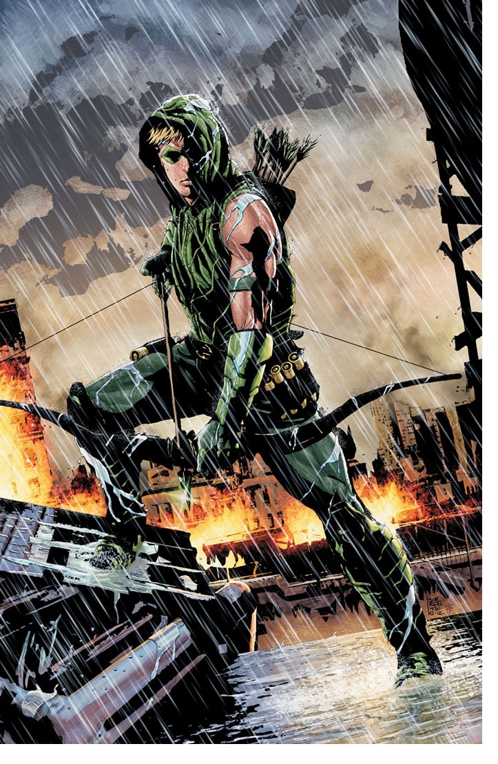
GREEN ARROW #17
Writer: Jeff LemireArt: Andrea Sorrentino
Publisher: DC Comics
Reviewer: Ambush Bug
I really haven’t read GREEN ARROW since Phil Hester picked up after Kevin Smith’s run with the character. Though those runs were fun, I felt that the Green Arrow I grew up reading from Chuck Dixon had never been fully realized since. I tried the first issue of the new 52 series, but again, the title fell short of what I wanted in an Ollie Queen series: that is, the three A’s—attitude, action and, most importantly, arrows. Now, having read this new, soft reboot of the series written by Jeff Lemire with amazing art by Andrea Sorrentino, I think this is an Ollie comic I can get behind.
The book opens with Ollie finding out that while he has been out whooping it up as a billionaire playboy, his company has gone to shit. A bit too late to save it, Ollie finds himself set up and on the run. The opening scene is dripping with real world action that, yes, there’s a bit of suspension of disbelief that all this can be done with arrows, but if you’ve got a book about an archer, then you’ve gotta have arrows. And this one has a mysterious archer using Ollie’s trick arrows against him.
This has been done before to both Green Arrow and his Marvel counterpart Hawkeye, but none of it has been done under the pens and inks of Andrea Sorrentino. Though David Aja undeniably kicks ass with his panels in HAWKEYE, Sorrentino uses his gritty Jae Lee-esque darks and lights to make one visually engrossing read. The panels in this issue popcorn about the page, focusing in on snippets of action as a larger action takes place, acting as a zooming and panning mega-camera. It’s just gorgeous to behold.
It’s a good time for those who like archers in comics, and I’m one of them. Sure, there are those who question how a guy with a bow and arrow can stand among gods and monsters and still have a chance in hell, but that makes the archers all the more fun to root for. With HAWKEYE kicking all forms of quiver over at Marvel, I was waiting for DC to catch up and give Ollie Queen the creative team he deserves. Looks like my wait is over.
Proofs, co-edits & common sense provided by Sleazy G
 Find out what are BLACK MASK STUDIOS and OCCUPY COMICS here and on Facebook here!
 Want more in all things Geek?
Check out PoptardsGo and on Facebook here!
 Get your copy of highly-anticipated anthology TOME by 44FLOOD today on their Kickstarter!
Check out AICN COMICS on Facebook and Comixpedia.org!