

| Issue #14 | Release Date: 8/1/12 | Vol.#11 |
(Click title to go directly to the review)
Advance Review: BEFORE WATCHMEN – OZYMANDIAS #2
MIND MGMT #3
HAWKEYE #1
UGLI STUDIOS PRESENTS #1
WARLORD OF MARS #20
MORTIFERA #0-1
HARVEST #1
DEADPOOL KILLS THE MARVEL UNIVERSE #1
RED DEVIL RISING: JOHNNY RED TPB
A VS X #9
DEADWORLD: WAR OF THE DEAD #1
 Advance Review: In stores today!
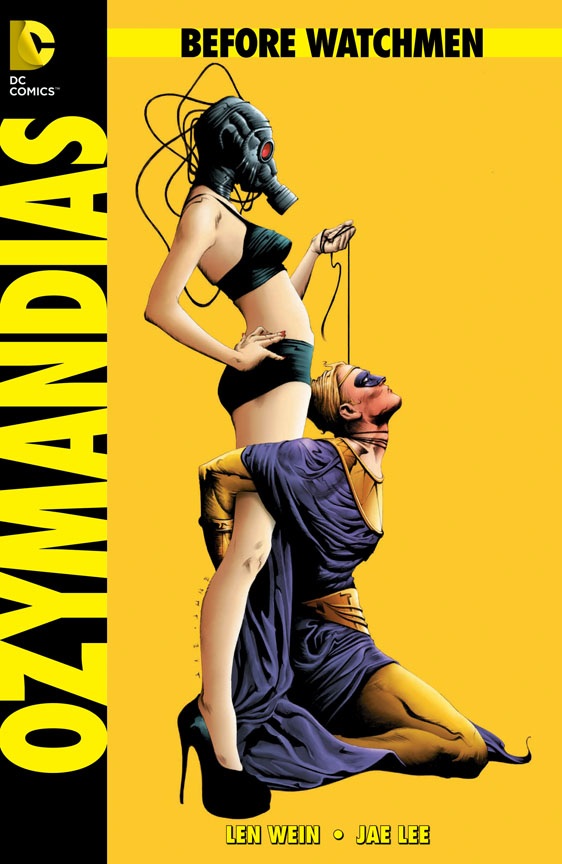
BEFORE WATCHMEN: OZYMANDIAS #2
Writer: Len WeinArtist: Jae Lee
Publisher: DC Comics
Reviewer: Optimous Douche
Now the real war begins. We fought the broad battle of the BEFORE WATCHMEN “haters” versus the “let’s see how it goes” factions in concept alone. It seems to have split the comic populace down a 50/50 divide. I chose my “let’s see” loyalties early, vowing never to shit on any comic before reading it.
So while I don’t know what’s going on in the hater camp except the ineffective SCUD missile volleys at us “lets’ see” folks of FUCK BEFORE WATCHMEN with no follow-up, I can say with certainty that the “let’s see” camp is now hearing the sound of war drums from within our own ranks as we begin infighting based on the merits of each individual title.
As we sit around the campfire at night, regaling one another with our adventures in each book, clear patterns are starting to form. SILK SPECTRE seems to be overwhelmingly doing no wrong; it’s our common denominator of comic goodness. Other titles like NITE OWL, MINUTEMEN and COMEDIAN seem to be leaving us all in fifty shades of emotional gray, eliciting neither undying admiration nor vehement hatred; a plethora of “meh’s” seem to sing out in chorus at the mention of these books. OZYMANDIAS, though, has made us more polarized then a pair of your grandmother’s gigantic Blue Blockers. Love or loathe seem to be the only options when it comes to OZYMANDIAS’ back story.
Sadly, it took me until this issue to gain clarity on why my comrades in arms are either spitting on this book or wanting to give it the proverbial “moosh moosh” before bed at night. OZYMANDIAS breaks the fundamental rule of good storytelling: it tells much more than it shows.
Personally, I like illustrated novels, so heavy narrative doesn’t really bug me. However, I fully understand that comics are their own medium and as art has improved over the years narrative boxes have become less and less important. I don’t fault my fellow camp mates for this type of presentation bristling their comic sensibilities. I was giving OZYMANDIAS leeway with issue one; exposition issues tend to be narrative-heavy to pack in the character’s back story and moment before (or in this case, forward story, and moment after in WATCHMEN) and to set up the action for subsequent issues. But when Issue 2 followed in suit as Ozymandias officially dons his purple and gold to strike fear in the hearts of the rapscallions who fed his girlfriend’s taste for the white powder, I started to realize the narrative could be a conscious and insightful choice on the part of Wein.
Where would the smartest man in the world choose to live? He would be a man who lived in his own thoughts, even when directly interacting with other people. Why? Because he is Jane Goodall, and humans are the apes he must live with. As an only child, I relate to Ozymandias. Growing up, I often found myself lost amongst my peers pining for more adult interactions every day at school. I’m no Ozymandias, but I lived in my head on a daily basis, using my imagination as an escape from the perceived lesser minds around me. I lived my life as a narrative, because the cacophony of child chatter around me was uninspired and uninteresting.
Maybe this isn’t a conscious choice on the part of Wein, but I know matter-of-factly that each creator put a lot of thought into this project because any missteps would be met with exponentially harsher scrutiny given how people covet the source material versus other books.
Despite being short on dialog bubbles, Jae Lee keeps the issue moving at a rapid pace. As Ozymandias’ mind races, Lee breaks panel boundaries to present encompassing scenescapes as broad as Ozymandias’ thought. In one brilliant panel, Lee makes thought kinetic bombarding Ozymandias’ eye with formulas and symbology as he sizes upon his next attack. One small panel--a perfect embodiment of what makes Ozymandias the king of WATCHMEN kings.
Next up – CRIMEBUSTERS.
Optimous has successfully blackmailed fellow @$$Hole BottleImp into being his artist on Average Joe. Look for Imp's forced labor on Optimous brain child in mid-2012 from COM.X. Friend Optimous on FaceBook to get Average Joe updates and because ceiling cat says it's the right thing to do.
MIND MGMT #3
Writer/Artist: Matt KindtPublisher: Dark Horse Comics
Reviewer: The Dean
Put simply, MIND MGMT is essential monthly reading. This is one of the few series on the stands that’s actually worth every penny of its $3.99 price tag. Matt Kindt has created something truly inspiring with this comic, and it’s not necessarily the story that’s keeping me hooked as much as it is the amount of content mashed into every page (including the back covers!), which almost makes this series an ideological statement as much as it is a great mystery. I recommend waiting for trades on almost everything out there, because that’s just the way they write ‘em these days, but I’m happy to tell you that this one is worth a monthly excursion, especially since it might take you a month to wring all the substance out of the last issue. MIND MGMT#3 continues Meru’s journey through China as she searches for Henry Lyme and the answers she hopes he can deliver. She’s quickly left defenseless and lost, armed with only a translation device, until she’s directed to visit ‘the Old Man’ who courteously foreshadows her fate. Meru is then pointed in the right direction, but it isn’t long before less altruistic characters manage to pick up her scent, and it seems her long awaited talk with Mr. Lyme may soon be violently interrupted. This issue is coupled with shorts “The Second Floor” and “The Ad Man,” which continue to grow Kindt’s impressively large story for only its third installment. I can’t say that I’m totally into the story just yet, as there’s a lot to keep track of and Kindt is moving it along at a pretty brisk pace, but I’m certainly intrigued by it, and the characters (Meru in particular) are becoming more engrossing with each passing issue.
With a mystery this large and complex, there isn’t a lot of room for artistic liberties in the overall graphic narrative. Readers shouldn’t have to waste their time figuring out what’s happening from panel to panel when you want their focus to be on the elaborate plot you’ve built. Fortunately, Kindt is able to keep his story enigmatic, instead of confusing, by maintaining an entirely readable panel progression but still throwing in a few dazzlers here and there to keep things interesting. The vision of Meru that the Old Man sees when he first encounters her is particularly striking, as it’s one of the few times the art breaks through the live area restrictions that head every page, and the ethereal visage has an almost refreshing quality to it that paces the story nicely amidst a somber opening, and an intense close.
MIND MGMT is an intriguing story coupled with impressive artwork, but that’s almost secondary to the overall package this series provides. I’d truly like to recommend this title on principle alone - when there’s so much put into one issue that even the back cover and margins are utilized, without a single advertisement to interrupt your reading, it’s difficult to argue that you’re not getting your money’s worth. I still think $3.99 (even $2.99) is too much for any single issue, but if you have to spend it, let it be for something like MIND MGMT.
HAWKEYE #1
Writer: Matt FractionArt: David Aja
Publisher: Marvel Comics
Reviewer: Henry Higgins is My Homeboy
Proving “Bow And Arrow Dude” Is Cool.
“Bow And Arrow Dude” is what my non-nerd friends called Hawkeye after THE AVENGERS came out. They were impressed, but generally didn’t understand why he was on the team. It’s the common criticism, asking why you would need someone with good aim to be on the same team as Thor, Iron Man, and the Hulk. I’m not even the biggest fan of Hawkeye, but I will happily defend his role on the team. Fraction seems to be on the same page, as he spends the first issue of the new HAWKEYE series just proving that Hawkeye is badass. It’s a very engaging introduction to the title and the character for the uninitiated, and a solid first issue all around. Fraction’s solid writing makes the issue stand out, and with remarkable art by David Aja complimenting it all, this is a very good start to a title.
Writing: (4/5) Clint is an immensely enjoyable character to read throughout the issue. Clint comes across as unspeakably cool throughout the issue, but not in a cold, uninteresting way. His coolness is earned, just through the opening pages of Fraction’s writing. We’re never told he’s cool, or shown him walking away from an explosion in slow motion. Rather, the opening pages have him stuck in a hospital gurney with severe injuries following an unexplained adventure. It’s his attitude, his way of speaking, his little grammar choices that remind the reader he’s more of an average guy than almost any other major superhero.
There aren’t any major problems with the issue, just a few smaller faults. Clint feels a little too saintly here. He’s never really at fault or has any real character flaws. He may have a temper, but it’s always displayed at times when it makes him the damaged party.Art: (5/5) Aja (whose previous work includes IMMORTAL IRON FIST with Fraction) is a fantastic choice for this title. I’ve only seen a little of his work post IRON FIST, and I’m extremely glad to see him getting consistent work again. The art is fantastic throughout the whole issue.
As he leaves the hospital, Clint comments on his love for New York. It’s a thread done by countless New York based heroes, but Aja gives NYC an energy that’s absent from other titles. The interlude with the taxi rush, the skyline during the roof party….it manages to make New York look realistic while retaining this odd sense of wonder. Aja just makes everything feel real and dirty and lived in. There isn’t much action here, but what we do see is very exciting. Aja has only improved since IRON FIST, and his creativity with the page shines. A fight scene in an underground casino is fast, furious, and brilliantly framed.
Hollingsworth does a great job on colours as well, keeping everything defined and clear while retaining a beautiful sense of placement. The underground casino fight scene could easily become muddled and unrecognizable, but Hollingsworth finds a way to make it vivid and clear.
Best Moment: The underground casino fight is just an awesome dream.
Worst Moment: I wish Clint was a bit more three dimensional in this issue.
Overall: (4/5) A wonderful start to an exciting series.
UGLI STUDIOS PRESENTS #1
Writer: Jason Lenox & David PaulArtist: Jason Lenox
Publisher: Ugli Studios
Reviewer: Lyzard
Though I have a hard time regarding a two piece feature an anthology, semantics out of the way, UGLI STUDIOS PRESENTS #1 works. The comics are disparate in tone and genre, while remaining on par with each other.
THROUGH THE EYES OF GRIZELDA is a combination between LORD OF THE RINGS and Egyptian mythology. Necromancer Amon Kadesh terrorizes the land of Xendria with the help of the Great Beast. The story is told from the point of view of Princess Grizelda, a particularly troublesome black cat.
Plot-wise the comparisons to the mythos of ancient Egypt are rather clear. In regards to “Lord of the Rings”, the similarities are more visual. From the map of the realms of Xendria followed by the font for the prologue, they are all similar to the works of Tolkien. The very first panel features the image of a tower seen through the vertically slit yellow eye of Grizelda, nearly identical to Sauron’s Great Eye. Amon Kadesh’s undead army overruns the humans of Xendria just like the orcs and trolls of Sauron’s troops. The similarities continue in regards to the relationship between the necromancer and the feline, parallel to Sauron and the wizard Saruman.
The artwork has numerous influences. Clearly there is going to be an Egyptian look, but the castle resembles a medieval fortress, and both armies feature armor styled from ancient Greece, Rome, and various Anglo-Saxon tribes of the Dark Ages.
Usually I would find such dialogue as “but their trite ambitions do not sit well with me” to be bathos (think of melodramatic like HIGHLANDER) but based on the style in regards to plot, characterization, and artwork, the wording fits.
As for the second story, THE GREAT VERMIN, it as well plays off of famous works, this time ALIEN (in particular ALIENS) and THE TWILIGHT ZONE. An alien extermination team has traveled to a planet in order to rid it of species X2987, regarded as the Great Vermin. Things quickly turn sour and out come the flame throwers.
As I read this comic it did seem to be falling into the realm of melodrama, becoming too serious for its own good. However, at the story’s conclusion the punch it delivers saved the day.
As the artwork and writing are done by the same team as THROUGH THE EYES OF GRIZELDA (Jason Lenox & David Paul) the quality of work is at the same level. Obviously the dialogue and artistic style are adjusted for the change of genre, but both pieces play off as homage instead of rip offs.
Both stories are incredibly short, 14 and 6 pages respectively. Hopefully, if UGLI STUDIOS PRESENTS continues there will be more stories like these two. In fact, I would be happy to see a collection of three comics as short as THE GREAT VERMIN since I feel the ability to tell such a well-written story so succinctly is a rarity.
Lyzard is actually Lyz Reblin, a senior screenwriting major with an English minor at Chapman University. Along with writing for AICN, she has been published twice on the subject of vampire films.
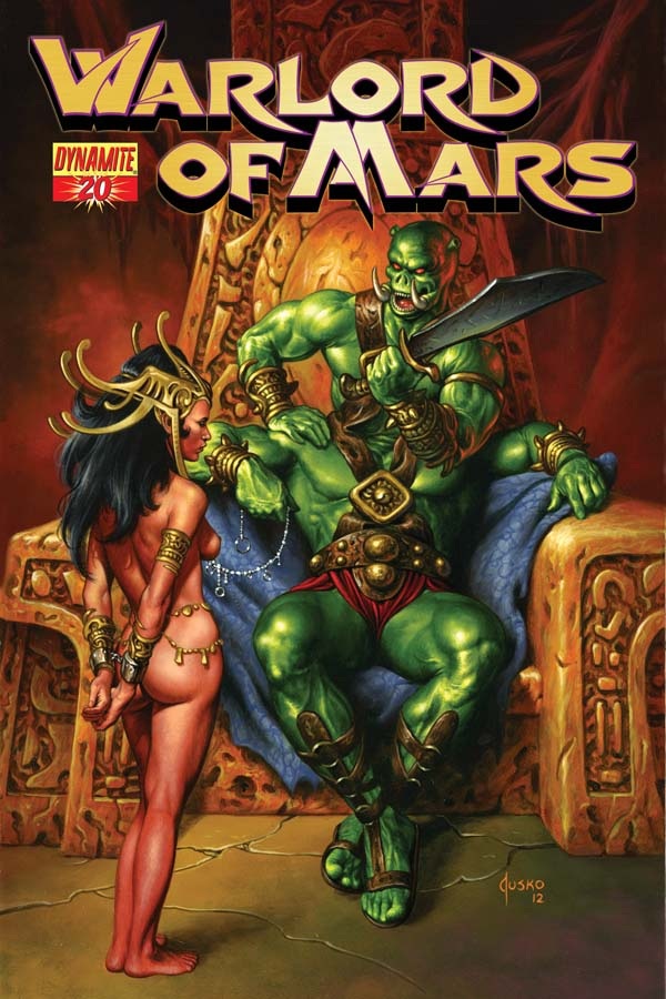
WARLORD OF MARS #20
Writer: Arvid NelsonArtist: Vicente Tifuentes
Publisher: Dynamite Entertainment
Reviewer: Masked Man
Don’t you hate it when you’re enjoying a good blend of writer and artist, then one of them takes off? Argh! That just frick’n happened. Last issue I was really enjoying Stefano Martino’s art, a real top notch talent. This issue, he’s not here- @#%&! Now, penciler for a day Vicente Tifuentes is a decent enough artist. His pages look good enough. The temples and monsters are really great, though his figure work could use a little work. Most of the poses are a bit awkward. John Carter looks way too similar to his son Carthoris. I often couldn’t tell them appear until I read the dialogue. Tifuentes’ storytelling could be better, too. You see, comic book art isn’t all about pretty figure drawing; it’s about telling a story with pictures. Now I know everyone says that, but here’s what it means: drawing what best conveys the story on each panel. The artist has to ask themselves, ‘what is the most important thing/the main point of this panel?’ For example: is it character A who stabbed character B,or that character B was stabbed by character A? Each one would be drawn differently. If you have great looking figures but you’re not showing us what we need to see, when we need to see it, you’re just killing the story. Now, I’m not saying Tifuentes is killing the story, but if he’s not careful he could easily start doing it. Looking back, if Tifuentes drew both issues I’d probably be fine with that. But after reading Martino’s first issue, it’s hard to get over the disappointment.
Arvid Nelson does a fine job of wrapping up this mini-story. As with his first original story, he’s trying to bridge the gaps, if any, between Burroughs’ books. Here he is spending a little time explaining how the black Martians (a group of religious zealots) can work with John Carter--the guy would exposed their fake goddess, Issus. To this he creates Linea, the granddaughter of Issus. Linea decides she is not down with the doomsday weapon her father unleashes after Issus is killed, so she helps John Carter and his son Carthoris in shutting it down. It’s a brisk two issue story, with some good action and nice development between the black and red Martians. Linea is a good character, too; unfortunately, she has no role in Burroughs’ next book. As a small side note, I do wish Nelson pushed the size of the Silians a bit more. It would have been great if someone said something like, “Are they big enough for ya now!” on page 12 or 13. Either way, a nice tale and I’m looking forward to the start of WARLORD OF MARS. Not to be confused with the title of the comic book, it’s the title of the next Edgar Rice Burroughs book in the Barsoom (Mars) series that Dynamite is adapting. With any luck Martino’s fine art will grace the pages--says so on their website.
Lastly, just to poke fun at things gone wrong, what the heck happened on page three? Seems like there was supposed to be a big flash of light, but it’s not there--d’oh! So, artistic disappointment aside, “Worms of Mars” was pretty good--it scores a 3 out of 4.
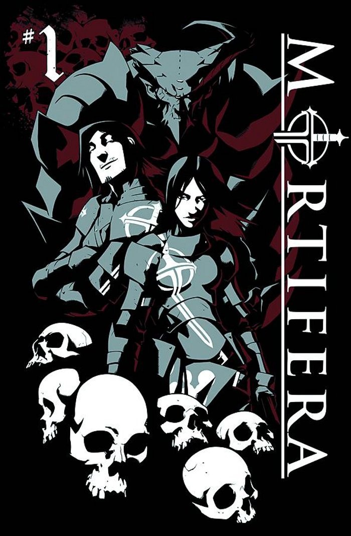
MORTIFERA #0-1
Writer: Stephan FrostIllustrator: Sarah Partington
Publisher: Sea Lion Books
Reviewer: Mr. Pasty
When I first heard that MORTIFERA was being published as a comic book, I couldn’t believe someone was able to convince Sea Lion Press to construct a graphic novel around a Black Metal band out of France. Then again, if Coldplay can get a comic book, I guess anyone can. Fortunately, I had gotten ahead of myself, as MORTIFERA has nothing to do with the music industry and instead spins a yarn about a demon-hunting militia formed in the dark ages. Think INFERNO -- but without all the spandex and quasi-hallucinations.
What I loved about this book is its simplicity. The entire premise is explained in one page. In fact, they may have even pulled it off in one panel. And you know what? Sometimes that’s all you need. When a priest goes rogue and tries to open a portal to hell, he accidentally lets in a few thousand demons who want to stake a claim to their new surroundings by killing everything in their path. Ever open the back door of your house on a hot summer night with all the lights on? Same principle. The good news is writer Stephan Frost doesn’t cheat the reader out of any exposition, assuming they’re privy to issue zero before picking up numero uno. The meat and potatoes of his narrative is the quest of “two sibling demon hunters (Catherine and Ethan) and a renegade demon that all seek to slaughter the damned throughout medieval Europe.” Earth’s initial demon invasion was stymied by the original MORTIFERA, but when the faction grew old and lazy, the few remaining hellspawns that survived the first war, led by the demon Kanisus, came out of hiding to stage a second offensive on the unsuspecting land. Now, the three banditos must find a way to stop them.
I like Frost’s idea to include a renegade demon, kind of like the T-800 helping the Connors vanquish the T-1000, and he finds a nice way to balance dialogue and action. I’m also happy to report that Sarah Partington’s artwork is faithful to the time period and her demons are sufficiently scary. She also demonstrates subtle differences in her palette that help enhance action scenes and draw out important intricacies when needed. Battles are muted and brown while magic is bold and bright. Those kinds of details, which seem like illustration 101, are often overlooked in indie books, so it was refreshing to see the MORTIFERA team hit all their marks. This is clearly a tandem that tells stories because they have a story to tell, not because they think it would be cool to make a comic book. The proof is in the pudding as MORTIFERA delivers what every comic book should: Action, drama, humor and lots of pretty pictures. More please.
Web heads who can’t get enough of Mr. Pasty’s word vomit are encouraged to watch him operate as Nostradumbass over at MMaMania.com here. Love, hate and Mafia Wars requests should be directed here.
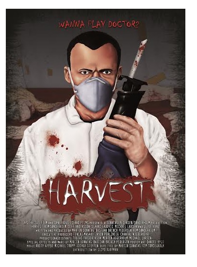
HARVEST #1
Writer: A.J. LiebermanArtist: Colin Lorimer
Publisher: Image Comics
Reviewed by Humphrey Lee
Come and listen to a story about a man named Ben. A whoremonger and a cokehead was he, when he wasn’t performing major surgery. Then one day when paged after a night of snorting, two orphans he did make, and now he’s resorted to a life of trafficking. Organs, that is. Black marketing.
So, yeah, that little ditty was probably pretty terrible and, yes, HARVEST is a pretty dark little comic book. It’s dark in all the right kinds of ways, mind you, but dark nonetheless. The book’s lead, Benjamin Dane, is a bit of a prick. He’s the cocky, god-complex wearing surgeon we tend to see on the TV and in the movies but with all the self-control of a member of Motley Crue when you put a drug in front of him. Obviously these two things aren’t the best combination of traits for a person to have, especially when they are manifesting in a character that you are eventually supposed to root for. And, honestly, I applaud Lieberman and Lorimer on this, for while we do get a pretty steady roll out of “loveable bastard” type character these days, such as Al Swearengen, Dr. House, Don Draper, etc. – characters that HARVEST itself invokes in some of its solicits – there’s a key component to that labeling: the “loveable” part. They may all be really screwed up and flawed characters, but they each exude something you can get behind, be it Draper’s smoothness, House’s intellect, and so on. So far Benjamin Dane is really anything but loveable, making his eventual road to redemption that much more distant and rough.
The rest of this introductory issue of HARVEST is just that: more introduction. The opening of the book is actually a part of that journey Ben needs to make as we see him coming to do some bad things to a man we have to assume has been part of his personal hell since he landed there. We also catch a glimpse of the people Ben is going to be working for, some rough customers that aren’t particular to the word “no”, especially the sexy/deadly night nurse Greer. The book paces out well, though it maybe jumps around a little much, but gives you all the information you need and puts the emphasis where it needs to be: Ben is kind of a mess and his life is about to get even messier than the woman he helped along to a grim death and the lives of the kids she left behind, which are going to be the “Ghost of Christmas Future” if you will that scares his ass (somewhat more) straight.
Colin Lorimer’s art here is the first time I’ve experienced but it also feels “familiar” in that it’s a pretty lush while being grungy style. It kind of reminds me a bit of Alex Maleev’s stuff circa his and Brian Michael Bendis’ DAREDEVIL run; it’s a very smooth style but has this graininess to it that, combined with some heavy shading, gives it a very modern noir feel. It wraps up a package that I feel is going to play out very well as a dark crime thriller with an appropriate gallows humor about it. If anything, it will be worth watching to see if Lieberman and Lorimer pull off the redemption of such a character who is in as harsh a situation as any of the aforementioned examples of the archetype he is being grouped into as far as what he has done, what he will do, and what he does after he realizes how fucked the things he has done have been. “Medical grade revenge” is the tagline du jour of HARVEST but I am much more interested in that other word with the “re” prefix and if it can even be obtained. Four more issues is definitely an easy commitment to make to see how the journey down that path plays out.
Humphrey Lee has been an avid comic book reader going on fifteen years now and a contributor to Ain't It Cool comics for quite a few as well. In fact, reading comics is about all he does in his free time and where all the money from his day job wages goes to - funding his comic book habit so he can talk about them to you, our loyal readers (lucky you). He's a bit of a social networking whore, so you can find him all over the Interwebs on sites like Twitter, The MySpaces, Facebookand a blog where he also mostly talks about comics with his free time because he hasn't the slightest semblance of a life. Sad but true, and he gladly encourages you to add, read, and comment as you will.
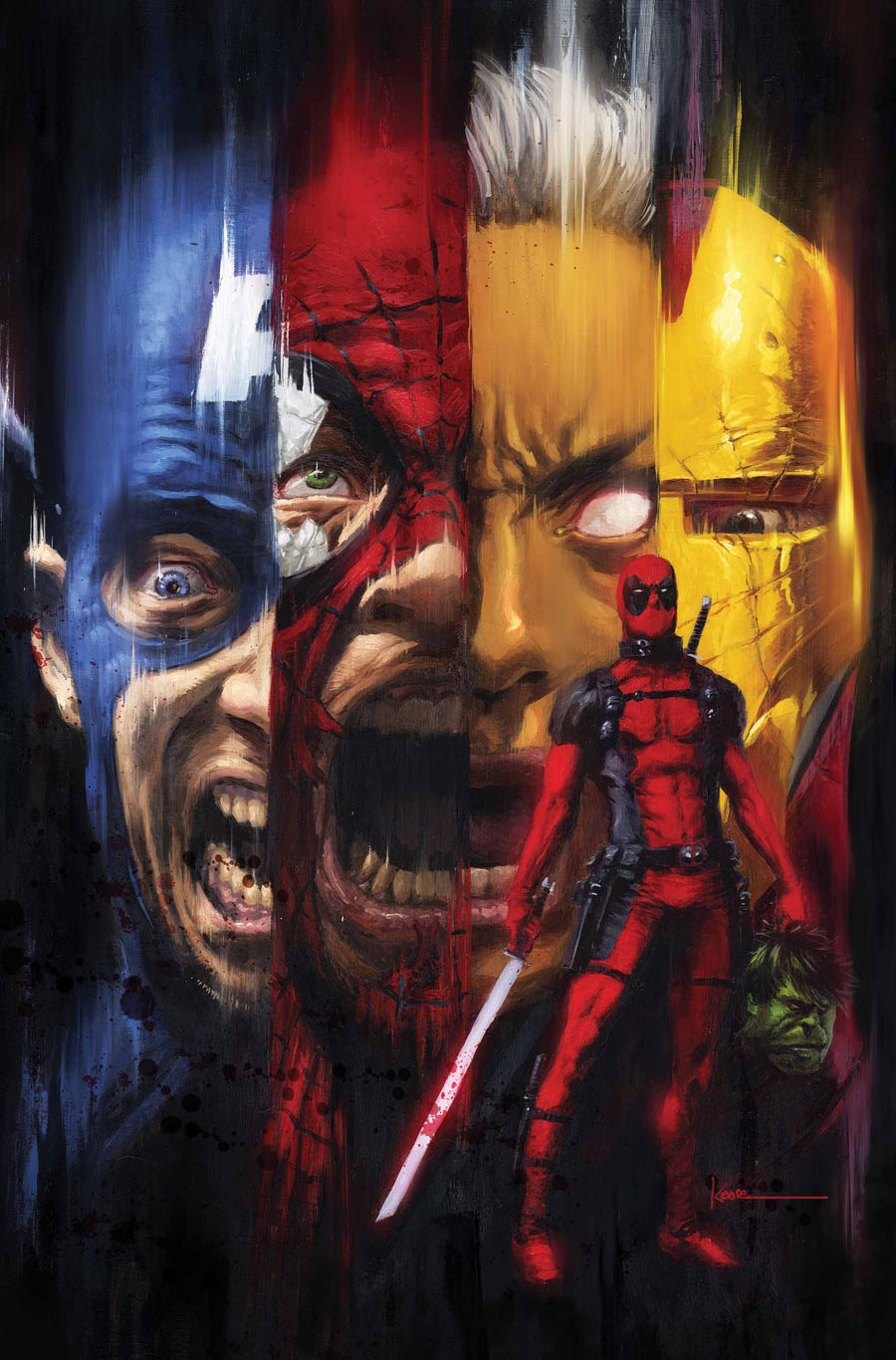
DEADPOOL KILLS THE MARVEL UNIVERSE #1
Writer: Cullen BunnArt: Dalibor Talajić
Publisher: Marvel Comics
Reviewer: The Writing Rambler
It took two readings for me to actually enjoy DEADPOOL KILLS THE MARVEL UNIVERSE #1. The first time it just didn't have enough of what I was looking for. I don't know why I expected more of a story from something with such a self explanatory title but, to fault myself, I did. Going back a second time I tried to compare the book to something I really hated recently, which was AVENGERS VS XMEN VS. That book and its story-less punchfests made me realize for a story with such a self-referencing title this Deadpool book was actually not as bad as I first thought.
Cullen Bunn tells a simple enough story where we have The Watcher introducing us to an alternate world where Psycho Man is planning to build an army to help him overthrow the earth and Deadpool is his first candidate. To Psycho Man's dismay, his reprogramming of "the merc with a mouth" doesn't work the way he planned and he unleashes a much darker part of Deapool's mind on this world's Marvel Universe. While the kill count was actually a little low in a book that is only set to be 4 issues long, I'm assuming now that we have the "why" of the story out of the way we can have some fun watching Deadpool absolutely brutalize the Marvel U's best and brightest.
Dalibor Talajić's artwork ran a little flat for me and was the weakest part of the book. The backgrounds especially just took me out of the story and took away from what could have been some nice tense death scenes. There's nothing horrible about his work here, but again it just comes across as mediocre in a book that I hoped would be overall very good.
My final gripe is that on the front cover of the book there is a large "PARENTAL ADVISORY: NOT FOR KIDS" stamped to warn parents of the horrors within, but to my dismay it really wasn't that horrible. Granted, the book clearly isn't intended for kids, but I've seen much worse within the pages of other books. Maybe I'm desensitized from years of poor choices, but with such a warning on the front cover and the fact that this book is basically a "What If" story that has no repercussions on the real Marvel Universe you would think the writer/artist would have taken more risk and made this a much more gruesome book.
I do enjoy watching Deadpool go a lot darker than in his normal series, and for that I'll follow along with this limited 4 issue series if only to keep up with the body count. While I expected a lot more from this book I'll give it the benefit of the doubt and hope a fun and much darker story unfolds over the next 3 issues.
You can follow The Writing Rambler on his blog here and follow on Twitter @Writing_Rambler !
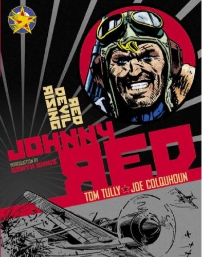
RED DEVIL RISING: JOHNNY RED TPB
Writer: Tom TullyIllustrator: John Colquhoun
Publisher: Titan Books
Reviewer: superhero
When I reviewed the Titan Books edition of CHARLEY'S WAR: HITLER'S YOUTH several months back I called out a particular section of the narrative that veered away from the main story established in earlier pages of the book. This segment had to do with WWI fighter planes and all of the crazy situations that surrounded them on their many missions over the skies of Europe. It turned out that the bi-plane fighter sequences were my favorite part of that book and that the rest of it, while surely entertaining, didn't really hold a candle to the manic exploits of the aerial acrobats who duked it out in the skies of the "War to End All Wars."
So when Titan sent me this volume of RED DEVIL RISING: JOHNNY RED I was pretty happy to get it. As unfair as it was, I was holding this book up to the standards set by HITLER'S YOUTH. Sure, not all war comics are exactly alike, but I'd been pleased by so many of Titan's previous publications of old British war comics that I couldn't imagine that wouldn't live up to what Titan had put out before.
It turns out that Titan has once again fulfilled my expectations of them. Everything that I loved about the fighter plane tales in HITLER'S YOUTH is magnified almost times ten in RED DEVIL RISING: JOHNNY RED. In RED DEVIL RISING we are treated to the over the top escapades of WWII fighter pilot Johnny Redburn. Seems like Redburn has a certain knack for getting himself into all kinds of trouble and because of his temper has been kicked out of England's RAF for striking a superior officer. With nowhere to go and no one to turn to, Johnny finds himself joining the 5th Soviet Air Brigade just so he can keep flying and fighting the good fight. Of course, Johnny is seen as an outcast by many of his comrades and that's where much of the conflict arises in RED DEVIL RISIN--that and the fact that any time they take to the skies German fighters are trying their best to make mincemeat of Johnny and his rag-tag group of ace pilots.
The art in RED DEVIL RISING is absolutely fantastic. Artist John Colquhoun is able to capture the stress of struggling to survive as a member of a WWII fighter plane squadron perfectly. There's a power to his artwork that makes every page of action in the book believable and engaging. The style of the ink work here is completely frenzied yet controlled. To me, the artist of RED DEVIL RISING would almost seem to be engraving his pages with ink as he went along. It's a bold and powerful technique that does more than craft a story, it sucks you in and almost makes you feel as if you're experiencing the action yourself. There were points when I was looking at the book and the intensity of the art would just suck me in and I could feel my shoulders tensing up as I read through the story.
The stories themselves are pretty fantastic. From the very beginning of the book, when Johnny learns of a debilitating injury that may take him out of the skies permanently, to every fantastically crazed dogfight Redburn and his compatriots struggle to endure through, RED DEVIL RISING delivers perfectly executed storytelling. The characters are all over the top pilot types with just enough depth to their personalities that they don't seem like all-out caricatures, and the pacing of the action is just set to overdrive. Writer Tom Tully has imbued his wartime flyer tales with fantastically staged action pieces and included just a small dash of humanity which makes the stories relatable to the common reader.
If you are a fan of war comics then you must run out and pick up RED DEVIL RISING. I believe it should be a required purchase for anyone who considers himself a connoisseur of hard-edged wartime fiction.
Discovered as a babe in an abandoned comic book storage box and bitten by a radioactive comic fan when he was a teenager, superhero is actually not-so mild mannered sometime designer & cartoonist, Kristian Horn of Los Angeles, California. Some of his work can be seen at www.kristianhorn.com and check out his blog at www.parttimefanboy.com. You can check also out his webcomics at www.babybadass.com and thediplomatics.com, which is currently in development.
A VS X #9
Writer: VariousScript: Jason Aaron
Artist: Adam Kubert
Publisher: Marvel Comics
Reviewer: Masked Man
So we are starting to head towards the conclusion of The Avengers vs the X-Men, and being the mixed bag of nuts this series is, it never seems to let up. The flash forward on the first page was very nice, as it sets the tone for a somewhat dark issue. Adam Kubert’s art still looks pretty darn good. All the pin-up shots are really cool---especially the Thor beat down. The unconventional page layouts didn’t always work, though. For example, Page 2 is just too cramped. Seriously, did you need a page and half splash? I think a single page would have sufficed and it would have given more room for the panels on page 2. And even when I was re-reading the book I got mixed up on pages 18 and 19. Pages 4 and 5 worked far better, as did pages 20 and 21. It was pretty funny to see all the superheroes in the infirmary were still in full costumes and masks. Did ya notice Scarlet Witch wearing hospital slippers--while in full costume, including headpiece? Yeah, not too smooth, Adam (unless it was meant as a joke).
Let’s talk about the story now. I still feel a sense of emptiness to this all, even with Spiderman’s sacrifice play--one that he walked away from and that he managed a total win with! Overall, very clever; I liked it. But the fact that he survived battling two of the Phoenix Five (er, Four), something Thor couldn’t even do, cheapens it and makes it come off like an old “G.I. Joe” cartoon fight. You know, where no one really gets hurt because it’s all action without substance. The powers of the Phoenix Four seem random as well. They made a point early on letting us know these characters are omnipotent, but the Avengers always escape them--though several get captured. Seems to me, based on the first few issues, it should just be boom- Phoenix Four wins! Scripter Jason Aaron seems to be aware of this problem, as he has characters mention that they are holding back.
The parts I do like (though quite predictable) are the corruption of the Phoenix Four and their split with the rest of the X-Men. I wish I could see more of the X-Men vs the Phoenix Four, but I can tell they are just moving the story forward to the Phoenix force vs the world bit, which I’m guessing will end with Hope absorbing the Phoenix force and then flying off into the universe--or maybe Tony Stark will build a mystic/science gizmo that displaces the Phoenix force instead.
Either way, we’ll all be back in two weeks to watch everybody’s plans start to melt down and hopefully start the kick-off to Marvel Now! in a good way.
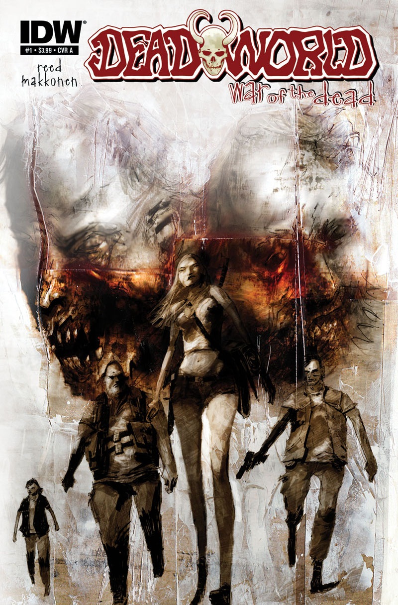
DEADWORLD: WAR OF THE DEAD #1
Writer: Gary ReedArt: Sami Makkonen
Publisher: IDW Publishing
Reviewer: Ambush Bug
If you’re like me and love horror, I’m sure you read THE WALKING DEAD faithfully. But I know occasionally, I get sick of all of the touchy feely melancholy malaise that often permeates the book. Like many of you, I do feel that the book is getting somewhat repetitious, but still I come back every time. For years I’ve been looking for something to read as an alternative to THE WALKING DEAD. Surely, this book can’t be the only book able to make an ongoing series out of the zombie holocaust. Ripoffs and zombie team ups with other monsters have been cluttering up the shelves for years, but THE WALKING DEAD still reigned supreme.
That said, I have been reading comics long enough that when THE WALKING DEAD did rise in fame, I was able to spot the similarities between that survivalist horror comic and one I used to read through the late eighties. That comic was called DEADWORLD, and somewhere tucked away in my stacks of long boxes I have every issue of the groundbreaking series which followed the exploits of a band of survivors just trying to live through what looks to be zombie Armageddon. Sound familiar? Thought so.
So when I heard IDW planned to dust off DEADWORLD for a modern audience, the fanboy in me who used to read the original DEADWORLD series first when he bicycled home from the shop did a backflip. Maybe, just maybe, I could finally find an alternative to THE WALKING DEAD and the flame of coolness that was DEADWORLD could be reignited.
I want to say that this book answered my prayers, but try as I might to stay positive, this book seems to want to squelch those hopes and dreams. To begin with, I am sure that this might have been a better story if not for the muddy artwork from Sami Makkonen. Like Menton 3, Ashley Wood, and Ben Templesmith before him (her?), she uses a layered computer effects-laden overlay on top of her sketches. While this technique works well with the aforementioned artists, here Makkonen’s work seems overdone. In a lot of the panels, I had to really work to understand what was going on and while sifting through the darkness often works for me when it comes to horror comics drawn in this way, if it blocks out the story, it is doing a disservice. There are a few nicely rendered images throughout, especially the splash final page, but for the most part, the art detracted a lot from the story being told.
Unfortunately, the story being told doesn’t know if it wants to recap the reader with the previous DEADWORLD narrative or just start fresh. For the most part, characters are told to the reader through captions. The descriptions are somewhat vague and leave a lot of important story to fall through the cracks. At the same time, there is a lack of actual scenes here as we are treated with a bunch of static shots describing the story so far and what is occurring on panel (probably because of the muddy artwork). I would have appreciated a simple recap paragraph on the inside cover, though I’m sure IDW felt that suggesting that there was a story before this first issue would be a detractor to new readers. But honestly, I don’t know a new reader that wouldn’t be lost in this issue. If someone would be happening upon this story for the first time, the amount of backstory told in this issue would be too much for them to soak in as told through the vague captions. As is, I was somewhat lost as to what was going on and I read the original series.
There is hope. By getting over the hump of the first issue which seemed to want to catch people up with the story without admitting there was an actual backstory, I hope that the next four issues, which will be coming out weekly over the next month, will focus on the story that is happening, not what has come before. This reads like a zero issue and it should have been labeled as such. A simple editorial page explaining what DEADWORLD was and where it came from would have helped immensely. Obviously, this property was dusted off in hopes that it would be the next big THE WALKING DEAD while strumming the strings of nostalgia of the few who remember the series. But in trying to do both, they created a mess of a first issue that tries to explain too much without giving us enough story in the present to entice even the die hards back for more.
I’ll be checking out the rest of this series to see if it improves. It’s only five issues--why the hell not? But so far, my hopes for something to come along and replace the meandering THE WALKING DEAD were not appeased by this incarnation of DEADWORLD.
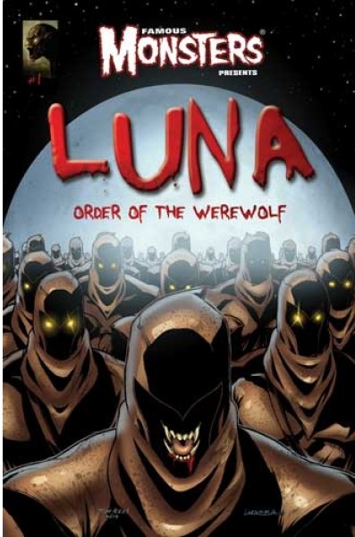
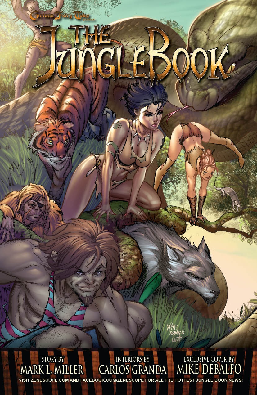 Ambush Bug is Mark L. Miller, original @$$Hole/wordslinger/reviewer/co-editor of AICN Comics for over ten years. He has written comics such as MUSCLES & FIGHTS, MUSCLES & FRIGHTS, VINCENT PRICE PRESENTS TINGLERS & WITCHFINDER GENERAL, THE DEATHSPORT GAMES, WONDERLAND ANNUAL 2010 & NANNY & HANK (soon to be made into a feature film from Uptown 6 Films). He is also a regular writer for FAMOUS MONSTERS OF FILMLAND & has co-written their first ever comic book LUNA: ORDER OF THE WEREWOLF (to be released in late 2012 as an 100-pg original graphic novel). Mark has just announced his new comic book miniseries GRIMM FAIRY TALES PRESENTS THE JUNGLE BOOK from Zenescope Entertainment to be released March-August 2012. Also look for Mark's exciting arc on GRIMM FAIRY TALES #76-80 which begins in August 2012.
Proofs, co-edits & common sense provided by Sleazy G
 Find out what are BLACK MASK STUDIOS and OCCUPY COMICS here and on Facebook here!
 Want more in all things Geek?
Check out PoptardsGo and on Facebook here!
 Get your copy of highly-anticipated anthology TOME by 44FLOOD today on their Kickstarter!
Check out AICN COMICS on Facebook and Comixpedia.org!