
| Issue #51 | Release Date: 3/7/12 | Vol.#10 |
(Click title to go directly to the review)
Advance Review: SAGA #1
RED LANTERNS #7
A.K.A. #1
UNCANNY X-MEN #8
SUPERBIA #1
NIGHT FORCE #1
THE MANHATTAN PROJECTS #1
FAIREST #1
HELL YEAH #1
 Advance Review: In stores today!
SAGA #1
Writer: Brian K. VaughanArtist: Fiona Staples
Publisher: Image Comics
Reviewer: Optimous Douche
It takes confidence in your writing prowess to name a book with such gravitas and power. Even though Vaughan has been responsible for birthing some of the great classics of the new millennium including EX MACHINA, Y: THE LAST MAN and RUNAWAYS, I had a few reservations about him penning a sci-fi/fantasy hybrid that chronicled an eternal galactic war. His past books were also high concept focusing on epic worldchanging events, but as an author he has always remembered no matter how cool a concept might be it will never sustain without being wrapped within the shroud of human turmoil and triumph.
I should never doubt a batter who hits a thousand. While the story of SAGA is high concept and does involve a cavalcade of characters, Vaughan took the approach of chronicling events from the viewpoint of a lone individual and borrowed heavily from the works of Shakespeare and the Bible. SAGA is a little bit Jesus, ROMEO & JULIET, HAMLET and finally LORD OF THE RINGS. Vaughan pulls at every emotion tied to human existence from birth to death, while remembering his audience’s thirst for the fantastic and imaginative.
It all begins with birth, with a woman concerned about the same things any woman pushing a new life from her holiest of holes would be concerned with: “Am I shitting the sheets, will my man ever go near my vagina again after seeing the horror show that is new life, etc..” Quite honestly I thought the scene was playing out on Earth until we widen out the panels to see that Mom has tiny dragon wings and Dad is sporting the horns of a ram. For a minute I had to ask myself if another culture would be so close to our own, that the universal truths of human existence and our interpretation of the universe would transcend to other species on other planets. Would they say shit, would they care about vanity, would an advanced species be giving birth to a child in the back of a body shop? Then I realized I’ve never been to another planet…so why the hell not. Perhaps “Battlestar Galactica” is right and there really is only one interpretation of the sentient experience.
The birth is quickly interrupted by forces looking for both Mom and Dad and here’s where we get our first sense of the larger universe beyond simple physical alterations. Apparently this child is the spawn of two warriors fighting on opposite sides of a galactic battle. Mom comes from the largest planet in the universe, appropriately called Landfall, and Dad is from Landfall’s sole satellite called Wreath. As the book states, there is no time in recorded history when the inhabitants of these two celestial bodies were not at war, but realizing the destruction of one would wreak havoc on the ecosystem of the other, the war moved away from these two worlds to be fought amongst the stars--hence why our warring love child is born on a backwater planet called Cleave on the other side of the galaxy.
Without giving away too much (too late?), it seems like the war is imbedded firmly in the ideology of “to magic or not to magic?” Wreath wields magic with the effortlessness of Merlin’s taint and Landfall seems to subscribe to a technological doctrine. Of course, any technology seems like magic in the right context, but in the SAGA reality the two live side-by-side. Landfall’s defensive technology seems aptly suited for tracking and thwarting magic users in this great war and Wreath’s magic seems more than apt to battle Landfall’s technology, as our two new parents quickly learn by escaping forces looking for the product of their copulation. Apparently this star child is the first of her kind and both sides want a piece of her and the heads of her parents.
From this launch point we are dribbed and drabbed story threads to come: an aristocracy in decline on Landfall as a young Prince tries endlessly to gain his father’s approval, a bounty hunter sent to look for the new parents and the parents quest on Cleave to find a ship that will take them to a part of the galaxy untouched by war (Earth perhaps? time will tell).
I applaud Vaughan by letting the new life narrate the story from a past perspective. This lets us know the little girl Hazel will live, most likely to Vaughan’s usual end game of issue 60, but as she foreshadows on the last page, not all characters in SAGA will share the same happy ending – including her parents.
Staples’ art is glorious. She is a master of facial expressions, which is a must for anyone drawing a Vaughan book since so much of his wonder is found in the subtlety of his dialog. She also owns the grand sweeping space shots and other sci-fi trappings like Landfall’s creepy monitor-headed elite. There is not one panel of this book that felt stilted or unnecessary.
I have been thirsting for a book like SAGA. The sci-fi space opera has been all but dead in recent years, while the mix of magic makes it something wholly unique in the genre. I’ve also been desperate for another Vaughan book since he forsook comics to go write that damn TV show.
Welcome back, sir--let the SAGA begin.
Optimous has successfully blackmailed fellow @$$Hole BottleImp into being his artist on Average Joe. Look for Imp's forced labor on Optimous brain child in mid-2012 from COM.X. Friend Optimous on FaceBook to get Average Joe updates and because ceiling cat says it's the right thing to do.
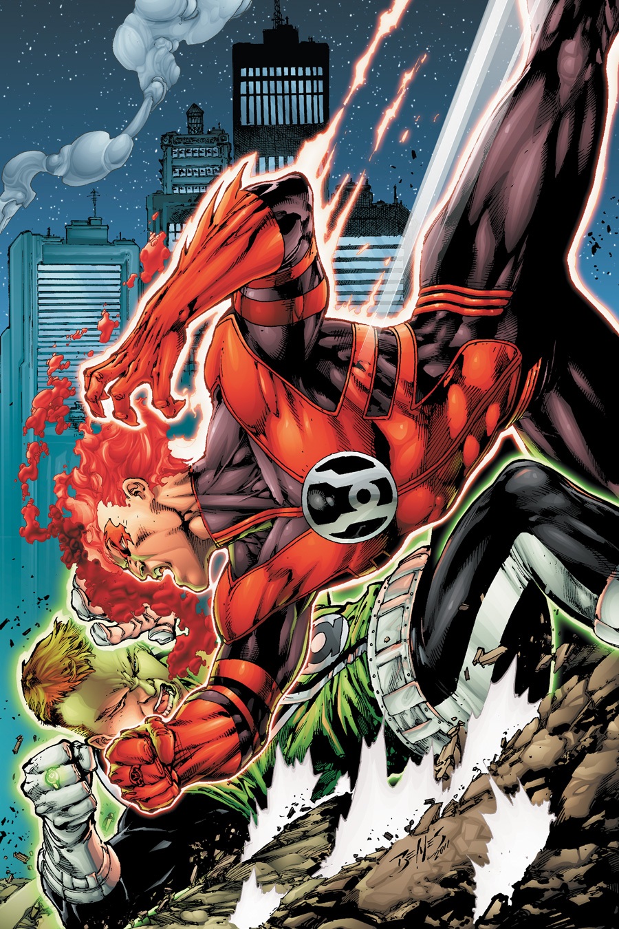
RED LANTERNS #7
Writer: Peter MilliganArt: Ed Benes/Diego Bernard
Publisher: DC Comics
Reviewer: The Writing Rambler
So the past several years of GREEN LANTERN lore, in a nutshell, have all been about colors and after I’ve finished reading this 7th issue of RED LANTERNS you can color me confused. I actually found myself going back and re-reading the 6th issue thinking I had possibly missed something because this issue seems out of place from where we left off. Unfortunately it wasn’t just in my head and we have yet another issue of missteps as I’m left waiting for this series (that I so often staunchly defend) to show something that will make me believe it will survive in the long run of the DCU. Help me, RED LANTERNS; give me something to defend you!
That’s just the start of my problems. I’d say I’m better now for venting, but I’m not. Let me clarify my feelings. Last issue we were left with Atrocitus and Bleez fighting for control of the Corps. The fight was brief and one sided as Bleez was manhandled, but it did give way to the idea that Atrocitus is truly losing control of the Corps. That’s where we stopped. Just an idea brought out to grow upon in future issues. Yet here we find ourselves just one issue later and apparently Bleez (who in case you forgot from my reference one sentence ago was just pummeled by Atrocitus) has seized control of the Corps and is leading them on a revenge mission against former members of Sinestro’s old Yellow Corps (which, unless you also read GREEN LANTERN, you’d be completely confused). On the flipside, Atrocitus seems to have gone on a vision quest and is off soul searching around the Red Lanterns’ home planet. The story still has not gone anywhere, but here we are branching off into new areas. I didn’t even mind seeing Bleez leading the Red Corps on a mission of revenge but we still haven’t even addressed the result of last issue so I can’t get behind it.
Speaking of behinds, I’m also officially getting tired of the cheap Bleez @$$ shots as well. I get it; she’s a hot monstrous alien. Seriously, I love the way Ed Benes draws this book but it’s like we can’t get through one issue without a forced close up shot of her best assets. Not to mention I read this comic digitally and noticed that when reading in panel view it actually moves to focus on her best cheesecake pose. Were this book better, I probably wouldn’t even care, but knowing effort is being wasted on things like this instead of building a great story is just getting under my skin.
Then we have my absolute biggest issue with this book right now. Besides the writing becoming more convoluted each issue and leading me to believe that Peter Milligan is just at a point where he is overwhelmed by too many ideas and doesn’t know where to go next, I have a personal vendetta against DC Comics right now as to their handling of the newest member of the RED LANTERN CORPS. For several issues we’ve been force-fed a backstory about a human who has become the first Red Lantern (despite both Hal Jordan and Guy Gardner having briefly possessed a red ring in the past, but that’s a whole ‘nother issue). It’s a story I haven’t particularly warmed up to as I care much more about the alien characters in the story, but nonetheless he’s here to stay so fine. What’s his RED LANTERN name you ask? Well, it’s Rankorr, of course…no, wait, it’s Rancorr with a C…no, wait, I’m looking at issue #6 and it’s definitely a K…what the #%^* is going on here? I’ll tell you what’s going on here. DC apparently cares so little about this book that on their own website they have his name spelled 2 different ways in the solicitations for issues 6 and then 7 (here check it out for yourself). Am I nitpicking? Sure I am. But it pisses me off either way and it’s a perfect example of how this series has become its own worst enemy by constantly jumping back and forth changing things.
Ohh, and don’t even get me started on the way the issue ends. It’s spoiler territory for anyone who follows the book, so I won’t comment, but yet again I don’t like where they have chosen to go in regard to Atrocitus, either. Sigh.
I think I’m going to stop here because frankly it just upsets me to have to rip on a book that I want to like so bad. I’m done reviewing this book for a while. I can’t see a point in wasting time angrily stewing in my thoughts about how much better this book should be by now. Sure I’ll keep reading because I have hope and I’m a sucker for Benes’ solid art on this series. I hope in the future I can report a positive change for this series but for now I’m going to leave it as it is, a big old mess that I wish I could help clean up.
You can follow The Writing Rambler on his blog here and follow on Twitter @Writing_Rambler !
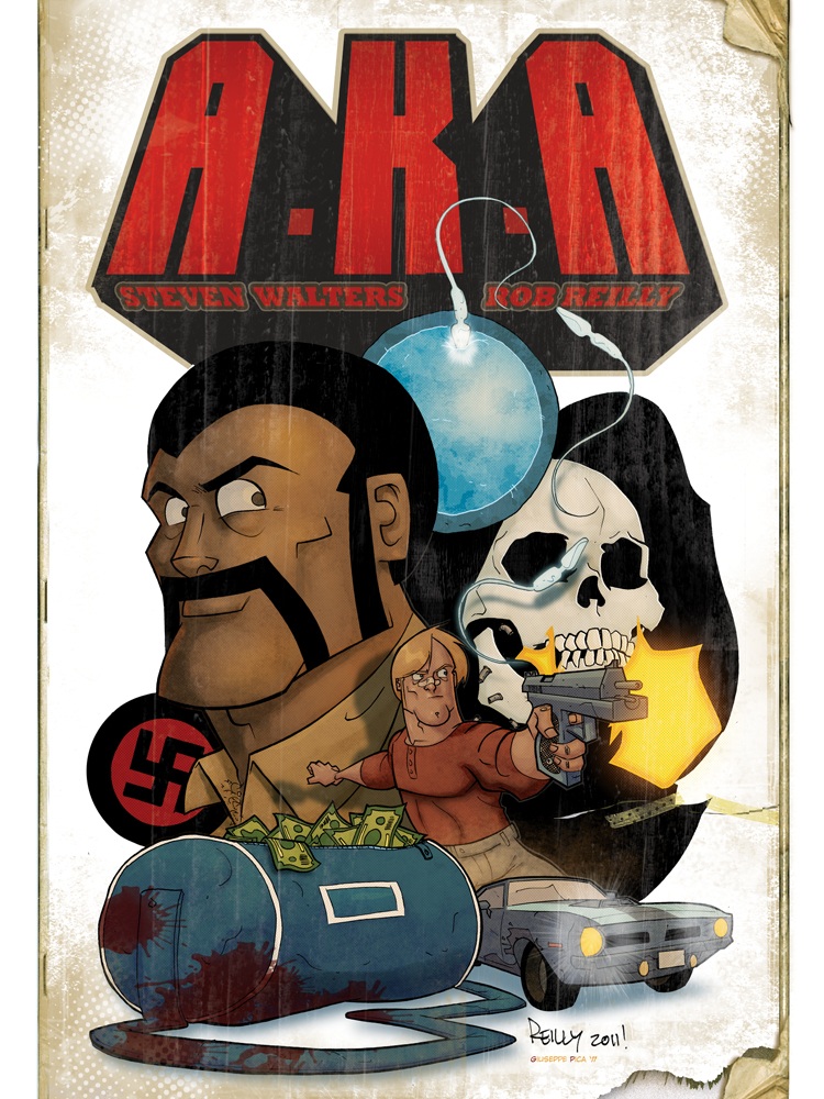
A.K.A. #1
Writer: Stephen WaltersIllustrator: Rob Reilly
Publisher: Graphicly.com
Reviewer: Mr. Pasty
When you see that a comic book has “True Love” in its title, you probably don’t expect the opening panels to feature a big black pole and a little white hole. But then again, A.K.A is no ordinary comic. And if my way of dancing around interracial sex is lost on you, I’ll go ahead and spell it out: Page one opens with a big strapping black guy getting ready to penetrate a voluptuous white woman, who admits (while on all fours) that she’s scared of his hot beef injection. Yes, this is the kind of material you can expect from co-creators Stephen Walters and Rob Reilly, who use a tried-and-true (but nonetheless slippery) tactic of sheltering outrageous material under the “grindhouse” umbrella. Does it work? Well, that depends on your interest in the genre. Mine is tepid at best, but I have an appreciation for the presentation, much in the same way I like to ogle steampunk, despite not really having much of an affinity for it. As for A.K.A, I got a kick out of the way Reilly overdraws his characters to fit that 70’s grindhouse mold. Every male lead looks strong enough to bench-press a Volkswagen and every female is hotter than anything I’ll ever shag – excluding my wife, in the off-chance she’s reading this.
The plot is so thin you could practically floss with it and revolves around a mob enforcer, a bounty worth a lot of money, and someone they call “The Black Terror.” I won’t spoil it and tell you if it’s the same guy with the scary shlong, but this material is unbleached formula. So much, in fact, it should come in a bottle with a rubber nipple on it. But who cares? It’s also a blast to read but be forewarned, this is adults only. Funny, violent and slutty, A.K.A is the kind of comic where anything goes and no stereotype is safe. In fact, you’ll probably trip over a few of them from page to page. That said, the opening love scene (she says the L-word, therefore it qualifies as one) is a great piece of symbolism to kick this story off because everything gels here. No parts seem out of place and when you look at this book as a whole, it doesn’t just call itself “grindhouse” and go about its business, it actually plays out like a trip to the drive-in, circa 1976.
Before you ever set foot inside the bedroom of scandal, you get “coming attractions,” which are three mini-stories that play out like trailers before the “feature presentation.” They not only hold their own against the main story, they may even equal or surpass it, because they have such an energy and Creepshow-esque arc to them, it really kind of acts like a graphical fluffer. By the time the actual A.K.A story got underway, I was already revved up and ready to go. As far as recommending this book, I can’t imagine anyone getting a hold of it and being disappointed. Is it the kind of story you immerse yourself in on a lazy Sunday afternoon? No, but it’s not designed to be. This is a Friday night thrill-ride with wacky characters and outrageous action. Sorry, no caped crusaders or brooding super villains here, just the 1970’s in all its exploitative glory. Or is that gory? Either way, this one is definitely worth a look.
Web heads who can’t get enough of Mr. Pasty’s word vomit are encouraged to watch him operate as Nostradumbass over at MMaMania.com here. Love, hate and Mafia Wars requests should be directed here.
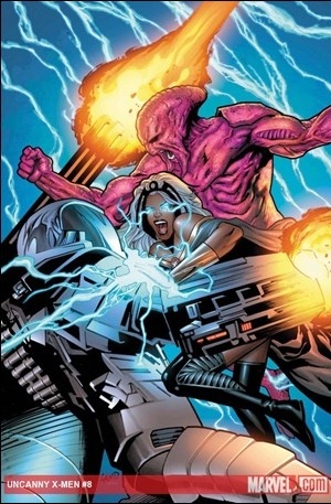
UNCANNY X-MEN #8
Writer: Kieron GillenArtist: Greg Land
Publisher: Marvel Comics
Reviewer: The Dean
As far as wrap-up issues go, this one is pretty solid. It’s the kind of conclusion that makes me reflect on the arc it’s closing more favorably than I had expected to, and aside from the standalone Phalanx issue, UNCANNY X-MEN #8 is probably the best installment of the series so far. I’m still not entirely convinced that Kieron Gillen is a great long-term solution for the series, and I don’t see it excelling past its middle of the pack spot in the X title hierarchy anytime soon. With this issue, however, I’m at least convinced that Gillen can manage a title of this magnitude, and that he has a clear idea of who these characters are individually, which helps to define and separate them as a team from Jason Aaron’s X-Men as well.
The most noticeable difference with this issue is how quick it reads, despite the relative lack of action compared to previous ones. Where other issues felt a little flat and drawn out at points, this one keeps the momentum moving by limiting scenes to three or four pages at a time, in which Gillen manages to squeeze a great deal of personality or drama – be it the playful banter between Hope and Namor (Sue Storm may find his advances significantly less flattering if she hears about his diplomacy tactics here), or the brief but touching moments after the Cyttorak deforms Colossus, which was a plot point I hadn’t really cared for much until that moment. Magneto and Psylocke enjoy a tense moment toward the end, but Magneto still feels a little too absent in this series overall. I’d love to see him butt heads with Cyclops a little more, seeing as how they represent two radically different ideals that are bound to reveal themselves, and since all Cyclops seems to do is check in on people. I could lead the X-Men if all I had to do was ask them what they were working on.
I think what I’m most excited for about the X-Men leaving Tabula Rasa behind is escaping the melancholy greys, reds, and blacks that dominated the color from Guru eFX. Greg Land has been doing a great job on the title to this point, but the redundant colors have me begging for a change of scenery, and even the final pages of blue sky in this issue felt like a long awaited breath of fresh air. There are a number of panels in this issue that are worthy of pause to really admire his work, but Colossus on his knees, having an especially difficult time overcoming this particular Cyttorak indulgence, takes a while to leave.
Gillen captures a very classic X-Men vibe in this issue, which help to define a great deal of this past arc, and his run on the series as a whole. This may be an exception, since Cyclops’ intent has been to present his X-Men as a dominating force, but it was nice to see him and the rest of the team revert back to their more peaceful and understanding ways for an arc, before AvX really kicks off and Cyclops is made out to be a huge dickhead (merely a prediction, since events are usually not kind to Cyclops, and I’m one in a very small number of Cyclops lovers out there). This is no WOLVERINE AND THE X-MEN, nor does it try to be, but it’s a decent enough alternative to the less than serious take on mutie life at the Jean Grey School for now.

GRACE RANDOLPH’S SUPURBIA #1 (of 4)
Creator & Writer: Grace RandolphArtist: Russell Dauterman
Publisher: BOOM! Studios
Reviewer: Henry Higgins is My Homeboy
The world of superheroes has always fascinated me, especially once you leave the capes and masks and instead examine what it would be like to live in that kind of world.
Clearly I’m not the only one, as countless of tremendous series have focused on such a concept. SUPURBIA is a fun, thoroughly enjoyable look into what it means to be married to such a character. What Randolph manages to do here, however, is really explore the spouses’ lives and their relationships with these characters. While each of the heroes offer interesting looks into these people, it’s not the driving force. Jeremy Metzger (the stay at home dad to an Amazonian warrior) and Helen Heart (the girlfriend of a reformed supervillain) especially present some very cool places that haven’t often been explored, at least to my knowledge.
All of this is complimented by enjoyable dialogue, clear characters, and the very solid art/colour by Dauterman and Cassata. A very fun start to what I hope continues to be a good title.
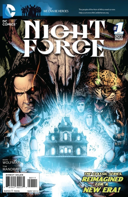
NIGHT FORCE #1
Writer: Marv WolfmanArtist: Tom Mandrake
Publisher: DC Comics
Reviewer: Professor Challenger
“Merlin, your damned Book of Night is becoming less helpful with every passing year.” -- Baron Winters
The original NIGHT FORCE comic book is one my favorite comic books ever. It was almost a spiritual sequel to Marv Wolfman and Gene Colan's work on Marvel's TOMB OF DRACULA (which they had recently concluded). TOMB OF DRACULA, itself, had developed over the years into quite easily the most complex and finest continuing horror comic ever published – at least up until Alan Moore took over SWAMP THING and broke new ground in the genre.
At the time that Wolfman and Colan completed their work on TOD, they both soon jumped ship over to DC to work on other titles separately (such as NEW TEEN TITANS for Wolfman and WONDER WOMAN for Colan). The two got back together to work on NIGHT FORCE--essentially a horror anthology book made up of multiple issue story arcs and Baron Winters serving as the supernatural “Mr. Phelps” to a group of, usually, unwilling participants on an impossible mission into the world of the occult. With TOD, there were still some limits at the time as to subject matter, but by the time NIGHT FORCE came about, there was more openness at DC to allow the exploration of more mature subject matter in books like NIGHT FORCE.
Each issue is a masterful excursion into horror noir with dramatic dynamic page layouts, cinematic pacing, and deep, dark shadows. Wolfman crafts unique individuals for each adventure – each with their own personal motivations and limitations. Somewhat unique to NIGHT FORCE was also the fact that it was highly unlikely that all the major participants were going to survive to the end of the story, or even succeed in their goals.
Baron Winters himself was a gruff, mysterious but aristocratic gentleman whose constant companion is the leopard named Merlin. There is much more to Merlin than he appears to be, but Wolfman wisely leaves that an ongoing mystery.
Flashforward to today and the environment at DC is once again open to giving NIGHT FORCE a shot. This time they are wisely doing the series as a closed mini-series rather than an ongoing series of stories. This way, if the title sells, Wolfman and crew can be commissioned to tell more stories of Baron Winters and his Night Force. If it doesn't sell, then they can collect it into a trade and make it available forever to those who search it out.
So, did I like it? Yes I did. Did I love it? No, I did not love it. I will reserve that judgment for the end of the story. But for right now, it's a good little start to another bloody and supernatural mystery. For now, all we need to know is there is some demonic, or otherworldly, conspiracy at work that looks to be attempting to birth some kind of demonic messiah or somesuch. For now, we get a bit of a hodgepodge of happenings that are not immediately clear as to how they are all connected. In fact, while Baron Winters seems nearly omniscient about most things, he is frustratingly in the dark about much of it at this point. For example, his mansion, which operates on differing planes of realities, has been infiltrated by agents of the Big Bad, but he is pulling together his Night Force and doing his best to work it through.
Visually, Tom Mandrake is doing some of his best and slickest work yet. Lots of moody shadows – perfect pairing of artist to writer (if we can't have the ghost of Gene Colan). He is well complimented by the color work of Wes Hartman. The story has a definite creepy feel to it. Winters is physically different than he was in the original series. That takes me a little getting used to, but I'm sure new readers wouldn't have a problem. In the NuDCU, there's an abundance of superheroes. How about giving a little non-superhero horror a try? I think you'll like it.
Prof. Challenger is Texas artist and writer, Keith Howell. You can read his stuff here and over at profchallenger.com. You can also get in on the ground floor of his new endeavor, "Everything I Ever Needed to Know I Learned from Comic Books" here.
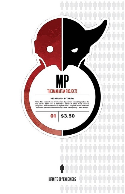
THE MANHATTAN PROJECTS #1
Writer: Jonathan HickmanArt: Nick Pitarra
Publisher: Image Comics
Reviewer: Henry Higgins is My Homeboy
The Impossible Lab...
A good number of the comics I read are centered around some “Super Science Lab”, and even as a fan of that trope, it can get tired. It takes an especially good comic to make that pitch seem fresh, and Hickman’s new series for Image, THE MANHATTAN PROJECTS, is one of the finest examples in recent memory. Following Dr. Oppenheimer as he is recruited into the service, the comic is a tremendous first issue.
Writing: (5/5) Hickman has a knack for “Super Science”, which is on full display here. The main plot of the book centers on Dr. Oppenheimer’s induction into the Project, and is presented in the very cliché’ “Walk through the lab” sequence. What makes this scene stand above the usual fodder, however, is the sheer inventiveness of it. This is a comic that features Buddhist monk samurai death cyborgs. That’s one of the weirdest sentences I’ve ever typed, but it manages to be both surreal and believable at the same time. There’s a certain insanity to it all, but it never feels like it’s there to be strange just for the sake of being strange. Rather, it’s all quite exciting, and opens the door for future endeavors within this universe.
That’s not to say the personnel side of things is forgotten. Almost half of the issue is centered on Dr. Oppenheimer’s history, and it’s fascinating. Jumping back and forth between Joseph and Robert’s history, the reader is given an intriguing look into their stories, their differences, and scarily enough, their similarities. While the discrepancies are apparent, it’s the small similarities (the attention to detail, the spirituality present in both) that stand out the most. It takes what should be a simple background description and makes it extremely engrossing. These pages are brief but flawlessly convey so much about the characters.
Art: (5/5) Pitarra is tremendous in this issue. The framing is remarkable, leaving room for broad landscapes and tightening up for more personnel scenes. The attention to detail is tremendous, especially during the siege on the facility. Just look at the numerous grisly fight scenes and movements during the scene. All the chaos and brutality, amidst the leisurely pace of Oppenheimer walking up the stairs. It’s a brilliant character moment, and shows an attention to detail that’s regularly cast aside. It compliments the writing thoroughly, especially during the section where the history of Oppenheimer is shown. All of this is complimented by Peter’s colouring, which is likewise sensational.
Best Moment: The montage of the Oppenheimer twins growing up.
Worst Moment: I honestly can’t think of one.
Overall: (5/5) It’s rare that I’ve been this excited about a comic this early, but if the rest of the series can maintain the same energy, edge, and intrigue as this issue, then we’re looking at something special here.
Also, I am perfectly willing to kill a man if it means we get more of Einstein and the slab.
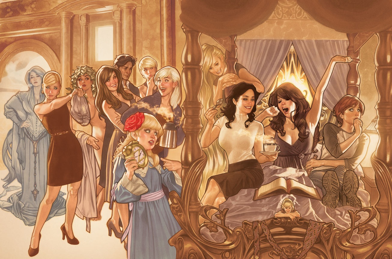
FAIREST #1
Writer: Bill WillinghamArtist: Phil Jimenez
Publisher: DC Vertigo
Reviewer: Optimous Douche
“Mirror, mirror on the wall, who’s the FAIREST of them all?” With Willingham’s latest spin-off to the FABLES-verse this question is more loaded than Lindsay Lohan and Drew Barrymore at their thirteenth birthday parties. Why? Because everything about this inaugural issue focusing on the fairer, but certainly not more gentle sex, is downright spectacular.
I’ll fully admit this review is written by a self-professed FABLES-aholic. Since issue 1, Willingham’s respect for Grimm canon made this universe and its inhabitants instantly recognizable, while his imagining of them in modern society made characters like Snow White, Bigby The Big Bad Wolf, and eventually Geppetto insanely interesting. Willingham is the only one to take the Grimm characters and give them a sustainable ongoing story. Sure, there’s always been one off comic miniseries and TV shows that have taken a swat at these characters, but they are either short lived or simply suck (looking at you ABC with The Charmings and “Once Upon a Time”). For over 100 issues, though, FABLES continues to reinvent itself to remain interesting and vibrant as each arc and mega arc close and lead to new adventures.
In recent years, though, fans have gotten antsy. As we grew to know each character better we saw a more finite focus given to individuals rather than the entire FABLES team. Miniseries like the wonderful CINDERELLA and story arcs like the current one involving Bigby & Snow’s cubs competing to become the new North Wind have almost obliterated the focus on other fan favorites. This is the problem with success: when faced with a stable of interesting characters how do you satiate fan thirst for deeper detail while balancing the need to sustain the greater universe? One could say “Have another big event.” The problem with that strategy becomes sensationalizing something that’s really a minor event, or even worse turning the term event into so much white noise.
The answer? Spin-off, baby…spin-off. Yes, these are usually sub-par material looking to monetize a trend (Remember The Ropers or the X-Men in recent years), but I’ll buy 1,000 books for a universe I love if the quality is top-notch. With FABLES I’ve never had to worry; there’s a care to all of the books that touch FABLES and it’s clear to see Willingham as a continued guiding force, even when he is not the primary author.
Future installments of FAIREST will see some of FABLES’ expanded universe creators like Chris Roberson from CINDERELLA coming back into the universe. For now though, we have the man himself, Willingham, tying together some loose threads from the Great War and unweaving a minor plot from the end of issue 107. The fiery redheaded narcoleptic Briar Rose is our first lady in waiting for some solitary story treatment. Even though her participation in the Great War was about as passive as one can get, her ability to sleep turned the tide of events in the Fables’ favor. Fans will remember her slumber being interrupted recently when she was absconded from the great city by the goblin hordes in their quest for treasure and glory.
FAIREST introduces us to another treasure hunter, the one and only Prince of Thieves, Ali Baba. In a routine scavenger mission, the “Prince” happens upon a magic bottle. Instead of delivering a wish granting genie though, this bottle is at first a perceived dud, delivering a wise cracking Bottle Imp that grants sarcastic quips over any monetary gain. He’s also a huge headache as Ali tries to understand the li’l fella’s propensity for mixing American culture with fable lore in each sentence he utters. He does it partly to be obstinate, but he’s also a victim of war, specifically the Great War where he served as a satellite of sorts providing intel to Geppetto’s forces on the strange ways of the mundy world.
Apparently Bottle Imps can’t provide direct monetary gain, but their ability for knowing things allows them to know where to ferret out money. In the case of this Imp, he knows of a Princess with a dowry that’s been sitting in a high yield 401K for years. To get this treasure Ali merely needs to wake Briar Rose with a kiss…oh, and fight off about a gazillion goblins as well.
Despite Jimenez’s august comic history, I worry whenever someone other than Buckingham takes on pencils. This goes beyond my love for illustrated margins; FABLES simply is not for every artist. Remember Allred’s turn at bat? Not so good. Fortunately, Jimenez is more than ready for this challenge. Each page is a visual sight to behold, whether close up on the Imp’s grimacing face or doing wide shots of the landscape. Exceptional cover art has also been a continued stable of the FABLES Universe. No one thought James Jean could be replaced until we met the wonderful João Ruas. Chrissie Zullo kicked major ass in CINDERELLA even though the cupie doll renderings were a far cry from the typical FABLES macabre. And now Adam Hughes has joined the club with his own unique style portraying the series as a whole as opposed to this singular issue. I’ll never fault a guy, though, for adding as many beautiful women as he can to…well, anything.
Great story, great art, and I think the episodic nature of this title will give it much greater staying power and variety than the more linear ongoing JACK OF FABLES.
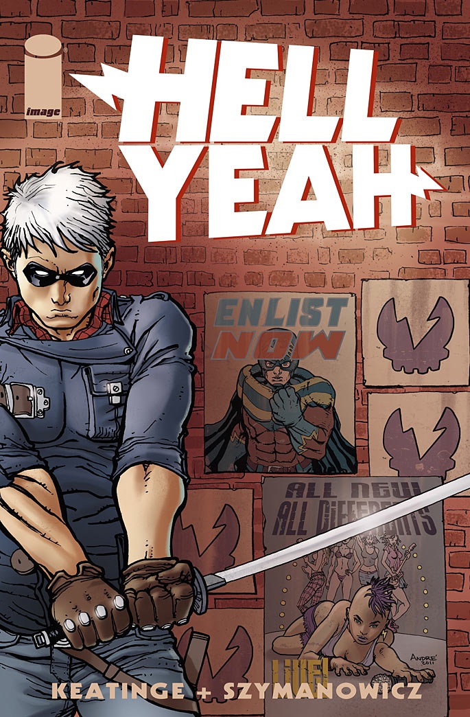
HELL YEAH #1
Writer: Joe KeatingeArt: Andre Szymanowicz
Publisher: Image Comics
Reviewer: The Writing Rambler
In comics we have some books whose title tells you what to expect. You’ve got your BATMAN, SPIDER-MAN, WALKING DEAD, AMERICAN VAMPIRE, etc. You have a good idea of what you’re getting into before you even open the book. Seeing a title like HELL YEAH had me curious at the least. I didn’t know what to expect; my thoughts ranged from a Stone Cold Steve Austin graphic novel to a story about following a heavy metal band. Interestingly enough, HELL YEAH is a superhero title, though not as simple as an origin story of someone getting powers and strapping on tights.
The book introduces us to Benjamin Day, a troublemaking student at one of the world’s most elite colleges (that’s in Portland) for people with powers. He has your typical anti-hero demeanor, getting in fights, not caring if he ruffles The Man’s feathers and all that other fun stuff. We learn that he’s the son of a war hero, who coincidentally was the first person to come in contact with superhumans. We also get to see some of Ben’s personal day to day interactions with his father and best friend (assumingly a future love interest). It’s a decent introduction to a new character, and although there’s a lot to process in this first issue, I enjoyed some of the quick flashbacks to roughly 20 years ago when this world was first introduced to superheroes. Joe Keatinge clearly has created a world he wants to share with readers, and although it jumps around at times I still think with time he can grow this book into something worth picking up on a monthly basis. Andre Szymanowicz follows suit with a decent outing here bringing the artwork to life, and while it’s not something that has me blown away, I do think it’s the right mix of real looking characters without becoming to “cartoony” like so many books often suffer from.
Overall I think this first issue did more right than wrong and I look forward to checking out where the series goes from here. There’s a decent cliffhanger and some other questions I’d like answered (like why is this society still using blimps? Is it just a WATCHMEN homage or is there more to it? I need to know!!!) that will keep me coming back for now. I found this book more enjoyable than several other #1’s that have been released recently (especially from DC & Marvel) so for that alone I’d say it’s worth your time.
Proofs, co-edits & common sense provided by Sleazy G
Check out AICN COMICS on Facebook and Comixpedia.org!