
| Issue #44 | Release Date: 1/18/12 | Vol.#10 |
(Click title to go directly to the review)
Advance Review: LORD OF THE JUNGLE #1
BATMAN #5
ARCHEOLOGISTS OF SHADOWS VOL. 1
Advance Review: NANCY IN HELL (ON EARTH) #1
RED SONJA: RAVEN (One-Shot) #1
FABLES #113
Advance Review: JUSTICE LEAGUE #5
KIRBY GENESIS: DRAGONSBANE #1
GHOSTBUSTERS #5
Advance Review: STEED & PEEL #1
Indie Jones presents a trio of indie anthologies!
AICN COMICS PODCAST #14!
 Advance Review: In stores today!
LORD OF THE JUNGLE #1
Writer: Arvid NelsonArtist: Roberto Castro
Publisher: Dynamite Entertainment
Reviewer: Professor Challenger
“Cowards! Scoundrels! How can you strand us here like this? After Lord Greystoke saved your life. How can you leave us here?” -- Alice Clayton (Lady Greystoke)
Yes, dear readers, the “Lord of the Jungle” is Tarzan. If you don't know that then you should not even be allowed to read comic books anymore. Tarzan is also “Lord of the Apes”, “Lord of the Trees,” and “Lord Greystoke” (or more accurately “Viscount”, but I won't go into that here). With the roar of a great bull ape, Tarzan comes to Dynamite with the LORD OF THE JUNGLE comic book. I come into this comic with the baggage of being a longtime reader of the Tarzan novels, comics, and viewer of the various films and TV series. It's a classic and archetypal feral man story with many different iterations and interpretations over the decades. My overall impression of the comic is positive.
As with many of Dynamite's series, the first issue has multiple variant covers; my copy is the Alex Ross cover. It's a dynamic cover design with a crouching Tarzan decked out in loin cloth, arm bands, wristbands, shoulder strap and wielding a knife. Behind him are a bunch of gorillas. The colors are a bit softer than I would expect, but it's still a nice cover. The “Lord of the Jungle” masthead is a strong design that looks carved from the wood of a tree.
I expected the comic to set out on its own path with a quick origin recap, so I was surprised to find the comic appears to be actually adapting the original TARZAN OF THE APES novel by Edgar Rice Burroughs. And, in the pattern of modern comic book storytelling, they are adapting it over the course of several issues as this one comic barely gets through the first 3 or 4 chapters of the novel (and that's by ignoring the set-up with the mutiny on the ship that leads to John and Alice Clayton being abandoned to the coastline of the Belgian Congo).
As adaptations go, it is pretty faithful to the book. The passage of time goes quickly as John builds an elaborate tree house to keep his pregnant wife safe from the dangers on the ground. The primary danger is shown to be a tribe of aggressive and powerful apes. In the novels, they are called Mangani and are described as a previously unknown species of great apes that is somewhere in intelligence higher than gorillas (Bolgani) but lesser than humans.
Most adaptations in film and TV have just ignored this aspect and made the apes into gorillas for purposes of telling the story. I'm not sure, yet, where writer Arvid Nelson is going with his adaptation because the apes in this comic appear to be gorillas and communicate with your basic “ooh ooh” ape-talk rather than the Mangani language that Burroughs described. However, there is an interlude with some Bantu tribesmen entering the jungle who encounter a vicious tribe of man-eating ape-like creatures that are identified with this exclamation: “What are these things?! They're not apes, they're not men—what are they?!”
They look very much like some of Frazetta's ape-monsters. They look like apes but are taller and leaner than the apes seen elsewhere in the comic, and they wear loin cloths, armbands, and use knives. So, I don't know exactly how the whole Mangani versus Bolgani thing is going to eventually go down in this title, but what I read is intriguing.
This issue covers the nearly 2 years in which the Claytons arrive in the jungle, have the baby, and then meet their end so that the baby, John, can be adopted by a female ape who has just had her newborn brutally murdered by the bull ape who leads their tribe. It's a familiar story and retold quite well (although I'm sure Nelson had to find it funny to be writing things like “Aah! Aah! Aah!”, “Rah! Rah!”, and “Ooh! Ooh!” into a script).
The art is reminiscent of Neal Adams' Tarzan covers and drawings without directly copying it. Clearly Adams and Frazetta are an inspiration to artist Roberto Castro in his approach to this comic book. I am going to once again ring that bell I ring every time I review a Dynamite comic book, though. It would benefit from using an inker rather than coloring directly on the pencils. There are moments where it works, but most of the time the line work is lacking and the color is overcompensating. It's a well-drawn comic, but it would be stronger with a good inker and more subdued coloring.
POSTSCRIPT: Most people these days seem a bit more knowledgeable about copyright issues than they were just a mere 10 years ago, so it probably isn't news to anyone why Dynamite is publishing a “Tarzan” comic book without the name “Tarzan” in the title anywhere. In the briefest way possible, it boils down to fact that while the first few “Tarzan” novels have slipped into the public domain, thus allowing Dynamite (or anyone) to adapt and do derivative works based on those, the fact that these stories are public domain has no bearing at all on the “Tarzan” trademark still owned by the estate of Edgar Rice Burroughs. If Dynamite wants to stick “Tarzan” in the title they would have to get permission from, and pay a licensing fee to, the ERB estate. So, they chose a descriptive title that evokes “Tarzan” without violating the ERB trademark.
Being the nerd that I am, I made the mistake of reading the indicia at the beginning of the comic just to confirm for myself that there were no attributions to or permissions from the ERB estate. But what I did find was that “Lord of the Jungle” is listed not as a trademark of Dynamite Entertainment but of “Savage Tales Entertainment, LLC”, so I tried to do a little research to find out just who “Savage Tales Entertainment, LLC” happens to be and what I found was a bit confusing. I couldn't find anyone publicly associated with “Savage Tales,” yet they appear to be out there just basically squatting on any unused publishing trademarks they can find. For example, I found “Savage Tales” claiming trademark ownership of Pete Morisi's “Peter Cannon, Thunderbolt”...since 1966? “Savage Tales” claims they own the trademark to “Charlton Comics”, “The Human Fly”, and other obscure marks like that. I don't know exactly what's happening, but it appears they are acting like web domain squatters but with trademarks. I sent a message to Dynamite's attorney last week just to ask for clarification. He was under no obligation to reply back...and he didn't, so the best I can do is speculate. My best guess, based on Dynamite's pattern of digging out old public domain characters and grabbing trademarks on new versions of them, is that “Savage Tales” is a subsidiary of some sort (or a partner) with Dynamite and they function as the licensing subsidiary of Dynamite. That would offer some legal protection to Dynamite they might not otherwise have. Setting up “Savage Tales” as an LLC gives an even greater degree of personal legal protection.
That's my best guess. I would love to know for sure, but information is hard to dig up online and the couple of people I contacted to ask about it either had no information or were unwilling to share, so there you go. The comic's pretty good, but I have no clue what's going on with the whole “Lord of the Jungle” trademark thing.
“Prof. Challenger” is actually Texas graphic artist and lifelong reader of comics, Keith Howell. He really digs Green Lantern, most recently completed the cover art for the upcoming book THE WORLDS OF PHILIP JOSÉ FARMER, and has contributed award-winning art, design, and editing to a number of books and magazines. He occasionally updates his website at at profchallenger.com and welcomes feedback from readers, both pro and con, but if female please include an attached pic in a tasteful state of undress. Thanks for all the fish.
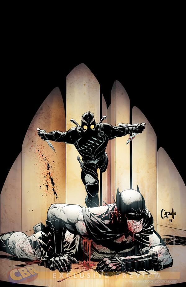
BATMAN #5
Writer: Scott SnyderArtist: Greg Capullo
Publisher: DC Comics
Reviewed by Humphrey Lee
This particular issue of BATMAN has made me a believer. Well, okay, more specifically it has solidified a strong belief I already had that Scott Snyder really is that good. Obviously, he has developed a convincing body of work since unveiling his talents to the comics world with AMERICAN VAMPIRE, but I always wanted to see more. There has been that “more” quantity- and quality-wise but it has usually been in the wheelhouse he set up shop in on his arrival, that of the horror arena. His work on BATMAN the past year has shown much more than that, with a great handling of the action/detective thrillers a good Batman story dictates. Which brings me to my latest epiphany via this issue: The Bat can crack.
One of my favorite themes of the New 52 has been the effort to capture the history of Gotham City, through this titles and the also excellent ALL-STAR WESTERN. Whereas the latter of those two is focusing on the as-it-happens perspective, which has its own appeal, I like what Snyder and Capullo have been crafting here with a more fill-in-the-blanks approach. The flashback looks at the machinations of the Court of Owls have been truly terrifying given how they operate, which attests to the writing in two ways. The main contribution comes from how seamlessly this group has been believably built into the universe of a character that has over seventy years of history. Tales of death, madness, and then no traces to follow are whispered about the Court and even the Dark Knight’s inquiries have pulled up very little except some fresh stab wounds. The execution on this alone has made this a great arc and constructed an obstacle that I imagine will be a go-to device for many a Batman story to come. Snyder and Capullo’s execution on this issue alone is what has really catapulted my belief in what this team and the Court are capable of doing.
For twenty pages this past week something I was not sure I’d ever see in a comic made itself a reality: it really looked like Batman was losing his fucking shit. Wounded and trapped underground in the Court’s Labyrinth, the Bat is taken on a pitch-perfect trip through hell. Bombarded with intervals of light and dark, nutrient and water deprived, most likely drugged, and who knows what else, you absolutely feel every paranoid moment the World’s Most Dangerous Man feels as he has seemingly met his match. Great lengths are taken to immerse you in the personal hell Batman is going through as the walls between identities starts to crack like he is, particularly through the book’s layouts. Quick cutting and jagged panels, a rotating, vertigo-inducing page scheme as Batman starts to tease a fling with dementia, and then the nail in the coffin: genuine worry from the rest of the Bat-family as to where he could be and what the hell is going on.
As far as I’m concerned, we’re three Comics Wednesdays into 2012 and we already have two “Issue of the Year” contenders between this and this year’s first SCALPED entry. The writing on this is pitch-perfect and the art accommodates it perfectly, as it has all this run so far. It’s lush, detailed, and gritty in a slightly exaggerated way that works to emphasize what makes this book work; it’s very Miller with Janson in my opinion. Take the first five words of that last sentence and I think that’s a wrap on my take on a book that I obviously think deserves praise for many a reason.
Humphrey Lee has been an avid comic book reader going on fifteen years now and a contributor to Ain't It Cool comics for quite a few as well. In fact, reading comics is about all he does in his free time and where all the money from his day job wages goes to - funding his comic book habit so he can talk about them to you, our loyal readers (lucky you). He's a bit of a social networking whore, so you can find him all over the Interwebs on sites like Twitter, The MySpaces, Facebookand a blog where he also mostly talks about comics with his free time because he hasn't the slightest semblance of a life. Sad but true, and he gladly encourages you to add, read, and comment as you will.

ARCHEOLOGISTS OF SHADOWS VOL. 1: THE RESISTANCE
Writer: Lara FuentesIllustrator: Patricio Clarey
Publisher: Septagon Studios
Reviewer: Mr. Pasty
ARCHEOLOGISTS OF SHADOWS (AOS) is a bold and ambitious project that could redefine the graphic novel industry – or collapse into obscurity under the weight of its own epicness. I say that because AOS is like nothing I’ve ever seen before in this medium, and it might scare some people away with its presentation. In other words, comic book geeks may not be ready for something as unique as this--at least not yet. Think Marty McFly’s gnarly guitar solo at the end of BACK TO THE FUTURE (and the faces of his peers) and you may have an understanding of what I mean. This is a new direction for comics, if you can even call this a comic, and according to Septagon Studios, it’s one that has been five years in the making.
They describe AOS as a “sci-fi/steampunk mash-up with a very unique art style thatcombines drawing, sculpture, photography, photo manipulation, and digital painting.” That’s quite a mouthful. And illustrator Patricio Clarey names STAR WARS, THE MATRIX, BLADERUNNER, TERMINATOR, LORD OF THE RINGS and AVATAR as influences. He also names the work of industry icons like Alex Ross, Dave McKean and Shaun Tan as inspirations to his work. That’s a pretty good way to describe his art, because if Alex Ross had too many mushrooms and fell asleep watching the SyFy channel, this is probably what his dreams would look like. This works as both an advantage and a disadvantage to AOS as a whole. First and foremost, this book is a showcase for new technology as it pertains to comic book illustrations. Having said that, it becomes a distraction to the writing of Lara Fuentes, who tells a familiar story of individuality and the protection of self that reads like INVASION OF THE BODY SNATCHERS, only instead of hatching from a giant snap pea you get mechanized.
It’s difficult to be critical of the narrative because it’s competently executed, but I felt a constant disconnect between the dialog and the art. Maybe that was by design, like the oft-blurred visuals, to give the reader a sense of fading away or slowly losing a battle of consciousness. I’m willing to give the benefit of the doubt, but just as a dramatic tension can often benefit from comic relief, I found myself searching for a little more humanity in my attempts to relate to the protagonists. I think their escape from the city was a good start, but I’m looking forward to having them fleshed out (pun intended) in volume two. Overall, I recommend AOS to fans of science fiction, but I also encourage casual readers to give this one a look as well. This way, in five years when Patricio Clarey perfects his style and makes it the new benchmark for graphic novels, you can look down your nose at fellow fanboys knowing you were already on board before the train left the station. Or, if it never catches on, you can at least look back on it with fond memories and cheap punch lines. Either way, pick this one up--you won’t be disappointed.
Web heads who can’t get enough of Mr. Pasty’s word vomit are encouraged to watch him operate as Nostradumbass over at MMaMania.com here. Love, hate and Mafia Wars requests should be directed here.
 Advance Review: In stores this week!
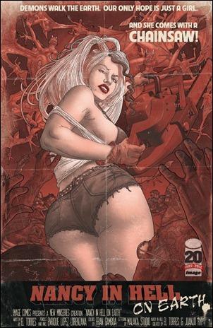
NANCY IN HELL (ON EARTH) #1
Writer: El TorresArtist: Malaka Studio/Enrique Lopez Lorenzanas/Juan Jose Ryp
Publisher: Image Comics
Reviewer: Lyzard
The original NANCY IN HELL run was the first series I covered for Ain’t It Cool News. Looking back at my reviews for reference, since the books are lost in one of several boxes filled with comics, I realized two things: 1) I really needed to improve my writing and 2) I buried those issues. Though I can’t get my hands on the original comics at the moment, without even seeing them, I have a hard time believing they were as bad as I said. I don’t see how that is possible when NANCY IN HELL (ON EARTH) #1 is so awesome.
I don’t know why I decided to return to the NANCY IN HELL series, but I’m glad I did. The comic begins with my favorite character from the series (in fact named as my favorite character in last year’s @$$ies ), Pytho. Apparently everything that happened in the first four issues was part of his evil scheme, which actually answers a lot of questions and fills in some plot holes. So apparently Pytho wants control of the EarthRealm. Seems like a cool gig, for our world has turned into a demon playground. Nancy and Lucifer have to find a way to shut the gates of Hell before the whole world is lost, starting with San Diego.
Yes, the book is set in San Diego. How did I know this? Because when the citizens are taken to safety, it is to the San Diego Convention Center. Having been to Comic-Con International several times over the years, I would be disappointed in myself if I didn’t recognize this building. This probably wasn’t intentional, but I do enjoy seeing a comic set in the ultimate comic arena.
As for the quality of the comic itself, Enrique Lopez Lorenzanas as the new artist is a great choice. Along with the colorist Fran Gamboa, this new issue reads so much easier than the past works. There isn’t a redundancy of color, allowing for a smoother reading experience.
El Torres’ characterizations have improved drastically. Yes, Lucifer is still a bitch. You would think that after several millennia without God’s love he’d finally get over it and accept the fact that he ain’t gettin’ it back. However, Lucifer’s moaning does allow Nancy to be snarky and kick-ass. Her killer use of a chainsaw makes up for her senseless feelings for Lucifer, whose only good quality I can see is using him for eye candy. Though I preferred Pytho in the original series, Nancy is already the coolest character in this continuation. That doesn’t mean that Pytho isn’t still enjoyable. His evil genius plan continues to get crazier and I just can’t wait to see what he does with Hell on Earth.
NANCY IN HELL has redeemed itself, though it seems that Lucifer never will. The jokes are working consistently, the sexploitation of Nancy Simmons is balanced with the skimpy outfit worn by Lucifer, and characters are whining less (again, sans Lucifer) and actually fighting for their lives. All I’ve got to say is bring on the apocalypse!!!
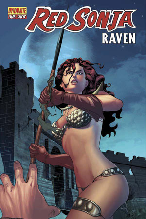
RED SONJA: RAVEN (One-Shot) #1
Written by: Marc MasonPencils by: Lui Antonio
Published by: Dynamite Entertainment
Reviewed by: superhero
Other than Frank Thorne’s Marvel Comics series, I really can’t say that I’ve ever given a crap about Red Sonja. From what I know of the character, which isn’t much, she pretty much exists as a sexpot alternative to Conan the Barbarian, depending on what gender you’re attracted to. I was never an avid collector of the Conan comics in the seventies and eighties, so I can’t say I know anything about Sonja other than her particular origin story. Other than the occasional pin-up art and the previously mentioned comic book series (which I honestly don’t remember for the stories), I have to say that I know next to nothing about Red Sonja.
I will say that I did like this one-shot, though. RED SONJA: RAVEN is a pretty decent little story that has Sonja facing off against a crazed Xena type (named Raven) whose ultimate goal is to decimate every man she comes across. Raven has gathered a large group of women warriors to help her accomplish this goal, and they kill every man they encounter regardless of how they’ve treated the women in their communities. Obviously this is because Raven was wronged in her own way by a group of men who give the term “scumbag” a new meaning. So Raven is on her own little mission to free womankind from the oppression of man, even if said man happens to be a little boy every once in a while.
Of course, such reckless slaughter cannot go on unhindered so Red Sonja, our own She-Devil with a Sword, finds herself at odds with Raven and her man haters club. The story opens with Sonja already having been captured by Raven and company. Sonja has to figure out how to escape from her imprisonment and then stop Raven from destroying every village that her battalion stumbles upon that happens to have a man in it.
There’s nothing really earth-shattering about RED SONJA: RAVEN. It’s just a pretty basic story of a heroine facing off against a villainess, but it was a good enough read that it kept me curious about how the tale was going to turn out. Unfortunately, much of the narrative is spent with Sonja playing “Professor X” to Raven’s “Magneto.” Some of the dialogue and interaction between the two characters was a bit tired, in my opinion. Maybe I’ve just read too many X-Men comics, but when Sonja has to launch into speeches about why all men should not be destroyed with Raven responding that each and every male that she comes across is evil I just started having some serious Chris Claremont flashbacks. But I was able to get beyond this little annoyance and enjoy the book for what it’s supposed to be: a straightforward action story with a woman in a chainmail bikini as the lead character. If you’re looking for anything really complex from a comic with a half naked woman as its star character, chances are you’re going to be disappointed.
What I really liked was the art. Penciller Lui Antonio and colorist Salvator Aiala do a really good job in this book. Antonio is capable with the storytelling and fight scenes while colorist Aiala follows it up with a warm color palette that enhances the illustrator’s work in all the right ways. Both artists together combine to make RED SONJA: RAVEN very visually appealing and keep Sonja and the other female warriors as sexy-looking as barbarian women are supposed to look in a comic like this.
So RED SONJA: RAVEN gets checked off as a “win” for me with this one-shot. Is it worth $4.99? Not to me. Twenty four pages of actual story padded with pin-ups that many comic fans have seen before…that’s not a lot of value in my opinion. There must be a market for it, though, as someone seems to be buying Red Sonja comics like these or my guess is that Dynamite wouldn’t be printing them. I was lucky enough to get a review PDF or I wouldn’t have even considered picking up this book. I know that comics are expensive to produce, but come on! Someone’s got to draw the line somewhere. I think I can safely say the $4.99 for twenty four pages of story is well beyond that line for this comic fan.
Discovered as a babe in an abandoned comic book storage box and bitten by a radioactive comic fan when he was a teenager, superhero is actually not-so mild mannered sometime designer & cartoonist, Kristian Horn of Los Angeles, California. Some of his work can be seen at www.kristianhorn.com and check out his blog at www.parttimefanboy.com. You can check also out his webcomics at www.babybadass.com and thediplomatics.com, which is currently in development.
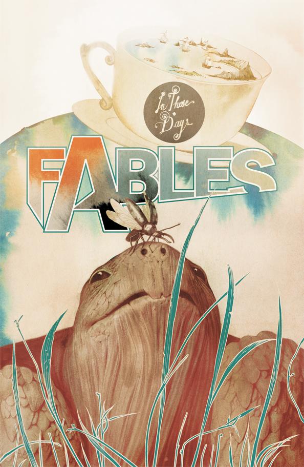
FABLES #113
Writer: Bill WillinghamArt: P. Craig Russell, Adam Hughes, Ramon Bachs, Zander Cannon, Jim Fern, Rick Leonardi, Ron Randall
Publisher: DC Vertigo
Reviewer: Henry Higgins is My Homeboy
Stories And Shorts
After the generally epic feel FABLES usually has, Willingham takes a few steps back and elaborates more on the general backstory of the universe. It's a welcome break from following the events of the last issue. As always with these departures, it's entertaining and expands the universe beautifully.
Writing: (5/5) While I do love FABLES primarily for its sheer scope, most of my favourite issues are the smaller ones, focusing on some random facet of the FABLES universe. All of the short features in this issue are utterly fantastic, and have more than enough depth for a regular sized issue, between a fantastic expansion of a barely mentioned side character and while exploring one of the more subtle plot inconsistencies in the series.
Everything is fantastic here, continuing Willingham's near flawless run record with this series.
Art: (4/5) Using a rotating crew for the art this month, FABLES manages to have a consistent art style throughout, even as each of them is unique.
Leonardi and Randall are great in their early pages, looking very "comic booky", and giving it a dynamic appeal. Russell is reminiscent of the traditional FABLES series, and looks tremendously cool--with each panel, something unique and interesting. Cannon's art is the largest and broadest, with a particularly good scope, though it has moments of inconsistencies. Bachs is utterly brilliant in his segment. The framing is spectacular, each page standing out boldly. The opening page especially looks fantastic, with an amazing and creative opening. The characters are very bold and look extremely bright. Adam Hughes is bright and dynamic as ever. The issue is consistent and enjoyable, and always, always engaging.
Best Moment: The opening page of "The Way Of The World".
Worst Moment: A few consistency errors in Cannon's segment.
Overall: (4/5) A well crafted issue of FABLES, just the latest in a great series.
 Advance Review: In stores today!
JUSTICE LEAGUE #5
Writer: Geoff JohnsArt: Jim Lee
Publisher: DC Comics
Reviewer: Johnny Destructo
Here's how it went.
1. YES! An awesome beginning, with the Flash and Superman. Pulse-Pounding!
2. OK! Green Lantern going up against Darkseid! Bone-crunching! Though GL is still referring to himself in the third person like a douche.
3. JIGGA-WHAA? Batman doing something so out of character it feels like an else-worlds tale! Mind-boggling!
4. "This wasn't part of the plan" No effing isht it wasn't part of the plan. What plan, exactly, are you talking about, Bruce? There has BEEN. NO. PLAN.
This entire series so far has read like a 15 car pile-up. One car just smashing into the next and so on. This is the fastest-paced slow motion comic I've ever read. I'm not quite sure what's going on with Geoff and this series, but it's just a damn mess. This is almost the MTV reality television show version of what people who don't read comics think a comic would be like. I feel bad typing this, because ever since he showed up, I have been a staunch supporter of John's work and I was SO excited for this book when it started.
And while each issue has had at least one really cool or interesting moment, each issue has also had at least 2 head-scratching and/or out-of-character moments as well. Hal Jordan is a mindless fireworks display, Superman is a mindless WMD, Wonder Woman is a mindless little girl who loves ice-cream and stabbing folks with her hobo knife..so on and so on. And in this issue, Batman goes from someone who is supposed to be a massively intelligent and careful detective to a mindless, reckless teenager. In fact, does anyone remember the adorable and fantastic episode of JUSTICE LEAGUE (Season 3, Episode 3) called KID STUFF? Wherein all adults vanish due to Mordred and the JLA all turn into..you guessed it: kids? It was really funny and cute because they were actually starting to act like children. Which was fine because they were ACTUALLY CHILDREN. In this series, all the characters are adults who act like kids. It isn't cute, it's just…strange and annoying. Oh and Cyborg's involvement? I was really curious to see how his storyline was going to coincide with the main tale and how John's was going to weave him into being on the JLA as more than the "token black fella". His solution? "Hey dude, do you wanna stay here? No? Well, I guess you're on the team, guy who has no idea how to use the abilities that he received 24 seconds ago!"
The upside is the action is a lot of fun and the art team does an amazing job! This is one of the top 3 best-looking book's on the shelves every month. I love flipping through it again even after I've read it, just to really enjoy the artwork. Just stellar work. It's a same that the story doesn't match the effort of the visuals.
"We got this"? …sigh.
When not hosting the PopTards Podcast at www.poptardsgo.com, fist-bumping his own nethers, discussing movies, comics and other flimflam here, JD is graphically designing/illustrating/inking for a living, hanging with the @$$holes and Booking his Face off over here. He is also now co-hosting another Comic Book discussion show on Party934.com alongside Bohdi Zen. They discuss comics and play music, check it out live every Saturday from 4-5pm.
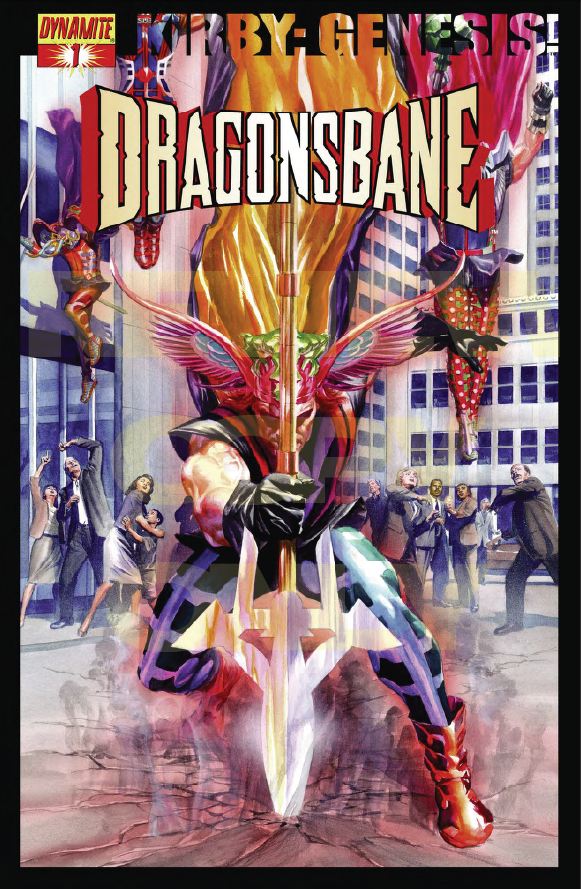
DRAGONSBANE # 1
Writers: Robert Rodi and Alex RossIllustrator: Fritz Casas
Publisher: Dynamite Entertainment
Reviewer: superhero
Ladies and gentlemen, I present to you…Thor!
Well…not Thor, but something very much like Thor…except newer and somewhat dumber.
To be fair, Thor was never the brightest torch in the hall, but the “Asgardians” inhabiting the pages of DRAGONSBANE really missed the wagon when it was trotting through the streets handing out brains.
The mythical realm of Valhalla has been cut off for ages from the rest of reality by the impenetrable Fell Mists. When our story opens, the mists have inexplicably begun to lift, signaling the end of the Valhallians’ (?) exile from the rest of the universe. At the exact same time as the long-imprisoning mists lift, a sorceress appears in the form of a mystical projection claiming that she needs help because her family has been betrayed by an unscrupulous dragon and only the remnants of these Norse gods can help her to free them. So, because the central characters of this book are of honorable stock, they proceed without question to follow the sorceress to aid her and her family. Out into the great unknown they go, beyond the Fell Mists, never questioning their situation as they pass through the ruins of other mythological realms on their way to aid the comely enchantress.
Sound like a bunch of smart guys, right?
Maybe I’m being a bit harsh here. For the most part DRAGONSBANE really does play out like an old school Dungeons and Dragons adventure. There are guys in armor on a quest against a mythical dragon to save a fair maiden. My problem is that it sort of presents itself a bit like a D & D game played by a group of thick teenagers. The characters in DRAGONSBANE are pretty much just fantasy warrior stereotypes walking through the motions of a paper-thin plot laid out before them. Oh, it’s true that one of them does voice a bit of suspicion in one paragraph during the whole book, but for the most part all of the warriors in this comic came across as a bunch of meatheads to me. Which is fine, I guess. I mean, no one really ever accused Conan of being a rocket scientist, right? But I would figure that in a whole city of divine beings that at least one of them would think it was a bit coincidental that the Fell Mists disappeared and that they were presented with the opportunity to go on a quest immediately thereafter.
OK, so while the story itself here isn’t quite spectacular, what is impressive is the art. Fritz Casas does a terrific job emulating the artistic style of George Perez, or possibly Phil Winslade, with just the right touch of Kirby design added in. Casas is great at rendering fantastically powered heroes of myth as well as their surroundings. He’s a master of detail and I’m sure that the art in DRAGONSBANE is going to grab a lot of people’s attention. If Casas can maintain this level of quality in his artwork and stay on a regular schedule this may be the first we’re seeing of the comic world’s newest superstar talent. Unfortunately, none of the characterizations in the first issue gave me the inclination to put this on my pull list, but it is Casas’s talent alone that will get me to check out DRAGONSBANE once again whenever it’s collected in trade paperback form.
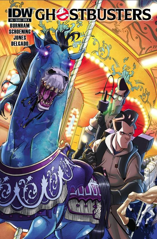
GHOSTBUSTERS #5
Writer: Erik BurnhamArt: Dan Schoening
Publisher: IDW Publishing
Reviewer: The Dean
This is easily the most frustrating series I’m reading right now. Writer Erik Burnham is so close to capturing both the nostalgia of the Ghostbusters franchise, as well its sci-fi comedy blend, that it’s making a serious bid for best interpretation since the films themselves. What hinders the title from actually getting there is what can also be said of any attempt to contribute to Ghostbusters canon since the first movie - its reluctance to let go of the successes that came before it. Burnham nails the characterization and dialogue, but is stuck repackaging the toys that Aakroyd and Ramis have already given us a few times before. This cushioned and perhaps too nostalgic approach to what should be a fresh new chapter in Ghostsbustin’ lore is often just a “been there, done that” sequel to the videogame.
While the overall story looks to tap whatever’s left of Gozer, the individual issues in this series are still strong and keeping me coming back month after month. A big reason for this is Dan Schoening’s art, which projects a lot of the same spirit in the characters that their charismatic, live-action counterparts had. The look is very similar to the “Real Ghostbusters” cartoon style, but the characters bear a much greater resemblance to the movies (Egon isn’t blonde, Venkman isn’t Seinfeld). Luis Antonio Delgado’s colors have been a bright spot in the series, too, with a vivid, polished look that helps even the redundant elements of the story feel fresh. The hyper-stylized look really adds to the fun of the title, and fits the PG vibe of the writing perfectly.
I know calling something “PG” can often come off as a dig, but I assure you it isn’t here, and that’s not what’s keeping GHOSTBUSTERS from reaching its full potential, either. Burnham does an excellent job capturing the essences of these characters without resorting to pale impressions of Bill Murray to make Venkman come alive. Burnham knows his own strengths, and seems to be reaching into his own sardonic, ebullient, or austere self to develop this Ghostbusters crew, making their comments and interactions feel much more genuine than even some of those in the recent “Ghostbusters: the Video Game”. Particularly impressive is Winston! I’m thrilled that Burnham has taken the time to spend a little more time with Winston in previous issues, as his interpretation is the best yet. This Winston seems to have a real function and purpose on this team now, and Burnham’s take feels like a natural progression of a character who’s been with this team for years now.
Things start falling apart, however, with Gozer, or with the Stay Puft Marshmallow Man, or with Slimer, or with the giant slime-like shell that envelops a large public area. Yep, all of those have been played already in just five issues. There are some great, new contributions here: proton grenades, the Paranormal Contracts Oversight Commission (PCOC) headed by Walter Peck, the John Belushi ghost that counsels Ray--even Idulnas was a strong villain, even if he was one of Gozer’s minions. But how can you pull everything short of crossing the streams in only five issues?! Still, this installment leaves enough original story to have me looking forward to number six, with the Ghostbusters’ conflict with PCOC being the most interesting. Peck’s impositions and expectations of the Ghostbusters are interesting, and it’s fun to see what an organization like the Ghostbusters might have to endure to continue to operate as a New York City institution. Simply seeing them on a routine house call, but struggling with the limitations of PCOC, would be a great read and would have made for a fun fifth issue. Idulnas had only been temporarily dealt with in the last issue, and he makes for a pretty cool larger threat to loom in the background. But every ghost doesn’t have to have the same gargantuan threat level that Gozer has, since it only makes the truly major villains like Idulnas look routine, and unfortunately this issue’s giant green (at least it wasn’t pink) carnival shell and ghost king are here to remind you of gimmicks and Vigos in past stories.
I’m hoping this is all just Burnham getting it out of his system, but I haven’t seen a walking Statue of Liberty or dancing toaster yet, so maybe there’s more to get out of the way before we can start reading completely original Ghostbusters stories. I really like Burnham on GHOSTBUSTERS, and I’d like to see this series have strong legs, but it’s going to need some more original content if it’s going to be worthy of the ongoing title it claims. There’s plenty here to give me hope, and while it’s not perfect, it’s still the best Ghostbusters writing I’ve seen in a while in this medium or any other. For now, however, every plug I give this series is coming with a “you’ve seen a lot of this before” disclaimer, but I’m still recommending it to the hardcore and casual fan as at least a fresh and enjoyable take on the characters, if nothing else.
 Advance Review: In stores this week!
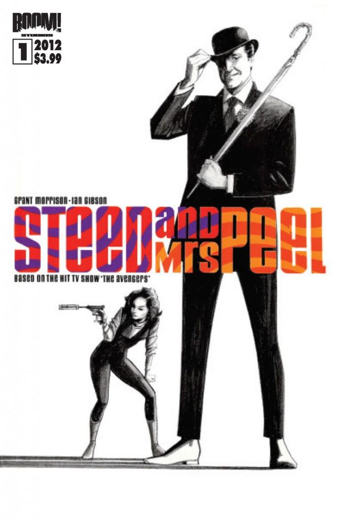
STEED & MRS. PEEL # 1
Writer: Grant MorrisonArt: Ian Gibson
Publisher: BOOM! Studios
Reviewed by: superhero
When the offer to review a comic based on the classic BBC TV show THE AVENGERS came up I had to take it. I’ve been a fan of THE AVENGERS for a long time. I own the Emma Peel DVD box set and have just loved the show since my first exposure to it years ago. Interestingly, it’s not nostalgia that is the reason for my fanboyish devotion to this fantastically fun spy series. I first saw an Avengers episode when I was in my late twenties and upon my first viewing I thought, “Where have you been all my life?”
So the news of a comic presenting new adventures of the best duo in espionage fiction got me very amped up with anticipation. I was a bit disappointed to realize that this BOOM! Studios publication was just a re-release of a long ago Eclipse Comics series and not something distinctly new. But I’d never had a chance to find the old Eclipse books, so while this isn’t a new series, it’s new to me.
Grant Morrison does a great job crafting an opening chapter that brings several of the former AVENGERS cast of characters back together. From Tara King to Mother to Emma Peel to Steed, a lot of the old gang are brought back into play. Morrison puts together a good tale that harkens back to the amusingly entertaining trappings of the classic TV show. Emma Peel’s return to Steed’s side was handled a bit anticlimactically for my tastes, being that when the show ended she wasn’t his partner anymore, but I was willing to let that nitpick go. All in all STEED AND MRS. PEEL reads very much like an old AVENGERS episode with all the oddball characters and situations that were hallmarks of the original program.
Ian Gibson does an OK job with the art, but it’s not a style that I would have picked for this particular comic. Much of Gibson’s artistic look reminds me a lot of Joe Staton, but with a less refined technique. In my mind I would have preferred a less cartoony approach for STEED AND MRS. PEEL, although I do appreciate that Gibson’s art does add to the sense of whimsy that should be evident in any AVENGERS story. Despite Gibson’s not-so-literal artistic method he is able to capture the resemblance of some of the actors from the original show as well as the spirit of the characters that they portrayed, so it’s not that I don’t like Gibson’s work but I feel that it may not have been the perfect fit for this book.
Despite my quibbles with the art I have to say I really did enjoy STEED AND MRS. PEEL. I’ll be adding it to my quickly shrinking pull list. As a fan of the old AVENGERS TV show it’s a pleasure to see these characters back in any fashion. I hope this series does well so that I can have many more STEED AND MRS. PEEL comics to read in years to come.


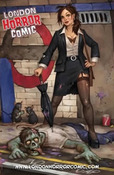 LONDON HORROR COMIC #1-4
Self published
John-Paul Kamath proves he’s a voice in graphic horror worth listening to in this terror filled mixed bag of moralistic TALES FROM THE CRYPT-ish tales ranging from goofy to poignant to downright gross. Lee Ferguson provides the clean and solid pencils while combined with Marc Deering’s inks to look a lot like Mark Buckingham’s fantastic work on FABLES. Kamath’s silent stories are especially effective and my favorites of the series ranging from a frustrated motorist lashing out at the happy folks around him, to a suicidal jumper finally finding love and losing it all in one leap. Kamath’s tales bite hard and leave their marks. My favorite of the bunch involves a prostitute, a john, and a glass eye. Just some sick stuff going on here, walking the line of the realm of wrong, but always entertaining. Kamath handles everything from gross out horror to goofy one offs to downright bone chilling scares. This anthology is highly recommended and can be ordered here.
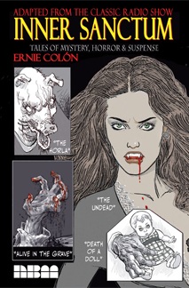 INNER SANCTUM Vol.1 HC
NBM Comics Lit
This is comics icon Ernie Colon’s love letter to the old radio horror shows of his youth; an anthology filled with tales of the dead rising, of curses bestowed on the evil and the innocent, and of monsters, ghosts, and madmen. All of these stories drawn in the classic style which made Colon’s work on CASPER THE FRIENDLY GHOST, RICHIE RICH, ARAK SON OF THUNDER, AMETHYST PRINCESS OF GEMWORLD, AIRBOY and countless other classic comics so memorable. The collection is hardbound and presented with style by NBM. My favorite tale of the bunch is “Death of a Doll” about a haunted doll. Second place definitely goes to the short but sweet “Lived Once—Buried Twice”. All of these shorts have a definite NIGHT GALLERY feel to them and is a must for appreciators of Colon’s classic work and lovers of old timey, scary radio shows.
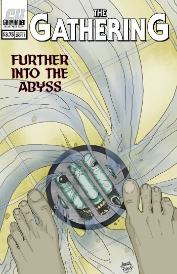 THE GATHERING Vol.6
Gray Haven Comics
Andrew Goletz has compiled yet another winning batch of short stories in this volume. Each issue of THE GATHERING focuses on one genre of storytelling. In the past, they’ve covered romance, heroism, and horror. Volume 6 is another focus on horror and covers a broad range of subgenres such as psychological horrors, demons, werewolves, ghost stories, and tales of twisted humor. Goletz has a knack for collecting a variety of indie voices and giving them this GATHERING stage to sound off on. Support indie storytelling by picking up an issue of THE GATHERING here.
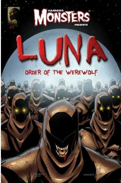
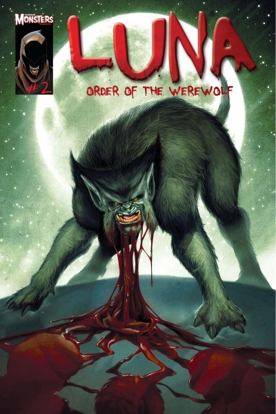
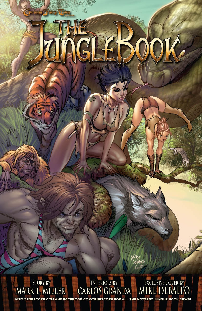
Ambush Bug is Mark L. Miller, original @$$Hole / wordslinger / reviewer / co-editor of AICN Comics for over ten years. Mark has just announced his new comic book miniseries GRIMM FAIRY TALES PRESENTS THE JUNGLE BOOK from Zenescope Entertainment. He is also a regular writer for FAMOUS MONSTERS OF FILMLAND and has just released FAMOUS MONSTERS first ever comic book miniseries LUNA (co-written by Martin Fisher with art by Tim Rees) You can order it here! Support a Bug by checking out his comics (click on the covers to purchase)!


(Just announced: NANNY & HANK is soon to be a major motion picture from Uptown 6 Productions!)
THE DEATHSPORT GAMES’ Facebook Page
FAMOUS MONSTERS PRESENTS LUNA: ORDER OF THE WEREWOLF’s Facebook Page
AICN COMICS PODCAST #14
Looks for more of the Holes rambling about comics on Poptards in future AICN COMICS columns!
Proofs, co-edits & common sense provided by Sleazy G
Check out AICN COMICS on Facebook and Comixpedia.org!