
| Issue # 28 | Release Date: 10/12/11 | Vol.#10 |
(Click title to go directly to the review)
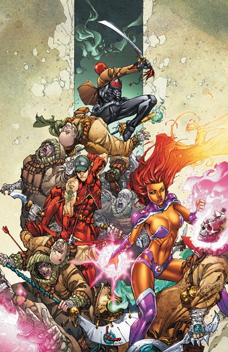
Advance Review: RED HOOD & THE OUTLAWS #2
The CBLDF presents: LIBERTY ANNUAL 2011 THE SHADE #1
FF #10
BATMAN & ROBIN #2
SCOREGASM
GREEN LANTERN #2
UNDYING LOVE TPB
THE UNEXPECTED #1
S.H.I.E.L.D. #3
DEMON KNIGHTS #2
 Advance Review: In stores today!
RED HOOD AND THE OUTLAWS #2
Writer: Scott LobdellArtist: Kenneth Rocafort
Publisher: DC Comics
Reviewed by Johnny Destructo
I am one of the 99%. Well, the 99% that thought that Princess Koriand'r (Starfire) was a filthy, filthy whore in RED HOOD #1. I too have been grumbling as well as mumbling about the sexpot issue and was prepared to be further disgusted by issue 2. The first part felt like a gross mishandling of the character as we know her, but the series' scribe Scott Lobdell has stated that there is a reason for her acting the way she is and I'm willing to hang on until then, because you know what? This was actually a really fun issue! Dammit, I was all up on my high horse and indignant like a jerky fanboy SHOULD be, and now I have to eat my hat. Oh stupid, hat...why couldn't you be made of delicious pancakes?
We get a glimpse into Jason Todd's post-crowbar resurrection and training from the All-Caste monks and The Ancient One, some jetsetting to Hong Kong and the Himalayas, and even get a good chunk of action for good measure. It was well paced, engaging and I don't think Starfire had random sex with anyone (unless she squeezed it in between panels...heh. Squeezed it in.) It's James Bond and Kill Bill rolled up in one. Next to Damian, I think Jason is becoming my favorite part of the Bat Family. He's straight-to-business and incredibly skilled, but has a personality beyond just "angry youngster". Half the fun is the back-n-forth between Jason and former sidekick, former heroin addict Roy Harper. It's the usual "we're probably best friends, but I'm gonna pretend to hate you" guy relationship, which I can totally relate to, and that makes it all the more fun for me.
I also love 'Hood's costume. It's sleek and hooligan, if not probably a little warm for Jay, what with it being a full-body Kevlar offering with a useless leather jacket OVER it. Dude must be sweating like an overweight furry in that get-up, but dammit, it looks cool. And it's a nice touch, 'Hood using the Bat-symbol, presumably to piss off Bruce.
The art by Kenneth Rocafort is rad, by the way. He has a sketchy penciling style that works really well with the subject matter, though I would like to see what it looks like inked. Rocafort's line is for the most part clean enough that he gets away with it, but I can't help but wonder if it wouldn't pop more with a less sketchy line quality.
Despite all the negative hubby-bubb about issue #1, number 2 may just be worth your time! Now if you'll excuse me, I have to go construct myself a delicious pancake hat.
JD can be found hosting the PopTards Podcast, drawing a weekly webcomic, discussing movies, comics and other flimflam over at www.poptardsgo.com, graphically designing/illustrating for a living, and Booking his Face off over here. Follow his twitter @poptardsgo. His talkback name is PopTard_JD.
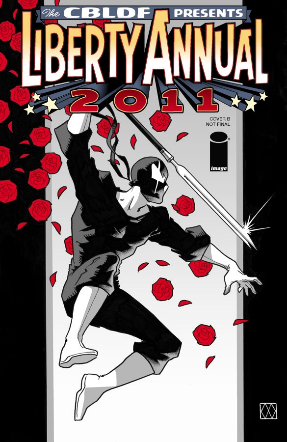
The CBLDF presents: LIBERTY ANNUAL 2011
Writer: VariousArt: Various
Publisher: Image Comics
Reviewer: MajinFu
Although I have frequently championed the all-ages comics, I also believe the medium as a whole has the potential to encapsulate ay and all types of stories. That’s why I can enjoy a book like Scalped as much as any decent Disney comic (or Snarked!) or whatever it is the kiddies are reading today. All that’s really important to me is good art and a great story. While this issue is more an anthology of talent than a focused narrative, the message and the cause it supports make it more than worth your five bucks.
This is really a showcase for some of the greatest talents working in the industry today, and a complete justification for adult comics as a whole. Topics range from homosexuality to kids with special needs, and you really get the sense they’re trying to cover as wide a spectrum of (for comics) taboo subjects as possible. It’s refreshing to see a comic that’s not afraid to address such a wide breadth of issues while utilizing so many unique styles and approaches, from comedic to dead serious. It isn’t kid-friendly but it’s still a lot of fun to read. My favorites by far were the clever “card trick” by J.H. Williams and Todd Klein, and Judd Winnick’s hilarious “Great Unsung Moments in the History of Free Speech.” The paper dolls from Elephantmen were pretty spectacular as well. Really, there’s something here for everyone to enjoy, and all of them are relevant to today’s wonderful, sometimes terrifying world.
The Comic Book Liberty Defense Fund is responsible for keeping censors at bay, ensuring we the readers can get all the sex, gore, depravity and curse words we can handle. They also support readers and creators who are under fire for even owning books with said questionable material. But it’s more than that. It’s about maintaining the integrity of the medium and channeling it to produce content that reflects every layer of society- good and bad, ugly or not. It means giving creators the freedom to tackle subjects of their choice so future readers and creators can learn from the mistakes of the past, as well as the great controversial triumphs in comic-dom. Without this, we get the stale, formulaic comic books the big two churn out every month. So pick this up and marvel at the wonders of uncensored comics. Gaze in awe at the work of creators who aren’t afraid to talk about the “important” stuff, as they do so with a sense of heart you rarely see in most mainstream books. It is truly a sight to behold.
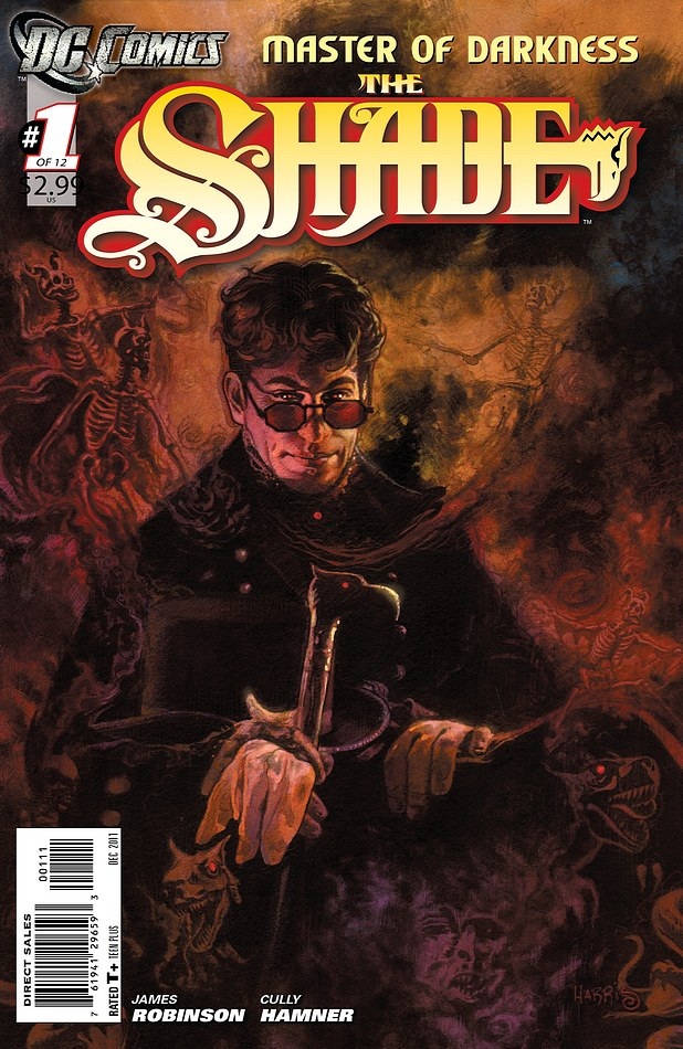
THE SHADE #1 (of 12)
Writer: James RobinsonArtist: Cully Hamner
Published by: DC Comics
Reviewed by: BottleImp
For any of you out there who were fans of James Robinson’s STARMAN series from the late 1990s/early 2000s, but like me were, shall we say, less than enthused with Mr. Robinson’s recent work on such titles as SUPERMAN or JUSTICE LEAGUE OF AMERICA, I have good news. Robinson has returned to write the one character that perfectly complements his writing style; Robinson has come back to Opal City and the Shade.
The Shade is the one character that can spout off all of the flowery, British-tinged speech that Robinson loves to write, exhausting the writer’s supply of purple prose so that the other characters that interact with the Shade can mercifully be allowed to talk to each other in more-or-less ordinary conversation. I’ve seen what happens when Robinson had no Shade to write for—that same over-wrought dialogue was stuffed into the mouths of characters that had no business speaking such crap. I, for one, did not care for a Superman who vacillated between sounding like an idiot or a vaguely Britishy prick. But with this new series, Robinson has returned to form with a mixture of the Shade’s charming snootiness, action, romance and mystery. Oh, and decapitation, too.
Cully Hamner brings his visual style to the Shade and Opal City, following in the footsteps of Tony Harris and (my favorite STARMAN artist) Peter Snejbjerg. I’ve been a fan of Hamner’s work from back when he drew the GREEN LANTERN: MOSAIC series, and I’ve enjoyed seeing his drawing style develop in comics like the recent BLUE BEETLE and the BLACK LIGHTNING: YEAR ONE miniseries. He’s got an appealing, slightly cartooney stylization of faces and figures blended with a remarkable sense of weight and solidity—like the best character designs for animation—that makes for clean, easy to read page designs that also deliver a maximum of dynamic energy. Hamner’s compositions also utilize solid black areas for maximum effect—a must for artwork depicting a man who can control living shadows. The art in this issue fits perfectly within the overall tone created for the Shade within the earlier STARMAN series, making it feel more like a continuation of that series than something brand-new. And for STARMAN fans like me, that’s a compliment.
There’s just one little matter that’s been gnawing at my brain…
So, the Shade is a villain who’s been around since the “Golden Age” of the 1940s, where he tangled with the Justice Society of America—and Jay Garrick, the original Flash, in particular. Robinson greatly fleshed out his character in STARMAN; that series is also inextricably tied into the history of DC’s WWII superhero adventurers. The Shade spends the opening of this issue chatting with Mikaal Tomas, the blue-skinned alien who also bore the Starman name, during which he mentions Tomas’ “gorilla friend”—a reference to Congo Bill/Congorilla, who appeared along with Tomas during Robinson’s run on JLA. Now, since DC Editorial has thus far implied that the Justice Society is not a part of the New 52, and in fact will soon be featured in a new Robinson-penned title set on Earth-2 (jeezus, I can’t believe they’re bring that back again!), the logical assumption is that this SHADE maxiseries is either A) set in this as-yet-to-be-explored alternate Earth, or B) this maxiseries is set in its own little continuity, unhampered by the recent “not-quite-a-reboot” of the New 52—which would explain how Robinson’s JLA stories are still extant here. Except…
Except that there’s some pretty hard evidence that this series is in fact a part of the New 52. Evidence in the form of a cameo from a certain monocular orange-and-blue clad assassin, decked out in the overly-fussy ‘90s holdover (pouches, spikes, pouches!) that’s become his not-quite-rebooted New 52 look. So… does this mean that the JSA, the All-Star Squadron, Jack Knight, and a talking golden gorilla are all still a part of the New 52 DC Universe? Does the Justice Society exist on two of DC’s parallel Earths? Or is it just more evidence that DC really, REALLY should have put a little more work into deciding which parts of their publication history would still “matter” in this new universe? My money is on the latter.
If you can turn off that corner of your brain devoted to trying to figure out what the hell is happening with DC’s continuity and just go with the flow, this comic will be worth your while. While THE SHADE is most definitely geared towards us STARMAN fans (some details, such as the Shade’s relationship with Hope O’Dare, will have meaning for only those who are familiar with the ins and outs of Opal City), there’s enough intrigue and action for newcomers to sink their teeth into as well. This first issue is a hopeful indication that Robinson is finally back to writing comics that you’ll actually want to read.
When released from his bottle, the Imp transforms into Stephen Andrade, an artist/illustrator/pirate monkey painter from New England. He's currently hard at work interpreting fellow @$$Hole Optimous Douche's brainwaves and transforming them into pretty pictures on AVERAGE JOE, an original graphic novel to be published by Com.x. You can see some of his artwork here.
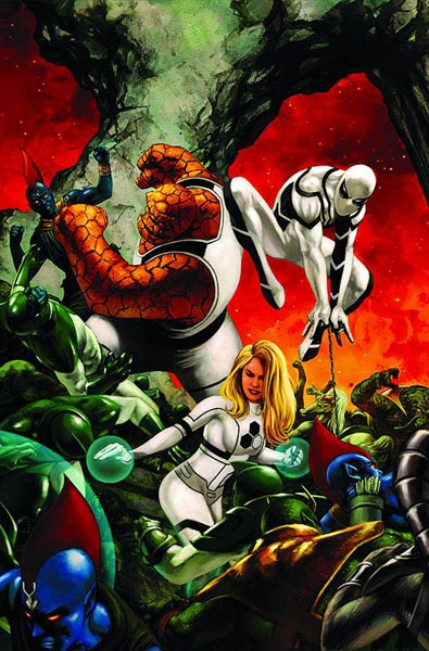
FF #10
Writer: Jonathan HickmanArt: Barry Kitson
Publisher: Marvel Comics
Reviewer: Henry Higgins is My Homeboy
Setting The Stage.
After a rather chaotic and fast paced story line, FF steps back slightly to reexamine the relationships of the title. It provides an interesting examination into the post-Johnny family, while also setting up the upcoming events of the story.
Writing (5/5): Hickman continues to be one of the best Fantastic Four writers in recent memory, able to juggle a good look into the marriage of Reed and Sue while also sowing the seeds of the next major arc. Reed and Sue's conversation is both amusingly realistic, but also a deep look into their relationship. Reed’s actions reflect no malicious intent, but a deep worry. It flies against the choices of past writers, and unifies the two well. It doesn't eliminate conflict or disapproval either, though, which is the right way to go. So many writers write the two as perfect lovers or spiteful bastards, but here, Hickman proves a steady hand and writes a realistic, flawed, but loving couple. The interplay between Peter and Ben is equally entertaining. It hits beats that a Johnny/Ben moment would lack, and in a well done way. Hickman simply continues to impress.
The set up involving Ronan is small, but dense. The implications of Crystal’s choices, the Kree assault, and the final words from Ronan easily set up a new arc. The Inhumans, though absent from the issue, hang heavily over the proceedings, just as they should.
The other setup involving the alternative Reed and the captured Dr. Doom is rightfully engaging. A captured and humiliated Victor is not something often seen, and it's a fascinating look at the character. His natural distaste for Reed is compounded by his capture by one, but he's almost forced to see alternative Reed as an equal. The other Reed, the most interesting of the lot (and therefore the one I'm happiest Hickman retained) is menacing in a much quieter way then we're used to in this series. He's simply Reed, pointed in the opposite direction. Throwing Nathaniel in there as well just makes the Latveria situation possibly the most engaging of the beats in the book, and I'm thrilled to see where it goes.
Art (5/5): Kitson is a perfect fit for this series, something I'm finding more and more lately. His scale within the larger universe is as impressive as always. The Kree armada just looks phenomenal. But the pacing, paneling, layout, and basic structure of the Latveria discussion or Sue/Reed talking is just as fantastic. Not much to say, but he may be one of the best artists out there to be doing FF.
Best Moment: Latveria.
Worst Moments: Some panels can be lacking.
Overall: Taking the Fantastic Four into one of the best directions it's ever had, FF continues to be one of Marvel's best titles.
BATMAN & ROBIN #2
Writer: Peter TomasiArtist: Patrick Gleason
Publisher: DC Comics
Reviewer: Optimous Douche
“TT” – Never has a verbal tick been so endearing. Well, endearing if an arrogant Robin with an epic chip on his shoulder is your cup of tea. Because make no mistake, the dye has been cast: the book may be called BATMAN & ROBIN, but this book is all Damian Wayne.
BATMAN, along with GREEN LANTERN, were the two titles that seemed to have remained virtually unscathed by the Flash’s last tampering with the dimensional vibrations of reality. Both books didn’t so much reboot as truncat the canon that existing fans so coveted and bemoaned before this new era of DC was unleashed on store shelves.
We are in a new era of BATMAN & ROBIN, but this is still the same book that we all loved pre-reboot.
Yes, the great Morrison has moved on to bluer and redder pastures, but the steadfast bedrock he built as the foundation for this title would be impossible to tear asunder unless it was given to the most incompetent of writing hacks. Some will even argue that the book is better now. Those people would be the Morrison detractors and those that felt Dick Grayson should have never donned the black cowl.
Personally, I enjoyed the Dick and Damian dichotomy. I went on record many times hoping Bruce would end up stuck in one time period or another during his journey home. BATMAN & ROBIN in its pre-reboot form showed a true maturation over its year long run. In the beginning, Damian’s endless chiding of Dick as a pale comparison to the father Damian never knew had just enough snark and banter to make the book fun without transcending to silly. It was also nice to see Dick not only have to protect Gotham, but also play the role reversal of teacher instead of student. By the end, a true friendship and dare I say respect between the two was beginning to shine through (well, as much respect as Damian is able to muster since we are all lesser life forms by his standards).
But we all knew Bruce would return. And I was worried as hell when he did pre-reboot. Bruce came back as an almost maniacal force--rightly so, after brother was bitch slapped by an Omega Beam and had to battle his way back through every epoch in DC history. One can hardly blame the transformation. He was so hell bent on restoring the image of The Bat and globalizing the brand, nary a thought was given to his son or restoring Bruce the man, instead of the Batman.
No more: Bruce is now in full-on daddy day care mode and it is truly wonderful to watch him and the creation of his bat-spunk try to relate to one another as human beings, not just as BATMAN & ROBIN. Don’t get me wrong, this is not “The Courtship of Eddie’s Father”. There are plenty of high-flying hijinks as the two topple an international ring of gun runners, but the book truly shines when the ass-kicking stops and Bruce simply tries to relate to his son.
I would be remiss if Alfred didn’t get a nod here. Through both iterations of BATMAN & ROBIN, Alfred has remained the sage voice of reason and advice. Pre-reboot, I thought Alfred had his work cut out for him trying to get Dick to man up in his role of Batman and turn Damian into an upstanding Robin as opposed to the psycho killer he was before. I honestly expected Alfred’s work to be done once Bruce came back. Oh, how wrong I was. If anything Alfred’s job just became ten times harder. Bruce Wayne has the emotional capacity of a real Bat, and while he has had many a ward pass under his charge, he never had one that was his flesh and blood and raised by a league of assassins. Alfred continually reminds Bruce through this issue (bravo to Tomasi for truly capturing Alfred’s dry British wit) that a “commendable job” is a far cry from “I’m proud of you, son.”
Tomasi and Gleason are taking a very dark turn with Damian and I think it fits, but before they make him a complete problem child I would caution them to remember what has come before. Simply because the books have rebooted does not mean all fans were given a mind-wipe. As much as I love douche Damian, as I mentioned earlier in this article, it was refreshing to see him soften a little and become a real boy at times.
I would also like to throw DC a challenge here. Fans are completely discombobbled by the four Robin thing right now from a timeline standpoint (I’m assuming Jason was still a Robin, but I’m not sure--see what I mean on confusion?). I humbly request a three volume set of mini-series that chronicle BATMAN: FIRST PUPIL, SECOND PUPIL etc…it will help us all gain clarity on just how truncated past canon truly is in the new 52.
Optimous has successfully blackmailed fellow @$$Hole BottleImp into being his artist on Average Joe. Look for Imp's forced labor on Optimous brain child in mid-2011 from COM.X. Friend Optimous on FaceBook to get Average Joe updates and because ceiling cat says it's the right thing to do.
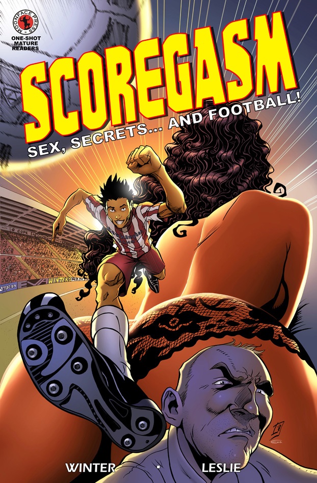
SCOREGASM #1
Andy Winter: WriterDuane Leslie: Artist
scoregasm.co: Website
Moonface Press: Publisher
Vroom Socko: Center Back
(NOTE: In this review, I will be making use of the term football as it is defined in the material under discussion. To those of you who are Americans, I'm talking about soccer. Deal with it.)
Billy Foley is a walking phenomenon. At sixteen years old, he's the breakout player for Newhampton Town Football Club. Sure, they're a non-league club, but they're making one hell of a run for the Cup, in no small part to young Foley's efforts. He's a pure talent, with dreams of playing for a team like Man United someday soon. Of course, nobody's perfect.
(NOTE: No offense to people in Manchester. I'm just more of a City fan, if only because I've actually seen them play in person.)
There is a problem, though: a secret that Billy has been keeping from his team, his fans, even his girlfriend. A secret that could end his career. A secret that an unscrupulous reporter has just stumbled upon.
At only 36 pages, the pacing of SCOREGASM does seem a bit rushed. This is an online comic, after all, where a story in theory should have plenty of room to breathe. An extra dozen or so pages that fleshed out the characters a bit more, as well as maybe showing another match result, would have made this a much better comic. That's not to say that Andy Winter did a bad job with this story; in fact, I had a lot of fun with it. I just wish that there'd been a bit more room for these characters to grow.
(NOTE: Yes, I'm actually complaining that a comic needs to be more decompressed. I blame Bendis, personally...)
What I loved about this comic though, genuinely loved, was the artwork from Duane Leslie, primarily in the football scenes. Leslie captures the speed, style, and excitement of football to near perfection. I went back and reread those scenes, then stopped reading altogether. I just watched the flow of play. It's that good.
So, how will this comic read for people who aren't into football? The main storyline could be about any sport, really, and the characters have plenty of charm, so non-fans should get plenty of enjoyment out of this one. But footy fans, they're going to have a blast with this.
Vroom Socko, aka Aaron Button, is a native of Portland, Oregon, and a lifelong supporter of the Portland Timbers. He's still a bit depressed over Friday's loss to Houston, and would like to know why the FUCK that elbow Mike Chabala took to the face didn't result in a red card for Danny Cruz! Ahem.
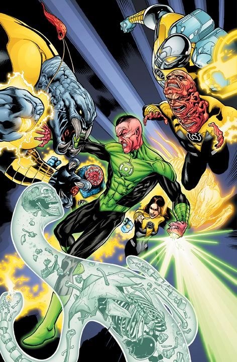
GREEN LANTERN #2
Writer: Geoff JohnsArt: Doug Mahnke
Publisher: DC Comics
Reviewer: The Writing Rambler
“The Corps didn’t simply give you a ring that could let you fly and create green airplanes. The Corps offered you a chance to improve the universe...did you ever truly take it?” –Sinestro
The entire second issue of GREEN LANTERN further pushes the story of Sinestro replacing Hal as the GREEN LANTERN of sector 2814 and pretty much makes Hal Jordan look like the dumbest person to ever slip on the emerald ring…and I’m loving every second of it. This is as classic as a modern GREEN LANTERN story gets. Sinestro training an arrogant and reluctant Hal. Hal refusing to listen. Sinestro showing him up and making his point in the end. For fans of GREEN LANTERN and Sinestro in particular (pretty much me in a nutshell) this book is becoming like a monthly dose of Christmas morning.
Whether or not you like his current remodeling of the DCU, GREEN LANTERN is Geoff Johns’ baby and I doubt he plans on abandoning that child anytime soon. You can just tell from this issue he seriously loves writing about the constant back and forth conflict that arises between Hal and Sinestro. It’s kind of crazy just how superior to Hal Sinestro is made out to be in this issue. It’s almost like deep down inside Johns has elevated Sinestro as payback for some overbearing flyboy type who wronged him in his younger days. I don’t know if it all comes down to Johns venting through his work but it makes for great character development. Despite all Hal’s been through over numerous years with the ring in his possession, in a few short pages Sinestro shows him how very little he’s ever really done with it and how his limited thinking (a critique he also applies to the human race in general) has always prevented him from being truly great. This issue is smart, well written and gives us a taste of exactly how Sinestro plans to use Hal to help him further his agenda throughout the universe.
Just like Johns, Doug Mahnke is at his best here. His artwork fills each page with the conflict and emotion that the story demands of it. I think he especially shines in the way he’s able to show the power behind the rings through the way he draws the light constructs. His interpretations of what they can do are some of the best around.
GREEN LANTERN has always been one of my personal high points for DC and this issue keeps that idea going strong. Johns and his team are able to take characters who you think can’t possibly have more stories to be told without getting stale and somehow make them even better. This book is about following Sinestro’s plans for restoring order (at least his version of it) to the universe and how he’ll use whatever and whoever he needs to see that plan come to fruition. This isn’t a story of a villain becoming an antihero or having a redemptive moment; instead it’s chronicling a character as exactly who he is at his core. Sinestro never claims to be a villain or a hero; he is simply a being who does not change his principles for anyone and it makes for an extremely enjoyable series so far.
You can follow The Writing Rambler on his blog here and follow on Twitter @Writing_Rambler !
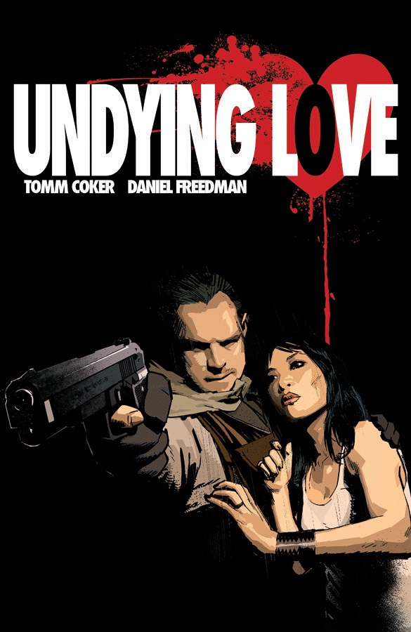
UNDYING LOVE TPB
Writers: Tomm Coker & Daniel FreedmanArtist: Daniel Freedman
Publisher: Image Comics
Reviewer: Optimous Douche
I know UNDYING LOVE has two strikes against it. One, it has love in the title. Not a word that generally resonates within this high octane testosterone-driven hobby. Two, UNDYING LOVE is about vampires--a topic that has gushed across our collective consciousness over the past few years much like the copious amounts of blood they spill in each tale.
I’ll admit I groaned when the PR push for issue one hit my hands almost a year ago. But then I took a second and saw who the creators were behind this book. OK, Image--that’s a good start. Anyone who still calls Image an indie publisher is fooling themselves. From a quality perspective indies are much grittier than the pamphlets that get corporate dollars backing them. We truly need a middle tier these days, because works like UNDYING LOVE are a bar above the books that are self-published off some Guttenberg press in Canada. I also read past all of the introductory fluff that makes PR people feel like they are actual writers to glean the creative names behind these books: Tomm Coker and Daniel Freedman. Both guys have spent years in the Marvel and DC bullpens and UNDYINGLOVE proves it.
So I dove into issue one and was immediately blown away. I’ve always dug Freedman’s work in books like WOLVERINE, but his sketchy yet ever so detailed renderings are truly made for the shadow world of UNDYING LOVE. When I looked past the art and dove into the story, two things struck me. First was the setting of Hong Kong. It’s one thing to simply place a book wherever you want; it’s another to truly inject the culture into the book. Not only does UNDYING LOVE leverage vampire lore, it’s clear that Coker and Freedman did their due diligence on the ancient orient and their specters that go bump in the night. This is better Asian fusion than the entire PF Chang’s menu. Second, Coker and Freedman made damn sure that being a vampire is no walk in the park. These are not people you would want as your prom dates and even though the hero of the book loves a vampire, he also knows that this is a love that will be an endless fight. Sure this is about vampires and it is about love, but it is also far from derivative. When talking about the love of a mortal and a vampire, UNDYING LOVE is the gritty blood-soaked antithesis to the vampires that sparkle and merely look at the camera with vapid moon eyes.
So I read issue one about ex-soldier John Sargent and his fanged lady love Mei. I delighted as they set up shack in a Hong Kong ghetto looking for an ancient vampire that might be able to cure Mei’s condition. I reveled in delight when that wizened vampire was a child that spoke with the soul of an ancient. And my hands started to sweat when that sage wunderkind told john that the only way to cure Mei would be to kill one of the oldest vampires in existence (yes, the old vampire rule of the older they are the stronger they are applies) and burn his heart so Mei can consume it.
And then nothing…I’m horrible at submitting Previews orders to my shop and sadly they don’t just naturally order every book out there. All I can say is, thank God for the graphic novel. While I curse the trade pacing that has blanketed our monthlies, there’s still no place better to play catch-up when a book falls off my radar.
Thankfully, the other four chapters collected in this OGN did not disappoint. As John Sargent looks for Mei’s maker Coker and Freedman’s research on the strange foreign customs of the Far East shine through on every page; quite frankly, this is unlike any vampire tale I have ever read before. Vampires usually just suck blood and occasionally transform into a bat; in UNDYING LOVE magic and vampirism combine to make these creatures of the night master elementals. On Mei and John’s side are a slew of other elementals, which help and hinder this most noble cause.
UNDYING LOVE also moves at a break-neck pace. I tend to take a long time with books. I first read art and story together and then go back to focus in on the finer points of both. It’s a testament when I can say I read a book twice and it felt like no time had passed. I wanted more after every chapter and I definitely wanted more when the last chapter closed. But alas, this is comics, and a comic without a cliffhanger is a book. By the close of UNDYING LOVE, John and Mei have just made it onto the sonar of her maker and if he’s half as bad ass as his underlings, Volume II promises to move even faster than on if that’s possible.
This might sound rather mean of me to say, but I hope Coker and Freedman have to spend a little more time shopping UNDYING LOVE around Hollywood. I want a resolution to the John and Mei story; so often these days once a book is bought as intellectual property from a studio it spells the death of the comic.
Yes, UNDYING LOVE would make a great movie, but it makes a fantastic comic, which we desperately need more of these days.
THE UNEXPECTED #1
Writers: Dave Gibbons, G. Willow Wilson, Alex Grecian, Josh Dysart, Jeffrey Rotter, Mat Johnson, Joshua Hale Falkov, Brian Wood, Selwyn HindsArtists: Dave Gibbons, Robbi Robinson, Jill Thompson, Farel Dallrymple, Lelio Bonaccorso, David Lapham, Rashan Ekedal, Emily Carroll, Denys Cowan
Publisher: DC Vertigo
Reviewer: KletusCasady
Well…that was…um…unexpected. Sorry, I couldn’t resist. If you couldn’t tell by the million names that are listed above this is an anthology book done in a very Tales from the Crypt/ Aesop’s Fables/Twilight Zone sort of style. I was really surprised because damn near every story was good. Actually, 8 out of the 9 stories were really excellent, my favorite being the first one that involves a grifter turned escape artist who learns an important lesson on how some things are inescapable. I can’t even go into a lot of detail about these stories because summarizing them would do a great disservice to this book. Let me tell you, though, the stories in this book are well thought out and with exception to the last story, all executed perfectly. Almost every story put a smile on my face when I hit the final panel of each segment, even the ones that ‘ol Kletus shouldn’t have smiled at. Each one of these stories does a great job of drawing you in, turning the tables on the reader and wrapping everything up at a moment that leaves your mind in a completely different place than where it was when you started the story. This comic also features one of the most unique takes on a zombie story that you will ever read; I mean…I can’t even go into it but damn, it’s funny, sad, relevant, gross and awesome.
My only complaints are the price and the last story. Now, this is a thick book with deft stories and great art but it’s also $7.99 and if I only bought 1-3 books a week, I’d have no problem picking this up but I spend about 30-35 bucks a week on comics and each week I have to make a tough decision on what to actually purchase and what to discard and if I’m thinking strictly with my wallet, the $7.99 gots ta go. I have a lot of friends who don’t really like superhero comics and only venture into comic shops casually and pick up something VERTIGO-like and this book is perfect for those folks, mostly for the fact that you get different kinds of short stories with a lot of kick. This is the kind of thing I’d read in the store, then go home and pray to the comic gods that VERTIGO will put out a giant anthology with this book and other short stories in it, which is what they may do because it does say #1 but we’ll see.
By the time I got to the last story my ADD/C kicked in and I started to drift off and seeing that the last story had the most dialog in it didn’t help. The problem with this story is that is wasn’t as tightly and neatly wrapped as they other stories; there was A LOT of explaining and flashbacks and flash forwards, Li’l Wayne makes a cameo (it’s not as bad as your thinking), snakes come out of a guys face, then it was too be continued…I felt cheated. I was ready for the story to flip on me as the others did, but nope. The story wasn’t bad--it just felt really long compared to the other stories (I went back and counted and this story seems to have just as many pages as the other stories) and it seemed to have caught a case of the Runny Bendis Mouth ™ after a while.
This book is damn near perfect; each story held something different, interesting and thought provoking plus the art was great across the board. The $7.99 cover price is a little stiff for a tightwad like ol’ Kletus but that’s mostly because I’m spending a lot of money on other comics as well (I’ll probably end up buying it on a slow week). If you’re looking for a quality comic that’s far from ordinary, this is definitely it!
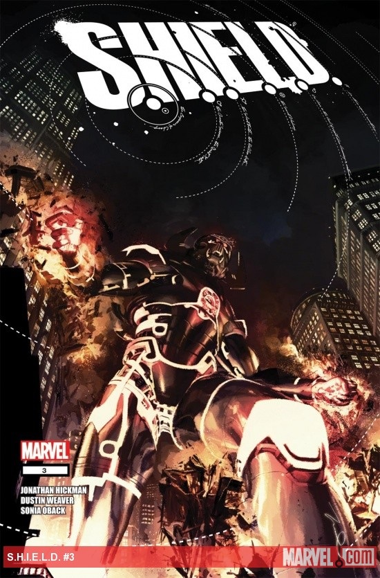
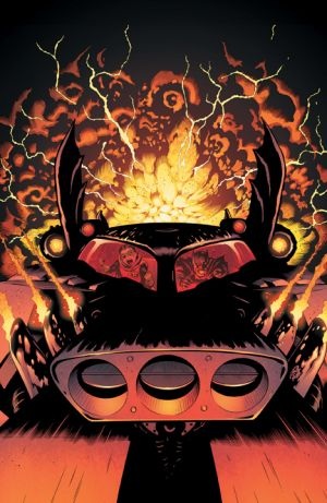
S.H.I.E.L.D. #3
Writer: Jonathan HickmanArt: Dustin Weaver
Publisher: Marvel Comics
Reviewer: MajinFu
This has got to be the most frustrating comic I have read in the last few years.
First of all, Dustin Weaver easily justifies purchasing this book. His artwork will leave you in awe and wonder, depicting a celestial giant destroying an ancient city while some of history’s greatest minds (Nikolai Tesla, Leonardo DaVinci, etc.) clamor to stop it. Weaver can capture the epic scope the story demands while illuminating every frame with little details that will keep you poring over the pages for minutes on end. It’s thrilling stuff, colored to perfection by Sonia Oback.
However, Hickman’s script (only two lines of dialog in the whole book!) is lacking, and the pacing of the story is entirely too slow for my taste, especially considering we only get a new issue every other month. I admire the writer’s willingness to step back and let the artist do his thing, but the overall story is starting to suffer from the snail’s pacing.
This is a book whose concept I enjoyed a great deal when it was first released, but then the first series “ended” and then another began, and we still haven’t seen the characters do much of anything except run away from their problems. It leaves me wanting so much more.
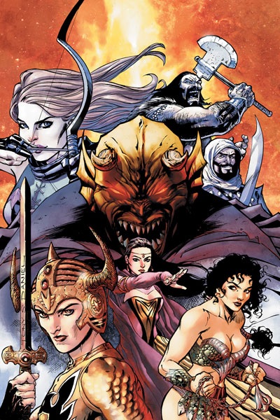
DEMON KNIGHTS #2
Writer: Paul CornellArtist: Diogenes Neves
Publisher: DC Comics
Reviewed by Humphrey Lee
I think it is safe to say that we are all starting to get to that turning point in DC’s “New 52” where fallout from the bomb that was 52 new titles has settled, myself especially as some personal stuff (i.e. a day job full on attempting to Norman Bates me) led me to basically read an entire month’s pulls, including about a fourth of this lineup, over most of last week. But my personal opinion on this is that while we may be getting exhausted by so much at once, especially after a healthy hype period to lead in, there’s a lot of good material here and I’d hate to see anything get overlooked. Fatigue may be setting in a bit and the idea of roughly 800 more words dedicated to these may seem superfluous, but good comics are good comics and good comics deserve (hopefully good) coverage. DEMON KNIGHTS is one of those “good comics.”
If anything, for me this title is filling the void left by the title shuffling and the lack of SECRET SIX therein. Take a motley crew of misfits and miscreants, bring them together in outrageous style and circumstance, push the pace with lots of absurd action beats (dinosaurs and dragons, oh my) and keep the humor coming. So far, DK here has been a great mix of all those elements, as well as standing out with a period setting you don’t see often see in comics, let alone mainstream superhero ones. And it has been doing all this while establishing new characters and playing with established and “lower tier” personnel, which is always commendable.
What I really like about this book, though, is just how it snaps. The way the beats move, how for two issues now it’s basically moving on Charlie Sheen gear, and has striven to throw the cast and reader into a meat grinder from the get go. It’s a great sign of things to come that Cornell is delivering lots of absurdity and irreverence. Admittedly, though, this will have to stop, as it could easily become a weakness as time goes on. Some more plots will have to develop outside of Mordru and The Questing Queen trying to slaughter our band of badasses, for one. For two, we will need to spend some quiet time with these characters, especially the ones that have now existed for the entirety of this series or a few pages of just this issue. For now Vandal Savage being a violent bag of crazy and quality one-liners is wondrous, but time spent with the new arrivals is also a must. The obvious note to make here is, well, it’s issue two--I’m sure there will be some of that in due time.
The last note to address, before I key in some last hits of praise to sell this thing, is that of another (relative) newcomer, and that’s Diogenes Neves on pencils. For one, it looks excellent; for two, it matches the bombastic energy of the writing perfectly. Every element that has made these first two issues a joy has been encapsulated by the artwork, from the glorified violence to selling the setting to the absolute glee on the face of Vandal Savage as he bludgeons one dinosaur with another dinosaur. Actually, that right there will be my last selling point. This book has Vandal fucking Savage beating dinosaurs to death with each other. Nothing I say can top what is laid out right there gloriously on the page and I hope that if you’ve passed up on DEMON KNIGHTS so far in all the bluster you are now learning the error of your ways. Cheers…
Humphrey Lee has been an avid comic book reader going on fifteen years now and a contributor to Ain't It Cool comics for quite a few as well. In fact, reading comics is about all he does in his free time and where all the money from his day job wages goes to - funding his comic book habit so he can talk about them to you, our loyal readers (lucky you). He's a bit of a social networking whore, so you can find him all over the Interwebs on sites like Twitter, The MySpaces, Facebookand a blog where he also mostly talks about comics with his free time because he hasn't the slightest semblance of a life. Sad but true, and he gladly encourages you to add, read, and comment as you will.
Proofs, co-edits & common sense provided by Sleazy G
Check out AICN COMICS on Facebook and Comixpedia.org!