
| Issue #26 | Release Date: 9/28/11 | Vol.#10 |
(Click title to go directly to the review)
Advance Review: PENGUIN: PAIN & PREJUDICE #1
ANNIHILATORS: EARTHFALL #1
THE FLASH #1
Advance Review: NIGHTMARE WORLD Vol.3 DEMON DAYS
GREEN LANTERN: NEW GUARDIANS #1
SPIDER ISLAND: DEADLY HANDS OF KUNG FU #2
ZOMBIE DICKHEADS ARE NOT COMING TO GET YOU #1
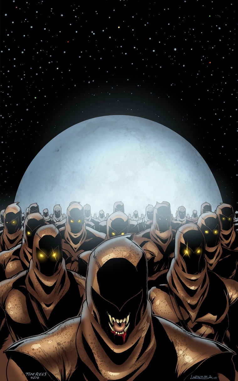
I, VAMPIRE #1
 Advance Review: In stores today!
PENGUIN: PAIN & PREJUDICE #1
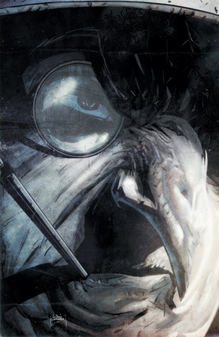
Writer: Gregg HurwitzArtist: Szymon Kudranski
Publisher: DC Comics
Reviewer: Optimous Douche
And with the birth of the series, comes the inevitable after-birth…the mini-series.
Mel Brooks used this line 100 years ago to describe artists and critics, of course referring to the critic in a not so favorable light. I actually wrote that first line before I even read PENGUIN: PAIN & PREJUDICE, hoping that like most mini-series this would be more of a money grab aimed at the hardcore fanboys and fangirls that profess zealotous devotion to the eclectic side characters in the DCU. You know, like Starfire (hornet’s nest -- poke poke). I really hoped the title would be an epic hot mess that I could spew some much pent-up venom towards. But I can’t: PENGUIN: PAIN & PREJUDICE was good—actually, it was spectacular. This was hands down the quickest page turner out of the new 52…I mean 26…whatever, you know what I mean. But sadly the only venom that will be spewed will be by Mrs. Douche when I try to justify why I need to now by five titles based on the Bats.
Were this old DCU, this title could have easily fit into one of the myriad of Bat books prior to the death of Bruce Wayne. However, the need to make the new books noob friendly meant focusing on the big Bat himself instead of his devilish rogues. I get it, I understand. Unlike most, I can even see the need for four books once it was apparent DC was trying to bring readers new and veteran, young and old back into the fold. So PENGUIN’S origin is relegated to a mini; given his stature I guess I shouldn’t be surprised. But despite the limited series run of this title, the immense quality makes me believe we’ll be seeing this “mini” stick around longer than some of the maxies.
In concept PENGUIN: PAIN & PREJUDICE is a simple introduction to the infamous Chester Cobblepot and his grotesque namesake façade. However, the devil is always in the details, and it appears in the new DCU the devil is also stoking the fires of the Penguin’s soul using unborn babies as fuel. It’s been a long time since I was generally disturbed by a comic book, the last I think being ARKHAM ASYLUM. Well, no more. Fuck the Joker and his erratic lunacy; I mean, really, the worst he’ll do is kill you. The new Penguin brings cold and methodical to new heights of criminal intent. The new Chester Cobblepot teaches readers a lesson I learned a long time ago from my father: bruises heal with time - emotional scars, only with death.
Beat by a nose. Over the years Cobblepot has mainly looked like a dude with a big nose that relied more on his steampunk cosplayer monocle and top hat to complete his transformation into his nom de plumage. Hurwitz, aided by Kudranski’s nightmarish pencils, turned Cobblepot’s nose into an outright birth defect. It looks like an appendage that was induced by thalidomide and then cursed by a wicked witch. Why not fix it? He is still part of one of Gotham’s founding families, complete with the riches of such a title. Basically, his parents didn’t give a shit and just went ahead and made prettier babies. It happens, even to the well-to-do--simply look at Randy and Dennis Quaid for proof. With this one simple birth defect, Hurwitz catapults the story forward in years showing how at each age how Cobblepot was emotionally abused and treated because of his malformation.
The man that leaves us with is one of infinite means and infinite hatred towards the society that shunned him. In the here and now, Cobblepot merely uses the people around him, including celebrities and aristocrats, to fuel his own selfish means. Hurwitz paints a Cobblepot that not only partakes in evil, but imbibes it into the core of his being. But he is the worst kind of evil, one that strikes where and when you least expect it. For today, Cobblepot will pay you off to keep the wheels of commerce churning; however, if economies tilt, you will become so much fertilizer. And so it goes, from a gruesome jewel heist to planning his party entertainment through coercion and blackmail. One man that simply makes an off color comment to Cobblepot in a nightclub quickly learns that there are fates far worse than death, finally making me realize what they were trying to say in “The Princess Bride” when they said “To the pain…”
Batman makes an appearance, but he was hardly necessary. Thankfully it was the last panel, so I was able to view a cool and collected Cobblepot unfettered from his squawks of fear and submission.
Kurdanski’s ability to bottle fear went far beyond Cobblepot’s nose. The panels of yesteryear have a dewy haze like a horror film filmed through a Vaseline covered lens, while the here and now takes a tonal shift, but never forgets the dark subject matter at hand.
I usually don’t recommend minis because I usually don’t buy them. But if you want to see the true dark side of the new DCU, grab a flipper and walk with the Penguin.
Optimous has successfully blackmailed fellow @$$Hole BottleImp into being his artist on Average Joe. Look for Imp's forced labor on Optimous brain child in mid-2011 from COM.X. Friend Optimous on FaceBook to get Average Joe updates and because ceiling cat says it's the right thing to do.
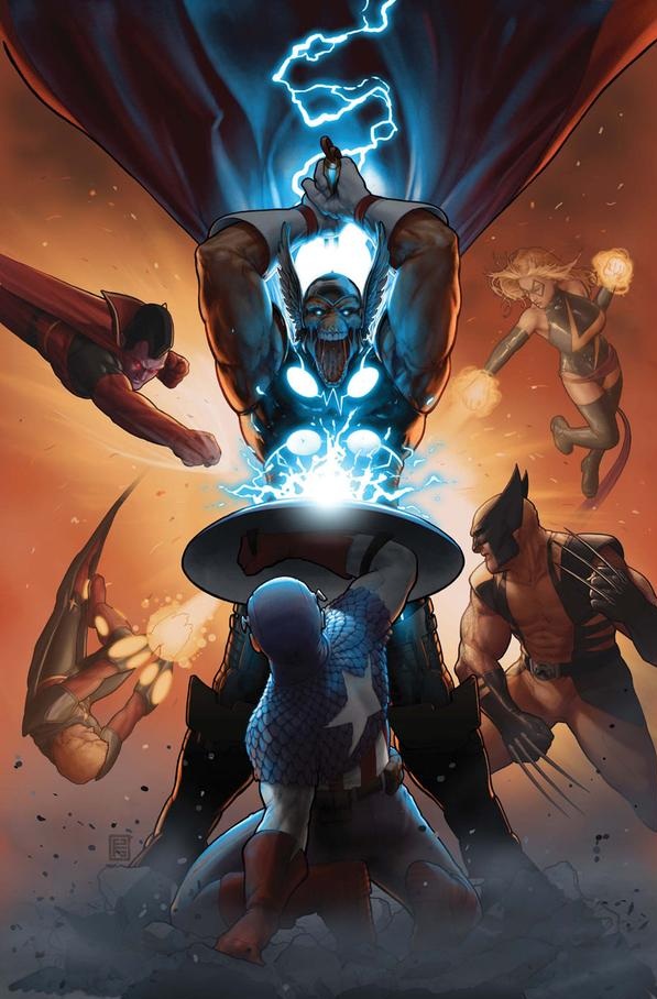
ANNIHILATORS: EARTHFALL #1 (of 4)
Writers: Dan Abnett & Andy LanningPenciler: Tan Eng Huat
Published by: Marvel Comics
Reviewed by: BottleImp
I used to think that the writing team of Dan Abnett and Andy Lanning could do no wrong. NOVA, GUARDIANS OF THE GALAXY, THE THANOS IMPERATIVE…these were some of my favorite comics, full of the excitement and character that was the hallmark of the best of the Marvel Universe. Then the ANNIHILATORS series came out, and the streak was over. ANNIHILATORS lacked that classic Marvel magic that I’d come to expect from Abnett & Lanning, and wound up being kind of a bore. So I was justifiably apprehensive about this new miniseries, which finds the team of cosmic ass-kickers headed to Earth to fight a clandestine splinter group of the Universal Church of Truth (they spawned the evil Adam Warlock doppelganger the Magus and were the big bad guys of the GOTG and THANOS IMPERATIVE series, remember?) which has infiltrated humanity. Would EARTHFALL fix those aspects of the original mini that didn’t work? Sadly, the answer is no.
So far, this series bears all the unfortunate marks that made the last ANNIHILATORS miniseries such a disappointment. First and foremost, we have the characters of the Annihilators themselves…or maybe I should say the LACK of character instead. By creating a superhero team comprised of nothing but heavy hitters, Abnett & Lanning ended up with a bunch of strongmen who, while they may look different, share the same attitude and mannerisms. Gladiator, Beta Ray Bill, Ronan the Accuser—all typical alpha male ass-kickers. Hell, I’d even lump Ikon the Spaceknight in the alpha male category, and she’s a woman. Quasar is slightly atypical in that he’s less of a forceful personality, but he doesn’t have much personality otherwise. At least he’s not continuously whining about how out of his league he is amongst such powerful teammates, like he was in the previous series. Speaking of the previous series, I was glad to see that the Silver Surfer did not make the Annihilators roster this time around. The team didn’t really need another nigh-omnipotent demigod, especially one who waxes philosophical; I’ve always felt that the Surfer works better as a plot device than as a character anyhow. No, the one and only member of the team that actually has an interesting, individual voice and personality is the one holdover from the late and lamented (by this reader, in any case) GUARDIANS OF THE GALAXY series: Cosmo, the telepathic Russian space-dog. Unfortunately, this one character’s quirkiness is not enough to counterbalance the abundance of dull weight.
I must admit that I was also disappointed to see that this new series did not feature a new artist. There was always something about Tan Eng Huat’s art on the original ANNIHILATORS mini that rubbed me the wrong way, and it continues to do so in this issue. Huat tends to draw his figures in such extreme perspectives that the overall impression the reader gets is watching the action through a fish-eye lens. That effect would not be bad in select areas, but when the entire issue looks like you’re reading it through an apartment-door peephole, it gets a bit tiring. Along with this distortion, Huat draws faces that stretch and contort so much that it looks like the Annihilators have been replaced by a battalion of Plastic Men. Faces change shape from panel to panel; on one page Quasar has a lean face with a chiseled chin, then on the next his chin has swollen up to Leno-like proportions. Then there’s the bizarre final page of this issue, when the Avengers show up and are floating in a collected mass in midair. I mean, Iron Man is obviously flying, and Spider-Man is in a typical jumping Spidey pose, but Ms. Marvel and Wolverine are just sort of hunkered down in the air, while Captain America seems to be standing on Wolverine’s ass. I’m not even going to try to figure out what the heck Valkyrie is doing. All in all, Huat is inching dangerously close to Liefeld territory with this page.
And don’t think that my reveal of the last page has spoiled anything that the cover to this comic hasn’t already given away. Actually, the cover is an even bigger spoiler, since it shows the Annihilators in combat with the Avengers—which we won’t get to see until issue #2. At least, I think that they’re in combat…the awkward symmetrical composition makes it look like Gladiator, Ms. Marvel, Quasar and Wolverine are all attacking Beta Ray Bill’s asshole.
At least the Rocket Raccoon and Groot back-up feature (nicely illustrated by Timothy Green II) has all the wit and character that the feature story lacked. Unfortunately, five good pages of story and art isn’t enough to justify the four buck price tag. Unless Abnett and Lanning add some personality to their roster of powerhouses, the new ANNIHILATORS series seems doomed to follow in the bland footsteps of its predecessor.
When released from his Bottle, the Imp takes the form of Stephen Andrade, an artist/illustrator/pirate monkey painter from the Northeast. You can see some of his artwork at sandradeillustration.com. The Imp is currently hard at work on the graphic novel AVERAGE JOE, written by fellow @$$hole Optimous Douche—look for it from Com.x later this year.

THE FLASH #1
Writer/Artist: Francis ManapulColor Artist: Brian Buccellato
Publisher: DC Comics
Reviewer: Professor Challenger
“But the thing is...no matter how fast or now far you run...you can't outrun...yourself?!”
-- The Flash (Barry Allen)
A funny thing happened on the way back to Central City. I read the first of “The New 52” that I fully enjoyed with no reservations. The reboot on Flash is simple and it works. Writer and artist Francis Manapul takes a broom and a dustpan to over 50 years of ever more complicated continuity and sweeps it clean. Back in place is a younger Barry Allen, experienced as Flash, but not experienced enough to have died repeatedly and been replaced and resurrected repeatedly. Gone is the Batman-esque tortured soul of the recent REBIRTHed Flash. Barry is a young professional crime scene investigator on the laboratory side. He's a bit O.C.D. and self-deprecating but highly intelligent and confident.
And he is a hero simply because it would be wrong to have his powers of super-speed and not be a hero. He cares about people and he cares about what's right.
This was a refreshing comic and a refreshing take on the relaunch without regressing our lead character to the point of mental infancy nor did it incorporate the darkness and bloody gore that permeates so much of the recent & new DC (so far as I've seen). So, hold on to your hats as I recommend this one for old-school and new-school readers out there.
What I discovered, to my surprise, is that Manapul is able to visually tell a story and make it flow smoothly and still incorporate some “Wow” moments with the action. In fact, the 2-page spread that makes up the title page and origin recap is one of my favorite images from all “The New 52” that I've actually had the fortune (or misfortune) to read recently. I enjoyed the dialogue and the way Manapul often integrates the panels and word balloons to move the narrative along. It gives a real sense of movement, which is always a trick for a comic book about someone with super-speed: how do you take static panel-to-panel storytelling and get a sense of movement and speed? I thought Manapul paced everything just right to give us ebb and flow, action and mystery, characterization and depth, and a strong cliffhanger.
Glory be, the plot does not revolve around Prof. Zoom or any of the familiar Rogues Gallery of The Flash, but rather a genuine mystery surrounding an old college classmate of Barry's. I love the Rogues and I love the Prof, but it felt nice to be re-introduced to Barry and Iris without the plot albatross of Zoom's (or other Rogues') evil machinations. It allowed me to just focus on Barry and, to a lesser extent, Iris. For most of the last 10 years or so, the focus of FLASH comics have for ill or good been a place where Flash himself is secondary (or even periphery) to the story itself. This is fine, occasionally, to mix things up in a long-running title, but when it becomes the norm to have the title character essentially a guest star or supporting character to his own book...well, that's losing focus and the writer needs to get reined in.
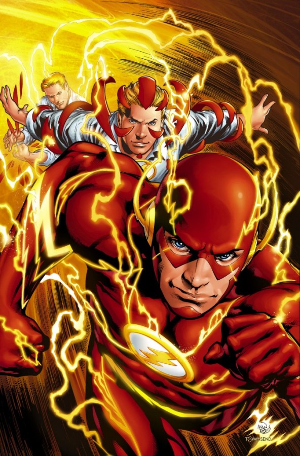 Visually, I found the art impeccable and often stunning. Manapul's art is both finished out and enhanced by Brian Buccellato's expressive coloring work. I recently came across a quote from the late, but not forgotten, comic coloring legend, Adrienne Roy. Roy said "Color leads the eye and helps tell the story subconsciously...it should never distract from the even flow of the total creation." Buccellato's work on this comic exemplified her statement. I especially liked his repeated use of a muted violet offsetting the strong red and yellow of The Flash. You can see an example even on the cover. It helped set a different tone for this comic from any other I had read from DC.
One of the things that's so easily overdone for the last few years of FLASH comics has been the coloring effects that have laid in the electrical charge bolts flying off his body. I understand that the intention has been to give a visual sense of movement and excitement to the character even when he's standing still. However, surely everyone else has caught on to how overdone it had gotten by the end. Well, here Buccellato works off of Manapul's pencils to create slight variation on that visual that works very well for me.
In the Silver Age, The Flash had his Flash ring, andwhen Barry pressed a button on the side, it would open up and his cloth uniform would fly out in grand Infantino-esque fashion to expand until large enough for Barry to change his clothes at super-speed. In 2011 and forward, the ring utilized some sort of higher tech to electrically fire the top of the ring outward where it expands and attaches to his chest to form his Flash insignia and the costume itself flies out of the chest piece in parts that form-fit around his body. The seams where those parts connect are the areas that we see electricity charge up when Barry takes off into super-speed action.
I was very surprised by THE FLASH #1. I did not like his characterization in the last, truncated FLASH comic, nor did I care much for him in the FLASHPOINT mini-series. I am also a bit saddened by the disappearance of Wally West/Kid Flash from continuity because he was a character I always enjoyed from his Kid Flash days through his 20 years or so as The Flash himself, but if DC continues to take care of Barry like they did in this comic, then the future looks quite decent for THE FLASH.
“Prof. Challenger” is actually Texas graphic artist and lifelong reader of comics Keith Howell. He really digs Green Lantern, most recently completed the cover art for the upcoming book THE WORLDS OF PHILIP JOSÉ FARMER, and has contributed award-winning art, design, and editing to a number of books and magazines. He occasionally updates his website at at profchallenger.com and welcomes feedback from readers, both pro and con, but if female please include an attached pic in a tasteful state of undress. Thanks for all the fish.
 Advance Review: In stores next week!
 NIGHTMARE WORLD VOL.3: DEMON DAYS
Writer: Dirk ManningArt: Anthony Peruzzo, Josh Ross, Jason Meek, Stacie Ponder, Austin McKinley, Grant Perkins, Seth Damoose, Renae De Liz, Len O’Grady, Mark Winters, Jeff Welborn
Publisher: Image Comics
Reviewer: Ambush Bug
I’m a huge fan of short fiction and short film. Although many pooh pooh shorter fiction, I find it refreshing to sit and be done with a story in such a short period of time. I also think to make a truly effective short story, you have to be a pretty damn good writer. You’ve got to cut out all of the fatty and flowery talk and get to the point quickly, while still hitting all of the right narrative beats. Well, if NIGHTMARE WORLD V3 DEMON DAYS is any indication, Dirk Manning is a pretty fine writer. His collection of short stories fell into either one of two categories: stories that felt complete and succinct and stories I wanted to read more about. In both cases, this is an amazing collection of short horror stories with a nice variety of artists, all matching the tone of the story perfectly.
I wanted to give all of the artists their due in this review, so I’ll touch upon each story briefly--all written by Manning, who has a great talent for filling a short space with just enough information to make the story feel utterly satisfying.
Frozen This is one of the stories I could see leading off a series of shorts centering on the subject. As is, this story of how vengeance trumps love is a wonderful dissection of the subject. Set in the times of swords and sorcery, most of the story centers on a barbarian making his way to rescue a maiden, but the ending is a doozy, leaving me wishing for a sequel. The art in this one, though occasionally cartoonish, is nice and gritty, like barbarian tales should be.
No More Tears follows a child’s wish taken a bit too seriously and resulting in utter devastation. I kind of like this snippet of a story with pretty decent art, especially when things get demonic.
I have to say, I kind of knew where Movin’ On was going from the beginning, but it still made for some cool reading. The art by Austin McKinley was comical but strong throughout and I definitely liked the abrupt ending.
A Therapy For Pain is a nice little moralistic tale set against the backdrop of the End of Days. Jason Meek draws some nice panels and an especially bodacious CEO at the center of the story.
Hungry Like the Wolf was probably one of my favorites of the book, not because it was a werewolf story, but because of the whimsical stick figure art by Stacie Ponder.
End of Days is a running theme of this book, as evidenced by the word-heavy chapter Prays Be the Lured. Though this is a wordy one, it still sports some fantastically detailed artwork by Josh Ross and Austin McKinley. Add It Up is a not so jolly take on Christmas. I love Christmas horror and this one is ghoulish enough to be one of my faves of the book. Down in a Hole visually is one of my favorites. The blocky and cartoony artwork by Grant Perkins depicting hell and the demons in it was one of the coolest versions of Hades I’ve ever seen. Though I should have guessed from the title, Extraordinary Machine surprised me with its twist ending. A couple’s tiff turns demonic in Milk of Human Kindness.
Manning wraps up this collection of stories by tying some of them together in the latter chapters, an ambitious and somewhat successful decision which made this similarly themed End of Days collection of tales seem more resonant. I especially like the quiet moments he gives Lucifer and God in the next to last chapter, and having finishing the book with a little down time with Nessie and Yeti was a nice cherry on top of NIGHTMARE WORLD V3 DEMON DAYS, an often entertaining and gorgeously drawn anthology.
 Ambush Bug is Mark L. Miller, original @$$Hole / wordslinger / reviewer / co-editor of AICN Comics for over nine years. Mark is also a regular writer for FAMOUS MONSTERS OF FILMLAND and will be releasing FAMOUS MONSTERS first ever comic book miniseries LUNA in October (co-written by Martin Fisher with art by Tim Rees) Order Code: AUG111067! Support a Bug by checking out his comics (click on the covers to purchase)!


Check out NANNY & HANK’s Facebook Page
Check out THE DEATHSPORT GAMES’ Facebook Page
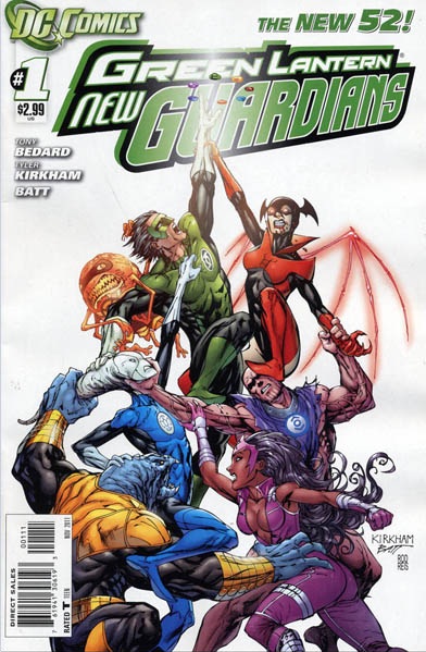
GREEN LANTERN: NEW GUARDIANS #1
Writer: Tony BedardArt: Tyler Kirkham
Publisher: DC Comics
Reviewer: The Writing Rambler
So there I was, set to dive into GREEN LANTERN NEW GUARDIANS #1 with my anticipation built up for this fourth and final LANTERN entry in the NEW 52. I mean, there’s no reason I shouldn’t love this book. I love GREEN LANTERN, I love Kyle Rayner, I love all the crazy chaos of multiple different-colored Lanterns running around in one issue, and I love mysteries, so this should be a no brainer (side note: I also love cake…but that’s neither here nor there). Yet here I am 20 pages later, completely indifferent to what I just read.
There’s nothing that stands out to me here that’s terrible because honestly, it’s not a terrible book. I wouldn’t even go as far to say it’s a bad book; it’s just kind of a pointless book. The whole issue feels like it’s trying to balance itself between being a jumping on point for new readers and a precursor to a new GREEN LANTERN event. We get a quick rehash of Kyle’s first introduction into the Corps which leads you to believe that the book’s first order of business is to welcome new readers, which is fine, and as a longstanding GREEN LANTERN fan who welcomes new readers to learn about what makes these characters so great I am more than willing to sit through a first issue of back story to get new people all caught up. But within a few short pages we’re rocketed ahead to present day where we quickly see yellow, red and violet lanterns being stripped of their rings with no explanation. Then in yet another blink of an eye were in Times Square following present-day Kyle’s adventures. Were I a new reader, I would have no idea what was going on.
This book should work for me; I’ve liked Tony Bedard’s work on GREEN LANTERN in the past and I really feel he understands and translates these characters well. I just think there’s so much going on for a first issue that we actually end up getting no real story at all. Tyler Kirkham as well has done great work on GREEN LANTERN in the past, and this book is no exception. His work is the highlight of the issue and he captures everything about Kyle’s personality perfectly, including his splash page of Kyle’s constructs when saving people in Times Square, which is just awesome to say the least. I have faith that they will both redeem themselves sooner than later, but for now most people could probably just wait to pick up issue 2 because there was seemingly no reason for this issue other than very brief set up (which I’m sure will be covered in issue 2).
Oddly enough, despite all my indifference towards this first issue I really am looking forward to reading what comes from GREEN LANTERN NEW GUARDIANS. Kyle headlining this book coupled with the interaction of all the other Corps could lead to some really fun stories in the future. I just hope that the awkwardness of this first issue is out of the way so we can move forward onto the success this title should have.
You can follow The Writing Rambler on his blog here and follow on Twitter @Writing_Rambler !
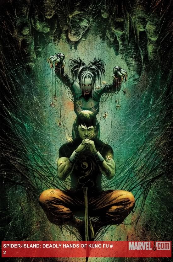
SPIDER ISLAND: DEADLY HANDS OF KUNG FU #2 (of 3)
Writer: Antony JohnstonArt: Sebastián Fiumura & Leonardo Fernández
Publisher: Marvel Comics
Reviewer: MajinFu
As someone who idolized Bruce Lee for much of my childhood, I am a huge fan of Shang Chi, and kung-fu stories in general, if you couldn’t tell by the name. The book is a nice fusion of horror and action, which sets it apart from many other martial arts books, similar to the Bride of Nine Spiders one-shot that showed up about a year ago. Actually, this is a better comic featuring the character, one I’d recommend to any fan of Iron Fist or the Immortal Weapons without batting an eye.
The listing of move names, a technique originally used by Ed Brubaker and Matt Fraction on IMMMORTAL IRON FIST is repeated here. It’s not quite as effective or witty as when it appeared earlier, but it does result in a pretty good punch line (pun intended). It’s all pretty derivative, but the creative team pulls it off so well I can’t help but be entertained by the distracting antics taking place in this comic.
Sebastián Fiumura illustrates the opening and closing of the issue, while Leonardo Fernández handles the bulk of the action, with inks by John Lucas and colors by Dan Brown. The vast art team results in a bit of a hodgepodge that still looks somewhat visually unified. Their styles fuse together really well, making the transition from one to another quite seamless. I do wish the action scenes had been depicted more clearly, as I’ve never been a fan of silhouetted figures twirling around as a substitute for solid fight choreography. The sketchiness of the art also works for the subject matter, but it’s not something I could see working for an extended period of time, as it looks rushed.
We also learn in this issue that Shang Chi is a fan of Fleetwood Mac. Personal or private bits of trivia are something I have always appreciated as a way of drawing the characters closer to our own lives. It tends to work best in the Marvel Universe, which parallels our own so closely. This brings me to my next point: the tie-in factor. I haven’t read an issue of Amazing Spider-Man since the end of the Kravenful “Grim Hunt,” and from the looks of Spider-Island, I’m not missing much. However, the idea of everybody in Manhattan getting spider powers and sprouting extra arms does make for a compelling, and admittedly absurd kung-fu concept. Even though the overall story is a bit predictable, the cliffhanger is enough to get me looking forward to what happens next, so way to go guys.
If you’re even slightly interested by the words “kung-fu treachery” this is probably worth a look-see. Read it and then if you feel like more martial arts horror, check out “Close Encounters of the Spooky Kind.” Just trust me on this one.
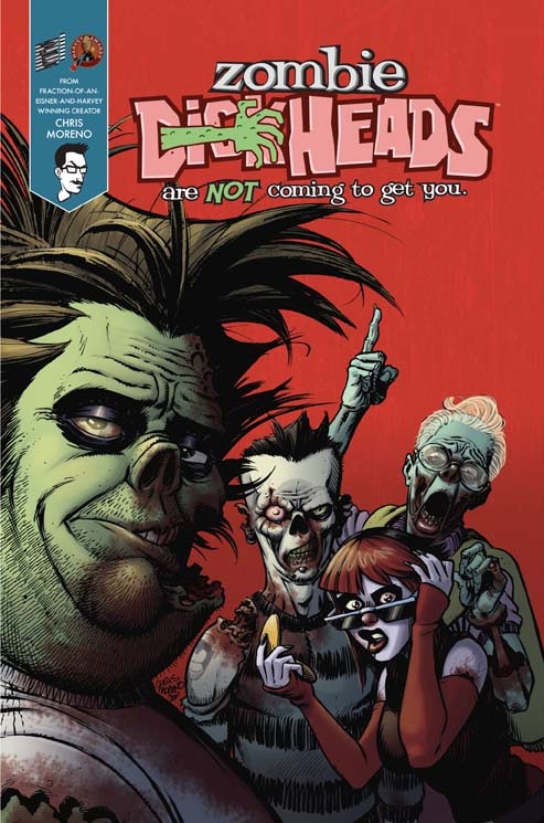
ZOMBIE DICKHEADS ARE NOT COMING TO GET YOU #1
Writer: Chris MorenoIllustrator: Chris Moreno
Publisher: self published
Reviewer: Mr. Pasty
Chris Moreno is sticking it to the man, or at least the big publishing houses, by going out on his own for a creator-owned comic book titled ZOMBIE DICKHEADS ARE NOT COMING TO GET YOU. Truth be told, you go to press with a title as epic as that and you better deliver. From what I’ve seen thus far, I think he has. ZOMBIE DICKHEADS are exactly what they sound like: a bunch of dickheads in real life who die – only to come back as zombies with the exact same personality. It reminds me of a funny bit by Dennis Miller when he talked about dying in a plane crash and having to check into heaven with the same group of assholes he couldn’t stomach on the flight to begin with. Having said that, the premise behind ZOMBIE DICKHEADS is to look at life after death from the zombies’ point of view.
What happens if you become a zombie but don’t have the urge to eat brains or convert your living kin? You have ZOMBIE DICKHEADS who ARE NOT COMING TO GET YOU. So can humans and zombies co-exist? Not down south, where a bunch of trigger-happy rednecks are looking to deliver some southern justice. Then again, that’s probably a bad example, considering hicks can’t really co-exist with anybody, including themselves. That means the zombies who take center stage in Moreno’s new book are playing the role humans traditionally would in a living dead-style narrative: on the run from a pack of bloodthirsty killers. It’s an interesting premise, albeit a little gimmicky, but I think the success or failure of this series all depends on how well Moreno can balance his storytelling. It works when you piss off the antagonists but it fails when you piss off the reader. That’s always the danger in a creator-owned comic book, because there isn’t much of a filter to separate the “Hey, this sounds good” from the “No, this isn’t going to work.”
Moreno is probably best known for his work on TOY STORY and WORLD WAR HULK, and it shouldn’t come as a surprise that his artwork is on point and just as good as anything else you can get from any of the big name publishers. ZOMBIE DICKHEADS has a nice comedic undertone and I like the idea of exploring fear and prejudice under a cloak of walking dead. Again, it comes down to balance. I hope the incessant banter between the dickheads in question is used as a plot device and not the actual plot, because Moreno’s first entry is a refreshing take on a very tired genre. I’d hate to see it lose its legs (no pun intended) but how far he can take it is entirely up to him. One thing is for certain, he’s off to a promising start.
Web heads who can’t get enough of Mr. Pasty’s word vomit are encouraged to watch him operate as Nostradumbass over at MMaMania.com here. Love, hate and Mafia Wars requests should be directed here.
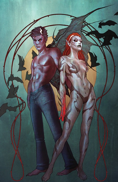
I, VAMPIRE #1
Writer: Joshua Hale FialkovArt: Andrea Sorrentino
Publisher: DC Comics
Reviewer: Henry Higgins is My Homeboy
The Boston Massacre…
Horror comics are hard to do, as eidenced by just how many terrible or lacking ones there are being released as we speak. But to see a solid one is always a pleasant surprise. To be honest, I, VAMPIRE worried me. I thought a DC horror comic (especially one from the new 52, which I have not terribly enjoyed) set in the new universe would be small, uninteresting, and really, not that good. But Fialkov, Sorrentino, and Maiolo are making me eat my words. This is a fantastic comic.
Writing: (4/5) Fialkov has his work cut out for him here. Not only does he have to establish a new universe and characters (which many of the new 52 didn't, because if you're reading this review you don't need a recap to understand Batman), and he excels tremendously. His brief fight scenes and conflict writing is well crafted, and at times even is able to draw your attention away from the art.
More then anything, however, the issue is a showcase for the brilliant dialogue that Fialkov can craft. The continuing conversation and debate between Andrew and Mary is engaging while not feeling drawn out or long. The couples’ quarrel that hangs over the proceedings never detracts from the more morose and interesting slaughter. Within a page, you feel as if you know these characters in a way most books just can't replicate. It's fast and entertaining and relatable, but it never tries to appeal to any certain demographic, mixing reliable conversation with a surprisingly epic scope. It helps that both lead characters are intensely interesting, and I can't wait to read more of them.If the book is ever weak, it's only in defining some of the more (to be honest) radical departures. It's not really commented on, but the power sets for vampires isn't terribly well explained. Normally this isn't a problem, but it's clear that it's making some obvious changes to the established vampire mythos. And while I'm sure that all will at least be addressed if not explained, the book does fail in establishing a defined universe for its characters to explore.
Art: (5/5) Sorrentino is REALLY good here. I mean, really good.
JESUS this book is beautiful. Gorgeous spreads of Andrew adrift in a sea of corpses fill the book, and never does it look mediocre or even average. At its weakest, it's still of a different caliber then most books being released right now.
The designs for characters flow brilliantly, especially a later shot of Mary (which, if you see, you'll know in a second). It's one of those few comics that require almost no imagination to see animated. The movement and scenery to the pages exquisite, just detailed enough to clearly describe a scene, but still vivid and bold.
The colorist is often underappreciated in the comic community, but Maiolo more then illustrates a control of muted and loud colors, and even if the art was otherwise unremarkable, would elevate this book to must read.
Best Moment: The shots of Boston.
Worst Moment: In terms of defining a character, it's a little lacking. But I am nitpicking here.
Overall: (4/5) This may be my favorite of the new 52, to be perfectly honest. It's also one of the most entertaining and engaging first issues I've ever read.
Proofs, co-edits & common sense provided by Sleazy G
And check out AICN COMICS’ New Facebook Page!!!