
| Issue #23 | Release Date: 9/14/11 | Vol.#10 |
(Click title to go directly to the review)
Advance Review: BIRDS OF PREY #1
FEAR ITSELF: THE MONKEY KING #1
DEMON KNIGHTS #1
MODESTY BLAISE: MILLION DOLLAR GAME
GREEN LANTERN #1
Advance Preview: GHOSTBUSTERS #1
MISTER TERRIFIC #1
ELDRITCH! #3
Advance Review: WONDER WOMAN #1
 Advance Review: In stores this week!
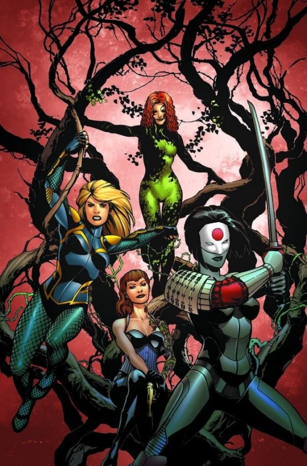
BIRDS OF PREY #1
Writer: Duane SwierczynskiArtist: Jesus Saiz
Publisher: DC Comics
Reviewed by Johnny Destructo
Action, suspense, fishnets. What more do you want?
Well, a couple things, actually. Like quality writing, solid art, and strong intelligent female characters--all of which are bases soundly covered in this first issue. Like with many of the positive reviews I've given to the DCnU books, I've never been a huge fan of The BoP. I've only caught a couple issues here and there. I get the main thrust. There are girls, usually led around by the wheelie-poppin' Oracle, who do...stuff....as a team. So I'm coming at this with (fairly) fresh eyes. And you have to admit, like it or hate it, DCnU certainly has people trying out books they wouldn't normally bother with, so cheers to them.
While the cover promises a mostly new BoP team of four members, we really only get to meet two of them in this issue--Black Canary, whom I'm already aware of, and Starling, of whom I'm less than aware. And so far...I like BOTH of these ladies. I've liked Canary ever since I saw her animated in the Justice League cartoons, and she continues to be a steady and self-assured fighter here. Best inner monologue quote: "If we survive this thing, I swear, first order of business...I'm going to recruit another ME." Cocky? Maybe a little bit, but if you fight off handfulls of masked dudes with cloaking tech all by your onesies, you deserve to be a little cocksure. And yes, I just realized that I wrote the word cock twice describing a female character. And I think that this is what I like about BC in this issue. Her part could easily have been written for a man in tights. Swierczynski doesn't try to sex her up or make her attractive. If you like strong female characters who can kick ass without wearing a thong, you'll like Black Canary. As for her costume, while it's definitely more appropriate for a fighter, it lacks the iconic quality of her older outfit. It's blue and yellow with armor, but I feel like it could be a costume for almost any other female character, and doesn't specifically scream Black Canary, and for a girl with a screaming power, I'd say that it's important that her costume reflect that.
And Starling: I dig this one. Nevermind that I have a thing for girls with tat sleeves. Her outfit is slightly more distracting to her male enemies (see also: boobs), but isn't anything I don't see girls wearing on a regular basis (sans sidearms, of course). I like her apparent religious background and her more street level approach to fighting, which makes a nice contrast next to Black Canary. So far, so good with the character interactions and I can't wait to see what happens when Poison Ivy, Katana and Babs join the series. I hope it keeps up the pace!
The art by Jesus Saiz, while not entirely flashy, is filled with interesting compositions and I loveloveLOVE the backflash transitions. They're incredibly cinematic in their effectiveness. He uses a particular pose in the present then uses that same exact pose in a completely different setting using a completely different mood to set up the time-rewind. Excellently handled.
This issue is a great jumping-on point...so jump on!
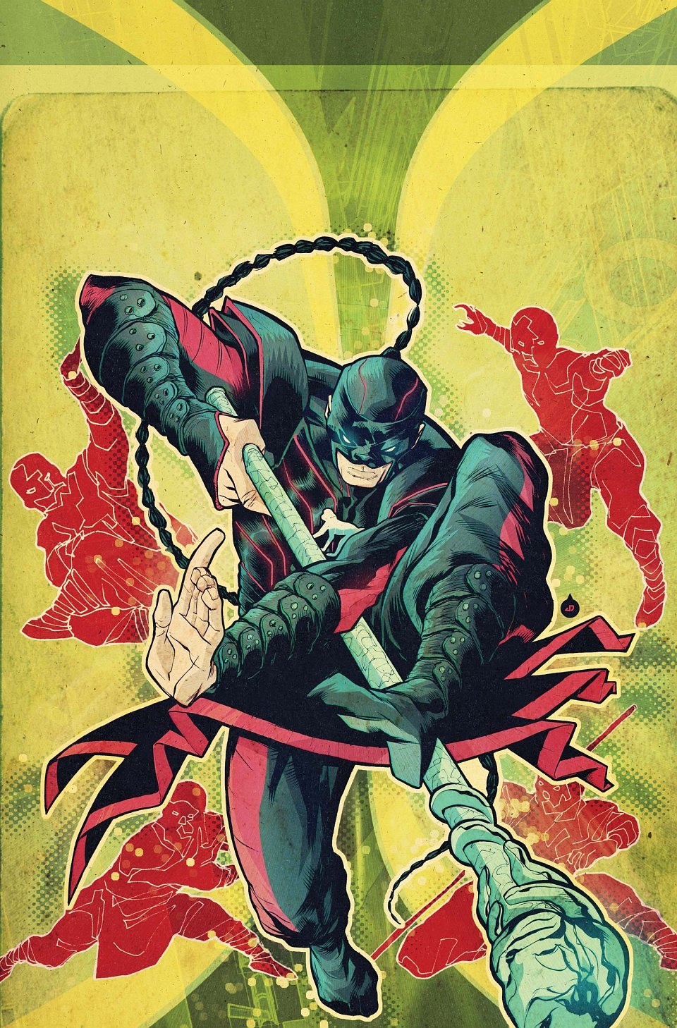
FEAR ITSELF: THE MONKEY KING #1 One Shot
Writer: Joshua Hale FialkovArt: Juan Doe/Will Quintana
Publisher: Marvel Comics
Reviewer: MajinFu
How many readers out there are familiar with THE JOURNEY TO THE WEST? One of China’s “four great classical texts,” it details the story of a monk who makes a pilgrimage to India, escorted by a monkey king named Son Wukong. Akira Toriyama’s “Dragonball” was loosely based on the epic folk tale, and countless others have adapted, lampooned or paid homage to the story for centuries. Now Marvel is trying its hand at the character, this time as a former crime lord who steals the monkey king’s staff and escapes thanks to the events of FEAR ITSELF. The issue is a fine introduction to an intriguing new character, even if the execution is a little rushed. As a bonus, while this is a tie-in to FEAR ITSELF, you don’t have to know a thing about what’s happening elsewhere in the Marvel U to actually enjoy this story.
The issue jumps around in time to a ridiculous degree, but the plot is never confusing. The main character is surprisingly upbeat and adventurous, which is appropriate to the original character. Even after being trapped in a cave for fifteen years, he maintains a positive outlook that is both refreshing and serves as his motivation. That doesn’t mean he’s a goody two-shoes, as shown in this issue by his vengeance on the man that trapped him. Thanks to writer Joshua Hale Fialkov, I still can’t quite peg where this character fits on the moral spectrum, and it’s getting me excited to see where this character goes next.
This is a character that has incredible potential to thrive in the Marvel U, thanks to a diverse power set and prominent martial arts skills. I could easily see him going on a multi-dimensional journey with Doctor Strange, or teaming up with Iron Fist or the Avengers. He’s the kind of powerhouse that could take on a whole team (or someone like Thor) all by himself, and I’m eager to see where he pops up again. Juan Doe and Will Quintana work well together as an art team, although I’m honestly not much a fan of the character’s design. He looks like a mix of Ronin and Daken, but with a braid, and did nobody think the monkey symbol on the chest was a bit too obvious? A costume that’s a bit more original (and Chinese!) could help this character to stand apart from the aforementioned martial arts heroes already established. Then again I really enjoyed the Monkey King’s personality, and his various transformative powers made for some surprising action scenes. He has a unique approach to just about every situation, and deserves a chance to play with the Marvel U’s finest.
The Monkey King has as much prominence and respect in his respective folklore as Thor or Hercules, and it’s thrilling to see he’s finally breaking into the Marvel Universe. This introductory issue does a great job of capturing the character’s essence and showing a concise plot that keeps things simple and light. While the time-traveling storytelling devices didn’t do much for me, there was enough in this issue to get me interested in seeing who the Monkey King gets mixed up with next (I imagine he’d mop the floor with Wolverine). Now if only they could make up a design that is more awesome and less cookie-cutter. Oh, and giving him a tie-in with the Immortal Weapons would rock! But I’m not here to let you know what I wish this comic was, but what it really is, and I can honestly say I liked it but it’s not exactly required reading. If anything, this has me salivating for the future possibilities for the Monkey King, which is a really good thing.
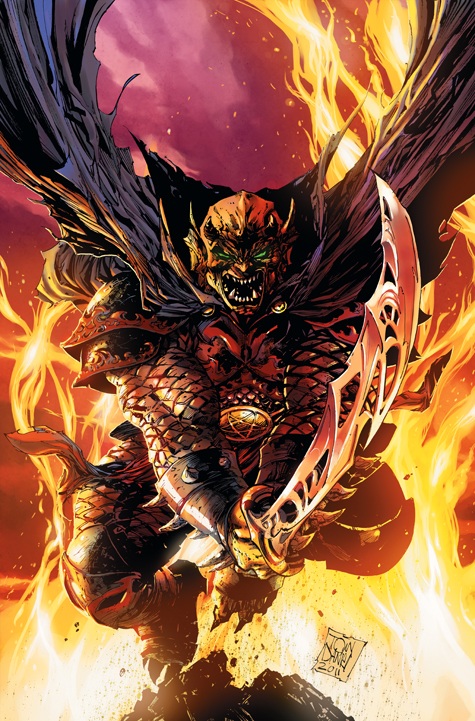
DEMON KNIGHTS #1
Writer: Paul CornellArt: Diogenes Neves
Publisher: DC Comics
Reviewer: KletusCasady
I, Kletus J. Casady would like to make a confession.
Forgive me Father, for I hath sinned.
I am in charge of the ordering the comic books at my local shop…and…I ordered waaay less of the New DC 52 than I actually needed. I should have known that all the folks that were in the store threatening to drop all DC’s books and petitioning to have Dan Didio burned at the stake were bullshitting, but I believed them and now those same folks are complaining to me about us selling out every week and how they can’t get a certain issue. As a business, selling out of a product is a good thing, nobody wants overstock everywhere, BUT selling more comics is also a good thing and I want to be able to provide for my nerdy brethren, y’know? Ah well, nothing I can about it now…thank you for listening, father.
Okay…now that that is out of the way, DEMON KNIGHTS is one of the new 52 that I was really looking forward to. If you haven’t read Paul Cornell’s MARVEL series CAPTAIN BRITAIN AND MI13 then you are missing out (his ACTION COMICS was also great). That series was a lot of fun and dealt with a lot of British mythology (a good amount of which I was unfamiliar with) but some of the best part of the series was the team’s interactions and the art by Leonard Kirk. It was obvious that Cornell had a firm grasp of British mythology and was able to relate it to the reader with out losing the fun. That’s probably the best way to describe this issue…fantastic art and a lot of fun.
This issue, like all the new 52, was a set up issue thats purpose really was just to get the players in the right place and bring the reader in to a particular world. Between the art and the dialog this team does a great job of submerging the reader in this time period without spoonfeeding or giving us too much information at once. The story mostly focuses on Etrigan but also gives a few glimpses of the villains in this book as well as a few of the other good guys that will be along for this magical quest (including a more ‘Savage’ foe that might actually be a good guy in this comic). There’s not a crazy amount that happens here and I’m not sure this issue alone will convince people that have no interest in things such as the dark ages, sorcery, demons, dragons, exploding babies, mythical weapons and the like to continue reading this series (I call those people boring) but in my opinion this was a great issue.
For the folks that are in to that sort of thing this issue does a great job of whetting the reader’s appetite and I believe those that are into this kind of setting are going to be in for a treat. The dialog in this comic is really great and at times hilarious. When Sir Justin The Shining Knight first introduces himself our ‘Savage’ friend whispers “My cods say that’s no man.” CBAMI13 was full of great (witty) dialog and I expect no less from a series such as this with a wide array of characters and personalities. This issue also has one of the more interesting love triangles I’ve seen in a while, probably since the pre-marriage days of Superman that involves Jason Blood, Madame Xanadu and…well, that would be telling and I don’t want to do that. I think if you are familiar with the past writings of Paul Cornell (CAPTAIN BRITAIN & MI13, LEX LUTHOR’S ACTION COMICS) or the artwork of Diogenes Neves (last GREEN ARROW series) then you know the potential this comic book has and that’s what has me looking forward to future issues of this comic. The knowledge of what these two have done and are capable of should do more for convincing you to read this issue than anything I can say here.
The artwork in this comic is pretty damn good. I’d say Diogenes Neves is the Oliver Coipel of DC; there’s not really anyone at DC who draws like him. His artwork is probably best described as a mix of Clay Mann (X-MEN LEGACY) & Oliver Coipel (MIGHTY THOR). Nieves’ artwork actually looks a lot better than the stuff he did on GREEN ARROW, and I loved the art in that series but in my opinion this issue is leaps and bounds beyond that. This may be due to the fact that Oclair Albert, known for his work with Ivan Reis on GREEN LANTERN, is doing the inking duties here. If so, may they remained joined at the hip for all eternity. In my opinion, this issue is in the top three as far as art goes for the new 52.
I’m really excited about this book because I think once we get into the thick of things we’re going to see some great team interaction as well as some cool magic, awesome weapons, badass monsters, some really great art and maybe more exploding babies (one can only hope). There’s just such a wide open canvas for this series, and I for one am excited to see the roads this comic book will travel. If anybody is thinking about gambling and picking up one of the new 52 that they know little about, do yourself a favor and pick this one up because once this comic book gets rolling, it’s going to be a hell of a ride…heh…see what I did there…cause like Etrigan is, like, a demon…and demons usually originate from…oh shut up, you love it!
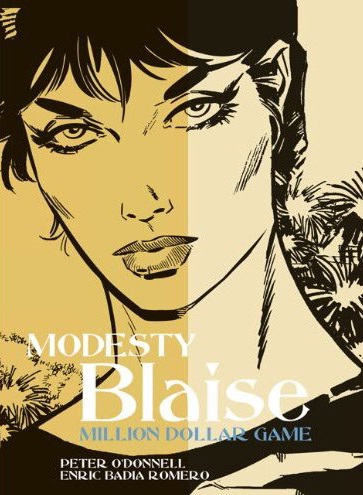
MODESTY BLAISE: THE MILLION DOLLAR GAME
Writer: Peter O’DonnellArt: Enric Badia Romero
Publisher: Titan Books
Reviewer: superhero
Leave it to Modesty Blaise to challenge my preconceptions once again.
When I reviewed the previous volume of these MODESTY BLAISE comic strip collections, I talked about how I’d never really gotten into daily newspaper adventure strips. That review, which you can find by clicking here, ended up with me eating a bit of crow on the subject of daily strips. Before sitting down and reading MODESTY BLAISE: THE DOUBLE AGENT I’d thought of comic strips as boring and dry. Newspaper strips were the stunted cousin of comic books, as far as I was concerned. THE DOUBLE AGENT certainly changed my notions of what I thought newspaper strips were. That collection singlehandedly altered the way I look at collections like these Modesty Blaise books and has made me more open when it comes to collections of daily adventure comics.
But when I opened up this collection I was surprised to see that the art of this series of strips was completely different than the previous one. I guess I wasn’t paying enough attention to the cover credits when I got the book. The new artists (or new to me, being that Enric Romero apparently drew the bulk of many of the Modesty Blaise comic strips) style was completely different from the artist who worked on the comics from THE DOUBLE AGENT. While Neville Colvin’s art was breezy and energetic, Romero’s art at first glance seemed a bit stiff and posed. I had been looking forward to seeing more of Colvin’s art so I was a bit disappointed when I saw a Modesty Blaise adventure drawn by a completely different illustrator.
It looks like I shouldn’t have worried so much, though. Much like when I first read THE DOUBLE AGENT, THE MILLION DOLLAR GAME’s art grew on me as I began to read the book. By the end of the first story I found that I ended up really liking Romero’s take on Modesty Blaise. It’s true that his style is a bit more rigid than Colvin’s, but it’s also true that Romero’s art is pretty impactful in its own way. Romero’s just as skillful as Colvin when it comes to storytelling and getting his point across on the page. If anything I’d say that Romero’s Modesty exists in a slightly sultrier world than Colvin’s. If I had to compare both of their takes on the character I’d say that Neville’s Modesty Blaise would be more an Audrey Hepburn type while Romero’s would be Raquel Welch.
The stories in THE MILLION DOLLAR GAME are entertaining but two out of the three (“Butch Cassidy Rides Again” and “The Vampires of Malvescu”) of them have an almost Scooby Doo quality to them. We have Modesty and her pal Willie stumbling across situations that involved either bandits disguised as old west outlaws or playing at their own version of a Hammer horror movie. The opening set up for those two stories are a bit goofy, but once things get moving it’s all super spy Modesty Blaise once again. Despite the slightly silly quality of Cassidy and Malvescu’s beginnings the stories in THE MILLION DOLLAR GAME end up being a really fun read. It’s another really terrific collection of comics that combines action, sensuality, and intrigue into one great package.
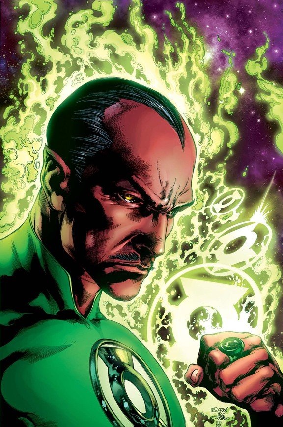
GREEN LANTERN #1
Writer: Geoff JohnsArt: Doug Mahnke (pencils) & Christian Alamy (inks)
Publisher: DC Comics
Reviewer: Professor Challenger
“This ring chose you to once again become a member of the Green Lantern Corps. After your betrayal, most would call that act heresy. But we do not. We see this for what it truly is. A chance at redemption.” – Guardian to Sinestro
I really wanted to like this one. For years, Geoff Johns was the guy I could depend on to resonate with me as a reader. He really “got” Hal and Green Lantern as far as I was concerned. I was not only on board with his introduction of the other colored lanterns, I thought (and still do) it was simplistically brilliant and opened up avenues for stories in the longterm. However...somewhere between the “Blackest Night” event and now, he lost me. By the time of the “War of the Lanterns” storyline, I realized I had no idea what was even going on anymore with the Lanterns, or Hal, and worst of all...I didn't care anymore.
And I stopped buying GREEN LANTERN.
Yes...I stopped buying GREEN LANTERN.
I've been pretty vocal in my cynical distaste over the reboot-that's-not-really-a-reboot of the DC line, but I've really tried to keep my criticism focused on the editorial and corporate side and give the creative talent their due. I never want to just crap wholesale on talent who are working, earning a living, and giving their best to try and produce quality stories within the confines of the editorial constraints. Lots of people are really enjoying the new DC books overall. At this point I've only read two of them: JUSTICE LEAGUE and GREEN LANTERN, both of them written by Geoff Johns.
GREEN LANTERN is a better single issue comic book than Johns' JUSTICE LEAGUE. I can at least say that much. It doesn't feel like the first issue of a comic; it just feels like the first part of a story in an already ongoing series. So, I would expect that any newbies who come along will feel mildly out of the loop, but I expect that most longtime comics readers understand how the game is played and will feel like they get all they need to know to follow the story.
Sinestro has become the most interesting character in the entire library of GREEN LANTERN characters, including Hal Jordan himself, so the idea of having Sinestro forced against his will to become the Green Lantern for our Space Sector again and stripping Hal of the ring is actually a welcome change. Most especially welcome given the fact that some sort of brain aneurysm has apparently occurred in Hal somewhere between GL: REBIRTH, the previous GL #1 and this GL #1 (and we might as well throw JL #1 in there too) and given him brain damage. The Hal in this comic book is a total idiot. No. I take that back. What is stupider than an idiot, but not quite to the level of actually being mentally challenged? Sub-moronic perhaps? I won't even go into it in this review, but the “action” sequence that Johns puts Hal through is just unbearably stupid. I think it's intended to be funny, but it's really just stupid and paints our “hero” in an especially...stupid (God, I wish I could come up with a better word) light. Then the exchange between Hal and Carol, where he is so incredibly dense and uncouth that even an uncouth lout would be embarrassed? I really cannot believe what I'm reading. But, thankfully, we don't get a full-on trademarked Johns “decapitation”...but we do get a NEAR decapitation of a Sinestro Corps member by Sinestro himself. I guess that satisfies our decapitation quota for this GL comic.
The art is competent, but not dynamic. There's a stiffness to Mahnke's work on GL that has just never rung my bell like, say, the exciting work of Ivan Reis or Carlos Pacheco. Because of that, the art unfortunately doesn't step in and win me over when the writing is lacking. I'm starting to think that top-tier artistic storytellers collaborate with Johns to create great works, but when Johns is paired with a merely good, but lackluster, artist that the flaws in his writing start to weigh it down.
On its own, this is not a bad comic. When Sinestro is on the scene, I'd give it a B+. Every time Hal shows up, however, it stinks down into the C- and D range. If you are a Sinestro fan and you hate Hal Jordan, this is the book for you. I hope they keep Sinestro as Green Lantern and forget about Hal at this rate.
 Advance Review: In stores next week!
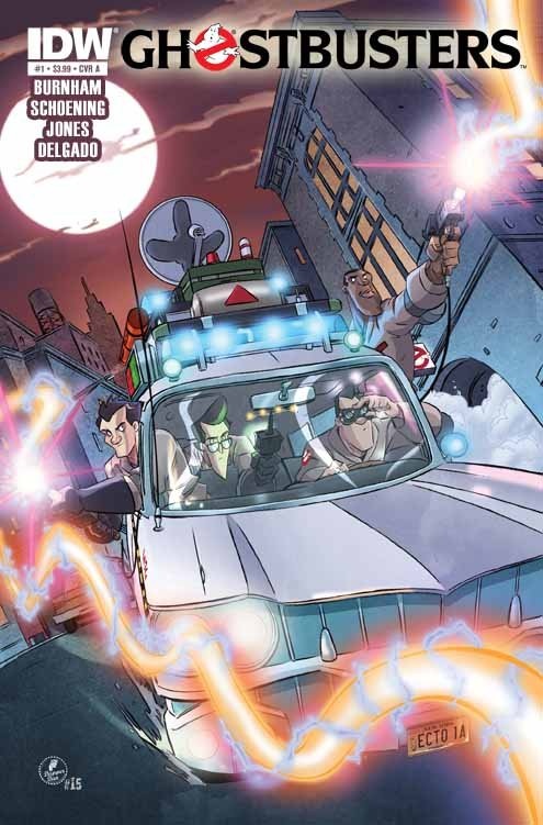
GHOSTBUSTERS #1
Writer: Erik BurnhamArt: Dan Shoening
Back-up story/art: Tristan Jones
Publisher: IDW Publishing
Reviewer: Ambush Bug
< br>I’ve been a fan of the films, of course. And I never seemed to miss an episode of THE REAL GHOSTBUSTERS even though I wasn’t sure why the cartoon was “The Real” ones and not the movie version. But I never really followed this new version of the Ghostbusters in comics until I picked up this first issue of the new ongoing from IDW.
To start off, the tone seems to be that of the cartoon with the cartoonish art by Dan Shoening. This isn’t a bad thing. It is a comedic comic book and the artistic tone worked in the past for what I remember of the cartoon series, but I found it curious that this was the route this new comic was taking.
Though the artistic tone may be set for the cartoon, the writing within is somewhat more sophisticated. Recreating some of the mature humor that permeated the first film and peppered its way through the second, the script by Erik Burnham surprised me. It is pretty darn funny and Burnham has definitely done his homework to get the personalities and the “voices” right. One can almost hear Akroyd’s sincere dim-bulbedness when Ray Stanz is talking and the sharp wit of Murray’s Peter Venkman. Hell, he even gets the voice of Janine right.
The story starts out with Ray having an ominous dream. After a nice montage of imagery from the first GB movie, there’s a peculiar appearance by John Belushi in Blues Brothers garb. It’s well known that Belushi was set to play Peter Venkman before he passed away, but given the cartoonish tone of the book, I found it more than a little odd that the dead actor shows up in the story. Pages later a kid shows up at the Ghostbusters HQ which, given the tone of the book, seems like we’re going to get your typical kid with a ghost problem story you’d see in the cartoon. Then we get Peter and Winston driving around having a conversation about ladies, which again seems tonally wrong given the art.
The book ends with an appearance by a familiar ghost, which despite the overuse of this ghost, it’s still fun to see. The curious thing is that after the ending, there’s a 3 page Ghostbusters Files segment by Tristan Jones done in a much more moody and realistic style, more akin to an X-FILES book. This tiny snippet of comic made me wonder what a darker, more adult version of the Ghostbusters would read like.
There’s nothing particularly wrong with IDW’s new GHOSTBUSTERS #1, but the tone of the book wavers between PG and PG-13. A slight difference in rating, but one that is nevertheless distinct from one another. I particularly liked it when the tone of the book was less akin to the cartoon and more to the mature-ish tone of the movie. Here’s hoping that the Ghostbusters not only find a ton of ghosts, but a fitting tone for the series. As is, I’m not sure whether it’s a dumbed down version of the movie or a slightly too mature for kids version of the cartoon.
 Ambush Bug is Mark L. Miller, original @$$Hole / wordslinger / reviewer / co-editor of AICN Comics for over nine years. Mark is also a regular writer for FAMOUS MONSTERS OF FILMLAND and will be releasing FAMOUS MONSTERS’ first ever comic book miniseries LUNA in October (co-written by Martin Fisher with art by Tim Rees) Order Code: AUG111067! Support a Bug by checking out his comics (click on the covers to purchase)!


Check out NANNY & HANK’s Facebook Page
Check out THE DEATHSPORT GAMES’ Facebook Page
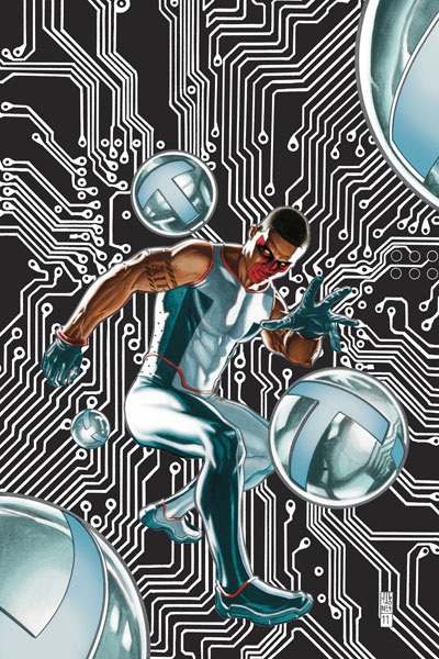
MISTER TERRIFIC #1
Writer: Eric WallaceArtist: Gianluca Gugliotta
Publisher: DC Comics
Reviewer: Optimous Douche
MR. TERRIFIC fits into DC’s marketing mantra with this reboot like a T-Shape into a T-Hole. TERRIFIC will be enticing to new readers and explain with sparkling clarity why old fans should give the T-man a chance in this solo title.
I read an ass load of comics, and my preference towards the DC universe is no secret, but my dalliances with the third smartest man on earth have been limited to his time on the Justice Society, so to say I was apprehensive about this new title would be an understatement. Plus, I was one of the proponents of using this reboot to consolidate some of the less than stellar solitary titles that had blossomed over the years in the old DCU. Could MR. TERRIFIC support his own title? What would set apart this heady hero from the rest of the spandexed cavalcade flooding the shelves of our local comic outlets? Well, I can encapsulate that in one word: science. And to speak more specifically, I will say that this is the only title to date that is true sci-fi.
Before you berate this assessment in the TalkBacks, allow me to draw an analogy. Yes, GREEN LANTERN is sci-fi in the broadest sense of the term, but I equate it to “Star Wars.” Sure, “science” is powering what’s going on, but our plebian minds wouldn’t grasp the “science” even if it was explained to us. Now, take “Star Trek.” Sure there are ample amounts of hyper-space bullshit crammed into the proceedings, but at least real science fact is used as the foundation. And that’s MISTER TERRIFIC. Wallace takes the best of what we know today and slides into an exciting skin of where that technology could take us with a little imagination, the hero’s spirit and unlimited coffers.
There’s more heart in MISTER TERRIFIC than I ever would have expected. The tragic loss of his wife and child provides a perfect explanation as to why a corporate CEO would start trying to right the world’s wrongs both in the lab on the street. Again, I give Wallace high marks for the balance he struck in this book of providing the gooey-nuggety center of exposition inside a hardened action-packed shell. I’ve seen all of the jokes calling MISTER TERRIFIC trite contractions like “Blackman” or the “Darker Knight,” but offensive undertones aside, these morons obviously haven’t read one page of this book. Yes, TERRIFIC is a CEO. Yes, he fights crime. Yes, he was even driven to crime fighting by the loss of family. But right there is where all similarities stop. He is as far from Bruce Wayne as one could be. TERRIFIC wants normalcy in his life. TERRIFIC is more drawn to the lab than the dark alleyways. I honestly think if Ennis were ever allowed to write Batman, he would spill copious amounts of jizz from the crusader’s codpiece the darker and dirtier the alleyways became.
MISTER TERRIFIC was also a perfect blend of action interspersed within the exposition, making it extremely noob-friendly and exciting. Some of the new DCU books either take too much or too little for granted, weighing the story heavily in one direction or the other and ultimately leaving audiences thirsting for either more action or more explanation.
One other thing that should be noted is Wallace’s tremendous courage in neither shying away from the race card nor belaboring the point too much. Actually, there was such humor in the interchanges surrounding race, it reminded me of conversations I’ve had with my friends. We don’t ignore that we’re different; instead we embrace the differences and laugh when we all fall into our collective stereotypes.
Again, this is a set-up issue, but I know all I need to know to say I’m in for issue 2. MISTER TERRIFIC is a totally different experience than what you will get from the other DC offerings. Be warned though, the science talk is heavy and TERRIFIC is definitely an elder statesman now of the new DCU. This is a book that speaks to those of us that have lived a little and enjoy our sci-fi with as much realism behind it as possible. I wish there was one word that could encapsulate the crispness of dialogue, story and imagery that was MISTER TERRIFIC. I guess I’ll just say it was stupendous and leave it there. Oh…wait…
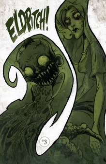
ELDRITCH! #3
Writer: Aaron AlexovichArtist: Drew Rausch
Publisher: ComiXology
Reviewer: Lyzard
Slowly but surely we are beginning to get answers in ELDRITCH! #3. This issue begins to explore the possible theories for Owen’s odd(er) behavior. ELDRTICH! #3 starts off strong, hits a slow patch, but recovers. As always the artwork is strong, but the writing becomes exceedingly lengthy. This is a problem I found within the first issue that I thought had been solved when reading the second book.
In ELDRITCH! #3, Anya receives some answers from Jess Newbarn, whose baby had attacked our Hot Topic heroine in the previous issue. While Jess remains mum on the contents of her house’s basement and her father’s bizarre properties, Anya learns enough to come up with three hypothesis of her own concerning her brother’s disturbing condition. Can this wanna-be scientist prove that her brother is a victim of the explainable or will the only possibility be the uncanny?
Aaron Alexovich’s writing starts off strong. He had me laughing from page two. If only he could have kept up the jokes through the rest of the book. Don’t get me wrong. Never does his skill with words become bad or even mediocre; Alexovich just doesn’t subscribe to the theory that less is more. When Anya is exploring all the possible explanations for her brother’s bizarre actions, page upon page is filled with text. First time reading, I merely scanned. Of course, since I am reviewing the comic I went back and read it all, but for other readers that don’t need to analyze the work, I wonder if skimming all of this text would come back to bite them later on. I’m not a fan of hidden hints buried deep within long, explanatory paragraphs. I feel that if the writer finds this necessary to do, then other clues need to be dropped throughout enough times so that if you don’t catch one you can catch another.
Despite Alexovich’s almost monologue-like dialogue, Drew Rausch’s artwork manages to help readers who wish to merely catch the drift of each panel. One of my favorite aspects of Rausch’s drawings is character reactions. Each panel brings a new look to each of the characters. The reader can learn just as much from their facial expressions as from the spoken dialogue. Rausch’s attention to detail, whether it is in his facial work or in the environment that these characters inhabit, make it clear why the book is published in black and white. I truly believe that color actually would detract from Rausch’s clever drawings, undermining the intricacies of each panel.
Through the combined efforts of Rausch and Alexovich, I can say that Anya is truly one of my favorite comic book characters. She has attitude, spunk, and says what the reader has on their mind. Also, unlike so many women in comics, she is not exploited for her looks, yet her appearance is not created for jokes either. Anya takes no prisoners, which is probably why if she were real she would hunt me down for that earlier Hot Topic comment.
ELDRITCH! #4 is going to feature a major climax, or at least that is what is hinted at. But I actually would be okay with more delays. I do look forward to reading each issue of ELDRITCH! and would be overjoyed to see it continue on even after this current story has run its course.
Lyzard is actually Lyz Reblin, a senior screenwriting major with an English minor at Chapman University. Along with writing for AICN, she has been published twice on the subject of vampire films.
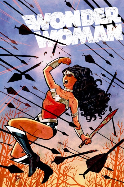
WONDER WOMAN #1
Writer: Brian AzzarelloArtist: Cliff Chiang
Publisher: DC Comics
Reviewer: Johnny Destructo
Amidst the myriad Wonder Women that have populated the DC Universe since her inception, my fave has to be the Diana from Darwyn Cooke's NEW FRONTIER. She wasn't on the take as far as guff was concerned and her stature promised as much. I have rarely enjoyed Diana as a character in her own book, though. Sadly, other than trying to find different constellations on her bloomers, ole' star-panties never entertained me as a character for more than a couple issues at a time.
My curiosity was piqued when Cliff Chiang told me that there would be a horror twist to this book, as I lerv me some horror. It seemed an interesting choice to make, considering the high-profile nature of the character. I'm actually in the middle of creating a Wonder Woman piece for a 5 year old girl to put on her wall, because she loves WW so much. That makes me feel torn, because like several other titles of the "New 52", this book is NOT for the young'ins. A character gets pretty brutally gut-shot with an arrow. There's a scene that mixes something from “The Godfather” with John Carpenter's “The Thing”. All we're missing here is nudity, or at least a dollop of side-boob.
And listen...err...read, I guess: I like legs as much as the next guy, or any lady-parts for that matter, but I have to say I was a little impressed with the fact that DC was gonna be covering up nU-Diana with some J'eggings (jean-leggings for those less in the know.) Not because I hate looking at her legs, but because I see woman after woman come into my shop and snicker at the panty-shots all over the shelves and I'm not just referring to the self-shot Polaroids I leave lying around. And the bikini bottoms are just impractical for Diana. I mean, come on! How much spray-adhesive does she have to use to keep her labia from attacking innocent bystanders every time she does a roundhouse kick? Other than that, though, I do like the modernized take on her stripper outfit. The bracelets finally look like more than just aluminum foil around her wrists and her corset looks pretty bad-ass.
I was also very curious with regards to the writer! Brian Azzarello? Sure, he can be great. But his BATMAN: BROKEN CITY, in which Bats actually does 100 BULLETS-esque word-play and...flirts with a female suspect? His SUPERMAN: FOR TOMORROW run with Jim Lee? NOT his best work, I'll be honest. Thank Hera this work is way beyond that stuff and doesn't get bogged down with overly clever word-mazes. There's actually a lovely balance between being just wordy enough and going mute to let the art do the heavy lifting.
And let me tell you, Cliff Chiang's art does said heavy lifting with nary a grunt. He handles suspense, gore, and action all with aplomb. His line-work is loose enough to avoid being static, and yet maintains a confident line.
If you're curious as to the plot: it revolves mostly around a power play between some mythical beings for possession of a young woman named Zola. Magical teleportation key this, Wonder Woman that, horse-people and three bimbo oracles. That's all you'll get, but believe me, it's good. Even if you haven't been a WW fan in the past, pants or not, this one is a bad mamma-jamma.
Proofs, co-edits & common sense provided by Sleazy G
And check out AICN COMICS’ New Facebook Page!!!