
| Issue # 19 | Release Date: 8/31/11 | Vol.#10 |
(Click title to go directly to the review)
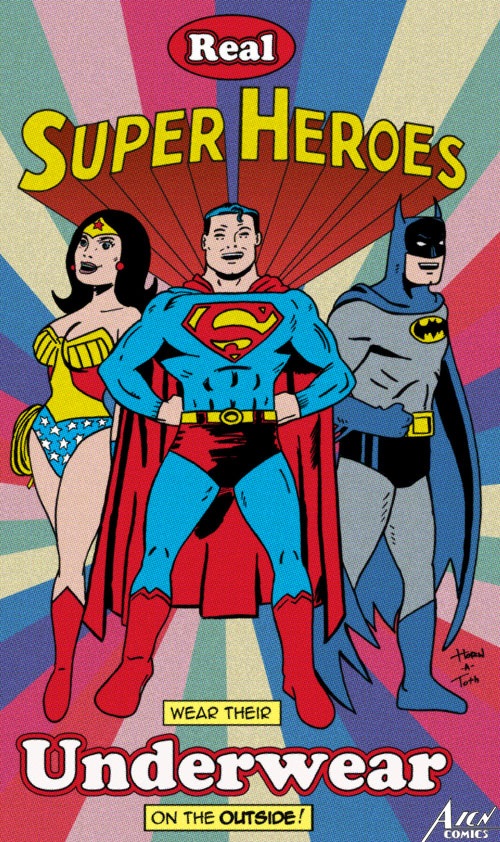
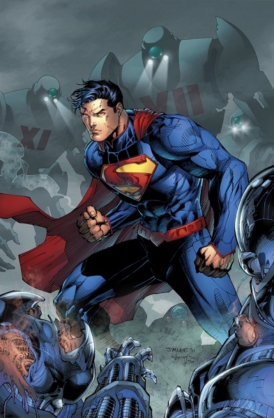
Advance Review: ACTION COMICS #1
Advance Review: THE BIG LIE #1
SECRET AVENGERS #16
FLASHPOINT #5
FREAKSHOW V1 TPB
ANGEL & FAITH #1
SETTING THE STANDARD: COMICS BY ALEX TOTH 1952-1954
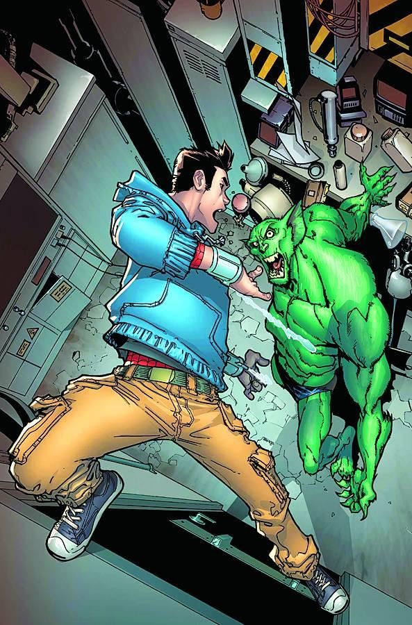
AMAZING SPIDER-MAN #668
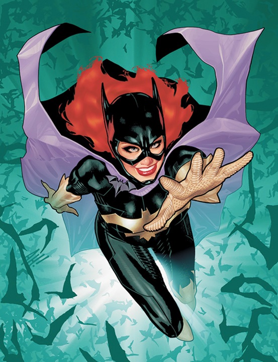
Advance Review: BATGIRL #1
ROAD-SIGN HANK AND THE ALIENS #1
INVINCIBLE #82
EARTHBOUND COMICS PRESENTS #1
CHEAP SHOTS!
 Advance Review: In stores today!
ACTION COMICS #1
Writer: Grant MorrisonArtist: Rags Morales (pencils), Rick Bryant (inks)
Publisher: DC Comics
Reviewer: Johnny Destructo
THIS should have been the book to kick off the DCnU. No offense, Geoff Johns or Jim Lee, but holy shit. Whereas I would give Justice League #1 a 3.5 rating, Action Comics is a 5 star book, easily! You know what? 6 out of 5 stars. That's how good this is. Superman lovers beware, this isn't the Supes you're used to. This Last Son of Krypton has no qualms about almost scaring an old man into a heart attack, or tossing abusive boyfriends through windows, or breaking hips and ribs in order to make a point. This character almost feels like a Reese's candy. You got your Batman in my Superman! (no Ambiguously Gay Duo undertones implied). This Superman does feel like he's got some of the Caped Crusader's characteristics, as far as his bad-assitude is concerned, so if you've been a fan of breast feeding, boy-scout Supes, you're in for something a little bit different. He's rougher around the edges and far weaker in terms of power, which already makes him more interesting for me to read. Something that would have taken Superman from DCoU 30 seconds to handle with his pinky actually does serious damage to nSupes.
This is what SUPERMAN EARTH ONE should have been, in my opinion. I wasn't a huge fan of Emo-Supes, and while there were some nice changes to the lore, I just wasn't all that excited about it. With ACTION #1, I found myself turning the pages faster as the story went on, to match my excitement. This book moves at a break-neck pace and it just doesn't let up. It's an interesting counter-balance to last week's JUSTICE LEAGUE, which was a slow burn, and this was a welcome change of pace.
All of our most familiar faces make an appearance, you'll be happy to know. Lois, Jimmy, Lex, Sam Lane. Also a new face: Clark's landlord, Mrs. N, who reminds me of Marsha the landlord from one of the best UK sitcoms ever: “Spaced”. I could almost here her saying " 'Ellooooo Briawwwnn".
The only negative thing I can think of to relay is that if this is supposed to be a NEW take on the Man of Steel, it's not so much that. Even though it takes place only 5 years ago, it definitely has a classic vibe to it. Despite the fact that there is current technology and contemporary fashion styles, Metropolis doesn't feel particularly like a City of Tomorrow so much as a City of Yesterday. Is that just what naturally oozes out of Rags Morales’ pencil? Or was it a very specific choice made by the team? Instead of feeling NEW, this has more of a Return To Basics vibe, but either way, it works. There's also a line so cheesy, I can't tell if it goes beyond cheese into awesome or if it is just plain awful. "You got sumthin' to say...SAY IT TO THE GUNS!"
Also, the Jim Lee cover. I feel like I should say something about this. I loveLOVElove the Rags Morales cover, but picked up the Jim Lee cover to review, and found that the Lee cover actually did the book a slight disservice for me. The Superman as Jim Lee drew him is NOT the Superman inside the book. In attitude and posture, yes, but he's dressed in his "Kryptonian armor" with the V-neckline, pointed cuffs and is covered in shiny reflections. Besides that, he's also in the middle of fighting super-futuristic looking robots which don't fit the more classic feeling smothered all over the interior pages. Atmospherically, it just doesn't match. They should have saved this cover for when the continuity leaps ahead 5 years.
Even if you were less than impressed by last week's offerings, I can almost promise you'll dig this book. This book made Superman exciting again, and thank Rao for that.
JD can be found hosting the PopTards Podcast, drawing a weekly webcomic, discussing movies, comics and other flimflam over at www.poptardsgo.com, graphically designing/illustrating for a living, and Booking his Face off over here. Follow his twitter @poptardsgo. His talkback name is PopTard_JD.
 Advance Review: In stores today!
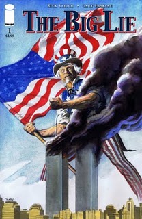
THE BIG LIE #1
Writer: Rick VeitchArtist: Gary Erskine
Publisher: Image Comics
Reviewer: Optimous Douche
The truth is out there, and it is my personal belief that the truth lies in the middle ground between conspiracy theory and the PR spin. For example, the age old question of "Did Oswald act alone?" My feeling is he probably did. But there's also that part of me that believes there’s a paper trail leading up to an executive order from Johnson. My religion lies in the middle ground of fact between Oliver Stone and Warren Commission. Yes, the conspiracy theory is sexier, but many conspiracy theories are as just as easily debunked as the facts they are trying to obscure. This is the same for 9/11. I should have known what to expect from THE BIG LIE's title alone, but the schmaltzy romantic in me was blinded by the time traveling scientist, Sandra, trying to save her husband, Carl, from his fiery fate. And for a few pages this comic was the epitome of sci-fi suspense set around that hallowed day of 9-11-01. This was before it turned into "Loose Change" the comic.
For those that have yet to see “Loose Change”, I highly recommend stepping away from this review for an hour and watching it on YouTube. This movie enlightened me to the connections between the Bushes and the Bin Ladens. It also helped open my eyes to the Cheney/Black Water connection. But then there are parts of “Loose Change”, like missiles flying out from the planes or the fact that explosive charges were set at pivotal structural weak points within the Towers and building 7. Basically, “Loose Change” and THE BIG LIE postulate that not only did the government know about 9/11, they orchestrated it with the flair and fancy of a Tom Clancy assault squad.
But, I’m getting ahead of myself. The book starts with a scientist working at CERN, getting smashed with atoms to travel back to 5 days before 9/11. Good science fiction fun here. As a disciple of Asimov and Bradbury, I have followed the doings at CERN since its creation. I wish they were this far along in the discovery of the universe’s substructure. In a wonderful plot device for urgency, our scientist’s calculations were wrong and she ends up just a few hours before the first planes hit.
Working high above the Tower 2 strike zone, Carl is quite frankly one of the biggest douche cocks I’ve ever read. I know Veitch was going for realism with Carl and his board room buddies that run a risk management firm for Hollywood and other big dollar clients, but he probably made these guys a little too real. Their corporate assholeness was making it really hard to feel bad about their impending doom.
This problem became worse once Sandra finally breaks into the office. Carl doesn’t recognize her. I understand a decade wears on a person, but I can go back to every friend I had in college on FaceBook, look at their pictures and say “Oh yeah, there’s so and so under either a few extra layers of middle-age cellulite or starter wrinkles” and I wasn’t married to one of them. I don’t care if it was ten years or twenty, I would still recognize my wife.
After Carl starts to waver a bit in his disbelief, Sandra whips out an iPad to show his buddies the news footage from 9/11. This was a great moment; the reactions to the iPad were spot on in context of the period. Just far back enough for touch technology to strike a sense of awe, but not so far back that they would hiss at it and throw hexes at it like a demon book. Also, the nod by one of Carl’s associates to Apple’s less than stellar state of financial affairs at the time was character and period perfect.
Here’s where the book started to make me angry, despite Veitch’s clever use of the next few pages to drive the plot forward. After looking at the footage, after looking into his slightly aged wife’s eyes, Carl is swayed by “The Firm” that this is all a hoax being perpetrated by their new client, a Hollywood mogul named Steve, to see if they can be fooled. Sorry, I’m just not buying it. Again, though, it was effective in moving the plot forward. Each specialist uses their forensic knowledge on things from structural engineering to national security procedures to poke holes in why the official story of 9/11’s events were bullshit.
Hear that change a jingle jangle….
See, I buy the Bush connection to Bin Laden; there’s documented stuff there. I buy as the book postulates that our government was working under an imperialistic mandate during the Bush years that stipulated the only way for our continued prosperity as nation is to place bastions of democracy (or consumerism depending on your level of cynicism) into resource-rich countries around the globe. Again, this shit is clearly documented; I’m on this train. The chatter going on that day between terrorist cells, yup, if it’s on record I’m playing it. But then there are the more fanciful feats of imagination. Like the thing with the government setting off explosives in the WTC buildings. Frankly, I don’t give our government that much credit. The amount of people to pull off such a feat would be huge; trying to silence them, virtually impossible. I look at how long it took us to plug a hole in the ocean and I can’t believe we had a project plan so well orchestrated that we could bribe or silence in some other way the number of workers it would take to place the sheer amount of fire power it would take to level the buildings.
So when on the last page after the planes hit when I saw a cross section between the floors with chunky amounts of plastic explosive tied to each girder, I have to admit I checked out.
I believe there were factions within our government that knew an attack was imminent. I also believe that there was financial gain to be made by people in decision making positions. But I can’t believe even beyond the magnitude of logistics that our government would not only ignore the demise of our national spirit, but ensure that it would in fact occur. Some would say the two are the same; that’s your right. I believe watching a bully pick on a kid, though, is far less malicious than joining in on the pummeling.
As a comic THE BIG LIE works on many levels. Erskine paints the world of ten years ago with great precision; from the technology to fashion everything is spot-on. Erskine also has a great grasp of facial expressions, which are needed since this book is talk heavy. And talk heavy is not a criticism here, I like chatty books. He even has a firm grasp of douchey, again needed given the personalities at Carl’s firm.
At the end of the day, any “problems” with THE BIG LIE stem directly from lack of faith or willing suspension of disbelief around this particular event…with the exception of Carl. I see him as a major slip in character development in getting us to empathize with him or his fate. Fine, make every other guy in the firm a cock in a seersucker, but Carl should have been more in tune with Sandra or more lovelorn with her prior to the planes hitting the tower. And Sandra frankly should have picked up a knife and hostage-walked Carl out the door while his cohorts were busy debunking.
Again, I love THE BIG LIE’s premise, but only about 47% of its execution.
Optimous has successfully blackmailed fellow @$$Hole BottleImp into being his artist on Average Joe. Look for Imp's forced labor on Optimous brain child in mid-2011 from COM.X. Friend Optimous on FaceBook to get Average Joe updates and because ceiling cat says it's the right thing to do.
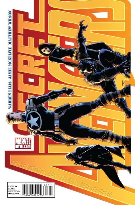
SECRET AVENGERS #16
Writer: Warren EllisArt: Jamie McKelvie
Publisher: Marvel Comics
Reviewer: MajinFu
For this stand-alone issue, writer Warren Ellis has elected to curtail the team to four members, a brilliant notion that really drives home the spirit of the book by removing irrelevant members. It makes perfect sense, since most covert teams work in small numbers anyway, but it also lends some breathing room for the characters to play in. That’s not to say this book is breezy or slow-paced. In fact, it moves at a breakneck speed, thanks to the discovery of a bright red “atomic” Cadillac early in the book. You read that right, and if that doesn’t sound like fun to you consider that the team has gone deep underground to dismantle a “Von Doom Time Platform” which lies somewhere several miles beneath Cincinnati.
The smaller team leaves no room for superfluous dialog or exposition. Black Widow is the car enthusiast and drives the car, Steve Rogers is the strategist that guides the team, Moon Knight is the wild card, and Beast works double duty as the comedic relief and the brains in the back seat, telling you everything you want (or maybe do not want) to know about time machines and their capacity for utter destruction. The execution is refreshingly simple and recalls Ellis’ work on other team books like THUNDERBOLTS and PLANETARY; both come highly recommended if you haven’t read them already.
If you missed his work in PHONOGRAM, pick up this book and take a gander at Jamie McKelvie’s clean, concise art style. With some excellent work by Matthew Wilson, the art team is creating the superhero comic for the next generation without losing any of the pop and vigor the classic illustrators brought to the genre. If you don’t believe me, just check out the two-page spread of Moon Knight aptly destroying a jeep and its three passengers. McKelvie clearly has a grasp of how to draw action scenes while utilizing the environment to improve the drama and composition to improve pacing. Whether it’s Natasha spinning the aforementioned super-Cadillac around a corner or Moon Knight smashing a goon’s face in with his grappling-hook/truncheon, every blow has impact and every essential movement looks incredibly cool.
Missing from the team already established by Ed Brubaker are Valkyrie, Ant-Man, Nova, and War Machine. Whether they’re on hiatus, gone for good, or Ellis has another mission planned for them I don’t know, but I do hope Ant-Man will make a return soon. In my honest opinion, the rest of the team always seemed a bit too bombastic for stealth missions, and would probably fit more comfortably in another book. But if anybody can prove me wrong, it’s the guys responsible for this issue.
I have one criticism, and it’s a purely cosmetic one. When Beast had his second mutation in NEW X-MEN, I distinctly remember his more feline form also impacting his feet and legs, making them more like the hind legs of a jungle cat. Here, the big, human-like feet make their return. Isn’t there some visual editor or something at Marvel who can get all the artists to consistently illustrate Beast? This in no way reduced my enjoyment of this book, but it’s something that has bothered me for years.
I gave this comic to my 19 year-old cousin and my grandmother, who do NOT read comics, and they both thoroughly enjoyed it without knowing anything about the team beforehand. My cousin even commented on how “handsome” she thought Beast was. Bottom line: buy this book and then buy one for a friend. This is how it’s done!
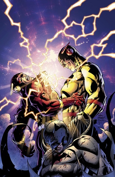
FLASHPOINT #5
Writer: Geoff JohnsArt: Andy Kubert (pencils), Sandra Hope and Jesse Delperdang (inks)
Publisher: DC Comics
Reviewer: Johnny Destructo
Well, it's been no secret that I've not been a fan of most of the FLASHPOINT crossover event. What IS a secret is my penchant for an activity I like to call Peanut Butter Balls. FP and PBB have certain aspects in common. They seem like a good idea in the beginning, but as the process wears on and the realities set in, it becomes clear that a better, less sticky decision could have been made. Next thing you know, you've got Extra Crunchy all tangled up in your short-hairs and the glue-like effect on your boxers isn't all that pleasant. But then you wash it out, and everything is grand again. This issue provided just such a cleansing feeling. I loved that The Flash had a whole universe-spanning crossover all to his onesies, but the problem was that I didn't give a good gawd-damn about ANY other aspect of the crossover besides wondering how it was going to affect the DCU. The only ancillary mini that I could even bring myself to finish was BATMAN: KNIGHT OF VENGEANCE (which, if you haven't read yet, you absolutely SHOULD. NOW.) I didn't care about 99% of the stuff that was taking place in the Flashpoint reality, maybe because I knew that none of it was going to have any real effect on anything, that it would all be erased by the end of issue 5, but I think the truth was just that I was bored.
What I did love, however, was the dynamic that Johns has been delving into with Barry and Eobard Thawne, the Reverse Flash. Just what did RF do, specifically, to create the Flashpoint universe? How would the final battle go down? What would Barry have to do to set it right? I don't want to spoil anything here, but I found myself really enjoying the answers to these questions. I will say that I loved the reveal as to what actually CAUSED this Flashpoint universe to Big Bang its way into existence. It was a nice little twist and actually threw me for a loop. The action was top-notch as well. I always get a bit of a rush when a Flash and a Reverse Flash go toe-to-toe and this wasn't any different.
But again, as with much of the crossover as a whole, anyone who isn't Flash, Reverse Flash or Batman is just cannon fodder that has absolutely no effect on the outcome of this event. Andy Kubert could have just drawn li’l stick figures wearing shirts that read "character" followed by a number and their presence would have meant just as much to me. Actually, now that I think of it, this issue is a perfect reflection of the series as a whole. The beginning: awesome. The end: awesome. But there is an entire chunk in the middle that I could have completely done without and still felt that I got the whole experience. And speaking of the end, I will mildly spoil one thing, just because I don't think it actually spoils anything. In order to fix everything the Flash must...RUN. And it turns out that he could have done this very important running as soon as he had his speed back, but for some reason he waits till the very last second. Weird. But hey, he's the Flash, so of COURSE he has to run. I just wish his running made some more sense. Like I said, the end was pretty great, and the moment spent between Barry and Batman is very cool, and shows Bats in a light that we don't get to see him in very often, which was nice. A friend had mentioned being annoyed that Bats was shown crying, but come on! The man has spent his entire life doing insane things in the memory of his deceased parents. Getting a recently written note from your long dead father would make even Chuck Norris cry. Of course, the tears would then punch holes in reality, but still.Overall, this was a pretty cool wrap-up to a series that...existed. I think this issue is by far the best of the mini-series and is a fantastic lead-in to the new JUSTICE LEAGUE #1 that also hit stands this week. I've found myself slowly getting excited for the new 52 despite myself and this issue left me amped to dive right into it, high-collared costumes and all!
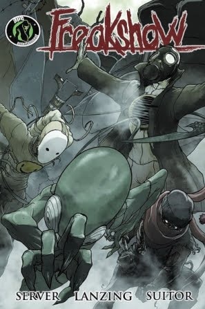
FREAKSHOW Vol.1 TPB
Writers: David Server & Jackson LanzingArtist: Joe Suitor
Published by: Ape Entertainment
Reviewed by: BottleImp
I missed this series when it first hit the comic stands, having been intrigued by a smattering of preview pages but not able to find the comic in any of the nearby comic shops. So when I found out that FREAKSHOW was going to be collected in trade paperback form, I jumped at the chance to find out more about what was going on with those fabulous freaks I had glimpsed earlier.
The setup is fairly straightforward and laid out within the first few pages: the world’s first costumed superhero, Vanguard, is killed almost immediately after his debut by a terrorist explosion. This explosion releases a chemical cloud that spreads across the city, the so-called “smoke” killing nearly everyone who comes in contact with it. However, there are those still living within the contaminated city whom the smoke has instead mutated, giving them extraordinary abilities and grotesque appearances. As the armed, uninfected soldiers seek to penetrate the smoke-enclosed city, the Freaks within fight to protect themselves by any means necessary. As the story progresses, the reader learns more about the genesis of the toxic holocaust, and the already wavering line between good and evil, between hero and villain, becomes even more blurred.
Server and Lanzing have crafted a masterful mystery with their series. The reader is immediately thrust right in the middle of the story, making it an exciting introduction to the Freaks. There’s Rot, zombie-like in appearance, with the ability to, well, rot anything he touches; Fog, the sentient vapor cloud who can take human form only by inhabiting empty clothing; Psychosis, who can make you see whatever nightmare he wishes you to see; Critter, the youngest of the group, possesses lizard-like skin and a barbed, prehensile tail; and Stronghold, the leader, super strong, super massive and nigh indestructible. The Freaks (and indeed, the entirety of the series itself) are an intriguing blend of classic comic book genres. There’s the obvious superhero influence (especially that of X-MEN) in the protagonists’ abilities (as much a curse as they are assets…again, shades of X-MEN) and their code names. There’s the science fiction element in the scenario of the chemical weapons and the quarantined city, though this also crosses over into the horror genre, bringing to mind such killer virus films as “28 Days Later” and “I Am Legend.” The horror elements are pushed further to the fore in the characters of Psychosis and Rot, both of whom look like they could have stepped out of any number of midnight movies. These disparate elements could have easily made for a thematically jarring read, but Server and Lanzing blend them effortlessly into a backdrop for the characters—which is really what FREAKSHOW is all about.
Joe Suitor’s artwork follows this same direction, keeping the characters and their emotions front and center. His handling of the Freaks and humans alike does a great job of showing the emotions of the characters, even if said characters have no face (as is the case with Fog). Suitor seems to have the most fun with Rot, whose sinewy, decaying body is delineated almost lovingly by Suitor’s inks and colors. If I had one nit to pick (and I do), it’s that the lack of background details sometimes takes away from the plot by leaving the characters to wander in a nebulous empty canvas. This technique works well when the setting is in the smoke-filled city or when Fog is spreading over the pages, giving the background a misty, haunted feeling, but in other cases I just can’t help wishing that I saw a little bit more of what the rest of this world looked like.
FREAKSHOW succeeds admirably as a science fiction story, a horror tale, and even as a superhero comic—though even with comparisons to X-MEN, I have to reiterate that this is not the standard “good guys vs. bad guys” spandex-soaked plot. This TPB is out now, and definitely worth a look from fans of any of those aforementioned genres.
When released from his bottle, the Imp transforms into Stephen Andrade, an artist/illustrator/pirate monkey painter from New England. He's currently hard at work interpreting fellow @$$Hole Optimous Douche's brainwaves and transforming them into pretty pictures on AVERAGE JOE, an original graphic novel to be published by Com.x. You can see some of his artwork here.
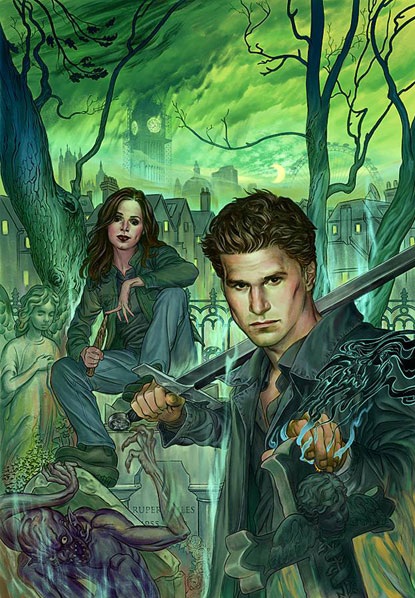
ANGEL & FAITH #1
Writer: Christos GageArtist: Rebekah Isaacs
Publisher: Dark Horse Comics
Reviewed by Humphrey Lee
It’s a month of restarts so I figure I’d jump the train early here, though not with one of the 52 we’ve all been anticipating (or ranting against). And this is a relaunch that actually refreshed me in a couple ways, one being a reminder of how much I really enjoy the Buffyverse, particularly in a nostalgic way given it was running during my informative/college years, and also from a “Man I love these characters” way, another side of this being a reminder of how little attention I was paying at the end of Season 8 because of how unfortunately tedious and overwrought it had become. Harsh, I know, but we always hurt the ones we love, right?
Both those forces I mentioned above, nostalgia and apathy, pretty much came to a head with this first issue of the two biggest “on the outs” characters of the Buffyverse after the events of Season 8. The main pluses come from the characterization here by Christos Gage of the titular characters and how more or less spot on it. Angel is back to his “world on his shoulders” roots after his role in the Twilight Saga and all the chaos that ensued during it. I’ll admit, though, that the tone of the book around Angel seems to be a bit wishy-washy as it ebbs and flows both angles of his involvement in the war, both as a catalyst by proxy since he was a driving force of all the death and destruction, and also as a victim in that if he did not do these things they would have been so much worse.
My apathetic side just triggered pretty hard typing that though, as I’m not even sure if that’s truly how things played out--I’m struggling so hard to remember (and had to wiki) what exactly went down in that book. It’s not particularly fair, especially to those who genuinely liked how Season 8 played out, but it’s a hurdle this book will have to overcome with me. Admittedly, though, it is winning given its handling of something I wasn’t a big fan of in the first place and the characters in question. Angel is back to how I like him and so is Faith, though her character has grown a bit and it’s fitting. While a character full of doubts in her own right, she has seemingly grown into acceptance of a life where, basically, “shit happens” to her and she has to pick up the pieces. In this case, though, she’s acting more like a pillar for Angel, who is the one bending over to gather shards of himself in remorse of what transpired at his/Twilight’s hands.
Okay, fourth paragraph in and I know there’s little talk about the actual plot, but that’s kind of the rub of this issue in that the characterization is the main theme running. Oh, Gage gives us some stuff to work with besides; a re-emergence of Whistler and an introduction of some pretty ruthless characters Angel had under him while Twilight (and that I admittedly thought I forgot about only to find they didn’t exist until this issue – score another for Team Apathy) called Pearl and Nash, and what Angel ultimately plans to accomplish in his new crusade. It’s a good start to what I’m sure will be a nice weave of new conflicts and old plots being built on, but these needles are just starting to get threaded here.
This first issue was all about setting a mood and, in that regard, it did it admirably. A fresh start was well needed and this accomplished that. While obviously the events of the past are not to be forgotten, a focus on the future is what the character Angel needs and exudes here and that is definitely the emphasis this book needs to have so it doesn’t collapse under the weight of all the shenanigans the Twilight material brought (funny how that name ruins even a GOOD vampire series). Rebekah Isaacs’ pencils are a perfect medium for this mood, too, with its crisp lines and spot-on depictions of all the characters given their real life models. It’s a fresh style for a fresh start and I hope the momentum this title has kicked off bodes well for Buffyverse Season 9. While the mistakes of the past make for good fodder to drive these characters, I just hope they were also learned from coming from a writing aspect as this next installment begins. Time will tell all that is left to say, I guess.
Humphrey Lee has been an avid comic book reader going on fifteen years now and a contributor to Ain't It Cool comics for quite a few as well. In fact, reading comics is about all he does in his free time and where all the money from his day job wages goes to - funding his comic book habit so he can talk about them to you, our loyal readers (lucky you). He's a bit of a social networking whore, so you can find him all over the Interwebs on sites like Twitter, The MySpaces, Facebookand a blog where he also mostly talks about comics with his free time because he hasn't the slightest semblance of a life. Sad but true, and he gladly encourages you to add, read, and comment as you will.
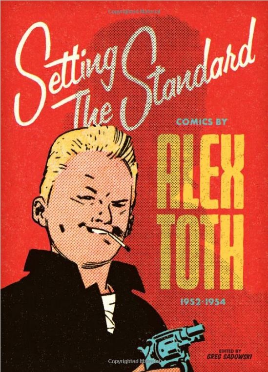
SETTING THE STANDARD: COMICS BY ALEX TOTH 1952-1954
Illustrator by: Alex TothEditor: Greg Sadowski
Publisher: Fantagraphics Books
Reviewer: superhero
Ever since I discovered Alex Toth’s art in a GREATEST BATMAN STORIES EVER TOLD trade paperback I’ve been a huge fan of his work. Obviously, I’d been exposed to his work much earlier on having been a huge childhood fan of “Space Ghost” and “The Superfriends”. It was that GREATEST BATMAN STORIES collection, however, where I first saw a complete Alex Toth comic book story and I distinctly remember it having an impression on me. The work was different than anything I’d seen before. It stuck out, mostly because it had an old school comic look to it but also because Toth’s artwork took it beyond just a static, boring old comic book story. It changed the way I looked at comic book art and I knew I wanted to know more about this Alex Toth guy.
As the years went by I realized that finding a lot of Toth art in one place was going to be a challenging task. If there was a book on Toth or his art I’d always miss its release for some reason and by the time I’d find it anywhere it’d be a bit too out of my price range. The same thing went for his comics. There were never any really large collections of his comic book stories and any comic books that featured any actual decent Toth art were hard to come by and usually tattered to bits when I’d find them. A couple of years ago a collection of his old Zorro art was released, but for some reason I found it to be lacking. The Zorro stuff didn’t hit me in the gut like some of the stuff I’d seen on his website. And original art? Forget it. Those were definitely out of my price range.
But now my dreams of a great Toth art collection have been realized as Fantagraphics Books releases possibly the best collection of Toth comic art I’ve ever seen. I’ll admit I’m not an aficionado on Toth art books, but every six months or so I’d just do a random search on E-Bay or Amazon to see if anything Toth related was coming out. Most of the time I’d be disappointed, but in my last search this little gem popped up. I knew that another Toth artbook, GENIUS ILLUSTRATED, had been released as well and I’d gotten a look at that book at Comic Con. While GI was a nice book, it still didn’t have the giant chunk of Toth that I’d looked for, that I’d craved all those years. I was hoping that SETTING THE STANDARD would give me the fix that I needed. Luckily, a fan posted a Youtube video of himself looking through SETTING THE STANDARD and I was pleased as punch by what I saw. I ended up ordering it right away.
SETTING THE STANDARD is a terrific collection of Alex Toth’s art from the 1950’s. This is pure and gorgeous Toth all the way. I can’t believe how impressed I am with the man’s talent after reading through this book. The man was a master. All of this is stuff I’m sure many people out there know. But what you may not know is what a great job Fantagraphics has done with reproducing these stories. Obviously, I’ve never seen the original comics offered here but it looks to me like the utmost care was taken to present these stories in the best way possible. All of the artwork looks fantastic and the colors just pop off the page. What’s best about the reproduced hues is that they are not overly computer colored. The color work done here is respectful of the time period the original art is from. So each story really gives off a retro vibe but is as crisply and perfectly detailed as if it were produced today. This is a Toth book designed by a Toth lover.
And there really is a lot to love here. Beyond just Toth’s art are the Golden Age stories he’s illustrating. Almost every genre is presented here. Crime, sci-fi, war, romance…they’re all here and each story is just as gloriously overly Golden Age dramatic as the next. This collection of comics just reminds me of how much fun the Golden Age could be at times, especially if you stepped away from superhero comics. Jilted lovers, crazed aliens, and heroic G.I.s all do their best to leap from panel to panel and entertain like only some of the best comic characters can.
Also included in the book is a pretty darn impressive interview with Toth himself. It opens up the book and sort of sets up the reader with where Toth’s headspace may have been when he was creating these books. It’s an interesting read and makes SETTING THE STANDARD much more than just a simple collection of Toth’s books. It helps flesh out the collection and informs the reader as to what Toth’s artistic/personal influences might have been during this time in his life and beyond.
I can’t recommend SETTING THE STANDARD enough, especially if you are a fan of Toth’s art or of Golden Age comics in general. It’s a perfect compilation of Toth comics from a time when he was obviously on fire as an artist. This book is both Toth and Fantagraphics Books at their best.
Discovered as a babe in an abandoned comic book storage box and bitten by a radioactive comic fan when he was a teenager, superhero is actually not-so mild mannered sometime designer & cartoonist, Kristian Horn of Los Angeles, California. He's been an @$$hole for three years. Some of his work can be seen at www.kristianhorn.com and check out his blog at www.parttimefanboy.com.
AMAZING SPIDER-MAN #668
Writer: Dan SlottArt: Humberto Ramos
Publisher: Marvel Comics
Reviewer: The Writing Rambler
In AMAZING SPIDER-MAN #668 we get to see part 2 of the SPIDER ISLAND story unfold, and despite all reason and logic it has me wanting to continue reading to find out how it all will play out. The story, when summarized, seems like it should be terrible. Most of Manhattan’s residents gaining Spidey’s powers, Marvel characters all over the place and Jackal as the villain (well, one of the villains, as his mystery woman who calls the shots has yet to be seen) is like an ingredients list of things that should make a bad SPIDER-MAN story, but somehow it just works.
Dan Slott does a fantastic job telling this story. While many other writers may have chosen to focus on all the action taking place between The Avengers and spider powered criminals, Slott instead invests this issue in Peter Parker and it makes for a better story. We get to see how Peter has to step back from everything and figure out how he can contribute to this battle without his costume. We get the reminder that SPIDER-MAN’s success has always thrived off of Peter’s personality and seeing him getting to enjoy being Spidey without the costume is where the real fun of this book comes from.
Humberto Ramos handles the art in the book well and in his typical manga-influenced way. Some of his work drives me a little crazy, especially some stretched out, disproportioned characters, but overall I enjoyed it. He does a great job handling the visual storytelling, especially with some of the battle scenes, particularly one shot of Peter leading a group of regular citizens into battle, which is just great fun for any SPIDER-MAN fan.
For a while now (pretty much since BRAND NEW DAY) I had given up on SPIDER-MAN titles as part of my required weekly reading but I figured I’d give SPIDER ISLAND a chance and I’m glad I did. Before this, it felt like Spidey stories as a whole had lost touch with what made SPIDER-MAN a great character and while this isn’t the greatest story I’ve ever read, it does feel like a step in the right direction. I don’t know how this entire 6 part event will play out but so far I’ve enjoyed what we have been given. Marvel can often have trouble finishing good storylines and I’m hoping this doesn’t fall into that same pattern, but for now, this issue as well as the first should be enough to keep people coming back for more.
You can follow The Writing Rambler on his blog here and follow on Twitter @Writing_Rambler !
 Advance Review: In stores today!
BATGIRL #1
Writer: Gail SimoneArt: Ardian Syaf (pencils), Vicente Cifuentes (inks)
Publisher: DC Comics
Reviewer: Johnny Destructo
"Why is Batgirl wearing Witchblade gauntlets?" That was my first thought when I saw her. Well, ok, that's not altogether true. That was my first thought when I saw the interior of the book. The cover was something else altogether. I've never really liked any Batgirl other than Barbara Gordon. Not Cassandra Cain, nor Stephanie Brown. Nobody ever mattered to me quite like ol' fire-nethers Gordon. But I'll tell you what, seeing her leaping off the cover of BATGIRL #1 got me more confused than a bi-curious boy-lady. You see, I love Bat-Babs as a character, and that INCLUDES her as Oracle-Babs. Feel free to punch me in my PC nuts but having a character go through being paralyzed by a grotesquely grinning, guffawing madman and still being one of the most important characters in the Bat-Family is one hell of an example of handi-capable. Yes, I actually just typed that. My point being, part of me is excited to see Barbara back in the suit, and part of me is disappointed that she's no longer in the chair.
Also, what does that mean to the continuity of THE KILLING JOKE, one of the greatest Batman stories of all time? Did none of that ever happen? WTF DCnU?? I was all set to be annoyed at the ret-conning of one of my fave Bat-tales, but I guess the LOL is on me. (Note to slf: stop txt-typing this rview.) I won't spoil anything here, but I will admit that the solution presented in this issue is just fine, and didn't piss me off. That being said: the story. Methinks Gail Simone is a horror movie fan. There are elements of the FINAL DESTINATION films here (albeit the original script idea for FD, if you know what that was) as well as THE STRANGERS, starring Scott Speedman and Liv Tyler. That didn't bother me all that much, as she took those elements and made them her own, but what did bother me was some of Batgirl's bat-shit insane mumblings.
"There you are, you rotten monsters. Found you, didn't I? Oh, yes I did, babies. How sad for you."
She sounds like a friggin' maniac, doesn't she? Reading that dialogue, I picture her smearing herself in mayo while eating McNuggets made out of babies. It just felt very out of place for Babs. I'm hoping we won't be seeing any more of that type of monologue from her in the future.
The Art is solid, if not amazing. Solid stuff. I'd say it's akin to Justiniano (sans alleged kiddie-porn tendencies) with just a hint of Adam Kubert. Some interesting, dynamic work here.
I don't want to get too much further into the book, but this is a solid step in the right direction for a character just getting back on her feet.
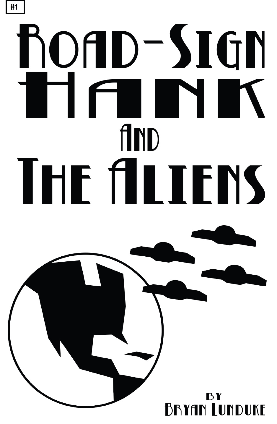
ROAD-SIGN HANK AND THE ALIENS #1
Writer: Bryan LundukeArtist: Bryan Lunduke
Publisher: Bryan Lunduke
Reviewer: Lyzard
Less is more. This old adage proves true in many situations, with ROAD-SIGN HANK AND THE ALIENS being one of those instances. This simple comic, completely stripped of details or complexity, is straightforward storytelling. No distracting bells and whistles are needed for this book. Bryan Lunduke exemplifies how minimalism can really maximize one’s story.
The comic is incredibly straightforward, just like its title. This is, in fact, a story about Hank and some aliens, done in the style of road-signs. Obvious? Yes. Funny? You betcha. We all know the predictable plots of alien invasion tales. This one, I believe, is type 6: hero’s girlfriend gets captured by aliens and hero sets out to rescue his damsel in distress.
The art is incredibly basic, which some may view as a cop-out. Sure, anybody could make a comic with a bunch of clip art. However, using clip art, could you make a good comic? Lunduke is able to take simple shapes and turn them into characters. There are no faces for Lunduke to manipulate nor is the ability to use body language available--merely simple titles establish a change in emotion.
But what makes ROAD-SIGN HANK AND THE ALIENS most effective is the writing. Following the trend of simplicity, the dialogue is straightforward, expository info-dumping. It is the matter of fact tone in which the information is given that gives it humor. No, this is not a laugh out loud comic, but you will chuckle. While most of the events and reactions are obvious, it is the random comments thrown in that boost the quality of the work. Apparently the aliens of Zaxacon 5 hate puppies. That may not seem important to the story, but it sure as heck makes me hate the aliens, which is essential since they are the villains.
Though the comic does not delve into its setting as far as time or location, it does have a 1950-1960s vibe. Beyond the popularity of alien invasion flicks of that era, the fake ads throughout the book are homage to the advertisements that would be included in comics of those days. Even the prices seem more realistic for that time period. At the end of the comic, we are left with many questions enumerated just as at the conclusion of any of the old Batman episodes. While this tale may be unsophisticated, it seems as though it could be a fun serial if Lunduke can keep up his quality of writing.
So…will you pick up this comic (available at www.lunduke.com)? Will it live up to the expectations that I have created for you? Will I be torn apart by talk-backers after they read ROAD-SIGN HANK AND THE ALIENS? I guess you’ll just have to stay tuned.
Lyzard is actually Lyz Reblin, a senior screenwriting major with an English minor at Chapman University. Along with writing for AICN, she has been published twice on the subject of vampire films.
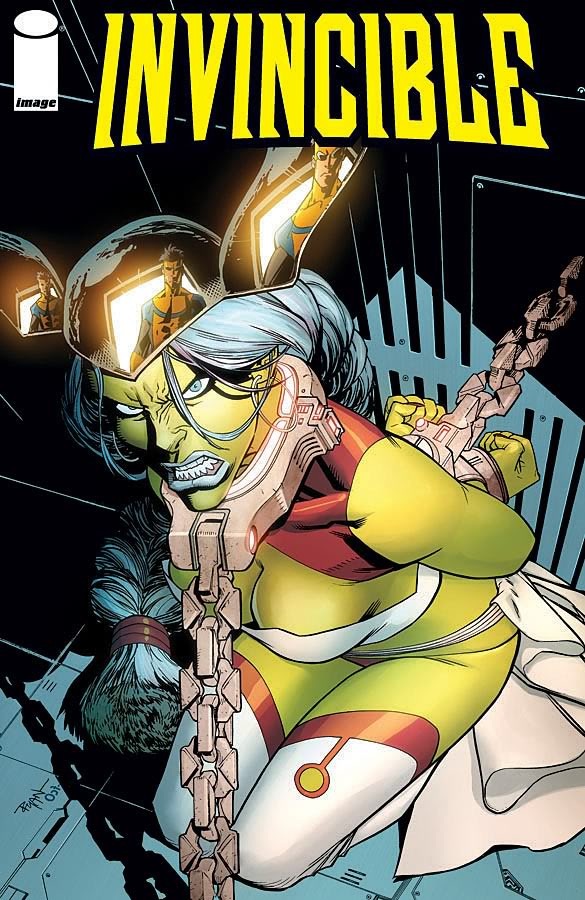
INVINCIBLE #82
Writer: Robert KirkmanArtist: Ryan Ottley
Publisher: Image Comics
Reviewer: Optimous Douche
Someone please challenge me. I want every person out there that can tell the difference between the words Viltrumite and Viagra to tell me in barbaric yawps that I am a fucktard who drinks epic amounts of tard juice from the deepest springs of the planet fuckoff for what I am about to say.
I think INVINCIBLE has lost its mojo. For quite a few months now, I just have not been getting the same feeling of excitement that I would get in early issues of this book. The jokes of poking holes in typical comic tropes, instead of being the garnish to the plot, have become the plot. Plus, there’s such a thing as too much realism in a comic. While not a chubby chaser myself, I’m fine with Atom Eve’s recent decent into the Lane Bryant lifestyle. What I’m not OK with is an entire fucking page of her justifying her fattitude while engaging in the high stakes activity of eating lunch. Have her justify her epic malaise and subsequent form while atomically transforming a car into a giant Yoo-Hoo. These are comics, for God’s sake--I don’t need to see a scene from every Applebee’s across the country.
I don’t mean to pick on Eve specifically, but the page I just described from this issue represents a failing I’ve felt permeating INVINCIBLE since the end of the Viltrumite War: all talk, no action, and very little consequence.
There are a couple reasons this could be happening, that is if you agree with my opinion. And again, if you don’t agree, please challenge me. I want to be convinced to love this title again.
Theory 1: It’s a bitch to come back from war, especially an intergalactic war of superhumans. Wartime truly embodies all of the exhilarating aspects of the human condition in a truncated timeframe; you have birth, love and death all wrapped in a cocoon of non-stop action. It’s very exhilarating, making most of what comes after an epic ho-hum. I felt a similar malaise after the Great War ended in FABLES, and I see INVINCIBLE in the same state of trying to reestablish a status quo before the next great threat rears its ugly head. Perhaps this issue will be that turning point as Cecil Steadman, government handler and great machinist of superhuman activity, unveils his new army on the closing pages. But we’ve seen evil Cecil before; we know exactly where his morality lies at this point, so I don’t know if this will be enough. Fingers crossed, though.
Theory 2: One could wonder if the story is done and INVINCIBLE has merely become the support column for the Kirkman Superverse. The bleed in and bleed out of ancillary characters has increased over time, but the increase has been in exponential overdrive since Kirkman started his own production company. Is the day coming when we will only see INVINCIBLE in the context of WOLFMAN or GUARDIANS OF THE GLOBE? I hope not. INVINCIBLE’S strength has always been grounded in Mark’s inner struggle; the world around him was merely a catalyst for that exploration not the main focus.
Speaking of the external world, I would like to interrupt “Theories of a Madman with Infinite Free Time” to make a comment on the art. I have loved the style of this book from Day One. Iit’s like an Escher painting; the more simplistic and cartoony Ottley gets the more poignant and detailed the images have become. This was especially true during the Viltrumite war – simply time stopping. So it’s with a beggar’s pride that I make this next request of Mr. Ottley, but I think it’s important. Simply changing facial hair does not two characters make. Do whatever you want in the background; personally, I appreciate detail, but I understand the need sometimes for cookie cutter approaches to filler. However, when two characters are central to past and future plots, namely Rex “The Robot” and the recent Vegas smasher The Dinosaur, this level of copycatting borders on unimaginative or uninspired. /blasphemyoff
Oh yeah, theories…
Theory 3: Mark’s story is over. No, not his life story, but did any of us sign on for seventy more years since INVINCIBLE ages pretty much in real time? I’m not sure; if you go back and read early issues INVINCIBLE’S central conflict was with his father and his heritage; most events centered on those two mysteries or unresolved emotional states. Could it be now that both have been quelled by the Viltrumite war and all that really is left for Invincible is to find a home as a godlike entity somewhere else in the Kirkman Superverse? The past few months have really made me feel this way.
I want to care about INVINCIBLE again, but I need a reason. Patience is a virtue that I simply can’t afford when it comes to comics these days; the pages are too sparse and lag time too long to draw out great mysteries. Yes, I will forever love Kirkman’s soliloquies on the woes of the world using the voice of Mark, but I expect those juicy sound bites as well as some real danger and action…ah…perhaps that’s it…maybe this all boils down to load balancing. The Viltrumite was all action and all resolution, while the follow-ups and have been all set-up delivered through all talking. Maybe the golden ticket involves infusing some big-time action into the set-up. And I will give a purple nurple to anyone that says the destruction of Vegas was exciting, it started and ended quicker than a Viltrumite on Viagra.
Something needs to change; perhaps a lot of things for me to feel vested in the INVINCIBLE world again. Please tell me where I am wrong TalkBackers, you’re my only hope.
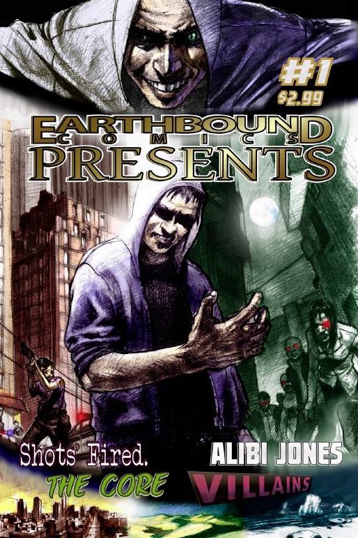
EARTHBOUND COMICS PRESENTS #1
Writers: Max Fauser, Ethan Slayton, Buck Weiss, Mike LuomaArtists: Ethan Slayton, Ruth Garcia Martin, Juan Carlos Quattordio, Ben Ferrari
Publisher: Earthbound Comics
Reviewer: BottleImp
I do love me a good anthology. There’s a few reasons; I like the fact that the short story format can be easily digested while still packing a jolt of reading enjoyment. I appreciate the fact that a whole bunch of succinct stories are compressed into one package, usually giving the reader a lot of bang for the buck, so to speak. And then there’s that wonderful characteristic of the anthology, be it in prose or graphic format, that it can run the gamut from containing stories that compose variations on a single theme to stories with no discernable connective theme whatsoever. Much like the recently-revived DARK HORSE COMICS PRESENTS, EARTHBOUND COMICS PRESENTS embraces that latter quality in its eclectic mix of tales. From science fiction to crime drama to superheroes and back again, here’s what you’ll find inside the comic’s cover.
“The Core,” written by Max Fauser and Ethan Slayton with artwork by Slayton, is my favorite segment here and probably the strongest in terms of the visual elements. The reader tags along with a group of human soldiers called to the aid of an alien civilization whose world has been destroyed by a mysterious space anomaly. When the soldiers reach the center of the anomaly, they discover a planet whose inhabitants have been destroyed by an ancient, monstrous force which seeks to reclaim its primordial rule by cleansing the universe of the squabbling, destructive insects who think themselves their world’s masters. In a nutshell, it’s H.P. Lovecraft in space. And as a certified HPL junkie, that makes “The Core” damn fine reading. As I said, this segment is visually the strongest out of the entire anthology. Slayton shows a deft design sense and a mastery of light and shade as he renders both the fantasy and sci-fi trappings and the horror-tinged tentacled Lovecraftian monstrosities.
We switch gears and pull a 90 degree turn for the next story, “Shots Fired. Shake and Bake,” written by Buck Weiss with art by Ruth Garcia Martin. No sci-fi or fantasy here, just the simple goodness of a couple of small-town police officers trying to capture a meth addict without harming the 9-month old baby he’s abducted. This crime drama is well-written with a good pace, as well as a slightly humorous skew given by the attitude of the narrator (one of the officers) towards the proliferation of meth-heads in their small rural community. The artwork is serviceable, but the quality varies drastically from the scenes set out in the bright prairie sunlight and the climax inside the darkened barn. The pages show a good balance of light and dark in the outdoor setting, but the latter section becomes muddled with the overuse of heavy black; I would have loved to see this part of the story handled with a little more judicious use of ink.
Back to the sci-fi genre with “Alibi Jones: In Over His head,” written by Mike Luoma and drawn by Juan Carlos Quattordio. This is a gentle, humorous tale that brings to mind the lighter works of sci-fi legends such as Henry Kuttner or Ray Bradbury, dealing with the inevitable complications that accompany the meetings of two different cultures. Quattordio’s cartooney style makes a good match for this light-hearted segment, though some of his figures end up looking a bit rubber-limbed. With a little refinement and bit more stylization the artwork could be more dynamic; as it stands, the visual component is an adequate complement to Luoma’s well-written story.
Last and least successful is “Villains,” written by Ethan Slayton and drawn by Ben Ferrari. It might be unfair for me to judge this chapter, since the segment is merely a preview for the forthcoming VILLAINS series, but so far this superhero story doesn’t seem to have much going for it aside from its focus on a supervillain as protagonist. Ferrari has a good handle on dynamic page composition, but needs to work more on basic figure drawing and anatomy to really pull the drawings together. Right now there’s so much gape-mouthed grimacing going on that I feel like this story is set in Liefeld-verse. But like I said, this is only a preview, so perhaps I ought to reserve my judgment for a more complete narrative.
So like most anthologies, EARTHBOUND COMICS PRESENTS ends up a mixed bag ranging for the great to the mediocre, though I can definitely see the promise of more good things to come. I’ll be watching to see what Earthbound comes up with next, and hoping for more surprises to scratch my anthology itch.

 Advance Review: In stores today!
DETECTIVE COMICS #1
DC Comics
Did you enjoy Tony Daniel's previous work on Batman? Well...this is more of that. So much so, in fact, that it doesn't actually feel like it belongs in this new DCnU reboot. It just feels exactly like the stuff I was reading before. Don't get me wrong, it's definitely quality stuff! Batman is bad-ass, the Joker is a maniac, just as we love him....it just doesn't have that "new universe smell" that I've been getting from the other #1 issues this week and last. Ok, sure Jim Gordon has red hair and a red mustache. Batman is wearing his over-designed new suit. Fine. Other than that, though...nadda-so-much. For the most part, Daniel has made great leaps in his drawing style in the past couple years. Used to be a time I couldn't stand him, but he's slowly starting to tumor on me. And there's SOMEthing about the way Daniel is drawing Batman's face and cowl that feels extremely Frank Miller Dark Knight-ish, which is pretty cool. He's also added in some of the Todd Mcfarlane "Batman is a pointy shadow with eyes" look as well from the BATMAN/SPAWN crossover. There is a specific panel, though, that looks dreadful. Check out the page where Batman shows up to see Gordon in front of the Bat-Signal. Gordon looks great, the background is stellar and detailed, but Bats himself looks like he was scanned in from a high-schooler's notebook. And I realize this is probably Daniel's doing as well, but the inking goes from super-detailed, and thinly lined to quick and sketchy, almost messy. It's a little disjointed. Overall, though, this is a solid issue; it just doesn't feel like a great beginning for such a classic title. To stop numbering DETECTIVE COMICS and restart with a #1, it had better bring down the moon, but this is just ...good. - Johnny Destructo
 Advance Review: In stores today!
JUSTICE LEAGUE INTERNATIONAL #1
DC Comics
Well, the streak had to end sooner or later. Up until this issue, I'