

| Issue # 12 | Release Date: 7/13/11 | Vol.#10 |
Hey folks, Ambush Bug here. As I lead a handful of @$$holes through the treacherous aisles, panels, and pathways of the 2011 San Diego Comic Con this week, the rest of the Holes are holding the fort and continuing to bring you the best reviews on the web. Enjoy this week’s reviews and look for updates from SDCC all week from AICN COMICS & AICN HORROR!!!
(Click title to go directly to the review)
THE RED WING #1
JOE SIMON: MY LIFE IN COMICS HC
X-MEN: SCHISM #1
GLADSTONE’S SCHOOL FOR WORLD CONQUERORS #3
GREEN LANTERN #67
DEVIL’S ISLAND OGN
FEAR ITSELF: SPIDER-MAN #1-3
ONE SOUL OGN
GREEN LANTERN CORPS #61
TAROCH #1
AVENGERS VS. NEW ULTIMATES #6
RANDOM VEUS Vol.1
HELLRAISER #3
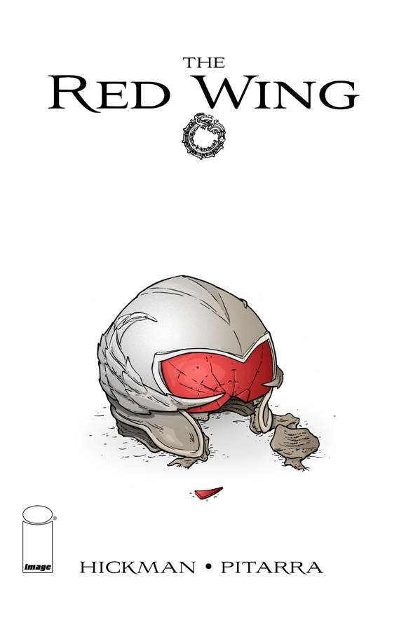
THE RED WING #1
Writer: Jonathan HickmanArtist: Nick Pitarra
Publisher: Image Comics
Reviewer: Humphrey Lee
There is nothing currently in the world of comic books that gets me as excited as a creator-owned title through one of the outfits I trust the most. In this case it would be Jonathan Hickman’s “homecoming” to the place that first made him – thankfully – known to the world of comics. Not to line this thing up to just be a verbal blowjob of Hickman’s body of work though, because I will honestly admit that so far I’ve been about 50/50 on my feelings toward them (Loved loved loved PAX ROMANA and THE NIGHTLY NEWS while finding TRANSHUMAN and RED MASS FOR MARS to be interesting but uneven affairs). But while the end result is of course important we’re talking a lead up here, and the fact of the matter is that while I haven’t thought everything Hickman did was a home run he always makes for an exciting plate appearance (to keep that metaphor going).
Okay though, I have to admit I did just lie to you all, because the rest of this piece is pretty much going to getting on my knees and suppressing my gag reflex because I indeed loved this book. If you were to sum up the premise of this book in a line it would be “intergalactic star fighter war that takes place through time and space” and, really, how do you not fucking love everything about those words put together? Just the implication of that, as is put into words in the book itself, that the potential for humankind should have reached via time travel and is instead a tool of war is a fantastic concept. But, in true Hickman fashion, the high premise of the book is not just shiny wrapping on an empty box, there’s a real nice human element here to polish the hook.
At the beginning of the book there’s an absolutely lovely sequence gearing up the premise while introducing us to a squadron doing a run through time to avoid a fight that finds them anyway. The thing about Hickman books in this capacity is economy, and it’s in full glory with THE RED WING as well. Not only did that first handful of pages give the premise and the scope the book is going for, but set up the emotional tether that is realized another handful of paper later as we’re introduced to Dominic and Valin, who lost their fathers in that opening sequence. That is where then Hickman decides to make me feel geekfully overjoyed to be a comic book fan as he describes the linear illusion of time and time divergence tactics and so on. This is where he also leads into the notion that Dom’s dad survived, on a one-in-a-million chance due to the tech shielding him, albeit stranded in time. Not so simple, but well explained and a highly effective plot to play out over the next three issues.
If anything, that last line above is really the only downside I’ve seen to this mini-series so far: the length. I absolutely love that Hickman reaches for the stars with his projects, but then crams (a little harsh a term probably, but apt) them into just a four or six issue jaunt. I’d love to see him let one of these breathe at some point – especially considering how wonderfully S.H.I.E.L.D. is playing out in the confines of the Marvel wheelhouse – but of course I’m just happy these books exist in the first place. And the artist choice, once again, is very proficient at making such a story happen. Don’t recall having seen Pitarra’s work before but it has an excellent flow, which is highly important for this book given its aim. The panels are simultaneously packed with detail and imagery but feel open-ended, which aids that idea of time hopping immensely. Like the story, it’s a shame there will only be three more issues of it, but I will gladly gobble up what we get of them both and highly recommend this book up for you all to do the same. Cheers…
Humphrey Lee has been an avid comic book reader going on fifteen years now and a contributor to Ain't It Cool comics for quite a few as well. In fact, reading comics is about all he does in his free time and where all the money from his day job wages goes to - funding his comic book habit so he can talk about them to you, our loyal readers (lucky you). He's a bit of a social networking whore, so you can find him all over the Interwebs on sites like Twitter, The MySpaces, Facebookand a Blogger Account where he also mostly talks about comics with his free time because he hasn't the slightest semblance of a life. Sad but true, and he gladly encourages you to add, read, and comment as you will.
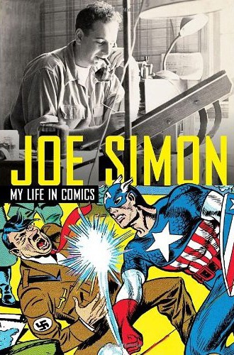
JOE SIMON: MY LIFE IN COMICS
Writer: Joe SimonPublisher: Titan Books
Reviewer: superhero
I’d imagine that there are some people out there who’ve had the experience of being a child and having their grandparent pick them up in their lap and begin to spin them stories about the way things were when they were growing up. I’d imagine that when those people were little tykes they would become enraptured by those particular tales, especially if they were about something that a young’n would think was particularly cool like an old war story or if that particular grandparent did something out of the ordinary for a living, like being a cop, or an actor, or, well, being a comic book artist. I never really had that experience growing up. All but one of my grandparents had passed on when I was younger so I never really had a memory like that. But after reading JOE SIMON: MY LIFE IN COMICS I can honestly say that I almost feel like I have.
I’m not saying this about MY LIFE IN COMICS because Mister Simon is close to a hundred years old. Far from it. I don’t want to give the impression that the writing in this book is stodgy or old fashioned. It’s because Simon, the man who co-created Captain America with Jack Kirby, writes in such a comfortable and comforting style that the prose in the book feels like having a natural conversation with someone, or rather, listening to someone who’s a terrific storyteller. There’s a warmth and straightforwardness to Simon’s writing that makes it feel as if you’re talking with a friend--as if you’re getting together for a cup of coffee and he’s just decided to tell you a story out of the blue, unrehearsed.
And there are a lot of great stories in this book. I know a bit about comic book history but it’s always great to hear tales of the Golden Age of comics from someone who was actually there. Here’s an autobiography that tells it like it was but never indulges in crass gossip or sleazy conjecture. Simon comes across as a guy with class, who shoots from the hip, and tells it like it is. It’s this feel of honesty and directness that makes MY LIFE IN COMICS a welcome read. You never get the feeling that you’re being fed a line or reading a tall tale. Everything that Simon decides to impart comes across as believable and reliable mostly because of his ability to write without over-exaggerating the details. MY LIFE IN COMICS is an entertaining and informative look into Simon’s decades-long career in illustrating and writing comic books and truly loving what he was doing all the while. I’ve seen some interviews and autobiographies about comics devolve into a gripe session about comics and the industry as a whole. Stuff like that will sometimes leave a bad taste in your mouth about comics and what goes on in the sausage factories that pump them out. While Simon does cover some of the challenges he dealt with during his time as a comic creator he never sinks into any kind of self pity or misdirected anger. You can tell he loved what he was doing when he was able to do it and much of MY LIFE IN COMICS reads as an affirmation of all the hard work and creativity that comic creators put into those pages all those years ago. Sure, a lot of people got the shaft throughout the years but Simon tends to look at things from the positive side. Like I said before, he writes with an air of class and self respect about himself and it makes the book all the better.
My only criticism might be that a lot of the good stuff takes a while to get going. Much of the beginning of the book is about Simon’s life growing up in upstate New York before he got into the comic industry. So some of the book spends a bit too much time on where Simon grew up, who his friends were in school, and what antics he was up to as a kid and a teenager. Which is fine, it is an autobiography, but I found myself becoming a little impatient and thinking, “c’mon, get to the comics already!” while reading the early chapters. But that may be more due to my impatience as a reader than anything else. Once we do get to the comics the book starts firing on all gears.
So if you’re a fan of comic book history or just a fan of the history of pop culture in America I’d suggest you pick up JOE SIMON: MY LIFE IN COMICS. Heck, I’d recommend it for most modern comic fans as well. It offers a terrific glimpse of a time when comics were made with real elbow grease and determination. It will inspire you as a comics fan to imagine what it was like to have been in the trenches of the early days of comics with a professional who loved his work and did his best with the tools that he had at his disposal.
Discovered as a babe in an abandoned comic book storage box and bitten by a radioactive comic fan when he was a teenager, superhero is actually not-so mild mannered sometime designer & cartoonist, Kristian Horn of Los Angeles, California. He's been an @$$hole for three years. Some of his work can be seen at www.kristianhorn.com and check out his blog at www.parttimefanboy.com.
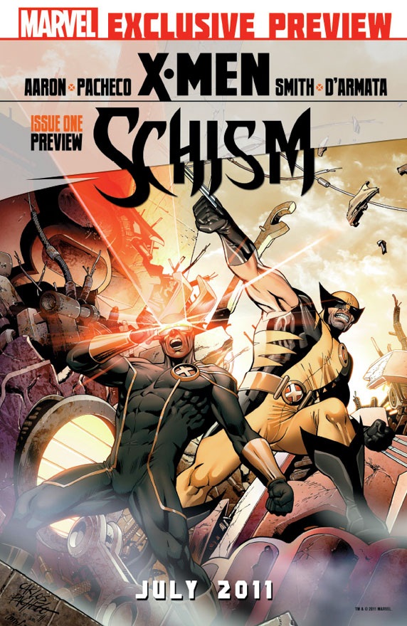
X-MEN: SCHISM #1
Writer: Jason AaronArtist: Carlos Pacheco
Publisher: Marvel Comics
Reviewer: Optimous Douche
First off, I want to acknowledge that not everyone will shoot the jism for SCHISM that I did. I’m a dirty dirty mutie lover, overly forgiving of the less than stellar arcs and at the zenith of comic ecstasy when the book hits homeruns like during Fraction’s run or anytime Ellis steps up to bat. If I try to take off my rose colored glasses, I would say Aaron has hit a solid triple here. What keeps him from completely rounding the diamond is that the story is as old as time. Humans hate mutants, Sentinels abound, shit tsunami aimed directly at muties across the globe. But the execution was fantastic. At the end of the day, I think that’s a fine compliment for a book that will shortly be fifty years old. The well of original stories while staying true to the characters can only be so deep. Remember Morrison’s run: it was different, and hardcore fans whined like little girls with skinned knees. I think I’m the only hardcore fan that actually enjoyed Morrison’s vast expansion of the mutiverse…and Beak. On a side note, if there are more fans that agree with me let me know, I feel so alone.
Where was I? Oh right, SCHISM. As fans know SCHISM promises to tear the mutieverse asunder to give Marvel an excuse to reboot. You know…because if your competition is doing something, you must do the exact same thing. I truly wonder if there are any marketing professionals at the companies anymore. Why they continue to battle in the bloody red water of market competition versus swimming for the competition-free blue water always astounds me, but hell with it, I expend enough energy on this hobby as is. Plus these kinds of thoughts are too close to my day job; this is supposed to be a relaxing endeavor for me. Some would say the mutieverse has changed pretty radically already over the past few years. I’m usually a guy who just enjoys the ride, keeping blinders pointed towards the final destination; with this issue, though, and the impending reboot, I’m truly fascinated by the final outcome of this story as much as the story itself. After the death of Nightcrawler, the move to Utopia, the symbiotic relationship with Atlantis, what surprises are in store for us send my mind swimming.
This issue does a pretty good job of defining some of the changes. Are they renumber worthy? Not at the moment. However, the seeds have been planted. Let’s just hope the next four issues germinate these seeds instead of covering them with a dying frost.
The beginning of this issue is all about characterization; I would say this is good for old and new readers alike. Knowing that the new titles are going to split the X-men into Camp Wolverine and Camp Cyclops, it makes perfect sense for them to open the book as Cyclops travels to the UN to ask for a global disarming of all Sentinels and other mutie hunting technology. Wolverine is Cyclops’ one man security team and the interactions between the two are the most humanistic and humorous I have ever read. The only time I laughed more was when Whedon opened ASTONISHING X-MEN with Wolverine hovering over a sleeping Cyclops and Emma Frost and making a reference about Scott not waiting for Jean’s body to get cold.
Speaking of Morrison’s run, we get to see an old friend from the now forgotten Omega mutant phylum. Yes, folks Quentin Quire has returned. How he interrupts the proceedings will remain in the book, but it is the most cathartic telepathic attack on government I have ever seen in X-MEN. His purpose is to turn Scott’s olive branch into a bully stick. Guess what? It works.
However, Quentin is not acting alone. This brings me to the third and final spoiler of this fantastic ride. Behind Quentin’s escape from Utopia and subsequent global attack is…wait for it…The Hellfire Club. Before you start bemoaning Claremont rehashing, know that Aaron is making the Hellfire Club his own, complete with a new Black King. Who the new Black King is I am going to leave as a surprise, but I’ll tell you now, you wouldn’t see this shit coming if you had every operator in the Psychic Friends call center sitting in your living room and your testicles were real crystal balls. Yeah, it’s that evil and good.
The only thing left for me to say on what I will consider a very strong start to this series is that I want to give a patented Optimous Douche Reach Around®™ to Mr. Pacheco. Yes, the art in this issue is spectacular, but the OPRA award is for being the first artist to not draw mutant messiah Hope as a teenage clone of Jean Gray. To other artists: it’s been done already, guys--she was called Madelyne Pryor.
Optimous has successfully blackmailed fellow @$$Hole BottleImp into being his artist on Average Joe. Look for Imp's forced labor on Optimous brain child in mid-2011 from COM.X. Friend Optimous on FaceBook to get Average Joe updates and because ceiling cat says it's the right thing to do.
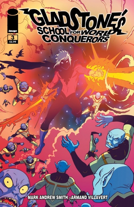
GLADSTONE’S SCHOOL FOR WORLD CONQUERORS #3
Writer: Mark Andrew SmithArt: Armand Villavert
Publisher: Image Comics
Reviewer: BottleImp
I was on the verge of dropping this title from my pull list last week. Let’s face it, we all are living a little bit leaner these days, and sometimes it becomes a necessity to trim the fat off some of those unnecessary expenses. And while I thought the first two issues of GLADSTONE’S were fair, I still hadn’t gotten invested in the series or its characters to any meaningful degree. The premise was fun but not especially original, save for the twist revealed in the second issue (SPOILER!) that the superhero/supervillain battles were all a sham for the public (END SPOILER). Armand Villavert’s characters were drawn in an appealingly cartoony style, but the general lack of background details tended to make the pages feel empty rather than just simply graphic. The colors (by Pommes) were bright and just a little garish, and somehow jarring when paired with the black and white linework. So, yeah, I wasn’t married to this comic. But this issue showed up in my pile last week, so I felt obliged to give the series one more try before cutting the cord.
Those magnificent bastards, they’re going to keep getting my money.
I can’t quite put my finger on what happens in this issue that turned me around. Part of it is certainly the fact that Mark Andrew Smith managed to add an incredible amount of depth to the GLADSTONE’S universe in terms of the characters and their history. From the supervillains’ trial of Abraxas (one of the few villains to NOT agree to the hero/villain truce) to the prison visit between the unrepentant Madame Skull and her sons to the simple, genuine love of Kid Nefarious’ parents (plus his characteristic adolescent reaction to said affection), Smith has both broadened the scope of the comic and delved more intimately into its cast in jest a few expert strokes. Suddenly, I actually care about what happens to these various patterns of colored ink.
Along with my newfound investment in the storyline, I’m even enjoying the artwork more. I still think that Villavert’s backgrounds tend to be a little too bare, but the action and dynamism of the figures tends to make up for it (for the most part…hey, what can I say? I think that the environment a character inhabits can be just as important as the character itself). Even the coloring feels more palpable to me, and meshes much more naturally with the action.
The final straw that convinced me to come back for more? The inventive use of the back cover to provide a great stinger to the story told within.
GLADSTONE’S still isn’t a comic book that I eagerly await each month—I’m not gaga over it, in other words—but Smith and Villavert have certainly piqued my interest enough for me to want to find out what happens next. Enjoy my three bucks, you comic-creating sons-of-bitches!
When released from his bottle, the Imp transforms into Stephen Andrade, an artist/illustrator/pirate monkey painter from New England. He's currently hard at work interpreting fellow @$$Hole Optimous Douche's brainwaves and transforming them into pretty pictures on AVERAGE JOE, an original graphic novel to be published by Com.x. You can see some of his artwork here.
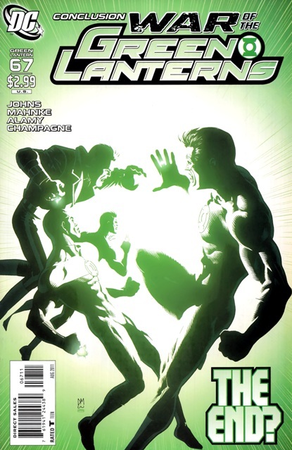
GREEN LANTERN #67
Writer: Geoff JohnsArt: Doug Mahnke
Publisher: DC Comics
Reviewer: The Writing Rambler
After some delays we reach the finale of the WAR OF THE GREEN LANTERNS storyline in GREEN LANTERN # 67 and unlike many other final “event” issues this one was actually worth the wait. There was a lot to wrap up in this book and for the most part it did a great job, both with payoff for the time the readers have invested, as well as some interesting set up for this September’s re-launch of GREEN LANTERN.
As I said the story is told well and if you’re a fan of what Geoff Johns has done with the GREEN LANTERN story over the past few years this is yet another of his best moments(I personally think this was much better than BLACKEST NIGHT or BRIGHTEST DAY). You can really see his love for GREEN LANTERN on the pages as it always seems he’s out to top himself with each new issue. I especially like what he has been able to do as far as his management of the several different color lantern corps and despite how easy it would be for all these different corps to get stale very quickly he has been able to keep them an enjoyable part of the overall GREEN LANTERN story.
The artwork in the issue is great, just as it has been for Mahnke’s work overall on GREEN LANTERN. I would assume this may have been the cause of the delays but seeing the final battle take place is such a thing of beauty through his work that it was clearly worth waiting the extra few weeks.
As far as storyline (spoilers ahead) in this issue, we get one final battle with Krona and though Hal is obviously the focal point of the book others get their chance to shine as well (I especially enjoyed Kyle getting to use his abilities as an artist to help turn the tide). Each page is action packed and full of the great moments fans have come to expect over the past few years. As the dust settles, were left with several questions to carry us over into the September re-launch, most notably what is going to become of Sinestro and his newfound “acceptance” back into the GREEN LANTERN corps and how exactly will Hal Jordan fit into the new book(s) now that he has been seemingly stripped of his ring? I honestly have no idea where Geoff Johns and the entire GREEN LANTERN story are headed but I am happily looking forward to whatever next story he has up his sleeve.
You can follow The Writing Rambler on his blog here!
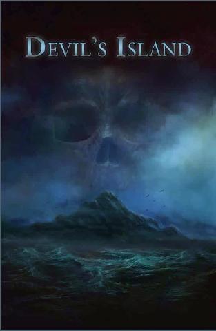
DEVIL’S ISLAND OGN
Writer: Nikola JajicArt: Josef Cage & Raymund Lee
Guest Reviewer: Danny Darko
You probably haven’t heard of Nikola Jajic, and that’s fine. No, really, it is. While this ISN’T the guy’s first foray into the world of indie comics/graphic novels/insert-clever-buzzword-here, DEVIL’S ISLAND is far and away the author’s most prolific work to date. Is ‘prolific’ the right word? I could have easily said ‘coolest’ or ‘best written and illustrated’ (which would be several words). I could praise Jajic’s ability to weave an intriguing yarn from French history, a subject I know very little of. While each of those is an apt description of how I felt about the book, none really paint a complete picture the way ‘prolific’ does. It’s really THAT good.
Let me preface the rest of this review by stating quite clearly that I would NOT heap false praise upon this book if I didn’t really enjoy it. In fact, I’m not sure I went into this thinking I would like it; historical thriller/prison drama didn’t sound like my thing. I remember first seeing unfinished pages pop up on Nik’s Facebook page, and thinking to myself “Damn, that’s really pretty, but historical fiction? Really, dude?!” It is with very little chagrin that I would like serve myself up a big, fat plate of crow, for it’s not until someone forces you too look at a subject more closely that you realize how wrong you may have been in your judgments.
Jajic opens the book with a dead body and a little levity: a gruesome combination, sure, but a good laugh mixed in amongst the rather heavy subject matter was unexpected and appreciated. Readers are quickly whisked around on a tour of the island prison before being introduced to one of the book’s central characters, Pierre, a prisoner charged with hunting down any would-be escapees. He and his band of Hunters make up the heart and soul of the story, a story about loss and penance, the illusion of freedom, imprisonment, and pain.
Pierre’s partners, Henri, Jean, and Rat, pass the time in their barracks when they aren’t tracking down other prisoners or disposing of dead bodies. It’s this juxtaposition of freedom/captivity that make the characters so endearing; they live in their cabin, enjoy tea/coffee, they sleep in beds, they even play cards, but they are NOT free men. Not by a long shot. Their stories with regard to how they came to be prisoners of Devil’s Island are tragic, particularly that of Henri, as these are mostly honor-bound men who simply made mistakes in judgment that resulted in life sentences. Other than each other, pain and anguish seem to be the men’s only companions.
Despised by guards and feared by the other prisoners, the Hunters can only truly trust one another. When their skills are put to the test tracking two extremely violent escapees, while armed with nothing more than sharpened sticks and knives, well, things get a little hairy. The book moves very quickly here, and despite their being the stars of the story it’s very easy to forget that the Hunters are NOT considered ‘good guys’ in their own world, which makes what happens next all the more tragic.
Jajic pulls a fast one on readers, diverting our attention away from the human drama that until this point has driven the story, but only long enough to smack us in the face with it by book’s end. It’s a sneaky ploy, and he’s a sly dog for pulling it off, but it’s a truly effective move that I should have caught on to, but didn’t see coming. The action is intense, made even more so by everything that the Hunters have risked, and to borrow a phrase, the payoff is both bloody and satisfying. Then Jajic, somehow, manages to up the stakes once more, twisting the definition of the word ‘freedom’, contorting it into some sort of dark, depressing place, removing from it any shred of hope or happiness. In other words, it’s heavy, dude.
Speaking of ‘heavy’, what a load artist Josef Cage was made to endure! In a book with no costumed heroes and villains beating the holy hell out of each other, Jajic delivers a story that is both interesting and as ‘adult’ as it comes. Cage’s pencils elevate that story and make it a sight to behold. I mentioned earlier that I was quite taken with the preview images that I saw a year or so ago, and thankfully the artwork is as consistently beautiful throughout the graphic novel as any of those pages.
Cage’s use of negative space, his ability to cram detail into a panel when it’s called for, and the opposite, his ability to take very little and deliver an emotional impact is extremely impressive. This is easily one of the best looking indie books I’ve ever seen. I don’t know where Nik found this guy, but I hope he keeps him locked in a basement somewhere, chained to a drawing table, cranking out comics for a long, LONG time.DEVIL’S ISLAND combines all of the best elements of historical fiction, prison drama, action movies, and revenge thrillers, delivering a decidedly different piece of work. It’s adult in a way that most ‘mature readers’ titles only dream of being; it’s not a book that pulls its punches, and it doesn’t rely on in-your-face sex or violence to get its point across. It’s a well written and beautifully illustrated book that is deserving of your attention, and more than likely your praise. It’s the kind of story that is bound to be discovered and enjoyed again and again by fans of all sorts of genre fiction as it grabs a hold of a reader’s attention on the first page, keeping it in a chokehold until the last. You probably haven’t heard of Nikola Jajic or Josef Cage, and that’s fine. No, really it is, because you will. Everyone will, and probably sooner rather than later.
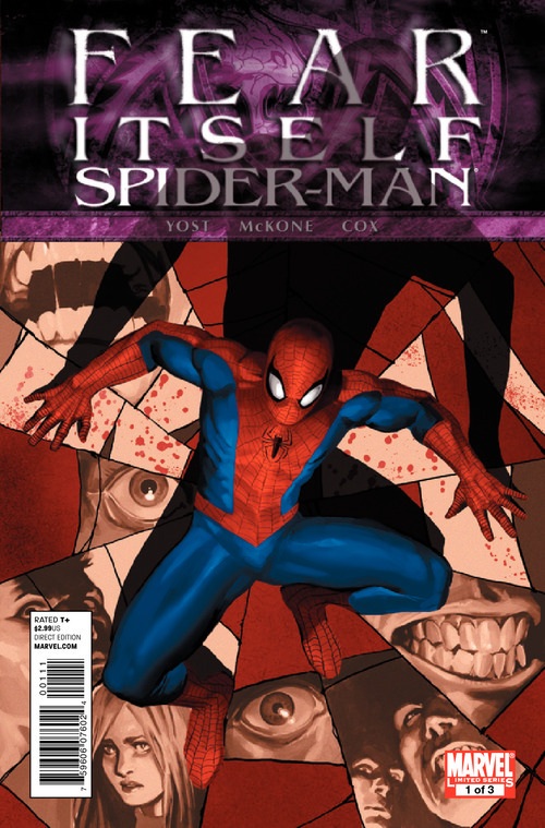
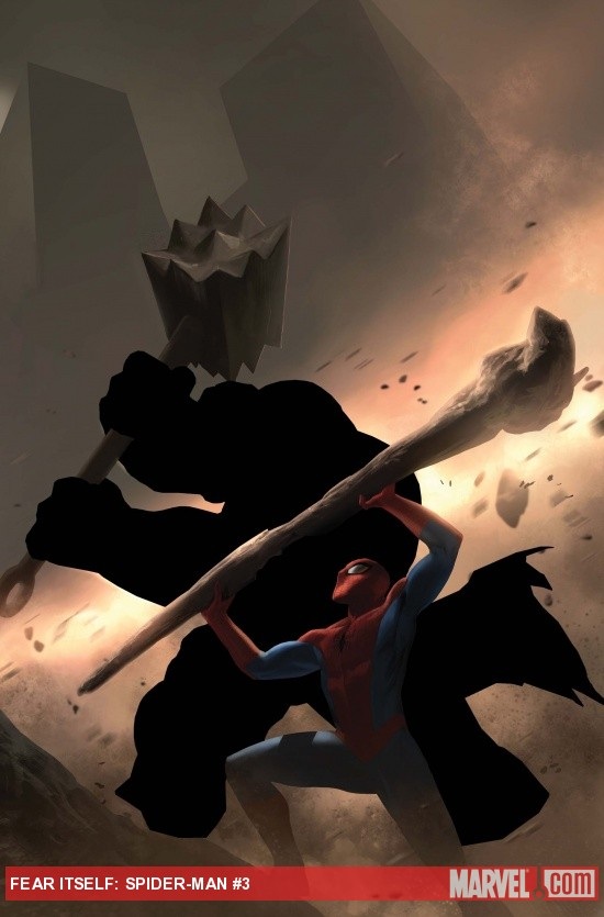
FEAR ITSELF: SPIDER-MAN #1-3
Writer: Chris YostArt: Mike McKone
Publisher: Marvel Comics
Reviewer: Henry Higgins is My Homeboy
Do You Fear....I Don't Know...Public Speaking?
As you can probably tell from my repeated many many MANY Spider-Man reviews, I really rather adore Spider-Man. But usually, and this is fairly consistent, his tie ins to crossovers in Marvel are terrible. DISASSEMBLED, HOUSE Of M, CIVIL WAR (which I'll argue is the beginning of a very noticeable slide in Straczynski's run), SECRET INVASION... most if not all of them have been just plain awful. But the FEAR ITSELF mini piqued my interest. It's by a writer I usually enjoy well enough (Yost), and I do love McKone's art. And FEAR ITSELF, to be honest, is probably one of the Marvel crossovers of the last few years that I'm enjoying the most. I've heard okay things about the book, and this week, with the release of #3, I picked up all three parts. I can safely say it's the best Spider-Man tie-in in ages. It does flow with the main book well, and it's well paced and good in its own right. That doesn't mean it's flawless; far from it.
 Writing: (3/5) Yost writes a solid book here, especially in terms of character. His Spider-Man reads very similarly to Slott’s, and it adds to the general feeling of consistency with the main titles that tie-ins are so often missing. His Spider-Man does show more fear than usually attributed to the character, but given the title of the tie-in, it plays well. If there's anything not great about it, it's his inner monologue. It reads dully most of the time, not really having voice or feeling. When it does, it's very effective (such as Peter being swarmed by Vermin). But it doesn't hold the effect the entire book. His determination, while predictable (seeing as it is Spider-Man), is the best moment of the book, especially during his final confrontation.
His supporting gallery, on the other hand, is marvelous. The Jonah scene in particular helps wash away any negative feelings I've had towards recent Jonah. I love J.J.J., and was thusly not the biggest fan of his handling during BRAND NEW DAY. It felt as if he were being devolved, and his evolving characterization forgotten. But Slott has been making progress, and the Jonah here is fantastic. The strongest scene in the entire mini is his talk with Spider-Man. It strikes right at the core of the relationship between Jonah and Spider-Man--one of unwilling respect. Jonah is forced to admit Spider-Man is a super hero, and sends him on his way to continue fighting. The few scenes we get of Norah continue to help her grow, making her less of the annoying bint we saw in BRAND NEW DAY. Seeing her still traumatized by her interactions with Osborn is refreshing, and gives her a weakness and reliability to latch on to. She proves strong enough to get past it, but the fear still gnaws at her, even as she helps Spider-Man out during the fight.
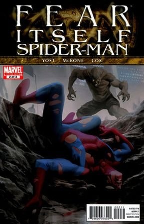
 The villains (if you can really call them that) are solid choices. Vermin is a fun character to see reappear every so often, and is really one of the only Spider-Man foes you can see managing to scare Peter. He serves his role well here, but he doesn't do much. Their fight scene is well done, but largely unneeded. The fight with the possessed Thing, on the other hand, is much bigger and thrilling to read. It conveys a real sense of dread, because both Spider-Man and the reader know that Peter cannot win this fight. Hell, the only way he'll even survive this fight is if he gets very lucky, which he barely does. It underscores the fear and feeling of the event as a whole, and the dread one feels for the heroes.
The mini's only real flaw, in my mind at least, stems from the all too happy ending. It ties up the story with too neat of a bow. It's supposed to be a nice, hopeful resolution, in the face of the all too powerful fear and pain in the story line. But it ends with no real problems, at least in Spider-Man's circle, and he can't even really call it a win, as the final battle wasn't really decided so much as abandoned. The resolution just feels cheap after such a well done execution.
Art: (5/5) I'm a big fan of McKone. He was one of my favorite artists when I really began to commit to comics in middle school, and he's always conveyed a very cool style. It's cartoony at times while also maintaining a certain realism. It flows well and delivers solid consistency. The designs of people and faces (while sometimes repetitious) are solid, moving in believable ways. The look and feel of Spider-Man swinging is very fluid, and one of the better versions I've seen in recent months. It just looks rather interesting, as the best web-swinging does. The fight with Vermin, on the other hand, works best because of the viciousness of it. If the scene is sold at all, it's thanks to McKone. It looks brutal and fast, each rip and claw feeling just real enough to sting. The art is rather good. It does suffer from small flaws here and there, but nothing really major enough to bring up.
Best Moment: Jonah.
Worst Moment: The resolution.
Overall: (4/5) A solid mini, and a very good tie in. It plants Spider-Man into the mindset of the crossover, and does a solid job of it.
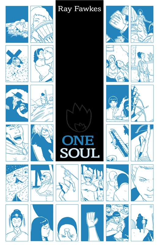
ONE SOUL OGN
Ray Fawkes: CreatorONI Press: Publisher
Vroom Socko: Just One Solution
To those of you headed to San Diego for Comic-Con, I have one thing to say. Before you do anything else, go to the ONI Press booth (#1833,) and buy a copy of ONE SOUL. You don't want to wait, because I have no doubt that by Saturday it will be sold out. This is easily the best comic of the year. With this book, Ray Fawkes does more to expand what is possible with comics as a medium than anyone else this century.
Each page in this book is the standard nine-panel grid, with 18 panels every two pages. Each of these 18 panels represents a different life. A neolithic hunter/gatherer, a Greek oracle, a shepard, a physician during the plague, a revolutionary soldier, a slave in the deep south, a vaudeville star, a WWII medic...each life is separated by time and place. Each life is shown from the same starting point, conception and birth. Each life is followed along the same span of years. Not every life, however, has the same number of years. Soon, black panels begin to accumulate.
What Fawkes is doing here plays to the strengths of comics like nothing else I've seen. I've heard people talk about how different stories are best suited for different mediums, but this is one of the few stories I've read that cannot be told in any medium other than this one. The format is part of the story; to try to tell this any other way would be like trying to make a TV show out of “House of Leaves”. You simply cannot imagine it any other way.
Actually, I must amend that last paragraph. This isn't a story, not the way most people think of stories, anyway. It has less in common with other ONI books like SCOTT PILGRIM or STUMPTOWN, and more in common with the works of Eric Drooker. This isn't comics as literature, it's comics as poetry. And, like the best poems, this book isn't really concerned with the particulars of narrative. It's concerned with something more important than that. It's a poem about identity, life, connectivity, isolation, and the question of humanity. The important shit, in other words.
Buy this book first thing. I promise you, the fanboys and the beancounters may spend this weekend talking about the changes at DC or the Captain America movie. But every creator at the convention worth a damn is going to be talking about Ray Fawkes and ONE SOUL. This book is something special.
Vroom Socko, aka Aaron Button, spends his free time either wandering through the bookstores of Portland, Oregon, or cheering on the Portland Timbers from the North End of Jeld-Wen Field. He's not going to be at Comic Con this year, on account of being broke. If you're there, buy this book. He's not kidding. And tell Joe Nozemack "Hi" for him, will you?
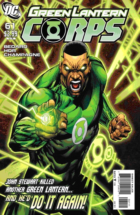
GREEN LANTERN CORPS #61
Writer: Tony BedardArt: Daniel Hdr and Keith Champagne
Publisher: DC Comics
Reviewer: The Writing Rambler
In the same week that we get the battle-filled epic finale to the WAR OF THE GREEN LANTERNS we also get a much smaller tale in GREEN LANTERN CORPS # 61. Much like the latest issue of EMERALD WARRIORS did with Guy Gardner, this issue is pretty much a stand-alone John Stewart tale (though the background is actually connected to the major storyline unlike Guy’s). In many ways it was a perfect complement to the large scale action we saw in GREEN LANTERN # 67 as it shows that even as the battle ends, everyone has to simply “get back to work”.
Bedard’s storyline is simple enough. The reserve Lanterns are turning in their rings due to the events of WAR OF THE GREEN LANTERNS having completed and one feels she shouldn’t have to, so she heads to John Stewart for advice. From here we’re given a story of John as a mentor for a rookie Lantern and despite John being a military man who will always “take the shot when necessary” he teaches her diplomacy and what it means to truly be a bearer of a green ring. It was a solid story for John Stewart and it showed that despite him being able to make the hard decision of killing Mogo in the last issue, he is fully aware and feels the pain of his decision.
The artwork in the issue is good and I especially love how John is captured at the end of the issue where you can really see the pain he feels for Mogo. The one thing I do have some issue with is the choice for the cover art where we see an enraged John Stewart with the words “John Stewart killed another Green Lantern….and He’d DO IT AGAIN” flying off the page below him. I really did not like this. It just completely contradicts the entire story we’re given in this issue and John Stewart’s personality as a whole. As we’re shown in the issue, John is an intelligent and strategic warrior who will only make a hard decision when he must and I wish the cover did a better job telling that as well.
When all is said and done, this was a good issue that allowed the reader to take a breath after the major events that had just concluded. While nowhere near as large scale and full of surprises as this week’s other GREEN LANTERN entry this was a nice addition to the story and a good starting point for WAR OF THE GREEN LANTERNS: AFTERMATH.
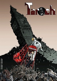
TAROCH #1
Writer: Clint GreenArt: Luke Orrin
Publisher: Bad Imprint
Reviewer: Mr. Pasty
The synopsis for TAROCH starts out by identifying the protagonist, Nicholas Brooks, as “a man who has never made a big decision in his life with no meaningful relationships, a worthless degree, a job he hates and the only constant in his life [being] a hangover.” In other words, he’s just like every other college graduate who’s reluctantly answered the call of the corporate rat race. Fortunately he doesn’t share their (our) inability to meet beautiful women who crash through walls and traverse alternate realities. If he did, this would be a pretty boring comic book. It isn’t. But something unexpected happened on the way to the review…
I plowed through issue numero uno fairly quickly because, well, it’s the opening act and we’re just getting to know each other. Characters are introduced, behaviors are established and the narrative pulls onto the highway and clicks into second gear. The aforementioned Nicholas Brooks is climbing out of a liquid rabbit hole and still has a few white bunnies jumping around his head. He stumbles into work and makes a few amusing sales calls for the machine in which he is a cog until something very comic-y happens: a cute little truffle comes crashing through the office wall calling him “the one.” He might as well be “the one millionth” at this point since we’ve had so many “you are the one!” moments in recent memory. We don’t know why she needs him, or why a “fiend” is chasing her, but watching a hung over telemarketer try to sort through a shattered reality plays to fairly amusing results.
Writer Clint Green doesn’t really flex his muscles in round one nor does he need to. TAROCH is slated for twelve issues and while the shuttle has launched, he’s still a long way from orbit. I can tell you everything is where it should be so barring a major collapse, I’m pretty comfortable with him at the helm. Where TAROCH shines the most is in the reflections of illustrator Luke Orrin. His palate is drab and drained of life, exactly what the world of a sobering drunk should be. I also appreciated his use of shadows but his real talent is in the eyes. Drawing expressions can be difficult but even more troublesome can be capturing emotion through lack of expression. Orrin’s execution is flawless.
That leads me to the short. TAROCH has a little tale called WHEN I GROW UP that follows it (unrelated to the preceding story) and I can’t believe how moved I was by the experience. This isn’t some quick escapade to reach a page count; this is an emotional tale of morality but about what I dare not say, as the payoff is too precious to spoil. Every young boy wants to be something fantastic when they grow up, including the one featured here. I said earlier that Clint Green didn’t do anything spectacular because the story had not yet required him to but this short proves he’s more than up to the task. The material presented here is delicate, moving and all too real but handled with such skill and maturity that I didn’t see the payoff coming prior to its reveal. Orrin’s brush, so understated in TAROCH, explodes in a kaleidoscope of visceral images that arrested my imagination from beginning to end. WHEN I GROW UP is a slam-dunk and a powerful statement, not because of its message, but because it showcases just how formidable a duo Green and Orrin can be when they’re in sync. I dare even say it overshadows TAROCH and is worth the price of admission alone. There’s nothing “Bad” about this “Imprint,” it’s an absolute must-buy.
Web heads who can’t get enough of Mr. Pasty’s word vomit are encouraged to watch him operate as Nostradumbass over at MMaMania.com here. Love, hate and Mafia Wars requests should be directed here.
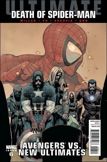
AVENGERS VS. NEW ULTIMATES #6
Writer: Mark MillarArt: Leinil Yu (pencils), Gerry Alanguilan, Jeff Huet, Jason Paz, Leinil Yu (inks)
Publisher: Ultimate Marvel
Reviewer: Johnny Destructo
This review contains SPOILERS.
It's been said that every writer has at least one great story within them, just waiting to burst out of its host. I'm of the opinion that Mark Millar has had several of those over the past 10 years, one that I loved so much, and gave such a glowing review of (MARVEL KNIGHTS SPIDER-MAN) that Mr. Millar was kind enough to email me and thank me personally for my knob-slobbery. Other examples of my Millar faves are the first two volumes of THE ULTIMATES. Having never really been a fan of The 616 Avengers, I found Millar's take on the concept to be a pretty fun romp. Those two volumes were, in my opinion, just waiting to burst forth from Mark Millar and I believe they read as such. None of his attempts thereafter even come close, this miniseries included.
I found this story to be simply OK. I never really felt anything as I slogged my way through this series, until one moment towards the end, which we will get to in just a second. It all felt very "been there, done that". A beloved character has betrayed us! No wait, a different beloved character betrayed us! No, no! It's a character that we never really heard of until recently who betrayed us. Whew!
The retreading of ideas isn't the only thing I found bothersome. I think an even greater mistake was made here, and that's the fact that now anyone can have superpowers anytime in the Ultimate Marvel Universe. If they want to, any character can become an invincible, Incredible Hulk version of himself with an injection. Anyone can have Spider-Man's spider powers or grow someone who does. How long until we see a Giant Man version of Thor, or Punisher stomping around Manhattan, wrecking shop? If anyone can assume these traits, everyone becomes interchangeable and the original characters become less special. Instead of Hawkeye having to use his special umm...Hawk-eyeing abilities to take down a threat, he Hawkeye Smashes his way through it. It feels cheap and a bit lazy. I realize that these things happen, Spidey was cloned already, so on and so forth, but this miniseries took it to a whoooole new level in a way that annoyed me.
The story bit that I loved and have actually decided was Awesome Of The Week was the bit where Tony uses his EMP to shut down his brother Gregory Stark's tech, leaving him vulnerable to attack. So how is he taken down? Thor hits this newly unarmed man with a BOLT OF MOTHERLOVIN' LIGHTING, deliciously crisping him to death, and jauntily cries "Got him!" Tony's priceless reaction being "Thor, what the HELL? I meant KNOCK HIM OUT." That actually made me laugh out loud while reading. Was it worth the 6 issues times $3.99 for that one glorious scene? No, not really. But dagnabbit if it wasn't funny as all get-out. It was definitely my favorite scene of this week.
Yu's work here is his usual solid penciling, but boyoboy am I uninterested in Sunny Gho's coloring style. More often than not, the colors are separated into "layers" and appear to be hit with a 1pt stroke of a darker version of that color. It reads like those cheesy old Paint By Numbers sets I used to love as a child. I find it disarming visually and a bit dark.
Overall, I could have done without this miniseries, ESPECIALLY since it had little to do with “The Death of Ultimate Spider-Man”, despite the banner draped across the top of every issue.
JD can be found hosting the PopTards Podcast, drawing a weekly webcomic, discussing movies, comics and other flimflam over at www.poptardsgo.com, graphically designing/illustrating for a living, and Booking his Face off over here. Follow his twitter @poptardsgo. His talkback name is PopTard_JD.
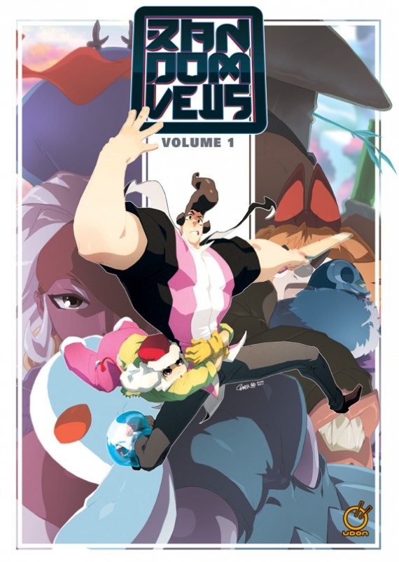
RANDOM VEUS Vol.1
Writers: Jeffrey Cruz & Leonhard BerminghamArtist: Jeffrey Cruz
Publisher: Udon Entertainment
Reviewer: Optimous Douche
Stylistically RANDOM VEUS is exactly what you would expect from an entertainment company named after a Japanese noodle and holding the MEGAMAN franchise – it’s a graphic novel heavily steeped in the manga/anime school of visual style. And I’ll fully admit my knowledge of this world ended back when Mrs. Douche and I would eat our breakfast watching “Sailor Moon” when we were in college. And make no mistake, even that was mockatainment. So, while the style was not in my wheelhouse, I can easily say that I had a blast wafting the vapors of pure imagination and other dimensional silliness that is RANDOM VEUS.
RANDOM VEUS has a strong premise for any genre: basically it’s the story of three inter dimensional couriers schlepping packages from one exotic dimensional plane to another. You know, exotic isn’t the right word. Exotic conjures up images of a secluded beach in Maui. No, the worlds of RANDOM VEUS are imagination incarnate. Ever been inside the mouth of a footsnake? What about gone toe-to-toe (or I guess fin-to-toe) with a landshark in a suit? The four chapters in RANDOM VEUS become progressively trippier the deeper down the rabbit-hole one goes.
While thoroughly Japanime, Cruz and Bermingham have a natural way with dialogue and story development that I find lacking in most of the sugar-coated big eyed end of manga pieces that I have skimmed in the past. There is a clear American to the dialogue that keeps the characters from transcending into the clunky language hurdles often caused by translation in this genre.
Our lead bohunk deliveryman is cool, collected and a former underwear model. His sidekicks, a blob with a smart-ass mouth and a slingshot of destruction saucer-eyed girl, remind you of traditional manga tropes, but again the dialogue allows that classification to remain solely with the visuals.
Is this a cross-over piece? No, nor should it be. Is this the first manga/anime piece that this “traditional” comic reviewer has ever been able to get through? Hells yes! And I more than got through it. I enjoyed every single panel of RANDOM VEUS.
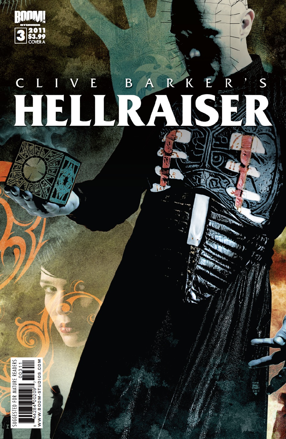
CLIVE BARKER’S HELLRAISER #3
Writer: Clive Barker & Christopher MonfetteArt: Stephen Thompson
Publisher: BOOM! Studios
Reviewer: BottleImp
Though I’m a fan of Clive Barker’s fiction and the first two HELLRAISER movies, I find myself curiously bored by this series so far. Though the premise of Pinhead trading his position in Hell to Kristy Cotton (the protagonist from those two movies, in case you didn’t know) is interesting, I’m getting a severe case of “seen-it-itis” here.
Let’s face it, there’s only so many times that you can see someone ripped apart by hooks and chains before it gets repetitive, and it got repetitive back in the ‘90s.
Stephen Thompson’s art this issue is an improvement to my mind over the previous two issues—at least he doesn’t over-spatter and over-photoshop as Leonardo Manco does (the “poster edges” filter has become a pet peeve of mine lately), but the overall effect still doesn’t inspire any real horror.
Maybe it’s because I don’t care about any of the characters, or maybe it’s simply that Pinhead and his Cenobite cronies have become far too familiar, but this series is a wash for me.
Proofs, co-edits & common sense provided by Sleazy G