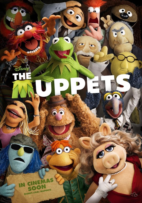
Hey folks, Harry here... It seems that Disney currently is going through a crisis of expectatons... JOHN CARTER OF MARS became JOHN CARTER... because well, let's not get their hopes up for Mars. Then this project started off as THE GREATEST MUPPET MOVIE EVER and became simply... THE MUPPETS. But then, think about the logos for both these properties... JCM for John Carter - and simple block letters with that Kermit "M" - it doesn't do anything to set up the film. I wish they just had the dusty and carnival looking original MUPPET logo - that is in the film... because that gives us the tone and a bit of the magic that the film itself will attempt to give us. BUT check out this international poster...

Now... I love the layout of The Muppets themselves here - but you see the problem with the logo - that M just bleeds into and gets lost on the poster in a way. But what I hate even more is the IN CINEMAS SOON with the url - being photoshopped upon the cardboard... instead of it being written with a marker. Whatever - I'm nitpicking... this looks like a MUPPET movie - and I'm just dying to see it.
And I want Disney to just fully embrace the magic of the characters and properties that they are attempting to bring us. How about you?
