

| Issue #3 | Release Date: 5/18/11 | Vol.#10 |
(Click title to go directly to the review)
BLACK DYNAMITE: SLAVE ISLAND #1
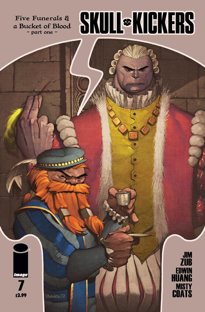
Advance Review: SKULLKICKERS #7
T.H.U.N.D.E.R. AGENTS #7
ROCKETEER ADVENTURES #1
BOOSTER GOLD #44
DRUMS #1
AMERICAN VAMPIRE Vol.2 HC TPB
CHEAP SHOTS!
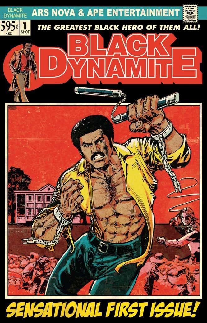
BLACK DYNAMITE: SLAVE ISLAND #1
Writer: Brian AshArtist: Jun Lofamia
Publisher: Ape Entertainment and ARS Nova
Reviewer: Professor Challenger
"Now dig. In my world, sometimes you get so used to seeing shocking shit -- that the only shit that's shocking anymore is your inability to be shocked by shit anymore. And that's when you see some shit that makes you realize...the shit you thought was shocking...wasn't even shit at all." -- Black Dynamite
Look, the bottom line is you either find BLACK DYNAMITE hilarious or you don't. I do find it hilarious. BLACK DYNAMITE was easily the funniest movie I saw in 2010, a brilliantly funny satire of the blaxploitation films of the 1970s by writer, creator, and star Michael Jai White. But how does that translate into a comic book? For the most part, it does translate quite well. You don't get the intensity of White's performance, which adds such a degree of absurd seriousness to every scene in the film. But you do get a good translation of the type of dialogue and offensive satire that made the movie rise above mere spoof and into a brilliant satirical piece of commentary on racism while also making you laugh continuously.
The creators of the comic book do take the opportunity to spoof some of the elements of the blaxploitation genre that filtered down to comics back then as well -- most notoriously with Luke Cage, Hero for Hire. The cover itself even looks like it could have almost been a LUKE CAGE comic book from the '70s. The layout looks just like the Marvel Comics of that era and Black Dynamite himself is decked out in a yellow shirt and blue pants just like Cage might have worn back then.
The comic book story is "Slave Island" and revolves around a racist perversion of "Fantasy Island" (a popular 1970s TV series for the newbs). Rather than fulfill everyone's personal fantasies, however, Slave Island is a place where rich, white racists go to live out fantasies of running an old slave-era Plantation replete with slaves, whippings, and master/slave sex.
It's all ridiculous, but also biting in its satire, and it requires Black Dynamite to save the day by taking out a shark with his bare hands, bedding some women, withstanding a whipping, and rallying a slave revolt upon the sick white racists on the island. There's a great call-back to the "villain" of the movie that will make any fan of the movie smile. In a lot of ways, the structure of the story also is a bit of a spoof of Bond in DR. NO and there are lots of pop culture referencing throughout the book to please the average geek including Alex Haley and "The Jeffersons." Be prepared for the language, though. It is filthy, but it's filthy in a way that makes you laugh because it's so over the top.
The art is also a fantastic throwback to these types of comics back in the '70s. Very reminiscent of artists like Billy Graham who worked on LUKE CAGE and JUNGLE ACTION back then. Needless to say, I enjoyed the hell out of BLACK DYNAMITE: SLAVE ISLAND. My only gripe is the $5.95 price. I would've liked to see that at least $2 cheaper. But in terms of getting a good translation of a character from movie to comic, this one did it right.
Prof. Challenger was beloved by many, despised by a few, but always lived his life to the fullest. Never did he miss an opportunity to pet a puppy, kiss a pretty girl, or ignore a hobo. He is survived by a long-suffering spouse, 2 confused children, a ridiculously silly dog, and a pompous fat old cat. The things that brought him happiness in this life were his comics, his books, his movies, and string cheese. Had he passed from this plane of existence, he would expect the loss to the world to be severe. As it is, however, he has not passed and has no plans to pass for quite awhile. So visit his website at profchallenger.com and read his ramblings and rantings and offer to pay him for his drawrings. He will show his appreciation with a winning smile and breath that smells like the beauty of angels.
 Advance review: In stores today!
SKULLKICKERS #7
Writer: Jim ZubArtist: Edwin Huang
Publisher: Image Comics
Reviewer: Optimous Douche
Reading SKULLKICKERS reminds me of the days back when my stand-up comedian friends were able to log on to Everquest. Even though we would taint the lands with our shout(s) of mockery, we still pretended that for a brief time we were part of that forgotten middle-earth like lore. We straddled the two worlds by unmercifully mocking the D&D tropes that we were also allowing ourselves to get lost in. It was a Richard’s Burrito, realities and times folding in on one another, but respectful enough to keep a tiny air pocket away from touching one another.
SKULLKICKERS holds the same lines of respect and hilarity. Author Zub finds a way to make you care about the so blatantly named lands of Mudwich and Urbia because they embody everything we would expect from towns of such names. They are familiar simply because we the geek have been trained to know them.
It doesn’t hurt that the lead characters…uhmmm….Knockcrotch and Meat believe everything is real, while still having an arseload of modern day cynicism. By the way, the names above are not the real names of the main characters. Even though issue 7 kicks off a new arc, we are still at a loss on the names of the crazy dwarf and strong silent type protagonists until the last page of the issue--that is, unless you are a reviewer; we get to consume PDFs with obtrusive watermarks and spoilers blacked out. So for now, I’m sticking with Knockcrotch and Meat until I learn otherwise.
Don’t misunderstand me, we know who these guys are, just not their names. The first volume of SKULLKICKERS taught us all we need to know about their personalities. We know greed, greed and greed motivate their actions and when not in pursuit of treasure, the rest of the time is occupied by grog. They are mercenary nomads in the truest sense of the word, but they are also ultra-violent SKULLKICKERS.
The ultra-violence, though, is tempered by the Warcraft-style renderings of Huang; he gives a cartoony feel without ever transcending into child fare. This choice allows the violence to also never transcend into gross, which is fine and dandy by me.
For those that know and love SKULLKICKERS, this new arc is slightly heavy on exposition, but it’s told in a nice enough style by a Chinese maid. So, longtime fans will find this time in the beginning enjoyable if somewhat unnecessary. From there the heroes of Mudwich are taken to the aforementioned Urbia to dine with nobles and be showered with praise for their heroic efforts…well…sorta. As is form with our unlucky duo, the shower of praise is more like a golden shower and by the end of their dinner the entire metropolis of Urbia believes they are murderers. As omnipotent readers, we know the true assassins, but the imagination and convention of this attack is just too much fun to spoil in this review. And that’s the best way to describe SKULLKICKERS: an imaginative and fun tale with lots of well…skull…kicking.
Optimous has successfully blackmailed fellow @$$Hole BottleImp into being his artist on Average Joe. Look for Imp's forced labor on Optimous brain child in mid-2011 from COM.X. Friend Optimous on FaceBook to get Average Joe updates and because ceiling cat says it's the right thing to do.
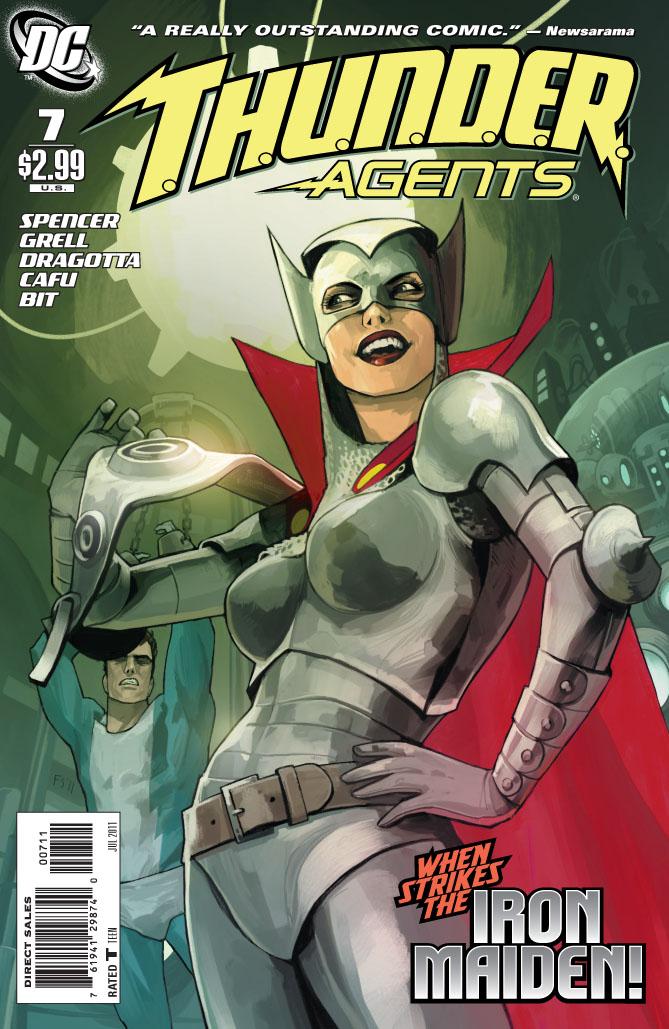
T.H.U.N.D.E.R. AGENTS #7
Writer: Nick SpencerArtists: Cafu, Mike Grell, Nick Dragotta
Published by: DC Comics
Reviewed by: BottleImp
Jeeeeeesus CHRIST.
Up until now, I was enjoying the format in which this series was written. I appreciated how the flashback sequences shed light on the backgrounds of the different T.H.U.N.D.E.R. Agents, enhancing the drama and depth of the goings-on of the present-day plot. I even liked the utilization of different artists—some of them comic book legends—to depict these flashbacks; it made it a simple matter to keep track of the multiple timeframes with little confusion as to what was happening when.
But this issue… Jeeeeeesus CHRIST.
The present-day plot is limited to two pages and six lines of dialogue. The rest of the comic is devoted to backstory involving the original Dynamo and his love/hate nemesis, the Iron Maiden. Now, that in itself is nothing to get overly steamed about—a little glimpse at the relationship between the hero and the villain (they had a sort of a Batman/Catwoman thing, if you know what I mean) definitely gives the reader more insight into the history of these characters. The problem is that this glimpse—and by glimpse, I really, REALLY mean glimpse, as in a quick look—this glimpse is stretched out over the entire issue.
How can I most effectively describe my frustration at this? Well, I can start by saying that it took under a minute to read the entire comic…including the ads. I can tell you that the Mike Grell-illustrated flashback sequence depicting the Iron Maiden living the comfy life of a suburban housewife (reminiscent of Vivica Fox’s part in “Kill Bill”) goes on for thirteen pages, when it could have easily been condensed (and probably made more visually exciting…sorry, Mike) to half that number. I can also say that the Nick Dragotta flashback sequence set in the T.H.U.N.D.E.R. Agents’ heyday back in the swingin’ ‘60s (that’s right…there are TWO flashbacks this issue) packs more action and story into its five short pages than the rest of the comic’s fifteen pages can manage to muster. I can’t express how disappointed I am that the messy, dangling plot threads left at the close of the previous issue have yet to be addressed. I can mention that the readers still know next to nothing about the current Agents beyond their names and abilities, and all this space in this issue that has been devoted to a thinly-stretched flashback would have better served to delve a little deeper into said characters, rather than introducing new ones.
But the thing about this quickly-read, non-plot-advancing comic that pisses me off the most is the fact that it STILL cost three bucks. Three bucks for a minute’s worth of entertainment. That works out to me paying Nick Spencer and Co. one hundred and eighty bucks an hour for this dreck.
(Yes, I know I’m stretching things a bit here by working the cost out to an hourly rate. But it’s my money, and I’m taking it personally.)
My point is: if comic books are going to cost three bucks a pop (and yes, I realize that three bucks is sadly the lowest comic price these days) then I want to make sure I get three bucks worth of entertainment out of them. I don’t think I’m asking too much; think about it—for the price of two comics, you could buy a full-length novel. For the price of three comics, you could see a movie. I just want to NOT get ripped off. In general, I like this series, and I was on board with what Spencer was doing to update these characters. But then he had to go and turn in a half-assed issue that any writer worth his salt would have folded into the larger narrative rather than stretching it out in order to pad an entire comic…
Jeeeeeesus CHRIST!
When released from his bottle, the Imp transforms into Stephen Andrade, an artist/illustrator/pirate monkey painter from New England. He's currently hard at work interpreting fellow @$$Hole Optimous Douche's brainwaves and transforming them into pretty pictures on AVERAGE JOE, an original graphic novel to be published by Com.x. You can see some of his artwork here.
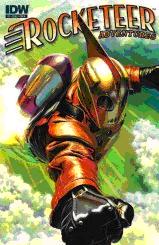
ROCKETEER ADVENTURES #1
Story/Art: VariousPublisher: IDW Publishing
Reviewer: MajinFu
Most of the readers are probably familiar with the Rocketeer movie of the same name (originally released in ’92 by Walt Disney Pictures), but did you know it was originally a comic?
Not just any comic, but an extremely proficient homage to the pulp classics of the ‘30s, created by a guy named Dave Stevens. The series originally began in the early ‘80s, sporadically releasing new material for the next two decades. Fortunately for fans of the story (and who doesn’t like a guy with a jet pack?) new adventures are now available.
The art roster alone more than justifies purchasing this comic, sporting two pinups by Mike Mignola and Jim Silke in addition to three short stories. John Cassaday kicks things off with a story he both wrote and illustrated. It’s short and sweet, presenting the hero Cliff Secord’s relationship with his girlfriend Betty. Next up is Mike Allred, whose signature style looks great for the character. Unfortunately, his story gets the short end of the stick, basically offering a transition between the first and last story.
The best story of the bunch is definitely the last one, which details Rocketeer’s long absence from America during WWII, via his letters to his girlfriend. Written by Kurt Busiek and beautifully illustrated by Michael Kaluta, my favorite parts were the snapshots which came with each letter, detailing his battles in the Pacific with a great sense of humor and storytelling verve. This is a brilliant example of how tell a very big story in an extremely concise way.
There’s also a preview for the next issue, with a roster that looks just as incredibly talented as the first. Great work all around and highly recommended to any fans of the movie and comic fans in general!
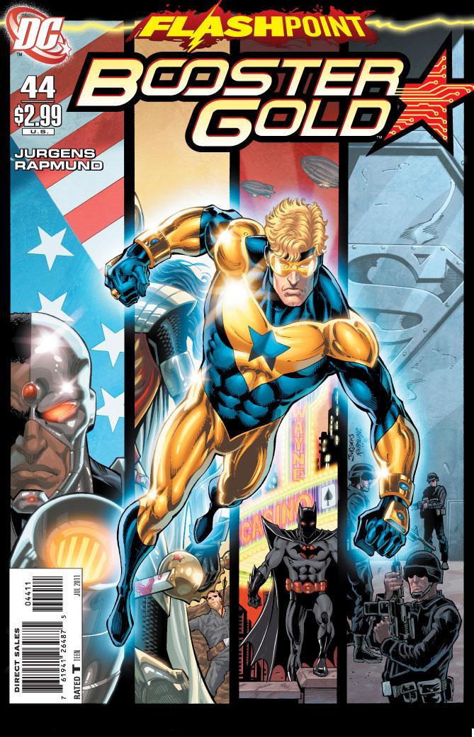
BOOSTER GOLD #44
Written by: Dan JurgensArt: Dan Jurgens and Norm Rapmund
Publisher: DC Comics
Reviewer: Irish Rican
BOOSTER GOLD #44 is one of the first tie-in issues to the DC Comics crossover “Flashpoint”. The issue, for having such a limited plot, is really all over the place. I'm not sure if by having Booster as the lone tie-in issue planned for May DC and Jurgens think they will get a whole slew of new readers over to the title. They do, once again, treat the readers to yet another brief origin story of Booster Gold. Wait - I'm getting ahead of myself.
The issue starts with Booster and Skeets flying into Coast City and finding themselves instantly under attack. This time it isn't Blackguard or Rainbow Raider but the Army who seems to think that Booster is part of a sole Atlantean attack. For those who haven't read “Flashpoint” here's a spoiler: It's like another dimensionuniversethingie or something.
Booster hasn't turned Atlantean but the Army doesn't know that and takes nothing for granted; they throw a huge frickin' missile at him. It's here where we get treated to, once again, Booster's origin. If you haven't read it in the original series, or 52, or JLI, or early issues of this series you are treated to it once again. We get it. Booster's a future guy. Now he's a past guy helping other timelines guy.
The remainder of the issue simply deals with Booster and Skeets getting their bearings together, trying to figure out why the Army is trying to kill them, and why Coast City is so...populated. Throw in a very nice two page ending that makes you go "HMMMM" and it makes you want to read the next issue.
Does that mean you can simply skip to the last two pages of this issue, read it, go "HMMMM" and skip the rest of the book? Honestly ...yes. I'm not sure what Dan Jurgens was going for here but for a 24 page book not much happens. The only tie-in to “Flashpoint” is that Booster is in this (spoiler) weirdFlashpointdimensionworld. There's nothing really else that is relevant to that overall storyline. The last two pages, which I won't give away, make you completely look forward to the next issue but BOOSTER #44 seems to be complete filler to get you to #45. For the diehards and completists only.
Ryan 'Irish Rican' McLelland has worked in movies and comics journalism for the past several years before joining the @$$holes here at AICN. Ryan’s comic work has already graced comic shelves with GRUNTS: WAR STORIES, Arcana’s PHILLY, and THE SENTINELS ANTHOLOGY. He rarely updates his blog but when he does it can be read at www.eyewannabe.com. Catch Ryan DJing all summer Thursdays from 9pm-midnight EST on 91.3 FM WTSR or streaming here.
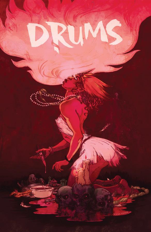
DRUMS #1
Writer: El TorresArtists: Abe Hernando & Kwaichang Kraneo
Publisher: Image Comics
Talkin’ to himself: KletusCasady
The cover of this issue immediately grabbed me; the second it touched my fingers I convinced myself that I had to at least take a look a few pages. bBfore I did I thought “wonder what this is about?”, I opened it and staring me in the face was a dead naked woman with her intestines hanging out, blood pouring out of her mouth and she was grabbing a man by the face saying “I will tell you,” at that moment I said to myself…”fuck…is she talking to me?!?!?” Of course not…but I MUST read this. Not that I’m a gore hound or anything…well maybe a little, but that picture alone had me hooked, if I was a fish I’d be on some rednecks boat with a sparkly Helicopter Lure tickling my throat waiting to be filleted. Image seems to be putting out a lot of really good books the last couple months and I figured since I liked the artwork and the creepy atmosphere, I figured I ‘d give this a try.
But Kletus, enough of this shit. how was it?
Can I tell you what it’s about first? That’s usually how I do these revie…
No! Answer my fucking question!
Ok…shit. I liked this book…a lot. I’m not going to lie most of the stuff I read and buy are mainstream superhero comics from the big 2 with the occasional exception here and there but every once in a while I get a hankerin’ for something different and that what this is. Part cop drama, part horror story, part spiritual story, this issue did a great job of not only keeping me interested but also getting though a lot of story with out having things seemed rushed. It was great read actually, not to mention this issue is pretty thick for $2.99.
Now what about the art? I know you’re kind of a stubborn jerk when it comes to art, did you give it a yay or nay and explain why good sir?
…uh Yay. This artwork is super moody which is kinda how I felt riding to this B-movie/ Drive -in convention in Jacksonville, I met Ilsa and I met Fred Willi…
Can we stay on topic please…?
Uhh...Sorrry, Yeah the art was really good and the atmosphere it created was great. This is a good case of how the art work can put a reader exactly in the state of mind the writer wants them in. In the comic, It’s rainy, cold, thundering and lighting and I felt like I was experiencing all of that just though these illustrations. I imagine finding an artist like this is great because you can eliminate the need to use page space to explain the mood or feeling of a particular story. The art is a little Darwyn Cooke-ish because everything in the panels is kind of stylized a particular way. What I mean by that is Cooke could draw over easy eggs and bacon and you could tell it was him. Not that over easy eggs and bacon can look that different, Cooke just has a certain style that flows through everything he draws and not every artist has that. The art also has a little Dalibor Talajic (HIT MONKEY) in it, mostly the way the bodies are shaped and move during action sequences.
What about the story? I know yer itchin’ to spoil shit…
I don’t really ever….never mind…The story is about a Federal investigation of a ritualistic mass suicide--or is there something more to this case than the local police and FBI are ready to handle?!!?
Wow, very vague…you should work for movie phone…any thing else you want to say? I’m sure there is.
Um…yeah this book has a great atmosphere. I felt like I was in this story while reading it. The art and story are perfect compliments to each other. This comic was a fun trip into the world of the supernatural and if this was made into a movie during the 70s, 80s or early 90s, it would be badass. Now if it was made it’d be some surface level movie that you’d seen a million times but all the elements are there for a great movie (a great comic as well). Also just to let you know there will be a lot of terms you don’t know the meaning to…but luckily for you blokes, they’ve included a glossary at the end of this issue. A nice touch because it frees up the pages so they can be seen in all their glory rather than jamming it up with definitions. Yet another reason this comic is totally worth the $2.99. If you’re into horror or supernatural themed stories, than you should definitely check this out. Now if you’re into voodoo, you should put down that bloody chicken head and pick this up…you could get some cool ideas…actually don’t do that, also don’t use that Kletus Cassidy doll in your rituals either for that matter…
You done?
Yeah but uhhh aren’t you, me?
Yup!
Isn’t that weird?
Yup!
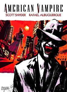
AMERICAN VAMPIRE V. 2 HC TPB
Writer: Scott SnyderArtist: Rafael Albuquerque
Publisher: DC Vertigo
Reviewer: Optimous Douche
This second foray into the mythos of the modern vampire tale stands head and shoulders above its inaugural predecessor for one reason and one reason only: no Stephen King.
Don’t get me wrong; I love Steven King. Page for page, I’ve read more of his work over the years than any other author. It was King’s name alone that got me started on this addictive tale about the world’s newest breed of vampires. As a comic writer, though, I feel King carries over too much of his traditional verbose book baggage into the comic medium. A well-crafted comic takes more than simply slapping long lines of prose into a dialog box. Comics are a carefully balanced delivery between leveraging call-out boxes, dialog, and allowing the artist to do their job in conveying the flow of the piece. Throughout the entire origin, King did an admirable job telling the beginnings of Wild West outlaw Skinner Sweet, who is converted into a vampire that the world has never seen before. But month-after-month it was the secondary tale of Pearl, a roaring twenties aspiring starlet who becomes Sweet’s “progeny”, that kept me truly engrossed and captivated. At the time I thought it was simply the story. As time progressed, though, and Snyder was unleashed into other parts of the DC universe, I came to notice a man-crush developing akin to a young writer five years ago named Geoff Johns who was reinventing THE FLASH. Snyder is DC’s newest star and an unstoppable comic force of creativity. This second volume of AMERICAN VAMPIRE is a crowning testament to that awesomeness.
The best part about AMERICAN VAMPIRE (for me at least) has nothing to do with vampires. As a moderate history buff, the best part to sink my teeth into is the tour of our young country’s history. As I stated, volume one danced between the times of the “old” West and America’s roaring twenties. Volume two takes us ahead a decade to the building of what will become known as one of the modern wonders of the world, the Hoover Dam. This story also focuses on how the building of this wonder forever transformed a sleepy little hamlet into the hot-bed of sin or bastion of true freedom (depending on your political leanings) that is Las Vegas.
Skinner Sweet is set apart from past vampires by more than just his new “breed” ability to walk in the sun and scoff at crosses. In most modern day vampire tales, the vampirism is what’s demonized. Generally vampires were once good people forced to do bad things because of their afflictions. Skinner, though, was pure evil before becoming a vampire. You actually feel sorry that vampirism must deal with Skinner Sweet. You also feel sorry for America, because Snyder is clearly setting up Sweet as an architect of the twentieth century, which loosely translates to our collective moral compass pointing permanently south.
In volume one the sweet juxtaposition to Sweet’s sour nature was Pearl. While Pearl makes an appearance in a few “after” issues, Skinner’s main foil throughout the Hoover Dam saga is a cop fighting desperately to hold on to the purity of Vegas. Hindsight being 20/20, you will continually know throughout reading the piece the man is on a fruitless mission, but you still can’t help rooting for him as he battles Sweet, a shadow organization of vampire hunters and several breeds of vampires themselves from across the millennia.
Pearl does appear in this volume, but her story is only loosely tangential to the action of the Dam building--that is, until the two follow-up issues after the Dam saga closes. Pearl, her roommate Hattie and Pearl’s husband use the final two issues of this volume to set the stage for the current WWII arc running through the AMERICAN VAMPIRE monthlies. Pearl finds love, but as with every vampire that chooses to love a human, the frailty of the relationship extends beyond the emotional to the literal. These two issues were simply heart-breaking; Snyder pulls at every emotional string on his banjolele to show that Pearl’s soul will forever be in a struggle of the light trying to overcome the dark pit that Sweet condemned her to.
No review would be complete without a critique of the art. Albuquerque’s name may be a bitch to get right without spell check or having grown up in New Mexico, but it’s a name and talent that will stay with you well after reading AMERICAN VAMPIRE. Albuquerque deftly manages each moment in this book with a gritty grace that is bare-bones at the same time rife with detail and expression. It’s a dark tone for a dark book, but Albuquerque never confuses dark and real with over saturated and sloppy. And the first two page spread of the almost completed Hoover Dam is simply awe inspiring in scope and detail.
And you know what, that’s probably the best way to sum up the total AMERICAN VAMPIRE experience; an epic awe inspiring tale, rife with historical accuracies and fantastical imagination, about one of the world’s oldest threats set against the back-drop of the world’s newest nation.

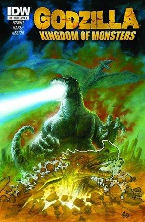 GODZILLA: KINGDOM OF MONSTERS #2
IDW Publishing
The monster mashing begins after a rather slow set up issue. I found a lot of the humor in the first issue to be a bit lame, but the humor in issue two seems to be a bit more on target as Anguirus and Rodan join the mix, especially a scene where a mourning father takes his revenge on Godzilla. But there are a few clunkers as Powell tries his hand at political humor (note to Powell: stick to the monster carnage). The scenes of people leaving Tokyo en masse and searching through the rubble for loved ones still hits a bit too close to home given recent world events, but writer Powell keeps the tone light and the monsters…well, monstrous. There’s a tendency to anthromorphize…to treat these monsters as if they have personalities of their own--a factor of the films that I never liked so much. Here Powell treats the monsters like walking natural disasters causing carnage and devastation wherever they stomp. With three monsters on a collision course in the next issue, you bet your sweet @$$ I’ll be back for more in a month. Especially if Phil Hester continues to draw the monsters and morph panels the way he does in this and the first issue. Simply gorgeous art in this one. - Ambush Bug
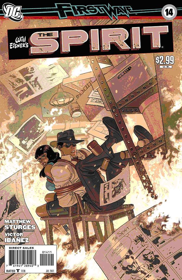 THE SPIRIT #14DC Comics
The new SPIRIT run has been solid work so far, but this issue is easily my favorite of the series to date! First of all, the art is gorgeous. Ibáñez injects the comic with a dynamism that would make Eisner proud, with a clean realistic style and immensely emotive characters. The color scheme by EGO is slightly muted, but serves the tone of the story well. The plot is fairly by the numbers, introducing a new babe for Spirit to fawn over, Alabaster Cream. She’s a total comics nut, involved with a shady criminal art dealer. She naturally runs into the Spirit who naturally decides to help her, hijinks ensue, you get the picture. It’s simple enough, but it moves at a quick pace and the layouts keep the story from ever getting dull. This is a one-and-done that is done right. This one’s highly recommended for people looking for a fun standalone issue, and fans of Bettie Page. - MajinFu
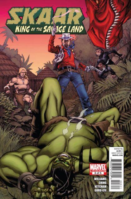 SKAAR: KING OF THE SAVAGE LAND #3 (of 5)
Marvel Comics
This is a fantastic book by a relative newcomer, Rob Williams (who is at least new to me) which focuses on the son of the Hulk, but also highlights some of the coolest untapped fun aspects of the Marvel U such as Devil Dinosaur, Two Gun Kid, and Ka-Zar. Mashing up all of these different characters together is what the Mighty Marvel Manner is all about and proves that you don’t have to have Wolverine or Spidey in your book in order for it to be a cool team. Rob Williams has that same style and sense of fun in his writing that Van Lente, Pak, and Slott had and look where they are now. Check out Williams’ writing here before he becomes a big name at Marvel. The art by Brian Ching and Rick Ketcham is another reason this little miniseries is tops. - Ambush Bug
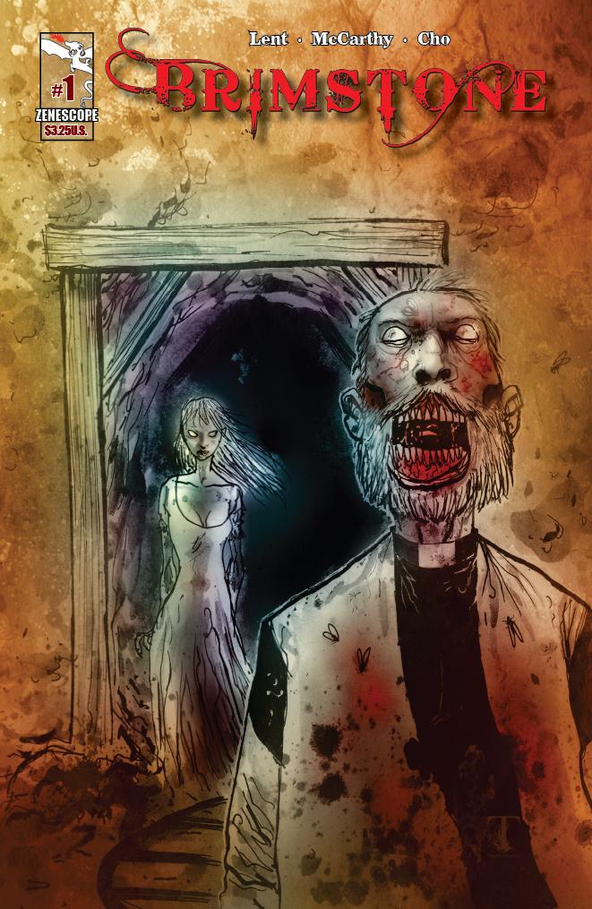 BRIMSTONE #1
Zenescope Entertainment
No this is not a remake of one of my favorite short lived TV series from the nineties about a dead lawman who is assigned by the devil to track down escaped evil souls. Remember BRIMSTONE? Man, that was awesome. This miniseries is something entirely different, but equally as awesome. I know what you’re thinking. Zenescope is that company made famous for having all of those cheese-cakey covers showing chest and ass cleavage. Yes it is. But BRIMSTONE is a step away from all of that. It’s a gritty horror Western about an Indian curse and a ragtag group of unlikely heroes who band together to take on what looks to be werewolves and zombies. I love me a good genre mash-up and this seems to both respect and admire the best aspects of both horror and Westerns. There’s a real DIRTY DOZEN/CUT THROATS NINE vibe to this book, where the “heroes” are as grimy as the monsters they are battling. Dime-store novel hero Viper leads a crew of swarthy men into the dark Indian territory. Moody artwork by Hyunsang Michael Cho is great and really communicates the action well in the silent panels. This isn’t your typical Zenescope comic. It’s a hard core horror Western with awesome covers by Ben Templesmith and Greg Horn. Can’t wait to see the bullets fly in the next issue when our posse and the agents of our Indian curse collide. - Ambush Bug
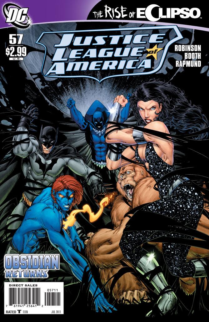 JUSTICE LEAGUE OF AMERICA #57
DC Comics
This week on the Justice League of Exposition, thrill at Jesse Quick as she bends the ear of Donna Troy about her diminishing powers. Swoon at the lengthy recap of the last few issues of heroes standing and talking by Alan Scott (who should be dressed as a giant lantern, shouldn’t he?) and Batman. Get all edge of your seat-y as Obsidian explains why he’s taking up space in this issue. Slap your head till it’s sore as Eclipso goes for the record of most inner monolog captions in a single two page spread. GOD DAMN when will someone shoot this book in the back of the head and give it another reboot? Robinson’s gone word crazy and Brett Booth has to be getting sick of drawing heroes standing around from different angles. Can someone get these heroes a chair? Maybe a nice sofa? And a new prescription of eyeglasses, maybe? I know I needed one after squinting to see any of the cool art in between all of those captions and world balloons. Problem is, this is a cool cast for the JLA with a lot of the Titans all growed up and in the big leagues. Management are going to think that the reason why this book is awful is because it’s not Bruce, Clark and Diana in the book. But that’s not it. It’s Robinson’s bad comic book writing. Self indulgent, overly expository, trade paced crap. - Ambush Bug
Proofs, co-edits & common sense provided by Sleazy G