
@@@ AICN COMICS REVIEWS! @@@
| Issue #43 | Release Date: 3/16/11 | Vol.#9 |
(Click title to go directly to the review)
Advance Review: CLIVE BARKER’S HELLRAISER #1
X-FACTOR #216
VERONICA #205
Advance Review: FF #1
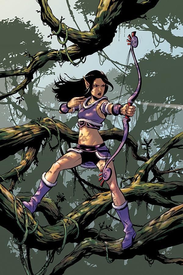
THE GUILD: TINK #1
ULTIMATE AVENGERS VS NEW ULTIMATES #2
Advance Review: NEONOMICON #4
THE LONE RANGER: THE DEATH OF ZORRO #1
THE UNWRITTEN: DEAD MAN’S KNOCK TPB Vol. 3
Advance Review: ULTIMATE DOOM #4
Indie Jones presents GATOR BUTCH #1
 Advance Review: In stores today!
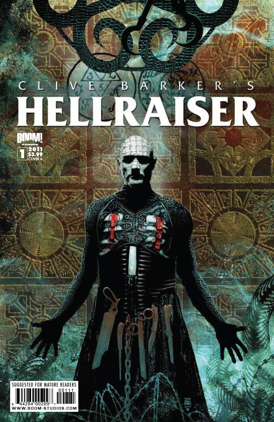
CLIVE BARKER’S HELLRAISER #1
Writers: Clive Barker & Christopher MonfetteArt: Leonardo Manco
Publisher: BOOM! Studios
Reviewer: Ambush Bug
Clive Barker is one of my favorite writers, and though I haven’t read a lot of him lately, after reading this first issue of HELLRAISER he still walks the line between poetic and perverse. HELLRAISER #1 sets the stage for a truly horrific journey for fans of the HELLRAISER movies (especially the first two, which, let’s face it, are the only two that matter).
The issue starts out ominously, as Barker and his co-writer Christopher Monfette describe the decrepit scenery of hell in the most flowery of ways. Leonardo Manco’s art is a wonderful juxtaposition of word and image with his dark and scratchy imagery. You get a sense that you really are reading a story by a writer who not only is fully capable of making each word haunt and inspire, but understands the medium of comics as well, letting the words be just another factor in describing what is unseen while the artist is given the chance to describe what is in image. It sounds like a simple concept, but one many writers crossing over to comics don’t completely understand.
The story is pretty simple. Pinhead, everyone’s favorite Cenobite, is growing bored with tormenting souls and repeating the same taglines he’s been doing since the first HELLRAISER film. Here he decides to denounce Leviathan and be cast down to Earth one again to experience new hells and dangers. I love this development in the Pinhead character and it stays right in keeping with the character that was given more depth in the HELLRAISER sequel HELLBOUND. Mention of the Channard Institute and the inclusion of Kirsty Cotton in the story shows that this, more than any other HELLRAISER continuation, feels more like a sequel to the first two films than any of the films following.
Leonardo Manco is a perfect fit for this comic. His gritty and scratchy images have dark corners and sharp edges. His work in this comic makes it feel like a dangerous read. Having followed his work for years, it’s good to see this artist fit so well with a concept. Here Manco shines in his large panels of Pinhead tearing the flesh from bones and presenting the puzzle box. But Manco doesn’t shy away from the details in smaller panels with less going on. There’s a franticness to Manco’s panels that oozes horror and unease--exactly the way I want to feel while experiencing a HELLRAISER story.
I can’t wait to read the rest of this series and see what hells Manco, Monfette, and Barker have to show us. So far, the story taking place in the first issue of BOOM!’s HELLRAISER has dug its hooks into me.
Ambush Bug is Mark L. Miller, original @$$Hole/wordslinger/reviewer/co-editor of AICN Comics for over nine years. Support a Bug by checking out his comics (click on the names to purchase)!
MUSCLES & FIGHTS VOL.3 & MUSCLES & FRIGHTS VOL.1.
VINCENT PRICE PRESENTS: THE TINGLER #1 and #2(interview, interview, preview, & review).
VINCENT PRICE PRESENTS #20 WITCHFINDER GENERAL(preview, review)
NANNY & HANK miniseries: #1, #2, #3, & #4 (interview, interview, interview, preview, & review, review, in stores now!)
Zenescope’s WONDERLAND ANNUAL 2010
THE DEATHSPORT GAMES miniseries: #1, #2, #3, & #4 (review, in stores now!)
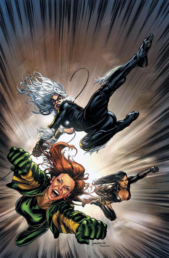
X-FACTOR #217
Writer: Peter DavidArtists: Emanuela Lupacchino (pencils), Guillermo Ortego (inks), Matt Milla (colors)
Published by: Marvel Comics
Reviewed by: BottleImp
This has probably happened to you: you’re enjoying a story—it doesn’t matter in what form--movie, novel, or let’s say, comic book—and suddenly a character starts spouting dialogue that breaks you jarringly out of the tiny imaginary world in which you were so happily immersed. The pristine narrative has been cracked open, the fourth wall has been breached, and you find yourself a victim of that old, groan-inducing AUTHOR’S MESSAGE!!! being hammered into your skull. Seriously, I hate being preached to by the books I read, the movies I watch, or the comics I buy. I’m looking for entertainment here, not a flashback to falling asleep in a college lecture hall while some guy drones on and on about a subject that had been beaten to death years ago. That’s not to say that entertainment should never have a viewpoint to present or a message to impart—I just think that the mark of a good writer is that he or she can put forth their viewpoint within the context of entertaining the reader and without creating a break from the narrative.
Such is the crime committed by Peter David in this issue of X-FACTOR, when Marvel’s mayor of New York (and SPIDER-MAN mainstay) J. Jonah Jameson confronts an angry crowd at an anti-Muslim demonstration, opens his mouth, and transforms into a ventriloquist’s dummy sitting on David’s knee, allowing the writer’s voice to flow out of him. It’s not that I’m offended by the content of the message—in fact, I agree with Jameson’s (David’s) views of the reasons behind the right-wing extremist xenophobia—but the words just don’t sound right coming out of the mouth of one of Marvel’s most historically hate-filled characters. Now, I’ll freely admit that I don’t read the Spider-Man titles nowadays, and my view of the former Daily Bugle publisher is an amalgamation of the original Lee/Ditko JJJ, the slightly-less-assholeish-but-still-pretty-much-an-asshole version from the late 1970s/early ‘80s, and the broad comic relief version portrayed by J.K. Simmons in the Raimi films. So the modern Jameson may very well be a crusader for tolerance and equality and if so, I’m sure somebody will nail me in the talkback forum for not knowing this, but the speech spouted off in this comic simply does not jive with the character as I know him, and I’m left feeling disappointed that David wasn’t able to interweave his opinion more gracefully into the tapestry of the narrative.
But I can’t harp on this too much, because the story surrounding the lecture is some pretty good stuff. David is continuing his trend of having his team of misfit mutants play with the broader spectrum of the Marvel Universe rather than limiting them to the usual mutant crossovers, and the result is fanboy gold. Along with JJJ, this issue double-dips into the SPIDER-MAN continuity with an appearance by the Black Cat as the team attempts to protect Mayor Jameson from a trio of superhuman female assassins, while David continues to add depth to the one-dimensional Shatterstar by dropping portentous hints of a hidden connection between ‘Star and fellow Mojoverse expatriate Longshot. Oh, and did I mention the dramatic cliffhanger? ‘Cause this one’s a doozy, at least for readers like me who have soft spots for the team’s C-Listers.
And the artwork… my god, it’s just gorgeous. Not only does Lupacchino have an eye for page composition and dynamic fight scenes, but she draws some of the most beautiful women to grace the comic page. Beautiful AND emotive, too! There are some artists out there who can draw pretty faces that have all the emotional range of a department store mannequin (Ed Benes comes to mind), who are unable to make those faces display any feeling. Lupacchino draws the women of X-FACTOR smiling, snarling, shouting, screaming, punching and pouting, and the emotion just pours out of those beautiful faces. I have to also give a lot of credit to colorist Milla for creating a palette that combines both subtle shading and moody color schemes with the more traditional bright comic book hues. It’s a perfect synchronicity of modern naturalistic sensibilities with the old-fashioned superhero fun, and gives this title a wonderful visual energy.
Now that I look back on it, I may have been a little harsh in my disapproval for David’s Jameson speech. After all, the rest of the issue is up to the level of quality I’ve come to expect from this title, and the X-Factor teams still remains one of the best-written collection of characters to grace the stands.
Just don’t lecture me, bro.
When released from his Bottle, the Imp takes the form of Stephen Andrade, an artist/illustrator/pirate monkey painter from the Northeast. You can see some of his artwork at sandradeillustration.com. The Imp is currently hard at work on the graphic novel AVERAGE JOE, written by fellow @$$hole Optimous Douche—look for it from Com.x later this year.
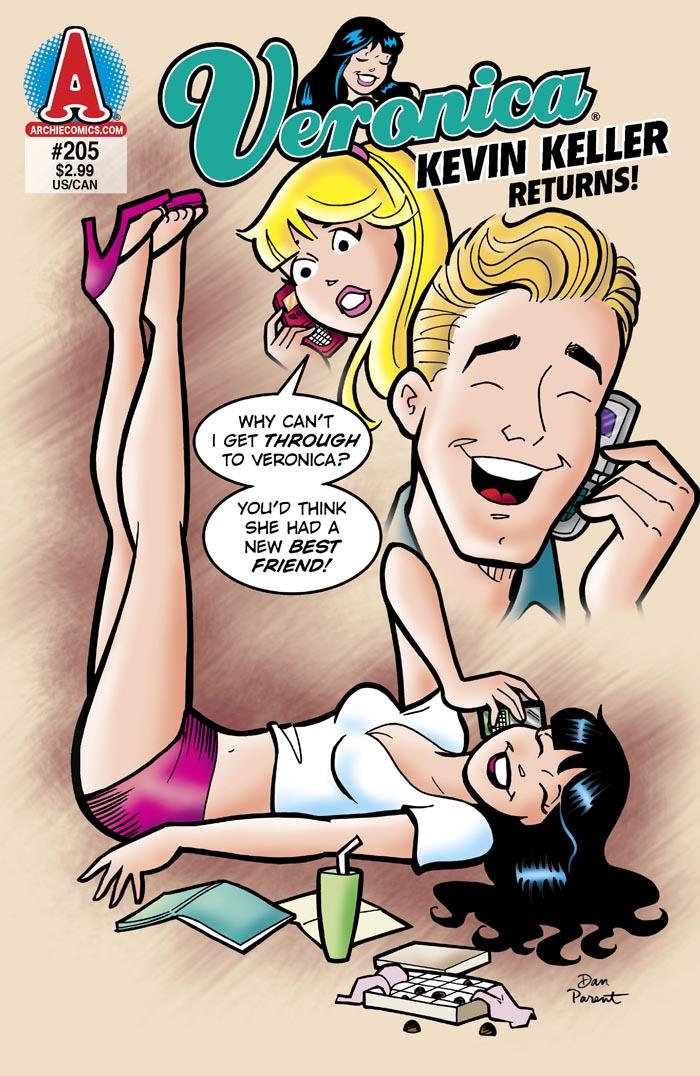
VERONICA #205
Writer: Dan ParentArtist: Dan Parent
Publisher: Archie Comics
Reviewer: Lyzard
For those that haven’t been keeping up with the Archie universe, you may think they are an old stick in the mud, unwilling to change with the times. Though Archie does stay true (for the most part) to their wholesome All-American image, Archie Publications is not one to ignore what is happening in our culture. Beyond the allusions and references to pop culture, last year they had an issue featuring Sarah Palin and President Obama. Also in 2010, they introduced their first openly gay character, Kevin Keller in VERONICA #202. That issue sold like hotcakes, demanding a reprint. I was never able to pick up the issue, but I do know the basic plot for it.
In VERONICA #202, Kevin Keller is the new boy in school and Veronica sets her eyes on him. But Kevin does not reciprocate these feelings towards Ronnie, who is at a loss as to why. Now by the end of the issue we know it is because Kevin is gay. By the time we are re-introduced to him in VERONICA #205, Veronica has moved on from crushing on Kevin to being BFFs with him. However, their friendship is at the cost of Veronica and Betty’s relationship.
First of all, I’ve never understood Betty and Veronica’s “friendship.” I know the expression goes “keep your friends close, but your enemies closer,” however I cannot see the point of being friends with the very girl that constantly steals Archie from you.
Secondly, I hate to love Betty, but I love to hate Veronica. Betty is whiny and passive, while Veronica is a bitch, but one who is active and speaks her mind. Truthfully, I don’t care whom Archie ends up with, but I cannot possibly root for Betty.
Though this is a Veronica comic, the focus of the story is mainly on Betty, as she struggles to get back her BFF. This issue features Betty at her whiniest and most submissive. She essentially lets Kevin Keller monopolize Veronica’s time without even putting up a fight. Who can cheer on a character like that? Jughead seems to be the best character in this issue, though I am biased. He actually sets plans into motion and has some humorous moments.
An interesting element of this particular issue was the allusions to our pop culture. Instead of saying Lindsay Lohan, they refer to a movie star called “Lydia Lohan” (who just happens to have a movie “so bad, it was funny”). Later on in the issue, though, they refer directly to “Laguna Hills” and real characters on the show like Spencer and Heidi. I found it odd that they would beat around the bush with Lindsay, but then directly attack the O.C. reality show. Small little peeve however, “Laguna Hills” has been off the airs for years and I can only hope and pray MTV will never do a marathon of it as the comic suggests.
There isn’t much reason to talk about the artwork, since Archie Comics has a pretty basic format for all their books. But after reading one of the “Archie New Look Series” that featured more realistic drawings, I’m happy to return to a cartoony style.
As for the book’s treatment of Kevin Keller, I’m happy to say that Archie Comics avoids stereotypes. Yes, he may watch vapid reality shows, but he isn’t into show tunes. Kevin Keller is just a regular guy who just happens to be gay…and can go head to head with Jughead in eating competitions.
The issue was weak, but had its moments. The focus being on Betty was a deterrent, but the ending did explain why Betty and Veronica could be friends at times. Overall, if you read the series you probably won’t mind it as much. If you read VERONICA #202 and want to see more of Kevin Keller beware, for his role is minimal in this book.
Lyzard is actually Lyz Reblin, a film student at Chapman University. Lyz’s love for comics stems from an internship at Dark Horse Entertainment as a freshman, which may explain why some of her favorite comic book writers are Gerard Way and Steve Niles. You can find her on Facebook, but only if you follow her band: Castle Town Convicts (possibly a Zelda reference?).
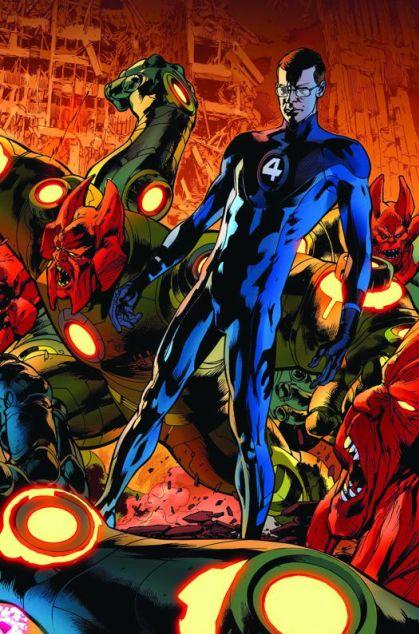
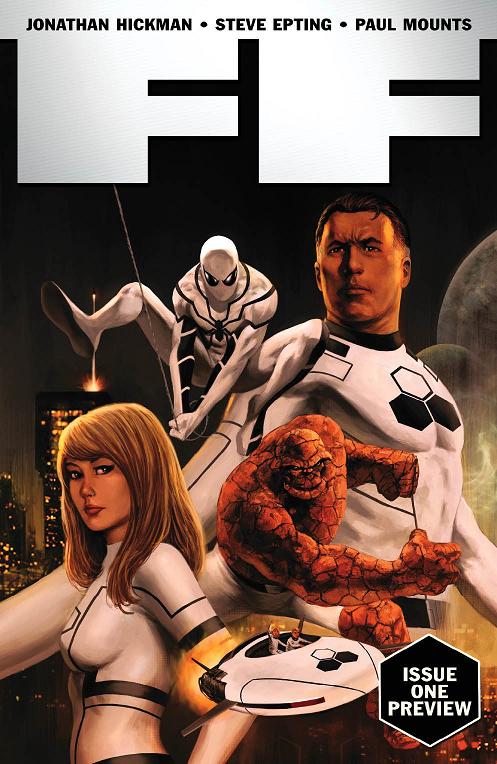 Advence Review: In stores today!
FF #1
Writer: Jonathan HickmanArt: Steve Epting (pencils), Steve Epting & Rick Magyar (inks), Paul Mounts (colors)
Publisher: Ultimate Marvel Comics
Reviewed by Johnny Destructo
Well, that was exactly what I expected. Jonathan Hickman's run on the FANTASTIC FOUR hasn't really kept me salivating for more. The Human Torch's death (and Marvel's treatment of said demise) was lackluster and DID leave me salivating for more, just not in a positive way. I only pick it up every couple of issues and read it to keep abreast, but without any emotional involvement on my part. This issue, however, is a great start to what appears to be a promising run!
The reason for including Spidey in the new "Future Foundation" (as the Fantastic Four are now referred to) is a simple yet meaningful one, and while Spidey is now on both the Avengers AND the FF, it makes sense with what is going on over in Spidey's title. “Big Time” and what has come after it, in case you haven't been paying attention, deals with Peter finally getting things right. He has money, a place to live, a great job that he loves, so on and so forth. Things are looking up for Pete and this is just another example of that.
His presence isn't all witty quips and banter though, and appropriately so. Spidey responds to problems with a good amount of humor as a self-defense mechanism, but the FF just aren't having it. Johnny's passing is too recent and too painful for anyone to be enjoying themselves just yet. That doesn't mean that the world has stopped turning, though, and the FF already have some threats looming and a bit of a surprise to deal with at the end of this issue.
Steve Epting's work here is very solid, if not particularly flashy. While it's strong, well-crafted story telling on his part, it has a similar enough feel to Bryan Hitch's work that it makes me want Hitch back on the book. I mean, look at that splash page of Spidey swinging through the city and tell me I'm crazy.
At any rate, if you're like me and were lukewarm about the run up until now, THIS is the place to pick it back up again! You won't regret it!
JD can be found hosting the PopTards Podcast, discussing movies, comics and other flimflam over at www.poptardsgo.com, graphically designing/illustrating for a living, and Booking his Face off over here.
THE GUILD: TINK #1
Writer: Felicia DayArt: Kristian Donaldson, Jeremy Bastion, Wellinton Alves, Tim Seeley , Adam Warren
Publisher: Dark Horse Comics
Reviewer: Ian Pershke
So at last the most reclusive member of the guild gets a back story, sort of. If you are familiar and a fan you know that Tink is private and rather verbally abusive to her guild mates at almost every turn. She is certainly not the “nice one” of the group. So as we embark to better understand Tink we are given a series of stories as she explains her background to the various guild members in more and more outlandish stories.
My personal favorite was an all too short, bitter romance novel-like encounter with a tall and handsome mysterious stranger with wonderful artwork by Jeremy Bastian. Tink, however, does not stop there: as she is questioned by other guild members to determine who she really is, she leaps off the cliff to the truly absurd. You can almost feel the gears in Vork’s head turning as he attempts to process the yarn that she spins. I did appreciate that her back story was always tailored to the specific character she was interacting with. Of course, in the “not a surprise” column, Bladezz was given a signal panel page to explain and bought it with little self reflection.
TINK was overall a success as it reflected genuine glimpses of the characters, and allowed us to learn at little bit about her. TINK remains the enigma, but as a fan I would have been disappointed if she was revealed here and not in later seasons of THE GUILD.
Next up is the always obnoxious Bladezz and the origins of Finn Smulders, teen model extraordinaire.
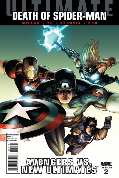
ULTIMATE AVENGERS VS NEW ULTIMATES #2
Writer: Mark MillarArt: Leinil Francis Yu, Stephen Segovia, Gerry Alanguilen
Publisher: Ultimate Marvel Comics
Reviewer: Henry Higgins is My Homeboy
Different side of things.
After the events of the last part, it's nice to see the story take a surprising turn. While the book itself in terms of scripting and even art can feel lacking at times, it is going in an interesting direction as we get ever closer to the end of the road.
Writing: (3/5) After the previous issue focused instead on the ULTIMATES, it's good to see the Avengers and some development for them. The team Fury recruits (who, by the way, is written well here--he sounds like Fury from the ULTIMATES, which is surprisingly rare as of late) is introduced in nice little scenes. Punisher's scene is predictable, but not terrible. It falls in line with the Ultimate version of the character. Blade's recruitment is similar; it sort of just happens. It's easy to guess what happens next, but it works. Ultimate Hawkeye is still Ultimate Hawkeye, and all that entails. The team works with an interesting dynamic, and it's always nice to see Fury take charge of a team on the field. The true villain is interesting and it's nice to see it's someone we've met before, and not just some random mook. It could have gone with a bit more explanation though. It took me a bit to realize that yes, we have seen him, and not too far back at that. The impact shockwaves are a nice touch, and the eventual arrival of Blade is brilliant. His hypnosis scene is well done on a lot of levels. The eventual reveal of who is the real big bad is a great little twist, and a good moment. Where the issue falls apart is dialogue. Much of it feels stilted (save for Fury and at times, Blade). The banter doesn't feel much like banter, and some of the characters talk a bit inconsistently (i.e., Punisher’s list of demands doesn't all sound former marine). The issue suffers from some problems here and there, and it distracts a fair bit from the overall quality of the comic.
Art: (4/5) Lu and Segovia turn out an impressive issue in regards to the art in this issue. The two play off one another well, and there are some very impressive visual things in this month’s part. The designs of Blade are good and consistent, all of them staying clear in character. Fury and Punisher look great, and Hawkeye is, for the most part, just as good. The definite highlight of the issue artistically speaking is the fight between War Machine and the proto Huk. It's fast paced, actually feels brutal, and is one of the better one on ones the Ultimate universe has had in a while. If the issue has any weaknesses artistically, it comes from Yu's only real flaw, in that some of his facial reactions don't work overall. But the issue looks great.
Best Moment: Proto Hulk vs. War Machine.
Worst Moment: Punisher's reintroduction.
Overall: (4/5) A solid issue, with some good set ups for the future. Also, I swear to god, if Spider-Man is in fact killed, I will kill a man.
 Advance Review: In stores next week!
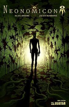
NEONOMICON #4
Writer: Alan MooreArt: Jacen Burrows
Publisher: Avatar Press
Reviewer: Ambush Bug
I always am a little tentative to crack open an Avatar comic in fear of what I’m about to experience. I love it that the company has that effect on me. Bloodshed, bizarre sex, twisted themes…you just never know what kind of depraved stuff you’re going see. Though this issue pales in comparison to the last two issues of this series, NEONOMICON #4 wraps the entire arc up in an expertly crafted bow.
Though I wouldn’t say I’m an expert on Cthulhu and Lovecraftian mythos, Moore fills this book with enough outsiders to the lore that I never felt lost or in need of some research to understand it. The story follows a young agent who is sent to follow up on the disappearance of a detective (from the first NEONOMICON series). Her investigation leads her to the bowels of a temple constructed by a Lovecraftian cult that worships a Dagon/Creature of the Black Lagoon-like creature. Captured and drugged, she is given as a sacrifice to fulfill the sexual and possibly nutritional needs of the beast. The end of issue three left our agent at the mercy of the creature as he is dragging her through the murky water, not really giving a shit whether or not she can breathe under water or not.
This last issue is high on action and tension. Moore divides the scene between extended scenes of the agents outside the temple and peppered shots of the agents inside as they descend into the darkness. Moore, despite his outspoken and bizarre real life shenanigans, is a master wordsmith, interlacing these scenes to amp up the tension-build to a climax that fully encapsulates the reader. As I scanned the panels, I was in that darkness with the agents, scared shitless and fearing what hides in the shadows.
Jacen Burrows delivers another highly detailed depiction of gore and violence. His hyper-real focus on the tiny details only serves to escalate the tension of this bizarre world Moore is mapping out. His sense of scene and angle is pitch perfect and the perfect compliment to Moore’s cinematic story.
Avatar books are not for anyone. They are violent and disturbing and will sometimes make you want a shower after reading them. But they are also expertly crafted, storywise. NEONOMICON is the perfect example of this. I never know if there will be more issues of this series to come because each issue reads with an ominous finality. If this is the last issue, it’s a doozy and I can’t wait to see what other despicable acts Moore and Burrows have for us in the future at Avatar.

THE LONE RANGER: THE DEATH OF ZORRO #1
Writer: Ande ParksArtist: Esteve Polls
Publisher: Dynamite Entertainment
Reviewer: KletusCasady
Apparently there’s a variant cover by Jerry Lawler…the “King” Jerry Lawler?!? The freakin’ wrestling announcer?!?! I always knew there was more to that guy than a loud mouth and big barrel-sized head. Anywho…If you’re around my age you probably have at least some fleeting memory of The Lone Ranger and/or Zorro. I’m guessing if you’re on this site, you’re pretty familiar with both of these characters. They’re not superheroes in the sense that we see today. These guys don’t have laser vision, expensive gadgets, the proportional strength and speed of a spider, or the ability to turn invisible or on fire (too soon?); basically their only super power is their will and determination to stand up and fight for what is right. The comic is about that and the inability to turn off those heroic instincts that have been coursing through their veins and how that may lead to trouble down the road.
In this story Zorro has settled down and lives the life of a married man, where his only serious troubles are showing up to dinner on time and keeping his wife happy. Through his narration we see that there is some part of him that misses those exciting yet dangerous swashbuckling days but we can also see that he may also feel that it was probably best for him to cut that part out of his life and hunker down with a woman he loves. I really like the idea of an old hero reflecting back on his life and reminiscing on the amazing things they’ve done in the past, especially with a guy like Zorro who has this rich history of heroic exploits. This story is really about Zorro (or any hero really) and his inability to turn his back on a person in need. This issue is great and although it would end on a somewhat sour note (nope, not telling ya what that is), this is a great stand alone issue. I’m not saying I can predict exactly what’s going to happen but I’ve got a good idea and I don’t NEED to see it for it to have more of an impact. This isn’t a diss on the writer at all; he’s crafted a story that’s so well told that if it ended here, I’d have all I needed to enjoy this story. This issue is strong as hell and while I don’t feel that I need to, I will be reading the rest of the series especially if Parks can make the next 4 or 5 issues as good as this one.
Because of the title ‘THE DEATH OF ZORRO’ there’s a sense of impending doom that’s kind of like a character in the story, hiding in the background of every page waiting to spring out and surprise the shit out of you, and this adds a lot of suspense to this story. It’s like a horror movie where you’re just waiting for that first death because you know its coming and every step that character takes you said to your self “ohhh shit…this is it!” And as soon as Zorro put on the costume, that was my exact reaction. No spoiler alert here, you read the title, you know the character and it ain’t some superhero “death” that really ends up being Invisible Woman from a different timeline, these characters have a lot more realistic approach to them so when a title says ‘DEATH OF…’ with these heroes, shit is about to get serious.
Just so you know, the Lone Ranger is in this book but not too much. His civilian disguise is great and reminds you of another hero you may or may not have heard of that rhymes with Shark Tent. I imagine he’ll be featured in the later issues more prominently but for now he just makes an appearance but it’s still a pretty cool one.
This comic did a good job of reminding me why I like heroes to begin with. You could ask someone right now why they like superheroes and they’d say something like “uhh…I dunno…’cause their cool?” but if someone were to ask me, I’d hand them this comic and say read this then you’ll get it. I think the moral of this story is you can take an old dog out of the fight but you can’t take the fight out of an old dog. I love the aging hero dynamic because it’s not really man vs. man, the real battle becomes man vs. self and how that can weigh on a retired hero’s conscience. That internal battle comes down to will power and do you have what it takes to get in the saddle again: damn whether you should or shouldn’t, the real question is CAN you do it…and in this case I say Zorro ca…well I wouldn’t want to give too much away so you’ll just have to read it. The art in this book is great and not in the sense that it is the best technical artwork that I’ve seen but it fits really well with the story. It’s kind of a mix between John Byrne (the ANGEL books he’s done recently), Chris Samnee, and a little Tomas Giorello-ish (just a bit). It has a very realistic feel to it but it also reminds me of Francisco Francovilla where the quiet moments exude a specific tone, especially the scenes with Zorro deciding on whether he wants to don the costume one mo ‘gen. If you have any love or interest in Zorro or the Lone Ranger whatsoever, you should at least read this issue and I promise you won’t be disappointed.
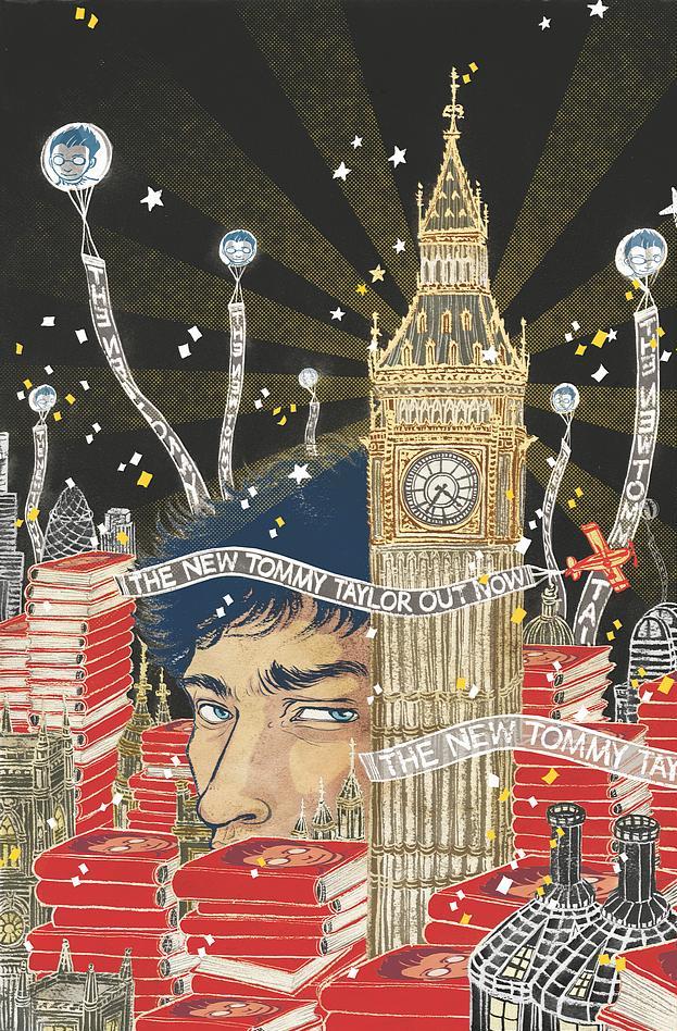
THE UNWRITTEN: DEAD MAN’S KNOCK (TPB VOLUME 3)
Writer: Mike CareyArtist: Peter Gross
Publisher: DC Vertigo
Reviewer: Optimous Douche
Do we imagine stories because they have always been, or does our imagination make them real? Don’t worry faithful followers, I didn’t bump my head or have a stroke since my last article. But how you answer this Philosophy101 question will be a direct reflection on how you traverse THE UNWRITTEN.
During the first few issues of this title I truly thought Carey had some sort of fetish for litigious activities. Setting up a main character that’s a boy wizard with two sidekicks from each gender seemed like the meatiest of chum to lure in the sharks that protect the JK Rowling Empire. When the book shifted out of this Hogwarts homage into what I could only describe as prognosticating parody I was once again worried for one of my favorite writers in comics. Tom Taylor, the grown-up real-life manifestation of Tommy Taylor, the Boy Wizard, seemed like a warning signal for Daniel Radcliffe from the year 2025. Then something magical happened: Carey climbed past Mount Exposition to bring us into a world that is beyond parody, beyond homage…quite frankly, ’s beyond anything we have seen before.
I hate to give a book report since the front cover pull-quotes from erudite news sources like the New York Times clearly indicate the comics world enjoyed this book enough to let the big boys know of its existence. However, for the four people that haven’t read THE UNWRITTEN within our cloistered nerd community here you go. When the series started (not this volume) you truly thought Carey was thumbing his nose at Rowling’s decision to abandon the halls of Hogwarts. Each of the opening pages of UNWRITTEN that traversed the adventures of Tommy Taylor was the looking glass reflection of the Harry Potter novels. You forgive this fact as momentum continues and you enter the “real world” of UNWRITTEN. Tommy Taylor, Boy Wizard is “merely” a book that captured the imaginations of several million people in the aught years of the new century. Tom Taylor is a smart but lazy young man, riding the mad cash provided by the convention circuit because he was lucky enough to have a father with a grand enough imagination to write such books and use his son’s name. By the end of the first issue, though, you realize Carey has a grander vision at play when Tommy’s sidekick from the book, Lizzie Hexam, appears at one such convention and tells Tommy that the books are an autobiography not fiction.
One would think this is a fairly simple answer to the book’s overall plot, at least I did. OK, so the kid escaped from the books and we are left with the Never Ending Story minus the gay flying dinosaur. However, as the series continues you begin to realize larger questions and philosophical dalliances of destiny versus a grand plan are also part of the kindling igniting Carey’s imagination on this title. Tom wasn’t merely part of his own books, he’s part of all literature, or to speak even more succinctly all literature manifests itself into the world as we manifest ourselves inside all literature. Naturally THE UNWRITTEN shows us the physical manifestation of this theory, but it does make one wonder at how truly powerful the written word has been in the shaping of human experience. As we have watched what was once fiction become reality throughout the course of our collective history, only the obtuse wouldn’t think to ask if we are on a grand plan that allowed us to imagine these flights of fancy or whether reality is merely a manifestation of our imagination.Were the1980s a good time because “Star Wars: A New Hope” made several million people in the world believe in a happy ending again after the bleak 70s or was it just the copious amounts of cocaine? Where does literature end and the real-world begin, or is there even a need for such a question?
Not everyone will transcend into this heady pontificating and that’s OK. UNWRITTEN stands as an exceptionally crafted piece of work that allows you to cruise at whatever level you want to with it. Simply enjoy the fact that Tom Taylor’s real-world situation is shit and he has been cast into intrigue, murder, and mystery against his will. If you want you can merely ogle at Carey’s and Gross’ cleverness by integrating tweets and blogs into the pages of UNWRITTEN to make Tom’s time in the real world feel even more real. You can feel like a moron as Carey layers the story with literary references that make you wish you never bought a Cliff’s Notes. Laugh as Frankenstein serves as Tom’s unlikely guardian angel. Laugh again as you see the grown Ron Weasley as a drugged out reporter that bungles every one of the tasks Tom sets him on. Marvel at the complexity with which Carey chose to tell the origin of Lizzie, Tom’s lady BFF, in the “choose your own adventure” issue that’s the capstone of this wonderful third volume. I have now read this “pick your story” twice, once in single issue format and again in the trade, and I’m still unsure if I have traversed every panel.
For anyone that wrote off THE UNWRITTEN as a Harry Potter knock-off you were flat out wrong. For anyone that calls UNWRITTEN inaccessible, you are simply not trying. For anyone that still wonders what the ultimate point of all this is, stop trying. THE UNWRITTEN will continue to pose more questions than answers as all good literature should. UNWRITTEN will also continue to shape itself in directions the author has chosen and if I understand even an inkling of the ultimate point, we all will be a part of the ultimate UNWRITTEN word.
Optimous has successfully blackmailed fellow @$$Hole BottleImp into being his artist on Average Joe. Look for Imp's forced labor on Optimous brain child in mid-2011 from COM.X. Friend Optimous on FaceBook to get Average Joe updates and because ceiling cat says it's the right thing to do.
 Advance Review: In stores today!
ULTIMATE DOOM #4
Writer: Brian Michael BendisArt: Rafa Sandoval (pencils), Roger Bonet with Jordi Tarragona (inks), Matthew Wilson (colors)
Publisher: Ultimate Marvel Comics
Reviewer: Johnny Destructo
4 issues of ULTIMATE ENEMY + 4 issues of ULTIMATE MYSTERY + 4 issues of ULTIMATE DOOM = $47.88. This story could have been told for under $25 and would have been just as strong, if not stronger, if you ask me, which you didn't. I'd be curious to see what the thinking was behind the marketing of this book over at Marvel, but it seems to me that 3 miniseries, virtually unrelated as far as the covers and numbering are concerned, would be hurtful to sales. Granted, I'm sure it was made up for by all the saps picking up what they thought was a #1 issue with either ULTIMATE MYSTERY or ULTIMATE DOOM, only to discover that they were sitting down in the theater half-way through the film, but that's not the point. I have to say, I think that's a little crappy and under-handed, attempting to trick people, yes TRICK them, into buying what they thought was the beginning of a story. It's just plain deceitful.
Now, with my ranting out of the way: Holy Hell I loved this series! Like I said, I would feel more strongly about it if it were half the issue-count, but I still feel really great about this series. Series of series? You know what I mean. The new Doctor Doom, if that what he really is, is awesome. I felt that as soon as he was revealed and I'm happy to say that Bendis didn't wuss out in the end (not that I ever expect him to) by making him a doppelganger or under mind control or some other such nonsense. I think it fits in perfectly with the direction the character has been taking lately and they always say that brilliance and madness are an angel's breath away from each other. Ben is different, the dynamic of the team is different and everything isn't just reset back to normal at the end of this series, and that's what makes this such a great experience for me. I'll be honest, I was always harboring just a tiny bit of fear that before the credits rolled, there would be a nice, happy ending here, and I'm so excited it didn't go that way.
Sandoval's art is really strong and dynamic here. It evokes a less "together" Immonen style, which is a positive comparison, and I really enjoy how he draws hair for some reason. It's all in one basic lump that rarely breaks off into strands, which should annoy me, but I really like what he does with it. It almost reminds me of the way Frank Cho draws his fabrics. Oh, I do have one complaint, but that is with Bryan Hitch's cover. Besides the fact that I miss the J Scott Campbell covers, why did Hitch draw Reed Richards so OLD on the cover? He's still a kid in the Ultimate Universe, but he's drawn to look much more muscular, broad and just plain old! Other than that though, all of the art here is excellent.
As much as I enjoyed this week's FF #1 over in the 616 Marvel Universe, I have to say that I definitely prefer the ULTIMATE FANTASTIC FOUR and all the shake-ups they are going through, and I'm chomping at the bit to see what comes next! This series was a hell of a read, and if you missed out, definitely pick it up when it hits the trade wall!

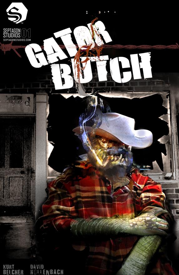
GATOR BUTCH #1
Writer: Kurt BelcherArt: David Hollenbach
Publisher: Septagon Studios
Reviewer: Mr. Pasty
GATOR BUTCH is described as “a tale of a beer drink’n, ass kick’n, half-human, half-alligator country boy and licensed monster fighter.” With that in mind, it’s probably no surprise this story takes place in a small Kentucky town named “Doghole.” Wouldn’t you know it, a local teenage girl has gone missing and the only person qualified to find her is Charles “Gator Butch” Buchinsky. That’s because he does the kind of dirty work the police won’t get involved in, because they’re afraid of crossing paths with the feared local legend of “The River Children.”
The River Children are kind of like the CHILDREN OF THE CORN, only instead of those two bickering dipshits Isaac and Malachai, you have a small clique of half-breeds that make the X-FILES Peacock family look like the BRADY BUNCH. Gator Butch decides to accept this new assignment from a mysterious girl despite his mama’s warning not to. Will he uncover the mystery of the River Children and get into a fistfight when he does? Do you read comics?
There’s a certain WTF? appeal to this book based on its zany characters and even zanier artwork. I’m not sure how to classify it, but it looks like someone got real high and started trying out all the cool buttons on the Photoshop toolbar to see how much they could distort some old family photos. Is it enjoyable? Well, that depends on what you’re looking for. I don’t think it’s an insult to anyone at Septagon Studios to suggest the plot is so thin you could probably use it to jimmy your front door open if you ever got locked out of the house. I just reviewed a similar book titled ROSS that had an analogous storyline, featuring an alien creature who was out to find a teenage girl and gets beat up by her captives when he finally locates her. Coincidence? No, because it’s not like ROSS invented that story either. My point is the book doesn’t have to break new ground to be effective if it’s delivered in a competent and enjoyable manner.
Having said that, GATOR BUTCH walks a fine line between primo and parody. There’s a lot of leeway as a writer when your main character talks like an illiterate hillbilly, and if the dialog is brisk and restricted by geography then all your creative eggs are in one basket. I’ve been a fan of Belcher’s since I saw his work at Creator’s Edge (see my STINK review) and to its credit, GATOR BUTCH has done enough to keep me coming back for more. And where else on the shelves of your local rag shop can you find a beer-drinking gator boy?
Web heads who can’t get enough of Mr. Pasty’s word vomit are encouraged to watch him operate as Nostradumbass over at MMaMania.com here. Love, hate and Mafia Wars requests should be directed here.
Proofs, co-edits & common sense provided by Sleazy G