
| #26 | 11/17/10 | #9 |
Gobble gobble,folks. Ambush Bug here. While everyone is preparing for Thanksgiving, the @$$Holes are cooking up a steaming plate of reviews peppered with that sweet, sweet @$$y goodness, you’ve been waiting all week for. But before all that I wanted to give a shout out to Popgun Chao$ who recently spoke with Mark Waid about SHAZAM. You can check out that interview here. You can also check out a pretty entertaining story about a conversation held with Neil Gaiman’s agent. Special thanks to Cody Walker for bringing this to my attention.
And now, dig into those reviews while they’re hot and steamy!
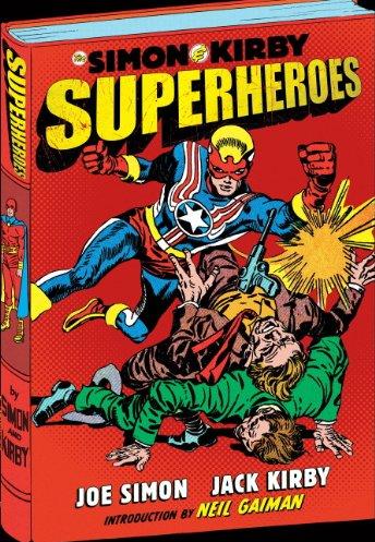
THE SIMON AND KIRBY SUPERHEROES
Written by: Joe Simon (with an Intro by Neil Gaiman) Illustrated by: Jack Kirby Published by: Titan Books Reviewed by: superhero
I’ve got a little secret. When I was a kid I hated Jack Kirby. Or, at least, I hated Kirby’s art. I just didn’t get it. I didn’t get the blocky figures, the weird anatomy, the…well, I just didn’t get Kirby. Whenever I saw a comic that Kirby illustrated I would just roll my eyes and force myself to plow through it. I’d inevitably end up enjoying it but there was something about Jack Kirby’s art that drove me up the wall.It wasn’t until I discovered Steve Rude’s art when I was older that I took a look at Kirby’s art with a more discerning eye. I loved Steve Rude’s drawing as soon as I laid eyes on it and when I found out that Kirby was a big influence on Rude’s style I decided to give Kirby’s work a second glance. I don’t know what it was, maybe I was just looking at it with a more mature eye or maybe I’d realized that the artists that I enjoyed when I was younger weren’t as great as I thought they were…but I ended up gaining a real appreciation for Kirby’s art. Later on I’d actually get to see some Kirby originals at a museum here in Los Angeles and seeing his pages in person just took my breath away. After that I knew that Kirby was truly a master of sequential art and that he was called ‘King Kirby’ for a reason.
As far as Joe Simon is concerned…well, I know next to nothing about the man. I have read some of the early Captain America comics that he wrote way back in the day but I’m pretty much woefully ignorant about Joe Simon and his contribution to comics outside of everyone’s favorite Star Spangled Avenger.
So I was very interested in reading through this mammoth collection of stories on which Joe Simon and Jack Kirby worked together. THE SIMON AND KIRBY SUPERHEROES is a book that is jam packed with mostly forgotten material from Simon and Kirby. It’s a terrific collection of crazy Golden Age stuff. I’m not going to lie to you…this stuff is wacky but it’s also fun in a way that not a lot of comics are these days. All you really have to do is look at the names of some of the characters whose stories are collected in this book to know what you’re getting into. Black Owl, Stuntman, Vagabond Prince, Captain 3-D, and Fighting American are just some of the crazy superheroes leaping and bounding through the pages of this book. These are exactly the type of stories you’d expect from the Golden Age era: goofy, implausible and action packed. These are superhero stories that don’t even attempt to bow to logic or any kind of laws or rationality--which is what make them an incredibly entertaining read. No one in these stories tries to explain their powers or their costume. No one in these tales ever stops to wonder why a man would dress up in tights to fight for the greater good. None of these heroes stop to search their inner souls for answers. They just fight bad guys…which is what super heroes should be doing!
But beyond the fantastically insane superhero stories in this volume lies something else even more interesting than simple tales of derring-do. From the beginning of this book to the end you really get to see how Kirby’s style developed; how he grew from being just an average run of the mill Golden Age comic artist to develop into the Jack Kirby that we all came to know and love during the Marvel Age. It’s fascinating to see how with each hero he worked on through the years Kirby began to work different artistic muscles to make the action more compelling and more dynamic. When you start with the Black Owl you’re getting some pretty stiff poses and panel work. By the time you get to the end of the Fighting American stint in this book you’re seeing Kirby at his best. Characters trouncing across panels with powerful force, perspective stretched to its breaking point, and drama played out in an almost unbelievable fashion. This book offers the reader a chance to see how Kirby’s style developed through the years and became the comic legend that would influence generations to come.
What was just as intriguing to me was to see how much of an obvious influence Simon’s writing would have on Kirby’s own creations in later years. The character of Stuntman is an obvious pre-cursor to Mister Miracle and there are several other tropes that Simon employs in these stories that Jack Kirby would incorporate in his later work. It’s evident that Simon was a big influence on Kirby in many ways as the stories presented in THE SIMON AND KIRBY SUPERHEROES are just as wacked out as anything Kirby came up with on his own in many years later.
So, yes, THE SIMON AND KIRBY SUPERHEROES is another homerun produced by Titan Books. It’s an eye popping and lovingly produced tribute to some of the best talent that the Golden Age had to offer. Go out and pick it up if you love classic superhero stuff. It’s worth its weight in gold and more.
Discovered as a babe in an abandoned comic book storage box and bitten by a radioactive comic fan when he was a teenager, superhero is actually not-so mild mannered sometime designer & cartoonist, Kristian Horn of Los Angeles, California. He's been an @$$hole for three years. Some of his work can be seen at www.kristianhorn.com and check out his blog at www.parttimefanboy.com.
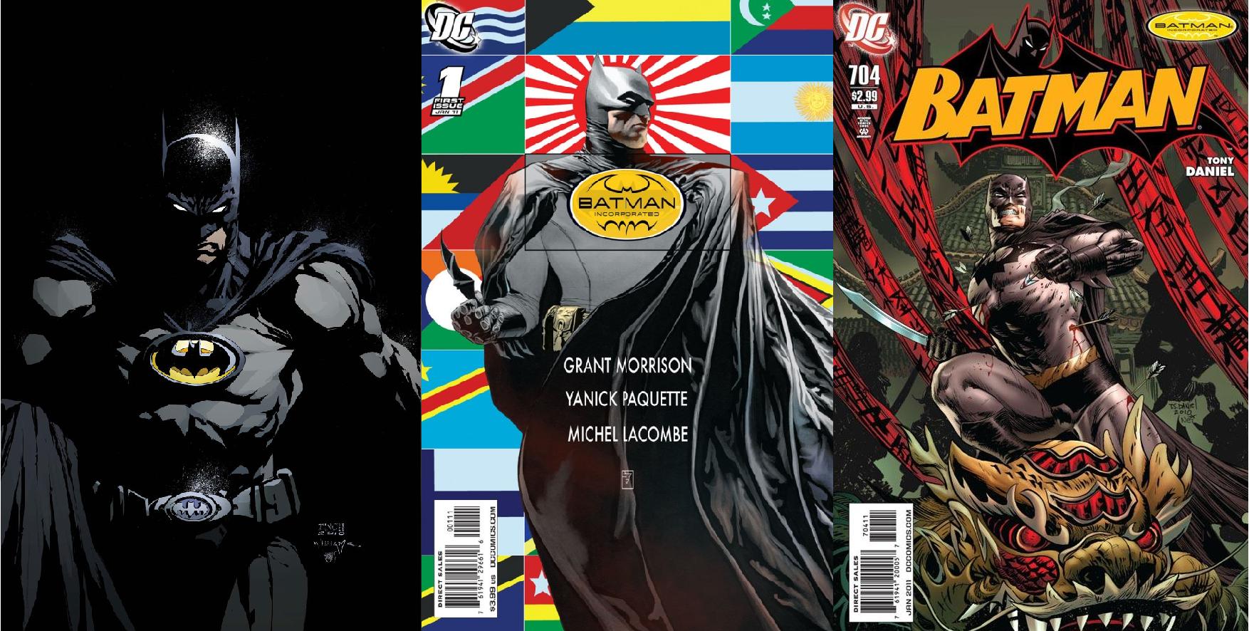
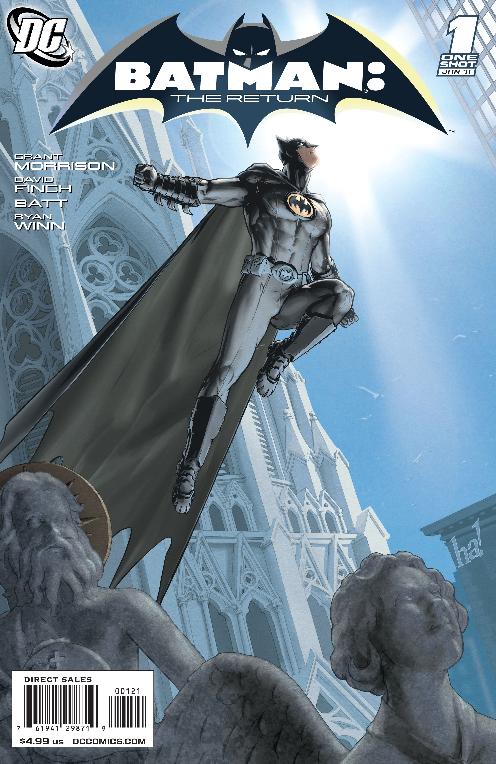
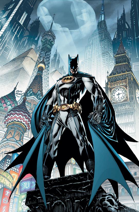
BATMAN: THE RETURN #1 – BATMAN INCORPORATED #1 – BATMAN #704
Writers: Grant Morrison – Tony Daniel Artists: David Finch – Yanick Paquette – Tony Daniel Publisher: DC Comics Reviewers: Optimous Douche & Johnny Destructo
Optimous Douche (OD): The 1…2…3 flowing continuity of BATMAN: THE RETURN, BATMAN INC and BATMAN is EXACTLY the way to get me to read multiple titles about the same character. Nothing pisses me off more than when a character is one place in one title, and then in that same month, in another title, they are somewhere completely different, not even acknowledging the happenings of the other books. Not Batman though. We got a whiff of this serial goodness with BATMAN & ROBIN and BATMAN: THE RETURN OF BRUCE WAYNE over the past few months, but that was bush league compared to the seamless flow going on between the titles right now. All three of these titles could easily be packaged together in one grand story heralding the return of Bruce Wayne to the modern era.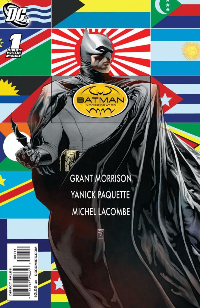 Johnny Destructo (JD): Agreed, Sir Douche. A prime example of how it's done improperly is Wolverine. I'll read an issue of NEW AVENGERS and see Logan up to shenanigans, and in the same month, he'll be romping about doing something completely different over in another Marvel title with nary a mention. I totally understand how difficult it is to maintain some semblance of order on a month-to-month basis, but a little effort goes a long way. Also, the irony isn't lost on me that you're praising this week's continuity when very recently, Batman had a terrible continuity snag, wherein he had returned in every OTHER title but the one he was supposed to return in! Talk about annoying! Also, I made the mistake of reading BATMAN, INC before picking up BATMAN: THE RETURN! Am I crazy, or shouldn't they have a little numbering system on the cover of the books, to let readers know in which order to read each book, a la the little S-Shield that DC employed on all the inter-crossing SUPERMAN books back in the 90s? If only to keep idiots like me from reading them out of order?
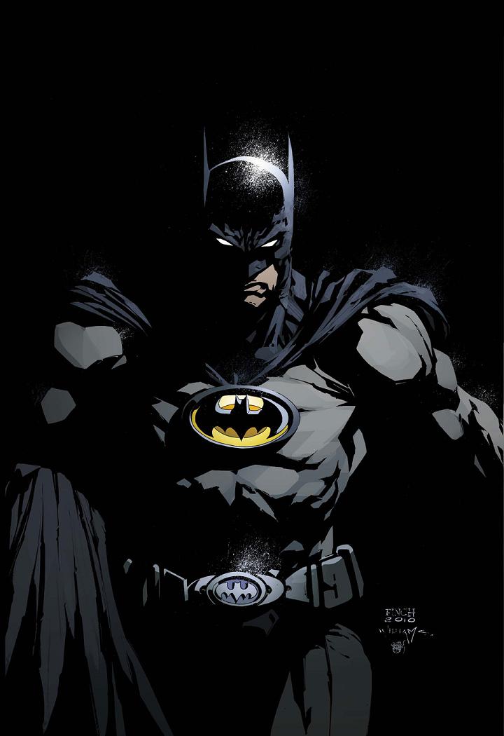 OD:At any rate, let's start with THE RETURN. What were you expecting as you picked this up, and did this title live up to that for you?
Before delving into THE RETURN we should probably make clear that the books didn't have to be read in a particular order, they all stand are their own just fine. I will say though the most surprising part of RETURN is what made it the best to read first. The book opens with Morrison once again dabbling in Miller's YEAR ONE like he did in THE RETURN OF BRUCE WAYNE. Once again he recreates that faithful moment when the Bat crashed through the window of Wayne Manor, but this time it's from the Bat's point of view. I love the fact the ancient Bat was looking for Bruce Wayne as much as he was looking for a totem to call his own. Morrison truly captured the essence of Batman within the heart of this weathered creature, fighting with indomitable strength to survive until it could be passed on to others, which is exactly the epiphany Bruce had as he struggled through time, and of course is the purpose behind the second half of the book where Bruce lays out his further plans for Batman Inc. and the protection of Gotham moving forward.
 JD: See now, THIS is where they lose me. That doesn't make any sense to me. The bat was looking for Bruce? Nope. I don't buy it, guy. Once you start delving into these types of ethereal boogens, it takes away from what I personally like about the character. I LIKE that Bruce is just a tortured soul who didn't know what to do with the bottomless depths of pain the murder of his parents brought, and so he put on a costume and fought crime as a vigilante. He does this because he's a little unhinged, mentally, not because of some totemic master plan. As for reading them in order, in THE RETURN, Bats calls Catwoman for some help, and in BATS, INC, we see them actually going about it. And yes, that's multiple entendre!
I take it you're OK with the idea of Bats recruiting a whole mess of people and commanding a sort of army? My initial reaction was that of "Buh-WUHH?" because Batman has usually rejected the idea of putting other people in harm's way for the sake of his personal mission (unless they are a hand-picked boy in yellow briefs, of course). But I think the more I sit with it, the more it reminds me of “The Dark Knight Returns”, and it's starting to sit better with me. Besides, I tend to critique my fellow fanboys for their fear of change, and at least this is something DIFFERENT, and it's certainly got me reading Batman again, which is aces.
 OD: That segue was smoother than the finger in my last prostate exam...OK let's talk BATMAN INC. I loved everything about this issue, but first and foremost I loved the fact Bruce's first recruits weren't the lame limeys Knight & Squire. I hate those two more than the finger from my last prostate exam. Bruce taking the sojourn to Tokyo to recruit Mr. Unknown was Morrison at his finest. Weird enough to be Morrison, but still grounded, comprehensible and possessing a strong clear plot. They really should have lopped off the last few pages of BATMAN & ROBIN 15 with the stupid press conference. It's not like Batman Inc is going to be filing as an LLC under Wayne Enterprises; Batman is doing all of his recruiting as the Dark Knight for God's sake. Oh well, what's done is done.
I want to give a particular shout out to the interplay between Batman and Catwoman in this issue. From the banter to the posturing right through to the break-in at Mr. Unknown's house the danger and sexual energy crackled off of the page. And really Catwoman should get a double shout out for her appearance in BATMAN #704 this week as well, wouldn't you say?
 JD: Wait, he was supposed to use his FINGER for my prostate exams? Oh ho ho, he and I are gonna have a li’l chat as soon as he's finished my next exam. I'm with you my friend, on the residents of Lameville, Knight & Squire. Surely they have fans, somewhere, I'm certain, but them fans ain't me. I tried to care about their new series, but alas...failure. I feel the same way about the Super Young Team, but I don't have much experience with them. The cheesy part of me (don't ask where it's located) kinda loves the names, like Shiny Happy Aquazon, but they seem more like cannon/hilarity fodder than anything else. The only guy who actually DID seem partly bad-ass was dispatched in the first issue. Hopefully Morrison will introduce far more worthy characters to the Batman, Inc. family. So far, any potentials who might be involved are laughable, throw-away knock-offs, wouldn't you agree?
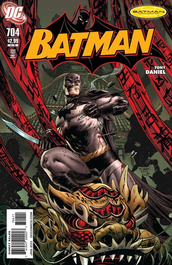 I'm totally joining you on the Catwoman out-shoutings, that's for damn sure. I love that character, and I never get tired of their interactions. I confess to not knowing much about her seemingly illegitimate sidekick though (if I may employ another astonishingly smooth segue) over in the pages of BATMAN 704. She's a sassy little thing, and clearly not even attempting to appear on the up-and-up for the Bat-fam. She seems like the Catwoman's own Damian Wayne. I don't know if Kitrina Falcone and Damian have actually spent time together yet, but I can't wait for that to happen! Bruce has Catwoman, Tim has Lynx, I think Damian needs his own female foil Hhly crap, as an aside, I may not have enjoyed THE RETURN OF BRUCE WAYNE mini-series, but I'm actually loving where this is all heading! Sorry, I'll put my Disinterested Fanboy Hat back on. Ahem. I hate stuff.)OD: All right, since we’re waaaaayyyyy past deadline at this point allow me to put the final toe tag on this puppy. BATMAN: THE RETURN was a great example of plans being set in motion – Bruce’s clarion call for a global protection of the night. BATMAN INC., while I find the name to be ridiculous, is going to be Bruce’s story to band his dark heroes together. This reminds me of the Justice League back when they had a purpose. Finally (and frankly the one I’m most excited for) we have BATMAN, or the continuing adventures of Dick & Damian as the dynamic duo. Again though, those are just the plots, the true magic of all these titles is the characterization. There have been a slew of debates in the TalkBacks recently about whether DC characters are more iconic than the other houses and as such miss the mark on looking at the people behind the masks. To those naysayers, I simply say you haven’t read DC in awhile. There’s some great fresh new blood interplaying with our tried and true favorites. It took us a long time and a lot of head games to get here, but the destination is truly glorious.
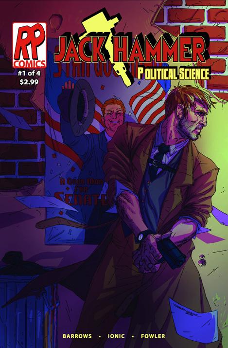
JACK HAMMER: POLITICAL SCIENCE #1 (of 4)
Writer: Brandon Barrows Artist: Ionic Published by: Reasonably Priced Comics Reviewed by: BottleImp
The mash-up of genres has become something of a staple in the comic book landscape. We’ve seen various permutations and combinations of horror, science fiction, comedy, historical fiction and, of course, superhero. The trouble becomes when a once-novel twist on a genre gets run into the ground through seemingly endless repetition—as is the case with the can-we-please-just-move-on-to-something-else-for-the-love-of-god zombie craze. But even the clichéd can become innovative through the quality of the presentation, which leads me to JACK HAMMER, a blend of 1940’s-style noir crime fiction and spandex-clad superheroes. This conceit has been explored before, but series creator and writer Barrows and artist Ionic succeed in adding their own sparkle to the idea and make the comic a pleasure to read.Barrows obviously has a love of the Mickey Spillane-type private eye fiction, and presents his own take on the classic elements. The tough-guy investigator is here, of course, only in this case the titular protagonist is an ex-superhero who retired from costumed activities (for reasons as yet unknown), and true to form, Hammer provides a narrative that the reader can easily imagine as a raspy voice-over (complete with a smoky jazz soundtrack). There’s the able-minded and able-bodied female receptionist, the trusty cabbie, the cantankerous police officer who begrudgingly works with our hero. And of course, a mystery to solve: why was millionaire Eddie Newman found dead, dressed to look like a homeless derelict, and who is the shadowy figure pulling the strings? Barrows blends the traditional noir elements with hints and glimpses into Hammer’s crimefighting past, although the private detective motif is clearly front and center as the driving theme of this series. I would love to see a little more of the superhero element enter the story; the characters clearly live in a world where costumed vigilantes are part of the status quo and therefore I’d expect them to be somewhat more visible. But there are three more issues to go in this series, so maybe Barrows is holding his cards close for now.
However, with all due respect to the writer, what really caught my attention was the artwork by the mysteriously-named Ionic. The drawing style has a graphic, angular and yet realistic quality, and the page designs are dynamic and easy to read. Ionic also has a knack for using interesting “camera angles” to tell the story; perspectives and viewpoints have been chosen with care in relation to both the action and page composition. The idiosyncratic coloring also stands apart from the average comic book—the colors are bold and vibrant, which ends up being a kind of a two-edged sword. On the one hand, the near-garish colors demand the reader’s attention and make JACK HAMMER look different from every other book on the stands. On the other hand, sometimes the near-garish crosses the line into just plain garish, and detracts from the drawing rather than enhancing it. The most blatant example is on page 15, an outdoor scene where the greenery is so super-saturated that it feels toxic. If Ionic could tweak the coloring just a bit and use the saturated hues a little more judiciously balanced with more neutral shades, but still maintain the unique color sensibilities, it would bring the artwork as a whole up to a higher level.
JACK HAMMER is not only a fun genre-twisting tale, but is also a sterling reminder to those readers who normally eschew the fringe publishers in favor of the Big Two and the Slightly Smaller Two or Three (and I include myself in there) that smaller publications do not mean lesser quality. Barrows and Ionic have created something which can proudly stand shoulder-to-shoulder with the mainstream fare, and I for one am looking forward to finding out what happens next to this ex-crimefighting private eye.
When released from his Bottle, the Imp takes the form of Stephen Andrade, an artist/illustrator/pirate monkey painter from the Northeast. You can see some of his artwork here. He’s given up comics more times than he can remember. But every time he thinks he's out, they pull him back in.
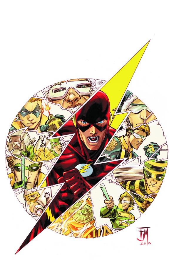
FLASH #6
Writer: Geoff Johns Art: Fancis Manapul Publisher: DC Comics Reviewer: Henry Higgins is My Homeboy
Fastest man alive, my ass. That issue took forever to come out.I feel as if I have to preface this by saying I grew up with Wally West. I was born after CRISIS ON INFINITE EARTHS claimed Barry Allen, so I've never read a current issue of FLASH where Barry wore the red suit. I liked him well enough whenever I'd read the original runs or he'd make a surprise appearance in the current series, but he was never THE Flash for me. So, having him brought back in FINAL CRISIS to be Geoff John's newest toy wasn't exactly a selling point for me. But, credit where credit is due, Johns turns out a good issue of this delayed comic. The writing is interesting, the Rogues (among my favorite villains in comics) are very fun to read, and I feel the strong urge to snog Fancis Manapul. It's not a perfect comic, but it does well.
Writing: (4/5) There's a lot to enjoy about this issue, so let’s get the bad out of the way. The Court of Temporal Justice feels too deus ex machina-ey for me. It's too all knowing, especially with all the storylines in the past that reflect on the future changing. The future Top is also a bit annoying. He's forced to steal away to the past to hide his family’s history. But if the Court of Temporal Justice is as good as they claim to be, then they should have known about everything already. And the big one, Barry’s powers aren’t really as formidable as they have been. Earlier in this story, Barry could do everything and rebuild an entire building in seconds and you don't question it. But here, his last minute feels overly challenging. Alright, nitpicking done.
Most of the comic is well written, exactly what you want from an issue of FLASH. Barry still plays the deadpan cop approach, which is a nice way to play it. Most heroes today are witty or at least have a line here or there. This guy is much more old school. The members of the Reverse Flash Task Force are great derivations of the Rogues and get some cool scenes. And the fun that comes from the regular Rogues is always great. The end feels a little underwhelming (a motorbike! Woo!), but it could play well in the future. Not perfect, but still a good issue.
Art: (5/5) Manapul may be one my favorite artists working now. His comics have a fantastic sense of color and brightness, while his pencils are the perfect mix between cartoony and real. He's perfectly suited for FLASH, especially the Rogues and the Flash in motion. The opening page (where in Flash recaps the story) is absolutely amazing. Flash chasing The Top up the side of the wall is fantastic. The facial designs, the emotions, the body designs. It all works.
Best Moment: Flash taking out the Top. Wow.
Worst Moment: The appearance of the Time Court feels rushed and underwhelming
Overall: (4/5) A solid issue, definitely worth a read.
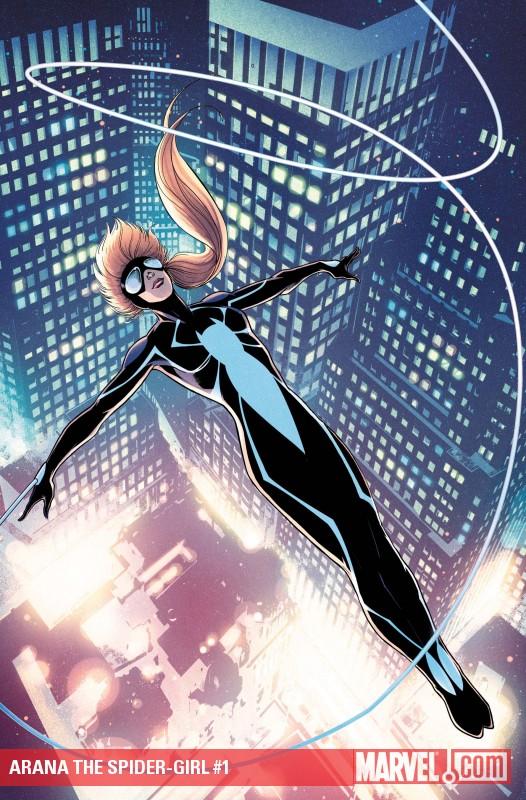
ARANA THE SPIDER-GIRL #1
Writer: Paul Tobin Art: Clayton Henry Publisher: Marvel Comics Reviewed by Johnny Destructo
We're gonna have to get over two things pretty early in this review: this powerless Spider-Girl is swinging around New York City on synthetic webs and kicking ass like a super-powered hero. Nevermind the countless hours of training and vast resources it takes millionaire Bruce Wayne to do it, this 15 year old girl is just as effective at crime fighting. It just seems a little backwards. Let's take her powers away and THEN give her a new title! Granted, for most of the issue, she's fighting regular de-powered criminals, but is seen having very little trouble actually taking them down. Suffice it to say, this series isn't trying to be grounded in any real world situations.Also, yes, I know some of you are angry about the cancellation of the previous SPIDER-GIRL series, detailing the exploits of Peter Parker's daughter's futurist shenanigans, but...well....get over it. I used to love that series as well, but I must admit, it lost steam for me some time ago. Take some time, mourn, then wipe your tears and get on with it.
With that out of the way, the series is off to a great start! Anya Corazon's new costume is muucch snazzier then her last one, though you'd think a ponytail would be a bad idea. Her threads are very reminiscent of the black Spidey costume, which was always one of my faves. Paul Tobin takes a bit of a gamble, displaying most of Anya's inner dialogue as tweets (which you can actually follow in real time at www.twitter.com/the_spider_girl), but it actually works well, though for how long, I'm not sure. It'll also certainly date the book once Twitter stops being a "thing". It's cute that she's a bit of an introvert at school and is basically best friends with her dad (who also happens to be an interesting character in his own right, as the exclusive interviewer of the Fantastic Four). We also get a visit from positive female role model Sue Storm to hang out for a couple pages to give us some motherly advice on meeting people and making friends. Awwww! Adorable! A crimson-hued baddy makes a guest appearance towards the end and I'm curious to see how our powerless protagonist parries on, but I'll have to wait till next ish.
Another aspect that I'm digging is that apparently this title will be side-by-side with the Amazing Spidey series. It gave me a mild tingle to see her mention the Octobots from last week's ASM. Cause I'm a geek like that.
The art by Clayton Henry is top-notch stuff! Take Ron Garney, Olivier Coipel and Stuart Immonen, blend their styles and you get Henry's snazzy inks.
There's also a really nice back-up story about Anya's first meet with the Fantastic Four, drawn by Dean Haspiel! All this for $3.99! Not too shabby, eh?
This is an a great read for any age, with something for everyone! It didn't exactly shatter my synapses, like the cover claimed, but hell, it's still highly recommended!
JD can be found hosting the PopTards Podcast, discussing movies, comics and other flimflam over at www.poptardsgo.com, graphically designing/illustrating for a living, and Booking his Face off over here.
DC UNIVERSE LEGACIES #7
Writer: Len Wein Artists: Dan Jurgens & Jerry Ordway Publisher: DC Comics Reviewer: KletusCasady
I can’t help but feel like there’s something missing from this comic. I can’t put my finger on it but there’s something that’s keeping me from being fully ecstatic about this title. It’s like when you’re cooking chili or stew and the taste is ok…but you know if you add that one ingredient, whether it be salt, pepper, spit, cayenne pepper that once it’s added will equal pure satisfaction. I like what they’re trying to do here but after every issue I can’t help but to feel a huge “meh!” escape from my lips. This issue is no different and I thought maybe this was the issue to turn it around being that it dealt with two of my favorite DC storylines of all time in ‘The Death of Superman” & “Knightfall”…but it wasn’t, I’m afraid this series maybe have flown to close to the sun on wings of pastrami.This series is pretty much DC’s version of MARVELS. Which is an awesome story by Kurt Busiek & Alex “I haven’t drawn interiors for over 5 years but still put my name at the top of everything I do misleading everyone that I actually did something more than say ‘don’t do that do this’ oh yeah and I only draw certain characters with certain costumes so fuck you” Ross about the dawning of the Marvel superhero age. Sorry I just love his art work and it annoys me he doesn’t do interiors anymore…rant over.
The fact that this can even be compared to MARVELS is kind of a negative for this series because that’s some big shoes to fill…like a 6 year old putting on Shaq’s size 43’s or whatever he wears. This series is written by Len “I win always because I created Wolverine” Wien and the story follows the main character Paul though the trials and tribulations of his life and as his life progresses, so does the genesis of the DC Universe’s Superhero age. This issue deals specifically with Doomsday & Bane and their effect on the Superhero community as well as the world in general. I did like seeing these events from the civilian perspective but I don’t think the turmoil and fear of the general population was captured that well. I mean, Superman is dead and Batman is out of commission; personally, if I lived in that world I’d be freaking the fuck out that two of the worlds top superheroes were defeated but there was no sense of widespread panic, no coverage of Superman’s funeral…something just felt flat about it.
Like I said I can’t put my finger on exactly what bothers me about it but there’s something about the issues by themselves that’s just not working for me. I love the art; all of the artists they’ve had through this series have been great. Even Scott Kolins, who I’m not particularly a fan of, has changed his style quite a bit for this book to a more realistic approach…and it looks great. The art in this book has been solid every issue and definitely has kind of an old school feel to it which I like, the big eyes, over exaggerated emotions, the kind of cheesy heroic poses, all just really work well for this book especially because of its historic nature. I thought that maybe since I wasn’t around (alive) for the Golden/Silver Age stuff that maybe that’s why I wasn’t connecting with those issues but I feel the same way about the stuff I was around for. I think this book will do a lot better as a collected series rather than a single issue comic, I read MARVELS as a trade paperback and maybe that’s why I hold that one higher than DC LEGACIES because I was able to absorb everything at once rather than reading each issue a month at a time amongst other things I find more exciting.
The point of this book was probably to streamline DC’s history in a single narrative manner so that a new reader could come in and get a taste of important happenings in the DCU since the Golden Age and for that I guess it does achieve its goal but reading each issue a month at a time…has left me a little bored. That doesn’t mean it’s bad but if I had a pull list this comic probably wouldn’t be on it.
The art is great and I’d really love to see Jurgens or Ordway on a monthly series like any BATMAN title, SECRET SIX or hell even SUPERMAN…I love that style and I think it worked really well on Booster Gold and could easily work for a more popular character. This book will be a lot better as a trade and really there’s nothing wrong with that, I just think it will be a better story once it’s collected and the reader can experience these events as a whole. This way the reader can take everything in at once rather than hoping that the emotional tether from issue to issue is strong enough to keep them interested month after month.
P.S. The back story was pretty fun and Brian Bolland is amazing…really fucking amazing.
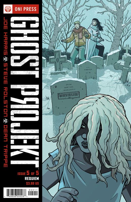
GHOST PROJEKT #5
Writer: Joe Harris Art: Steve Rolston Publisher: Oni Press Reviewer: Mr. Pasty
When I was a wee lad, the only thing I found scarier than ghosts were Russians. It’s not that the undead weren’t pulling their weight, but once the sun came up all I had to do was stay out of the cellar (and the local mausoleum) and I was temporarily safe from the threat of marauding specters. But the Russkies? Shit, those heartless bastards had the button, and the finger that hovered over it in the paranoia of my childhood never slept. This is what life was like as a child of the cold war: The best part of waking up, was plutonium in your cup. Then that blotchy-headed commie and his stinking Perestroika had to go and take all the fun out of hating Soviets. That is, until Joe Harris came along and gave us the wonderfully executed GHOST PROJEKT. Of course we know right away this is a Russian story because Harris has not-so-subtly replaced all the C’s with K’s in his text, which is the ‘Net’s Pavlovian bell for eliciting the I see what you did there response from circling cyberclowns.Unfortunately GHOST PROJEKT has presented me a tale featuring both ghosts and Russians, leaving me no one to root for. But wait! Here comes U.S. Weapons Inspector Will Haley! Wa-hoo! Will was brought in to track down a “weapon” that’s gone missing from an abandoned Soviet facility and naturally he gets a hot-ass Russian liaison to escort him through his daily adventures. While ol’ Willie looks more like a college intern trying to un-jam the office copier than a bona fide weapons inspector, his appearance actually serves to better demonize his Soviet counterparts. Chief among them is Dr. Konstantin, whose hellacious “Project Dosvidanya” (Harris again with the subtlety of an axe to the face) threatens the security of the entire world. Can Haley foil Konstantin’s evil plans, uncover the secret of the “Dark Rider,” win the girl and actually live to tell about it?
Harris has five issues to sell you on his story and to give you an idea of how spectacular his results are I’ll tell you how I conducted this review: two pages into GHOST PROJEKT #5 and I jumped ship. Not because I wasn’t feeling it, but because it was so superb I felt compelled to track down and read issues 1-4 so that I could do the final installment with more than just the press notes. What’s clear from the onset is that Harris approaches this story as a writer. So many “high concept” projects start with non-writers brainstorming over a double latte and the tried-and-true “Well, we want to do a comic, what’s a hot topic right now?” Not here. This is a great story that became a great comic book. I like how Harris intercuts his narrative with different layers of the same angle without compromising the progression of the arc or bogging down his dialogue with retreads. He also stays true to his Russian backdrop and the authenticity of his framing sets it apart from the typical “pick exotic locale, add generic plot” formula. I can’t even do my usual nitpicking because there’s really nothing here to complain about (except maybe that I won’t get to read issue #6).
I’ll admit that when I first saw Steve Rolston attached to the pencils for GHOST PROJEKT my initial reaction was “Oh great, EMIKO does mother Russia.” In what’s becoming an alarming trend in my life, I was wrong yet again. Rolston continues to show his maturity as an artist and does a great job here of capturing the right mood while resisting the urge to go overboard with heavy shadows and thick lines. Some of the early laboratory scenes are just terrific. And kudos to Dean Trippe as well for muting the color palette in all the right places – only to slam it over your head when the shit hits the fan. These guys do a great job of complimenting each other and the end result is a comic book that is at the top of my “must read” list. If you haven’t had the opportunity to get your hands on GHOST PROJEKT, you’re missing one of the finest mini-series of 2010. Do yourself a favor and check this one out.
Web heads who can’t get enough of Mr. Pasty’s word vomit are encouraged to watch him operate as Nostradumbass over at MMaMania.com here. Love, hate and Mafia Wars requests should be directed here.
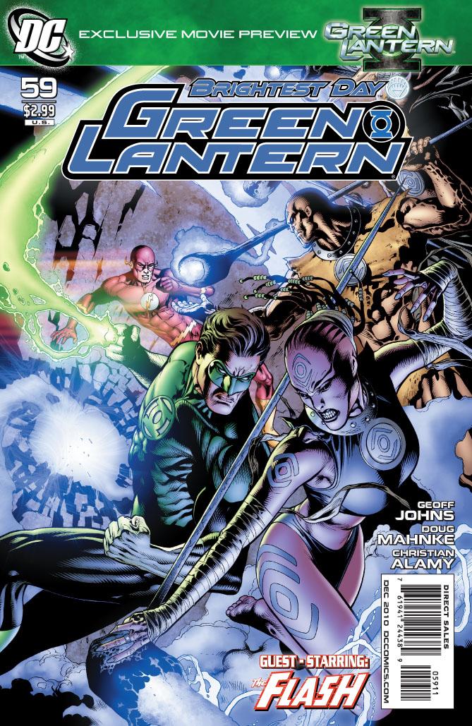
GREEN LANTERN #59
Writer: Geoff Johns Art: Doug Mahnke Publisher: DC Comics Reviewer: Henry Higgins is My Homeboy
Purple Prose.The return of the Indigo Tribe is a very mixed bag for Green Lantern. Though the tribe has a lot of potential and has had some brilliantly cool moments, they didn’t really stand out much in BLACKEST NIGHT, save the occasional deus ex save. Having them return this issue plays out similarly. The arrival of another corps, especially this one, is a very engrossing idea. But the issue doesn't pan out as well as it should.
Writing: (2/5) The Indigo Tribe, for being such a big feature of the book, don't really serve a major purpose. They are the big players of the issue, but none of their moments are necessarily good. It is good to see Black Hand again, as his "punishment" for his role in BLACKEST NIGHT left me wanting. What's become of him is interesting. He points out Hal’s hypocrisy, which is always nice. But he seems less interesting of a character than when we last saw him. Flash's role in this issue is much too judgmental. He plays the role of Saint Barry, condemning Hal for his actions for allying with Atrocious. But it comes off as much too harsh. Barry's missing most of the story, and you'd think a forensics officer would be more willing to learn the whole story before making a judgment. Especially since, in his own series, he usually explores the entire situation before making any decisions. On the plus side, Salaak's small scene reminds me why he's one of my favorite supporting characters. Saint Walker also is fantastic—the more of him the better. His brief moments with Barry are well done. The sudden appearance of Parallax is good, but very, very, VERY random. Though, who he possess will be good to review down the line. A subpar issue in the writing sense though.
Art: (4/5) Mahnke does the usual here. And by that, I mean he turns out a very good looking issue with some faults here and there. The looks for the Indigo Tribe remain interesting, especially Black Hand, who looks fantastic. Seeing one of the bigger bads of the past years in absolute calm is both unsettling and soothing at the same time. Parallax's target at the issue’s climax is great as well and is a good reminder of how creepy Parallax can be. Some small problems here and there, mostly in the form of Barry and his face and body, detract from the whole. But it's still a good looking issue.
Best Moment: Parallax looks cool.
Worst Moment: Parallax appearance in this issue is random.
Overall: (3/5) A decent issue, if a bit flawed. Hopefully Johns gets it back up to it's gold standard soon.
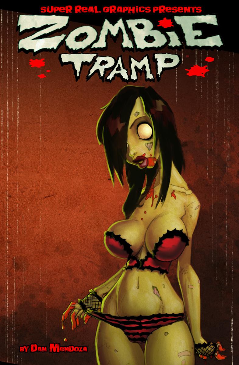
ZOMBIE TRAMP Vol.1
Written and Illustrated by: Dan Mendoza Published by: SUPER REAL Graphics Reviewed by: superhero
In general, I’m not a guy who appreciates T & A comic books. I’m not a prude or anything but if I want to see naked ladies…well, that’s what I got married for isn’t it? When I saw the cover to ZOMBIE TRAMP I made the assumption that I was in for just another horror book that was trying to bait the typical male reader with a mindless story wrapped in well endowed cartoon characters. You’ve seen them: comics which depend on images of scantily clad women to sell their books without anything of real interest or substance within to warrant their purchase.Well, you know what they say about assuming, don’t you? Yes, it’s true that ZOMBIE TRAMP does have it fair share of female cartoon nudity but it’s far from being just a gratuitous comic book read. There’s an actual story here and it’s an entertaining and humorous one. ZOMBIE TRAMP actually exceeded beyond my expectations and became a read that I thoroughly enjoyed. For horror fans there’s a little bit of everything you’d expect in your typical horror tale. There’s sex and violence but it’s tempered by an amusing bit of Looney Toon type zaniness that brings a strange sort of lightheartedness to the book. It’s not a serious horror tale. If anything it’s the type of horror comedy in the vein of EVIL DEAD 2 which, in my opinion, is high praise.
Creator Dan Mendoza’s art perfectly complements the madcap energy of his writing. It’s a simple yet direct style that has a good flow to it. His storytelling is spot on and his caricatures have a classic style that’s reminiscent of old school cartoons…but with a sexier edge to them of course.
All in all ZOMBIE TRAMP is another impressive release from Super Real Graphics. I was actually quite surprised as to how much I liked it. As a matter of fact I consider it one of their best books. I’ll go even further and say it’s one of the most original and fun zombie books to come out in the past several years. It takes a genre that’s become a bit stale of late and adds a crazy sexy twist to it. If you’re interested in something different than your average run of the mill zombie tale than ZOMBIE TRAMP is the book for you.
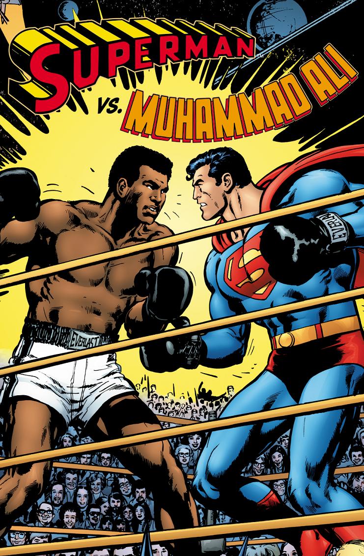
SUPERMAN VS. MUHAMMAD ALI HC OGN Reprint
Writers: Denis O’ Neil & Neal Adams Artist: Neal Adams Publisher: DC Comics Reviewer: Optimous Douche
Despite the circa 1978 kitsch, the last son of Krypton going toe-to-toe with the Thrilla from Manila was pretty goddamn cool. Kitschy-cool in the same way 1960’s black horned rim glasses were when Weezer started wearing them again in the 90s…not when everyone started wearing them…again; the same kitschy-cool that was the “Brady Bunch Movie” before we were subjected to “Starsky & Hutch”. While this is not the most original, ground breaking, or relevant plot…this book is a gorgeous over-sized early Christmas present of innocent nostalgia showcasing one of comic’s greatest artists at the zenith of his career. I swear to God, the pictures in this book are more alive than the front-page of The Daily Prophet and the over-sized format makes them all the more enjoyable. I love this book in the same way that I love my bootleg copy of “The Star Wars Christmas Special”…it’s a collection of my childhood, a time when our celebrities were worthy of sharing the page with heroes like Superman. Who could we say that about today? Superman vs. Jason Giambi – Superman waits patiently as Giambi juices before the home-run derby. Superman vs. Paris Hilton – kids get to see if Kryptonian physiology can battle syphilis. You couldn’t even go to the well of boxing for a fight espousing the superiority of America, it would just be Superman and some frigging Ukrainian no cares about. No, the innocent spirit behind this fist-to-cuffs is for another time, but what a time it was.Each gigantic page and panel of this piece is like a time capsule of both comics and Americana in the late 1970’s. From the cover to each glorious splash page I could see before my eyes the evolution of comic art from the sketchy silver age to the realistic modern era (minus the muddy heavy inking that seems to be the evolution beyond realistic to hyper-realistic). I’ll be honest, you could navigate a battleship through the gigantic plot holes in this book, but it was a time when the comics were still primarily being read by children. A kid simply won’t question things like why the greatest modern-American boxer is shooting hoops in a Metropolis slum. Kids wouldn’t question why an alien race (the Scrubb), with technology far superior to our own, would insist on showing their superiority in a boxing match as opposed to using a cannon from their armada to blow up an island…oh wait, that does happen, yet still Superman and Ali must fight. Kids won’t wonder how Ali, a man whose head was caved in so many times he couldn’t stand in place a decade later, could deduce Clark Kent’s secret identity where so many others have failed. It’s a naiveté we simply can’t understand as adults, but I certainly do envy that type of blind faith. I’m also going to give huge props to Adams for recognizing in his forward how campy the journey ahead of you is going to be. But while campy I will not belittle the experience of this book.
Adams and O’Neil were given an almost impossible task to write a book that would get approval from Ali’s manager while still engaging a comic audience. Granted this wasn’t the first time Superman rubbed shoulders with real world celebrities, but to write a book that would exalt Ali the man, serve as an instruction manual on boxing, showcase that the best boxers use their heads more than their hands, and still appeal to those that love comics, but couldn’t give two-shits about boxing…phew, I’m tired just writing the prerequisites; so kudos to both creators for actually creating a narrative around this.
The price tag on this book is far from cheap, but as they say, you get what you pay for. Despite the silliness of it all, I spent more time this week with this hefty campy tome than any of the other brooding, dark and depressing storylines that have become the comic norm (or societal norm – let’s pass on that debate for now). This is not a comic book, it’s an interactive experience. Right from the cover I was engrossed in identifying all of the celebrities that surround the boxing ring in the same way I try to figure out who the celebrities are during the “Dean Martin Roast” DVD infomercials. There are literally over 100 of the 1970s’ forgotten best gleaming with smiling faces on the cover. After that game was over, I spent hours just soaking in Adams’ artwork. The attention given to the time period is meticulously detailed and it’s not just the primary characters; as a woman saunters down the street a man gives a casual glance to her posterior, the crowds that gather around Ali all look like individuals not a wash of faceless sameness. Finally, this book is actually pretty damn informative on the subtle nuances of the “sweet science.” Prior to this reading I thought a rope-a-dope was simply silly Ali rhyming flourish, turns out it was actually a real boxing move. Again, don’t be put off by the price; this is a coffee table book more than a comic. Since we have had this on a table at Douche Manor, all of my non-comic friends have picked it up and interacted with it in some way. Plus it’s a damn sight cheaper and more interesting than the Bridges of New England or the coffee table book recap of the Charles & Di wedding.
If you want to take a time warp back to a simpler time and revel in the glory of sheer imagery bliss, you can’t go wrong with SUPERMAN vs. MUHAMMAD ALI. If you want a deep complex story, well you know where to get that.
Optimous has successfully blackmailed fellow @$$Hole BottleImp into being his artist on Average Joe. Look for Imp's forced labor on Optimous brain child in mid-2011 from COM.X. Friend Optimous on FaceBook to get Average Joe updates and because ceiling cat says it's the right thing to do.
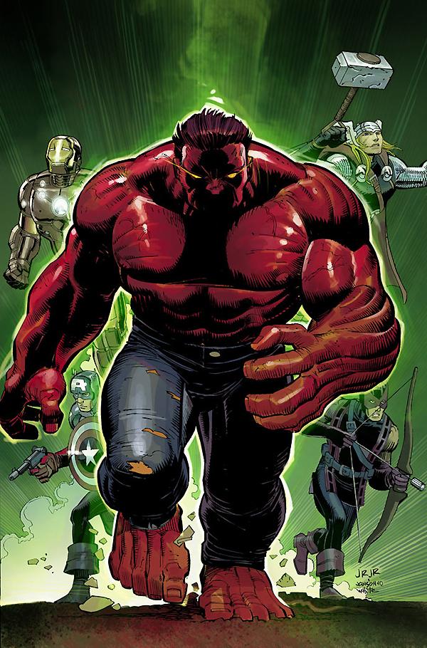
AVENGERS #7
Writer: Brian Michael Bendis Art: John Romita Jr. Publisher: Marvel Comics Reviewer: Johnny Destructo
I wasn't very nice to this book the last time I reviewed it, but I just didn't care for the Kang story. This one's got me stoked though! This one is a bit of a breather after all the nuttynut time traveling, and it's a welcome one. I LOVE that Bendis took a b-list character like The Hood, who only showed up in 1 or 2 stories, and made him a major player in the Marvel U. The last time we saw Parker Robbins, he was depowered and imprisoned, and I, for one, am glad to see him back in action. Still hungry to get back in the game, Robbins is seeking a new way to power up...and if someone wants power in the Marvel Universe, I can't think of anything as cool as the weapons he's attempting to track down.Besides The Hood's quest for new powers, we also get a little more of Simon (Wonder Man) blabbing about how the Avengers are jerks and blippityblappitywhatever. I never liked Wonder Man as a character, but this is an interesting idea: a previous member of the team is threatening and attacking his former buddies, but to what end? I'm mildly curious to see where this is headed. Really though, Thor? He was "one of the great Avengers of all time?" Hmmmmmnope, not really. He's always come off a bit more great LAKES Avengers to me. But we'll see where this is headed.
I was also a little worried about seeing Red Hulk (I refuse to call him Rulk. Shitsticks. I just did.) joining the Avengers, but I'm ok with the way this goes down, actually. Nice to see Red get clocked in his rosey facebits.
With regard to the art, JRjr is still drawing extremely attractive women unattractively, and I can't tell what exactly is causing his stuff to come across as rushed, whether it be him or Klaus Janson/Tom Palmer's inking, but from experience, I'm thinking the looser stuff is Janson's. I'm not sure what the breakdown is, but this stuff just isn't looking as polished as JRjr's work just a few years ago, and that's a damn shame.
This is an interesting new story arc and now is the right time to jump on, even if you didn't like the last storyline!

Hey folks, Ambush Bug here with another batch of freshly picked indies for you to dig into for the holidays. Be sure to seek these independent comics out because they’re definitely worth it. First up, we have an Oni treat from our beloved Mr. Pasty, then I chime in with a few indie picks of my own.
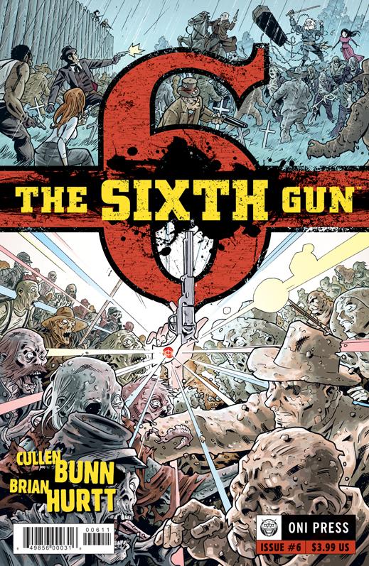
THE SIXTH GUN #6 Oni Press
I came back to THE SIXTH GUN after abandoning the series following the first two entries and I’m sorry to report that issue #6 was a stark reminder of why I jumped ship in the first place. The actual “sixth gun,” the last revolver in a series of mystical pistols, is doing some damage in a battle between a bunch of people I didn’t care about under an umbrella of popular themes including the Wild West, zombies and hot chicks. The writing and illustrations are both executed in a competent if unspectacular manner, but the chaotic pacing and crowded panels didn’t do the story any favors and from my standpoint it needed all the help it could get. It’s not hard to see why this project got off the ground as there’s plenty to work with here, but in the end I didn’t feel compelled to root for the good guys or hiss at the bad guys. It’s all just kind of “there” and while I’m sure what the characters were doing was probably important, it just looked like busywork to me. THE SIXTH GUN reads like a crowded day at the mall: Plenty to see -- if you can shake that underlying urge to just get the hell out of there. - Mr. Pasty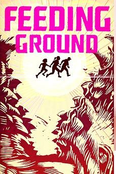
FEEDING GROUND #1 By Swifty Lang, Michael Lapinski, & Chris Mangun Archaia In stores today!
One of the cooler books I picked up at this year’s NY Comic Con was this new offering from Archaia. FEEDING GROUND is unique in almost every way, from the gorgeous art which uses a limited palette in order to communicate the multitude of emotions of the characters within the pages to the concept of setting a werewolf story on the backdrop of the dangers and perils of crossing US/Mexican border illegally. This first issue offers a sympathetic stance toward those crossing the border illegally, but doesn’t lay on the political debate thickly at all. If anything, the story takes the role of reporter, showing the trials of the illegals and the coyote leading them to a new world with an unflinching eye. What I liked most about this first issue is the attention the makers of this book take toward small moments. Multiple panels showing miniscule moments embrace the reader and pull one into the scene. A drop of blood falling on the desert ground echoes off the page. The wind blowing shirts hanging on a clothes line fully paints the scene as the characters strive for something greater and make sacrifices to attain that goal. The limited color scheme makes the world all the more desolate and perilous. You’ll shiver as Flaca, a little girl who seems to be the heart of the story, is attacked by a growling beast in the fields surrounding a factory that is forcing the people to take the dangerous journey across the border. This issue is just beginning, but the first issue grabs you by the throat and will leave you gasping until the next issue drops. As an added bonus, this comic is printed in both English and Mexican language as a flipbook for no extra cost. I had a chance to interview the makers of this book at the con. Be sure to look for the interview in the coming weeks. In the meantime, take my word for it, seek out FEEDING GROUND. It works as a political commentary ripped from the headlines as well as a nail biting horror/thriller. Highly recommended. - Ambush Bug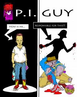
P.I. GUY #2 Paper Crane Factory
Another installment of P.I. GUY means another trip to a world filled with insanity and perversion where the only voice of reason is a gumshoe with the head of a pig. Issue two tells the sordid tale of a discarded blow-up doll that becomes posessed by a vengeful clam and looks for a date in a Riverdale-esque malt shop with its own version of Archie and Reggie in tow. P.I. Guy himself only makes a brief appearance in this issue as this evil blow-up doll's origin story takes center stage. The story, as with the first issue, is well structured but will be sure to offend those with a delicate temperament. Though the art needs a bit of work, especially when it comes to consistency from panel to panel, P.I. GUY has a lot of charm under all of that smarm. - Ambush Bug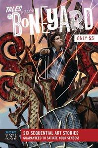
TALES FROM THE BONEYARD #1 Pop! Goes the Icon
This is a comic book anthology benefitting the Las Vegas-Clark County Library District/Vegas Valley Comic Book Festival and contains work from some of talented indie voices. The book centers on a junkyard filled with gaudy flashy signs, statues and refuse of this town of modern adventure. This book has a bit of everything, from a tender interaction between a runaway and a robot (by PJ Perez) to a sad story of a bum taking shelter in a hollowed out statue of a leprechaun (beautifully drawn by Barret Thomson). There are also fun riffs on zombies (in a fun tale by F. Andrew Taylor), superheroes (clever gaffs on DC & Marvel standbys by Deryl Skelton), aliens (excellently drawn &b written by Warren Wucinich), and post apocalyptic madness (in inspired pages by Jarret Keene & VIctor Moya). This hodge podge of indie goodness is definitely worth seeking out. - Ambush Bug
SCUM OF THE EARTH Ashcan Artists Sketchbook #2 By Jim Mahfood
I picked up this little artist's book at Jim Mahfood's booth at SDCC this year. I've always been a huge fan of Mahfood's frantic and exciting artistic style and how it has evolved into a sort of expressionism that holds onto just enough structure to let you see what his subject matter is clearly, but frayed/burned/splattered around the edges just enough to make you marvel at the hand that drew it and question your own and the artist's sanity all at once. Mahfood's art is looser here in this book, representative of feeling rather than logic. Check out Mahfood's awesome art on his website here to see what I mean. Mahfood has done the impossible; becoming a big name in comics while not letting that fame dilute his pure indie spirit. - Ambush BugAmbush Bug is Mark L. Miller, original @$$Hole / wordslinger / reviewer / co-editor of AICN Comics for over nine years. Support a Bug by checking out his comics (click on the titles for purchasing info)! MUSCLES & FIGHTS VOL.3 & MUSCLES & FRIGHTS VOL.1. VINCENT PRICE PRESENTS: THE TINGLER #1 and #2 (interview, interview, preview, & review). VINCENT PRICE PRESENTS #20 WITCHFINDER GENERAL (preview, review). NANNY & HANK miniseries #1, #2, #3, and #4(interview, interview, interview, preview, & rev