
| #24 | 11/3/10 | #9 |
Advance Review: In stores today!
BATMAN: THE RETURN OF BRUCE WAYNE #6
Writer: Grant Morrison Art: Lee Garbett & Pere Perez Publisher: DC Comics Reviewer: Optimous Douche
I’m not quite sure we can say there are any spoilers left when it comes to the return of Batman. First off, he’s fucking Batman; we knew he would be back eventually. So what we’re left to analyze and dissect as fans is how we feel about the return itself.Personally, I’m mixed. I’ve waffled between love (Dick and Damian) and perplexed (so…what happened to Bruce again? Ah screw it, this time travel shit is a blast). I can say without reservation, though, I have never been bored once during the myriad bat-tales, and the death of the caped crusader has been one of the most intricately woven arcs in comics. Doomsday schoomsday…that shit made us look like brutal cavemen compared to the mind weave Morrison has concocted during his time shepherding the Dark Knight.
To truly appreciate this issue, you first must appreciate (I won’t say understand, but yes, appreciate) the many deaths of Batman over the past few years (that’s R.I.P. through today). His death had more levels than Dante’s made-up architecture of hell. On one level we had the “concept” of Batman laid to rest by Mr. Gaiman. On another level there was the death of Bruce Wayne’s spirit as we saw during R.I.P. Then we get onto Batman being the catalyst for the death of existence. Finally there was the physical form of Bruce cast back to the dawn of man via Darkseid’s Omega Beam at the end of FINAL CRISIS. And that’s been the RETURN OF BRUCE WAYNE (ROBW), reuniting the spirit of Batman with the physical carapace of Bruce Wayne. That was until this issue…this is not your “Quantum Leap” time period of the month (that’s not a knock, I loved “Quantum Leap” and I’ve giggled like a schoolgirl as Morrison played with time throughout the past five issues of ROBW). No, this issue serves as the last connective tissue for all the layers...and this final chapter of the RETURN OF BRUCE WAYNE is the Rosetta Stone connecting Bruce’s final trip through space-time and what we already knew of his return.
I won’t pretend to understand everything that went down in this issue; I’m simply not as smart as Morrison. New Gods, Old Gods, Fourth Worlds and Fifth Worlds are all concepts for the purists of the DC fans and the cosmic thinkers that are simply not fully grounded on this plane of existence. Do I enjoy dabbling in these concepts and debating them with comic fans around the world? Hells yes, that’s the chief reason I write for Ain’t It Cool (trust me – it’s not the pay). But to say I fully comprehend every turn of phrase and Morrison cosmic deconstruction is a lie I’m not willing to live, and I also believe it’s a sign of false arrogance left for those who need to be the smartest person in the room. At the end of the day, this event has been like a “choose your own adventure” that you can gin into as deeply or as shallow as you please. I can tell you what it meant to me, but again, I’m not that smart. Pick up the book for yourself and decide where the ultimate meaning lies within your own imagination. (OK, here is your obligatory “spoiler” warning).
Symbols...Gods wield creation and Armageddon not through beakers or splitting atoms, but through conduits of the abstract. It was a concept that Morrison played with in FINAL CRISIS and I still contest would have worked much better if the book had been called anything but “CRISIS.” Now for those that thought CRISIS worked just fine, name and all, ROBW is your sword of vengeance. Here the symbols make much more sense (at least to an Obtuse Douche). A bell, a gun and a falling pearl necklace…the very items that created Batman would once again restore him at the end of time within Vanishing Point (for anyone who has been asleep at the wheel – Batman couldn’t make it through time without undoing creation itself). Batman is the Alpha and the Omega. For his supreme arrogance in confronting Darkseid, he must be reborn and once again die. Again though, I will leave the true analysis of what transpires at this level to the comic historians, those versed in all things Kirby. Sorry, but all of this Fourth World stuff all happened before I was born. There have simply been more than enough comics in my lifetime to keep me engaged and constantly reading. This was all fairly forgotten lore up until a few years ago and I suspect it will slide back into the ether after this event is finally over.
I know…it’s heady stuff, much headier than the rest of the series has been, but it works on many levels with Morrison’s flourished text driving this cosmic roller coaster. Once again though, being an Obtuse Douche, I would like to leave behind the shattering of worlds and focus on the point that was finally clarified in this issue and will be the future driving force behind the Batman going forward.
If you were like me and found Bruce’s decision to form Batman Inc. at the end of BATMAN & ROBIN a bit abrupt…almost out of character if you will (and even if you won’t), ROBW gives you the rationale behind this seeming madness. This issue served as a cathartic release for Bruce. The shackles of guilt he has carried every time he brings someone into his dark journey have finally been broken. There would have been no more Bruce without the friendship and perseverance of those like Wonder Woman, Superman, Green Lantern and the Titans fighting to bring him back, even if it meant the end of all existence. Is it a level of context I wish I had a week ago before reading BATMAN & ROBIN? Absolutely, but it also works in hindsight.
Again, this issue stands apart from the rest of the series. While it was not my particular cup of tea, I certainly see the need for it. Morrison had to tie up all of the loose ends in his Bat-opus so others could take the Bat-reigns unfettered by baggage that only Morrison is truly fit to carry. However, I will remember with fondness the past five issues of this series as a team of creators not only reinvented Batman, but also the joy of getting lost through the ages of time.
Optimous has successfully blackmailed fellow @$$Hole BottleImp into being his artist on Average Joe. Look for Imp's forced labor on Optimous brain child in mid-2011 from COM.X. Friend Optimous on FaceBook to get Average Joe updates and because ceiling cat says it's the right thing to do.
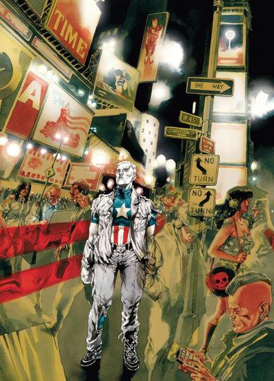
CAPTAIN AMERICA: MAN OUT OF TIME #1
Writer: Mark Waid Art: Jorge Molina Publisher: Marvel Comics Reviewer: BottleImp
“A Man Out of Time”—Captain America has gone through a lot, beginning with his original exploits in the 1940s to his re-emergence in the Marvel Universe in the 1960s and subsequent history up to and including the current Marvel continuity, and, every so often, someone will tackle this notion once more. I suppose it makes sense given the fact that this character has been kicking around for seven decades, and the world—even the highly unrealistic world of spandex-clad demigods duking it out from Manhattan to the ends of the universe—changes a lot over the course of those years. How logical then, that over the years many writers have revisited Captain America and his displacement in order to explore their respective eras. Now Mark Waid is taking a look at our time through Cap’s eyes, and so far, he’s doing a good job of adding some new polish to this dusty old idea.One of the more interesting aspects is the new idea (well, new for ME, at any rate) that Captain America and Bucky are more or less equals, partners in their costumed campaign against the Nazis rather than hero and sidekick. It’s a nice change from the classic “Gee whiz, Cap!” attitude of the Bucky that I remember, and makes a lot of sense when looked at logically—Bucky has as much (if not more) army training and experience as Steve Rogers, just sans the super-strength. Along with the elevation of the sidekick to partner status, another thing that Waid writes that I like is his Captain America is not the born leader that I grew up reading in the exploits of in both his own title and AVENGERS. Waid’s Cap is, as Steve Rogers himself says in this issue, “just a soldier.” Waid shows us a more pensive, reflective Rogers than we’re used to, a man who is aware that he is more or less a walking piece of propaganda, and is half convinced that that the U.S. government will end up taking the suit and shield back after the war and send him home with the regular soldiers. That’s a pretty far cry from the take-charge guy that leads the Avengers, and I’m hoping that as this miniseries progresses, Waid will show the growth of Steve Rogers from soldier to leader.
Another simple-yet-dramatic innovation is the manner of storytelling—we, the readers, see events as Captain America sees them. There’s no third-person omniscient narrator to tell us that Cap is frozen under the ice, it’s just one page watching the plane blow up, then boom! next page waking up to see a group of weirdoes in strange outfits staring down at you. Or one of my favorite moments (that I’m sure most younger readers won’t get, unless they’ve seen the original version from the ‘60s): unseen by Captain America, the Avengers have been turned to stone by one of their enemies, and Cap walks right past them, taking the reader along with him. It’s a great method of really making us feel Cap’s confusion and disconnection with his surroundings, even as we anticipate what he will encounter.
The one thing that keeps me from giving this comic a sterling review is, unfortunately, an unavoidable side-effect of the aforementioned decades-long history of Captain America: continuity. As I’ve mentioned above, I remember back when Cap was the confident leader of the Avengers, the man that was honored and respected because of his years and years of experience. Well, how does that fit in now that Marvel is retconning Cap into waking up not in the late 1960’s, but sometime far more recent? Now, I’m not 100% sure when Cap is supposed to be unfrozen in this issue—it’s never told explicitly, although in one panel depicting the New York skyline it looks like the Twin Towers are still standing, and there are shots of an ATM and two separate women wearing decidedly punkish fashions, so I’d hazard that we’re looking somewhere between 1985 and 2000—but no matter the exact date, given Marvel’s long continuity, there is a lot of history that’s going to have to be re-written or (more likely jettisoned) in order to accommodate this revised timeline. Newer readers probably won’t have as much of a problem with this, but for old-timers like myself, it’s a little disappointing to realize that some of the best stories of our childhoods are likely to be forgotten or ignored simply by reason of temporal compression.
Even so, this issue is still a fun read for old fanboys like me, and I’m betting that newer readers, while possibly not able to pick up on the subtler references to the original comics, will also enjoy it. Waid’s storytelling is a fresh spin on Cap’s history, and penciler Jorge Molina provides excellent visuals with expressive slightly cartoony faces and bold page designs. I’m sure that Marvel will begin to flood the stands with more and more Cap-related comics as the movie release grows nearer (just as they’ve done with their Thor-related titles), but MAN OUT OF TIME is a comic that promises to say something new rather than merely exist as a shameless tie-in.
When released from his Bottle, the Imp takes the form of Stephen Andrade, an artist/illustrator/pirate monkey painter from the Northeast. You can see some of his artwork here. He’s given up comics more times than he can remember. But every time he thinks he's out, they pull him back in.
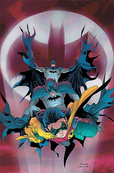
BATMAN & ROBIN #16
Writer: Grant Morrison Artists: Cameron Stewart, Chris Burnham, Frazer Irving Publisher: DC Comics Reviewed by Johnny Destructo
I'm not smart. Grant Morrison proves it to me time and time again with his often esoteric, sometimes ridiculous, occasionally impossible to read stories. 75% of the time, I regard him as one of my favorite funnybook writers. The rest of the time, I wanna slap him and say "Speak English, motherfucker! Dumb it down for me cause I wanna actually figure out what you're saying!!"This series, BATMAN AND ROBIN, is by far my favorite of Morrison's recent Batman work. I've never cared about the Black Glove or Final Crisis, or Batman R.I.P. or the Return of Bruce Wayne. I have, however, really enjoyed his work here, delving into the relationship between Dick and Damian and their new roles as the dynamic duo. I haven't loved to hate or hated to love a character as much as I have Grant's Damian. It's a glorious thing, to watch him write this character and his interactions with the Bat-Family. What I'm not enjoying as much is the giant bat monster thing, time-traveling Bruce, Dr. Hurt/Thomas Wayne/Space Voodoo stuff. Some day I'll probably go back and re-read the entire Morrison Bat-run, but as of now, having read it an issue at a time, I can't say that it's the most cohesive story. Maybe I'm the only one who had to look it up on wikipedia to try to understand it, but I doubt it!
Anyway, we're here to talk about this specific issue. This one had enough answers, enough action and enough smarmy Damian for me to love it. There is a great deal of bad-assery and hilarity to enjoy here. Award for best line goes to Dick, on Bruce's convenient return: "Guess I should have known you wouldn't just turn up during lunch tomorrow or something normal like that." This is a fine wrap-up to Morrison's run on this book, but of course the main concern is the final couple pages and the cliff-hanger. This poses quite a few questions regarding the legal ramifications facing Bruce in the upcoming series. ALMOST akin to Daredevil's identity being leaked or Spidey taking off his mask on national television. I'm definitely curious to see where we're going with all this! It seems to be going against everything we've been lead to believe is the M.O. of the Dark Knight. One man stalking the shadows of Gotham, remaining an untouchable legend to keep the superstitious and cowardly criminals afraid. Now it reeks more like1980's film “Hero at Large”, starring John Ritter. It really takes Bats out of the shadows and into the spotlight, which just kind of seems...wrong. Not to mention Bruce will now probably have to face charges for aiding and abetting a known vigilante/criminal which is, let's face it, what Batman REALLY would be in the really real world.
As for the art, Cameron Stewart does a fantastic job here with the two-page spread of the Batmen and Robin taking on the Black Glove's goons. Definitely worth taking your time to soak in all the action he packed into those panels. Stellar work. Frazer Irving also does his usual fantastic job here, but anyone else notice that when Bats punches the Joker, the foreshortening is so drastic that it looks like Joker's head is literally been punched off of his body and is about to hit the reader?
No offense to the talented folks who have drawn this book, but Oh Frank Quietly, why did you never return? What I wouldn't give for a whole 16 issues of you on this series to compliment your ALL STAR SUPERMAN run. The composition of this cover is unfortunate, however. It looks like Dick Grayson's Batman is literally straddling Robin like a hobby horse towards the reader.
At any rate, this was a great issue, and if anything, Grant Morrison keeps me guessing. And feeling like an idiot.
JD can be found hosting the PopTards Podcast, discussing movies, comics and other flimflam over at www.poptardsgo.com, graphically designing/illustrating for a living, and Booking his Face off over here.
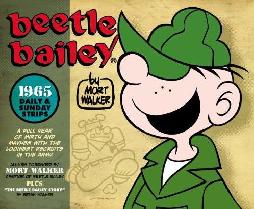
BEETLE BAILEY: THE DAILY & SUNDAY STRIPS, 1965
By: Mort Walker Published by: Titan Books Reviewed by: superhero
When I was first offered this book for review I have to admit my first thought was a very reluctant, “Ooookaaayyy…I guess so.” It’s not that I don’t like Beetle Bailey. It’s just that I never really cared one way or the other about Beetle Bailey. When I was a young’n I loved the funny pages. I was obsessed with Peanuts--so much so that when I’d go on summer trips to visit my aunt she’d take me on an outing every week to get whichever one of the collected Peanuts books we could find at the local K-Mart. As I got older, I grew to love stuff like Bloom County and, of course, Calvin and Hobbes. Beetle Bailey…he was just kind of there on the way to get to all those other strips. Much like Blondie or The Family Circus, I always saw Bailey as sort of filler to take up space for other strips which I actually loved. It was an OK strip, but nothing that I was crazy about.It’s amazing how things change as you get older. As I hesitantly turned the pages in this Beetle Bailey collection I found myself…enjoying it. Really enjoying it. I actually cracked a smile in several places and, I’ll admit it…I even laughed out loud once or twice. I don’t know why…suddenly I just found Mort Walker’s motley gang of military screw ups very amusing. Maybe it’s just that I’m older and I find the strip a lot more charming than I did when I was kid. Maybe I didn’t get certain humor when I was a kid. Maybe it’s just that there are certain interestingly non-PC aspects to the 1956 Bailey universe that I found it refreshing in a way that I didn’t expect. I can’t pinpoint what it is…but I’ll be damned…I enjoyed the heck out of reading this Beetle Bailey collection.
Part of what I loved about it was Mort Walker’s cartooning style. Yes, it’s simple…but it’s deceptively simple. Walker’s art style is fun and expressive. Sure it looks like a kid could draw it but if you know anything about cartooning you know that it’s not just a bunch of scratches on paper no matter how simplistic a professionally drawn comic strip looks. The masters are the ones who can convey a fun bit of business with a definitive style and fit it into a maximum of four, maybe five panels. It’s not easy…it’s a real skill. After reading this edition of Beetle Bailey I have to say that I believe there’s a reason that Walker’s creation lasted as long as it did and it’s because Mort Walker was probably one of the true masters of comic strip art of the past century.
So, yeah, I’m going on record as saying I really liked this collection of early Beetle Bailey strips. It’s an edition that’s rounded out by two well written and informative introductions about Bailey’s creator, Mort Walker. This is a fun all around compilation of a comic strip character from a bygone era that I think a lot of cartooning fans will enjoy.
Discovered as a babe in an abandoned comic book storage box and bitten by a radioactive comic fan when he was a teenager, superhero is actually not-so mild mannered sometime designer & cartoonist, Kristian Horn of Los Angeles, California. He's been an @$$hole for three years. Some of his work can be seen at www.kristianhorn.com and check out his blog at www.parttimefanboy.com.
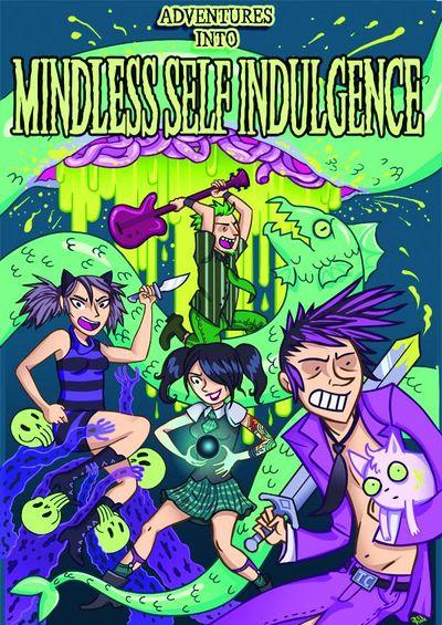
ADVENTURES INTO MINDLESS SELF INDULGENCE #1 (One-Shot)
Writer: Jimmy Urine, Kitty, Lyn-z, Steve Righ?, Jess Fink Artist: Jess Fink Publisher: Image Comics Reviewer: Lyzard
After the arrival of a Justin Bieber comic, comic book purists may not welcome the news of another musical celebrity book. And though Mindless Self Indulgence would hardly be categorized as celebrities, despite their large underground following, I wish I could say the comic didn’t replicate the trauma of Bieber’s book. Now, I cannot speak to which of these comics is worse, because I refuse to pick up the former. This is because I believe it should only be read as punishment in one of the deeper circles of hell. But, ADVENTURES INTO MINDLESS SELF INDULGENCE does not bode well for the future of musical talent-based comic books.Before I get into the details of the book, I want the readers to know that I wanted this comic to be good. I love Mindless Self Indulgence (MSI). It brings back memories of high school--prom to be specific. Not that my school played MSI at our senior prom, it was hardly that cool, but the limo ride there and back had MSI as its soundtrack. Their raunchy, inappropriate electronic rock should have warned me of the type of events that happened to them on the road, but I walked in unafraid. Very bad mistake.
From the cover, the comic book seems like harmless fun. It’s colorful and bright, nothing too disgusting. Then comes the Certificate of Authenticity following the index. In this prologue the reader is warned of the “crazy fucked up shit” that is to come, with what one can only hope are purposeful misspellings. This is followed by the first story, “Dick on Fire”, starring Little Jimmy Urine. Does this story really need any explanation? All I do need to say is that you see everything. Fortunately the comic is in black & white, a godsend in my opinion due to the amount of gross body matter shown. Throughout the book you have several “It’s the Kitty Show” segmenys featuring the band’s drummer. The only other story is entitled “48 Hours” and follows Steve and Lynz. This vignette is pure chaos.
What should I have expected? I’ve heard the lyrics to their songs. I sing along to “Stupid MF” all the time. Should I have been shocked and surprised? No, but I was. From my experience in comics, it is violence that pushed the envelope, not sex and bathroom humor. Yet I hardly find ADVENTURES INTO MINDLESS SELF INDULGENCE refreshing, merely lewd and crude.
I also doubted the validity of the stories. They seemed exponentially blown out of proportion. After doing some research I found this to be partially true. Though Little Jimmy Urine did get arrested for pulling out his member, it was during another show that he attempted to light it on fire. As for the other stories, I believe most of Kitty’s tales because they don’t seem far-fetched. However, “48 Hours” seems completely out of this world to possibly be true.
The art was tolerable, I guess. It is hard to judge due to the content of the material. However, I think I’d prefer it if Jess Fink continued designing shirts for Threadless, more than creating these MAD Magazine style comics.
I’m sure die-hard fans of the band will enjoy reading of their exploits. Maybe I’m just a poser who digs the music but not the image of MSI. But that does not excuse poor storytelling and rip-off styled art.
Lyzard is actually Lyz Reblin, a film student at Chapman University. Lyz’s love for comics stems from an internship at Dark Horse Entertainment as a freshman, which may explain why some of her favorite comic book writers are Gerard Way and Steve Niles. You can find her on Facebook, but only if you follow her band: Castle Town Convicts (possibly a Zelda reference?).
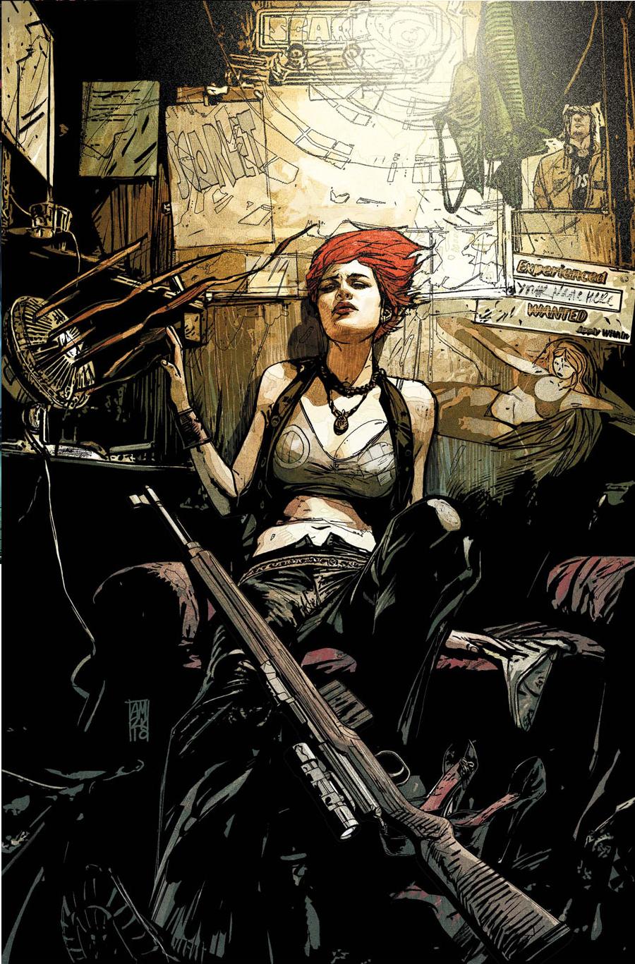
SCARLET #3
Brian Michael Bendis: Writer Alex Maleev: Artist Marvel ICON: Publisher Vroom Socko: You Cannot Stop Us! We Are The Rose City!
It may just be due to the date, and that I reread the book every year at this time, but SCARLET seems to be a 21st century reinvestigation of the themes found in Alan Moore's classic V FOR VENDETTA.Plotwise, the two books are travelling along a similar track. Like V, Scarlet has suffered at the hands of her society. Like V, she first struck out against those who directly hurt her. And with this issue, like V, she is taking the fight directly to the government. She is reaching out to the citizens who live under this umbrella of corruption. And she is relentless.
If you recall, I reviewed the previous issue, calling it the Bendis book I'd been dreaming of. This new issue only reinforced that idea. The heart of this installment has our heroine meeting up with Brandon, her dead boyfriend's best friend. This moment is great, not just because it features another excellent Maleev Montage, but because it gives Scarlet a real confidant. Oh sure, she's been giving us soliloquies since the first issue, but we're along for the ride no matter what. The addition of Brandon gives her someone who can talk back. She can tell him how nervous and excited and scared she is about what she's doing, tell him just why she has to do this, and in return he's someone who can, hopefully, let her know when she goes too far.
This issue also manages to take care of my one prior complaint, that the book didn't feel quite "Portland" enough. Well, the intro quickly takes care of that. It features Scarlet contemplating a wedding that spontaneously breaks out at Waterfront Park. Very Portland. For those not from the area, yes weddings can break out in the strangest places. You can get legally married at Voodoo Donuts if you want. Hell, two of my friends got married in a vacant storefront window, then the woman who performed the ceremony invited the two of them back to her place for a threesome. I swear I didn't make any of that up.
This is the best book Bendis has on the stands right now. Period. This is THE must read comic being published right now. It's been a while since I've had this much anticipation for the next issue of one of his titles. Not since ALIAS, at the very least. Bendis has mentioned that the next issue is going to be a major game changer, so it's sure to be a can't miss read. I have a sneaking suspicion that it will involve the response to Scarlet's actions at the end of this issue not living up to her expectations. Because at this point, despite the similarities, she is not V. V has verve and style that Scarlet is lacking. And Scarlet genuinely hasn't hit bottom quite yet. There's still room for her to be disappointed by the world at large. That's my prediction at any rate.
That, or Hawkeye is going to show up.
Vroom Socko, aka Aaron Button, has probably undersold the greatness of this book, and definitely undersold the greatness of Portland. And yes, he's ending this review with a HOUSE OF M gag. What?
GRIMM FAIRY TALES WONDERLAND ANNUAL 2010
Writer: Raven Gregory, Dan Wickline, Mark L. Miller, Lynda Ly Art: Alfred Trujillo, Tess Fowler, Dafu Yu, Thiago Santos Publisher: Zenescope Entertainment Reviewer: Mr. Pasty
I love Annuals. Always have, hopefully always will. My favorite as a kid were the year-end Hulk offerings. The stories always felt bigger, grander, more important than the usual fare and I like that for the most part, the events transpired outside the reality of the current storyline. GRIMM FAIRY TALES WONDERLAND ANNUAL (GFTWA) 2010 is no exception but I will confess that my pessimism alarm started sounding when I saw it was a collaborative effort. To be honest, I’ve never been a big fan. I always thought the group effort was largely uneven because you would get some great work marred by the one contributor who decided it was time to “re-imagine” the franchise.I don’t know how they pulled it off, but GFTWA is fucking seamless. Actually, I do know how they pulled it off; it’s called “talent.” A quick roll call reveals some of the industry’s more recognizable names, and there’s even AICN’s own Ambush Bug getting his hands bloody with some of the seasoned vets and (not surprisingly) he holds his own. So what’s happening in GFTWA? Well, as the title suggests, it’s pretty fucking grim. Apparently they didn’t raze the house that gave Roger Cobb so many sleepless nights and those pesky Wonderland creatures have gone and driven real estate prices way down by way of Roach Motel. Simply put, you can check in but you can’t check out.
That’s giving the one-legged girl across the street plenty of angst. She’s got a broken leg to contend with and it leaves her with lots of free time. That means hours of loitering on Facebook and of course, staring at the house next to her to see what poor saps it will devour next. I like the play on REAR WINDOW, though I will admit I never wanted to ass-bang Jeff Jeffries. Angela on the other hand, aside from being the conveyor belt that efficiently advances the narrative from one sub-plot to the next, is pretty fucking hot for a chick that just lies around all day. Heck, everyone is smoking hot in this book, even the fat Pink Pearl (ALPHA FLIGHT #22 to save you the Google search) lookalike who auditions for THE RUINS in the haunted garden. Anyway, Angie is trying to convince a couple of hip, twenty-something reporters that the abandoned house on the next lot is pure evil and she hopes to do it by recounting the more recent murders that have transpired under her watch. I’m sure in today’s society, if the cops won’t help you and your parents don’t believe you, the next logical step is to call TMZ. If nothing else, you’ll at least get a talentless hack with a steady-cam sticking their snout in somebody else’s business.
The meat and potatoes of this book are the stories Angela tells. They serve as a nice segue into each artist’s contribution and there isn’t a weak link to be found. Considering that I just wiped my ass with Zenescope’s SINBAD, you can rest assured this isn’t just pillow talk. This book delivers. True, the art, just like the writing, is noticeably different between stories, but the reason it works so well is because it’s not a jarring transition. The look and feel may change, but the quality doesn’t. I think that’s why this collaboration succeeds where so many others fail. Special thanks to the team for also leaving me on a cliffhanger – but not at the expense of the story arc. In the end, the reporters don’t believe Angela because she has some dirt in her past that gives them pause. But will they at least take a peek inside the house after they leave? Will Angela mount her crutches and follow them?
Without getting into one of those hideous acronyms, I should caution that GFTWA is by no means kid-friendly. Yeah, I know, kids today are desensitized to everything, but I would be remiss in my review if I gave it a green light for all ages. I’m not even that concerned about the blood and guts, which make their requisite appearance, but rather the darker themes that sometimes get into your head. This house isn’t just a meat grinder; it’s a mind fuck too. It’s the total fucking package baby.
GRIMM FAIRY TALES WONDERLAND ANNUAL 2010 is fun to read. It’s intelligently written, beautifully drawn and extremely well produced. A lot of care went into this collaboration and it shows in the results. GFTWA is what being a comic book fan is all about and the best compliment I can give it is that it reminded me of some of the best CREEPSHOW or TWILIGHT ZONE stories from my childhood. You know, the ones that gave you nightmares and cold sweats -- but still had you coming back for more. Consider GFTWA an early lock for multiple @$$IE Awards.
Web heads who can’t get enough of Mr. Pasty’s word vomit are encouraged to watch him operate as Nostradumbass over at MMaMania.com here. Love, hate and Mafia Wars requests should be directed here.

CHAOS WAR #3
Writers: Fred Van Lente & Greg Pak Art: Khoi Pham Publisher: Marvel Comics Reviewer: KletusCasady
They snuck another one in on us. Another fricken' event and this one, much like “Blackest Night”, has our heroes battling an unstoppable force that has resurrected dead heroes to help Nekro…I mean Chaos King defeat the last of the good guys and thus rule/ destroy the universe. It’s not an event until there are multiple tie-ins that most of the time could have been avoided; for this series there are 8 miniseries/one shots. If an event is important enough to warrant that many tie-ins then why not just put it in the main titles? If it’s an issue of creators not wanting to be shoehorned in to an event, then really what’s the point? If you’re going to have an event I feel as though it should be reflected through those characters’ comics; that way we don’t have to spend an extra 50+ dollars on shit that won’t even matter in two years. I do like this series but the amount of mediocre events lessens the impact of that “Holy Shit!” moment that has come to be expected in these types of comics. This issue is good but overall boredom for recent events may creep through this review…so be warned!The story behind this series is that the Chaos King (last seen during the HERCULES “Secret Invasion” issues…which were damn good by the way) has secretly been killing off deities to make himself stronger and now wants to reveal that strength to the world by…destroying everything, or at least that’s what I gather. Hercules has totally grown on me as a character; I was baffled when he took over Hulk’s title but after reading a few issues I was hooked and every issue had more than one laugh out loud moment and Amadeus Cho is a great fucking wing man. This issue deals with the newly cosmically powered Hercules attempting to gain help fighting the seemingly unstoppable Chaos King with the help of a few God-like badasses…but is it enough? The best part of this comic is the interactions between the characters and how it still maintains a really serious tone while still allowing the types of jokes in that made Hercules great.
Khoi Pham is doing his best work here and I’m not sure if it has to do with the inker or colorist but this is leaps and bounds beyond THE MIGHTY AVENGERS. I think the biggest difference is that things look more completed than they did before; in MA his artwork reminded me of Phillip Tan’s work on BATMAN & ROBIN where the action was almost really good but there was just a slight lack of detail that left me wanting a few more lines in there just to round things out and provide a little more definition. Pham’s work (might be the inker) has that definition now and his art almost looks like a completely different artist.
The writing is good and if you like Hercules the dialog is pretty much on par with what it was in that title. The story to me is alright but my problem with events such as this is that there really is no tension for these events anymore. It’s either some hero is going to die during the event or some hero is going to be resurrected during the event...oh yeah, and the heroes are going to win and everything will be back to status quo about a month after everything is said and done. The more frequently these events happen and the more frequently that these types of formulaic things happen in these events the less I really have invested in the end result.
Despite my tone I do think this issue is good but when I start to think of other events and how they ended up, I start to get bored and wonder what the aftermath of the series is going to be and whether the event was actually necessary just to bring Hero X back to life and kill Hero X who nobody gave a shit about in the first place. If you like Hercules you are probably already reading this thus not needing ‘Ol Kletus’s blessing, but if you aren’t, I don’t know that there is much to say for me to convince you. The artwork is good and definitely Pham’s best work in my opinion. The story isn’t bad but I’m not sure it’s going to hook someone who has no interest in Hercules and his supporting characters. Also for you completists out there make sure you start saving cause there’s a slew of tie-ins coming down the pipes and I know you want that $4.99 Chaos War Stilt-Man one shot.
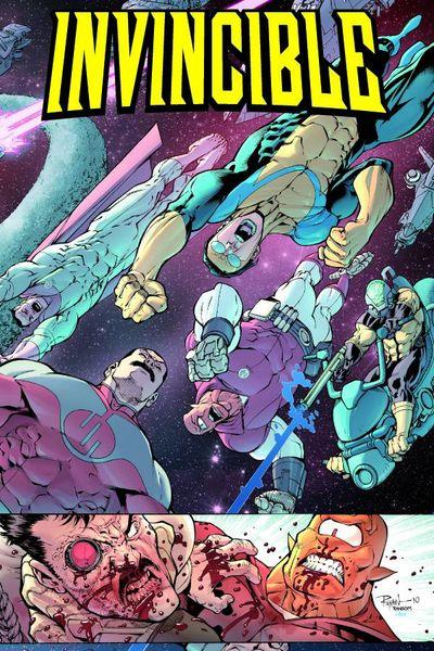
INVINCIBLE #75
Writer: Robert Kirkman Penciler: Ryan Ottley Inker: Cliff Rathburn Colors: FCO Plascencia Publisher: Image Comics Reviewed by Johnny Destructo
To provide a balance to Grant Morrison's esoteric and mysterious style of writing, I present Robert Kirkman, writer of the at-times overly earnest and exposition-heavy INVINCIBLE. Robert loves him some word balloons, filled to brimming with...words. Soo many words. But hell, if somebody transcribed both my spoken words and my inner monologues, I imagine it would be a pretty text-heavy graphic novel itself. The saying goes that "less is more", but I can't think of any way this book could be any better than it is. It takes the strengths of both the DC and Marvel Universes and creates something wholly new. It feels familiar, sure, but in the same way visiting a beloved childhood haunt might.We're nearing the end of the Viltrumite War, and it has been some ride. This issue is no different, in that yet again, action and surprises abound. As brutal as it is heartfelt, this issue takes no prisoners and leaves outer space a bucket of gravityless blood and innards and mustaches. Seriously, you know an alien populace is rotten when every single male of the species sports a creep-tacular molest-ache. Invincible and his buddies take the battle directly to the homeworld Viltrum to finish off the remaining Viltrumites and end this war once and for all. Unfortunately for some of our beloved characters, the baddies aren't going to just lay down and die. Expect casualties.
This book is balanced brilliantly. The text-y bits are evened out by the silent bits while the overly earnest dialogue is countered by the brutal violence. This is a fantastic book that is a pure joy to read. Some folks seem annoyed by the lateness of this issue, but for the most part, I'm just happy that it comes out at all! And good god, the wait was worth it to enjoy Ottley's pencils. That boy can draw him some stuff. And the blood! He's a gore master. Definitely worth the wait. That said, I didn't need to pay $5.99 for the extra Science Dog story, or the Tech-Jacket stuff. I look forward to both the cheaper cover price next month as well as how this is going to end!
SECRET SIX #27
Writer: Gail Simone Art: J. Calfiore Publisher: DC Comics Reviewer: Henry Higgins is My Homeboy
Brought to you by the letter "I"! ....I'm sorry. It's affecting me.Simone’s new issue of SECRET SIX is a good read, but isn’t as good as last issue. The characters, dialogue, artwork—it’s all well done. But it doesn't add up as well as it should. The art picks up some of the slack though.
Writing: (4/5) Overall, the issue is a fun read. Tremor’s introduction to the team at the beginning is a nice little bit of analysis on the characters and offers a promising Deadshot moment. The issue continues to shift back and forth from fun idea to interesting one. One moment, Scandal becomes darker, dealing with the possible death of Bane. The next, Ragdoll gets in a good joke. And when it's neither of those two, it's merely awesome. Jeanette and Waller get the big moments in this issue, having two defining moments that, if you don't already like them, will make you love them. The set pieces, as well as the little bits of dialogue here and there, are all are solid as can be. However, a few plot holes deter from the overall issue like the deus ex machina feeling that the healer brings. The take on Killer Shark is also a bit odd. And as fantastic and funny as Simone is, the scene doesn't seem consistent. So nonplused by having an eye ripped out, Shark makes an AVATAR joke. It's a good line, but he just got his eye ripped out. It's very inconsistent. Finally, the presence of a dark god character is very, very, VERY out of left field. Not a huge follower of Skaar outside of some brief exposure from JLU, this is too much of a continuity nod to really connect to.
Art: (5/5) Calafiore....damn. You know what? I realize it may seem tired and hokey for me to say the same things every month, but he's just been absolutely brilliant on this series. I'm going to save some time and just point out what moments are perfect. The opening page of Giganta, Scandal holding Bane, Jeanette’s smile (FUCK THAT'S COOL), Jeanette in Banshee mode, Bane on a dinosaur, everything in the battle sequence, Catman in the suit, "The Wall" (FFFUUCCCKKK), the final page! There you go. Go buy this issue, if only for that.
Best Moment: Either the scenes with the Wall, or maybe Jeanette.
Worst Moment: This issue has a lot of Deus Ex Machina moments, I'm afraid.
Overall: (4/5) Weaker than last issue with a few plot holes here and there, SECRET SIX is still good. It remains one of the best titles being published now.

BULLSEYE: PERFECT GAME #1
Writer: Charlie Huston Artist: Shawn Martinbrough Publisher: Marvel Comics Reviewer: KletusCasady
Talky.That was the first thing that came to my mind after reading this issue.
In my opinion, Charlie Huston has delivered some good stories for the most part; I liked his MOON KNIGHT until it got crazy as hell and his ULTIMATES 2 ANNUAL wasn’t bad either BUT this comic is boring and rarely will I ever say a comic needed to be shorter (especially at $3.99 a pop) but this comic probably could have cut about 4 pages out and it would have been a lot more enjoyable of a read.
When I first leaned about this comic, I thought that this idea is pretty damned good and was surprised someone hadn’t done it before. Bullseye as a major league pitcher….pretty fuckin’ cool if you ask me, but then I started reading, and reading, and reading, and the guy kept talking, and talking, and talking. Some of it was really cool like the parts with Bullseye killing all these various people just to challenge himself but Christ, if I was in that room with the guy that was narrating the story I would’ve smacked him about halfway through and said “Get to the fucking point man, I got shit to do!”
I feel like this issue could have been a lot better if we skipped the set up, went right into Bullseye pitching multiple no hitters and had this guy’s narration over drawings of Bullseye actually playing a game rather that watching a fat dude in a sweaty tank top walk around his apartment. The artwork is good, nothing spectacular but nothing really bad about it. Think Sean Phillips with a tad of Dalibor Talijic from the HIT MONKEY one shot.
This issue had potential but I got bored about halfway through….Read at your own risk (of boredom)!

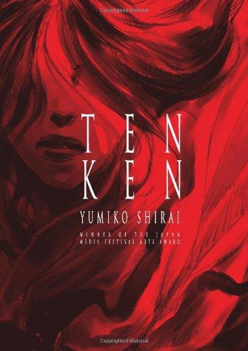
TENKEN Vol.1
By Yumiko Shirai Released by One Peace Books Scott Green
Shirai Yumiko (also a children's illustrator, her series WOMB runs in the Japanese edition of alternative manga anthology IKKI) did not create a disposable pop read, and her work was recognized with the Japanese governmental Agency for Cultural Affairs' 2007 Japan Media Arts Festival Encouragement Prize . While re-architecting a legend into a 300 page, sci-fi romance epic manga, TENKEN removes the familiar handrails. It has its own identity, and asks for a thinking audience, willing to read into implications. Though its approach to engaging the audience differently is not recommendable without qualification, TENKEN is a noteworthy choice for adventurous readers of manga and comics in general.TENKEN isn't an easy hike for any reader, but it's a decidedly rockier trip for audiences outside its native target.
Coined by Koichi Iwabuchi, there's a concept of "cultural odorlessness" that plays into the "Cool Japan" conversation. The origin doesn't stick to the product. With HELLO KITTY or POKEMON, the appeal is global. You don't read "Japanese" from it. SAILOR MOON might be spun from the East Asian folktale of a rabbit on the moon, DRAGON BALL might have launched from as a parody of a Buddhist epic, NARUTO might be informed by a history of ninja and their use in times of inter-state warfare, but each has been adopted by non-native cultures often without a key sense of where they're from. The metaphorical contrast is "natto," resembling, smelly, sticky bean paste.
John Ford may have influenced Akira Kurosawa, and it's been said that a reason why Kurosawa is so popular in America is because his movies looked to western cinematic traditions, but, there's no mistaking that SEVEN SAMURAI is a Japanese movie. It's not "culturally odorless." You might prefer to watch SAILOR MOON or NARUTO anime in the original Japanese, but it is not necessarily strikingly wrong to see the characters speaking English. On the other hand, the notion of SEVEN SAMURAI in English is jarring.
Manga readers have undoubtedly hit works that were unmistakably Japanese; intrinsically bound to the nation's history, legends or its modern condition. That said, there aren't many manga in North America that read as Japanese as TENKEN. Even, the chapters of Osamu Tezuka's PHOENIX that deal with Japanese history and spirituality, such as Karma, about the establishing of Buddhism in Japan expressed through the story of an 8th century bandit turned carver, doesn't compare.
TENKEN is built on the Shinto myth of Yamata no Orochi, the eight headed dragon. As recounted in the volume's introduction, storm god Susano was walking along a river when he encountered an elderly couple crying. They informed Susano that once a year, the great serpent Yamata no Orochi came and eat one of their daughters. With only one daughter left, they were despondent. Susano requested the daughter's hand in marriage. When granted, he turned her into a comb, which he proceeded to put into his hair. He then arrange for a vat of strong liquor and the construction of eight gates. Yamata no Orochi went to drink the liquor and as the drunken serpent became entangled in the gates, Susano chopped the monster into pieces.
Orochi is all over Japanese pop media, from BLUE SEED to KING OF FIGHTERS. Even in GHOST IN THE SHELL, Motoko Kusanagi takes her name from Susano's sword. However, mostly it's just a dragon slaying story. Here, be ready to grasp the metaphor, because it’s essential to the significance of what's happening.
Yumiko Shirai projects the myth into a science fiction romance. Set in a post apocalyptic future, brought upon by dirty war, a sky scraper tall bamboo scaffold is being erected for the Tenken Festival, a twice a century ceremony in which a young girl is sacrificed to appease Yamata-no-Orochi. There are signs and mysticism, but this is the reenactment of a pattern and not a Harryhausen legend come to life. These people believe in the dictates of their faith, but don't necessarily expect snake godzilla to erupt out of the earth.
TENKEN’s Japanese-ness is essential, but it's also only a starting point. It's a work of a particular vision and the years it took to develop the manga are evident. It's a reforested landscape, in which monumental, semi-urban environments have been built from bamboo. Though, in this sphere, the notion of a poisoned world calls to mind Hayao Miyazaki's Nausicaa, TENKEN doesn't look like that, or any other work. While manga can be an enable genre works, that doesn't always translate into unique landscapes. TENKEN is a beautiful member of the subset of manga that consistently pays attention to visually establishing its world. The walls that characters move around, the forests that frame its buildings, it is all specifically TENKEN. This unique look is further pushed out by a brush illustrated approach, whose wispiness and space give the manga a half dreamlike feel.
The participants in this reenactment of the Orochi legend have histories and perspectives. It is possible to grasp and relate to what is human about them, and to emotionally invest in their relationship. Yet, the heft of the manga is in their relationship with the Orochi story, and to get to that, the manga needs to be engaged. What Shirai Yumiko intends the reader to pull from what her characters go through is not spelled out with complete explicitness.
It's welcome to find a manga that is unique and a bit difficult. However, for all its laudable qualities, TENKEN is more recommendable to adventurous readers than casual ones, and even with the best of intensions, it's ultimately more interesting than fascinating. The English version of the manga reads like a translation with little adaptation, and that makes the task of paying attention more difficult. The writing is always clear and appropriate, but it can also be a bit cold. However, that is not the entire reason that TENKEN should probably be read by people who want to read TENKEN. Unlike most manga, TENKEN was not first published in serialized from, and as such, doesn't have the hooks that typically pull a reader along. Not taking up the business to do so, the manga is not going to convince a disinclined reader to make it through the volume.
Scott Green has been writing for AICN ANIME for over nine years. If you like what you see here and love anime & manga, be sure to check out his latest AICN ANIME column every week on AICN.

Hey folks, Ambush Bug here. Here’s another handful of Indie treats you should check out if you’re in the mood for comics off the beaten mainstream path.

NINJAS VS ZOMBIES ASHCAN EDITION #1 Azure Press
I’ll be reviewing NINJAS VS ZOMBIES the movie in an upcoming AICN HORROR column, but I happened upon this ashcan comic based on the film and had to give it a mention here in Indie Jones. Though this comic recreates a lot of the scenes from the film, because the film is a low budgeteer, the action and drama seem to work a lot better on the page. Both the comic and the film are a lot of fun, but in the comic, there’re no limitations and it makes the already fun concept a more developed one. Here the action scenes seem all the more effective. The campy dialog is fitting, the tone is fun, and the delivery is good. I know the makers of this comic really want to make films, but from what I’m seeing here, they do a damn fine comic and it would be good to see more of them. This issue focuses on Kyle, a down on his luck actor who delivers pizzas and stumbles into a world where he is suddenly given the powers of the ninja and must fight a horde of zombies in order to survive. Writer Thomas Chillemi keeps the dialog crisp and fresh and artists Jamie Martinez and Ruben Rodriguez offer some dynamic panels and art inside of them. Fun stuff. - Ambush Bug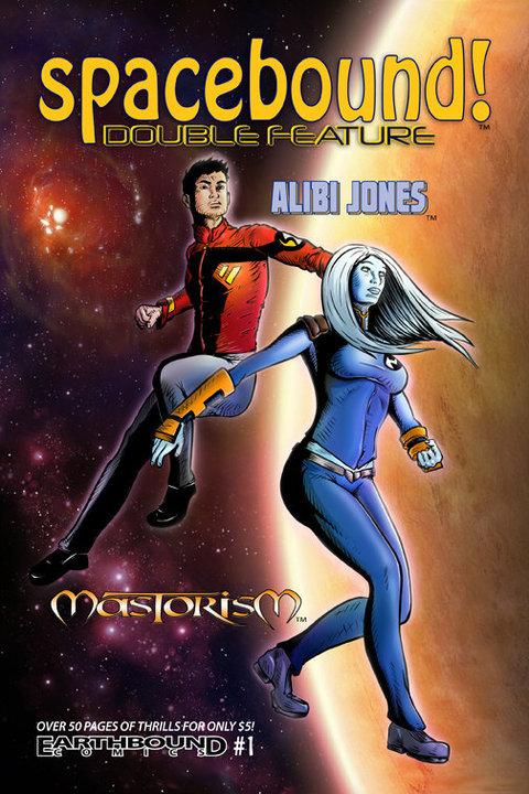
SPACE BOUND! DOUBLE FEATURE #1 Earthbound Comics
A double-shot of space adventure here, but two very different types of stories. The first feature is “Alibi Jones,” written by Mike Luoma and illustrated by Meisha, and follows the exploits of an interstellar ambassador against a backdrop of political intrigue. The second is “Mastorism,” written and drawn by Matthew Grant, which deals with super-powered aliens fighting against an evil overlord. Both are well-drawn, though “Alibi Jones” has a little bit more grace and finesse in both figures and page designs. It’s a shame that color printing is so much more expensive, because I think that color could really enhance each segment. The other drawback is that with both stories, a reader coming to the characters and their respective worlds for the first time is thrown right into the middle of a whole mess of backstory without much in the way of introduction. I think a more “new-reader-friendly” way of storytelling for this double-feature would go further in terms of hooking those new readers and enticing them to read more. As it is, telling the reader to go to the website to learn about what’s going on in the comic you have in your hands feels more like you’ve been given a chore that has to be done in order to understand what you’ve already bought. Nonetheless, there’s some decent art and storytelling here in these two space-opera tales. -BottleImp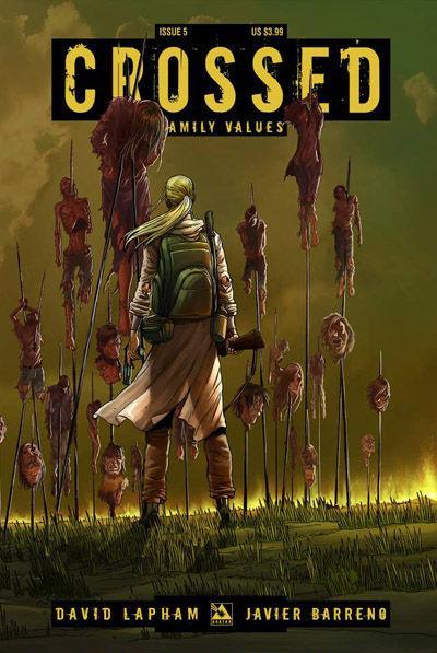
CROSSED: FAMILY VALUES #5 Avatar Press
So over the last few weeks, I’ve caught up on CROSSED. I decided the second issue of the first series where the family is torn apart and raped on panel was too much for me at the time and dropped the title. After a year away, I decided to give the series another try. I know there are those who swear up and down that CROSSED is both genius and trash. I don’t think its breaking new ground as far as storytelling, but after the shock of the first few issues of the first series, some semblance of plot began to arise. By the end of Ennis’ first series, there was some kind of point to the ick-fest I endured. Ennis was establishing the threat of the Crossed in those first few issues, then moved on to survivalist horror. I still prefer THE WALKING DEAD, but Ennis did a decent job of actually getting me to root for these characters to survive. Now…I never read STRAY BULLETS, but with this new CROSSED series and last week’s PUNISHER One Shot, David Lapham is quickly becoming my new favorite writer. Lapham is going over the top with all of the incest going on in this miniseries, FAMILY VALUES, but he’s also making it hard to look away. Sure it’s depraved. Yes, it’s perverted. OK, you might want to take a shower after reading. But I’m riveted to see how these survivors are going to make it out of this series alive. So far, things are so dire that I can’t see how anyone can survive. Again, it’s not for everyone, but Lapham brings a heft to this story that makes it more substantial than Ennis ever did with his original series. - Ambush Bug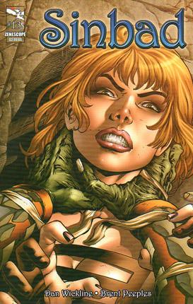
SINBAD #13 Zenescope Entertainment
I’m trying to decide who’s to blame for this travesty. SINBAD #13 is so poorly executed, so incomplete, you can almost feel the resentment from whoever it was at Zenescope that had enough contempt for the reader to say “Meh, it’s good enough, send it to the printers.” We’re talking about Sinbad here. The guy is a fucking icon; what’s he doing mired in this dreck? My biggest complaint is the art, especially the backgrounds. Flat and one-dimensional, there’s no depth, no color--they’re completely void of any distinct characteristics whatsoever. The panel transitions remind me of the day I got Windows 98 and was scrolling through the pre-installed wallpapers to decide which outdoorsy theme was the least depressing. And the characters? They talk without opening their mouths. It’s a particularly impressive feat, especially when they’re screaming. There’s also an “action” scene that has one of the heroes waving his arm rapidly to use some kind of power to ward off falling rocks, but because there was no actual effort to establish that wavy-arm motion, it just looks like a guy with three arms trying to hail a cab. Did someone use Ed Naha’s SINBAD storyboards to practice inking? I don’t even know if this qualifies as a comic. Dialogue consists of such tried-and-true winners like “Your wound, it’s gone!” followed by “We can worry about that later!” If you took Sinbad the adventurer and replaced him with Sinbad the stand-up comic and kept all the same dialogue, it would be a marked improvement, that’s how putrid this book is. Avoid at all costs. - Mr. Pasty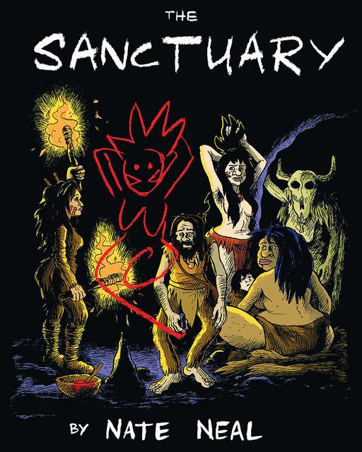
THE SANCTUARY Vol.1 Fantagraphics Books
I’m a huge fan of the silent comic and although this is not one of those, it might as well be. THE SANCTUARY is a caveman story and like QUEST FOR FIRE and to a lesser extent Ringo Starr’s CAVEMAN, it is a story told in a caveman language. But writer Nate Neal does a fantastic job of establishing a language and by the end of this story, the reader is pretty fluent in the language of “ooks” and “voks” as well. To tell a semi-silent tale graphically one must be a pretty phenomenal storyteller. Neal fits the bill and tells the tale of a meek cave artist, an outcast woman, and a noble leader and how their roles challenge the scheme of things. Neal flows one panel into the next and doesn’t need words to tell this tale. The tale is multi-textural, about an artist who is pressured to tell the history of the tribe, but history is written by the victors and that motto was true even in caveman times. When our artist is forced to change his story, this throws everything into chaos. Neal depicts how one tribe comes apart at the seams when one tiny fact is altered. You could read metaphorically into this story and relate it to the role of government, the media, and religion factor into every day life. This story is that layered. Then again you can just sit back and enjoy an amazing story of a tribe of cavemen trying to get along with one another. Neal is providing the art as well and though it’s a bit cartoony given the sophisticated story being told, it’s not bad either. Sort of GROO-like in its design by way of the old B.C. comic strip. Neal is an amazing storyteller though, understanding how panels fit together and how to communicate essays of words without muttering one. THE SANCTUARY is a phenomenal storytelling achievement. - Ambush Bug
Readers Talkback