
| #23 | 10/27/10 | #9 |
Hey folks, Ambush Bug here. I’ve got a couple of worthwhile announcements to share before we hit the reviews. First off, Cody Walker of Popgun Chao$! had a chance to sit and talk with Ron Marz in an extensive interview about the controversies that surrounded his GREEN LANTERN tenure including the problems with Hal Jordan fans and also his views on Women in Refrigerators. You can find that interview here. It really is a fascinating read.
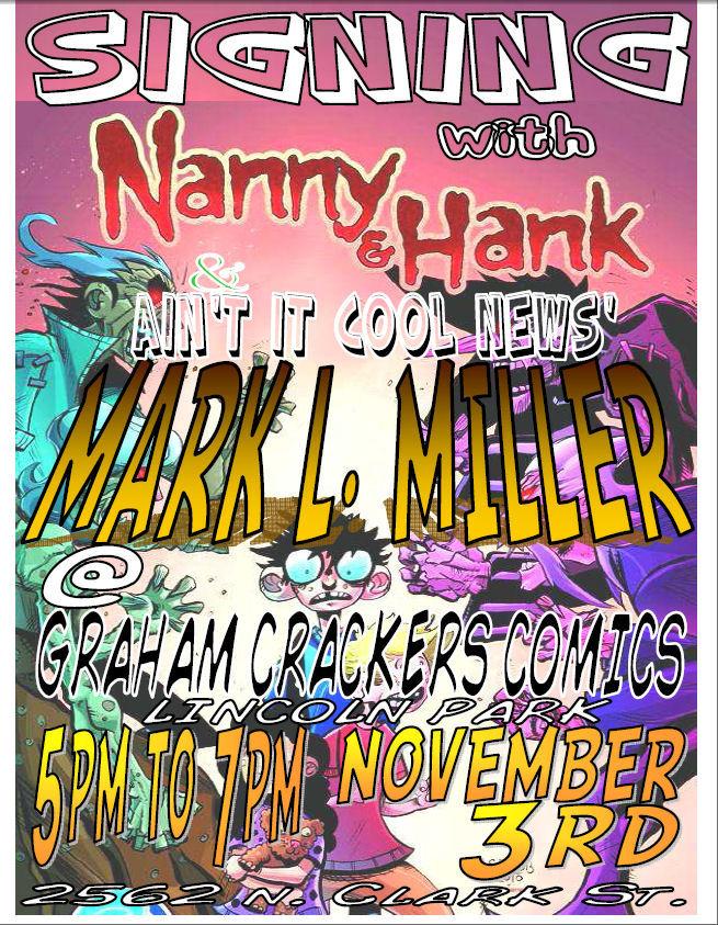 I will be signing my new book, NANNY & HANK #1 tonight, Wednesday evening from 5-7pm at Graham Crackers Comics, at 2562 N Clark St. in Lincoln Park in Chicago. Be sure to stop by and say hi and check out my new book. I’ll also be signing some of my other books. It’d be great to meet some AICN-ers if you’re in the area, so stop by, check out the comics, and say howdy! Find out more about this event here!
And now, on with the reviews!
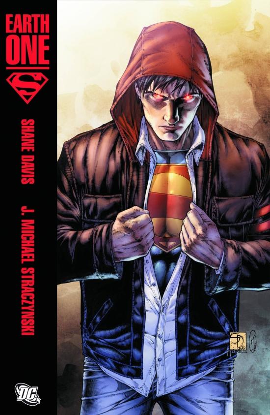
SUPERMAN: EARTH ONE HC Vol.1
Writer: J. Michael Straczynski Artists: Shane Davis (pencils) & Sandra Hope (inks) Publisher: DC Comics Reviewer: Professor Challenger
"So what do you think about this super-guy?" -- unnamed Arctic researcherThis is going to be a long review, so I apologize up front for that. But I think the degree of press attention for the first in DC's new line of EARTH ONE books justifies a lengthy examination.
I appreciate what DC is attempting here, but I wound up ultimately feeling dissatisfied by the end. The mythically iconic nature of Superman's origin story is such that I never tire of reading different versions of it. I do tire of retellings of Batman's origin, Spidey's origin, etc. As a general rule, just note the origin and get on with a more interesting story. The INCREDIBLE HULK movie did the origin perfectly... quick flashes of images that give the viewer all he needs to be up to speed and then jump into the story. Superman, however, touches that messianic aspect within that makes it eternally ripe for reinterpretation. So with hesitancy, but also anticipation, I dove into SUPERMAN: EARTH ONE and there are parts I liked a lot but rather than build enthusiasm as I read it, I eventually reached a point where I felt I was simply plodding through to a thunderous clunk at the end.
Don't get me wrong. It's a beautifully produced book. I love the printed hardback cover (rather than a slipcover). It looks and feels substantial in your hands. For $20, you want to at least feel like you're getting your money's worth.
And like I said, I appreciate the attempt here to reinterpret the Superman concept for the modern, and presumably, more current youthful market. The news coverage of the event has been stupidly fixating on the "hoodie" that the brooding 20 year-old Clark Kent wears on the cover, much like the news media missing the point of the WONDER WOMAN reboot by hyper-fixating on her costume change. As such, the media misses the bigger picture. First though, let me first lay out those elements that did work for me.
The degree of thought that went into this work is impressive. Straczynski removed nearly every shackle of DC continuity from Superman and approached much like a new concept within the "real", or rather a more "realistic," world. This is not the "Earth Prime" of DC continuity. The concept of "Earth Prime" was that it was "our" world...that is...a world without "Metropolis", "Gotham City", "Star City", etc. "Earth Prime" was our world in that the DC characters existed there, but in comics only. This new line of EARTH ONE comics is not the same concept. This is "our" world only in the sense that it is mundane and recognizable. On "Earth One," the fictional cities of DC exist and the characters do not already preexist in the comic books of that world. So, it's not "our" world. In "our" world, people would have instantly recognized Clark as a "super-hero." But in the EARTH ONE series, not only is he the last son of Krypton...at this point...he is the only one of his kind. He is something truly new.
I liked Straczynski's characterization of Clark throughout the entire book. He's a young man striving to determine his purpose in life. I liked how Straczynski extrapolated the impact of these types of powers upon a young man of good character in this modern day. In a sense, the first part of the book plays out a lot of details quite similar to the classic novel GLADIATOR, by Philip Wylie, which was an inspiration for the Superman character originally. Clark, in this well-thought out concept, basically has his pick of anything he wants to do. He can sign with any major sports organization because of his physical abilities or he can write his own ticket in the science field because of his heightened mind and information processing. So, why does he choose a daily newspaper in 2010 when the newspaper industry is struggling for relevancy in the digital age? And why does a major metropolitan newspaper decide to hire a 20 year-old with barely a 2-year degree from community college? Straczynski sets it up fairly well. Not totally believable, but it kinda works for the apparent necessity of inserting the iconic elements into Superman's origin.
I appreciated the utter absence of any sense of a Lex Luthor or a Brainiac or a Zod. My geek side may love these characters, and truthfully, Lex Luthor particularly is one of the great villains of literature...who has rarely had a great story utilizing him. But for this EARTH ONE type of project to work, it has to establish Superman in this "realistic" world first...and there's no need to tie his feet to the continuity cement blocks before he's even gotten out of the gate.
I appreciated Straczynski's decision to focus on the conflict that gives rise to Earth's first super-powered champion and to make the outside conflict an extra-terrestrial assault. One thing Straczynski does well is set-up under layers of conflict that give a sense of a larger story at work. In this case, the main focus is clearly on the inner workings of a young man struggling to embrace his destiny against the temptation to just make a lot of money and make sure his widowed mother never has to worry about anything. At the same time, the larger conflict brewing out there is that Clark is also the target of an intergalactic hunt to track down and destroy the last Kryptonian by Krypton's bitter enemies.
The details of these conflicts were all very fascinating and well-thought out...but yet...by the end I felt dissatisfied. It was actually around the point where Clark finally put on the suit and took on the alien assault that the book started to lose steam. At the point where it should be at its most exciting, I was losing interest. I couldn't tell whether it was the pacing, the dialogue, the art, or what...but I went from thinking this was surprisingly good to the point where I cringed almost when Clark put on his sloppy, low-waisted pants, suit with a tie and popped on the glasses.
I realized, ultimately, that it was the forced introduction of the familiar that intruded upon my enjoyment. So much of the first half of the book felt new and "real" that as each of the more familiar aspects of the concept appeared, the flow was interrupted with the recognition of what was happening. What I realized was that, like the frustration of reading a book that violates its own internal logic with a deus ex machina resolution, this story worked within its own logic up until it started adding back in those elements outside its own "realistic" logic. Would that Straczynski had been afforded an opportunity to fully extrapolate the basic Superman/Clark Kent dynamic into something completely new, I think this would be more substantial than just a best-selling piece of eye candy.
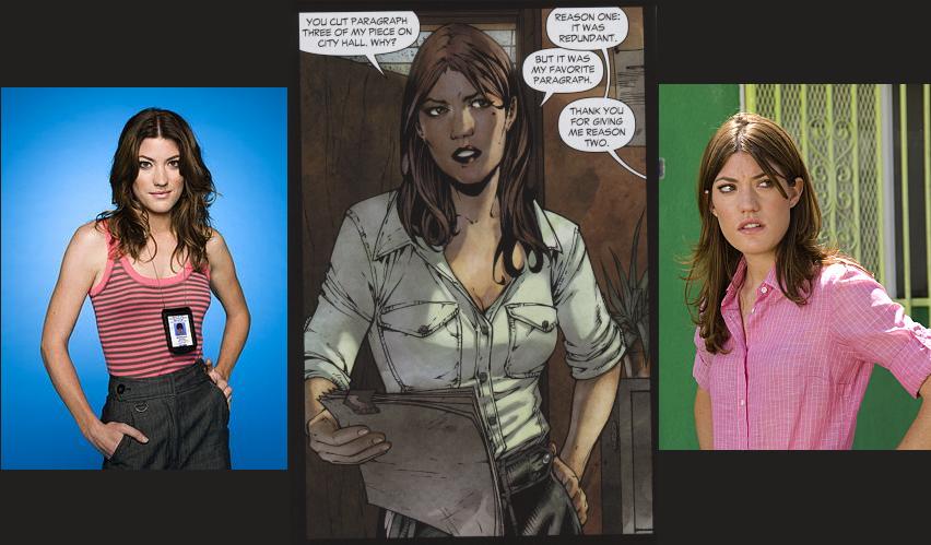 Which brings me to the art. How do I put this? Buried somewhere beneath the stiff bodies, stone faces, gnarled hands, and light-boxed Google photos of "Debra Morgan" from DEXTER is a good artist trying to pull himself up and out like a zombie clawing itself out of the grave. The tracing and swiping is hamstringing Davis's ability to tell this story in a truly effective way. Compare his lack of drama (because his panel compositions are limited to fit the photos he Googled) to John Bolton's uses of photo referencing in THE GREEN WOMAN (which I reviewed last week). It's an astounding gap between the two and it's more than just years of experience.
All artists, myself included, are guilty of some degree of tracing and swiping. In fact, the first "cartooning" I did back in elementary school was using carbon paper to trace RICHIE RICH and SPIDER-MAN covers. And a lot of what I produced in my teen years was built from tracing or copying my favorite artists, which actually taught me quite a bit about basic drawing techniques. Hell, as a 17 year-old, I all but redrew a bunch of Bernie Wrightson panels for a school project. I'm not proud of it, but that's the idiocy of youth there. Transitioning into a commercial illustrator, however, a person has to move beyond that and into your own. In a professional job like this one, Davis is flat-out guilty of artistic plagiarism, at least in his use of the "Debra Morgan" photos, but I suspect now throughout the book. Immediately noticing the tracing made me start fixating on every other character in the book and wondering about the photo references. As a result, I started seeing faces that might be Brad Pitt, Robert Downey Jr., and maybe even Christian Bale as Clark? I'm not sure. But the Lois reference isn't even disputable because it's an outright trace much of the time. In contrast, Gary Frank's version of Superman is a fine example of how to take a real person and use them as the basis for your character without tracing photos of that person.
I've noticed a tendency in younger artists in the Google age to rely on tracing rather than develop their own style. And in an artist like Davis, this does a disservice not only to the project but also to his own development as an artist. He obviously has raw talent because the details that he adds and his landscapes, alien designs, and his ability to copy as well as he does all demonstrate that he has the skill if he stops leaning on the photo crutch. He is clearly weak when handling the human form, the human hand, or how the body moves in any real sense and this creates that stiffness throughout the book. Working slavishly off of posed photographs will diminish any sense of movement that an artist is trying to evoke. It's the difference between photo as reference and photo as crutch. The experienced artist takes the photo and uses it to give himself an "action" line for his character, then he builds up from the action line with the basic skeletal framework for the form. Then he draws his character from his own action line and framework...NOT FROM THE PHOTOGRAPH. It's the same type of thing I deal with when I am teaching basic research and writing. To avoid a charge of plagiarism, when researching facts, take bullet point notes (not complete sentences) on a separate sheet of paper and then write your paragraph or paper from your notes and not from the original source. This way you are creating your own work and not stealing someone else's work.
Davis's blatant tracing here is akin to a writing student I once had, one of only two I've ever had to fail. She was actually one of the strongest natural writers I've taught, but the final research project counted for 50% of her grade and I never allow make-ups for the Finals. She had 3 solid weeks to work on it. When I sat down to grade it, I noted that the project was formatted beautifully, structured correctly, and was reading quite well...and then I caught a glitch. In the middle of a well-written paragraph there was a "page number"...the type of "page number" that Westlaw inserts in their digitized Case law so that a researcher can properly cite the page number for the physically printed version of the case. She had missed it or forgotten to delete it before she turned it in. So, I pulled up the case on Westlaw and found the page number and yes, she literally cut-and-pasted paragraph after paragraph. Without spending the rest of my night trying to distinguish between which parts of the project she wrote on her own and which parts were plagiarized, I had to give a zero on content.
Unfortunately, turning a critical eye towards this project, Davis's artwork in SUPERMAN: EARTH ONE winds up getting a zero from me as well because I honestly can't tell what all he traced and what all is his own work. Had he sketched from the photos first and then worked from the sketches, there would be similarities to the photos but they would not be blatant tracing.
Sandra Hope, on the other hand, lays down gorgeous inks and texturing to Davis's art. For my money, the gorgeous look of the art overall is grounded more in Hope's inks and Barbara Ciardo's beautifully rich but slightly desaturated colors. Hope particularly brings confidence to the line-work and demonstrates once again why she is one of the finest of the current crop of inkers. Digital rendering is leading to a reduction of opportunities for professional inkers, but I am very happy that DC chose to bring her in on this book rather than work directly from Davis's pencils.
I really admire what was attempted here. And it is not a failure. In fact, I suspect most people will enjoy it and never dig any deeper critically...and that's fine. We all approach our art and literature with differing needs and expectations. I, however, found SUPERMAN: EARTH ONE at times excellent, at others stilted and dull, and overall a disappointing almost classic.
When he's not cat-juggling, Prof. Challenger is really Texas artist Keith Howell, otherwise known as "The Beast With Ten Arms" or "Beefy Hunko' Man...With Glasses". If you are intrigued, just visit at profchallenger.com where you can find out more than you ever wanted to know about him, including how to follow his Tweets or read his blog or hire him to draw sumthin for you.
Advance Review: In stores this month!
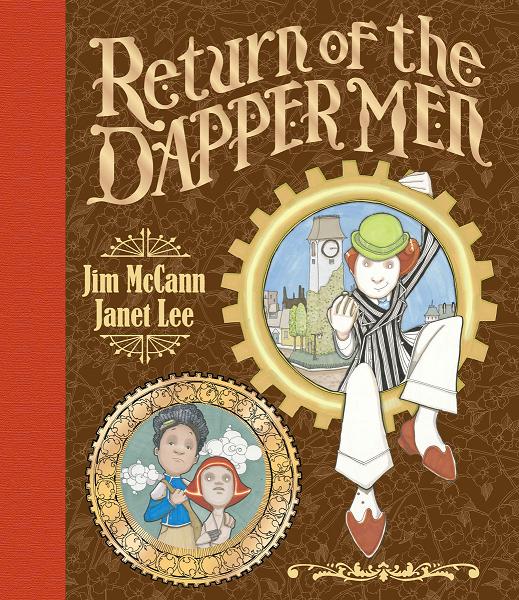
RETURN OF THE DAPPER MEN HC OGN
Writer: Jim McCann Art: Janet Lee Publisher: Archaia Reviewer: Ambush Bug
In my close to ten years reviewing comics on this site, I have never had the privilege of seeing a classic being made from the ground up. That is, until now. I have spoken to Jim McCann a multitude of times. McCann worked PR at Marvel and of course in order to set up interviews and previews, it was Jim’s job to reach out to folks like me. Through the years, Jim and I have swapped emails talking about Marvel projects, our favorite characters, and favorite comics we’re reading. Last year, Jim chatted with me about his upcoming HAWKEYE & MOCKINGBIRD series and both of us were giddy at how cool the art looked. At C2E2, I had a chance to see Jim’s newest project going into development. Jim was walking around with slabs of wood the size of a microwave oven door. He was more than eager to show me that they were actual pages to his new book from an amazing new artist Janet Lee. These “pages” were actually carvings and hand-painted layerings on blocks of wood. Always looking for new and exciting media used for comics, my interest was officially piqued.So over the last year or so, when I’d see Jim at SDCC or C2E2 or NYCC, Jim would have another “page” to show me. And although I’d seen a ton of pages, all I knew of the story was that it was something of a fable. Though I knew little about it, the art and the enthusiasm Jim had in his voice every time he talked about this piece was infectious and let me know it was going to be something special. When I saw Jim at NYCC this year, he was practically jumping out of his chair as he presented the finished product I hold now in my hands. I’d call it a comic book, but in fact, RETURN OF THE DAPPER MEN is so, so, so much more.
A little about the story: set in a place called Anorev, a place outside of the restraints of time, lives two sets of beings: children and machines, both of which are completely stuck in their ways. Machines being machines, doing what they are programmed to do: work and little else. Without the presence of time, the children are always children, always playing and never working. Everything was the same day in and day out--that is, until it wasn’t. Ayden, an inquisitive boy, and Zoe, a bright eyed robot, share a romance that neither of the children or the robots understand, much less condone. And then a couple hundred dapper looking gentlemen float down from the sky. This is the point in the story where everything changes.
And I want to stop there, as far as telling you about how the story goes. It’s a wonderful set up, metaphorical in regards to much of what life is often consumed by (work or play) and how breaking away from the mundane is not such a horrible thing. This is a story that dares to challenge the reader to dream and follow a different path. It’s a classic fable in that one hundred people can read it and come up with one hundred different meanings for what exactly it is all about. I love it that McCann is fully enmeshed with the metaphor of the story and still keeps it a story without becoming about some kind of preachy cautionary tale. McCann lets the reader dive into this world he has fully realized and lets it play out beautifully.
Janet Lee is a true artist. I’m not talking graphic artist. She’s a good one at that too. But she’s a visionary. That term is tossed around too easily these days, but here it is deserved. From the masterful manipulation of various media to the composition of the images on each page, this is probably one of the most beautiful pieces of graphic illustration I’ve ever laid my eyes on. Lee’s elevated this intricate fable into something that should be shared with folks inside and outside of the comics industry. Her pages are instantly mesmerizing and force you to flip through the book again and again to see every genuine brushstroke and every careful carving. These pages can’t be duplicated and each one is a bona fide work of art.
I know I’m gushing over this book but I can’t help it. It’s the type of book you set on your coffee table when folks come over and eagerly look at as folks pass by and crack it open, just so you can talk someone’s ear off about it. Be sure to check out Jim McCann and Janet Lee’s labor of love, THE RETURN OF THE DAPPER MEN. It is something genuinely special.
Ambush Bug is Mark L. Miller, original @$$Hole / wordslinger / reviewer / co-editor of AICN Comics for over nine years. Support a Bug by checking out his comics (click on the titles for purchasing info)! MUSCLES & FIGHTS VOL.3 & MUSCLES & FRIGHTS VOL.1. VINCENT PRICE PRESENTS: THE TINGLER #1 and #2 (interview, interview, preview, & review) VINCENT PRICE PRESENTS #20 WITCHFINDER GENERAL (preview, review, in stores now!) NANNY & HANK miniseries #1, #2, #3, and #4 (interview, interview, interview, preview, & review, in stores October 2010! Check out the NANNY & HANK Facebook Page!) Zenescope’s upcoming WONDERLAND ANNUAL 2010 (in stores in October!) THE DEATHSPORT GAMES miniseries #1, #2, #3, and #4 (in September Previews Order #SEP 100860, in stores in November 2010! Check out THE DEATHSPORT GAMES Facebook Page!)
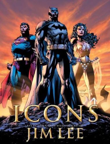
ICONS: THE DC COMICS AND WILDSTORM ART OF JIM LEE
Illustrated by: Who do you think? Written by: Bill Baker Published by: Titan Books Reviewed by: superhero
I’ll be the first one to admit it: when Jim Lee broke out in the early ‘90’s with his work in the X-MEN I was hooked from the first time I saw his art. There was just an amazing energy he brought to the page that reminded me so much of the Japanese cartoons (now called anime here in the States) that I absolutely loved when I was a kid and a teenager. I can’t remember in which issue I first saw his work but I do remember just looking at it and going…”hoooleee sheeeyut!”It was like nothing I’d ever really seen before in a comic book. Up until then most of what comics had been filled with was a very recognizably American comic book style. It’s hard to explain to a lot of comic readers these days because today’s books are so full of different styles of illustration that it’s hard to imagine a day when, for the most part, there was a lot of sameness in the way a comic book page was laid out. The artistic styles weren’t the same but the way a panel was drawn or the way a page was laid out was very much directed by a sort of house style that was evident at the time at the big two. Sure, we had our Neal Adamses and John Byrnes but even they were very much, by the late ‘80’s and early ‘90’s, sort of blending into a landscape of other comic art on the newsstands that was one of sameness.
Then along came Jim Lee, and, of course Marc Silvestri , Todd McFarlane and yes, it’s true, Rob Liefeld. I’m sure it’s hard for a lot of younger comic fans to believe, especially the way the comic market is today, but when these guys debuted in the pages of their own Marvel Comics books they absolutely blew the doors off of the comic industry. Out of all those aforementioned artists Jim Lee was hands down my favorite. There was something about his art that just…I can’t think of a more appropriate phrase for it…kicked ass! It was dynamic, it had strength, it just was…amazing. His superheroes looked so powerful and the women, the women…well…let’s not forget, I was a teenage boy.
So now we have this book ICONS: THE DC COMICS AND WILDSTORM ART OF JIM LEE.
Let me tell you now that Jim Lee fans have hit the motherlode.
Titan Books has absolutely outdone themselves with this book. Not only is it filled with page after page of fantastic Jim Lee artwork, it is a beautifully designed and gorgeously executed tome. Tome is the only proper word for it. This book is huge. Honestly, you could kill someone with this book. I don’t know what I expected when I saw that this was coming out but I didn’t expect the book to be as fantastically impressive as it is. The pages are huge, the layout is just stunning and so much care has been put into presenting Lee’s artwork in an impressive package that the book itself is almost a work of art on its own.
But forget about the way the book’s put together, let’s talk turkey…what are we getting in this book? What we get is some of the most perfectly selected artwork from Jim Lee’s days at Image/WildStorm as well as his current tenure at DC Comics. As a matter of fact, the book starts with galleries of the big three heroes from DC and I think that Batman fans are going to go loopy over the first section alone. Some of the artwork selected for this book is absolutely breathtaking.
Now let me be clear here…while I was a Jim Lee superfan back in the day…well, these days I feel like a lot of his work’s been a bit rushed in some places, particularly during the HUSH Batman run. You know, you get older, you get exposed to different artstyles, you take a life drawing class or two and you start to see some of the flaws in many of your former artistic heroes’ work. The stiffness of poses, the excessively rendered and ridiculously clenched anatomy, the recycling of body types, the overly done scribble lines…you know what I mean. Yes, it’s all there and yes, these days when I hear a Jim Lee book is coming out I’m not a jazzed as I was when I was younger…mostly because I pretty much know what I’m going to get from a book Jim Lee’s involved with these days. Storywise it’s probably not something I’m going to be all that interested in these days but I’ll admit there’s something about his art, flaws and all, that really, really appeals to me.
Which is why this book is perfect, especially for someone like me…who isn’t necessarily into superhero books all that much these days. This book is all about the art and presenting the art in the most exciting way possible. I wasn’t kidding when I said that the work here had been perfectly selected. ICONS is the best of his stuff; at least it’s the best of his stuff to come out since he founded Image Comics and sold his WildStorm studio over to DC. As a matter of fact, my only complaint with this book is the fact that it doesn’t include any of Lee’s Marvel work. Of course, the book is called ICONS: THE DC COMICS AND WILDSTORM ART OF JIM LEE, but I just figure if you’re going to go to the trouble of putting a great book like this together why not make it a whole career retrospective? Of course, we all know that Lee’s been recently promoted to a top position at DC Comics so maybe he didn’t want the Marvel name on any book bearing his name. Which makes the cynic in me just think this book may be a bit of a propaganda piece for Lee’s promotion. That’s too bad because I would have loved to see some of his old X-Men art blown up and displayed like so many of his other pieces here. I mean really, wasn’t it his Rogue and Psylocke art that got so much of our attention in the first place? It just feels to me that an important part of his history got left out in this book. Hopefully, someday we’ll get to see a retrospective that includes all that Marvel art as well. For now I’ll be content to drool over his work in ICONS and if anyone tries to take it from me I’ll just give them a concussion by smacking them over the head with it.
Discovered as a babe in an abandoned comic book storage box and bitten by a radioactive comic fan when he was a teenager, superhero is actually not-so mild mannered sometime designer & cartoonist, Kristian Horn of Los Angeles, California. He's been an @$$hole for three years. Some of his work can be seen at www.kristianhorn.com and check out his blog at www.parttimefanboy.com.
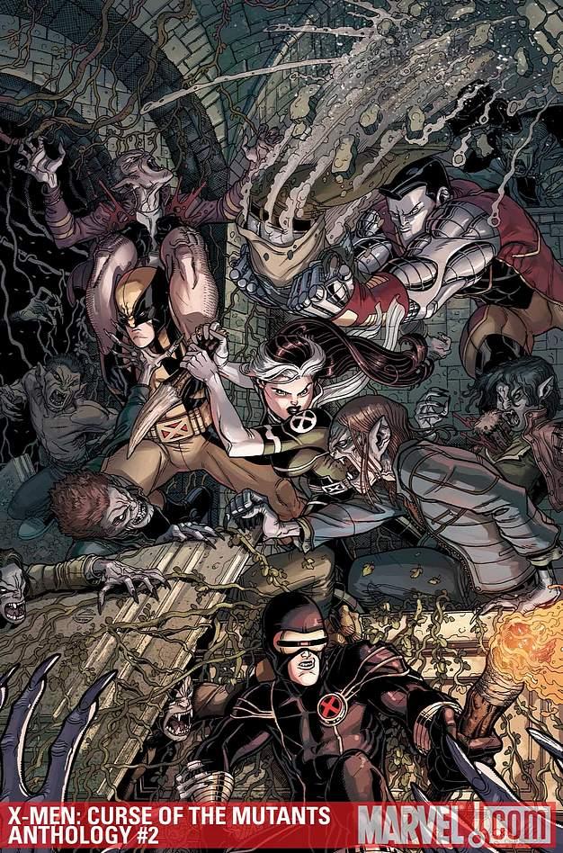
X-MEN: CURSE OF THE MUTANTS – X-MEN VS. VAMPIRES #2
Writers: Mike Benson, Simon Spurrier, Howard Chaykin, Mike W. Barr, Chris Claremont Artists: Mark Texeira, Gabriel Hernandez Walta, Howard Chaykin, Agustin Padilla, Bill Sienkiewicz Publisher: Marvel Reviewer: Lyzard
This week I was lucky enough to review two comics pertaining to my favorite monster: the vampire. About a month ago, I reviewed the first of two issues for X-MEN: CURSE OF THE MUTANTS--X-MEN VS. VAMPIRES. Though I haven’t kept up with the X-Men universe outside of the films, I was still able to enjoy the stories within the issue. However, X-MEN: CURSE OF THE MUTANTS-X-MEN VS. VAMPIRES #2 is much more difficult to follow if you don’t know about the mythos of the X-men. I also felt that the stories were not nearly as strong as their predecessors.The book has five stories within it, each by a different team of writers and artists. The first tale is FLESH, FANGS, AND BURNT RUBBER, which features my X-men crush, Gambit. Next comes CALL ME SANTO, a vampiric Moby Dick tale. Following this is SKIN DEEP following the X-Man Karma. Then there is ANGEL VOICES, which obviously features Angel. Lastly, we have the conclusion to NIGHT SCREAMS!
Out of all five of these short stories of vampires, my favorite was CALL ME SANTO, a surprise for me actually. The thing is, I HATE Moby Dick with the white-hot passion of a thousand suns. You would too if you had to study it for four months back in high school. Even the mention of whales gets me steamed. So to have Moby Dick turned into a vampire whale, one would think I’d be grabbing the nearest harpoon. Instead, I found myself enjoying the creativity and wittiness of the comic. There is no dialogue within the entire comic, but plenty of references to the original book. The visual storytelling ability of artist Gabriel Hernandez Walta is highly impressive. Walta, in collaboration with the scriptwriter Simon Spurrier, created the most fun and humorous story within the collection.
ANGEL VOICES was the hardest for me to understand, because I did not know what Apocalypse did to Angel. In short, Angel does mention this is the reason for his change in attitude, but I wasn’t aware of the full back-story. The comic is still followable, and reminded me of last issue’s SURVIVORS, as they both deal with the morality (or lack thereof) pertaining to killing.
The finale of NIGHT SCREAMS! was also a letdown. Maybe it is because I’m not used to Chris Claremont’s style, but I felt that there was too much telling and not enough showing. The mythos was overexplained and became repetitive. Though they did pull on several traditional vampire elements, I find stories that invent or tweak the mythology (with the exception of TWILIGHT’s glittering vamps) to be much more interesting.
Another thing I didn’t understand about the comic was the Parental Advisory on the cover. There is no cursing and the violence is very minimal. In the last issue I could understand its being put there for Wolverine’s dialogue, but this time I really didn’t see the point in it. I’m all for parental advisories on comics to prevent me from ralphing due to excess gore, but I feel that this time it was unwarranted.
I went into reading this comic with high expectations, due to the enjoyment I got out of its predecessor. However, I found myself underwhelmed. One out of five is a horrible ratio of failure, though that one successful story is quite memorable. Is it worth the $3.99 I had to pay? Probably not, but when Marvel does lower its prices I won’t feel as cheated.
Lyzard is actually Lyz Reblin, a film student at Chapman University. Lyz’s love for comics stems from an internship at Dark Horse Entertainment as a freshman, which may explain why some of her favorite comic book writers are Gerard Way and Steve Niles. You can find her on Facebook, but only if you follow her band: Castle Town Convicts (possibly a Zelda reference?).
Advance Review: In stores today!
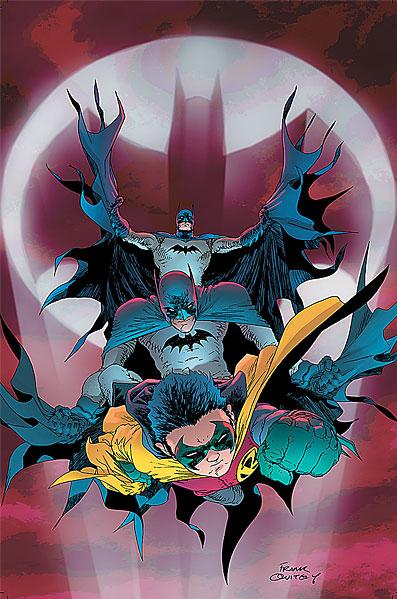
BATMAN & ROBIN #16
Writer: Grant Morrison Artists: Stewart, Burnham & Irving Publisher: DC Comics Reviewer: Optimous Douche
This is the big one folks, the Rosetta stone that tidily explains the entire physical, mental and spiritual deconstructions of BATMAN’S past two years. But before I feed all of you naughty children your delicious spoilers, I first need to pay homage to what Morrison delivered in the pages of BATMAN & ROBIN over the past fifteen issues. R.I.P. left me flat; yes I was a “Hurt mocker” who simply was not into the mind-fuck of Bruce Wayne. BATMAN proper took too many divergences into exploring Bats as a “construct of the universe” -- a fourth-wall breaking mind fuck, if you will. Please don’t see my douchetastic descriptions as slights against these titles, in hindsight they served their respective purposes gloriously as part of Morrison’s overall tapestry, they simply weren’t for your ole’ Uncle Optimous. Now, I have been digging the hell out of RETURN OF BRUCE WAYNE, but as much as I’m enjoying this jaunt through time the book still has never felt like Batman. BATMAN & ROBIN, though, has kept the heart of Batman alive through all of these trials and tribulations. The title has delivered something pure through all of this loss and rebuilding, something that Bruce’s books simply couldn’t throughout this journey. Dick Grayson has kept alive the detective, Damian Wayne is simply the best little bastard in comics as he owns and at the same time unmercifully mocks the complete lunacy of a ten-year old fighting crime, and dear Pennyworth has shown yet again that family and spiritual unity are far better crime fighting weapons than any old utility belts or silly automobiles with after-effects. Even without Bruce Wayne BATMAN & ROBIN has been the most Batman-like title to grace the shelves, and I will sorely miss Morrison’s cerebellum bleeding out on the page month after month. All right, thank you for the moment of sentimentality, now let’s take a look at the final chapter of this grand and glorious comic run. Oh yeah, and we should probably talk briefly about the heaping mess-o-shit Bruce Wayne throws himself and the Batman family into at the end of the book.This title is truly the cloverleaf of all the Batman stories that have been tripping around the DC Universe. Want a resolution to the Black Hand? You got it. Need to know where Thomas Wayne and Dr. Hurt mesh together? Consider it explained. And all of the answers are as simple as our erudite TalkBackers made them out to be. That’s the thing about Morrison; the concepts are not all that complex, it’s the way in which they are presented that makes all of us primate collectors scratch our simian temples for a time period before we get it. Seriously, it all does make sense (well…you know…for a comic). The mind-fuck, the devil doctors, the spirit of the Bat…everything simply flowed into one cohesive narrative from the cornucopia of titles that have been carrying these elements for so long. Well, sort of cohesive; I will admit that the artist fandango was a bit jarring in places. Not because the art was bad; I mean, how could it be? It’s simply that each artist is sooo good at their craft, shifting between them is sort of like Dali saying to da Vinci, “take a breather, dude; I’ll finish this smiling bitch off proper.” When you are distinct it is very hard to share the space between covers with others. I’ll give the editors props for the ol’ college try of shifting artists with each story-break, but again the book wasn’t long enough for the transitions to flow seamlessly. But to give credit where credit is due, after my vagina was done aching from the abrupt shifts, Stewart, Burnham and Irving owned their pages.
My two favorite moments (outside the return of Bruce of course) had to be the battle of crazy between Pyg and the Joker. Their collective insanity leaves seismic activity in its wake. Now of course Pyg gets caught to fight another day, but Joker, oh glorious Joker, you surprise yet again my friend. Not only is the clown prince of macabre working on the side of the angels, he left me so giddy for future stories that my grin was larger than Dr. Hurt’s when Joker buried his ass six feet under (shit, spoiler alert – Sorry).
Keep in my mind, my descriptions are only 1% per volume as cooky and cool as Morrison’s original material. Read the source on this one folks, trust me.
Now for the big resolution and as a long time Batfiend this has me more nervous than a Robin in a room full of crowbars -- Batman Inc. Sure we’ve all seen this ominous branding the past few months cropping up on advert pages inside our favorite funny books, but I know I didn’t take this shit literally. I truly thought it was just a way to package an entire team of crime fighters across Gotham like has happened every other time Bruce goes on walkabout. Well guess again, kids. As the four Batsignals streaming across the sky solidified, the Bat brand is about to go totally corporate. Bruce not only fesses up to financing Batman over the years, but he also announces the fact he will be financing worthy Batmans from across the globe. While a cool concept, does anyone else wonder how long this idea will last? This is basically legitimizing vigilante justice inside a tax shelter. It also brings to fruition the Shadowrun version of the future where every corporation acts as a government in and of themselves (think about it folks – Wayne Enterprises isn’t that far off).
I am caught between sorrow and nervous anticipation right now. Damn you BATMAN & ROBIN for being so damn good and making me care so much.
Optimous has successfully blackmailed fellow @$$Hole BottleImp into being his artist on Average Joe. Look for Imp's forced labor on Optimous brain child in mid-2011 from COM.X. Friend Optimous on FaceBook to get Average Joe updates and because ceiling cat says it's the right thing to do.
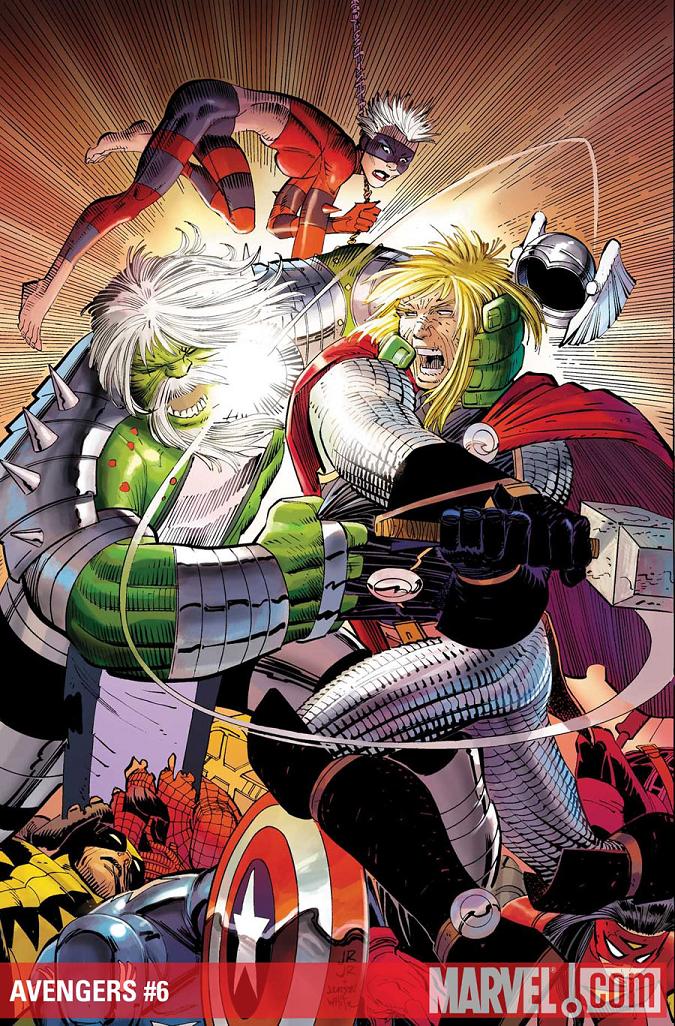
AVENGERS #6
Writer: Brian Michael Bendis Art: John Romita Jr. Publisher: Marvel Comics Reviewer: Henry Higgins is My Homeboy
Exactly how you expect a Bendis event to end.Bendis' worst trait during big event/stories comes from his lack of closure. Everything feels rushed and tidied up too neatly. It happened with HOUSE OF M. It happened with SECRET INVASION. And it happens here as well. Romita's art is spot on and Bendis does decent character moments, but it's not enough to subside the feeling of disappointment that comes with the ending.
Writing: (2/5) Everything falls too much into place this issue. For five issues, everything moved about at a decent pace (well, except maybe the second issue). This issue spends most of its time ending everything too cleanly. Ultron and Iron Man go back and forth for a couple of pages and eventually it loses any real interest. It feels like a lazy way to end the bit. The sudden appearance of Killraven was also not a surprise and it doesn't get nearly the right amount of attention. A few inconsistencies come in towards the end, with Kang’s betrayal. Despite the art looking well done, it feels extremely odd to have the Maestro killed so quickly. Despite faltering about with the flow of the story, Bendis' take on the main characters remains consistent. Early on, Wolverine and Ultron have a back and forth which boils down to Ultron explaining why Wolverine would lose in a battle between the two. And with one sentence, Wolverine responds with an utterly perfect Wolverine line. While it is very much a talking head scene, Ultron comes across beautifully. He's exactly what you expect Ultron to be in this situation.
Art: (4/5) Romita, in the final part of the story, goes all out and creates a brilliant-looking finale. The sequence of Kang's army attacking Ultron is utterly fantastic. The destruction of Ultron by the army of various heroes and villains really lends an epic feel to the climax to the story. Kang's inevitable betrayal looks great as well, selling the horror and surprise in the sequence. While the artwork is good throughout, moments at the end of the book are a bit muddled. Tony's new device is unclear (most likely purposeful) but doesn't even give any ideas towards its intent. With the look on Tony's face giving off a knowledgeable recognition, it's a bit odd we don't even get a hint of its purpose. For all we know, it's the ORB, or it's a cool little trinket. The final page especially feels extremely half-@$$ed and colorful. It just doesn't gel with the rest of the issue.
Best Moment: Kang's army. Just brilliant.
Worst Moment: The last page. That's just weird.
Overall: 3/5.
Advance review: In Previews Now!
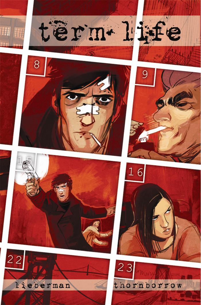
TERM LIFE OGN
Writer: AJ Lieberman Artist: Nick Thornborrow Publisher: Image Comics Reviewed by Humphrey Lee
Crime noir is a wonderful thing and the more of it we get, I generally like to think, the better. Usually there’s some dames and some rough and tumble men with some fisticuffs and gunfights and all sorts of enterprising crime. The problem is, though, when you get yourself some crime noir, usually it’s always with the dames and rough and tumble men and fisticuffs. Sometimes it’s spruced up with a little character drama, but rarely it seems like it’s ever enough. In comes TERM LIFE to be my noir treat at the most timely of times.TERM LIFE is a book about relationships, or more specifically the lack of them. Our lead is Nick Barrow: kind of a fuck up, kind of really good at what he does. What he does is set up some nice sized thefts, take a little off the top for planning them, but leave the bulk to those doing the heavy lifting and walk away without getting his hands dirty. Walking away is a common theme in Nick’s life it seems, as he walked away on his daughter before she was old enough to remember given the relatively complicated and shady life he leads. Eventually Nick finally grows a bit older - or some balls depending on how you look at it – and decides he needs to be a man and look out for his family. But it wouldn’t be noir if some dirty individuals didn’t fuck up the score and Nick’s newfound change of heart and life in general with it.
Essentially what this story boils down to is lost time. Time Nick lost by being a deadbeat dad, time Nick needs to make up for, and time that Nick needs to keep eating up as a life insurance policy he took out on himself, knowing the fix may finally be in, needs to mature to actually provide for the daughter he has neglected to get to know. That is the main thing this book brings to the crime noir I love so much that made it stand out a little more than the normal noir affair. There are several things in addition to this, particularly the way it played out as the story moved forward and Nick did his thing and forces conspired against him and against each other behind the scenes. Not only did TERM LIFE go a little against convention by deciding to tell a more “human” story than just a “dirty” one, but it bounced around with perspectives and time frames and character interactions that added a bit of depth to the storytelling and keeps the reader on their toes a bit.
But, really, if there was any standout elements of the book, they were the turmoil and blossoming relationship between Nick and his estranged daughter, Cate, and the wonderful pencil work of Nick Thornborrow. Yes, the growth between Nick and Cate more or less plays out probably how you think and, to be honest, does not seem to get the page count it could and should. This, if anything, being probably my biggest and only real complaint about TERM LIFE: that such a huge element as this needed some more playing out and the book itself probably a half dozen or so more pages to accommodate. But, as it develops, it is genuinely involving and, well, sweet to watch. And as for Thornborrow’s pencils, I absolutely loved them. Very soft lines that pack lot of oomph in them in spite of their minimalist nature. And the color palette for the book, some very dirty and muted tones, accommodate perfectly as well as lend the atmosphere you want out of a Noir book nicely. These two offerings from both ends of the creative crew respectively are what made TERM LIFE a nice, fresh take in this genre I appreciate greatly.
This is some really quality material here though, whether you are a fan of the crime fiction or no. It scratches the itch if you are, but if not, there’s some good human drama about a two time loser and his only kin, only with some really bad men in the mix to muddle things up any more. And it made me aware that Nick Thornborrow and his talents are in the world, which is a huge plus if anything. Now, the catch is – and I covered this in an Q&A piece with writer AJ Lieberman just this past week – TERM LIFE isn’t “out now” as in you can’t just go to the LCS and snag it up, but it’s “out now” in that it just showed up in the latest PREVIEWS for you to say to your LCS, hey, gimme this thing so I know you’ll have it for me in two months when it’s really out instead of chancing it because non-Big Two books are sadly under-ordered in general. If you like books with a bit of grit, some bloodshed, and a little bit of “awwwww”, then yeah, this is a book for you as it was for me. Let the pimpfest end and the pre-ordering commence…y’know, if you think this would be your kind of schwag. I’m just the messenger after all. Cheers…
Humphrey Lee has been an avid comic book reader going on fifteen years now and a contributor to Ain't It Cool comics for quite a few as well. In fact, reading comics is about all he does in his free time and where all the money from his day job wages goes to - funding his comic book habit so he can talk about them to you, our loyal readers (lucky you). He's a bit of a social networking whore, so you can find him all over the Interwebs on sites like Twitter, The MySpaces, Facebookand a Blogger Account where he also mostly talks about comics with his free time because he hasn't the slightest semblance of a life. Sad but true, and he gladly encourages you to add, read, and comment as you will.
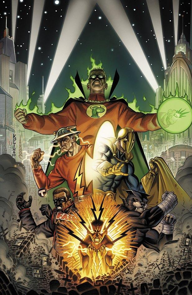
JUSTICE SOCIETY OF AMERICA #44
Writer: Marc Guggenheim Artist: Scott Kolins Colors: Mike Atiyeh Published by: DC Comics Reviewed by: BottleImp
Like the moth to the flame, the hand to the itch that remains just out of reach, like Charlie Sheen to the high-priced prostitute…so am I repeatedly drawn back to those heroes of the so-called “Golden Age” of comic books, the Justice Society of America. I can’t really pinpoint the reason these characters hold so much fascination for me. Part of it most certainly is the funky costumes. It also might be that I have a subconscious resentment of being born in an era where men just aren’t wearing enough hats. Most likely, though, is that these characters have been around for so long that they’ve stagnated, and with every new incarnation of this team I hope that something new will be done that will inject vitality into these septuagenarian superheroes. I really liked the JSA series of the early 2000s: the mix of old and new heroes, the attention paid to the team’s history as well as presenting new threats—Geoff Johns (along with James Robinson and David Goyer) had a good thing going there. Johns’ relaunch of the series just a couple of years ago, however, left me cold, and the recent helmsing by Bill Willingham…well, let’s just say that I wasn’t a fan. So now here we are once again, with a new creative team and a new direction. And while it’s still too early to pass judgment on this direction, this issue leaves me with decidedly mixed feelings.On a positive note, writer Guggenheim is giving the Justice Society a new threat rather than the seemingly endless parade of “legacy” villains that had become par for the course for this title. A little mystery is a good thing, and considering that the reader still knows next to nothing about this new villain by the end of this issue, Guggenheim is looking to give the reader a little more than the standard spandex-clad slugfest. In fact, all we know about the mystery villain is that he escaped from a CIA prison in Afghanistan, he’s super-strong, good with a sword, and seems to be nigh-invulnerable. Oh, and that apparently, he’s a Middle-Eastern terrorist.
Here’s where I’m afraid that this new team is already falling into a near-fatal comic book trap. It has been pointed out many, many times, and by many, many people ranging from the fans posting on message boards to professionals in the industry, that comic book superheroes and real-world situations do not mix. I’m not talking about the kinds of situations like, “I’m not paid to dress up and fight evil, so I’m getting kicked out of my apartment,” or, “How can I tell my girlfriend who I really am?”—Stan and Jack and Steve took care of that back in the 1960s. No, I’m talking about the big-picture, 24-hour news channel kinds of situations, like war, genocide, famine…and terrorism. Let’s face it: Superman or Green Lantern or even Batman with all his gadgets would have no trouble tracking down Osama Bin Laden and wiping out Al Quaeda, just as they would have had no trouble flying into Berlin in 1940 and killing Hitler. But, for obvious reasons, that can’t ever be done in a comic book (unless the comic book in question is unconcerned with keeping its fictional world in sync with reality, in which case Superman could whale on Bin Laden and we could all cheer him on while he does it). With the close of this issue, the reader is left with an image of a devastated city with a smoking hole at its center—an image, when coupled with the fact that this destruction was wrought by a super-powered terrorist, undoubtedly meant to remind the reader of the imagery of 9/11. It seems as if the direction Guggenheim is aiming for is one that will thrust these fictional characters into the heart of one of the real world’s most pressing problems. While I’m glad to see something new being done with these old characters, I’m concerned that the end result could fall as flat as Superman disarming the world in THE QUEST FOR PEACE…or Big Blue’s current Forrest Gump-ing across America in his monthly title.
In addition, I couldn’t help but notice a rather large plot hole that mars the action of this issue. The terrorist is laying waste to the city, while the JSA (having been magically transported to the area by Dr. Fate) are causing almost as much destruction in trying to subdue him. Here’s my question: if the heroes are concerned with stopping the villain and stemming the casualties and property damage, why don’t they get him out of the area and somewhere isolated? Dr. Fate, as we’ve seen, could teleport him. The Green Lantern could put him in a green bubble and toss him somewhere. The Flash could run into him (as he does during the fight) and PUSH him into the Atlantic Ocean. I know that I’m being a little too “thinky” about a comic book battle, but come ON, people. Little details like that really undermine the verisimilitude of the story, and if I can’t believe that superheroes who have been around since the ‘40s wouldn’t think to put average citizens out of harm’s way, there’s no way that I’m going to believe that they’re going to take on the terrorists.
While the writing is leaving me with mixed emotions, it’s nothing compared to the art. I’ve written before of my general dislike of comic book art mimicking a “painted” style with its coloring, and my preference for the more traditional inking to provide those solid black areas that help so much in terms of composition and definition. Here we have artist Kolins’ linework over-rendered by colorist Atiyeh, who has done his utmost to render every object and person as three-dimensionally as possible. The problem here is that Kolins is not a photo-realistic artist. His proportions are often skewed, his faces stylized, so the realistic color modeling clashes with what should be a more idiosyncratic style. There are a couple of pages—one panel of the Flash rushing toward the viewer, another which uses a starkly-drawn silhouette of the unnamed menace as a compositional element—that are rendered in flat color and restrained shading, and these two pages look better than anything else in this book. I believe that Kolins’ art could really be something new and exciting for the JSA series, if only the drawing and the coloring on the whole could be as synchronized as those isolated examples.
It’s not a straight shot out of the gate for this new creative team, but on the plus side, they did manage to pique my interest. I’ll be sticking around for the next issue in hopes that the plot holes will be patched and that Kolins’ artwork will be allowed to be its best… but given my history with this title, especially in recent months, I’m not going to be holding my breath.
When released from his Bottle, the Imp takes the form of Stephen Andrade, an artist/illustrator/pirate monkey painter from the Northeast. You can see some of his artwork here. He’s given up comics more times than he can remember. But every time he thinks he's out, they pull him back in.
Advance Review: In stores today!
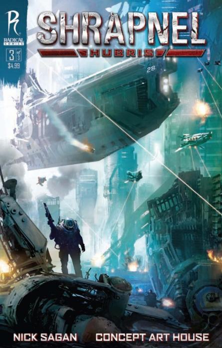
SHRAPNEL: HUBRIS #3
Writer: Nick Sagan & Clinnette Minis Art: Concept Art House Publisher: Radical Comics Reviewer: Mr. Pasty
There’s something about seeing giant battleships flying through the air that gets me all hot and pasty on the inside. Okay, they’re not really battleships, but they look sort of submarine-ish/aquatic and certainly like an anachronism for this interstellar battle. No matter. SHRAPNEL HUBRIS #3 is picking up right where issues one and two left off. The Solar Alliance is doing bad things to the resources of Venus and well, ex-Marine “Sam” Narayan isn’t going to just sit back and take that lying down. That means he’s got to rally the rebels and stick it to the Empire, I mean, uh, “Alliance” and right all the wrongs that they’ve done. That means guns, lots of guns. Unfortunately it also means talking, lots of talking.This book has a certain amount of charm to it, even in spite of its clichés. The backgrounds have sort of a washed out look with all the key ingredients of advanced time and space including long trench coats with popped collars, postindustrial decay, windows with rounded corners and of course, space marines! There’s even time for a mixed martial arts demonstration and since MMA pays my bills, you can imagine how much I was marking out when a Kimura was slapped on midway through the story. As far as the meat and potatoes of this book, well, it’s probably a lot closer to what I had expected from the STARCRAFT comic (minus the narcolepsy) but so too does SHRAPNEL HUBRIS suffer from too much yapping at times. Not nearly as much as STARCRAFT and certainly not enough to dissuade me from recommending this book, but this is a space battle and I’d like a little more action and lot less red tape.
The art is effective, if unspectacular, but I will say some of the last few panels with a certain six-armed goddess were splendidly done and only added to the increasingly bizarre elements that kept me turning the pages. I guess in the end it’s hard to knock a book that makes you want to keep reading it. I know SHRAPNEL HUBRIS wants to be taken seriously and while its efforts were lost on me, I did enjoy the experience. Probably because there’s a strong emphasis on character development and the locations are fleshed out instead of just summarized. And how can you not like a book that has KAABOOOOOMM written under an explosion? Like I said, there is a lot of charm here and characters that I’m willing to invest in. In this case, the sum of its parts are greater than the whole. I didn’t really care about the story, but I certainly cared about the people and places that were in it, and so far that’s been good enough to keep me coming back for more.
Web heads who can’t get enough of Mr. Pasty’s word vomit are encouraged to watch him operate as Nostradumbass over at MMaMania.com here. Love, hate and Mafia Wars requests should be directed here.
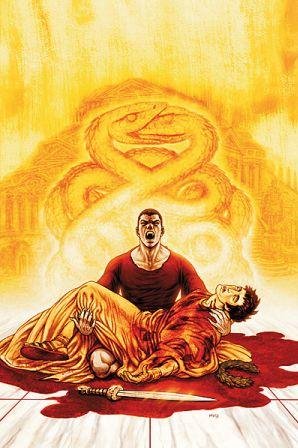
IDES OF BLOOD #3
Writer: Stuart Paul Artist: Christian Duce Publisher: DC WildStorm Reviewer: Lyzard
As one reader corrected me in the talkbacks, IDES OF BLOOD is filled with numerous references to Shakespeare’s JULIUS CAESAR, none so clear as the title of the newest issue: FANGS, ROMANS, COUNTRYMEN. After a disappointing second book, I was won back over with the third. It still suffers from pages of talkativeness, but this issue features spreads of action as well.In IDES OF BLOOD #3, Rome is falling apart after the death of Caesar. But there is a peculiarity in the bite that brought death upon the emperor. It has become infected. What does this mean? Well, you’ll have to read the book to find out. Meanwhile, Valens has been captured as the murderer of his beloved Caesar. However, with the help of Publius Scipio and the vampiress Ione, Valens attempts to escape the carcer in order to find the vampires’ secret city: vrykolaka res publica.
The first thing that struck me with this book was the gore. So far the series hasn’t been that gory or disturbing. Seeing a vampire’s faced ripped off, leaving only the muscles, goes way beyond anything else portrayed in the past two books. Though it is jarring, I couldn’t look away. Maybe it’s my morbidity, but I found beauty in the red skinless face. Though there are some other grotesque moments in the comic, especially come the big fight sequence, none reach the level of grotesqueness featured within the first few pages.
Speaking of the major fight scene, it was the most fun I’ve had reading the comic yet. Why? Because it wasn’t overloaded with wordy dialogue! As Valens and Ione fight for their lives, writer Paul allows artist Duce to have at it, without getting in his way with speech bubbles. The few jokes Paul does write rarely work, except in the beginning of the fight where Valens says “can you handle yourself on your feet a