
| #19 | 9/29/10 | #9 |
Hey folks, it’s your pal, Ambush Bug here. We’ve got a mess of reviews this week for you all to enjoy, but before you scroll down I just wanted to let you all know that I’ll be at this year’s NEW YORK COMIC CON! Having just wrapped up my 20 interviews and columns dedicated to this year’s SAN DIEGO COMIC CON, being the glutton for punishment that I am, I’ll be gathering some more cool stuff from the con to be at on the east coast, which looks to be pretty fantastic. So if you’re a creator or publisher and want me to stop by your booth or if you’re just a fan wanting to gab comics among the masses, drop me a line and I’ll try to track you down. And if you can’t go, fear not. I’ll bring back a whole lotta goodness to report on here in future columns.
And now, on with the reviews…
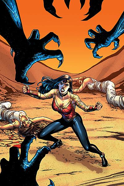
WONDER WOMAN #603
J. Michael Straczynski: Writer Don Kramer, Eduardo Pansica & Allan Goldman: Artists DC Comics: Publisher Vroom Socko: Wondering...
The new direction on WONDER WOMAN initiated by JMS, the dreaded reboot, is one of the most extreme in recent memory. It's also one that, for reasons known only to the creative team, removes every single iconic element from Wonder Woman's character. Paradise Island, the costume, her status as the personification of Truth, all gone. Now, Wonder Woman has been many things over the years: a symbol of feminism, a character study of the dichotomy of the warrior who stands for peace, an argument in favor of light bondage, and perhaps most memorably under George Pérez, a “Stranger in a Strange Land”. So, while this massive alteration of the character is jarring to say the least, there's no reason to think that this story won't end up a rousing success.Except...
The narrative has the most schizophrenic pacing I've ever seen in a comic. The centerpiece of this issue is eight pages set in the Underworld, aka Hell. Anyone else would have made an entire issue out of this moment, but JMS is keeping this story very fast paced. Unfortunately, the three credited pencillers(!) seem to delight in using six pages to tell an action scene when it would be more effective to use four. This places the rhythm of the comic at odds with itself, with a framework that is neither traditional nor decompressed, yet tries to be both. Still, with a strong plot this deficiency could be overlooked, and we could still have a good comic on our hands.
Except...
The story so far has been an absolute mess. This new Wonder Woman was presented to us as an urban, modern character, yet we've spent the past two issues in Turkey, a trip made on the flimsiest of narrative coincidences. The main storyline of this issue has Diana being killed, then attempting to escape the Underworld. The Hero travelling to the Land of the Dead and returning is, of course, a staple of Greek myth, done often as a form of penance, a quest for lost knowledge, and ultimately as an acknowledgement of the hero's mortality. Here, it's done for the sake of three pages of exposition about how Hades has abandoned his realm. Since it happened simultaneously to Aphrodite's abandonment of the Amazons in the first issue, it doesn't take a genius to see where this is going. (I do find it odd that the Goddess of Love is somehow the patron of the Amazons, when that role has traditionally belonged to Athena, Goddess of Wisdom and Combat.) But still, all this could still lead to a decent story as long as the characters are strong and relatable.
Except...
This new Wonder Woman seems to be only one thing: an angry killer. Three issues and a prologue into this story, and all we've seen her do is listen to exposition, be angry at the Gods for abandoning her, and kill people. We have lost a unique sister figure, an ambassador of peace, an icon of virtue and truth, and in her place stands a thug. If there was a hint, an inkling that there was more to this character than death and vengeance, this new take might be worth following further. Unfortunately, all we have so far is a total blank slate. There is nothing to this Wonder Woman that makes her stand out AS Wonder Woman. And that's boring. As it stands, it would take an exceptional idea behind this book to make it worth reading, and even then it would be as the guiltiest of guilty pleasures.
Except...
At the three issue mark, what is this book really about? Its thematic focus has been simple: a large group of powerful men have been, for three issues, slaughtering women. Bloodily. Now, I don't know the specifics of JMS' thoughts on gender relations, and I DO know that the motives of a fictional character or group have nothing to do with the belief system of their creator. But the mood of this comic, of its savage violence against women, is disturbing, grotesque, and offensive. And there are no longer any rationalizations for continuing to read it.
I'm not against changing the direction of a title, or shaking up a character, not even one as iconic as Wonder Woman. But an uneven story with a one-dimensional protagonist filled with weak plotting and heavy handed violence against women is not a bold new direction. It's just a shit comic.
Vroom Socko, aka Aaron Button, lives in Portland, Oregon. MIDNIGHT NATION and RISING STARS are two of his favorite comics, so he doesn't have an inherent bias against JMS. He wants that on the record.
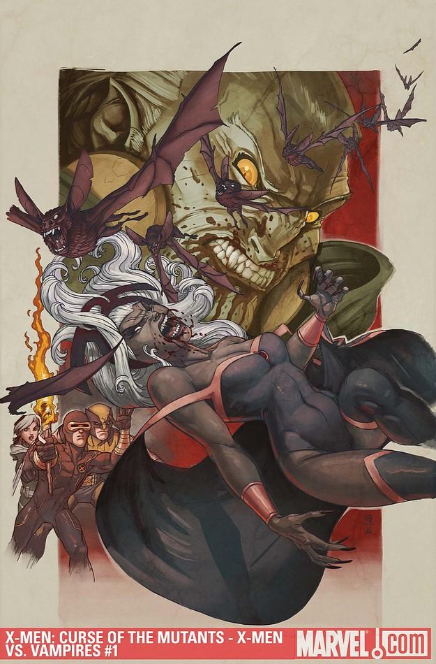
X-MEN: CURSE OF THE MUTANTS – X-MEN VS. VAMPIRES #1
Writer: James Asmus, Christopher Sequeira, Peter David, Rob Williams, Chris Claremont Artist: Tom Raney, Sana Takeda, Mick Bertilorenzi, Doug Braithwaite, Bill Sienkiewicz Publisher: Marvel Comics Reviewer: Lyzard
If anyone has been following my reviews, they may have noticed a commonality between some of them. That similarity is vampires. I love vampires. Not the sparkly pushovers in “Twilight”, or the whining Louis from “Interview with the Vampire”, but the monstrous type. I’m talking Bill Paxton in “Near Dark” vicious. So when I saw X-MEN VS VAMPIRES, despite not having kept up with the series in years, I just had to read it.X-MEN: CURSE OF THE MUTANTS – X-MEN VS. VAMPIRES #1 is actually several stories, not related except for the fact that they all contain vampires. The first, FROM HUSK TIL DAWN, features an X-Man I was not familiar with searching for her friend Jubilee. Then there is I’M GONNA STAKE YOU, SUCKA, which follows Dazzler as she hunts a serial killing vampire. RUE BLOOD is a bit complicated to explain without spoiling it, so we move on now to SURVIVORS where Magneto runs into an old friend he never thought he’d see again. Then there is the real treat of the book, all the way from July 1982 we have THE UNCANNY X-MEN # 159’s NIGHT SCREAMS! Storm is attacked by an unknown assailant and soon grows ill. Because the comic reveals to you who this attacker is on the first page of this particular story, I shall too. It is none other than the Prince of Darkness himself: Dracula.
When I first opened the comic, I thought that one of the vampires was a favorite X-Man of mine: Gambit. He had red eyes and spoke French. This turned out to be wrong, but if you do have a character in your universe that is known for these two things, I would avoid having another character with the same attributes. Also, keep the continuity. In FROM HUSK TIL DAWN, the vampires’ eyes are first white, then red. It is possible that the eyes go red upon their growing angry, but there were only two panels with this inconsistency.
Speaking of consistency, all of the stories drew the vampires in essentially the same way. All just had fangs (no “vamped out” faces like in LOST BOYS or Buffy), and with the exception of RUE BLOOD, the vampires shared the glowing eye trait. But the art style to each story was very different. I personally preferred from HUSK TIL DAWN because it is the look I have grown up with, pertaining to X-MEN comics and then SURVIVORS, which felt more like staring at a painting. RUE BLOOD was the only one where I disliked the look; the action was difficult to follow and it was over stylized. It did, however, contain a TRUE BLOOD joke. Anyone who knows the main actress in “True Blood” will get the connection.
My favorite tale, story-wise, was also SURVIVORS. It’s very dark but also esoteric, not to the point of being above an average reader’s head, but it does make you think. It was also nice to see Logan/Wolverine in the 80s UNCANNY X-MEN. As soon as he can, he goes for a brew. It’s nice to see that the movies got some things right.
I think for the first time since I started this gig, I finally found a comic that I truly enjoyed throughout. Sure, “Rue Blood” was confusing to me, but it was one weak link amongst five stories. I’M GONNA STAKE YOU, SUCKA reminded me of the world in “Kindred: the Embraced” and not just because both are set in San Francisco. Overall, it was great to see this large team of writers and artists show different visions of vampires in the X-Men universe. I can’t wait for #2, which will also conclude the story NIGHT SCREAMS!
Lyzard is actually Lyz Reblin, a film student at Chapman University. Lyz’s love for comics stems from an internship at Dark Horse Entertainment as a freshman, which may explain why some of her favorite comic book writers are Gerard Way and Steve Niles. You can find her on Facebook, but only if you follow her band: Castle Town Convicts (possibly a Zelda reference?).
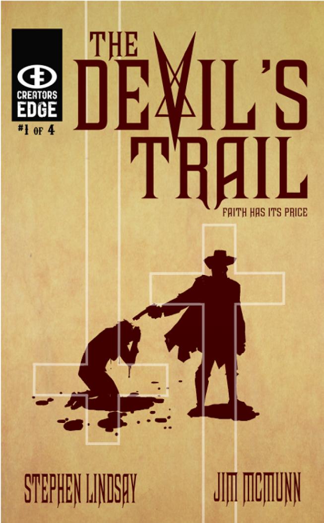
THE DEVIL’S TRAIL #1
Writer: Stephen Lindsay Artist: Jim McMunn Publisher: Creator's Edge Reviewer: Optimous Douche
White hats and black hats…a tale as old as…well, the Old West…or at the very least…”Bonanza”. Logic tells us that the real Old West was probably a filth pit where nothing would stay white for very long, and I’m not just talking about Stetsons. It was a land that was so seemingly vast and endless that the governors of our modern society like Police, NSA, stoplight cameras…basically all the things that keep us civil simply didn’t exist. Writer Stephen Lindsay recognizes that this trope of being able to identify an individual by their clothes is just that…a trope…a convention for the masses…life is simply never as simple as black and white. Sometimes good people have to do bad things in the name of justice!THE DEVIL’S TRAIL may be set in the Old West and borrows on many conventions therein, but this is a whole new fresh approach, at least it is for this intrepid comic reporter. Lindsay takes a more spiritual approach to this time period by making the white hat a man searching for not just evil, but rather the pure embodiment of evil, a “man” named Jericho. Likewise our white hat relies less on guns and gumption, more by instead packing a hefty arsenal of crucifixes, holy-water grenades and…well…yeah, he does have his fair share of gumption.
See, instead of being faced with hornswagglers and filthy cattle rustlers our intrepid hero must fight undead demons as he traverses the barren devil’s trail in search of Jericho. As we all know, a crucifix is far more powerful than a six shooter when confronted with demons. A lazier reviewer might say this book is the WALKING DEAD meets “Tombstone”, merely pushing together two settings for the purpose of a tidy pull quote. That approach not only does a disservice to this book, but the books it is being compared to. In the world of “high concepts” there are no easy fits. If I had to liken this to another piece the vibe I got was far more akin to Stephen King’s “Dark Tower” series than anything else.
My two favorite moments were when our white hat comes across a seemingly abandoned farm house where a sweet little girl is left to care for her possessed Mother. The mother goes all demon-crazy bat-shit and our white hat puts her down accordingly. What we are left with is the juxtaposition of innocence and a man trying to preserve innocence for the world. Our white hat takes the girl along with him and continues after Jericho. My other favorite moment was when our Black Hat Jericho stumbles into a one horse town to convert the citizens into demons. Jericho is simply cool. He doesn’t embody the stereotypes of evil, this fucker is just simply evil. I don’t want to ruin things, so I’ll leave it at this was one of the sharpest moments of the book.
Now for the art…as much as I loved the actual story, I just could not get into the art style. But this is a personal choice. It’s not that it was sloppy; McMunn knows what he’s doing from a layout and story flow perspective. It’s simply that his style is a little too Spartan for my taste. Some folks really dig the minimalist approach and I don’t fault them for that. But I have suckled from the teat of early 90s over-produced material and I will always carry that sweet (or sour depending on your viewpoint) nectar within my marrow. I don’t like gratuitous splash pages and poses, but I want my purpose driven panels to be rich with detail. Again though, that’s just me.
So, all-in-all THE DEVIL’S TRAIL is a grand read with rich undertones, but again the art left me wondering just how gruesome things could get with a different style.
Optimous has successfully blackmailed fellow @$$Hole BottleImp into being his artist on Average Joe. Look for Imp's forced labor on Optimous brain child in mid-2011 from COM.X. Friend Optimous on FaceBook to get Average Joe updates and because ceiling cat says it's the right thing to do.
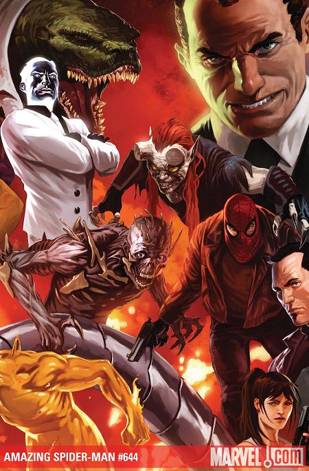
AMAZING SPIDER-MAN #644
Writer: Mark Waid Art: Paul Azaceta Publisher: Marvel Comics Reviewer: Henry Higgins is My Homeboy
Survival of the Fairly Alright…“Origin of the Species” turns out to be an alright issue, which is incredibly surprising. The story has been lacking overall so far, but it's nice to see a fairly enjoyable issue of this arc.
Writing (3/5): Mark Waid steps up from the last few issues and turns out a fairly good one here. Waid adds a lot of nice touches that were absent from the earlier parts of this story like Doctor Octopus making his own Spider Tracers (in the shape of an octopus). It’s inspired and something I'm surprised I haven't seen before. The dialogue in this sequence isn't fantastic, but seems hammy to me. The Rhino scene is also well done, with the confrontation between the two playing well. Rhino sparing the child is a nice touch, and well appreciated. The scenes not focused on Peter or his villains slow down the pace severely, however. Primarily in the apartment of MJ’s friend, the scene just falls flat. It lacks character and just feels by the numbers (friend is angry, MJ references some past transgression, friend helps). The end of the issue, however, is good. I really enjoy the little twist even though it'll resolve itself quickly, I expect.
Art (2/5): Paul Azaceta's art style isn't my fancy, but it does have some nice moments here and there. Azaceta still doesn't do faces that sit well with me. They come off as off-putting, especially Harry as he leaves Menace with MJ. But to his credit, the action sequences are well done. A standout is the arrival of Rhino on the scene, which plays out well. The Carlie sequence with Tombstone, on the other hand, falters about. With too many weird faces, and awkward poses like Carlie showing off her badge, the scene doesn't translate well. The demon baby by Mysterio isn't good at all to be honest, but it's not as bad as Harry's face at the end of the issue. Those just aren't looks the human face should be able to make.
Best Moment: The Rhino confrontation. It follows up on my favorite “Gauntlet” story, and sets up another fight down the road. Fantastic.
Worst Moment: Harry's face. Gaah!
Overall (3/5): The issue, while still not great, has improved steadily on last issue. Hopefully this trend continues.
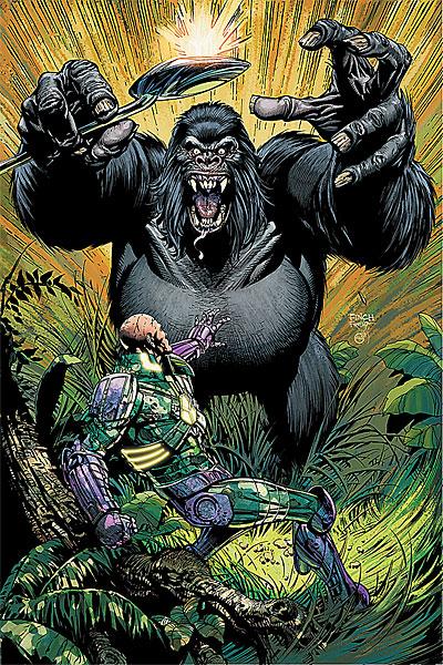
ACTION COMICS #893
Writer: Paul Cornell & Nick Spencer Art: Sean Chen & R.B. Silva Publisher: DC Comics Reviewer: KletusCasady
What happened to the days of a good villain? I don’t mean the guy that shows up for two issues, arrives with some asinine plan then gets defeated and put back in jail time and time again. I’m talking about a villain that’s feared & relentless in their pursuit of what they feel they are owed or a villain so steadfast in their resolve that the hero has lost before they started but is forced to play catch up/cleanup. I’m talking about Doom circa 1980’s, Darkseid in the 70’s, Apocalypse in the 90’s. I just don’t feel as though villains are really that feared or respected these days. I know Brightest Day/Heroic Age is supposed to be the return of the “hero” but what about the villains? Where do they stand in all this? I would venture to say that a superhero, much like a college football team, is measured by the strength of their adversary, and these days we don’t really see villains the way we used to. Mostly what we are privy to are heroes dealing with their own problems via some self destructive path they’ve lead themselves down, but the villains--the people heroes should fear--are nowhere to be found. Leading me to a strange idea that’s happening now…a superhero’s book taken over by his greatest foe. I’m talking about ACTION COMICS starring none other than Lex “my appearance changes on a weekly basis” Luthor.I’ve always thought of Lex Luthor as a badass almost like Batman in a way, where he’d have contingency plan upon contingency plan to escape nearly everything Superman could do to take him down, leaving Supes with no evidence of any wrong doing by Lex. This is the first issue of ACTION COMICS I’ve bothered to pick up and read since the Lex takeover but with artwork from Sean Chen I couldn’t resist. He’s definitely one of DC’s top 5 artists but it seems (much like Jimmy Cheung over at Marvel) that he doesn’t seem to get that much work and I wonder why. His art is great, the page itself just looks really clean, there’s no clutter, there’s no extraneous lines everywhere and every character looks good. I wish he was permanently on this title. I don’t have anything against Pete Woods and I do think his artwork has drastically improved since the disaster which was AMAZONS ATTACK (WORLD OF KRYPTON didn’t look too bad) but I still can’t get into it; too many weird squiggly lines and he’s another artist that makes everyone look like they’re in dire need of some Dulcalax.
I’m an art first, story second kind of guy which I why I decided to buy this issue but with my man Paul Cornell (CAPTAIN BRITAIN & MI13) writing, I know I was in for a good story as well. I’m pretty sure Gorilla Grodd is one of those villains people see and kind of roll their eyes at but Cornell does a great job of making him pretty menacing and smart; the only thing…Lex is tad bit ahead of the game, which is exactly where he should be. This issue is great because not only are the villains acting as such but they’re written in such a way that either one of these guys could have come out on top, not to mention both seem equally as vicious as the other. Gorilla Grodd is crazy as shit in this comic and I don’t think I’ve seen him like this possibly ever and I don’t think I’ve seen Lex this cunning in a really long time. Even though this issue is written in serious tone there are some laugh out loud funny moments in this book. When Grodd first confronts Lex in the jungle, the talk Luthor has with his employee “four weeks ago” and what that means to the overall story (you’ll see what I mean if you read it), Grodd eating…Lex’s…well I’ll just stop there for now. This is villains being villains and it’s great.
This issue has a welcomed mix of humor, evil and conniving villains trying to one up another and it seems as though that may have been the case with the previous issues as well. I think this issue will probably stand above those issues simply because of Sean Chen’s beautiful art. I won’t gush too much but I’ll say he’s in my top ten favorite artists working right now. The covers for this series have been spectacular and I’m kind of bummed Finch isn’t at Marvel anymore but I’m really enjoying his take on DC’s cast. I am kind of skeptical on his upcoming Batman book for some reason but that’s another story. This issue is definitely worth the cover price and my only complaint is that Sean Chen probably won’t be doing the next issue thus putting it in the back burner next to my plans to go to grad school. I didn’t read the back up feature (almost never do), because it had to do with one of the most annoying characters of any universe in Jimmy “how am I still 16” Olsen. If you miss the good old days of bad guys being smart, savvy and evil, check this issue out.
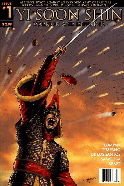
YI SOON SHIN: WARRIOR AND DEFENDER #1 & #2
Writer: Onrie Kompan Artist: Giovanni Timpano Find out more on this book here. Released October 2010 Reviewer: Jinxo
Well, I have to say this comic is well outside my normal wheelhouse. I'm mostly a hero-book type. YI SOON SHIN is actually a historical action adventure book. Not sure I've ever read a true historical comic. It was a stretch but an interesting and pretty entertaining one.The book tells the story of an actual figure from Korean history in the 1500's. At the time the Korean Navy was a bit of a mess with four different fleets who did not coordinate their efforts. That's not so good when, say, a well organized Japanese Navy invasion fleet shows up. While others in the Korean Navy are busy shouting, "Run away!" or "We're all gonna die!!!" or are just at a loss, Yi Soon Shin is the one guy to step up and say, "Okay, here's how were going to kick their asses!" And ass kick he does.
I found this a fascinating read on several levels. First off, this is history I don't know. It is interesting dipping a toe into a whole other culture. What do I know from Korean history? But, make no mistake, it's action packed history. Looking for bloody battles? Here ya go. Massive fleets of warships, swords, guns, cannons? Yes! A smart alecky dog sidekick who makes snarky asides on the action? NO! You have come to the wrong comic.
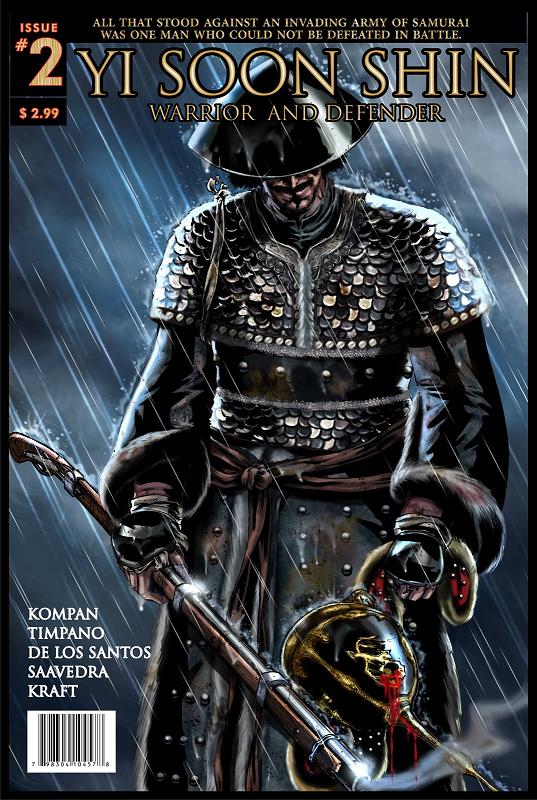 I do have to say, though, that this book did give me a similar feeling to the one I had watching Oliver Stone's JFK. It is based on a true historical story but it is also an adventure comic written with Yi Soon Shin as the clear heroic figure. And not saying he wasn't. But what I am saying is that like JFK it's history filtered through the entertainment medium. Even as I was enjoying the read, I was constantly wondering, how accurate is this to what actually happened? How much is changed just due to the legend growing in the intervening years? How much has been changed by the author in the name of making it a better yarn or to make Yi Soon Shin more heroic? For me having these questions in my head isn't a bad thing but part of the fun. Sort of a mental game of liars’ poker between the reader and the writer. You're reading something and enjoying it but then weighing it juuust a bit. Example. Issue #2 starts with a Japanese general berating one of his underlings and then accepting his underling's apology... with a kiss. Fully fictional book you just go, okay. Here I have to ask, is this general a true historical figure or an invention for the story? If he is real, was he really gay? How much of what I am reading is really based on a true story and how much of it is based on a true story the way the movie FARGO was?
The art is pretty outstanding too. Looking at it I almost missed the forest for the trees. As a reviewer I will go back to look closely at the art. I found myself looking so close at how the facial expressions were drawn and the like, smaller details, when I suddenly realized I was an idiot because I was idiotically missing the BIG picture. The massive amount of intricately designed ships, fortresses and uniforms that fill the book is truly impressive. It's a damn good looking book.
It is interesting that this book is an indy book. Mad props to the crew working on it because they're clearly putting their blood and sweat into this series (in addition to the blood and sweat drawn on the pages). It's interesting that an indie film usually means small scale due to a low budget. But an indie comic, wow, it can go epically big. This is a really really indie book so you may have to look for it or ask for it at your local shop. You can also check out some of what these guy are up to at their website.
Jinxo is Thom Holbrook, lifelong comic book reader, and the evil genius behind poobala.com. He may appear cute and cuddly but if encountered avoid eye contact and DO NOT attempt to feed.
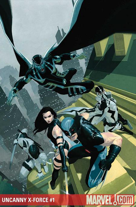
UNCANNY X-FORCE #1
Writer: Rick Remender Art: Jerome Opena Publisher: Marvel Comics Reviewer: Johnny Destructo
"No jovial sense of adventure. No camaraderie. To overcome the tension. This is NOT the X-Men."I must confess, I got halfway through the first issue of the last X-FORCE series, before deciding that it's not at all what I wanted from my merry band of mutants. Being proactive: fine. Taking the fight directly to the bad guys: great. Murdering every single mother-lover in the room for no good reason: blarp. It just felt like a bunch of assholes running around getting their stab on. Also, I kinda hated Clayton Crain on that book for some reason. Just felt over-done, I guess. This one's feeling different though. The smaller team really helps. Cut down to just Wolverine, Phantomex (from Grant Morrison's NEW X-MEN run), Psylocke, Archangel (or Angel, depending on what panel you're referencing) and the only other mutant with as much over-exposure as Logan: Deadpool. This feels like a pretty slim but effective team.
Conspicuously missing from this roster is former team leader Cyclops. Having recently officially disbanded the X-Force team, he has no idea that these cats in black and gray are still running around playing pin-cushion with people's innards. Which is for the best, I think. It never sat right with me that Cyke would allow such a team to run amok. I realize he's the new, improved, douchey-er Cyclops, but still.
THIS feels like where Wolverine should be. Logan playing nice on both THE AVENGERS and THE NEW AVENGERS feels about as natural as him playing sassy tunes with Archie & The Riverdales, wearing Prince's assless yellow chaps. Yeah, you know the ones, naughty boy. It's just plain silly-town. But he's at home here. I'm also glad to see Phantomex, who I loved back when Morrison created him. This dude just has so many interesting character traits! He has a symbiotic nano-technology relationship with E.V.A, is literally unable to believe in a higher being, his mask has "telepathy blocking ceramics"? Huh? Sure, why not? He is British, but pretends to be French, just 'cause? Go with it! I hope Remender really gets to play with this character; I'm looking forward to more.
Artist Jerome Opena does an absolutely fantastic job with this book. He has a bit of a David Finch thing going on without being over-bearing. He uses a variety of camera angles and keeps it in motion for a dynamic, fluid feel. Dean White's colors bring it to a whole other level, as well, painting each scene a different hue, sometimes with an aggressive saturation level. It's beautiful.
This is a pretty fun book and features an old nemesis in a different form. I never really cared about him/her before, but this looks promising! Check it out, it's definitely worth your $$.
Quick side-note: If you haven't read the 3 issue mini-series X-FORCE: SEX & VIOLENCE, get ON it. That was the best thing I've read with an X on it since “Second Coming”!
JD can be found hosting the PopTards Podcast, discussing movies, comics and other flimflam over at www.poptardsgo.com, graphically designing/illustrating for a living, and Booking his Face off over here.
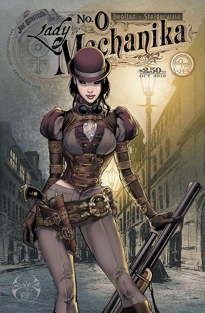
LADY MECHANIKA #0
Writer / Art: Joe Benitez Publisher: Aspen Comics Reviewer: Mr. Pasty
Joe Benitez is back and ready to prove he’s still Top Cow with an intriguing steampunk series titled LADY MECHANIKA. A lot of fanboys don’t get the appeal of steampunk and that’s kind of a deal breaker here because this is it in earnest. If you’ve never fantasized about Laura Ingalls growing cybernetic quills and shooting them into Nelly Olsen’s ass, then this book probably isn’t for you. For those of you who choose to hang around until the end credits, you’re likely to find LADY MECHANIKA a mixed bag.As with any creator-owned property, you have to take the bad with the good – and I use the term “bad” very loosely here as Benitez has been around the block and clearly knows what he’s doing. What might be bad for him is still better than a lot of the crap littering our shelves every Wednesday and I can honestly say there wasn’t anything here I found to be reprehensible. My major gripe is that Benitez creates a fresh and interesting character – and then fails to do anything fresh and interesting with her. But don’t worry, half the time you won’t even notice because Benitez has made her so friggin’ hot.
LADY MECHANIKA was plucked from an abandoned laboratory after having her limbs removed and replaced with mechanical parts. With no memory of who she is or why she has an iron pussy, she decides to spend her days as a paranormal investigator circa late 1800’s. Imagine if Doug Quaid put on a top hat and said “Fuck Mars, I’m going to work for those plumbers at TAPS” and you kind of get the idea. Issue #0 has her chasing “The Demon of Satan’s Alley,” which turns out to be a curious little goblin who speaks perfect English and just so happens to know bits and pieces of her sordid past. Too bad he eats a bullet from a local yokel before he can dish and wouldn’t you know all hell breaks loose when the town posse tries to detain her. Would it surprise you to learn she is a highly skilled fighter? Or that a mysterious bad guy wants to use her powers for his own evil scheme? Of course it wouldn’t, and I think that as the reader, that was a bit of a disappointment.
From a technical perspective, it’s well executed. Unfortunately it just isn’t that interesting. She’s got no memory, she works as a paranormal investigator and above all else, she’s a strong, independent woman who can kick the shit out of you. She’s basically a T-1000 with amnesia in a flounced petticoat. I just wasn’t feeling it and the strong heroine thing has been done to death. There are just no surprises here. Amateurish? No. Paint-by-numbers? I could make that argument.
Having said that, the artwork here is a perfect 10. It’s good when an artist understands his subject, but it’s even better when an artist loves it, and Benitez loves steampunk. LADY MECHANIKA looks like it was comprised of photos from old newspapers or family albums and then given the wash and hot wax with Adobe Illustrator. I just can’t say enough goods things about how well Benitez captures the feel of the steampunk universe and the Lady herself is comparable to any of the industry’s top heroines. She’s that hawt.
Would I recommend this book? I would. The artwork alone makes it worth checking out and like I said earlier, the story wasn’t doing anything for me, but it’s technically competent and I think that’s important to note as a reviewer. My inability to become immersed in the story may have more to do with personal taste than the author’s failure to deliver the goods. Also keep in mind that this is issue #0 and what you see isn’t always what you get once the book shifts into second gear. Pasty says give this one a look and decide for yourself.
Web heads who can’t get enough of Mr. Pasty’s word vomit are encouraged to watch him operate as Nostradumbass over at MMaMania.com here. Love, hate and Mafia Wars requests should be directed here.
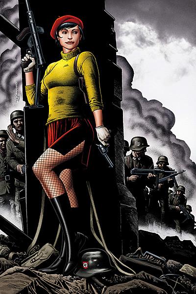
STAR-SPANGLED WAR STORIES: MADAMOISELLE MARIE #1
Writer: William Tucci Art: Justiniano, Justin Derenick, Andrew Magnum, & Tom Chu Publisher: DC Comics Reviewer: Majin Fu
My dad is in the army, and his dad before him was in the war, so I grew up listening to war stories. However, with the exception of a few Unknown Soldier back-issues, as well as following the current series from issue 1, my exposure to war stories in the form of comics has been limited. So when I saw this on the stands, I thought I’d pick it up and give it a try.Mademoiselle Marie first appeared in Star-Spangled War Stories way back in 1959, and was notable for being the love interest of Sgt. Rock (thanks Wikipedia). But Mademoiselle Marie is not just one woman, as the name is really a title, given to the best and brightest, and the most dangerous, tasked with protecting France at various points in history. I have had the luck of discovering some of Marie’s old adventures, and I gotta say they were pretty fun. Even with the goofy French phonetics, Marie was a cool character that added some sex appeal to an otherwise dark chapter of Europe, as well as playing a key role in several top-secret missions.
The plot here involves Marie dropping behind enemy lines to help a few French resisters destroy a German railroad. Simple enough right?
Unfortunately, this is not a very good comic. The plotting and pacing are very poor, causing the comic to drag at one point and sputter the next. There are also a few key moments that could have used a proper transition, but instead, it just reads like there’s a page missing. The flow in this comic is severely screwed. Moments that are supposed to be shocking read as merely jarring, primarily because the story skips ahead suddenly without much explanation. Also, the big twist when traitor reveals themselves is projected fairly obviously early on, so it’s not surprising in the least when it is finally revealed.
Furthermore, while Marie should be the strong female protagonist, she comes across as a bit of a sloppy operative. You can imagine how disappointing this is, since she’s the main character. Her personality lacks consistency, and she’s kind of a jerk at first, making her less sympathetic.
The art doesn’t fare much better, but it’s still an improvement over the plot. Every page is rich with detail, and the coloring is appropriate to the book’s tone. However, when Marie first appears in a mini-skirt and knee high boots after paratrooping behind enemy lines, it just looks silly. Her original introduction was much better. Also, between the three main members of the art team, you think someone would have commented on how eerily formfitting her turtleneck looks. You can’t usually see the outline of someone’s navel while they are wearing a sweater, but here you can. There is also a point six pages in (not counting ads) that looks really awkward, where the French resistance leader, Maquis leads Marie into a room by the hand. If he is reaching down to hold her hand then why is she bending her elbow up? It doesn’t make sense if they are standing on the same plane.
To top it off, this issue is priced at four dollars. Normally, DC’s feeble attempts to justify taking more of your money consist of squishing a preview into the back, which they also cram into every other comic they price at four bucks. This issue is different. There are no bonus materials whatsoever, just 22 mediocre pages.
While Marie’s first mission in Star Spangled War Stories #84 is an impressive romp with a thrilling story and a delightfully efficient lead, this new comic is lacking a lot of the soul inherent to that work. Even the onomatopoeias come across as dull. If you are looking for a good war story set in Europe, I suggest you look for those Sgt. Rock rereleases that came out last month. It’s a shame, because Mademoiselle is a fun character with lots of potential for exciting missions spanning across several timelines. This is not one of those tales.
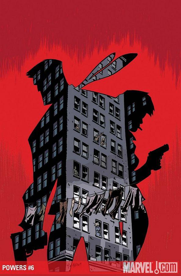
POWERS #6
Writer: Brian Michael Bendis Art: Michael Avon Oeming Publisher: Marvel Icon Reviewer: Optimous Douche
Bendis: the man has become a verb, and with that lofty status is the inevitable profile that never leaves the comic fanbase in emotional limbo. On one side you have the vitriolic debasing of his work with well crafted phrases that would make crack whores blush with girlish embarrassment. On the other side is the barbaric yalp of his fervent defenders, sounding out a cacophony of platitudes that ooze across the page like a WWII Dear John letter (pssssttt…he’s never going to write you back – even if you give your smileys a blowjob face with a cum trail :-0… ). These days if I were to liken this chastising to an 18th century duel between two fancy-men, the slap gloves of choice would be ULTIMATE SPIDER-MAN and AVENGERS.Week after week after week the griping saturates the intertubes: “Bendis raped my cat’s soul with AVENGERS.” “Fuck you ULTIMATE SPIDER-MAN FTW!” “AVENGERS resurrected my cat’s soul just so it could come back and rape my dog’s soul!” “Mephisto mefisted regular Spider-Man…ULTIMATE SPIDER-MAN FTW!” And all of this is just recently, knowing that my Mother reads this column it wouldn’t be proper to bring out the discussions from M-DAY and SECRET INVASION.
It’s funny how passion works though, because the arguments always seem to be less about Bendis as a writer, but more so the direction he takes characters. “I don’t like my super heroes sitting around talking.” Fair enough, but let’s be honest, I have yet to see any issue that all takes place around a kitchen table. “I don’t like the team line-ups,” again a fair statement, but should that spite be directed at Bendis or at Marvel as a whole? Marvel is a corporation, people, and while I’m sure Bendis is a powerful force within its hallowed halls I’ll bet my copy of ULTIMATE SPIDER-MAN 1 that Bendis does not determine the lineup in a vacuum. Before you read one line further, ask yourself if you have ever chortled at a Bendis dialogue bubble or ever once been swept away by the dark tones and cynical underpinnings of titles like ALIAS. If the answer is no, thank you for reading and enjoy the next review. However, if the answer is yes, then despite your misgivings on Bendis’ “in canon” Marvel properties, you might just enjoy POWERS. Now, if you’ve read POWERS, but left for reasons like the fact it had a delivery schedule that only seemed to coincide with Lindsay Lohan’s sobriety, or you were put off by the monkey fucking arc, I will say with certainty that now is the time to return.
The best premises are always based in simplicity. Take a well established genre…the hardnosed detective story…infuse it with some supernatural human beings…and top it all off with the icing of an inciting event. In the world of POWERS that event was the outlawing the use of powers unless sanctioned by the government. In the hands of other writers such a premise would carry for a few arcs, a few guffaws at superheroes running from police and the series would have petered out before the first recession hit our shores. Bendis doing what he does best, though, made us care equally about the characters in POWERS as much, if not more so, than the world in which they live.
It all started with Walker and Pilgrim, the grizzled veteran and his rookie counterpart investigating the murders of powered individuals. From story to concept Bendis had me hooked immediately. Whether it was actually solving the case or the fantastic interrogations beneath the dimmed fluorescent glow of power inhibitor lights, the story felt more real than any episode of CSI or LAW AND ORDER. What followed was a maturation of these characters. As time went on Pilgrim’s hot headedness was tempered by Walker and then reignited by living in this insane world. Walker has always served as the story’s enigma. Once a power certainly, perhaps an immortal or a construct of the universe…maybe…he has always been the true definition of a hero. Sure he’s had his flaws and some questionable dalliances with fame over time, but in the end he always comes back to a moral center that is far more plausible than the eternal do-goodedness of Clark Kent. There’s doing good and then there’s being a do-gooder; I’ll take the former any day as far as building an interesting character.
So where is POWERS today? Well it’s on a fairly regular publishing schedule for starters with nary a panel of monkey fucking to be found. Walker is still coming to grips with his new Green Lanternesque power ring and also trying to train his undercover, all while trying to save face during his day job so his new partner doesn’t suspect what he’s up to. Good thing, too, since this partner appears to still have ties to internal affairs. Pilgrim has been on the sidelines after her appearance of powers, but makes a turn on the last page of this issue that will thrust her full-force as a power to be reckoned with (at least as far as Walker is concerned). One other great reason to pick up this issue is the start of a new murder investigation; this time it appears immortals can die in the most grisly of manners. Bendis is also whetting our appetites with an exploration of hero morality. How does a hero decide what people are worth saving and when? Should true heroes even make those distinctions? It’s a far more plausible set up than the current meanderings of a certain crestfallen man in blue tights over at DC.
Oeming simply continues to rock the house. I’m usually the first to dump on art that seems “sketched” or let’s say lacking realism. But for some reason I simply adore Oeming’s work. Never mind, I know the reason, even if you hate his style he nails the fundamentals of pacing and emotion. For any book these should be fundamental tenets; for a book like POWERS they are an utmost necessity and Oeming simply delivers year-after-year.
In the end analysis if you have your mind set on hating Bendis, then no words will convince you otherwise. I simply find it fascinating that as a community we praise Stan Lee as if he were the modern-day Jesus when his words deliver more camp than the “Meatballs” movie franchise. If anyone else tried to write like that today they would be shown the door after their first issue. The man was great for his time, but that time has passed and the medium has evolved. You might disagree with this evolution and I’m sorry for your loss of a time that will never return, but time stands still for no one…not even comic collectors. POWERS – get it, read it, love it!
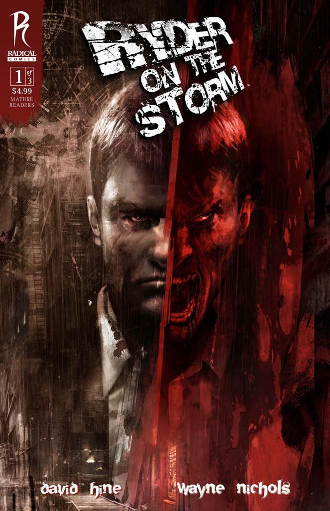
RYDER ON THE STORM #1
Writer: David Hine Art: Wayne Nichols Publisher: Radical Comics Reviewer: Lyzard
At least this comic came with a “mature reader” warning. Though some of you may view this as a form of censorship, I gladly welcome these parental advisories that Marvel and Radical comics include. It prevents me from upchucking my lunch. RYDER ON THE STORM most definitely is for mature readers. Not for sex, but for bloody violence. I’ve noticed that comics don’t take sex as far as they do violence, which seems to be a realm saved for film and HBO. But though the comic made me squeamish and squirm, I still found it fascinating. It’s a rubbernecking comic. One in which despite the horror, you can’t look away.RYDER ON THE STORM #1 tells the story of Private Investigator Ryder. He is hired by Katrina Petruska, a nightclub singer, whose rich hookup has just killed himself…by power drilling eleven holes into his head. But this is no ordinary case. As Ryder investigates, he finds out that the city’s founding family, the Dantons, may be involved and that they are much more than meets the eye.
RYDER ON THE STORM does not get any points for originality. It’s a neo-noir like BLADE RUNNER, has similar ideas to MALTESE FALCON, and a feel similar to Frank Miller’s SIN CITY (especially THE HARD GOODBYE). It even takes the masquerade scene from Stanley Kubrick’s last film, EYES WIDE SHUT, as a model for the club Lust Garden at which Katrina works. So if you are looking for new ideas, don’t go down this dark alley. It’s predictable what direction the story will go, even if you don’t know your film noir.
That being said, I still enjoyed the comic. Setting it up in the near future, instead of the present, was a nice touch due to the ancient matters that come into play later on in the story. This intersection of the past and future made it a blend of the neo-noir of MINORITY REPORT and the classic noir of DOUBLE INDEMNITY. It has the archetypal characters, such as your PI, femme fatale, annoyed detective, and shadowy antagonist. It also is full of grays. I don’t mean in the color, but in the character’s morals. Each of the characters has a dark side, which in any other comic would make them two-dimensional, but it has become such a trend in noir that the characters still read one-dimensionally.
But that’s okay, what kept me coming back was the art. It was the choice of the artist in when and what not to show that really took me aback. The reveals were intensified by the suspense built through the drawings and even the lettering. The constant RRRRR sound in the apartment, at first seems like it could be the phone, but later we find out it’s actually the drill. I felt this comic was very alive; I could hear the sound of the drill, the whack of fists, the screams of agony even when they weren’t spelled out for me. Again, what to show and not to show. The colorization made the reds (not always just blood) and greens stand out. Everything else was muted. My very problem with neo-noir films is the use of color. I enjoy CHINATOWN because its muteness is the closest you can get to the black and white feel of the traditional noir stories, without going b&w themselves. This comic deals with color in a similar way, but not to the extent of SIN CITY, where, when important, a color is highlighted and heightened.
I know I’m referencing a lot of films, but the layout of the comic was very cinematic. Again, this goes back to the reveals, but there was also parallel editing, where in you have two panels with a similar image, but it’s the differences that matter. This may be blasphemy to comic purists, but the book came off very much like storyboards in their varying angles and focus.
RYDER IN THE STORM #1 is a powerful comic. Though I knew where it was going in nearly every page, it was the experience that I enjoyed. Feeling the pain, hearing the screams, it’s a sensory book that makes one more in tune with ones senses than even some films. If this is your genre, then I highly recommend it, not for it’s story, but for it’s imagery.
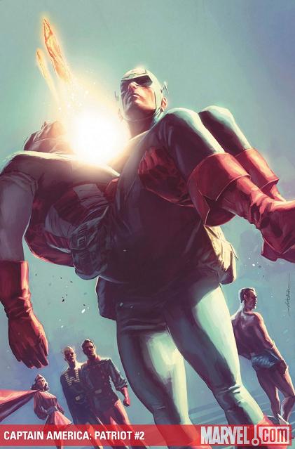
CAPTAIN AMERICA: PATRIOT #2 of 4
Writer: Karl Kesel Artist: Mitch Breitweiser Publisher: Marvel Comics Reviewer: Jinxo
One of the earliest comics I can remember buying was a special issue of CAPTAIN AMERICA where all the various men who took the name of Captain America were pulled from various points in time to wage battle together. At that point I was flipped out by the idea there had been Captain Americas other than Steve Rogers so I had to check it out (let's pretend I wasn't also fueled by enjoyment of what I now know were HORRIBLE Captain America TV movies. Yikes!) Ever since then I have had a curiosity about those other Caps so, clearly, CAPTAIN AMERICA: PATRIOT went right on my pull list. The story of how the non-super powered hero The Patriot ended up stepping up to fill the role of Captain America? I gots ta know!!!I have also been buying most of the other Marvel retro books that lay out the history of the Marvel Universe back around WWII. One of the things I am enjoying about CAPTAIN AMERICA: PATRIOT is the specific point of view. Part of the story with the substitute Caps is always the replacement Cap being down, feeling like an imposter, almost impotent power-wise next to the other heroes. And in something like the MARVELS PROJECT that would come off as a downer. Huge buzz kill. Action and adventure going on and here's the guy who gets to be Captain America going all Droopy Dog saying (and you must read this AS Droopy Dog), "I wish I was good enough...I suck." But this book hits that same element from replacement Cap Jeff Mace's point of view. Somehow kinda being in his shoes makes a difference. You get it. It isn't him sucking and feeling bad for it. It's this regular guy trying to fill the shoes of a legend. He gives it one hundred and ten percent and still is not hitting the mark Steve Rogers set. He comes off not as a whiner who isn't good enough but instead as a regular American trying against all odds to BE Captain America...which really embodies what Captain America at heart should be. And with this ret-conning we also get him willing to do the right thing for a friend even if it isn't the PC thing to do. I think that might be the part of issue 2 that really hit me most. Nice truly heroic moment to have everyone tell him "It would be best if you steered clear of this," and for him basically say, "Yeah...you can stick it. I'll do what I feel is right, thanks."
Also really digging the modern yet retro art by Mitch Breitweiser. The art for sure doesn't look like the hero comics of that era which tended to be much simpler--basic lines and simple coloring. But somehow this is what the comics from back then SHOULD have looked like. You get the feel of the simplicity of art. Instead of looking like a painting as comics can look today it has more of a sketched and rough paint look. And the color scheme seems tweaked slightly yellow to imply the yellowing look of an older comic. I dig it. This isn't the biggest book out now for sure but it's a great bit of revisiting of "forgotten" Marvel history.
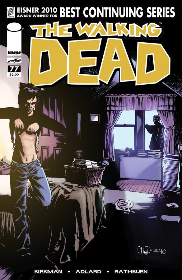
THE WALKING DEAD #77
Writer: Robert Kirkman Art: Charlie Adlard & Cliff Rathburn Publisher: Image Comics Reviewer: Henry Higgins is My Homeboy
No stupid jokes here, this issue was just that awesome.Just...just...fuck. I have absolutely nothing bad to say about this issue. I wish I could leave it at that; I should just leave it at that. Nothing I can say is going to make this issue any more enticing then it naturally is. THE WALKING DEAD #77 was one of the most perfect comics I've ever read. The art, the pacing, the dialogue, the ending, everything was fantastic. Kirkman is among the best writers doing comics today, and this issue shows exactly why. And the fact that it's one of the best issues of THE WALKING DEAD ever, a book that has rarely, if ever, had an off issue, just makes it all the better.
Writing (5/5): There's not a single off scene in this book. Carl confronts Rick over his daydreaming/hallucinations of Lori on the phone, and it plays exactly how one would expect it to. Rick explains, hopelessly reaching out for his son to understand. It’s heartbreaking on both sides as Rick desperately clings to the idea of Lori. But it also snaps something in Carl, and it seems the last bits of Carl’s childhood are gone (he can't pretend, even for a second, that he can hear his mum. She's dead, plain and simple).
Andrea's first romantic interest since the death of Dale, like with the Carl confrontation, plays out very similar to how it was expected. Andrea's attempts to be flirty again fail miserably in a very quiet moment between her and her suitor which is a well done look into her mindset after Dale's death.
****SPOILER**** The death of Scott is surprisingly touching. I felt more sympathy for the death of this nondescript red shirt than I've felt for major characters in the past. A beautifully written scene. ****END SPOILER ****
Glenn and Maggie's distancing relationship is patched up, and it's done realistically and brilliantly. Instead of going the usual fiction route of angry make up sex symbolism, the two actually do what most people do. Talk it out. The conclusion to the issue is just....fuck...it’s just brilliant. Absolutely brilliant. The whole issue, for all its interpersonal looks at the characters, has a real sense of tension building, that climaxes when Peter attacks the group taking care of Scott. The scene is tense, and just explodes into a great turn. Which is followed by a bigger "Holy shit!" Which is then followed by a huge "HOLY SHIT!" The series is swerving around its preferred tropes and is going for new angles on established ideas. Kirkman writes one of his best comics ever here.
Art (5/5): Has Charlie Adlard ever done a bad issue? Ever? There are not enough good words to say about his art. It's striking, clear when it needs to be and shady when it needs to be. The murders at the end especially are absolutely marvelously paneled, with both having deliberate weight on the plot, exuding a sense of urgency.
Best Moment: The ending. Damn.
Worst Moment: I can't think of a single one.
Overall (5/5): This comic deserves the Eisner it won last year so much. And if the series maintains the level it brought with this issue, it'll stay on top.

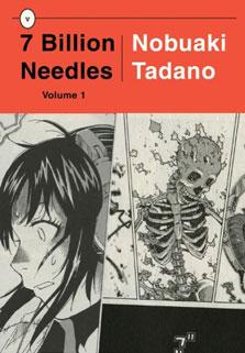
7 BILLION NEEDLES Vol. 1
By Nobuaki Tadano Released by Vertical, Inc Reviewer: Scott Green
7 BILLLION NEEDLES... maybe it was some failing that I didn't figure it out earlier, but once the title's meaning became evident, it became pretty brilliant.On a clear night, Hikaru Takabe, an orphaned teen girl with a 10,000 mile stare and headphones nearly constantly affixed to her ears, wanders out of her room on a stroll to the beach. As she wades into the water, the serenity is shattered when a meteorite miraculously changes course to collide with the girl, designating her body. Cut to a school room scene. Hikaru is staring out the window, occasionally giving the ticking clock a glance. She begins experiencing odd stimuli, making her sensory relationship with the world as strained as her social relationship. Then, she begins hearing voices, informing her that she died; that an alien with, well... alien biology, had to bond with her in order to preserve her life. But, Hiraku's symbiot isn't the only extraterrestrial that made its way to Earth. The other is more parasitic, using its host to kill, and kill until it wipes out the population around it, potentially causing mass extinction if left unchecked. Hiraku's alien frames the relationships in another way. Hikaru, must help the police officer alien Horizon locate and apprehend the criminal Maelstrom before the latter begins its assault on humanity.
7 BILLION NEEDLES is based on Golden Age hard sci-fi writer Hal Clement's 1950 novel NEEDLE. That's no secret. It's printed on the back of the book. Saying that a work recalls a classic is another way of saying that its premise is nothing new. Sci-fi from various traditions have had configurations like this one. In manga, there's PARASYTE, about an alien spore that is supposed to bore into the brain of a teenager, but, because the target fell asleep with headphones on, wound up in his hand; and there's BIRDY THE MIGHTY, about a female, intergalactic police offer who accidentally kills a teenage boy when transporting to Earth, then revives him in such a way that they can swap bodies.
Informed by Hal Clement's original, 7 BILLION NEEDLES has its own approach to the material. Reading the manga, I found myself not so much thinking about the other manga that it resembled as I was the novel. Despite significant differences from Clement's, knowing 7 BILLION NEEDLES was an adaptation infected me. The ways in which the manga plays with perception, senses, and connection with alien intelligence are the ways in which sci-fi writing is made interesting. I couldn't stop thinking about how it would work as prose. When Hikaru starts feeling disconnected to her body, or reacts to the grievous damage that bodies takes, I couldn't help but consider how Hikaru's experience would be related in prose.
A few big spectacle shots started to cure me of that mental re-engineering. A bit of bleeding, a person bisected by a clawed kick, some shots of dinosaurs framed by lightning strikes, and I'm thinking more visual driven sci-fi media.
My perception shifted again upon introduction of the turn that Hikaru needed to start talking to her classmates in order to ferrit out who was hosting Maelstrom. Teenage personal issues projected onto a sci-fi struggle…that engagement with the lead's social avoidance finally slapped me into manga-thinking. This is a title from COMIC FLAPPER, that specializes in collecting series that explore subject through female leads, written for male readers (TWIN SPICA, TRANSLUCENT, DANCE IN THE VAMPIRE BUND).
Describing 7 BILLION NEEDLES like this makes it sound like it was built from distinct elements. However, thinking back on what I read, those impressions merged. It blended novel-style concept driven sci-fi, movie style spectacle and manga style approach to teen concerns. And, that multi-media mix of qualities became 7 BILLION NEEDLES’ own strength.
On one hand, 7 BILLION NEEDLES’ manga/science fiction formula is one with the potential to keep its audience mentally, viscerally and emotionally engaged. On the other, it doesn't manage that to the extent that the series becomes one of the more urgently involving that you'll read. Working with a spacey, distant lead can be tricky, but, the barrier really keeping 7 BILLION NEEDLES away from being a hit is that execution in matter such as its illustration are often only as good as they need to be. It becomes noticeable when panels in