| #14 | 8/25/10 | #9 |
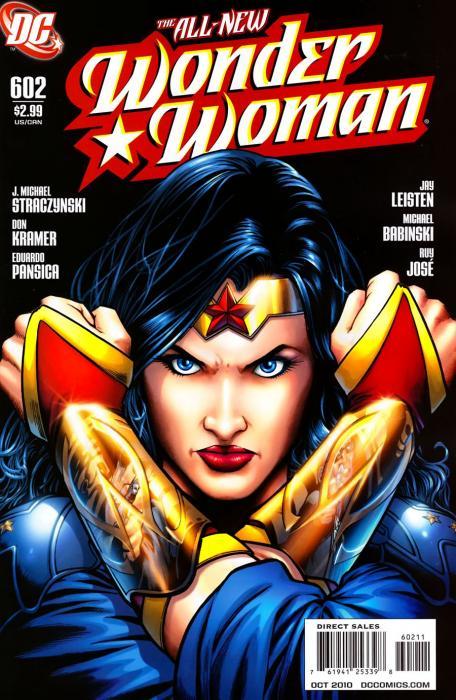
WONDER WOMAN #602
Writer: J. Michael Strazcynski Art: Don Kramer Publisher: DC Comics Reviewer: Ambush Bug
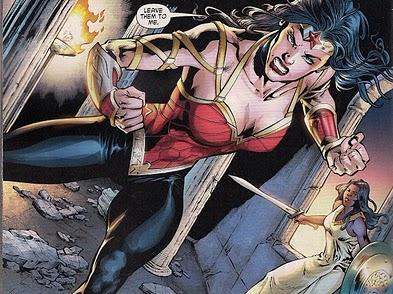
So I wasn't going to review this week. Since I can see the finsh line on my gaggle of interviews I did for SDCC this year, I figured I'd focus on that. Then I happened to read the new issue of WONDER WOMAN and before I knew it, I found myself typing this one out. The big controversy of this book is the debate over Wondy's costume change. The slutty stripper look was out and Jim Lee was recruited to design a new look for the Princess. Now, I wasn't really up in arms about this new look. It's reminiscent enough of Diana's old costume with basically the same color scheme. The bracelets are there, only now more detailed. The headdress. The bustier. The stars. Seems to me, the only thing that most people have a problem with is the nineties half coat she wears. JMS tried to justify the change in costume by saying that WW is more gritty now and needed something a bit more concealing in order to go into battle because things were going to get gritty for the Amazon very soon. This is all well and good, but in this issue, just before Diana jumps into battle, JMS' statement is kind of blown to shit as she takes off the much loathed jacket and dives into battle.And you know what? The golden arm lacing underneath was a pretty fantastic design. Hopefully, JMS will lose the jacket look and go with the look of Diana at the end of this book, which in my opinion, is pretty bad@$$. I could see this design making its way to the big screen and being somewhat believable (which is probably one of the main reasons for the redesign anyway). Lee's design is simplistic. The changes are subtle (really she's just wearing pants). The real difference is in the little details of the costume like the arm wraps, the detailed bracelets, and the stylized headdress.
 But enough playing fashion police for superheroes. The costume was really just a non-story publicity stunt to pull in new readers. What about the story itself?
Seems someone has pulled a cosmic whammy on the Amazons and made it so that the world didn't know they existed. I have to give JMS some credit for balls since he was so up in arms against the way his run on AMAZING SPIDER-MAN ended, which basically had the same premise (that the world forgot who Spidey was / that MJ & Pete never got married), for doing a story like this. Maybe he's trying to prove that he can make this premise work (which Marvel is failing at miserably, BTW). Who knows the motivations behind it, but there are more answers than questions in this six-hundred and second issue of WONDER WOMAN. With an army trapping a group of Amazons in Turkey armed with goddess-killing weaponry, Wonder Woman must lead these Amazon survivors to safety.
What follows is a lot of the talky. Sure, this exposition is important, but it takes a whole lot of time before Diana leaps into battle. The beginning of this issue is a page turner with Wonder Woman barrelling through tanks and trucks, a one woman army full of rage. But the talky slows down this comic to a screeching halt. Sure, JMS has a gift for gab, but here, for some reason, seeing Diana cut loose at the beginning had me itching for more. Eventually there is a pretty fantastic action sequence after the talky to finish the issue. JMS is good at the single issue yarn, so while a tad on the boring and redundant side (the info given in one panel is immediately repeated by another character in the second panel on one page, I shit you not), it did build for some nice emotional investment for a development that occurs late in the book. The issue in itself was finely crafted, but the dialog in the middle made for some thick muck to plow through to get to the good stuff.
My final point of discussion to raise here is about the final page of this book. Filled with rage, Diana lets loose on these human soldiers who have killed and hurt many Amazons. The last page has her standing triumphant, covered in scars and blood, with a blood stained sword and shield. Not long ago, everyone lost their shit when Diana snapped the neck of Maxwell Lord. And for issues after, Diana was filled with angst and grief over it. The killing was even retro-fixed by Geoff Johns when Max was brought back at the end of BLACKEST NIGHT. Here, Diana decimates an army of soldiers following orders. Sure this happens off panel and JMS could get all GI JOE-y about it and say they all received non-lethal wounds, but there's no indication that Wondy didn't tear through them like tissue paper and eat their hearts for killing one of her beloved sisters. What frustrates me is that I have no problem with Wondy being a warrior-born with no guilt about killing on the battlefield, but let's have a bit of consistency here. Let's see if the same folks complaining about Diana going all neck-snappy on Max have anything to say about her killing an entire army.
Despite the criticisms, I am liking this book. JMS delivered a strong single issue, though it did lag in the middle. While the headlines may be all about the costume change, JMS is doling out a solid story, despite the inconsistencies and hypocrisies. I've always been a fan of WONDER WOMAN, but have yet to read a Wondy comic and thought it was absolutely fantastic. Here, JMS gets close. Close enough to have me come back to see if he gets any closer.
Ambush Bug is Mark L. Miller, original @$$Hole / wordslinger / reviewer / co-editor of AICN Comics for over nine years. Support a Bug by checking out his comics! MUSCLES & FIGHTS VOL.3 & MUSCLES & FRIGHTS VOL.1. VINCENT PRICE PRESENTS: THE TINGLER #1-2 (interview, interview, preview, & review) VINCENT PRICE PRESENTS #20 WITCHFINDER GENERAL (preview, review, in stores Aug 25th!) NANNY & HANK miniseries (interview, interview, interview, preview, & review, in stores in September!) Zenescope’s upcoming WONDERLAND ANNUAL 2010 (in July Previews Order # JUL10 1200, in stores in September!) ROGER CORMAN PRESENTS DEATHSPORT miniseries (in September Previews Order #SEP 100860, in stores in November!)
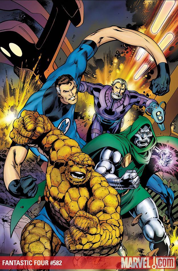
FANTASTIC FOUR #582
Writer: Jonathan Hickman Art: Neil Edwards Publisher: Marvel Comics Reviewer: Rock-Me Amodeo
And to think, my grandfather used to call them “funny books.” I wonder what he would think if he could have read books like this. Ah, he’d probably still call them funny books.Not me. I’m enthralled. I’ve looked forward, more and more, to each issue of Hickman’s FANTASTIC FOUR, for the art also, but mostly for the story. The plot, players, the scope…see, there’s one thing that almost guarantees a mediocre run of any book that has Mr. Fantastic: you can’t write a genius if you don’t at least lean in that direction yourself. And I’m thinking Hickman has a MENSA card tucked in his wallet somewhere.
In fact, I’ve had this growing feeling each month, a pseudo-deja-vu, as I read each new development, twist and jaw-dropping concept. And I finally figured out what that past emotional echo was. It’s how I used to feel when I picked up an issue of PLANETARY. Hickman isn’t quite as “out there” as Ellis, but man, this book has genius fueling it. And it’s accessible genius. That’s a neat trick.
In this issue, Richards, Grimm and Doom continue to play their roles and stay within the framework of the characters they will become. We also see a few other subplots put to rest, like Franklin and Val’s visit from the future, “all hope lies with Doom” and all that. And like any good continuing monthly, it also raises a few more subplots, since it seems Franklin and Val may not be quite as dead as they initially thought they would be (gee, ya think?) and Val’s advice to her mom is predictably vague. In the end, I probably should be upset at the way things finished, but oddly, it seemed appropriate.
The only weak spot, for me, was the arrival and departure of the utterly disposable Anachronauts. I know things had to tie up quickly since this was only a two parter, but honestly, these guys could not have been deader on arrival if they had all been sporting red shirts and a Star Fleet insignia. Or maybe they were all engaged to Cartwrights. Or both (you know how these space-time things can go.)
But overall, a good issue, and a good story in a string of good stories. Nigh bottom-line for me is, I really like this run. Like “Half-Life” was the thinking man’s first person shooter, FANTASTIC FOUR is the thinking man’s action book. It’s high science fiction.
Before I end, I should point out how much I’ve enjoyed Edward’s pencils. If Bryan Hitch and Jose Garcia-Lopez had an artistic lovechild, I think it would be Edwards. Yeah, some of his panels are a little wonky, okay. However, most of his work is wonderful, and drips of potential. His name has never rung any bells with me until this run, but he reminds me of the first time I saw a fairly unknown artist with dashes of brilliance, some guy named Perez. And I’m not saying Edwards is the next George Perez, nor should he be. I’m just saying, since he’s a relative newcomer to comics, we haven’t even seen this guy’s best stuff yet. So keep an eye out for his work, because not only is he good, but he’s going to keep getting better. That is, if he sticks with funny books.
Rock-Me Amodeo is a daytime computer guy and nighttime all kinds of things. He’s also probably the only guy ever to write a book and a movie still hoping he might someday break into comics.
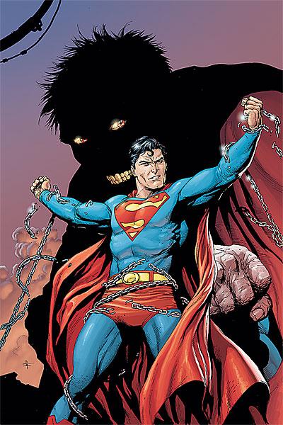
SUPERMAN: SECRET ORIGIN #6
Writer: Geoff Johns Artist: Gary Frank Publisher: DC Comics Reviewer: Johnny Destructo
“Besides being an excellent author, Geoff Johns must be one hell of a chef, able to take even the most stale ingredients and make a mouth-watering buffet of brain-steak. SUPERMAN: SECRET ORIGIN shouldn’t appeal to me in the slightest. I’m not a Superman fan (except for the films and a handful of extraordinary graphic novels). I, like most of the general population, am aware of the origin of Supes. And yet here Johns takes elements from the SMALLVILLE television show, the Superman movies and the original origin story and cooks up something that tastes different then what I was expecting.The pencils by Gary Frank, one of my fave artists working today, are quality as always, and he’s pulling the same trick that’s been getting me for the past couple years, in that he’s drawing Clark to match the facial features of Christopher Reeve (the most well-known actor to wear the tights on film).”
The above was taken from my review of issue #1, and 5 issues later, it still holds. This is the only Superman story since Grant Morrison’s maxi-series that I’ve read all the way through, let alone enjoyed! Although reading a Superman origin story is basically like reading a Chinese takeout menu (I mean, really -- you look and look, but you still order the same 3 things every time), it can still be a good time if it’s done right. And this one definitely was. I actually wouldn’t mind if this was a reboot of the character and we were starting fresh from this mini-series. This is what Geoff Johns does best -- that is, steal my money with his amazing comics.
Stupid, talented jerk.
JD can be found hosting the PopTards Podcast, discussing movies, comics and other flimflam over at www.poptardsgo.com, graphically designing/illustrating for a living, and Booking his Face off over here.
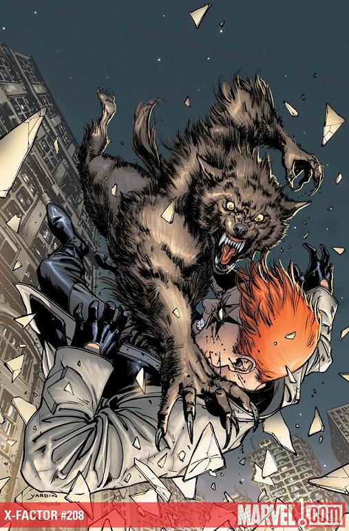
X-FACTOR #208
Writer: Peter David Penciler: Emanuela Lupacchino Published by: Marvel Comics Reviewed by: BottleImp
With all the team books, epic crossovers and earth-shattering event books put out by the Big Two that have been choking the stands over the past—well, I guess it would be fair to say over the past decades, although it certainly feels like the “major event” trend has become more pronounced in the last few years—it’s hard for a jaded comic book reader like myself to imagine a time before the idea of a shared fictional universe. If we trace the notion back to the beginning, we certainly have to thank Sheldon Mayer and Gardner Fox for bringing DC’s heroes together as the Justice Society of America, comicdom’s first superhero team, in the pages of ALL-STAR COMICS. But even then, the characters had little interaction with each other. The team would meet, then split off into solo adventures, with each hero’s tale written and drawn by a different creative team, then they’d all meet back at the end for a group shot. The individual stories would have no lasting impact on the world these characters inhabited, and each character’s world would in turn have little impact on the others.No, the real breakthrough in that notion of a shared universe came when Stan and Jack (along with Steve and later Gene and John and a whole slew of talented writers and artists) did their thing in the 1960s, and decided that the Marvel Universe would be peopled with characters who would interact with each other in ways that had never been seen before. The Fantastic Four could run into Spider-Man over the New York skyline, Doctor Doom could take a break from harassing the FF and take a turn at being a dick to the X-Men, and a Norse god could descend from the heavens to piss off an irradiated scientist with anger issues. How wonderful it must have been for a young reader at that time, how thrilling to think that each month could bring strange new adventures and new characters to the newsstands! But now the shared universe is old hat, and has devolved into characters being spread around multiple titles so often and with such heavy-handedness that it’s a relief to find a Marvel title that DOESN’T feature Wolverine or Deadpool as one of its major players.
The reason I bring this notion into discussion is this: the once-novel idea of a shared universe is now the norm. What was once a joy to experience has become, more often than not, a colossal bore. Even worse, the tightly wound skeins of continuity that run through Marvel’s (and DC’s, but let’s stick with Marvel for the sake of relevancy) titles seem to have become a sort of creativity straitjacket for some, leading to stories that lack the energetic punch that you could find even in the lower-quality Marvel comics from those early years.
There are, however a few happy exceptions. Peter David’s X-FACTOR stands out as perhaps the best.
The genius of David’s recent work in this series is that he embraces Marvel’s shared universe in the best possible way: by being wonderfully unpredictable in the ways he brings his team of fringe characters into contact with other denizens of the Marvel U. Sure, there are the standard mutant menaces to be faced, but aside from the dull-as-dirt (and most likely editorially mandated) Sentinels, in the past year David has given his readers a great Dr. Doom (both present-day and old-as-fuck, crazy-as-shit, still bad-ass future version), an obligatory superhero slugfest with the Fantastic Four, a cameo from Dr. Strange villain BARON MORDO, for chrissakes! and now David is gleefully pitting Jamie Madrox’s offbeat detective agency against the Norse Goddess (and sometimes Thor’s foe) Hela, with the fate of 1970s Jim Starlin staple Pip the Troll at stake. I don’t know how Pip managed to avoid appearing in Abnett and Lanning’s Starlin-heavy cosmic titles, but David is certainly putting him through the wringer here. The cameos in X-FACTOR are so varied that this title never feels predictable; the added bonus is that the main cast is equally unpredictable in their own situations.
Remember way back when, when Rahne Sinclair (aka Wolfsbane) had to leave the X-Factor team to go be on Marvel’s latest X-FORCE iteration? David took this blatant editorial character shuffle and managed to turn it into a poignant parting between Rahne and her sometime boyfriend Rictor. Then there was that whole Rictor/Shatterstar thing—you know, the one that outed Rob Liefeld as a major homophobe? What initially looked like a publicity stunt has developed into an exploration of character, sexuality, and relationships. And just when everything was looking smooth, David cranked up the volume on this soap opera by bringing a very pregnant Rahne back into the picture. In lesser hands, this would be melodramatic cheese. But by balancing the pathos with liberal doses of his snarky brand of humor, David gives a liveliness and a startling sense of realism to the scene. Well, as realistic as you can get when you have a pregnant werewolf tackling a half-naked extra-dimensional killing machine out of a second-story window.
As good as David is with the script, part of what sells X-FACTOR as being more true to life than every other mutant book on the stands is the superlative artwork that has graced this series since its beginning. Taking the reins this issue is Emanuela Lupacchino, and she has done a wonderful job maintaining this title’s level of excellence. Her drawings blend realistic proportions with simplified lines that never fall into the trap of being too cartoony, and she really sells the story with the fantastic facial expressions that each character is given. I don’t know if Lupacchino is just doing a fill-in or if she’s taking over regular art duties, but either way this title could do much worse.
For both story and art, for the quirky characters and the unpredictable situations, and for the blend of drama and humor that marks every issue, X-FACTOR remains a joy to read, a wonderful throwback to the days when Marvel really WAS the “House of Ideas,” and you never knew what was going to be waiting for you when you turned the pages that month. And best of all (at least in this reader’s opinion): no Wolverine.
When released from his Bottle, the Imp takes the form of Stephen Andrade, an artist/illustrator/pirate monkey painter from the Northeast. You can see some of his artwork here. He’s given up comics more times than he can remember. But every time he thinks he's out, they pull him back in.
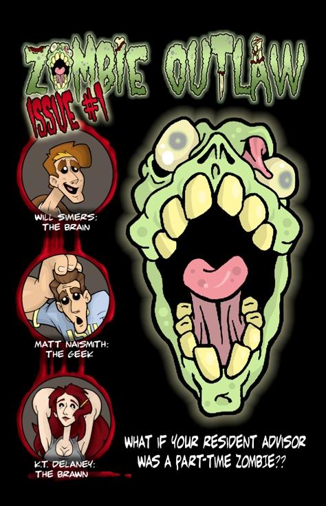
ZOMBIE OUTLAW #1
Writer: Brian J. Apodaca Art: B. Paul Jordan Publisher: ComiXpress Reviewer: Mr. Pasty
Ah, the glory days of college. Busty babes, brawny brutes and your part-time zombies. What, your place of higher learning didn’t feature killer zombies entombed in the bowels of the campus library? Sheesh, you shoulda transferred to Irvine State University (ISU) where you could have majored in Zombie Arts alongside Will Simers and his resident advisor Matt Naismith.Too complicated? No problem, picking up ZOMBIE OUTLAW #1 will give you the same experience and won’t put you 100k in debt. This latest entry into the saturated genre of flesh-eating zombies is big, bright and fun. Right away you’ll notice that B. Paul Jordan’s artwork has a very lighthearted and cartoony feel that is a refreshing change from the Ross clones that take themselves way too seriously. I’m reminded of the old RADICAL RICK animated strip from the back of the BMX Plus magazine in the late 80’s in its ability to stay both edgy and accessible at the same time. Simply put, this is a comic book that delivers.
Of course the plot (just like most zombie plots) is graphene-thin but just as strong. Writer Brian J. Apodaca isn’t trying to invent the wheel because that’s impossible. The wheel has already been invented, just like the zombie comic book has already been done ad nauseam. ZOMBIE OUTLAW succeeds because it recognizes the limitations of its source material and instead focuses on exploiting its strengths.
To that end, this book is filled with all the components a jaded reader might demand when grading this effort. Unlikely hero? Check. Girl with big tits? Check. Hapless bystanders with exposed flesh and slow reflexes? Check. If you must know, the ISU campus rests on the site of an 1872 zombie battle that now houses the corpse of outlaw Edward Dransby. On that corpse is a super-special hat that would really help elevate the grade of Matt Naismith’s thesis -- but don’t expect ol’ Eddy to just hand it over.
Yup, this is Zombies 101 that reads more like an honors class. Credit to the team of Jordan and Apodaca for making it work. That’s a pretty tall order in this day and age considering how may times we’ve had zombies shoved down our throats, but like BREAKFAST WITH ROB, the gang behind ZOMBIE OUTLAW resists the urge to paint by numbers and instead creates a comic book that doesn’t require any kind of intense commitment or 18 issue character arc to enjoy. You pick it up, read it and have fun. That’s the reason I got into comics in the first place and a re-emerging trend that I for one am hoping will continue. For anyone that’s looking to join that movement, ZOMBIE OUTLAW is as good a place to start as any.
Web heads who can’t get enough of Mr. Pasty’s word vomit are encouraged to watch him operate as Nostradumbass over at MMaMania.com here. Love, hate and Mafia Wars requests should be directed here.
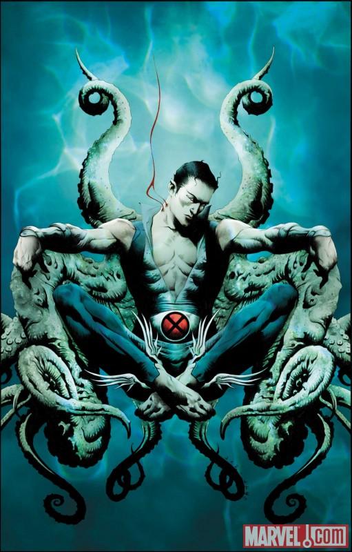
NAMOR THE FIRST MUTANT #1
Writer: Stuart Moore Art: Ariel Olivetti Publisher: Marvel Comics Reviewer: Ambush Bug
God, I hate my optimistic side. I really want to read a good modern WONDER WOMAN comic or a good modern AQUAMAN comic or a good modern NAMOR comic, but for some reason, it really hasn't happened yet. Despite the fact that it is tagged with an annoying X-Men crossover tag, I decided to give the first issue of NAMOR THE FIRST MUTANT a try. Though I was a fan of Byrne's series from the nineties, I really can't say, I know the reason why I like the underwater heroes other than the fact that they are the underdogs of comicbookdom and I love rooting for the underdog. While Namor and Arthur Curry are pretty different characters, both have been given the short end of the stick (the shallow end of the pool?) when it comes to their own series, despite them being some of comic books' oldest and most recognizable characters. Stuart Moore has always turned out solid work and I love Ariel Olivetti's painterly style, so when I saw their names on the cover, I had to pick this one up.I wish I could say this was the comic that does Namor justice, but sadly, I didn't really like it. The main reason why was simple: the issue was pretty boring. Panel after panel of people talking and swimming, waxing expositorically ad nauseum. Sure Namor has a long history, but is there a way of explaining that without filling the ocean with word balloons? Midway through, Namor comes across a vampire squid. A damn cool concept; one maybe artist Ariel Olivetti could really lot loose with and make for some dynamic panels.
Nope.
Namor finishes it off in three small panels. And then we're back to swimming and talking.
Missed opportunity of the highest order.
The other hit this comic has against it is that it's so closely tied into X-MEN. Having evolved past my addiction to mutant comics, the X-Men logo offers no pull for me. Seeing that Namor is so closely tied to the X-books may yank in a few X-readers, but for me, it didn't work. If anything, having a first issue focus so much on another comic's storyline only gave me the impression that this comic doesn't really have a strong premise on its own. I'm assuming this is an ongoing series. If it is, then it should have taken a few issues to be able to stand on its own before diving right into a crossover. This is what kills my interest in X-FACTOR, a comic I usually love, but have a lot of difficulty getting back into after every crossover. Happening right off the bat like this immediately strains any interest I may have here.
The art is pretty sweet. Ariel sure knows how to draw people swimming. Thank god, because that's what Moore has him do here over and over. There are a few panels though where the size and proportion of the characters seem a bit off; as if Olivetti drew them separately and tried to resize them to fit into the same panel. The action scenes are pretty dynamic and there is a nice chase with some good intensity toward the end of this comic (plus a decent, though page consuming double splash of an underground tunnel full of vampire sea monsters).
All in all, though, this was a bit disappointing for someone rooting for a kick@$$ Namor comic. What I got was filled with people swimming and talking and seemed to lack a voice of its own due to the crossover. Too bad, really. I wanted to like this one.
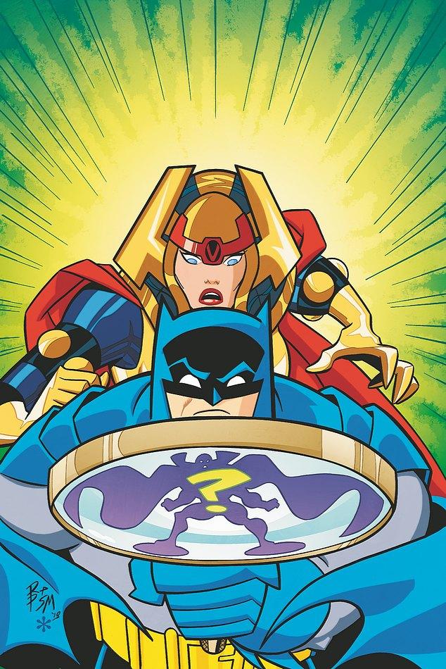
BATMAN: THE BRAVE AND THE BOLD #20
Writer: Robert Breenberger/Landry Q. Walker Artist: Robert Pope & Scott McRae/Eric Jones Publisher: DC Comics Reviewer: Lyzard
What I love about BATMAN: THE BRAVE AND THE BOLD, the TV series, is its tongue in cheek nature. Sure, it isn’t any BATMAN: THE ANIMATED SERIES, but it is willing to poke fun at itself (especially in any episode featuring the pathetic Aquaman). So when I found out there was a comic based on the series, and at this point there really is a comic for any video game, TV series, or film property out there, I was excited. Poor, poor, bitter disappointment arose. BATMAN: THE BRAVE AND THE BOLD is nothing like its television counterpart with the exception of its attempt to copy the animation style.The particular issue I grabbed was BATMAN: THE BRAVE AND THE BOLD #20. You don’t need to read a prior issue because the book is self-contained. But you do need to know the DC Universe to understand the characters that come into play within the comic. Unlike say, the Nolan films, there is more in THE BRAVE AND THE BOLD universe than the usual Batman fare. Sure, you get Catwoman, the Joker, the Riddler, etc. But you also get other DC characters from other properties that appear in Gotham City.
The story in BATMAN: THE BRAVE AND THE BOLD #20 is called “Home Wreckers”. Actually, it’s a two-part story, with each part in the same book. Don’t ask me why they do this, even without their putting the additional story between Batman and Martian Manhunter in between. The main story follows Batman as he tries to help Big Barda find her husband: Scott Free.
As I mentioned in my ARCHIE AND FRIENDS #146 review, the artists get lazy, especially in the fight scene between Barda and the Furies. I couldn’t feel the action lifting off the page; it did not feel kinetic to me. It felt more like the beginning and end of a motion, never the middle. The colors also don’t fit the normal Batman universe. I expect black, blues and grays. Instead there are tons of red, yellows, and even some greens. I know the TV series has vivid coloring too, so I cannot fault the colorist too much for following the source material.
The comic almost talks down to the reader. I realize they are aiming it towards kids, but when the action shows something, you don’t need to repeat it in the dialogue. Even “kid” movies, like the great Pixar films, are not condescending; they’ll drive the message home in a fun and interesting way. BATMAN: THE BRAVE AND THE BOLD #20 fails to cross the line between kid and adult comic. Using Pixar as an example again, what John Lassiter has always said is that he wants to make movies he wants to see. I highly doubt this is a comic the writer would have wanted to read. The dialogue is cliché, repetitive; nothing pops out in a good way.
Overall, if you cannot already tell, I was very disappointed in the work put into the comic BATMAN: THE BRAVE AND THE BOLD. The television show is far superior to the comic in every way. Plus, watching the TV show is free. So don’t go wasting your money on buying the comic when you can just sit down to Cartoon Network and laugh at the jokes, instead of laughing at the awfulness that is the BATMAN: BRAVE AND THE BOLD comic.
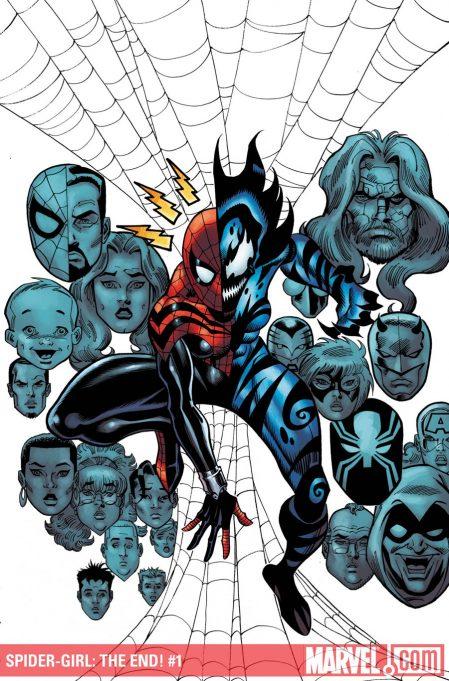
SPIDER-GIRL: THE END #1
Writer: Tom DeFalco Art: Ron Frenz Publisher: Marvel Comics Reviewer: Henry Higgins is My Homeboy
Parting Is Such Sweet Sorrow....Again.Going by the comic industry as it is today, SPIDER-GIRL should have died years ago. The ages of the characters, the old school fun, and (let's be honest) having a female lead just doesn't usually work, unfortunately. But somehow, this series has outpaced numerous other series’ extinction along the way. SPIDER-GIRL, which has always been in threat of being killed off, has gotten another cancellation. And with SPIDER-GIRL: THE END, the series gets a proper send off. The issue ends a long running plot point, giving the series a good end--should this be the final issue ever.
Writing 4/5: Tom Delfaco, who's been running the series since its inception, gives the series a fair end, if not perfect, with a closing off of the "Menace" story, which has been an interesting read, if not great--the shadow of the hero and all that. The juxtaposition between April and May has always been entertaining, and it continues with that idea. When the two converse, you actually have a few moments of sympathy for April, but you still side with May. That's the sign of a good character, to elicit that reaction. The time shift sets up a nice introspective look at April. The issue is missing a few things, notably a farewell to the supporting characters that have made this series so much fun (Darkdevil, Normie, and Phil don't really do anything, or even appear outside of faces in the last scene). Part of the reason the series is so fantastic is because of the great supporting cast, and it would have been nice to see more of them. Also, for a SPIDER-GIRL finale, it didn't feature nearly as much Spider-Girl as you would expect. The issue ultimately focuses more on April and the conclusion of her arc, which would have been ok if it wasn't the finale. But the writing is as it always is: insanely charming and fun.
Art 4/5: The art follows the traditional SPIDER-GIRL art scheme--fantastic. The panels have a certain timeless quality to them, definitely different than anything else is on the stands. It feels like an old-school SPIDER-MAN comic, which was the idea behind the series. A few shots here and there falter about, but it keeps up it's high standard for almost the entire book.
Best Moment: The expression on April's face shortly before the end of the book, ****SPOILER**** as she's about to die.****END SPOILER**** It's a very quiet moment, and it makes you feel so bad for this character you hated moments ago.
Worst Moment: For Spider-Girl’s last hurrah, she's not exactly the star here.
Overall 4/5: If this is how the series ends, so be it. I'll be keeping my fingers crossed for another go, though.
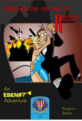
EBEN07 ADVENTURES
Written by: E. Burgoon & D. Bethel Art: D. Bethel Publisher: Brain Food Comics Reviewer: Optimous Douche
James Bond is a messy bastard. Think about any Bond adventure and the veritable shit storm left in his wake. Swiss chalets tumbled like matchsticks (people lie in there, asshole), exploded tanker trucks, toxic chemicals left sitting on a warehouse floor after the bad guys have been apprehended…and don’t even get me started on the amount of DNA the man spooges inside of bed linens, allies, and victims alike (before they are dead – I hope). For a guy that is supposed to be a secret agent, he leaves a trail of destruction on par with a Kansas tornado in August. So how does he remain undercover? Why has his identity not been exposed to the media with every hapless misfire of his Aston Martin rocket launchers? Well, I can’t speak for Her Majesty’s Secret Service, but I can sleep well at night knowing that American covert operatives are neatly and discretely being “picked up” after by Eben07, agent of the Intelligence Cleaners Agency.Despite my general misgivings about reading comics electronically, I fell in love with the exploits of Eben07 as a web comic property early last year. Each panel of “For the Love of Russia” was craftily delivered as one joke pages each week that masterfully weaved together a full tale of espionage and intrigue as Eben07 “picked up” after a top operative in post-communist Eastern Europe. Thankfully the boys at Brain Food heard my bemoaning on the intangible nature of their webby goodness. Now, “For Love of Russia” and other Eben exploits can be held, read, felt, licked, fucked (whatever you like to do with your comics) right in your hands. I received three tales that I will unmasterfully try to summarize, while dusting off some of the cleverness I can hazily recount from the Eben07 web property.
Don’t let the glasses and lack of ocular definition fool you, because any similarities to Dilbert end right there. Eben07 is not some mealy-mouthed little bitch that just bemoans his daily existence. Eben is a man of action, a man who cleans up the messes left behind by more careless operatives…and, he just so happens to lack ocular cavities. Plus, the art and humor contained within the pages of Ebon would make Scott Adams green with envy. Seriously, if some upstart cable channel is looking for a cartoon property to dispel to the masses, look at the success of “Archer” and ride that wave by signing Eben. Even though the boys were looking for me to hock their latest brainchild ‘Operation: 3 Ring Bound” I would be remiss in this review if I didn’t cover some of my favorite past ground. I’ve always been a huge fan of parody, hence why my long boxes have a healthy heaping of MAD magazines. I truly feel EBEN07 shines when he is poking fun at the James Bond flicks both in title and form. “For the Love of Russia” has very little to do with the Connery tale of yore, but it does send Eben and partner Ninja Dan behind the iron curtain to tackle gypsies, train espionage and the general clust-fuckery that Eben so naturally brings to any and all situations.
While not a comic I was able to touch, feel, lick, fuck, “Operation: Goofinger” gets a shout out simply because I love the name (remember, Eben creators -- more Bond parodies please). You can still get this gem online simply by cutting and pasting “Operation Goofinger” into Google. This is a joyous romp that takes Ebon and partner Ninja Dan deep into Fort Knox. Get it?...gold…goo…finger…fuck, I feel old when I have to explain this shit. While I probably would have made this a cleanup of the spy spooge I mentioned earlier in this review, I am merely a frustrated writer. The boys at Brain Food had a story to tell, and tell it they did. Again, leveraging the medium they had to work in, each page or strip delivers its own rewards while still fitting into a greater story. While on the website also check out “Operation: Clean the Cleaners” that reveals the origin of the ICA on a case to find out who stole “The shot heard around the world.” (Extra bonus points for Gen Xers that finish that statement with “was the start of the revolution, the minutemen were ready on the move”)
Even though I’m here to truly tout OPERATION: 3 RING BOUND, I think this one took the “cleaner” element of Eben a little too far. Don’t get me wrong, the hilarity in this issue is delivered in spades as Eben and Ninja Dan are sent back to High School a la “21 JUMP STREET” to uncover the disappearance of operatives that were disguised as janitors. Seriously, this is a fucking funny book as these two thirty-somethings try to blend into today’s high school environments. My particular favorite moment was when the guys loaded up their iPod with the hottest rock tunes from the likes of Nirvana and STP…sadly those tunes are now officially in the realm of classic rock.
No, my favorite adventure to date is hands down “Operation: Mongoose.” And there is nary an Eben to be found. No, this adventure is a prequel that explores the start of the ICA under Eben’s ancestor Abel. At the crux of Mongoose are shadow puppet organizations that have been orchestrating world events from Castro to the assassination of Lincoln. I can’t help it; I’m a sucker for alternate history.
Well drawn, expertly written and never taking itself too seriously, Eben is a damn fun work timewaster and an even better read in print. Keep up the good work, gentlemen, and remember two things: more play on Bond movies, and please for the love of God can we get Eben on an exchange program to clean up after a certain British spy.
Optimous has successfully blackmailed fellow @$$Hole BottleImp into being his artist on Average Joe. Look for Imp's forced labor on Optimous brain child in mid-2011 from COM.X. Friend Optimous on FaceBook to get Average Joe updates and because ceiling cat says it's the right thing to do.
ULTIMATE MYSTERY #2
Writer: Brian Michael Bendis Artist: Rafa Sandoval Publisher: Ultimate Marvel Comics Reviewer: Johnny Destructo
OK. So, I’m kind of lost as to the point of the format for this/these series(es?) Decompressed storytelling was pretty big for awhile there, and it seems to have gotten better over the past year or so, with shorter stories taking place (“Siege” was amazing and nice and quick!). So what’s the deal with this? ULTIMATE ENEMY was 3 issues, which led directly into ULTIMATE MYSTERY, which I assume will lead into …ULTIMATE CEREAL? ULTIMATE ...TOASTER? (I dunno, I try to avoid Previews and spoilers whenever possible.) The point is, I’m sure there’s another mini-series coming after this one. Why? Why not just do one 12 issue maxiseries called ULTIMATE MYSTERY? So they can get the unsuspecting to buy three #1 issues that are all part of the same story? Does anyone LIKE this format? Let me answer that for you. No. Even if you answered “yes” to that question, you’re wrong and I’m right. Also, you look dumb in that turtleneck sweater.So, while I don’t approve of the format, I have to say this second issue of the second miniseries of this maxiseries (see? it’s ‘tarded when you have to spell it out like that, right?) is pretty good stuff. I can’t say I’m incredibly intrigued by the mysterious enemy itself, but the dialogue for Mahr Vehl [or Captain Marvel (see what they did there with the spelling and the what-not?)] is pretty brilliant, especially in issue 1. Friggin’ awesome. Also, can I have a Spider-Woman series now please? She is one of my faves of the current Ultimate U. I love that she is the female version of Peter Parker (quite literally a clone) and that Human Torch has a crush on her and that it’s wicked awkward for her and Peter to interact. Love it.
My favorite aspect of the Ultimate Universe is the fearlessness with which the characters evolve, and how different they are from what we know in the 616 U. I’m a sucker for alternate versions of characters, and I love that the writers are getting more fearless with that. Bendis is exploring things like “if Ben Grimm isn’t forever trapped in a body made of rock, what does that mean for the character?” I’m sure a lot of fans are annoyed that he isn’t still the spitting image of the 616 Thing, but I’m grateful that Bendis is taking risks like that. Yes, let’s see what The Thing would be like if he was a super-powerful purple fella. Why not? I’m also curious to see what the deal is with Reed Richards. Supposedly he perished in ULTIMATE ENEMY, but is he mini-series dead, or ULTIMATUM dead, and if the latter, what does that mean to the FF as a team? So many questions that I’m curious to see resolved.
Again, I don’t really care about the Enemy itself, as much as what it has wrought. I can’t wait until the fifth part of the seventh miniseries that ties all this together to find out! Ahhh, sarcasm. You’re my only friend.
PS. J Scott Campbell, you are absolutely one of my favorite artists working today. But Rick Jones is supposed to be 15 (so it says in this issue)…why did you draw him with the physique of a 25 year old athlete with Willem Dafoe’s face?
PPS. The 616 Nick Fury sight gag was purdy funny.
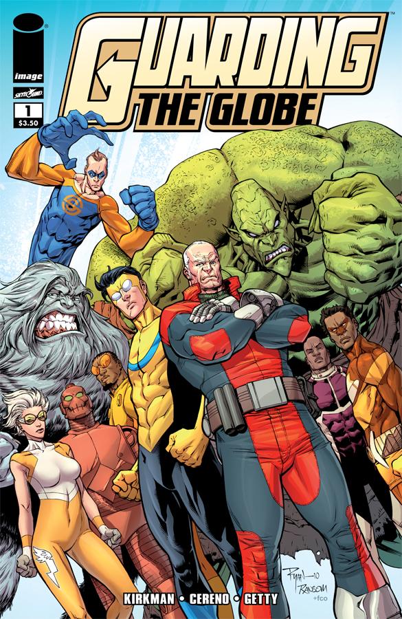
GUARDING THE GLOBE #1
Writer: Robert Kirkman / Benito Cereno Art: Ransom Getty Publisher: Image Comics / Skybound Reviewer: Humphrey Lee
There’s two main things I learned with this debut issue of GUARDING THE GLOBE: One, I’m pretty much Kirkman’s bitch and will hand him $3 to $4 for anything with his name on it (yes, I got SCIENCE DOG this week too), and two, I really do love a lot of these characters that have been born within the pages of INVINCIBLE these past several years. They have been fleshed out enough to always warrant some attachment to them and I’ve always felt that at least a mini such as this would be worth a shot. Now that it’s here I hope it hits ongoing status toot sweet.Given, there appears to be some growing pains here. The book moves through a lot of things and feels speedy despite it actually being quite a wordy read. It’s actually got what I call “Invincible Pace” down pat, where a lot of concepts and plot threads are thrown at you with some lengthy exposition, but it happens at a breakneck pace. This kind of overwhelms here a bit though, because usually all those multitude of shenanigans in the pages of INVINCIBLE are happening to just the front-most characters. In this case, there’s more than a handful to keep tabs on, leading to the one other real downside this issue may have; if you’re a fan of INVINCIBLE it’s pretty easy to keep up with these guys and what’s going on; a total newb, though, might have an issue with staying with the pace and people.
Once these quibbles are out of the way, though, what remains are the inherited thrills and joyousness from this book’s parent work. I love the nonchalant way that INVINCIBLE revels in its super heroic tropes and it thankfully carried over to this book. From yet another Flaxan invasion at the beginning, to the Brit sequences where he’s just randomly donned jet boots and some arm attachments to enhance his strength, this book just owns what it is. And this is all a good sign because I will assume that, since he is a busy man with a very big TV show debuting soon, Mr. Kirkman will be giving the reins a little more to Mr. Cereno. Between this and the ATOM EVE books he worked on, it is obvious he knows these characters and can work well with them and in developing them.
Random Getty is the name I’m unfamiliar with here, but I’m already a fan of his pencils with this. It’s the kind of superhero art I enjoy; the figures command the presence they should, each panel is packed with detail and action without feeling crowded, and it has great flow. Seeing more of it actually has me as excited about this book as the idea of getting more time with these characters each month (especially Brit--love that Brit). I think it’s just about time something like this came into being. These characters were just too rich with personality to continue playing second fiddle to the guy who has enough going on with his own adventures in his own book. Oh, and when this thing finally does (hopefully) go ongoing? Just call it GUARDIANS OF THE GLOBE. I know the name of this mini has a meaning to go with the aim of this arc, but it’s still one trick enough to bother wasting time on. Everything else though? Pretty much aces. Keep it coming.
Humphrey Lee has been an avid comic book reader going on fifteen years now and a contributor to Ain't It Cool comics for quite a few as well. In fact, reading comics is about all he does in his free time and where all the money from his day job wages goes to - funding his comic book habit so he can talk about them to you, our loyal readers (lucky you). He's a bit of a social networking whore, so you can find him all over the Interwebs on sites like Twitter, The MySpaces, Facebookand a Blogger Account where he also mostly talks about comics with his free time because he hasn't the slightest semblance of a life. Sad but true, and he gladly encourages you to add, read, and comment as you will.
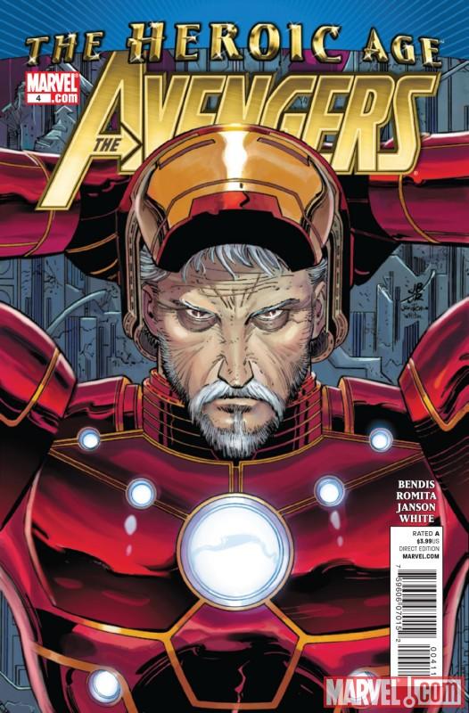
AVENGERS #4
Writer: Brian Michael Bendis Art: John Romita JR Publisher: Marvel Comics Reviewer: Henry Higgins is My Homeboy
Big and Loud.It almost feels like a counterpoint, reading both AVENGERS and NEW AVENGERS. Both had very solid, but not fantastic, opening issues. NEW has been fantastic, and just getting increasingly so. AVENGERS, on the other hand, has been lagging. This issue continues that descent and falters about.
Writing 2/5: As I said while reviewing last weeks NEW AVENGERS, Bendis writes a certain cartel of characters extremely well. But in here, they don't work as well. For every proper Spider-Man scene, we get one of Thor or Hawkeye just not landing correctly. Last issue splits the story in half, with one chunk of the team protecting New York while the other lands in the future. The home team gets the most focus and is more entertaining, to be honest. Jessica Drew is a very hit-and-miss character, but Bendis usually writes her well, as he does here. Killraven’s appearance is worth a couple of good lines, but the scenes with him slow down the book, though it might be interesting to have him stay on, which is actually what I'm expecting. The dialogue either is great or falls apart, and it mostly falls apart, with Hawkeye specifically not being funny at all.
The second chunk centers on the time team, and it doesn't really stand out at all either. Cap and Iron Man debate about killing Kang, which leads nowhere. We get another shot of the Maestro, and it doesn't lead anywhere either (though Hulk being ecstatic Wolverine is there because he missed him made me smile). The kids appear and again it leads nowhere. The future scenario should be more interesting and engaging, but it doesn't really do anything great.
Art 3/5: Seeing Romita's name on a book cover is usually a good sign, but this series really hasn't shown off any interesting art moments that truly stand out. This issue may have some fantastic sequences, but most of it is subpar. It's probably exemplified with Thor, during the big NYC time crisis scene. Thor’s face as he charges the aliens changes in appearance to Betty White. His face seems extraordinarily wrong. But it's okay in the long run, thanks to the utterly fantastic "Oh....oh shit." face he has, in the books best moment. Romita goes all out in a sequence of time collapsing utterly with Galactus, biplanes, dinosaurs, aliens, helicarriers, and blimps all appearing randomly. This issue shows the best and worst of Romita with some very lacking moments sandwiched between some brilliant.
Best Moment: The aforementioned New York time-fuck. It's just utterly fantastic.
Worst Moment: The story goes nowhere.
Overall 2/5: The series so far has felt like it should and could be so much more, but has yet to hit the proper pace. Hopefully it picks up soon, before it loses its new series momentum.