| #10 | 7/28/10 | #9 |
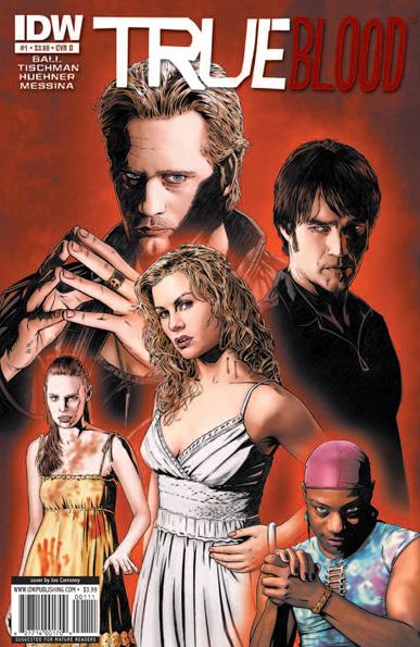
TRUE BLOOD #1
Story by: Alan Ball with Kate Barnow & Elisabeth Finch Written by: Mariah Huehner & David Tischman Penciled by: David Messina Published by: IDW Publishing Reviewed by: BottleImp
Okay, I’ll admit it—I’m slavishly addicted to HBO’s TRUE BLOOD series. I avoided it during its entire first season run; while my girlfriend tried to convince me that the vampires presented here did all the things that vampires are traditionally supposed to do, in my mind TRUE BLOOD was lumped in with all the trendy vampire hype of the last few years (tops on that list is, of course, the wretched TWILIGHT phenomenon) and I LOATHE the trendy vampire hype. But she wore my defenses down with tidbits of information about the series that tickled my interest (“It’s not just vampires; there’s a guy who’s a shapeshifter.” “Like a werewolf?” “Well… he turns into a dog, that’s KIND of like being a werewolf.”) and details that spit in the face of the teeny-bopper Twi-hard trend (“They bite people all the time, and you’re pretty much going to see someone naked in every episode.”), and I finally succumbed to the vampire trend and watched the first episodes. Needless to say, I was hooked. How refreshing it was to see vampires who actually drank blood, for whom daylight might be a painful, burning death rather than glittering like a glammed-up Abercrombie model, and were actually menacing. Sure, TRUE BLOOD is a soap opera…but it’s a balls-to-the-wall, entirely impossible, funhouse-at-the-fair kind of soap opera. The best part is that by virtue of being on a network with little censorship, TRUE BLOOD is free to revel in its sex and violence, while having a budget able to support (for the most part) depicting the more fantastic elements of its world.Herein lies the problem with IDW’s comic book version of the series. In theory, the comic book is the perfect medium to depict ideas of fantasy, because there is no budgetary limitation that would discourage special effects, exotic locations or intricate costumes. Basically, if the artist can envision what the writer puts down in the script, it can be presented on the page. But here’s the thing: HBO has already been doing a pretty good job of making the fantastic elements palpable. The setting is real-world, so no need for more imaginative vistas to serve as a backdrop. And even the special effects have been pretty effective; at least, they’ve been better than you’d find in your average Sci-Fi Channel movie-of-the-week. So in this respect, the comic book version of TRUE BLOOD doesn’t really give the reader anything that he or she couldn’t experience just by watching the series.
And make no mistake, you HAVE to have watched the series in order to understand the comic. Ball and his entourage of writers are clearly gearing this comic towards the already-initiated fans of the show. There is no way in hell anyone could read this issue cold and know what was happening. So right there, IDW is limiting its audience to cater to only TRUE BLOOD fans…which would be all well and good, if the series gave the reader something that the show could not. But as I’ve already said, the comic book doesn’t have a great advantage in the visual department. Sookie and the crew at Merlotte’s Bar & Grill are menaced by a creature from Indian legend with Lovecraftian tentacles and a B-movie monster lower jaw; it’s neat, and perhaps the show wouldn’t be able to pull it off without looking cheesy, but at the same time I can’t help but feel that this demon would be far more interesting were it presented within the format of the television series.
Maybe the reason that this comic is so unsuccessful is that much of the spirit of the show comes from its characters, and what each actor brings to his or her role to infuse that character with life. Messina, though certainly a competent artist, runs into the problem of relying on reference of the actors for his faces rather than adapting their looks to fit his style. You can easily tell which panels were drawn using shots from the series and which were drawn without reference; the end result is that the faces sometimes change panel to panel, or worse, Messina relies so heavily on his limited reference that the faces end up having a curiously flat quality, lacking in real emotional energy. As the demon-thing is tearing the redneck extras apart in the bar, the main cast looks surprisingly unmoved, while the poor doomed figures (NOT painstakingly drawn from screen captures) display the quality of real emotion that Messina seems unable to instill into his photo-realistic drawings of Anna Paquin.
The final nail in this comic’s coffin: the price. $3.99 for a substandard version of stories that you won’t even understand unless you’ve already been paying to watch the real McCoy on HBO? Despite Alan Ball’s assertion that the TRUE BLOOD comic book takes place in the same world as the television series, it doesn’t. It can’t. While events in the show may be referenced in the comic, there is just no way, logistically, that this comic will ever impact what is done on television. Different creative team, different schedules…different medium. While I usually support the written word as being preferable to film adaptation, in this case I’d have to admit that it goes the other way. TRUE BLOOD the television show is far superior to TRUE BLOOD the comic. If you’re a fan, you’re already paying good money for the better product—don’t throw more money away on a pale imitation.
When released from his Bottle, the Imp takes the form of Stephen Andrade, an artist/illustrator/pirate monkey painter from the Northeast. You can see some of his artwork here. He’s given up comics more times than he can remember. But every time he thinks he's out, they pull him back in.
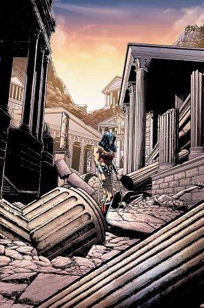
WONDER WOMAN #601
Writer: J. Michael Straczynski Art: Don Kramer (pencils), Michael Babinski (inks) Publisher: DC Comics Reviewer: Humphrey Lee
Well, you’ve got to appreciate a man giving himself an out right from the get-go. Ever since it was announced that JMS would be taking on two of DC’s big guns, I wondered what the man would do with them. If there’s anything the man has managed to come up with interesting takes on the icons of the industry. And then I saw that his take on Superman was to make like Frodo on the way to Mordor with the walky walk (this time sans the homoerotic sidekick behind) and got a little scared. An issue of it justified my apprehension. One issue into his WONDER WOMAN run, though, and I’m not quite sure how I feel.As I said before, I actually kind of appreciate the balls it takes to come right out and say “Chances are, I will retcon this on my way out the door” by going the BACK TO THE FUTURE 2 approach – i.e. divergent timeline. In one way it really will give JMS some room to play around a bit, with no real ramifications, if that word even exists when discussing big franchise characters. What I’m not sure I’m sold on is the limitations JMS did decide to give himself. A depowered Diana is not exactly something I think I want in WONDER WOMAN run. Mind you, I’m also someone who doesn’t mind the temporary costume change, so I may not know what the hell I’m talking about.
Despite this less wondrous Wonder Woman, this issue did manage to excite with some Amazon badassary, so hopefully that’s a good sign for the future. There’s some good humor mixed too, as JMS tends to do with even the more stoic books (like his THOR run) but the overall narrative still felt a little heavy-handed. That’s forgivable though, there’s a lot of setup ground to be covered to get this take on the character running.
One thing that did impress off the bat was Don Kramer’s art. I’ve always been a big fan of his smooth lines and, surprise surprise, they work well here with Wonder Woman in all her, well, womanliness. Sometimes his facial expressions may be a little offset or exaggerated, but overall there’s a great flow, there’s lots of detail in some really loaded pages, and I think Diana still carries some of her normal majesty despite her more “functional” garb. It’s really good superhero art and it adds to the piquing of my interest toward continuing with this take on the character.
There’s loss, there’s a shake up in the status quo, there’s a mystery as to who is responsible for it all, etc, etc; basically it’s another run on a big time character by one of the bigger time writers in the medium. I may not be completely sold yet, but I’m not completely turned off like I was in just one issue of SUPERMAN. When it comes to trying to rejuvenate the more storied properties these days, that really seems to be the give and take of it and, for now, I’ll take it.
Humphrey Lee has been an avid comic book reader going on fifteen years now and a contributor to Ain't It Cool comics for quite a few as well. In fact, reading comics is about all he does in his free time and where all the money from his day job wages goes to - funding his comic book habit so he can talk about them to you, our loyal readers (lucky you). He's a bit of a social networking whore, so you can find him all over the Interwebs on sites like Twitter, The MySpaces, Facebookand a Blogger Account where he also mostly talks about comics with his free time because he hasn't the slightest semblance of a life. Sad but true, and he gladly encourages you to add, read, and comment as you will.
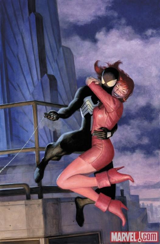
AMAZING SPIDER-MAN #638
Writer: Joe Quesada (Jim Shooter & David Michelinie, pages from ASM ANNUAL #21) Art: Joe Quesada, Daniel Miki, Richard Isanove, Paolo Rivera (Paul Ryan & Vince Colletta, pages from ASM ANNUAL #21) Publisher: Marvel Comics Reviewere: Henry Higgins is My Homeboy
One Moment In Time That I Want Back!GodDAMNit. Just...GODDAMNIT! I had gotten over it! I had moved on! I had learned to deal! I had gone to therapy. I'd talked it out. I'd done everything! “One More Day” was in the past! And the series had gotten good again!
Mostly good, but good! The dark days were over! But now, I just...AHH! AHHHH! AHHHHHH!!!
Okay, okay. I'm fine, I'm fine. Deep breaths. I'm a leaf on the wind…a leaf on the wind. Okay. This weeks AMAZING, is awful. It's just...awful. No other words spring to mind. Well, okay, a lot do, but they would open up some demon book somewhere. This book is just bad. And it's not just the fact that it's the follow up to “One More Day.” No, I actually took a day to register, to think, to look at this book constructively. And for all that effort, this book is horrendous. The follow up to “One More Day”, Mary Jane visits Peter, to finally "talk" and get everything out in the open. The book is essentially three books, intercut throughout the issue; the two modern points are written by Joe Quesada, and then we have different artists. The talk, which has art by Quesada, Danny Miki, and Richard Isanove. Then there's the flashback to the new events of the wedding day, with Rivera on everything. We also have, here and there, pages from ANNUAL #21, the actual wedding issue. Because I needed a reminder of how good things were. I know this is supposed to be a review, not a summary, but there's...just...so many problems. It's like Quesada is just taking the mickey out of us now, and actually has the real issues to Spider-Man in his basement somewhere.
Let's start with the opening scene. The first splash page of Mary Jane gives you some hope, with a decent rendering of MJ. And then you see pug-nose Peter, followed by, at the end of the page, Fat Forehead Peter. I say fat forehead, because his facial features take up maybe twenty percent of his head. Oh, I'm so excited for the next forty pages. The writing isn't immediately horrendous, but it's still not good. Peter goes from being a bit of an idiot, to the capacity of a thirteen year old boy ("You have mental scars littering your mind, making you doubt all judgments and personal decisions as moves in the wrong direction? Awesome!") Then MJ becomes a Victoria’s Secret model for a moment while talking to Quesad-I mean Peter. Trust me, you'll make the same mistake if you're not paying attention. If you're going to be terrible at art, at least be consistent. God I hate this issue.
Shooter pages! Oh joy, now I get to associate him with this issue. Thanks a lot you prats. I will say this; the artwork takes a definite upswing here, with facial reactions and body movements being, you know, realistic. We have some henchman to Electro, who was captured in the original story, escaping custody, thanks to the actions of a red pigeon.
A red pigeon!
I'm going to assume it's Mephisto what with all the red and the henchmen later on and all, but don't quote me on that. It's just so subtle. So after the henchman escapes, thanks to absolutely none of the cops noticing him walk out of the car, I'll repeat that, none of the cops noticing him walk out of the car, we cut to...hold on. Artwork problem. When he gets "diabolical" or whatever he becomes upon seeing the doors open, I think he's getting a little too excited ("I'm tied up in the back of a cop car, and a bird just showed up...mmm yeah, just how I like it...), we cut to another annual scene, before returning to the creepy crook, learning the address of the cop who arrested him. Because apparently no one thought to look back for the armed thug who just escaped from the car! More flashbacks, before we get Peter and Mary's send-off parties (Peter's just makes me sad). The next page is in the early pages style and are marginally better. But that's not saying much. Annual pages, followed by brooding Peter (my favorite!) and the crook attacks the cop. And says he has a rape fantasy about the cop’s wife. You know…for the kids! The cop yells out he's a cop, because that'll stop the crook, just in time for Spider-Man to show up and take a cinderblock to the face!
Our hero, ladies and gentlemen!
He decides to just walk off the concussion (I've had concussions. You don't just get a little dizzy and see a few lights), and then falls off a building saving the crook, before the crook escapes. I hate this issue. The final splash page is Mary Jane doing the best representation of this issue ever.
Fuck this comic. Not the series. Not even the writers and artists who have all done decently in the past. Just this comic. This comic is awful. It rivals “One More Day” in level of bad.
Writing - 1/5
SO...MANY...HOLES...GOING...MAD...
Art - 1/5
It's bad throughout, with a few shots here and there decently done. But overall, not good. Nowhere near good.
Mephisto stole happiness and time from Peter and MJ. Does that mean this comic is my personal Mephisto? I don't know, but I'm dousing it in holy water, just to be sure.
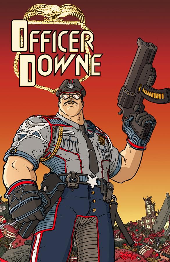
OFFICER DOWNE #1
Writer: Joe Casey Art: Chris Burnham Publisher: Image Comics Reviewer: Majin Fu
I missed the trip to the LCS last week, so I apologize in advance for my tardiness, as I missed a great one. If you haven’t heard of OFFICER DOWNE, you should know it’s the best one-shot I’ve read this year.Prior to picking up OFFICER DOWNE, I had not seen much of Chris Burnham, but after reading this, he has definitely become a name to watch out for. He is essential to the success of this work, delivering art that is energetic and highly detailed. Just looking at the wrap-around front cover, astute readers will notice dozens of little references and bonuses littering the pile of corpses. A premise like this calls for lots of action, and he delivers in spades. Scenes are dynamic and there is also a lot of variety in the paneling. Normally the result of smaller panels is significantly less detailed work, but Burnham injects even the smallest panels with just as much precision and care as his splash pages. His lines are perpetually clean and his action is choreographed so each splash pages crashes in at the point of maximum impact and velocity. It is stunning work for fans of the likes of Geoff Darrow or the late Seth Fisher. This is definitely the spiritual descendant to works like HARD BOILED. This is easily the most graphic book I have read this year, drenched in creative displays of gore. Most of the time, the violence is so absurd it becomes comical.
Oh the story? Los Angeles is practically being run by a crime syndicate known as the “ Fortune 500.” Officer Downe gets the job of dismantling said syndicate, a task which he leaps into with gusto. Downe as a character is more of a force of nature, driven by a sort of single-mindedness that is both refreshing and absurd. Whether he’s narrating his own preparation of his “correctional equipment” or just kicking through the wall, his words and actions will delight the reader. Joe Casey delivers an excellent script that helps to maintain the tone of the screwy story, but also hints at a tragic flaw in the main character: his loss of humanity in the name of street justice.
There is a sequence close to the end that perfectly showcases the talent and creative energy just pouring out of this book. In thirty-one panels across two pages, Burnham and Casey move between Officer Downe being beaten brutally and showing the results of his beat-down at his home base. These creators obviously have a huge respect and understanding of the medium and they put that understanding into practice on every page. This comes highly recommended, but it’s not for the kiddies.

GREEN LANTERN #56
Writer: Geoff Johns Artist: Doug Mahnke Publisher: DC Comics Reviewer: Optimous Douche
Kid: “So Mr. Hammond, how many licks does it take to get the center of an orange lantern?”Hammond: “One, two, three…you know what? With a head like mine I’ll just swallow the fucker whole!”
While I hate to lead off with the end, the result of GREEN LANTERN #56 was telegraphed from the outset. Hell, even the nightmare inducing (yet still wonderful) cover lets you know something is inside Hammond’s mouth and Hal wants it back. Yes kids, the big-headed baddie Hector Hammond has finally escaped from his interment at Belle Reve and he is on a mission — he feels the need…the need for greed.
This thing is simply packed with comic goodness from start to finish. From Hammond’s escape to the final scene when he consumes the orange lantern (or does it consume him…hmmmm), Johns is accelerating his usual story development from slow boil to a full-on flambé with this issue. Mahnke’s ohhh so creepy portrayal of Hammond as a mongoloid Macy’s Thanksgiving Day float and John’s continued excellent portrayal of Larfleeze, the greediest lantern of all, were strong indicators that we might finally be out from under the “Blackest Night” exposition blanket that has mired the story from moving forward over the last few months. While the appearance of Lobo delivered a kick-ass issue last month, let’s be honest, at the end of the day it was still just exposition for our favorite Red Lantern Atrocitus. Carol Ferris and Sinestro are also absent from this issue and for that fact alone I was truly thankful; I needed a break from the power ring posturing.
Hammond’s appearance wasn’t really a surprise to anyone. Even before Johns started whetting our appetites a few months ago by placing Hammond in the denouement of each book, we all knew Hector’s big head would show up eventually since he will be one of the big baddies in the upcoming Green Lantern movie. This slow burn approach to bringing together your cross-channel synergy is far preferred over the marketing fuckbaggery Marvel pulled a few years ago with a certain Web slinger’s black suit. I’m all for wrangling in some new comic readers based on movie success as long as true comic fans aren’t forced to suffer during this cross-promotional blitz.
I was certain (as I think most fans were) that Larfleeze’s adventures would be continued in the pages of Luthor’s new title ACTION. The way those two were getting along during BLACKEST NIGHT, I thought they would use their collective will to overthrow Prop 8. Alas though, the bald one seems dead-set on finding the Black Rings instead. I don’t know why, but that’s for another writer to figure out. No, it looks like Larfleeze has been hanging in the Pacific Northwest looking to unlock the whereabouts of the most elusive greed inducing human of all time, Santa Claus. Johns once again simply delivers sharp moments that ease a new reader right into this history, without punishing all of us long-time fans with dull exposition. A lesser writer simply would have had a bunch of orange constructs out collecting shit; Johns deftly keeps the collecting in the past to instead give Larfleeze a consumerism perch from which to work on his list to the jolly old fat man.
Granted, none of this is really about the lanterns themselves, but rather the chewy nuggety life-form centers of each lantern. New gods, Oldest Gods, New-Old Gods or something else entirely, well that is still to be determined. I never thought Larfleeze and Hal would join forces, but with Hammond now in possession of the Orange entity next month’s issue promises a team-up more unlikely than Bruce Willis and Tracey Morgan. I can only be grateful GREEN LANTERN is being held far more deftly with Mr. Johns at the helm.
Optimous has successfully blackmailed fellow @$$Hole BottleImp into being his artist on Average Joe. Look for Imp's forced labor on Optimous brain child in mid-2011 from COM.X. Friend Optimous on FaceBook to get Average Joe updates and because ceiling cat says it's the right thing to do.
And now for another take on GREEN LANTERN #56
GREEN LANTERN #56
Writer: Geoff Johns Art: Doug Mahnke Publisher: DC Comics Reviewer: Henry Higgins is My Homeboy
Commercialization is awesome.Since his tenure on GREEN LANTERN began, Johns has had two types of characters appear. Some show up and immediately steal the scene, have unique voices, and quickly become fan favorites. The others are boring, predictable, and all around dull. It's nice to see this juxtaposition done brilliantly in the new GREEN LANTERN. On the one hand, we have the eternally fantastic Larfleeze, and on the other, we have the monotony that is Hector Hammond. But it is nice to see Johns is keeping up the series’ sterling reputation, and that with only a few scenes, he sells the issue, despite having the Super Stalker as a major player.
Writing: A lot of people have already commented on John's crush for Hal Jordan, so there's really no point in bringing it up for long. Suffice to say, Jordan still has his traditional "bestest person ever" character, but it's downplayed in here. In fact, Jordan really isn't even the star of this issue. Instead, the main focus shifts between Hammond and Larfleeze.
When the scene sets on to the latter, it just reminds you why this character is one of the best things to come out of BLACKEST NIGHT. The first time you see him (or moreover, his constructs), they're hanging Christmas lights on forest trees, around what is in essence a giant pile of stolen goods, littering the ground in a mountain of unwanted shit (think Hoboken). Larfleeze has apparently been stealing everything he can from the neighboring area, and Green Lantern goes to talk to him about it. While we do get the already tired "I've seen commercials!" line, we also get a look into Larfleeze's newest obsession - Santa Claus.
The avatar of avarice, the living personification of greed and gluttony, loves Earth because it has Santa Claus. That's brilliant. It's such a good in-character moment that it cracks me up. The image of Larfleeze becoming the DC Universe’s Grinch, sneaking into Wayne Manor to steal all the presents. "Borrowing" the Daily Planet globe thing, so he can have the biggest Christmas ornament of all.
The downside to the issue appears not too long after that, in the form of Hector Hammond throwing a car at our heroes. (Am I the only one who went straight to "Captain Hammer threw a car at my head."?) Hector just doesn't really seem like a credible threat to Green Lantern. His little creepy conceptions of himself slow down the entire issue, his menacing moments get knocked down a notch whenever you remember that he's a real life bobble head. Green Lantern has baddies like space Hitler, an army of indestructible machine men, the living embodiment of fear itself, and multiple times in a little over fifty issues, we see this idiot. Swell. The only way he can get any credibility is what happens in the end, and even then, he doesn't look nearly as frightening as he should. He still looks like that weird kid I went to high school with who insisted we call him Loki. He stares a lot. He thinks he's a badass, but is utterly miserable at everything he does.
Also included in this issue is a short two page moment of Renee Montoya and Saint Walker talking over The Question’s grave. And while it is a huge "Big Lipped Alligator Moment", it reminds me why I love Saint Walker. It's such a quiet moment, and it works so well.
Art: As it usually is with Mahnke, the art is varied, but leans more towards the good then the bad, easily. When he's allowed to go wild, it's fantastic(the various constructs, and when he wants to be creepy, it's effective), but some faces here and there seem weird, as well as some basic moments, like Larfleeze in the distance seeming off kilter. But overall, Mahnke does well, especially with the army of Larfleeze constructs, each of them having their own weight and design. Not much else to say.
Best Moment: Larfleeze claiming there's a mountain of evidence that Santa Claus exists. Or calling him a "Well fed reindeer wrangler". Or...you know what? The whole sequence. That sounds about right, the whole sequence.
Worst Moment: Hammond floating in leisurely. "Look out! It's the Perilous Pedo! The Malevolent Molester!"
Writing - 4/5
Art - 4/5
Overall 4/5 - My strong, strong, STRONG dislike of Hammond aside, the issue manages to sell you simply on the Larfleeze scenes alone.
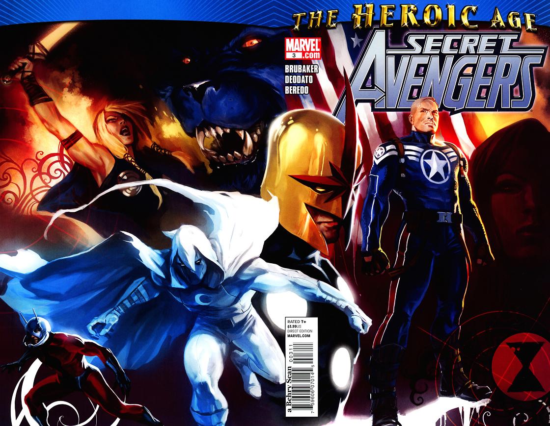
SECRET AVENGERS #3
Writer: Ed Brubaker Artist: Mike Deodato Publisher: Marvel Comics Reviewer: Jncndac
What do you say about an Avengers comic that starts off in the 1800’s on horse back, jumps to the now on Mars, bounces back to Earth and back again and ends with a splash page promo for next month with Steve Rogers putting on Nova’s Helmet? C’mon bunky, say it with me -- you say, Make Mine Marvel! That’s right kids, artful Edward Brubaker is at it again with another installment of what is quickly become the best Avengers title out there! Sweet Secrets abound in this SECRET AVENGERS issue and only Edward could take a rather boring artifact like the Serpent Crown from old avenging days and spin it all HP- Lovecrafty-like.It seems that every time you turn around some comic story is centering around some apocalyptic Armageddon end all story and as a device it can get tiresome, I mean how many dimension destroying dalliances can a merry marvelite meditate on before boring brain bruises burst your bubble? I was afraid that’s were we where headed, but before you could say “GYAAAAA!”, every thing goes all KA-Zmaaaak on you and the next thing you see is Nick Fury as head of security for the bad guys? I don’t know what the secret sauce is in those serpentine chapeaus but I wanna know!
As every astute earthman knows by now the aforementioned Mr. Brubaker’s run on CAPTAIN AMERICA has become the gold standard for the aforementioned Captain and if he can even remotely continue to tell those kinds of stories in an AVENGERS titles I dare say we are in for a good ride, be it on horse back or human rocket. And what the heck is the 9th Legion?
NEONOMICON #1
Writer: Alan Moore Artist: Jacen Burrows Published by: Avatar Press Reviewed by: BottleImp
Ah yes, Alan Moore and H.P. Lovecraft...a match made in geekdom. I've been wanting to see Moore's take on Lovecraft's Mythos since I got left hanging by that aborted LEAGUE OF EXTRAORDINARY GENTLEMEN One-Shot that was to have found Mina Murray and Allan Quatermain helping out Randolph Carter in Arkham. Moore did touch a little bit on HPL twice in that series—once obliquely in the text backup feature in volume 1 (“Allan Quatermain and the Sundered Veil”), and he played it for laughs in a segment of LOEG: THE BLACK DOSSIER. But now with THE COURTYARD (which I finally managed to get my hands on this past week) and its continuation with this series, Moore is diving headfirst into Lovecraft's world.Being both a Lovecraft fanatic and (in most cases) a fan of Moore’s work, I’m happy to report that this melding of storyteller and subject satisfies on both levels. NEONOMICON continues where THE COURTYARD left off, with events that have taken place between the two series hinted at and referred to by the cast of characters. Two FBI agents are investigating a case of seemingly unconnected murders and mutilations that had resulted in another of their department going insane and becoming a killer himself. What appears on the surface to be an underworld of rock music and hallucinogenic drugs turns out to be much, much more as the agents plunge deeper into a strange world filled with rock musicians snarling gibberish words in their songs (words like “Nyarlahotep” and “Ia”) and references not only to Lovecraft’s fiction, but also his influences and disciples.
(If you haven’t read THE COURTYARD (also published by Avatar and available in trade paperback), my advice is to go out and get it. It’s not necessary in order to understand NEONOMICON; Moore and Burrows are careful to fill the reader in on all the salient details from the earlier work that are required for reading comprehension. But THE COURTYARD is a damn good read, and will add an extra layer of enjoyment to your experience here).
While Lovecraft in comics is nothing new—in fact, the Old Gent seems to be everywhere you look on the stands these days, even in Marvel’s cosmic superhero stories—NEONOMICON manages to stand out from the rest in its execution. Moore essentially brings Lovecraftian fiction back to HPL’s formula of ordinary people in an ordinary world catching the barest glimpse of the terrible dimensions beyond our own. As readers, we are riding along with the FBI agents and we, like they, are also only seeing a tiny fraction of the strangeness that Moore and Burrows choose to reveal. This stylistic choice brings to mind not only Lovecraft but the Lovecraftian fiction by Ramsey Campbell, who set the horrors of the eldritch deities against bleak and mundane urban landscapes that made the sense of fear and alien-ness even greater. Burrows’ work reminds me a lot of former Moore collaborator Dave Gibbons, who worked with Moore on a little-known series in the 1980s that set spandex-clad superheroes against a real-world backdrop. Like Gibbons, Burrows’ work is not flashy, but it is extremely tight and realistic in the depiction of form and space…again, which only makes the horror element that much more horrifying.
There are still mysteries about this world, however. In Moore’s world, for one, a giant dome covers Brooklyn. Why is that? Agent Merril Brears recognizes the stage name of Ulthar Cats’ lead singer, Randolph Carter, as the name of a fictional character, saying, “There’s something weird about this. It’s…see, it’s almost like some big literary in-joke…” So in this world, Lovecraft’s fiction exists just as it does in our own…so why has no one else picked up on these references?
I’m not sure when (or even if) these questions will be answered, but they certainly give me even more reason to read this series than the already-enticing Moore and Lovecraft team-up. Fans of either author will enjoy this series, but fans of both will go mad for it.
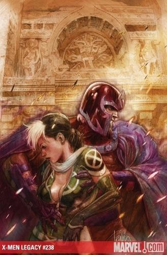
X-MEN LEGACY #238
Writer: Mike Carey Art: Clay Mann & Jay Leisten Publisher: Marvel Comics Reviewer: Henry Higgins is My Homeboy
Attention! Hellion is still a twat. That is all.As with most major crossovers, the first issue after “Second Coming” in Carey's LEGACY leaves a lot to be desired. The issue lacks any real focus and more often than not, just lacks that eternally elusive "not boring as all hell." If this issue suffers from one thing, it's an overwhelming boredom. That and confusion.
Writing: Our issue of X-MEN begins on the Corridor. ...Okay, what's the Corridor? It's not mentioned in the recap at all, so is it new? Does it serve a major purpose? Who are the people here? Who are the ..."guards" I suppose would be the best term for them? Or are they parents to this girl? Who is this girl? She's a mutant, I'm guessing, because it's never said, not even really implied. How do they know she's a mutant, or even has superpowers? This is happening days after “Second Coming”. Is this someone repowered by Hope? Did she never lose her powers? Is her power being the blandest character ever? Can she talk to machines? What is it? Good lord, we're only two pages in and I'm already confused/uninterested.
The rest of the book continues on like that, even when not focused on the girl or her...corridor....thing. Rogue and Magneto chaperone a few of the students to India, where Indra (the pink armor teen) has to see his family. The characterization, like usual from Carey, is on...for the most part. Rogue still stands out, with her usual aggressive nature being complimented by her always appreciated "I'm right, and you're thick" sensibility. But, as she really has been the closest thing the series has to a counselor, she gets a well written scene with the team’s resident teenage git, Hellion. Good lord, ever since NEW X-MEN ended, Hellion has sucked. He was good at filling the jock with potential role brilliantly, but since that series ended? He's either been a loud ass ("We don't want to hurt you! We just want to be safe! And to do that, I HAVE TO HIT YOU!") or emo cannon fodder ("My hands! Now what will I cut myself with?"). Thankfully, it's only one scene, before resuming the weird scene in India. We see Indra meet his family for the first time in years, but this version of the character doesn't gel well with what I've seen of him. But then again, I only remember him from NEW X-MEN; maybe he's changed. I expect the same has been done to Anole and Loa, who now have personalities resembling sandpaper. We get your typical "Overbearing Indian parents" storyline, with Indra being informed he has a marriage to prepare for. Following on that, the girl from the first scene shows up, causes problems for Magneto to solve, the girl lands, and then Sentinels chase her. Still paying attention? I hope so, so you guys can let me in on it.
Art: And the art just reinforces the story, almost perfectly mirroring the feel of the comic. And by that, I mean it's uneventful, cliché, and looks familiar. While it does a serviceable job and is in no way bad, it just looks and feels like a lot of art we've seen elsewhere. Nothing really to say about it, just that it's...kind of there.
Best Moment: The driver for the team gives Loa a Ganesh figure, as a sign of good faith. Later on, she lifts the figure and whispers, "Do your stuff Ganesh!" Hee. That's good.
Worst Moment: Will someone in the comments please explain to me what the hell is going on in the first half of the book?
Writing 2/5 - Boring, and when not that, incredibly confusing. Characterization can only do so much, you know.
Art 3/5 - Nothing bad, nothing good.
Overall 2/5 (Yes, I choose not to round up. That doesn't mean I won't round up in the future. My review, my call.) - It's just...so bland. Like reading a beige comic, that befuddles me a lot.
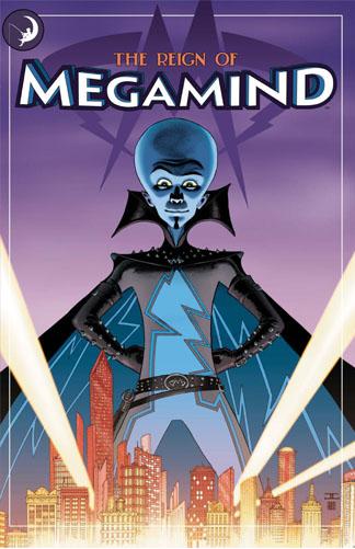
THE REIGN OF MEGAMIND Preview Edition
Written by: Joe Casey Art by: Marcos Mateu-Mestre, Iuri Lioli, Jason Scheier, Griselda Sastrawinata, Sai Pink Lok, Tianyi Han, Grant Bond, Adam Archer, Carrie Strachan Published by: DC WildStorm Reviewed by: superhero
I’ve got to say as much as I’ve loved Pixar’s stuff for the past several years I’ve enjoyed Dreamworks Animation’s recent output almost as much. Stuff like KUNG FU PANDA, MONSTERS VS ALIENS, and HOW TO TRAIN YOUR DRAGON have really spoken to the ten year old boy in me and I’ve enjoyed those movies in a slightly more pure action movie way than the recent stuff from Pixar Animation. Don’t get me wrong, Pixar is tops in my book but Dreamworks seems to be putting out stuff that seems to be missing out there in animationland these days…the unadulterated action/sci-fi action movie cartoon of yesteryear. So when I saw the trailer for MEGAMIND I was more than happy to see that they were delving into that pool once again. I’m cyked to see MEGA MIND…I won’t lie to you. It looks right up my alley and I was just as cyked to be able to check out this preview comic based on the movie.As far as the comic itself goes…well, I’d have to say it’s pretty much your average movie tie-in book. There’s nothing spectacular here really except for the artwork. Part of the problem is that this book seems as a sort of prequel to the movie while being hampered by the fact that the movie itself hasn’t come out yet. So it can’t really give you anything more than the trailer itself will. What the book ends up being is a bunch of silly vignettes dealing with how MEGAMIND has consistently failed in his attempts to thwart his nemesis and the hero of Metro City, Metro Man. Again, nothing here that you haven’t already seen in the trailer. In a way, I kind of feel sorry for the writer of this book, Joe Casey. He’s got to write a comic book based on a property that hasn’t even been released yet without blowing any of the actual plot of the movie. That’s a challenge that would be hard for any writer to live up to. Casey does his best but it’s not enough--or at least it wasn’t for me. It’ll probably be entertaining for little kids, which, let’s face it, is probably the audience it’s aimed toward anyway. But for someone looking for something more than just a trailer in comic book form I’d say just wait for the movie. Unless you’re a hardcore MEGAMIND fan…which is sort of impossible being that the movie isn’t even out yet.
Discovered as a babe in an abandoned comic book storage box and bitten by a radioactive comic fan when he was a teenager, superhero is actually not-so mild mannered sometime designer & cartoonist, Kristian Horn of Los Angeles, California. He's been an @$$hole for three years. Some of his work can be seen at www.kristianhorn.com and check out his blog at www.parttimefanboy.com.
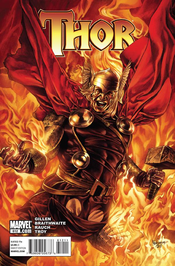
THOR #612
Writer: Kieron Gillen Artist: Doug Braithwaite Publisher: Marvel Comics Reviewer: Jncndac
I love THOR, more so now as an adult than when I read my first adventures of the Odin son as a child. I would say, in my humble opine, that the 79 issue, 7 year run of Dan Jurgens that began in 98, was the best THOR I had ever read. Nay! I say some of the Best Comics I ever read. The proof lies in the fact that it is the ONLY comics my lovely bride was ever snookered into reading. My “I only read John D MacDonald, Carl Hiaasen, Laurence Shames, Barbara Parker or Dave Barry South-Florida-Based Novels” wife. My “man-she-would-look-hot-in-a-Scarlet-Witch-outfit” wife…sorry, comic review, right. Anyway, that run was incredible. I then completed my Thor collection, read all the Stan & Jack stuff & it was great, and then JMS resurrected Thor. It was fantastic, loved it, picked right up were we left off, ended too soon & so now we have this Gillen guy taking on my favorite Asgardian. So, to say I had a tiny tad of trepidations would be an overwhelming understatement of epic proportions.We are only a few issues in, and after getting past the obligatory SIEGE tie in issues, we are starting to get to the heart of his first story. And it is strangely unfamiliarly familiar.
Ok, secret time again: I HATE ZOMBIES! I think they are stupid, boring and overused almost as much as vampires. They have been thrown into the Marvel U to pander to the lowest common denominator that is YOU, you lousy zombie fans. Now that I have that out of the way, I thought Mr. Gillen was playing the Zombie card with these cursed Disir characters, and he may have, but they have turned out to be rather complex zombies, if that is what they are and that was what he was going for and then, we have been cursed and the Loki double, double cross, the epic quest/trek through Hell it has all the markings of a good Thor yarn. BUT because of my Zombie prejudices I would have to say the story is good but I am more interested in what Zombie-less quest he has in store for the Thunderer in the future. I will say he has done more interesting things with Hela then anyone has. She is now more than just a hot pale chick in a very cool headdress with a Thor obsession; she sometimes looks like Aku. I also never knew Mephisto was a cross-dresser, so you got that going too but that is a story for another day.
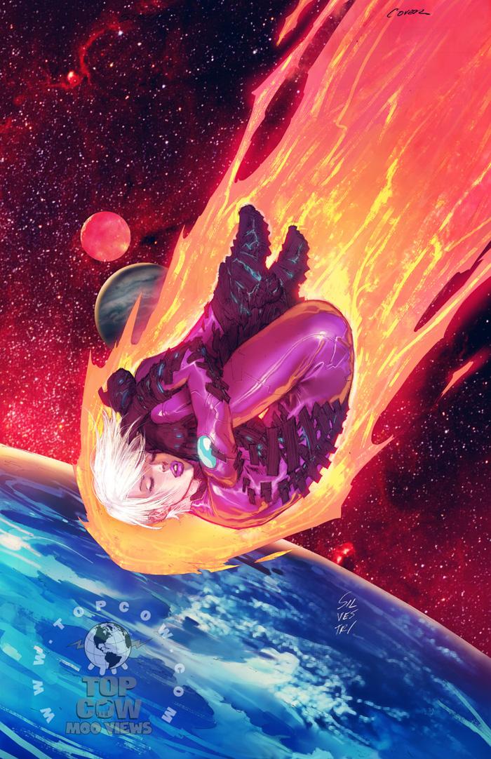
PILOT SEASON: STELLAR #1
Writer: Robert Kirkman Art: Bernard Chang Publisher: Top Cow Reviewer: Mr. Pasty
I like the fireball from space. It’s kind of the DEUS EX MACHINA in reverse. A lot of times you just can’t find a good way to close out a story and other times you just can’t find a good way to open one. When in doubt, have something (or someone) land (or crash into) earth (or earth-like planet) from a distant locale. It’s done rather frequently and often to great success (ahem, Supes) but how often is it done with a touch of bangability?Well, in STELLAR, our haughty heroine is bouncing – and bouncing from planet to planet in search of good deeds that need to be done. Why? Well, seems she fucked up back on Earth and needs to cleanse her soul by scraping some barnacles off her wounded conscience. What better way to get the job done then doing that whole Bennu of the Golden Light thing -- only instead of that goofy amulet, her ass lights up like the Times Square Christmas tree in every panel? Well, not really, I’m just very, very lonely, so every girl’s ass does that for me.
Anyway, as writer Robert Kirkman explains, STELLAR is another entry into Top Cow’s PILOT SEASON series of one-shots that are “new ideas” designed to gauge fan interest in long-term exploration. Which of his (and co-creator Marc Silvestri’s) books will make it to the big time? Well, that’s for the fans to decide through a voting system that will have all five PILOT SEASON entries competing against one another.
In the corporate world, we used to call that throwing a glob of shit against the wall to see what sticks. Or brainstorming. It all depends on how much you like the ideas that are being presented. As far as STELLAR is concerned, I like what I see, but it’s quite the slippery slope. I’m not going to call this a retread but by the same token we’re not exploring new worlds either--especially the part where our leading lady can’t touch or kiss the man she loves because it causes him bodily harm. Let’s face it, it’s virtually impossible after this many years of comics to be truly original or groundbreaking and truth be told, readers don’t really require you to be. What we do require is an interesting concept brought to life with an intelligent narrative complimented by (but not overshadowed by) engaging visuals. On those levels, STELLAR is a success.
But hitting your mark with a one shot is like teasing audiences with a three-minute movie trailer. Everything looks good because it’s just a glimpse at the best parts. Sure, I’m interested, but how long can you sustain that interest over the span of several issues is what makes a comic great. STELLAR is like taking a drag from your buddy’s cigarette when you run into him out back on your fifteen-minute break. You get the satisfaction you’re looking for, but it’s already dissipated by the time you get back to work. STELLAR is highly recommended for anyone with a short attention span -- or a fear of commitment.
Web heads who can’t get enough of Mr. Pasty’s word vomit are encouraged to watch him operate as Nostradumbass over at MMaMania.com here. Love, hate and Mafia Wars requests should be directed here.
BATMAN: THE WIDENING GYRE #6 (of 6)
Writer: Kevin Smith Penciler: Walt Flanagan Inker: Art Thibert Published by: DC Comics Reviewed by: BottleImp
After a long delay, the final issue of this series is out. Actually, it’s not really the final issue, because this series ends on a cliffhanger with the tantalizing words: “End of Volume 1.” So now we have to wait lord knows how long for Smith and Flanagan to finish whatever the next series will be called to find out what happens.I’m probably giving off a negative vibe, and I don’t really mean to. All in all, this miniseries was pretty good—certainly a cut above Smith’s last Batman mini—with a lot of moments that stand out as being quality storytelling. Unfortunately, this issue has to go and ruin it all by being a Kevin Smith book.
I honestly don’t know if Smith writes sex and fart jokes into his stuff because he actually thinks it’s funny, or if by now he thinks that’s what is expected of him. For every really great, well-executed moment in this comic, there is a lowbrow joke that runs counter to the impact of those better moments. For example: Batman, having just proposed to his on-again, off-again, and now on-again girlfriend Silver St. Cloud, muses on just how lucky he is. “It’s like she was MADE for me,” he thinks. “Or made FOR me.” Batman’s paranoia kicks in, and what follows is a scene of remarkable intensity as he yanks Silver out of the car by her hair so that he can test her DNA and make sure that she isn’t a killer robot sent by one of his enemies. And then there’s the wordless scene in Arkham Asylum, when the Joker and Batman’s pseudo-sidekick Baphomet lock eyes in a chilling page, beautifully rendered by Flanagan. And of course, there’s the cliffhanger ending…
But then there’s Silver talking about how her nickname for Bruce Wayne came from a night of multiple orgasms, or the story Batman tells about how he wet his pants early in his career, or Catwoman acting like a jealous girl who got stood up at the prom, or the tiny little nitpicking detail of when Bruce proposes to Silver he says, “…all I WANNA [emphasis added] do now…” Seriously, Batman is going to speak like a twelve-year old kid? “Wanna?”
I hope that when Smith and Flanagan roll out the next chapter in this series (that’s right; these minis are all connected), Smith tries for a little more consistency in his tone. Yes, we know, you are famous for the dick and fart jokes. But you can do better than that—this issue is proof. Leave the potty humor alone for a while; maybe write another script for Jason Mewes to get it out of your system. Because your Batman works much better when he’s not getting laughed at for his bladder problems.
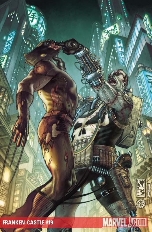
PUNISHER: FRANKEN-CASTLE #19
Writer: Rick Remender Art: Tony Moore Publisher: Marvel Comics Reviewer: Majin Fu
I have been looking forward to this rematch since Daken hurled pieces of Frank into the sewers in the PUNISHER: THE LIST one-shot. Remender actually made me respect Daken and view him as a legitimate threat in the Marvel Universe, and I really enjoyed how the two vastly different characters interacted with each other. I should note I don’t read Dark Wolverine regularly, so I missed the first part of this story. The summary on the first page says something about Frank going to Tokyo and Daken hunting for the Muramasa blade but that’s not what you care about is it? No, we all want to see the re-match between Daken and Frank. Of course, the cover seems to suggest Frank will be helping Daken pick his nose in the middle of the street, which unfortunately never happens. Maybe next issue…Once again, Frank and Daken take to the sewers for an old-fashioned throw-down. There’s a strong sense of déjà-vu in this issue, and the characters even comment on this themselves, calling it “the same dance.” That may be true, but it’s hard not to have fun watching Frank drop the proverbial anvil on Daken repeatedly throughout. I was on the cusp of dropping this book when I noticed Moore was coming on to help illustrate the re-match. As expected, he does a great job of capturing the visceral thrill of witnessing a Frankenstein monster battle a ninja mutant. The “dance” analogy is appropriate; as this fight definitely has a rhythm, and it is evident Frank Castle is completely in control for most of the fight, leading Daken into one trap after another.
If you have yet to accept the new status quo, then there’s not much I can do for you except assure you the old Frank should be back before the year is out, and if not, point you to the Punisher Max series, which I hear is doing quite well for itself. For those of you who can accept change, Remender and Moore have given you the reader a comic that entertains and nearly overflows with an energy and momentum that is sorely lacking in many other Marvel titles. Even if I probably saw that ending coming, I am excited for part four, and may even pick up and read parts one and three to get the whole story.
This book does not deserve to be maligned or pushed to the side. It’s the sort of comic we as readers should embrace for its creativity and bravery, for giving us the same thing twice, but kicking it up a notch.

Ambush Bug here with more indie goodness served fresh and steamy. Be brave and take a chance on these awesome comics from outside of the norm.
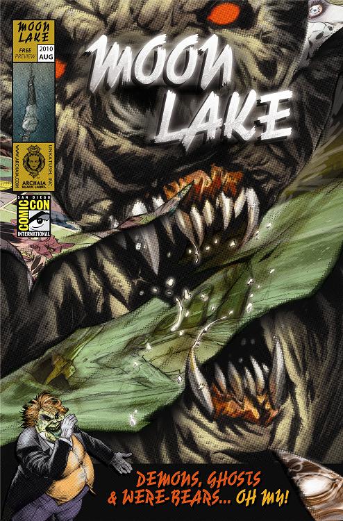
MOON LAKE / DAYS MISSING (SDCC 2010 Flipbook) Archaia
I spent a lot of time at the Archaia booth at this year’s con, and for good reason. Archaia has some of the most provocative and gorgeously produced books in the biz. Plus they are a company that seems to be brimming with ideas and new talent. This flipbook, premiering at this year’s con, is the perfect example. MOON LAKE slithers from the cracked brain-pan of comedian/actor Dan Fogler, who you may know from his roles in BALLS OF FURY and FANBOYS. His portion of this flipbook shows the range of talent he has wrangled together for his MOON LAKE anthology book coming out this Halloween. The two short tales presented here are equal parts horror and humor, which seems to be the tone Fogler is going for with the entire MOON LAKE book. The first tale, “His Final Escape”, has an escape artist attempting a stunt on the banks of Moon Lake with horrifyingly twisted results. Nick (Archaia’s AWAKENINGS) Tapalansky provides the first haunting tale.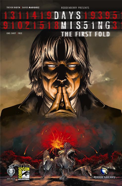 The second short is by Stef (Devil’s Due’s HALLOWEEN) Hutchinson and it’s definitely warped and wrong in all the right ways. In a twisted riff on Werner Hertzog’s GRIZZLY MAN, an overzealous naturist runs afoul of a were-bear. Carnage ensues. Flip the book and you get a story from one of the strongest sci fi books of last year. DAYS MISSING follows the adventures of the Steward, who has existed for ages, making sure that humanity survives by working on the periphery and redirecting life-altering circumstances to prevents the human race’s extinction. The short story here shows the first entry in the Steward’s library of interventions where he attempts and fails to prevent the dinosaurs from extinction. This was a brisk but soulful tale of the Steward’s longing for companionship that tells us a lot about the character in very few pages. Both of these books are going to be available through Archaia later in the year and if this flip book preview is any indication, they are definitely books to look out for.
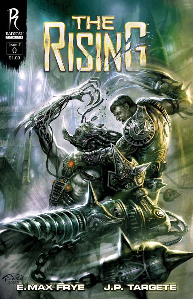
THE RISING #0 Preview Book Radical Comics
Radical Comics is the king of high concepts and here with this cross between SPARTACUS and V I think they have another high concept winner. The exposition is a bit heavy in this first issue, but necessary for the cliff hanger to be so dire. Earth has been enslaved by aliens and one man seems to be on a path to rising from slavery to overthrow his captors in gladiator style games. As usual, the art here is amazing with vivid colors and gritty landscapes. The story moves along briskly, although the aforementioned expository panels slow the pace down a bit. There's just enough in this preview issue to get me interested and excited with this premise. Chalk up another Radical book on my pull list please.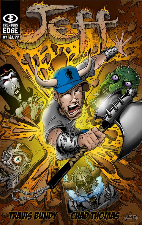
JEFF #1 By Travis Bundy & Chad Thomas Creator’s Edge Press
What can I say about JEFF? Well, it’s a really fun and quickly paced story of an everyday guy who finds himself transported to a fantasy realm without warning and in this realm he fights demons and monsters while defending buxom damsels in distress. Jeff tries to explain why he’s late for work, but no one believes Jeff when he talks about these random adventures he finds himself flung into. Sure some of the humor is lowbrow, but not everything has to be heady and high class. Writer Travis Bundy has my kind of warped sense of humor. I appreciated the simple premise and damn fun art by Chad Thomas. The potential for the premise of JEFF is endless and there’s something about this regular guy that is extremely likable. I’d definitely like to read more of JEFF.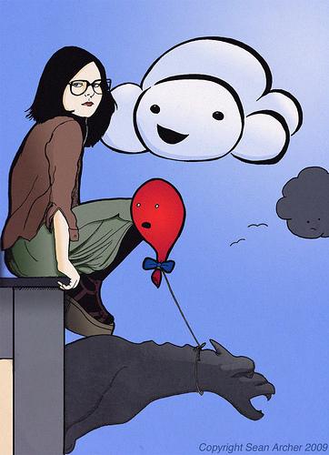
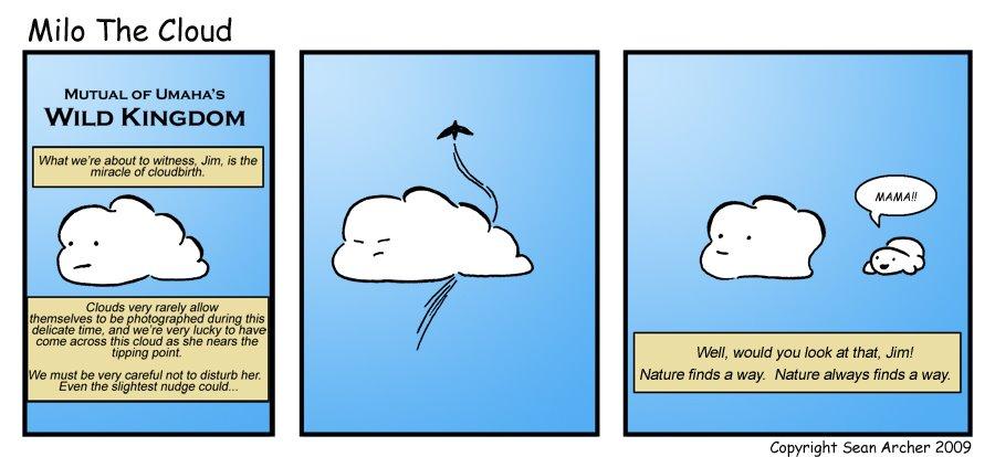
MILO THE CLOUD #1 By Sean Archer Click here for the online comic.
I picked up this tiny little preview comic at C2E2 and accidently placed it in my autographed copy of one of the most beautifully produced hardcovers I’ve ever seen, Archaia’s TUMOR HC GN. After rereading that masterpiece this weekend, I found MILO THE CLOUD’s preview book and remembered how enamored I was with the simple concept of a chipper little cloud and his rambunctious friends: a balloon, a cardinal, and an emo girl. Milo seems to always be in pretty high spirits and often gets somewhat metaphysical with his other airborne friends. Although this strip is cuter than all get out, this it is also smartly written and cleverly humorous. This tiny little ashcan book was a fun little preview of what’s to come from creator Sean Archer who states in the afterword that a book is on the way focusing on MILO in late 2010. If the strips in this book are any indication, I’m definitely going to be seeking out the truly original, undeniably cute, and devilishly funny MILO THE CLOUD. Sure, this may fall more into our dot.comics section, but the ashcan screams Indie Jones all the way, and Sean Archer deserves all the recognition he can for this original concept and excellent execution MILO THE CLOUD. Archer says there’ll be Milo plush toys on the way too…and dammit if I can’t help but want one of those! Read the webcomic from the beginning here and if you’re not addicted after a few hits you have a heart as cold as ice.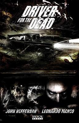
DRIVER FOR THE DEAD #1 Radical Comics
It’s always good to compare a new comic to something similar and though there are shades of Cal MacDonald, John Constantine, and maybe a bit of the film ANGEL HEART tossed into this book, it reads as truly original. I was fascinated at the level of detail writer John Hefferman goes into when dealing with the realm of voodoo supernatural. I loved the Morgan Freeman-ish exorcist that started out the book and the exorcism that takes place goes into dark corners that I’ve never seen before in comics, let alone film. Leonardo Manco supplies the art, so you know two things: it’s going to be gritty as hell and it’s going to be fantastic. The art in this one is both as Manco adopts a more painterly style, but still injects grime and grit into every panel. Plus the main character is a bad@$$ driver who drives an even badder-@$$ier car, so it’s got that going for it too. Highly entertaining for those of you who like their horror ugly and fresh!