

What’s SHOOT THE MESSENGER?
Well, AICN COMICS: SHOOT THE MESSENGER is your weekly one stop shop for comic book -EWS. What’s comic book –EWS? Well, it’s our hodge podge of everything not reviews here at AICN Comics. Sure you can find out the @$$Holes’ critical opinions of your favorite books every Wednesday at AICN Comics. But here, you’ll find special reports such as previews, interviews, special features, and occasionally news gathered here from our online brethren at Newsarama, CBR, Wizard, etc. Sure those guys are the best at reporting news as it breaks. Click on the links for the original stories. This column cuts the crap to run down all the vital information for those of you who don’t follow it as it comes in, and serves it all up with that special ingredient of @$$y goodness.
Good Morning, Talkbackers! Ambush Bug here. We’ve got an extra special column this bright and shiny Monday morning. We’ll have an AVATAR contest, an interview with myself from my book signing for my new comic THE TINGLERS, plus a whole slew of previews in an extra special Tuesday edition of Shoot the Messenger tomorrow. But first enjoy this special interview with

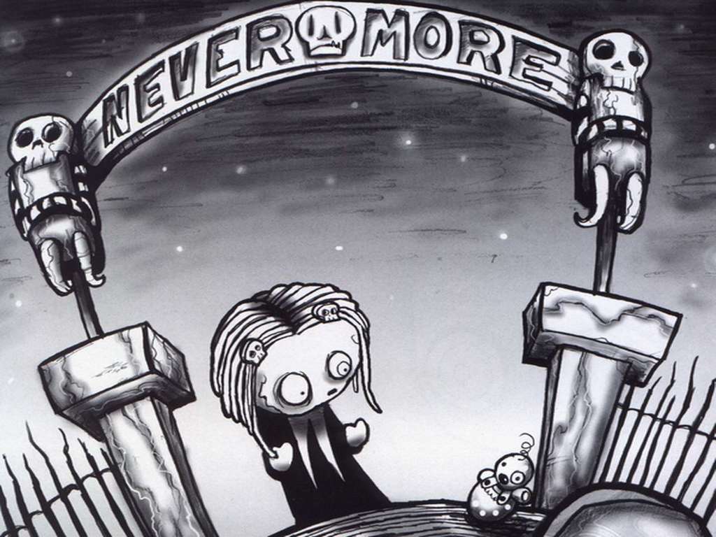
Matt Adler chats with LENORE’s Roman Dirge!

Hi folks, Matt Adler here. I recently got the chance to interview LENORE creator Roman Dirge about his creation and her debut at new publisher Titan Books. If you’ve read my reviews of some of the Lenore books, you know this is a series that comes with a recommendation from me, so it was a pleasure to be able to speak to the man behind the madness. Off we go!
Matt Adler (MA): What first got you interested in doing comics?
Roman Dirge (RD): I always liked the idea of being my own boss. I've worked as a designer, illustrator, idea guy for companies and other people's projects in the past so I can definitively say creating and executing whatever I want is pretty damn self rewarding. I love doing comics because no one is looking over my back telling me what to do. If I want to do a nine page joke about a banana, I'll do it, much to the possible cringing and cocked eyebrow of a publisher. I'm also lucky in that I can write and draw so comics are a perfect match for my head stuffs.MA: How did you come up with the idea for Lenore?
RD: I was doing an independent comics and art magazine in San Diego in 1992. I turned in the first issue that contained entirely contributions from friends. I didn't even have any of my own art or comics in it. The printer informed me that I was several pages shy of the minimum that could be printed. I went home that night and decided I would just create some character to fill up those pages. I had a napkin that my baby cousin had baby doodled on, and in the squiggles saw Lenore. I adapted that into the character and did the comic. I believe it involved Mr. Gosh trying to hook up with Lenore. It was quickly evident that it was the reader's favorite comic in the magazine and a tiny, stinky star was born. I had no idea it would become the main body of my life's work. Shoot me.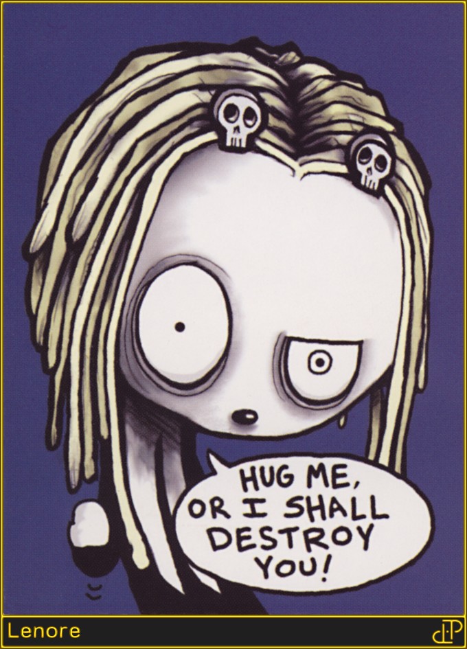
MA: How did Lenore come to Titan Books?
RD: I had been approached by much larger publishers over the eleven or twelve years I was with SLG publishing, with promises of grandeur and more bling in the piggy bank, but never wanted to leave SLG. Dan, the owner, took a chance on me when I was relatively unknown, and I always respected that and felt I owed him to stick with him and his company. It wasn't until a vastly expensive, six year long divorce battle and me about to lose my house, did I start entertaining other offers. This is what I do for a living. I ultimately ended up going with Titan because they had a plan for expanding my audience. They also market and promote. They also offered more bling for the piggy so I don't have to draw my books on dirty newspaper out of a shopping cart in an alley downtown, mumbling incoherently to an empty can. So far, it has been a great decision as Lenore is being forced upon more unsuspecting victims than ever.MA: Who are your major writing and artistic influences?
RD: That's always a tough one for me to answer because I've never looked at or read something and gone "I wanna be like that." I'm sure I have them though cause we all are inspired by something. Possible candidates were things I loved growing up. I was a huge fan of Sergio Aragone's GROO THE WANDERER series. My new book I'm working on, titled SAMURAI SLOTH, definitely feels like I took some influence away from that. I ended up in an elevator with Mr. Aragones at last year's comic con and I had to suppress my fan boy giddiness so I wouldn't latch on to his leg and go "OHMYGAWDILOVEYOOOOU!" Dr. Seuss was another biggy for me. Walt Disney for sure. I kind of always wanted to be a more evil version of Disney. I know there are a lot of Disney haters that would say that's not possible, but I love the guy. I wish that urban legend of his head being frozen somewhere was true so I'd have the chance of talking to Disney's thawed out reanimated head some day, but alas no.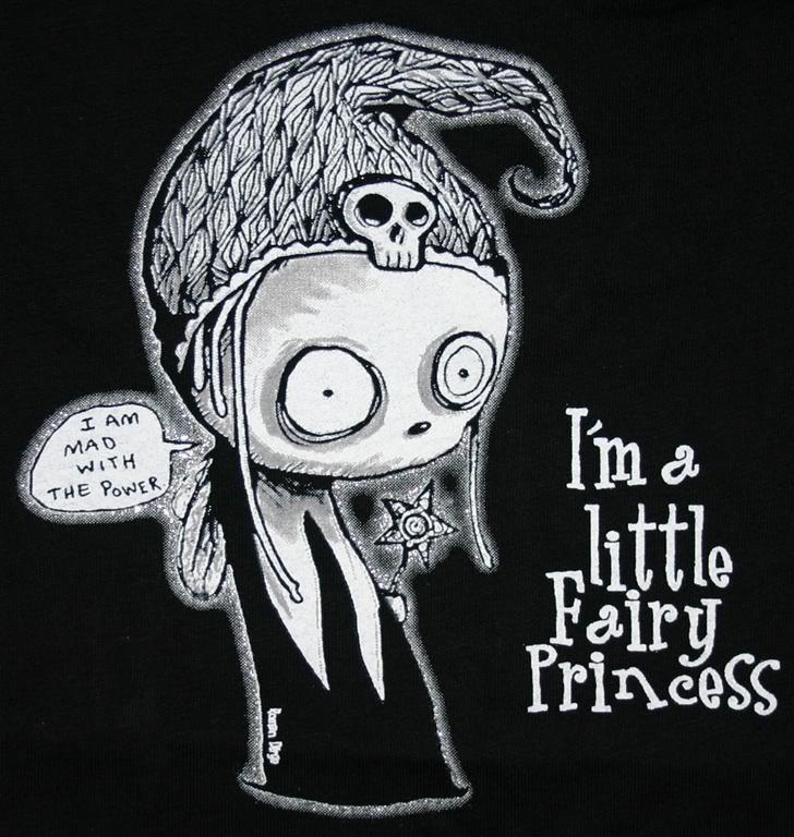
MA: What is it that attracts you to the macabre in your work?
RD: No idea! I think it's attracted to me. I could try to do a book about puppies riding lambs to the cupcake castle and I guarantee you no matter how hard I try, the puppies will end up horribly maimed, the lambs will need counseling and powerful meds, and the cupcake castle implodes, killing hundreds cause really building a cupcake castle on a cupcake foundation is just stupid.MA: Can you give us an idea of your usual process in writing and drawing a Lenore story?
RD: I'll have an idea for something and just let it percolate up in my noggin. Sometimes it brews around up there for years before I get to it. With older issues of Lenore, there was no process. I'd just stare at a blank piece of paper until something fell on it. No plot, just silly scenarios. These days, I at least try to tie the stories together with a form of plot, though admittedly thin. Usually they are just an excuse to have Lenore incite more funny. I'm always trying to get better at what I do. The first Lenores from 17 years ago compared to now illustrate that! As for actual process, usually I'll know what I'm going to write and draw at least nine months before it's due to be turned into my publisher. So naturally I wait until two months before it's due to start working on it. The last month will generally consist of seventeen hour work days seven days a week, turning me into an unrecognizable, mountain man looking stink beast. The best work comes from this time though, as I am delirious and slightly mad. Usually covered in Cheeto bits too. When the book is done, I have a ritual of getting cleaned up, wincing my eyes and stepping out into what they call "daylight" to see humanity and eat something that wasn't delivered to me.MA: Are there any plans for Lenore in other media?
 RD: Always! It's a never ending battle to get a Lenore TV show or movie made. I've had several opportunities for it over the years but I was never happy with the boundaries or the altering they would make to Lenore. Hopefully one day it will be an ideal situation, and I'll get to go nuts with it. I'm just now finishing designing the art for an awesome Ragamuffin iPhone game called "VAMPIRE PUFF PUFF" which should by out by January or hopefully sooner if I hurry. It has Lenore in it and if it does well, I hope to have an update where you can play as Lenore. So far it's just for the iPhone which is cool by me, but we hope to release it on other platforms in the future. I'd love to see a Lenore on ice show where it goes horribly wrong and skates become deadly weapons, but I won't hold my breath on that one.
 MA: Are you working on anything else these days?
RD: As I write this, I'm working on finishing up coloring Wedgies, the second Lenore compilation. I've gone back and colored all my old Lenore issues. Just finishing my iPhone game "VAMPIRE PUFF PUFF". Pitching a live action zombie show to various networks. Working on SAMURAI SLOTH here and there. Writing the next issue of Lenore. Writing up a sci-fi show pitch and playing around with my home website Spookyland.com to make it bigger and better... and weirder.In most places, Matt Adler goes by the name his mother gave him, but occasionally uses the handle "CylverSaber", based on a character he created for the old DARK FORCES II: JEDI KNIGHT game (one hint of his overweening nerddom). He currently does IT and networking support for the government of Nassau County, NY, but his dream is to write for a living, and is in the process of figuring out how to get publishers to give his stuff a look. In the meantime, he passes the time by writing for AICN, CBR, and a few other places. He has also written for MARVEL SPOTLIGHT magazine.
Randy Queen shares his thoughts on
THE DARKNESS/DARKCHYLDE:
KINGDOM OF PAIN One shot.
Up next we’ve got a very cool, exclusive, behind the scenes piece here from Top Cow and the folks behind the upcoming THE DARKNESS/DARKCHYLDE: KINGDOM OF PAIN 48-page One Shot which hits the stands late December. I’m going to pass the mike over to writer/artist Randy Queen who will walk you guys through the process from sketches to final cover for this project and the design for the new look for the Darkness’ armor. Take it away, Randy!
I hope you enjoy this illustration process, but almost every piece is unique onto itself. Sometimes the image comes right away, and in a rare moment of confidence I draw right on the board. Most times it's revising multiple sketches until you get something which is sized up, and printed back out to be lightboxed. There is no one right way of course, and everyone's process varies.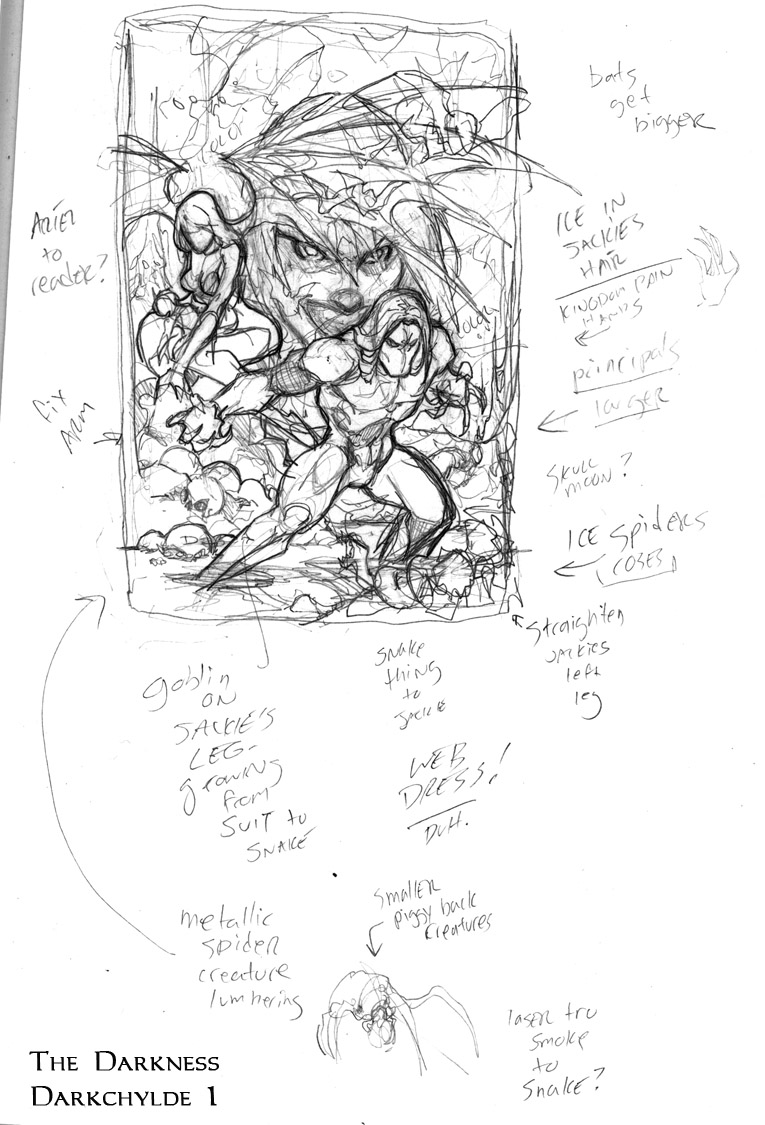 Image 1: This is sort of what I call, for lack of a better term, the regurgitation step. It's get all your ideas out in the most rudimentary form. My original inclination was to do sort of a Drew Struznan style floating villain head in the background of the two main figures. I scribble quick notes so I don't forget other impulses I have. One was to try to include a technological threat, as I wanted to get away from the aspect that people's nightmares are solely of demonic type creatures. The squiggly spider shaped thing at the bottom was meant to be robotic, yet was ultimately replaced by classic Darkness creatures. The floating head crowded my two leads, so this was jettisoned as well. I made a note to fix Jackie's arm (too long) and to add important details like ice in the hair, and Ariel's web dress.
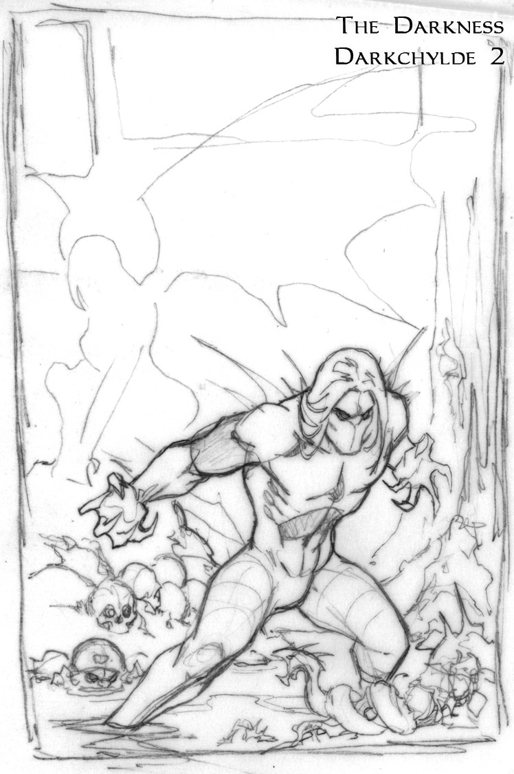 Image 2 features a revision with Jackie's corrected arm, and some tighter anatomy. Something I noticed here was that the torso looked a little too pinched and lacked power, so this was later addressed.
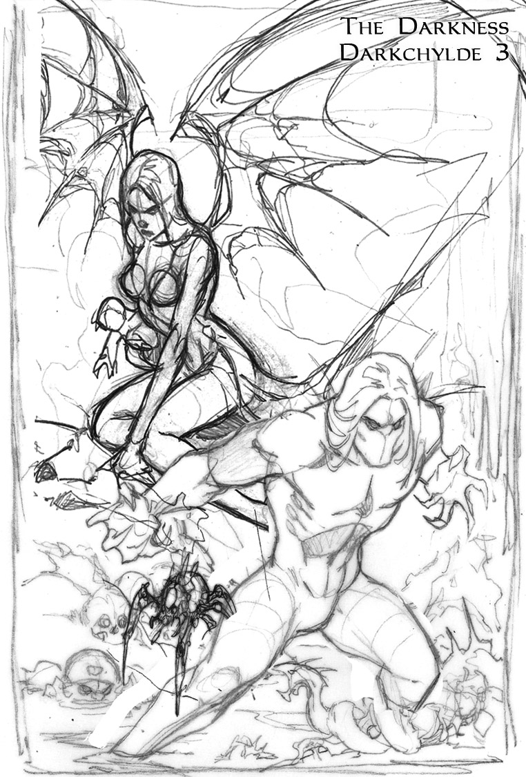 Image 3 has Ariel incorporated, and turned slightly more to engage the reader. I liked her forward slant and the menace of her stare, but I just could not get this one to work on the board. I tried to the point where it was counter productive and needed to move along. Some days you just don't have it. One thing that's frustrating with working on actual boards vs. digital is you only get so many erasures before it starts to deteriorate. So be pretty darn sure before you start to lay down lead. In photoshop you can revise forever with no medium erosion, but you do not have an original at the end of the day. Pros vs. cons. Here I'm also seeing how my little technological spider works.
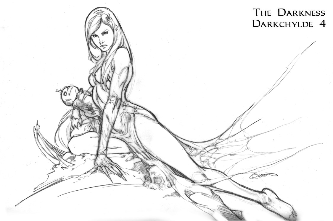 Image 4: Here's another Ariel pose since the prior didn't fly. I love the serene mood, but that's also the problem. It did not jive with Jackie's obvious intensity. He is ready for battle, and Ariel seems reflective here. Too pretty, and belongs to another piece. But I like it, and I have it for later. Yay!
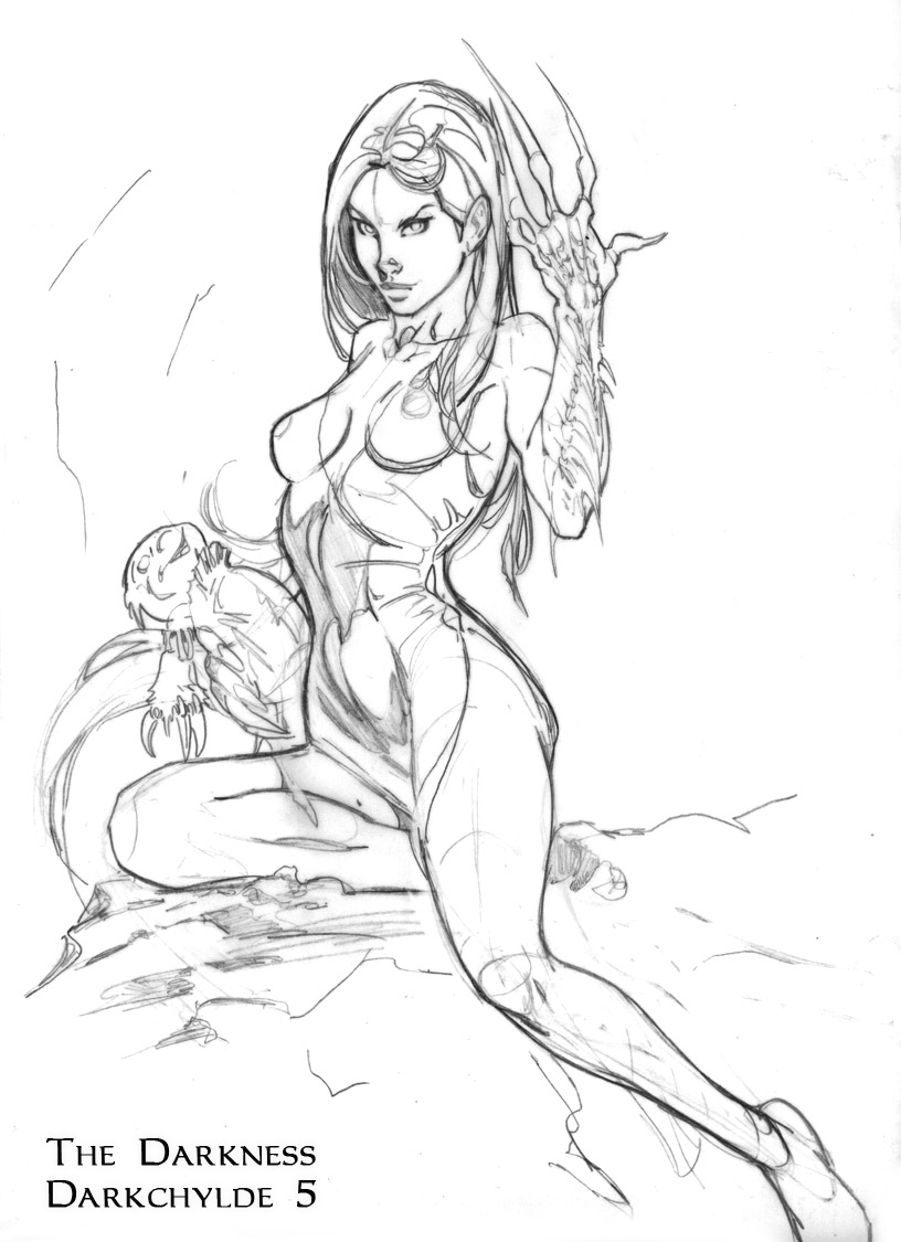 Image 5: Obviously I am agonizing over Ariel. Usually there's one thing on every piece I get hung up on that makes me nuts. Sometimes it's an eye, the angle of a cheek, or some other nonsense that has decided to make me crazy. I leaned her back more to show off the torso, and web nightgown more. And while admittedly, the hand up pose is a bit cliche, and I was very aware of this, at the end of the day it shows off the character and communicates some desired information. The leg is in need of some refined foreshortening, which I would have addressed later. I liked the slight upcurl of the lips, but it seemed too playful and I've lost the menace I responded to in my rough. But I do like the curves and the way the doll hangs in her grasp.
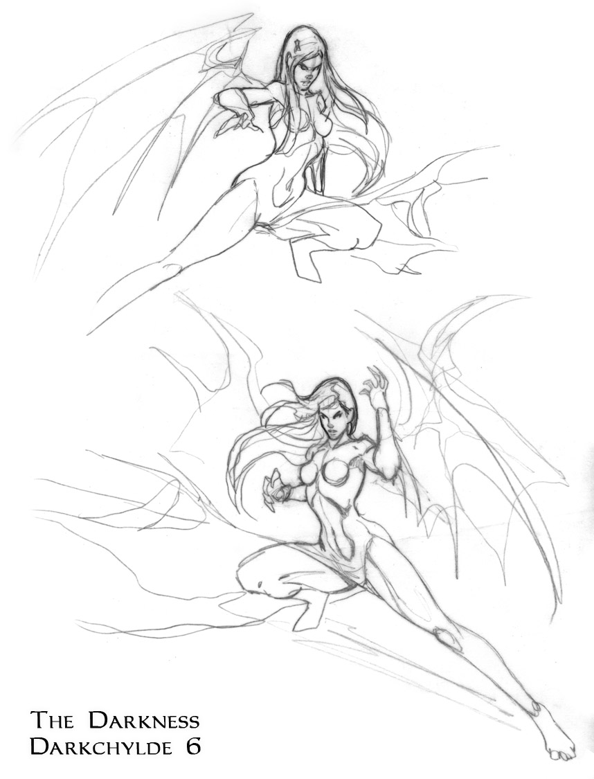 Image 6: Still playing around with poses (agonizing, really) to make sure what I have what works best. The one at the top I kind of dig. It seems loose and organic, while the one at the bottom looks like stock hero pose art exhibit A. Yuck.
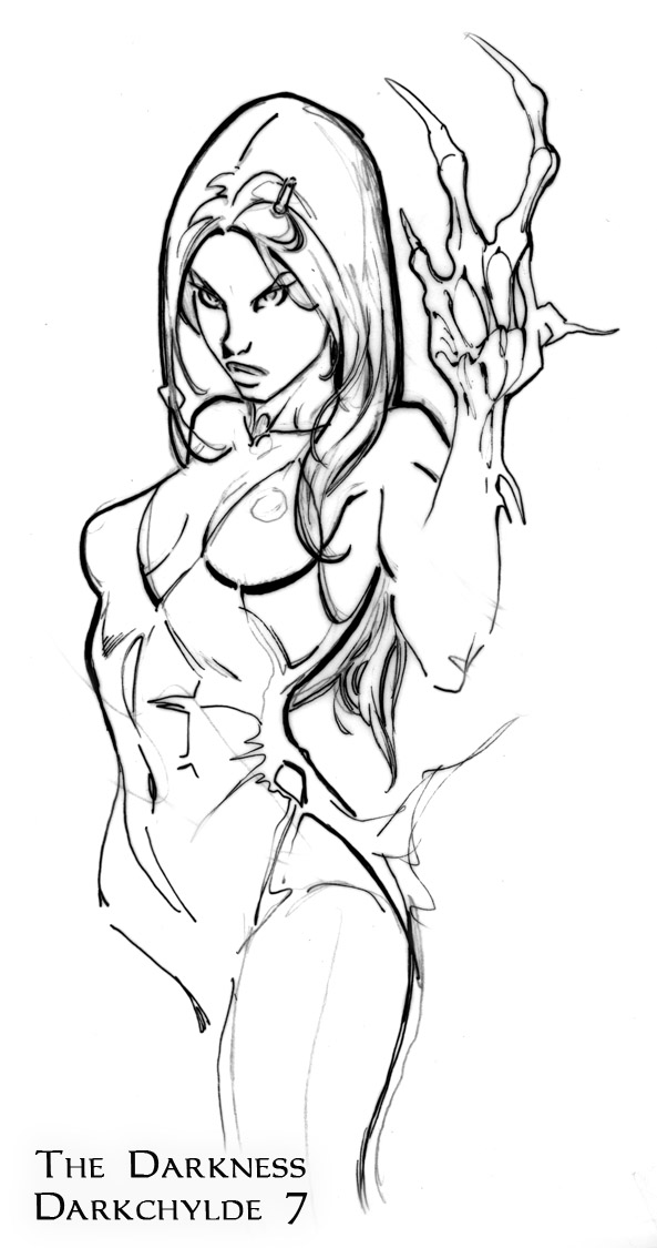 Image 7: Finally Ariel is communicating an appropriate attitude. It's sullen menace, but still sexy. I'll take it, and I sort of have to as the clock is ticking. This was plugged onto the body from Image 5, which was then further refined. I gave her three fingers instead of five because she is turning into something less humanoid, and five fingers in that equation lacks imagination, doesn't it?
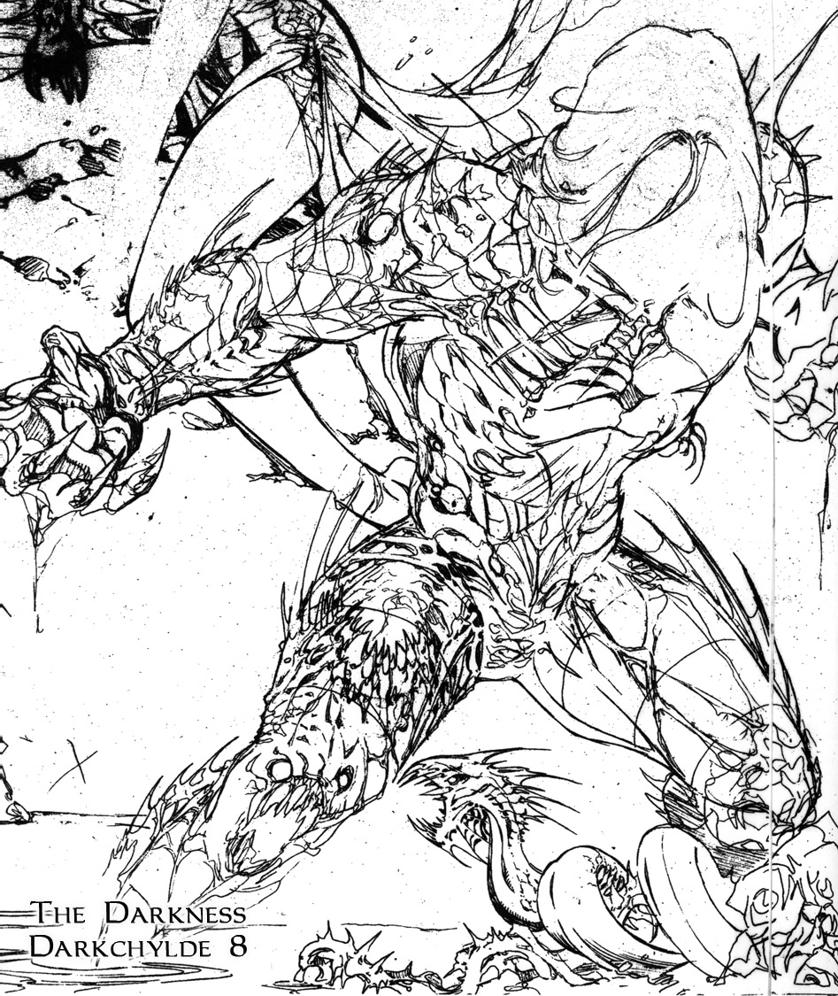 Image 8: This shows the necessary under drawing that goes down before you add other shapes on top. They are simplistic and cylindrical, but nevertheless important to be aware of when you are adding fairly complex organic armour textures over them. What you are doing is essentially sculpting shapes in 2-D, and the more effectively you understand this will only help your final. To the right I've got an ice serpent roughed in pretty good, and I thought it might be fun to add classic Darklings where the techno spider was, so there's this fun little unobtrusive drama playing out at the bottom of the illustration. If you can make that work without taking the spotlight off where it should be then it's fine.
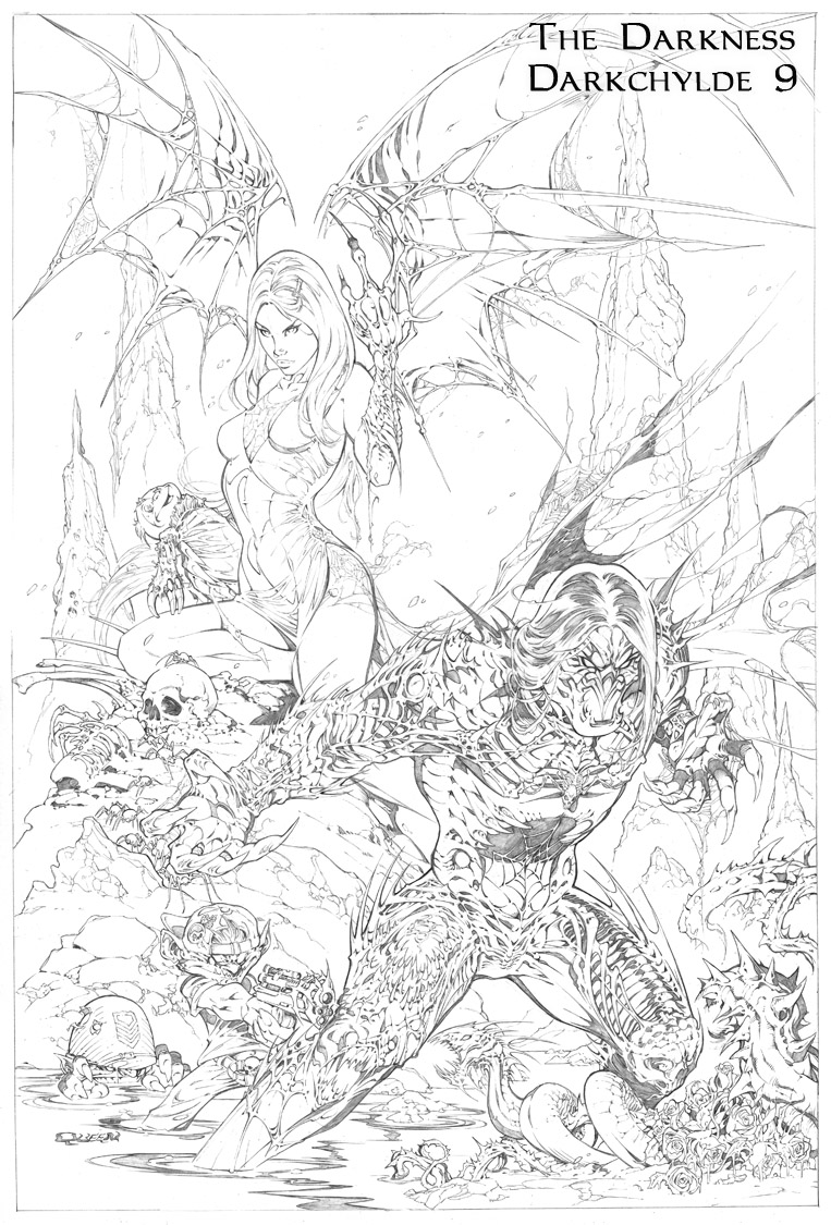 Image 9 (a): Many hours and some pretty exhaustively tight pencils later and the line art for the piece is done.
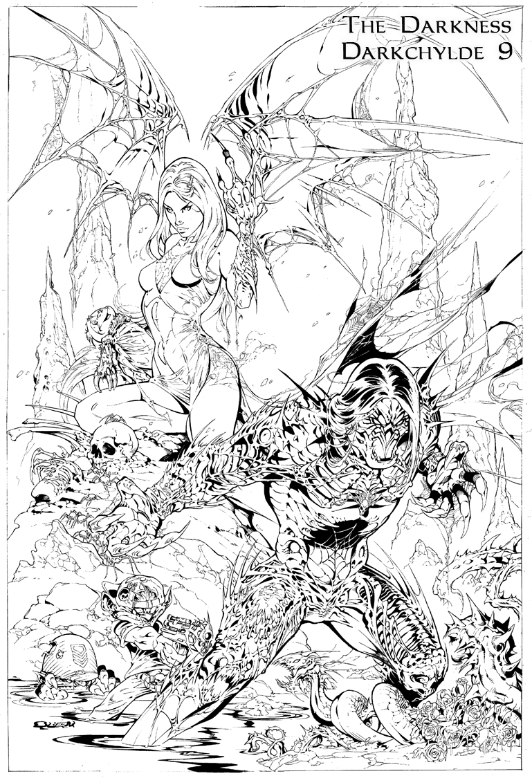 Image 9 (b, or image 10 ? labeled as 9 on image): When you pencil something with this degree of polish and detail, you sort of have to be insane to try and ink it. One, it's a time consideration where you could be doing a new piece, and two, you could ruin it. If your pencils are, for the sake of argument, a "10" because you were feeling particularity great that day, and you ink it the next day when you're only an "8" then suddenly you've lowered the power of your line art two points. Tricky. Ideally, if you know the piece is to be inked, even by yourself, don't shoot for a 10, shoot for an 8, which you hope the inker takes to 10. If your pencils are tight, polished and happy, probably smarter to let them be. Here, this piece is remarkably digitally inked by Sarah. For some, digital inks means just scan the pencils and color all the soft grey pencil lines and surrounding rough areas from revisions, etc. Sarah does digital inks better than anybody because they are solid black, and to my eye, indistinguishable from practical. She painstakingly cleans it all up and provides a clarity to digital inks that others simply do not. Not that I've seen.
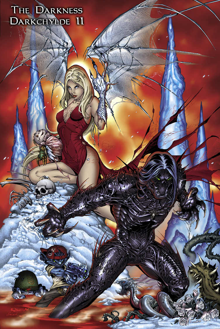 Image 11: Did we skip 10? Ah, who cares. Anyway, this is the final colored piece by Sarah. The red fiery sky is used as an attention getter, and also to evoke intensity. In an interesting choice, the halo of light helps punch, as well as connect the two main characters. White and blues were chosen for the creature Ariel is turning into to suggest some type of ice monster to compliment the environment. I think the Darklings and the ice serpent work well as an unintended happy accident. Some of the detail is still getting lost on the Darkness armor, which is a tough consideration when the armor is so dark -- thus the character’s namesake. So just to prove you're never actually done until it's printed, we will likely address this further before publication. THE DARKNESS/DARKCHYLDE: KINGDOM PAIN is in stores December! www.topcow www.darkchylde.com
 Thanks Randy. It’s cool to see how these things come together and the artist’s thoughts on that process. Be sure to check out Top Cow’s THE DARKNESS/DARKCHYLDE: KINGDOM OF PAIN One Shot in comic shops in late December.
