| #3 | 5/27/09 | #8 |
Hey folks, Ambush Bug here again with another trip to the past…more specifically, a trip back to our very first official column at AICN. And this week, Ye Olde @$$ from the Past focuses on my very first review for AICN Comics. This time, the focus is one of the most critically acclaimed series in the last ten years: RISING STARS. Much like JMS’ current M.I.A. super hero mystery series THE TWELVE, RISING STARS suffered from tons of delays back in the day. This was the focus of my review, which, although wordy, shows that no matter how long ago it was, some things stay the same. It’s also fun to note that the guy who’s been putting together the Indie Jones/dot.comics sections of this column for the last five years once categorized himself as a “DC/Marvel collector.” Hope you enjoy this blast from the past…
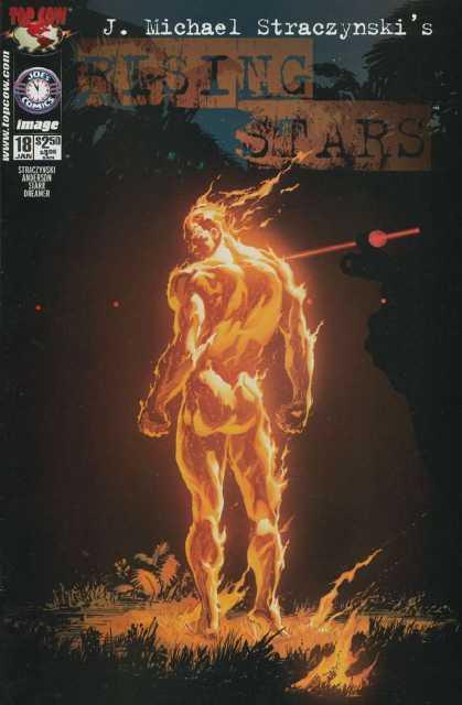
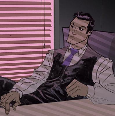
RISING STARS #18
Writer: J. Michael Straczynski Artist: Brent Anderson Publisher: Joe’s Comics/Top Cow Reviewer: Ambush Bug First posted on May 3, 2002
I consider myself a DC/Marvel collector. Sure there are various other titles that I pick up that are not published by the big two, but I have found that, for the most part, collecting independent comics is just plain frustrating. Either the title in question mysteriously stops publishing in the middle of the run or the creators quickly get bored with the series at hand and move on to other half assed projects. The biggest reason I collect so few independent comics is the fact that time schedules are often thrown out the window and you never know when the next issue will appear. Monthly books turn into bi-monthly books, which evolve into quarterly books. By the time I get the next issue, I have totally forgotten the premise, the characters, and why the hell I gave a fig about the book in the first place. Say what you will about Marvel and DC, but aside from a few exceptions (*ahem*DK2*ahem*), you can follow a title and not have to wait until your next dental appointment to read the next one.Which brings me to the dental appointment book called RISING STARS. This series was the stuff that coolness is made of when it first hit the stands. BABYLON 5’s writer J. Michael Straczynski has been weaving an intricate and engaging tale of real world super heroes. The premise was simple (and not all too original since it is basically a rip off of Marvel’s failed NEW UNIVERSE endeavor from the mid-eighties): A meteor strikes the town of Peterson, IL in the late sixties and gave all 113 of the unborn children of the town super powers. Since then, the children have grown up, fought and killed each other, whittled their number down to under 60, and banded together to use their powers to help change the world and make it a better place.
So how do I know this? I read it in the Previously… blurb on the inside cover of issue #18. I honestly do not remember when the last issue of RISING STARS came out, but I believe it was sometime late last year. Well, it’s April now and I have read a lot of comics since then. I appreciate the blurb on the inside cover explaining the basic premise, but when I saw this comic on the racks at my local comic establishment, I debated whether I should buy it or not. I can’t recite one character’s name from this title and I have collected it from the beginning. Sure I know that one character’s name is Poet and another’s is Ravenshadow, but the characters in this book call each other by their real names and don’t wear costumes, so this knowledge is usually useless.
RISING STARS is released as a Trade Paperback about every four or five issues. This is a good way, for those of us who may have missed an issue, to catch up with what is going on and enjoy an entire story. That’s great. That’s hunky dory. I am glad that the stories are available, but why not just cut out the middle man and publish a yearly Trade Paperback size graphic novel depicting an entire story arc of the regular series? The damn book comes out tri-annually anyway. Those of us who have been collecting what was supposed to be a two year series have been left hanging for over three years now.
I wouldn’t be ranting about this if RISING STARS was a crap comic. It is not. I love the way JMS can tell an intricate and personal tale and still tie it into the flow of the larger storyline. Each issue is building upon itself and revealing just enough to snag the reader for the next installment. JMS is doing the same thing over in his other dental appointment book, MIDNIGHT NATION. Both of these books are building to an explosive climax and I can’t wait to read them. I just hope I am still alive and kicking when the final issues hit the stands.
This issue deals with Jerry Montrose, AKA Pyre. He basically has the powers of the Human Torch, but none of the confidence. Fulfilling his duty to change the world with his powers, Jerry destroys all of the drug fields in South America and returns to his job at a Vegas casino. After meeting with his boss, Jerry finds out that he has missed a rival mob boss’ drug field and is sent back to South America on a clean up mission.
The dialog is right on. Not clichéd or over the top. At one point in the story, Jerry tries his hand at witty banter, but it just doesn’t work for him and that reveals a lot about the evolution this character has gone through. Jerry’s lack of confidence has been prominent throughout the series, but his recent success in destroying the drug trade has given him a little backbone. The result is an ominous look at things to come. Bad things are on the horizon and I can’t wait to see it unfold.
Brent Anderson scratches out some wonderful images for this issue. His style might be described as the bastard son of Barry Windsor Smith and Gil Kane with a little DNA from Klaus Janson thrown in for good measure. The images are powerful and fitting for the real world type of storyline that is unfolding.
If you don’t regularly collect this series, wait for the trade paperback. If you are impatient like me and do get this series, pick this issue up. RISING STARS #18 tells an extremely strong, yet simple story and cleverly expands an already fleshed out world that these heroes are trying to survive in. I hope JMS gets this series back out on a regular basis and tries to make it at least bi-monthly again. The extended spaces between issues really hamper one’s ability to appreciate the clever intricacies and delicate threads JMS takes the time to add to this series. My teeth are thanking Mr. Straczynski for keeping them sparkly fresh because every issue reminds me of my next cleaning, but at the same time they are chomping at the bit in anticipation for a regularly distributed next issue.
Ambush Bug is Mark L. Miller, reviewer and co-editor of AICN Comics for over eight years. Check out his short comic book fiction here and here published in MUSCLES & FIGHTS 3 and MUSCLES & FRIGHTS on his ComicSpace page. Bug was interviewed here and here at Cream City Comics. Look for more comics from Bug in 2009 from Bluewater Productions, including the just-announced sequel to THE TINGLER for their VINCENT PRICE PRESENTS ongoing series in stores October 2009.
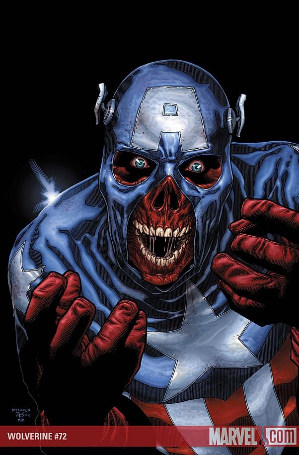
WOLVERINE #72
Writer: Mark Millar Artist: David McNiven Publisher: Marvel Comics Reviewer: Optimous Douche
Millar has not only conceived a glorious future imperfect with the series “Old Man Logan”, but in a stroke of juxtapositioning ingenuity chose this dystopian backdrop to traverse the as yet unexplored possibility of a pacifist Wolverine. Fuck FINAL CRISIS, you want to see the day the evil won, this IS it!The most awe inspiring element of this story is the fact that Millar leaves you in a perpetual state of anticipation and bombards you with sucker punch surprises that resonate to the core of our comic fandom. Every time I felt the sun was about to shine and the good guys would prevail, Millar twisted my literary testicles and said, “Fuck you, go get your happy endings at an Asian massage parlor because you won’t find any here.”
Are there spoilers ahead? You bet your ass there are Bub.
Set some fifty years after all of the villains of the world banded together to kill the super heroes, the world lives in the shadow of oppression. America is no longer one nation, but four kingdoms each ruled by one of today’s super villains or their progeny. I applaud Millar for not devising some overly complex takeover scheme to destroy the world’s heroes, but rather relied on simple math and the fact that villains have no reservations in delivering the final solution. It makes sense when you think about it. The only thing stopping villains from truly flourishing is their own megalomania.
Wolverine…excuse me, Logan as he now insists on being called, is a husk of the man he once was. Despite finding domestic bliss in the wastelands of the Western United States with his wife and two little wolvlings, times are tough and the rent is now due to the overlords of this territory, the hillbilly grand-spawn of the Hulk. Beaten by some untold atrocity (well, untold until part 6), he has vowed to never again raise his fists or SNIKT his claws in anger, even when Hulklings are pounding his face into the dirt. This was the first of many times during this series where I was screaming at the book in my hands for Logan to stop playing possum and tear the guts out of his adversaries. Faced with the same pummeling next month and the threat of his family sharing in the pain, Logan looks to a cataract ridden Hawkeye for some form of work to keep the “Deliverance” Hulkies at bay. Hawkeye, now a drug runner by trade, promises Logan enough money to keep his family afloat for the future if he simply acts as a navigator on a cross-country trek to deliver goods to New Babylon the former site of Washington D.C.
There were three distinct facets of story-telling brilliance that cascaded throughout this journey. Exposition has never been handled more tightly than the simple GPS map on the front page of each issue, letting you know exactly “Where’s Wolverine” this week. Despite my repeated screaming at the inanimate books in my hands, there is nary an adamantium skewer to be found until the very last page of the series. By not giving Logan his traditional defense mechanism, Millar relies on ingenuity and clever escape mechanisms to get the dynamic duo out of harrowing situations like the Ghost Riders of San Francisco, the city devouring mole men and rescuing Hawkeye’s daughter from the confines of the New Kingpin. Probably the sweetest gift of this series though, was the macabre new map markings of this haunted landscape including Hank Pym’s corpse acting as a ghoulish version of the St. Louis Arch, Hammer Fall where America flocks to see Thor’s shattered hammer as the town center piece, and Mt. Rushmore with a new face to let you know who was the chief architect in the fall of the heroes.
McNiven deserves a two handed reach around for crafting each panel with the care, and making even the non-action oriented sequences a sight to behold. The ability to craft dramatic tension with mere facial expressions is a rare gift indeed.
If you want me to give away the ending of this amazing run, well, too bad. Suffice to say that even in the “final” battle (final in quotes because the dénouement will be happening in a giant-size special) Logan keeps his claws inside his meaty fists and finishes off his adversary with gorgeous poetic justice. And the reason behind Logan’s vow to keep peace will finally put an end to the non-stop debates of which X-man is the most powerful of all.
When Optimous Douche isn’t reading comics and misspelling the names of 80’s icons, he “transforms” into a corporate communications guru. "What if the whole world had superpowers? Find out in the pages of Optimous’ original book AVERAGE JOE. Read the first full issue on Optimous’ New Blog and see original sketches by fellow @$$hole Bottleimp. If you are a publisher or can help these guys get AVERAGE JOE up, up, and on the shelves in any way, drop Optimous a line."
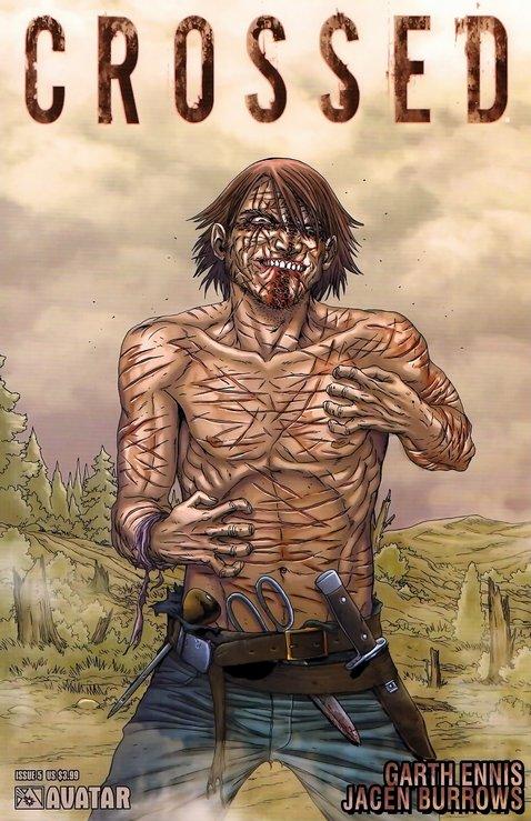
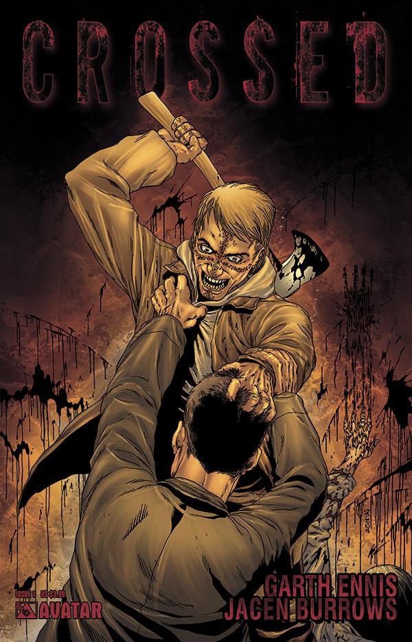
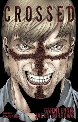
CROSSED #0-5
Story by: Garth Ennis Art by: Jacen Burrows Published by: Avatar Press Review by: Baytor
CROSSED is the Bataan Death March of comics.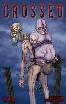 That, in a nutshell is its greatest strength and greatest weakness. Garth Ennis has joined the fray of “survivalist fiction” and has stripped away all the easy outs. No one is coming save them. There are no scientists working on a miracle cure. There is no handy Navy Seal to protect you. The Crossed are of human level intelligence and won’t die off of starvation…at least not until well after you do. Fighting the Crossed is next to useless because they will do anything to kill or infect you. And you can hide, but if they find you, you’re fucked.
Forget about lighting fires to stay warm; they will see the smoke and find you. Forget about hunting for food; they will hear the shots and find you. Forget about ransacking the local grocery store for canned food; they already took it all. You will never find out what caused the outbreak. You will never know the full impact of the outbreak. You will not dare hope for the future, because there is only surviving today.
 In essence, Garth Ennis has crafted a narrative black hole at the heart of his story. Unless he backs down and embracing one of those easy outs, this book is about the slow-motion extinction of humanity, and it’s disturbing and fucked-up to watch someone do this in such a prolonged fashion. Craft-wise, I cannot fault the book. Jacen Burrows was born to draw stuff like this and Ennis is playing the concept completely straight. There are some scenes that don’t really work (such as the Biscuit Game and the Kindergarten Kids), but overall Ennis seems to be accomplishing what he set out to do with this book, which is tell the story of long-term survival in an unsurvivable situation without pulling any punches.
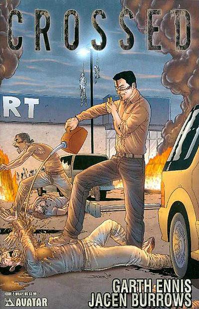 It’s nearly impossible to read CROSSED without thinking of that other story about cannibalistic, rapist pseudo-zombies: BLACKGAS. Warren Ellis’ tale is, by far, the more entertaining of the two, but I think it’s because it’s also much less ambitious, following the tried-and-true formula of zombie fiction. While he introduces a couple of new (and fairly disturbing) concepts into the mix, it isn’t functionally different from NIGHT OF THE LIVING DEAD, 28 DAYS LATER, or even SHAUN OF THE DEAD. It exists firmly inside of our comfort zone 95% of the time.
That’s because most zombie stories are a laugh. It’s about mindless slaughter and bloody mayhem, which is why they usually start off slow, introducing us to the main cast, then set the brain-eaters loose. Once the action starts, anyone introduced is just meat to the slaughter and there are usually only one or two deaths that have any impact.
 CROSSED inverts this formula, starting off by showing us how deranged and twisted the Crossed are in graphic detail, then deliberately slowing the pace down, introducing us to the main characters, and dwelling on the hopelessness of their situation.
What’s somewhat surprising is that CROSSED is not nearly as violent as it first appears. Yes, the prologue and first issue are pretty much a goreophile’s wet dream, but since then, the level of violence has fallen dramatically. There have been three panels of flesh-eating and no on-panel depiction of rape since the first issue. The latest issue features no violence at all. But that first issue and a half did its job by showing us how far Ennis & Burrows are willing to go and suggesting in dialogue that the Crossed have become even more depraved since then.
 Ultimately, the problem with the book is that it’s not an adrenaline high about fighting zombies. CROSSED is about being so fucking afraid of fighting zombies that you’ll attempt to cross the Rockies in winter without proper clothing and no food, knowing that if you die in the attempt, you’re still better off than if you had tried to fight them. The Crossed are basically a McGuffin to push a bunch of decent folks into a situation where they can’t win just to watch them circle the drain. If we gauged the success of horror by its ability to disturb, then CROSSED would be a notable success; but such judgments are more complex than that. We expect to be entertained at some primal level by our horror stories and Ennis seems determined to deny us this. It makes the work more powerful and I respect it for its effort, but I’m not sure that I like it.
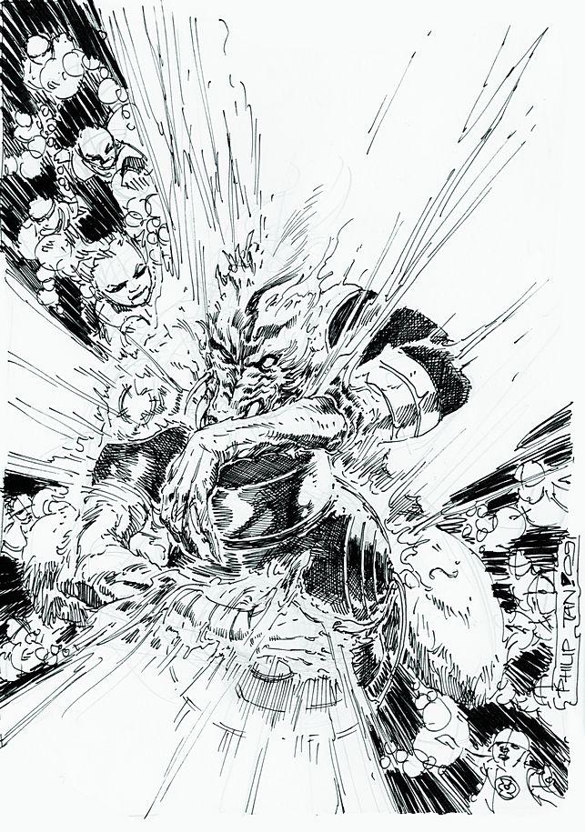
GREEN LANTERN #41
Writer: Geoff Johns Artist: Philip Tan and Eddy Barrows Publisher: DC Comics Reviewer: Liam ‘The Kid’
Note: ‘The Kid’ is 8 years old and has been doing reviews on his own site since August of 2008. And you can now follow the kid’s daily ‘adventures’ on Twitter.The main Green Lantern, Hal, still has two rings: a blue one and a green one. Him and the other Green Lanterns went to the home planet of the Orange Lanterns and they’ve been battling all of them. The Orange Lanterns are special because there is really only one Orange Lantern who is in control and the other ones are just ghosts of people he kills and become under his control.
Instead of fighting the Orange Lantern, Hal tells him that he’ll give him the blue ring that he wants so bad if he just tells him the story of how he became an Orange Lantern. I liked the whole story about how Larfleeze and his friends were searching for this special box and that they made the deal with the little blue Guardians to keep the Orange Lantern. I don’t like the blue Guardians at all. They’re always up to something and they make all of these rules and keep secrets from the good guys. All of the Orange Lanterns are kind of funny in a way. They’re mean and tough but they’re so greedy and that’s what the Orange Lantern’s power is. It makes everyone greedy. So all of the ghosts and creatures that find it keep saying, ‘mine, mine, mine’. Even when they find out that Hal has a blue ring they surround him and go ‘mine, mine, mine’. It’s supposed to be scary because he is up against all of these Orange Lantern ghosts but it’s still kind of funny when you read it like that.
There wasn’t a lot of action in this issue. Most of the action is in the story that Larfleeze tells about how he got the power and the battle with the blue Guardians. The Green Lanterns don’t do much in this issue and Hal is pretty much just captured and talking the entire time. I like how the artist draws all of the Orange Lantern ghosts. They look very cool and different from the other teams and they’re all these weird types of aliens. What I don’t like is that the art was very dark. It all takes place in Larfleeze’s cave but a lot of the backgrounds and stuff was hard to see because the colors were really dark. Even people like Hal were colored darker than other comics.
The end of the issue is really good. I like when Larfleeze tries to take the blue ring from Hal after the story. I was really surprised by what he did. I don’t know what’s going to happen to Hal in the next issue or if his green ring will make things better but it was a cool move that Larfleeze did on Hal. I like the Orange Lanterns and the way they act all crazy but so far they haven’t really done a whole lot in the story. The Blue Lanterns are cool because they are the most powerful but so far I like the story with the Red Lanterns the best because they did a lot more and the battles were bigger with them. I hope that in the next issue we finally get to see a huge battle between the Orange Lanterns and someone else.
Rating: 7 out of 10
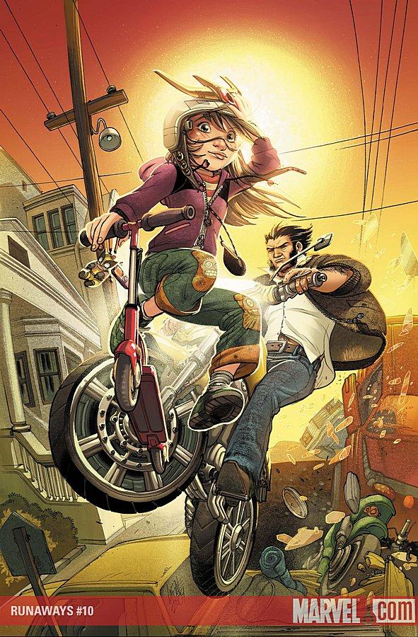
RUNAWAYS #10
Writer: Christopher Yost Artist : Sara Pichelli Publisher: Marvel Comics Reviewer: steverodgers
Marvel stops the bleeding on Terry Moore’s RUNAWAYS with a picture perfect one-shot by Christopher Yost and soon-to-be full-time artist Sara Pichelli. In issue #10, the Runaways head to San Francisco so Molly can check out going to school with the X-Men (note to Marvel parents: if your kids are mutants, just home school them, social skills be damned). While at school, Molly manages to irritate every X-Men in the building, including her charge and mentor to precocious girls everywhere, old man Wolverine. Beyond Molly being Molly, the other kids banter like they used to, hang out with some B-List X-Kids (they might be A-List, they look pretty D-List) and have a good time in the city by the bay.What makes me love this issue is it’s the RUNAWAYS I remember; it’s the easy humor, fun, adventure and emotional realness that used to pop from every page while BKV was running the show (and to a lesser extent with Whedon’s too-short stewardship). Yost pulls off this trick by putting Molly through the emotional wringer and having her confront the reality that her folks were more than “super villains” in the abstract, but in fact two very real, sadistic killers who took pleasure in hurting other people, including the guy looking for revenge by seeking out to kill Molly. The capture, battle and rescue are fun—and funny—but there is a sense of real danger that makes it thrilling.
There is one great panel that encapsulates everything that makes RUNAWAYS such a (potentially) great book, and where Wolverine once again proves his mentorship chops (let’s face it, Kitty Pryde turned out to be a terrific adult) and says just the right thing to a distraught Princess Power, sobbing with the weight of her parents’ crimes barreling down on her. I’m not sure if it’s because I’m a new parent and am a tad more sensitive than I used to be, or maybe it was just the perfect writing and illustration, but I have to say I got a little dusty. Totally embarrassing.
The next issue kicks off a new arc, with Kathryn Immonen writing; I can only hope they keep the momentum going, because when RUNAWAYS is done right, it is one of Marvel’s best and most unique books.
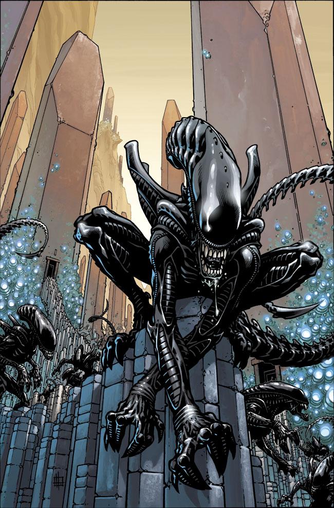
ALIENS #1
Writer: John Arcudi Art: Zach Howard Publisher: Dark Horse Comics Reviewer: Mr. Pasty
Ripley, believe it or not, the Aliens are back! In a licensed comic no less, where they’re faced with a fate far worse than Hudson’s incessant whining. They must now survive the opinions of cynical comic book fans worldwide.Dark Horse has boldly gone where most men have gone before, but since they were able to find a fair amount of success in their STAR WARS and CONAN books, I welcomed their interpretation of the ALIEN franchise.
I won’t give you any of Carter Burke’s double-talk so here it is: ALIENS is comic books done right. Trying to build a compelling story around a one-dimensional antagonist that is basically death with fangs can be a daunting task. Fortunately John Arcudi’s script instead focuses on the impact the Alien existence has on the human elements in his story. I also like that fans of the movies will get their share of easter eggs without finding a complete retread of existing material. Set sometime after the events in the original “Alien”, Arcudi uses slow and deliberate pacing that establishes his characters and gives readers an investment in their fate.
A lesser writer would have likely bathed his opening panels in Alien carnage and probably could have made it work, but the restraint demonstrated here makes this book’s payoff that much sweeter. And when I say payoff, I mean one of those moments where you’re in cruise control and suddenly BAM! You got served.
Some of the initial reviews I’ve seen have been critical of Zach Howard’s art and expressed disappointment that his visuals don’t faithfully adhere to the dark and foreboding tone applied in the movies and perhaps earlier books. It’s a fair point, but after digesting the material I’m confident his color scheme works. The dichotomy between the security of rich and colorful environments versus the jarring effect of violence and sudden death surfaces one of the many underlying themes in this book: We should fear the Aliens, but we should fear ourselves even more. There are no safe zones.
ALIENS #1 is a success. It’s a daring departure from the precedent already set by the movie franchise and fans of good comics, regardless of genre, will appreciate the fine job Dark Horse has done, yet again.
My rating: 5 short, controlled bursts out of 5.
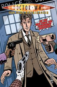
DOCTOR WHO: THE TIME MACHINATION One-Shot
Tony Lee: Writer Paul Grist: Artist IDW Publishing: Publisher Reviewer: Jinxo
I enjoyed this comic but I have a feeling it would annoy the crap out of many readers.First off, I love the simplified comic art look. Today everything is just so intensely detailed I just enjoy once in awhile finding a book where they go for more of a more minimal almost doodly look.
I also like the general flow of the book's story. We have the current Doctor back in the past running around adventuring with H.G. Wells. One of the plots that the revamp of Doctor Who put into play was the creation of the British organization Torchwood by Queen Victoria. This is a group meant to defend Britain from the paranormal, but it is also tasked with capturing The Doctor. The show has never really shown Torchwood of the past really gunning for The Doctor. This issue does. It also has other people gunning for The Doctor as well.
Part of the fun of the issue is also what could be part of the annoyance for some readers. The issue touches on and references several of The Doctor's previous TV adventures. In most cases this is handled in a way where those unfamiliar with the adventures in question can still follow along. But there is one major one that is not clearly explained up front. It's explained after the fact. The result is the story can come off at points as really confusing. You have to be able to say to yourself, "The writers have to know this is baffling and be doing it on purpose," and then go with it. THEN when the explanation does come, it gets into some confusing time travely logic which, again, will annoy some. For me though, I enjoy a story that is a bit of a challenge and strains the brain cells. To a point. Go too far and my head will explode. But this story still fell within the area where I could enjoy it. Just a bit of logic dizzying fun. But if confusing timey-wimey isn't your cup of tea, steer clear.
Jinxo is Thom Holbrook, lifelong comic book reader, and the evil genius behind poobala.com. He may appear cute and cuddly but if encountered avoid eye contact and DO NOT attempt to feed.
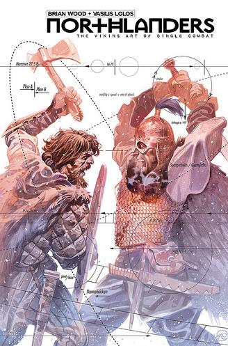
NORTHLANDERS #17
Writer: Brian Wood Artist: Vasilis Lolos Publisher: Vertigo/DC Comics Reviewed by Humphrey Lee
Despite having no reason to believe so, I always felt ever since this title started up about a year and a half ago, that we'd be experiencing an issue like this stand-alone jaunt right here. Once I got a little taste of the book and the perspective and narrative that it played with about the "Viking lifestyle" and just sort of the generalized romancing of the era, I just knew that there'd be something where we got some really down and dirty dissection of the brutality of it all, don't ask me how. There's such a sweet science to the art of armed combat, it just seemed such a natural idea that we'd get into the nitty gritty of it, though I would have assumed it would have been maybe something in the form of a first person narrative of whomever was the main character of a particular arc or what have you. And here it is! The main event! Two big burly men of somewhat lesser class or demeanor ready to smack the shit out of each other and hack the man in front of him into kibble if need be, all because, well, that's what they do. Ah, the old school life...The true glory of this issue liesin the presentation and narrative, like it always has throughout the series so far. It starts off with a brief and somewhat humorous set up of a tale of two feuding lords using declared champions of theirs to fight for the settlement of their squabbles, which have gone on for generations because of blatant stubbornness, of course. And really, going off to talk about the direction of this issue, what it felt to me as I read it, was that it was almost like the Viking version of "Why We Fight". This issue isn't exactly all about the technical, though Wood does go through a great deal of effort to talk about things like the make and pure numbers of their weaponry - length, weight, etc - or to talk about the philosophy of stuff like going armorless to emphasize speed and ferocity against an opponent weighed down a bit by his coat and shield, watching for a hidden dagger that might find its way into your thigh and so on. What it really is though, is more of that romance I was talking about, the idea of the Viking as a conqueror or as a warrior, or really just as a mindless thug who likes to bludgeon people to paste and take their shit, and then live in mortal fear that some day once they have their own family and household to worry about whether the same fate will eventually come to them.
The art by Vasilis Lolos, the (I think) fourth artist to be showcased on this book, matches up very well with this one-and-done tale. It's not exactly my favorite on the series, but that's like saying the SuperBowl XL win by my Steelers isn't my favorite. It might not have been pretty, but it still was a win. And that's the point here, this issue should be a little ugly and Lolos’ art style puts all the emphasis where it should be. When you have a story like this, where it's presented in kind of a voice-over documentary style you need to call the right flow of how the action will work around the captions, and then you need to give those pristine moments of mannequin like posing for the camera as you start your next train of thought, or to just show off these terrible figures. And Lolos’ art is perfect for this. The lines are dirty but very detailed, and these look like the rough and tumble fuckers that you'd expect those now ancient warrior figures to look like. There's lots of great action lines, and some really great and over-emphasized expressions to really drive home the feeling of the struggle between these two men. Really cool stuff; I hope he gets another tale to draw in the rotation on this book.
If there ever was an issue to show just what a book is about, this is it for THE NORTHLANDERS. It's just so brutal and direct, yet a little playful and definitely a love letter to the era it's showcasing. I've loved how Wood has given us several motivations for each of his main characters in each arc to be doing what they do, but at the end of the day it's always the same reason - to carve out your own little piece of the world and then to hold onto it with every ounce of strength and will in your body. And really, despite the obvious differences in savagery and aggression (and really, that sometimes doesn't seem to be the case either) is it all that different a philosophy than what we live by today? I'll leave you to read this issue and decide; in the meantime I'll be sharpening my axe in case we decide, as a society, to get in touch with our more savage sides. My neighbor has a pretty shiny new Shelby GT I wouldn't mind claiming…
Humphrey Lee has been an avid comic book reader going on fifteen years now and a contributor to Ain't It Cool comics for quite a few as well. In fact, reading comics is about all he does in his free time and where all the money from his day job wages goes to - funding his comic book habit so he can talk about them to you, our loyal readers (lucky you). He's a bit of a social networking whore, so you can find him all over the Interwebs on sites like Twitter, The MySpaces, Facebookand a Blogger Account where he also mostly talks about comics with his free time because he hasn't the slightest semblance of a life. Sad but true, and he gladly encourages you to add, read, and comment as you will.
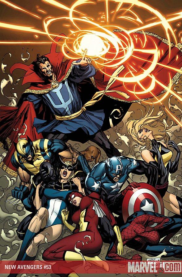
NEW AVENGERS #53
Writer: Brian Michael Bendis Artist: Billy Tan Publisher: Marvel Comics Reviewer: Liam ‘The Kid’
Note: ‘The Kid’ is 8 years old and has been doing reviews on his own site since August of 2008. And you can now follow the kid’s daily ‘adventures’ on Twitter.I think Spider-Man and Luke Cage should have their own comic book. They are so hilarious together. The first couple pages of the comic just take place in the Avengers jet plane and that could be very boring for a comic but the Spider-Man and Cage parts are really funny. Spider-Man is apologizing to Cage because they found out that Cage’s wife used to love Spider-Man when they were all in school together and the more Spider-Man keeps talking the more Cage is getting angry. The best part is when Spider-Man jokes that since Cage and Iron Fist broke up he wants a shot at Iron Fist and Cage screams for them to hurry up and land the plane.
I don’t really like all of the magic stuff. I don’t think Doctor Strange is that cool and if he’s supposed to be an expert he really doesn’t know what’s going on because he’s been looking for that magic eye for a couple issues and he still has no idea who is going to have it. The only part of the magic story that was kind of interesting was when Hood broke into the devil guy’s house and started to battle him. I like that Hood thinks he’s so tough with that huge monster inside him but the devil guy pretty much just kicked his butt. Doctor Strange and Hood are kind of the same because they both stink as characters and can’t do anything right.
The action in the comic was really good. I liked how Wolverine jumped out of the plane and the woman with the gold mask started shooting at him and he wasn’t getting hurt by it but Spider-Man still tried to save him. And then there was a really cool fight with Spider-Woman and the girl with the mask where they do karate with smoke covering them. The best part of the battle was when the bad girl takes a woman hostage and Captain America saves the hostage.
There was a lot of good action and a lot of funny parts in the book. Even Captain America was funny when he was yelling at Spider-Man for calling him Bucky Cap all the time. I like that Spider-Man annoys a lot of the people on the team but he’s a great hero so they let him stay on. The art was really good and I like how Captain America is drawn with the shiny suit and the guns and shield. The fight with the Hood and the devil guy has a lot of cool art, too. I like how the flames are all over the place and how creepy the artist makes the Hood in monster form. I just wish the magic stuff was more interesting.
In the end it was a pretty good comic all around. Luke Cage, Spider-Man and Captain America are all awesome. I wish that Ronin did more. He’s the leader and he’s not really in the comic but maybe next issue. I am glad that the eye found a new magician so maybe the magic story will be over soon but I have no idea who the guy is that has the new powers except that he looks kind of strange. I want to see the Avengers team up and go on more battles, especially Norman Osborn’s team, instead of chasing magic people around.
Rating: 9 out of 10
STARCRAFT #1
Writer: Simon Furman Art: Federico Dallocchio Publisher: DC Wildstorm Reviewer: Mr. Pasty
Transmit coordinates…coordinates received…STARCRAFT is finally here in all its graphic glory and I’m not lost on the irony that this book drops the same week as Dark Horse’s ALIENS #1. The original Starcraft RTS game borrowed heavily from the ALIEN movie franchise with a great deal of success. Unfortunately it falls just shy of duplicating that success in its transition to comics.
The story begins with much promise, as Simon Furman opens STARCRAFT in the midst of battle. The opening panels are haphazard and muddled together (likely by design) and the confusing, often disjointed narrative effectively mimics the chaos and disorientation of real war.
Federico Dallocchio compliments the tone by expanding and contracting his art in unison with the script. Battle scenes are messy and bleed together. Corporate offices are one-dimensional and sterile.
What helps this book is the strength of the source material. The STARCRAFT universe is rich with unexplored storylines and populated by complex characters spread out across three separate races. Having said that, there is a STEEP learning curve for even the most loyal fan. I think Furman may have tried to be a bit too faithful here, as I spent a lot of time backtracking to recollect which of the innumerable characters he was referencing from earlier panels, even on the second and third read. His introductions are so brief that any exposition reads like a military roll call.
STARCRAFT #1 is a serviceable albeit impatient entry into the saga of the Blizzard space wars. As it is in war, the decision makers often consider their troops expendable. Furman may have adopted that philosophy for STARCRAFT, which in the end overwhelmed me with so many disposable characters that I found it difficult to attach myself to any of them.
My Rating: 3 Zerg-impregnated Kerrigans out of 5.
WAR MACHINE #6
Writer: Greg Pak Art: Allan Jefferson & Mahmud Asrar (pencils), Nelson Pereira & Jeffrey Huet (inks) Publisher: Marvel Comics Conflicted: Ambush Bug
Picture a reviewer torn.That’s how I feel about this latest issue of WAR MACHINE. I don’t hear too many rumblings in the TBs about WAR MACHINE, but I’ve been enjoying this series so far mostly due to the amazingly gritty art by Leonard Manco. Manco’s art on this series so far looks as if it were made from military photographs from a war zone from a long ago conflict. They’re dirty little panels, filled with sizzling bullets, blood, and all forms of wartime grit that you’d expect from a comic called WAR MACHINE. Aside from my dislike for the initial direction this series took off from since Rhodey looks way too much like DC’s Cyborg character for my tastes, it was the art that kept me involved, kept me invested, kept me spending my money every month despite the story and direction.
Well, Manco didn’t draw this issue and part of me wants to take this opportunity to take my leave and give my hard earned shekels to another comic. And just as I was about to leave…they pull me back in.
No, it’s not the art this time. The art in this issue is ok, I guess. Pretty straight forward and strong, but lacking the bone-crunching post-apolcalyptic grime that permeated in all of Manco’s panels. Here the art is crisp and clean and all together, just ok. Not the reason why I plan on keeping on keeping on with this book.
And James Rhodey Rhodes is still all Cyborg/Robocop-ed up here. I understand making Rhodey an actual War Machine in body as well as armor and spirit was an ok decision, but to literally make him look exactly like Cyborg under the suit reeks of unoriginality. If anything, the longer Rhodes is in that DC character’s body, the more reasons I can think of to leave.
 Nope. The reason why I’m sticking around can be summed up in two words and as soon as I say them I’m sure some of you will be kicking yourself for missing this issue and will make it a point of searching for this one next time you go to your LCS.
American.
Eagle.
Yep, Ellis’ THUNDERBOLTS bad@$$ makes an appearance and looks to be around for a while in this comic. And all of the things that made you love the character in Ellis’ first few arcs of THUNDERBOLTS are presented here by writer Greg Pak in the same fashion. See American Eagle sip tea with War Machine’s mother. See him kick the @$$es of all of Rhodey’s pit crew. See him strut his stuff like he’s king o’ the world in all his glory in this issue.
Side Note: I know everyone loves American Eagle and I do too, but I have to boo the decision to Bendis him up and make him lose his costume. Sure Ellis made it a point to try to make it ridiculous, but I think his costume (pictured over there) is pretty bad@SS and not something out of the Village People’s laundry bin. Even before Ellis’ relaunch of the character, I loved me some American Eagle. The MARVEL TWO-IN-ONE ANNUAL he premiered in was one of my favorites (mostly because there was a scene where American Eagle rips a giant tree out of the ground with his bare hands!) and worth checking out for newly dubbed American Eagle fans everywhere. Hopefully with old school continuity lovers (like Slott, Pak, Van Lente, Wells, and Parker) on the rise at Marvel, we’ll be seeing the return of that awesome headdress and costume sometime soon. End Side Note.
I have no idea if American Eagle will be around for a while or if Leonard Manco is taking a break from the series or never returning, but as long as one of them is in this book, I’ll be there to check it out.
Every comic shop has them…battered long boxes jam-packed with dog-eared titles ranging from forgotten heroes of the 1970s to multiple copies of chromium-covered “collector’s item” comics from the Big Bust of the 1990s. But if you are patient, and dig deep enough, you just may find something special…
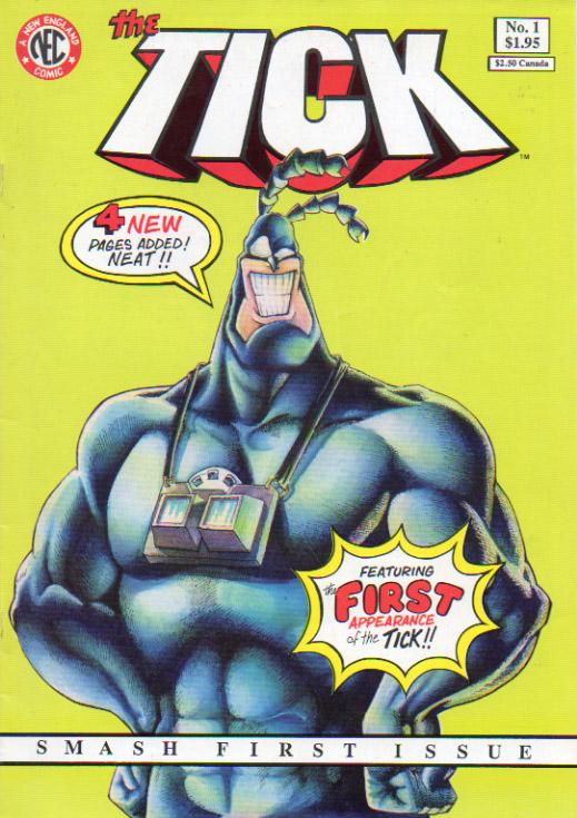
THE TICK ongoing series #1-12
Writer and Penciler: Ben Edlund Inkers: Max Banks, Dave Garcia, Jeff Whiting Published by: New England Comics Press Reviewed by: BottleImp, who traded a picture of Alexander Hamilton for ‘em.
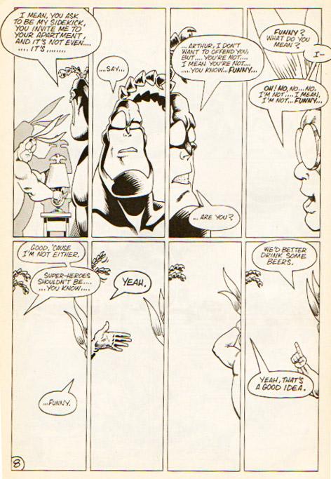 First off, it must be said that the first few issues of THE TICK are pretty amateurish, art-wise, especially in #1 (wherein Edlund inked as well as penciled). Settings tend to be vague, some of the action moments don’t really read as such, and while the Tick himself is always carefully rendered, supporting players and background characters appear flat and hastily scribbled. However, the page designs and pacing of the story are working well, and the gags hit all the right beats. The artwork gets lots better over subsequent issues (there’s a definite Eisner influence that pops up around the third issue, right down to a set piece bearing the title of the issue), probably due to Edlund’s increasing skill and/or competence as well as having others ink over his pencils. But though the art wasn’t quite there from the get-go, the tone of this series is firmly in place right from the first page. THE TICK is that rarest of comic books that revels in the absurdities of the superhero comic, and in doing so, jumpstarted a whole new genre of humorous adventure.
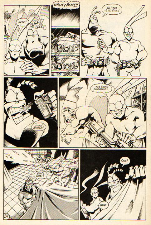 Humorous comics were nothing new—Harvey Kurtzman and Co. were poking fun at their own medium back in the 1950s with MAD. And like MAD, THE TICK began with a more satirical bent. Specifically, the first five issues involve a tangled plotline involving ninjas, samurai, and a dagger-wielding, bandana-wearing woman named Oedipus. Drama geeks and Literature majors, now’s your time to show off. But after this playful knock at Frank Miller and the late ‘80s ninja explosion, THE TICK morphed into something new. It still mocked superhero conventions, but in a broader manner. The characters of the Tick and Arthur evolved, and so too did Edlund’s storytelling skill develop. As the series progressed THE TICK became a marvelous mash-up of superheroes, Python-esque surreal humor, and a healthy helping of kitsch. The Tick himself transcended the basic comic book parody to become more of an archetype: the good-hearted simpleton (such as can be found throughout Grimm’s fairy tales) who perseveres because of his innocence (although in the Tick’s case, being nigh-invulnerable certainly helps).
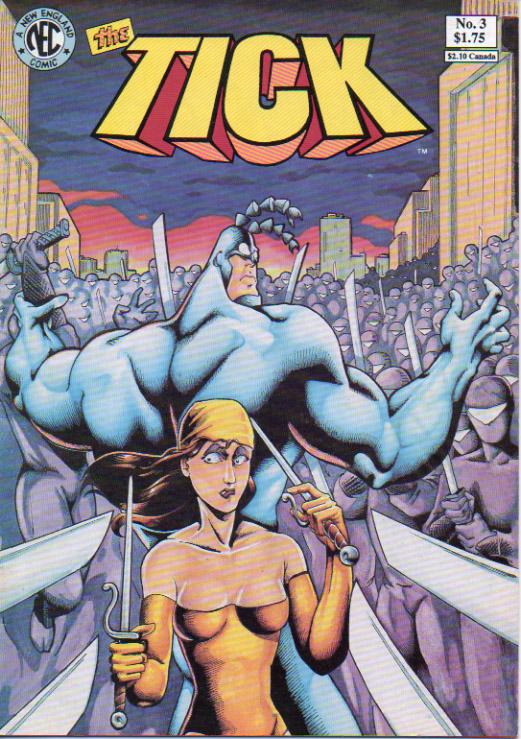 But forget that stuff—what it all comes down to is that THE TICK is a hell of a lot of fun.
I came to THE TICK through its Saturday-morning-cartoon incarnation, but had never read the original comics—the curse of living in a small town, reliant on the grab-bag availability of convenience store comics. So I was stoked to find these in the cheap box at my local comic shop. Surprisingly (to me, at least), a good amount of the cartoon was taken almost verbatim from the source material. Of course, there are a few differences in the more adult-geared comic, such as a spattering of curse words throughout and, possibly my favorite moment from #6, the Tick’s slightly homophobic reaction to Arthur’s non-“Spider-Man and his Amazing Friends”-style apartment. Classic.
If you can’t find the original comics anywhere, NEC has also published reprint collections of the various Tick series—check your local comic store.
When released from his Bottle, the Imp takes the form of Stephen Andrade, an artist/illustrator/pirate monkey painter from the Northeast. You can see some of his artwork athere. He’s given up comics more times than he can remember. But every time he thinks he's out, they pull him back in.

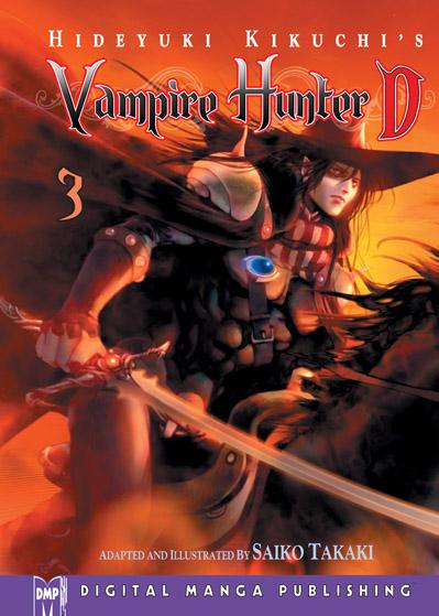
VAMPIRE HUNTER D Vol. 3
Story by Hideyuki Kikuchi Adapted by Saiko Takaki Released DMP Reviewer: Scott Green
The third volume of VAMPIRE HUNTER D presents a bull rush through a worn out post-post apocalyptic gothic western world. Its volume long, written for graphic novel race kicks off with a spaghetti standoff as vampire hunting half vampire D charges his mechanical horse after undead lord Mayerling as the pure blood absconds with a young woman, only to find the notorious mercenaries of the Marcus clan also slaughtering their way towards the lord. The messy situation gets nastier when Barbarois mutants dog pile in, ostensibly on behalf of the vampire lord.On May 26, 2009, the sad news came that Sumiyo Imaoka lost her battle to cancer at age 56. Under the pen name Kaoru Kurimoto, she wrote 126 fantasy books concerning a leopard headed warrior in the GUIIN SAGA series, in addition to her novel cycle “Makai Sui Koten” (“Hell's Water Margin”) - a cross between Chinese wuxia tradition and Cthulhu mythos. Kaoru Kurimoto, along with Hideyuki Kikuchi were primary creative forces who set the template for what's now known as "light novels." GUIN SAGA, Hideyuki Kikuchi's similarly seminal VAMPIRE HUNTER D and their descendants are brisk pop-lit books that are generally for a teenage/young adult audience. And like Kurimoto and Kikuchi's work, light novels trended towards genre and often concerned themselves with inventing a world.
A key quality of light novels is that they're quick reads. In several reviews, I made the point that Guin Saga is fantasy for an adult audience who no longer has the time for a Tolkien-esque doorstop. You can get through most of a light novel in a sitting or two. I brought Kikuchi's DARK WARS: THE TALE OF MEIJI DRACULA to the gym recently, and by the time I completed exercise cycle and working my legs I'd finished a bit more than a third.
The third VAMPIRE HUNTER D novel, "Demon Deathchase" was the source material for Ninja Scroll director Yoshiaki Kawajiri's movie VAMPIRE HUNTER D: BLOODLUST. That movie's location bound final act and Elizabeth Báthory stand-in Carmilla aren't be to found in the novel. Without that in place confrontation, the novel is constant, frantic motion.
Saiko Takaki's manga adaption clings closely to the novel and as such, inherits that breathless dash through Kikuchi's world. This volume of VAMPIRE HUNTER D bolts from one dark tableau to the next. It's a bumpy ride on a wheel who's spokes consist of cursed paragon D, gothic Mayerling - a vampire painted as an honorable figured doomed by his love of a human woman, a Marcus clan willing to stop at nothing, including fratricide, to see their obsession through to the end, and a wildcard Barbarois ready to forward their own agendas. It's a concept driven affair. You get D crossing his sword with a giant man wielding a spiked pylon, D versus dark inverses of himself from the Barbarois, a militarized dirt buggy versus a vampire super-coffin, and all sorts of other genre chimera.
The evident intension has very little to do with a smooth, coherent narrative. It's the storytelling equivalent of the "Itano circus" - the Macross publicized sequence in which a swarm of missiles are launched, with their exhaust vectors painting the sky in ant trails. The target direction is obvious, but the participants are spectacularly screaming all over the map to get there.
Saiko Takaki effectively evokes the feel of the novels. The manga neither ignores nor stumbles over the contradictory notion an dusty wanderings of a man in an elegant cape. It has improved on its ability to suggest the style of the novels' illustrator Yoshitaka Amano (probably best known in North America for his work on the FINAL FANTASY games.) And, without aping Amano, Saiko Takaki touches on his trademark willowy forms and credibly puts them into action.
Essentially VAMPIRE HUNTER D is the novel as manga, faithful down to how many arrows are put into a bow. The problem is that this limits the derivative work. There are observations that make the novel involving that don't translate to manga... that the shadow of a man with a spear slung on his back looks like a person impaled... how the great technology once produced by vampire lords has worn down to the point where it's literally missing screws. The manga is not well suited for that style of commentary and doesn't really replace it with its own spin, other than it’s the story in sequential art rather than prose. It's a well executed adaptation of VAMPIRE HUNTER D into manga, but if that's not something that interests you, the manga isn't going to persuade you otherwise.
Scott Green has been writing for AICN ANIME for over seven years. If you like what you see here and love anime & manga, be sure to check out his latest AICN ANIME column here.

Hey folks, Ambush Bug here with another hard drive full of webcomics for you to digest. This week’s assortment is made up of various genres and styles, proof positive that some of the most interesting comic book stories can be read for free and are just a mouseclick away. Click on the links below to start enjoying these outstanding webcomics.
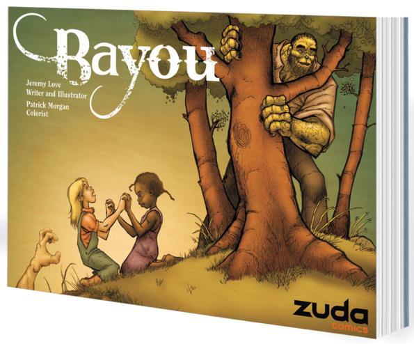
BAYOU VOL.1 DC Zuda
This collection of the popular DC Zuda webcomic is one of the best comics I’ve read in a long time. Volume one introduces us to an all too real and ugly world of 1933 Mississippi and all the hardships you could imagine for our star, a young African American girl, Lee, who through a series of unfortunate events leaps through the swamp-like version of the Looking Glass into a world of horrible monsters and wonderful mysteries. This is a beautifully written fable that doesn’t pull punches when it comes to depicting real world ugliness. The pain and heartache felt by the main character oozes off the page and will touch even the coldest of hearts. The art is altogether unique in its slightly caricaturistic yet realistic versions of real life characters. Writer/artist Jeremy Love is a true find and proof positive that true talent lies in DC’s Zuda online comics zone. Although the paper the book is printed on was a little disappointing (felt like old and flimsy newsprint to me, but maybe I got a bad copy), the quality of the content within BAYOU VOL.1 is something that must be seen to be believed. Please check out this collection and give it your love. I want to see more BAYOU on Zuda soon!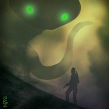
GOLDILOCK
Speaking of ZUDA, creator Adam Lucas contacted me to give me a heads up on a new webseries he’s submitting for DC’s online comics branch. It’s called GOLDILOCK and it looks to be a pretty amazing sci fi tale. The art looks fantastic and full of imaginative creatures and landscapes. ZUDA should give GOLDILOCK a chance from what I see here. Check out the trailer for Adam Lucas’ GOLDILOCK here to see what I mean. Best of luck, Adam.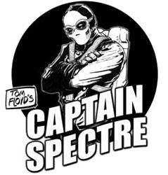
CAPTAIN SPECTRE AND THE LIGHTNING LEGION
This is one of those throwback stories that is so in love with the reference material that inspired it, it’s infectious. A celebration of old radio serials of the past, CAPTAIN SPECTRE AND THE LIGHTNING LEGION takes the reader back to a simpler time, when people hung out in malt shops and it was ok for the hero to kill a bad guy and everyone was pretty much ok with that. Things start out pretty normal with your typical boy running down a typical street in a typical neighborhood, but soon events spiral into the realm of adventure--hard core adventure where the stakes are dire, the pulp action is high, and the heroes and villains collide. Tom Floyd has done his research and added all the right elements to make this an all new adventure that reminds you of adventures of old. Four chapters are done so far, and the website looks like an old radio, which I think is pretty keen too.