Cool News
A Remake That Doesn't Need To Happen Gets A Poster That Doesn't Even Try!! THE TAKING OF PELHAM 123 Poster Is Here...
Merrick here...
This poster...is cheap, ugly, and says nothing about this new film from Tony Scott.
Or, maybe it does say something about the film...if it's trying to illustrate that this movie should never have been made.
I'm not sure if the Marketeers were aiming for retro, and missed the mark? If their PhotoShop froze-up half-way through the image's production? Or...whatever.
This originates from an exclusive over at JoBlo - you can see its embiggenable entirety by clicking the thumbnail below.

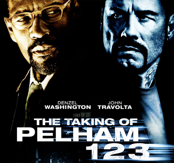
Harry here - this poster makes me sick to my stomach. Looks like a shit direct to video hack job. Check out the original...


-
+ Expand All
-
I think the best poster I've seen for a while was the one for Jack Brooks: Monster Slayer and that one wasn't even original.
-
Look at that facial hair fest, BA badass
-
SBTM: "Nothing Much, Sorta Whitish Blue Man...
-
Care to explain exactly what is wrong with that poster, Merrick? How does it demonstrate why this movie should not have been made, specifically.
or are you just blowing smoke out of your ass again? -
...As Good as It Gets. Just a photo of Jack Nicholson with sunglasses. What is the movie about? Jack Nicholson loves to take a walk in the sun? I mean, here they even put some color filters over it and show a train.
-
What exactly did you want instead, Merrick?
-
Pack it in.
-
How about explaining EXACTLY WHAT IS WRONG WITH IT, instead of handing out these Papal Bulls as if the words themselves are validated because you said them. Knowing nothing about this movie, I get the impression that Denzel and Travolta are the antagonists and that Travolta is some sort of 'bad guy' - I got all that from a simple 'duet' poster.
-
..normally those idiot Hollywood art directors can't even manage that, even if there's only two people on the poster.
-
I love the 1974 version, especially Walther Matthau.Btw, that poster is kinda lame and unimaginative.
-
I'm like the run n' shoot Houston Oilers on a 3rd and 11: PASS!
-
Harry said, "it makes me sick to my stomach. it looks like a direct to video hack job" I don't know how you express opinions generally, but I think that explains how he feels and why pretty acutely when you combine it with actually looking at the shitty poster. What more do you want from him?
-
This poster is absolute shit.
-
That old poster is retarded. Sorry dude, it's the poster for retards where the film is spoon fed to retards. They still probably didn't know what the film was about. Summary: old poster made of failure. New poster: slightly less fail but at least you know who's in it and it doesn't like like a Chick Tract.
-
..and as far as him explaining to you EXACTLY what is wrong with it, why don't you form your own opinion. DO you need him to tell you what to think? Moron.
-
..and as far as him explaining to you EXACTLY what is wrong with it, why don't you form your own opinion. DO you need him to tell you what to think? Moron.
-
Harry and Merrick tossed out opinions WITHOUT BACKING THEM UP. All I asked for was some kind of explanation of what brought them to that conclusion "looks like a direct to video hack job" - sorry, that doesn't really tell me what's so wrong about this poster. Whether or not I have formed my own opinions is immaterial, but if you actually knew how to read with that mongoloid retard brain of yours, you'd find my opinion about 4 or 5 posts ABOVE your retarded double-post of failure.
Next time you want to call someone a moron, make sure you dont do it in a double-post. Makes you look very stupid. -
Very rarely do you see posters nowadays that are iconic. There may be a couple here or there, but for the most part they all look like THE FAST AND THE FURIOUS.
-
Feb 10, 2009 11:42:37 AM CST
Whoever said As Good as It Gets had a terrible poster...
by blackmantis
...has obviously never seen this one -- http://tinyurl.com/aqtcpe
-
modern marketing wisdom dictates that the actors faces must dominate the poster but we, the potential audience, don't learn anything else about the film except who the stars are. The original poster has a lot going on (almost too much) but it has menace and action and it tells the audience they are in for an intense thriller. Posters in the 70's were like a whole movie trailer on just one piece of paper. Awsome.
-
what did you expect from a Tony Scott film?
-
Don't you think we should ask for MORE?
-
... but likely won't match the original. Not a fan of remakes, though. And yes, there does seem to be less art in movie posters, as in book covers. It must be cheaper to photoshop stills than to commission original art.
-
but yeah, it's nothing special. It's not horrible, it's just blah.
I used to love those old posters as a kid, but now they just remind me of MAD magazine. If we fold it it's probably Alfred E. Newman shitting on Tony Scott. -
Ah, the good ole days...
-
hey let's make the black guy brown and the white guy white. but then to drive it home we'll have the black guy be the only brown element in the poster.i didn't know travolta was making anything lately- too busy flying around with his gay lover nanny and all that.
-
I KNEW it would be head shots. If no one knew of the original the title is meaningless. I liked the old school disaster-movie feel of the original.
-
I heard he was but I never took stock in it. This is at least the SECOND time that he has participated in an unnecessary remake where he plays a role that was originally played by a white man. What if they remade Seven or Shawshank Redemption with some white guy taking over for Freeman? There would be an outrage, no doubt. The original Manchurian Candidate was amazing but the remake was awful and I am sure this will also be the case with this remake.
-
Feb 10, 2009 11:53:38 AM CST
HOW THE FUCK DO YOU FIGURE THEY AIMED FOR RETRO?
by dannyglovers_dickblood
Seriously. What the fuck? Its just a standard studio boring looking poster. They weren't aiming for shit. TONY SCOTT IS GOD.
-
that poster can pass for a comedy today. the remake poster is not exceptially bad, it's just generic. it's how every movie is marketed nowaday. huge mugs of big stars splash across the entire poster. it's boring, but how else would you attract the movie going public?
-
I wonder if they ever did a parody of that movie back in the day.
-
Shouldn't it be called "The Dick Taking of Pelham 123"?
-
Every damn poster looked like that back in the day. I bet if we build a time machine and sent this site back in time the same stuff we say today would hold true than. BUT...
This original film ROCKED... and so did Star Wars... so never mind we wouldn't be sounding like a bunch of whiney TB'ers. Hehe. -
You've got the "1408" poster.I just hope that since this is basically a hostage drama, and a war of wills/wits, that we get Crimson Tide Scott, and not Domino/Man On Fire Scott. I rewatched Crimson on TCM recently, and it holds up very well.
-
Feb 10, 2009 12:11:31 PM CST
It Quite Clearly Says, "This is Another Mediocre Tony Scott Movi
by grungies
-
I was wondering who that other black guy was next to Denzel until I saw Travolta's name. Nice lighting!
-
No seriously, Travolta sucks whale tits. He deserves to get locked up in direct-to-video hell.
-
Feb 10, 2009 12:19:15 PM CST
Blackmantis, I love you for showing me that poster
by shut the fuck up donny
and I now must get it for my room.
-
True Romance. Everything else...and I mean everything else is SHIT. Including the poster, yes I agree with the headmasters here...it is shit, not ass smoke.
-
If they remade Shawshank with a white guy playing the role of Morgan Freeman's "Red" it would be fine. Seeing as how Red WAS a white guy in the book by Stephen King.
-
The poster for True Romance was one of the most uninspired posters in movie history. Yet the movie was amazing.
http://tinyurl.com/cu58gd
-
I don't think it's all that bad. Generic, yes, but Denzel Washington is the obvious selling point of the film, and the rest tells me it's a gritty urban thriller. I like the minimal warm/cool hue coloring job.
-
The group hostage story has been done so many time before, I don't blame them for not going that angle - especially when it is more interesting to see Denzel & John act in the movie together. To bad that it will probably be Denzel as the "good guy" & John and the "bad guy"...the other way around would have been REALLY interesting.
-
That was a good poster. It saddens me that most modern posters (Blackmantis' example being the exception) are just moviestar faces. I know it's been like that for a long time. I rememeber when Crimson Tide came out and I saw the poster and was like, "Oh, more faces." So, if I was already bored of it then, you know how I feel now. Granted, a lot of those old tyme movie posters were of just the movie stars' faces, but there were always the really iconic images thrown in there. the stone title of "Ben Hur"; the countless awesome "King Kong" posters; even those kooky comedy posters of the 70s and 80s that had a cariacture of every character featured on it. What about iconic stuff like "The Man with the Golden Arm" or "Jaws"? Or stylized stuff like "Breakfast at Tiffany's"? Oh, well. I suppose the pendulum has to swing back sometime...
-
Looks like a Tony Scott "movie" poster to me. (man on fire / Domino) lol "retro"..lol..thanks for the link to ANOTHER website for information. Aint It Cool..we Whine and cry and post links to other peoples shit.
-
...and if want a funky rhyme then come see me...
-
Are all photography based as opposed to artwork/illustration/absract... its kind of like today's mass audience needs to be spoonfed literal clarity as opposed to any kind of abraction of concept. The other side of the coin is foreign movie posters from back in the day... they would get the craziest results by hiring artists to make posters for mainstream genre movie releases in foreign markets...
guess what this is:
http://tinyurl.com/c8pd2o -
They've opened the movie poster handbook and their running it step by step.
-
You can smell Merrick and Harry's disdain for this project. And yet, I wonder if either of them ever bothered to read John Godey's original bestselling novel. Probably not. If they did, they might understand why another take on this story isn't such an evil thing.As for this movie poster, it may not be Poster Of The Year but it's not nearly as bad as they are making it out to be.
-
Denzel Washington is every bit as good an actor as John Travolta. Which is to say, they both suck mountain oysters.
-
I saw the original years back and about a month ago on TCM. It was the shit. This remake won’t make sense unless it is a period piece, and then why bother?
Other great titles that could apply to this vanilla-ass movie poster:
The Bakery
Carpark
Loyal Opposition
Free Refill
The Lumberyard
Return to Sender
See, anything applies when it is just 2 stupid heads. “It doesn’t matter what it’s about – it has DENZEL and TRAVOLTA!!!”
-
The Bakery
Carpark
Loyal Opposition
Free Refill
The Lumberyard
Return to Sender -
Despite what Oscars say, Vincent Vega, Tony Manero, Chili Palmer and even Danny Succo and Edna Turnblad kick most Denzel performances save Malcom X and maybe Training Day. I'll watch this to see John in full bad-ass mode (Swordfish, Face Off, Broken Arrow, Get Shorty) rather than the bland Denzel.
-
The character Washington is playing was originally written to be a black man in the novel. It was changed into a white guy for the 1974 version of PELHAM, as played by Walter Matthau.
-
It is completely boring and uninspired. It is like every other poster out there: showing photos of the stars in close up staring seriously at the viewer, but without being related in any context whatsoever to what the movie it is promoting. This could be any movie – Face/Off II, American Gangster Returns, The General’s Other Daughter - who the hell knows.
Complain all you want about the other poster being dated, and perhaps it was, but it also was a piece of art that you could instantly identify. Other dated posters include Jaws, American Graffiti, M*A*S*H, Star Wars, Exorcist, The Warriors, Blazing Saddles, etc.
I admit, the purpose of a movie poster is to get people inside a theatre and perhaps the new trend of just having photos of the stars works wonders at that, but I miss the day when the poster was more than just forgettable advertisement but instead a memorable part of the film going experience. Back when the posters for Halloween became just as memorable to me as the film it enticed me to see.
Now excuse me while I pull and look at out my dated and “retarded” poster for the Big Bus.
-
You include Edna Turnblad as an ass-kickery role??? OK, Washington hasn't played a role in full drag......THANK GOD.
-
Literally NOTHING. There is no way in hell I would ever see this based off the poster. Terrible. Floating heads, all caps. Nothing about the movie. The absolute worst in poster design. The art director that approved this should be fired.
-
a bit generic, to say the least. But come on! Does it even warrant a mention? And I don't think either Harry or Merrick can sound more bitter. About what? Who knows. But get real. A big slice of movie posters have been "faces" for decades. That ain't gonna change. Much Ado About Nothing!
-
who the hell even watches a movie based on the poster?...are there people that do that?
-
Feb 10, 2009 1:22:11 PM CST
I knew it!! As soon as I read the headline i thought,"someones's
by brock landers baby
This movie will suck.
The original pitted brainiac,Shaw against regular Joe,Matthau. Now,Denziel ain't going to be anything but sparkling in any movie he does. So there will be no battle of wits,just guns/chicks/explosions? -
Edna Turnblad was a CHALLENGING role, and Johnny kicked ass specially at the final number. Which is more than Denzel has made since Malcom X. Probably the most "playing safe" 2-Oscar winner star in Hollywood. To look back in the past and see how Travolta wasn't even nom'd for "Blow Out", "Get Shorty", "She's so lovely", "Hairspray"... well it's just proof they don't like the guy that much in Hollywood.
-
must be a slow news day if the poster of a remake of a movie most people never even heard of is getting bashed. this poster is boring, and the original poster was B-movie retarded
-
At least I'm keeping my money in my pocket.
To think I used to respect Denzel Washington. But after this? Not bloody likely. *sigh* -
I think it might be from the DVD menu of the original film. Looks similar to that stylistically. I know it doesn't need to be remade, but I do think the film will be ok in Tony Scott's hands. He's decent with thrillers and action. If it turns out to suck I will admit to that as well on this board but I think with the caliber of talent involved here, we should give it a chance before bashing it.
-
for trashing his scene on that True Romance poster...
That True Romance poster looks like a frame the night cleaner picked off the floor. But that was Goddamn great fuck'n film.
"Now tell me. Am I lying?"
-
Feb 10, 2009 1:29:51 PM CST
OOhhh,Travolta is scary. He has black hair AND a tattoo.
by brock landers baby
He bad.
Denziel good.
So me like Denziel. -
Or maybe Gold and Blue. Probably the color scheme of the film itself. Hey, I like the Scott brothers a lot, and I dig when Tony works with the big D, and ultimately I will reserve judgement for at least a trailer, but this poster sucks a greesy monkey cock.
-
Blow Out is one of my favorite, if not favorite Brain DePalma film, and a role that took Travolta out of the "kid" roles he had prior. And Get Shorty stands as one of the few, if not only film, to get Elmore Leonard's vibe on the screen, in no small part to Travolta's performance. But sorry, you lost me with Hairspray, which seemed liked novelty casting (yes, I know the role was played in drag from the original), and the make-up looked like a living Cabbage Patch Kid.
-
Or maybe that's Robert Downey Jr in the Travolta role.
-
Alien Goatee Invasion Movie!
-
stay with that shaven head mate
-
...someone didn't get an invite to the set from Tony Scott, did they?
-
walk around the lobby saying, "Ooooh I want to see that" after looking at it for 3 seconds. Like the guy a few months ago who, after seeing a "Leatherheads" poster proclaiming John Krasinki as The Bullet, told his wife "I wanna see that football movie 'The Bullet'. Looks pretty good." The same audience members who feel the need to tell those they are with whether they want to see each advertised movie througout the trailers. Like Jim Gaffigan says, no one ever watches commercials and says whether or not they are going to buy the product. This post might not make any sense, maybe I should get back to work.
-
now that I see the full poster (why did you have to cut off half of it AICN, just to prove your point?), the subway silhouette and the skyline does help balance the "GIANT FLOATING HEADS". It does look much better than the cropped version.
-
The original Pelham did terrific business... in New York, Boston, Chicago, Toronto & London. The rest of the world? It sucked.
Why? Those cities had subways. The people could relate. I saw this on a series in Canada called Movies 101 on TVO. It includes a lot of interviews from twenty years ago or more by Elwy Yost, who is Graham Yost's father. The senior Yost had an encyclopeadic knowledge of film, and was able to get interviews with thousands of movie makers from big stars to bookkeepers. He once sent a note to his son's elementary school. "Please excuse Graham's absence yesterday. Citizen Kane was showing on the late movie."
Back on topic - the reason you can't have a subway-related icons on the poster is that you instantly alienate over 80% of the movie-going public. -
I thought the cropped head shot WAS the entire poster. I didn't know about the skyline and the subway light.
Still not a great poster, but at least it isn't nearly as bland or as boring as just a pair of head shots of the stars. -
A corporate executive, Photoshop, an intern, and a dream.
-
is this just a teaser poster or is it the final poster?
-
cause a passenger a minute killed could be pretty fucking interesting if it 2 hours. What if they run out???
-
"Wanna Compare Penile Lenght and Girth?"
-
Why they remade this film I'll never know. The casting shows a complete lack of understanding of the material.
-
No matter how bad this poster is, the DVD cover will be much, much worse.
-
...the marketing for Liam Neeson's flick, "Taken". The way "Taken" is being marketed using Neeson's little chat on the telephone with the abductors is a neat and tidy way to sum up the movie in the same way the quote on that movie poster for the original Pelham 123 sums up that movie.
-
mission accomplished Harry. Your poorly cropped and chopped edited version of the poster is a smashing success. Whomever it was on this production that steamed your panties sure got what was coming to him.
The actual poster (as opposed to the painfully obvious 'crap-edit' that AICN created in order to fabricate this whole tempest in a lapband), is not nearly as bad as Harry and Merrick intentionally misrepresented it to be.
The HarryFail Express keeps on running, boys. -
Most of the movie posters of the past 15 years just suck a dead dog's ass!No creativity, no style...Just plaster the star's mug(s)nice and big and they will come! Even McDonalds has an ad agency make fake great looking burgers for ads cause real burgers photograph like shit!
-
http://www.joblo.com/newsimages1/pelhamposter-big.jpg
Nice try Harry. Keep on failing, chief. -
yes - the original is a great movie - it still holds up well - my guess is the makers of this new one just want a good character showdown (over phones) between the 2 leads (on the poster) - thats all i can see them taking from the original (mathau and shaw) - at least its tony scott directing - "man on fire" was really good - maybe some of that grit will be on this
-
At least try to hide the bias with some fake objectivity.
-
That was a fucking kickass poster that Harry covered a while back in the DVD column. That movie probably sucked a whole bunch, but that poster was freaking awesome!
-
Hope JT has that same monotone, I'm obiviously reading off cue cards that Ice-T has every week on L&O:SVU.
-
They taste like it too
-
I went to the link, but it is blocked here at work. Then I looked at the URL and thought to myself, "Mr. Twist, you and I are fucking done, professionally."
-
Really? He's dead?
-
You got me. :(
-
Where 90% of the audience has no idea that the original exists and doesn't particularly care. Anyway, the poster for the original gives me a Police Academy-vibe (too many characters drawn together, each trying to convey an emotion).
-
..is actually pretty cool. It's got the two stars, a subway train and a threatening skyline. What more do you need, really?
-
posing as a black guy.
-
Feb 10, 2009 2:56:01 PM CST
Merrick, this is just a variant of the "flying heads" poster.
by jackpumpkinhead
In other words, a variant of the Modern School of Poster Design. Or, in other other words, shit.
-
mostly consist of floating heads, no creativities, just laziness
-
It's a movie poster. Not looking for it to make me blow my load in my drawers. And, while I do not share Arcadian's vitriol, methinks he has a point. Did someone incur Harry's wrath with this film?
If your gonna hate on the poster, show the whole damn poster. Shows Travolta as the badass of the piece and showcases two actors whose films make bank, regardless of what all the internet movie experts here think of either of them. I would imagine the trailer would be the more relevant bit of marketing here. And name one remake that does 'need' to happen. The original is a nifty film, but hardly some sort of pristine classic. -
Feb 10, 2009 2:59:36 PM CST
the original poster looks like something from MAD magazine
by wickedjacob
you know, maybe one of those overly complicated things you fold at the right spot to get the real picture.
-
Even better:
http://secondavesagas.files.wordpress.com/2007/09/pelham123.jpg
http://www.soundtrackcollector.com/images/movie/large/Taking_of_pelham.jpg
And not a trace of flying heads on either. But what other than shit can you expect from Tony "I WILL live up to my brother's fame, you'll see!" Scott? I'd like to hope it flops badly and maybe even buries the twat's remake of "The Warriors", but whom am I kidding... of course it will make tons of money. -
123 Fast 123 Furious
-
my fiend's dad says Mick Jagger is gay...
-
look at any movie poster from the 70s - they filled seats - they made promises - and kept most - they were great art - that transcended their purpose and the movies they were for (a lot of the time) - look at the original jaws poster - perfect - or phantasm - or logans run - or rollerball - art
-
There are so many movies I saw just because the poster hit me right between the eyes. Most of them were simple but I still look at them as pure forms of art. Too bad those days have all but ended. I think Alex Ross needs to do some movie posters especially for comic films. It's a total no brainer.
-
The Jerk. With this you know exactly what you are in for. http://tinyurl.com/2f7g6e
-
Feb 10, 2009 3:29:12 PM CST
Not only that, but this poster doesn't inspire confidence
by continentalop
Besides the fact that I think older movie posters used to be art (like JimmyJoe RedSky mentioned), this poster also doesn't give me the impression that they filmmakers have any confidence in their movie. Whenever I see a poster that only features the leads in an ambiguous pose, overlooking a generic cityscape, I think to myself that the producers have no confidence or idea how to promote this. They have no movie to sell her, just the stars. If the movie itself was better, I would have expected them to have made a more original poster and expect them to use word-of-mouth and critics reviews to make people want to see their product, but not here. Instead they use only the names of the stars to sell this film, implying to me that is all this movie has got - two big name stars but no plot or emotion or suspense or anything else that would make it worthwhile.
Maybe the film is good, but that isn’t the feeling I get when I see this poster. I just see “Typical Bad and Unoriginal Hollywood Production.”
-
I mean seriously two fucking heads? That look like they're taking the most excruciating nastiest shit ever?
-
Bah.Robert Shaw would slap these pansies around.
-
Feb 10, 2009 3:47:57 PM CST
UM MERRICK..YOU CUT THE BOTTOM OF THE POSTER SHIT FOR BRAINS
by somashine
http://www.iwatchstuff.com/2009/02/10/taking-pelham-1-2-3-poster.jpg
The REST of the poster that Aint it Cool Propoganda cut off..JESUS YOU ARE FUCKING RETARDED -
Feb 10, 2009 3:49:02 PM CST
http://www.iwatchstuff.com/2009/02/10/taking-pelham-1-2-3-poster
by somashine
Just in Case you missed it you whiny Baby...jesus this site has become a joke
-
no better no worse.. if I didn't know who made this movie, I would know from the poster it was Scott.. I hope they use the original music!
-
He did cut the bottom.
-
The original poster looks like a cover to a shitty National Lampoon vhs tape.
-
Gee, I wonder who's starring in this...
-
Um, the character WAS white in the original Stephen King novella.
-
exactly - there is nothing wrong with this poster - it disappears amongst every other modern poster - the original is cool - it was very cool in the 70s and its still cool - taste is relative i guess - any real lover of movies would get why the original is cool and the new one is nothing to remember - im guessing you were born long after the original pelham 123 was released
-
michael ironside bugging out scanner style
-
I'm liking your taste in posters.
Another great poster was "Joe." -
With the razor blades shaped like fangs and the legend "Made in the USA" stamped on them.
-
Oops! I meant kick some guy's ass. My mistake. Sorry.
-
wow what a poster - far better than the movie
-
Feb 10, 2009 5:06:45 PM CST
"battle for the planet of the apes" ridiculously cool
by jimmyjoe redsky
-
Feb 10, 2009 5:12:22 PM CST
The overly wordy AICN article has a headline that doesn't make a
by tallboy66
And goes on way too long. Merrick sucks. Bring back Moriarty.
-
There has hardly been a single movie poster worth looking at since the Rocketeer poster - probably the last poster to NOT have cheesy photos of the actors on it. I can't imagine how bored the graphic designers must be who crank out this mediocre stuff.
-
photo manipulation done right
-
posters that show nothing but the actors in close up says, 'hey, see this movie... (fill in blank) is in it"
-
idiot
"...bothered to read the John whatever's bestselling novel..."
Here's a clue on how to not sound like a press release and get IDed as a plant : don't sound like a press release -
from his glory days of Man on Fire. As uneven in tone as Domino was, it's more entertaining than Last Bay Scout or Top Gun. I knew when I saw Deja Vu that the fun, stylistic Tony Scott (the one most talkbackers despise, yeah, I realize) was gone, replaced by the very unremarkable, run-of-the-mill director. I'll admit, I usually love it when a director goes a little crazy with the editing in post production (Snatch, Pulp Fiction, Ang Lee's Hulk, etc.)
-
...but low budget, b-movies had such cool posters and cover art?
I mean, I never would have rented a shitload of schlocky/crappy movies (Maniac, Spasms, The Burning, Hollywood Blvd,, Mason County Line, Fade to Black, etc.) if they didn't have such awesome cover art on their dvds or vhs boxes. -
its harder to make a great movie than it is to make a great poster - for this reason bad movies usually kick ass in the poster department - they have to sell harder
-
nowadays most movies are bad and flat out suck no matter what the poster looks like - and bad not in a good way, like "chud" or "q: the winged serpent" - both of which had great posters
-
Yeah, I know. I used to work for Roger Corman at Concorde/New Horizons, and for Alain Siritzky (the "genius" behind Emmanuelle) and I remember all the time we spent making great looking poster art and fake trailers for stuff we hadn't shot yet. And I kept thinking, "if we spent this much effort on making a good product, we wouldn't have to spend this much effort on lying to our buyers!"
-
Seriously, this remake is a waste of resources. I can rent the original...or, better still, INSIDE MAN.
-
best SW rip off poster ever - and a corman movie
-
...and it delivered. It promised you a giant flying serpent that grabbed women, and it gave you a giant flying serpent that grabbed women.
Not like "Dreamaniac," which promised a young adolescent boy tantalizing naked women but instead delivered a Dave DeCoteau film freighted with more gay code and innuendo than any film since "Desert Fury". -
looks like boris vallejo painted it
-
Ridiculous movie though (but the script by John Sayles is pretty good; he knew how to writer monster/horror movies).
-
That poster just made me go see that movie. My dad is still pissed at me for forcing him to take me.
-
"Deeds not words". That funky poster was like hypnotic to kids. We didn't stand a chance.
-
the poster promised a level of coolness that was undeliverable - and i love mad max - but that poster is so cool the movie suffers in comparrison - just a masked bad ass holding a smoking sawed off shot gun with a car a corpse and some buzzards behind him - it says so little but speaks volumes - epic
-
who gives a shit about a poster for a film that will be seen, enjoyed for what it is and then quickly forgotten.
-
floating heads= cheap sell.
and i love tony scott's hyper-amped style. despite how it seems its very deliberate and difficult to make work and i think its brilliant. -
AT the Talkbacker near the top who mocks the original poster for "spoon-feeding retards the plot." As if there wasn't a world before the Internet, a world in which average people didn't know every friggin' thing about a movie before it even came out. Sheesh.
-
Sure it's dated but it's still better by a long shot. Now of course they couldn't remake this poster because every cry baby dumb bitch would complain seeing it in the theater. PC fuckwads would be on the news claiming it promotes terrorism. Or they don't want their kids seeing images like that when they are seeing Paul Blart Mall Cop. My personal opinion taking your kid to Paul Bary Mall Cop makes you a terrorist and you should be killed or put in GITMO. I wish movies would have kick ass movie posters again but oh well the good days of movies are gone.
-
is a film I wont see.
-
Loved the original movie, (was 7 years old when it was released) as a matter of fact, take today's poster and stick Walter Matthau and Robert Shaw's mugs in those same poses and you would have a great poster. As you said, taste is relative.
-
Agreed_ King Kong 76-Great poster!
-
Fight!!!
-
Seriously, that's Travolta out of the closet, folks.
-
For that matter, so does Denzel.
-
"... and not enough on Travolta. Are you fucking professional or not?"
-
Feb 10, 2009 8:40:37 PM CST
SPOILER giant psionic squid hijacks the plane in ending
by groothewarrior
Travolta, Matthau, Shaw and Washington must unite against a greater common enemy!
-
Feb 10, 2009 8:58:02 PM CST
WELCOME BACK KOTTER 39: VINNIE VS. FREDDIE BOOM-BOOM
by bringingsexyback
Ba-ba-ba-ba-ba-ba beatdown!!!
-
Travolta: "Stay gold, Pony."
-
"Well then, you better stop looking at my eyebrows"!!!!
That conversation works originating from either side of the poster.
-
The Movie
-
Travolta: "Between two pillows."
Denzel: "Those aren't pillows!!!!!!" -
And the train is on the moon!
-
Denzel: "Good luck carrying it home."
-
Travolta: "Jim Cameron. Who's lighting you?"
Denzel: "Danny Boyle." -
Great poster... I have a framed promo movie poster edition of it that lacks the black movie credits and fills the whole poster with the painting by John Berkey... who also did the great cover painting for the Star Wars novel... and... I think the '76 Kong is GREAT.
-
And so did the first Burn after Reading: http://tinyurl.com/as3og3
-
"Thank Holy Sweet Christ I landed 'The Wrestler,' now I'll never have to work with Tony Scott again."
-
is what this movie is. we don't need a fucking remake of this. And I could add many more to this list.
-
Seriously man, we're fuckin done professionally.
-
enter the dragon - apocalypse now - every which way but loose - star trek 1-4 - the missouri breaks - my fair lady - hair - all winners, poster wise
-
ever see the other kong 76 posters - the subway smash and the gate smash - they were promos - burger king gave some away back then (with a wopper) - great posters - frame worthy
-
The Movie.
-
Cuz Photoshop is no substitute for a palette and canvas. Death to the new flesh.
-
looks like someone spreading their cheeks upside down.
-
Didja know that the New York transit authority (or whatever it's actually called) set a condition on the production that the method they used to disable the "deadman" switch had to be completely fake? Apparently there actually was a way to disable the deadman switch, and they didn't want any actual criminals getting any bright ideas. Neat, eh?
-
THE TOWERING INFERNO. Movie posters today suck! just look at how great the old Bond posters were compared to what they are today.
-
...of a shitty scott glenn movie. That is one of the few examples of a good remake.
-
The death of the movie star and all that? No one gives a shit about their faces, we know what they are. Give us something related to the story, that's what we want!!!
Also I don't see how this is any more forgettable than 80% of movie posters, it's just generic. -
Could another Travolta reboot.
-
THE POSTER SUCKS. THIS IS NOT OPINION.
-
is the interest it brings over the original. a lot of movies fans who might not have seen a particular flick, will suddenly see a REMAKE of something and check out the original version. i know i have. and i have made my dvd collection all the richer for it.
-
just for scaring the shit outta me when i was a kid.Nothing says "ojj shit" than a poster of a rotting corpse with subtitles; "We are going to eat you". >:)
-
I take it travolta is the bad guy due the the lack of tie and being blue !
-
Aside from the brilliant TRUE ROMANCE, the guy did also the following:THE LAST BOY SCOUTCRIMSON TIDESPY GAMEplus some really fun guilty pleasure flicks like TOP GUN, DEJA VU and DAYS OF THUNDER. And MAN ON FIRE was okay, too, imho.Only DOMINO was really crappy.
-
This will be good. It's Tony Scott, it's R rated. This will kick ass. I will be watching this and Public Enemys this summer. Films made for adults. You guys can have your G.I Joe and Transformers all day long.
-
...The Last Boyscout!I dare you! I double dare you, motherfockers!!!
-
http://tinyurl.com/cla3nf
-
is one of the few guys that keep making badass films for adults. I love him for that. The trailer for this will be very good and I think the movie will be great.
Revenge friggin rocks by the way! -
Eagle Eye was so good. Enemy Of The State was ten times better and smarter. And it was rated R as opposed to Eagle Eye's PG-13 rating. And don't get me started on Man On Fire. That movie was brilliant!
Tony Scott will deliver this summer. -
I have to say, you have to be one of the more advanced plants I have seen come of late.
You actually try to push the R-rated nature of this film as a reason for geeks to go watch it, and I respect that.
But, as much as I love the last boy scout (shit was awesome) and true romance (awesome), I will not tolerate a Warriors remake that WONT HAVE ANY BASEBALL MOTHERFUCKING FURIES!
Seriously, it's either source material of gtfo, and if not watching this movie means no warriors remake, by all means I am boycotting this film.
You're a nice guy Bruarvatn, but you and me are done professionally. -
funny with the Bale thing. I am no plant. I am from Norway and have been reading this site for 12 years. I just happen to love Tony Scott films. I'm not sure this will be great, but based on the talent involved I think it's gonna be pretty damm good.
I have to admit I have not seen the origianl but I think Tony Scott knows how to make a good, fresh remake.
I love The Warriors but I think Tony Scott would have made a great modern day gang epic, but that film looks to be dead in the water. I have not heard any news about that one for years. But like I said, I think it would have been good in a different way than Hills' original.
And after PG-13 Die Hard, Max Payne, Eagle Eye and so on, an R rating always makes me happy.
-
Rockstar released their videogame adaptation of The Warriors, and I know a lot of people that got into The Warriors because of that that probably never would otherwise.
Are you telling me that kids wouldn't get The Warriors, when the makers of Grand Theft Auto proved that actually, embracing source material (read: the only reason anyone gives a shit about the name recognition) rewards the die hard fans and brings in new ones at the same time? -
Crimson Tide, Last Boy Scout, True Romance, Man On Fire and so on. Spy Game was also great. Smart, entertaing and exiting.
And I have to say I even like The Fan. De Niro is crazy in that one. It's also very violent and edgy. Not a typical crowd pleaser but for me it was dark, scary and disturbing. Thumbs up from me. -
If people see this Pelham movie, Tony Scott inches a step closer to the Warriors Remake.
If there's one way I like my Tony Scott, it's with Shane Black or Tarantino. This remake stuff is for the birds. -
that much about The Warriors. I saw it about 15 years ago when I was sixteen, and I remember I loved it. I love most Walter Hill's movies by the way.
Who knows what the ramake would have been like. It would probably have been very different but still good I think. Like Snyder's remake of Dawn of The Dead.
I wold love an R Rated gang epic from Tony Scott, maybe it should not be called The Warriors refering to the old movie, but like it Dawn of the dead I think it would have turned out good based on Scott's talent and vision. -
The Warriors remake is dead. I don't think Tony Scott will ever make it. He has not talked about it for years. My guess is it will be made in about 5 year by Len Wiseman or something like that. And it will probably be PG-13.
Then I think we would have prayed for the Tony Scott version. -
Feb 11, 2009 4:33:05 AM CST
But Dawn of the Dead was just zombies...
by im_a_lead_farmer_muthafucker
Zombies are a generic enemy like vampires, werewolves etc.
But the Warriors had gangs like THE GRAMMERCY RIFFS, THE BOPPERS, and THE BASEBALL FURIES.
Remaking the Warriors without the Baseball Furies and the Grammercy Riffs is like remaking The Empire Strikes Back with no AT-ATs and no Boba Fett. -
(though Hugo Weaving did the comic book justice), but the posters were keen.
-
...it was also bikers, which is why the remake sucked. The theme of the movie was a the one-legged priest said, only when we stop killing each other will we be able to stop fearing the dead. Well, when bikers come to plunder a department store because neither side will share, you know you can never defeat the dead.
-
The funny thing is that the original novel of the Warriors is nothing like the movie. The gang isn't called the Warriors and in fact are a bunch of wimps.
But that still doesn't mean I want to see a remake of the Warriors. You want to make a movie about street gangs with elements lifted from the Anabisis, go ahead. Just don't call it the Warriors. -
Guys, I'm not a flamer here. If you have the ability and time to read back - I post very rarely, and do not bring the hate. But ... let me get this straight ... Merrick says "the poster you see here sucks". Harry chimes in with "yep, sure is shit!" ... BUT NEITHER OF YOU MENTION YOU'RE ONLY SHOWING US HALF THE POSTER. Guys, your "journalistic integrity" just took a HUGE whopping hit in my eyes. I never thought such a thing was possible. I looked up to you guys, and would like to continue to. But please don't try to pull fuckin' cheap wool over my eyes again! If you got a reason to hate this movie or this director, come out and say so - I'll respect your honesty. But not this bullshit, please. Not this Hearst-OReilly-yellow bullshit.
-
whoever wins, we taste the colors of the rainbow
-
I thought that was THE TREJO for a min
-
And Travolta looks like he just stepped out of an Underworld flick.
-
You're fucking amateur. Matthau trashes your fuckin' lights.
-
is the one thing I fear they'll never beat with this remake. The film was great but the music was a blooming triumph in itself. If you can't top the original movie as well as the music then don't bother doing a remake! At least Bryan Singer got that much right with his Superman Returns flick!
-
I agree with HenryVIII. Put the whole poster up. Not everybody will click to embiggen. The train gives a little bit more info. Now I don't look up to anyone unless they're taller than me, but I will say I've enjoyed reading most of the stuff Harry and the rest post. But it is a little childish, to me anyway, to only put up part of a poster, not tell us there's more, and just trash it outright without more of an explanation. I smell grudge. Either against the making of the film, the director, etc...
-
scarface is the best poster.
-
http://www.latinoreview.com/news/the-taking-of-pelham-1-2-3-poster-6153
-
the Soylent Green poster. The original Pelham poster, not the new one of course.
-
Just saying
-
Feb 11, 2009 8:42:10 AM CST
Twats crying "dat's only half of da poster, you suck!"...
by jackpumpkinhead
Do they really think that the small subway car pasted somewhere below the GIANT FLYING HEADS magically makes this pathetic poster amazing?
That's not even to mention the fact that it actually makes the damn thing look more like a remake of "Rollercoaster". Which probably will happen, too. -
Sure, Man on Fire was good..but did anyone else see Domino Deja Vu The Fan or Enemy of the State? Fuck, those were god-awful.
-
Back in the 70s, the ROLLERBALL poster got me in to see the film. And I went back a couple of times because the film lived up to it. Still does. Back then, posters certainly got me there. Now? Word-of-mouth, usually, or outstanding reviews.
-
Where Dakota runs around killing the gangsters who killed Denzel only to find out he's actually still alive and it was all a hoax arranged by Mickey Rourke who is really her father.
-
Comes back so he can hit on Fanning's hot mom.
-
Staying Alive Travolta into that poster?
-
http://tinyurl.com/cwd3ss
-
I, for one, didn't say the poster was amazing. I merely stated that pertinent info was left out to make it suck even more. But I don't think it's amazing nor pathetic. Therefore I am removing any twat status you may have assigned me. -
Yes, I have a t-shirt of the subway/city painting, and I have all 3 of the glasses. It's funny that someone took the face off the first Berkey Trade Center painting, and put it on the other three paintings... that was not his intention. Shit, I think I even have the lunchbox somewhere.
-
The problem with this poster and other like it, is that the poster is about who IS IN the movie. Rather than, what the movie was about.
The original movie poster, while you may not like-- at least it told you something. I mean really, apply what posters are now to classic movies. Imagine Jaws with the 3 big head triangle of: Dreyfuss, Schneider and Shaw?? Or Close Encounters with Dreyfuss and Garr? The last poster (with this type of layout) was Cameron's Titanic. Other than that-- all shite! -
i saw the whole poster - just more photo montage - subway system is blue above ground is orange - i get it - the hero and villain, plus their settings, are color coded - so the movie goer knows who is who - brilliant - if you are a moron
-
Something about The statue of Liberty's head is cool in a creepy kinda way.
-
http://www.impawards.com/2006/marine.html
I mean honestly. What do you want people. -
i have a print of that - EFNY
-
FOr giving us the gayest scene ever(volleyball) in a feature film. legendary!
-
QtXObmY tJCrVpyz
-
mlhOEN YJuJlx
Readers Talkback
User Login
Top Talkbacks
- Whitney Houston 1963 - 2012 -- 209 total posts 207 posts
- AVENGERS enemy revealed as pink boardgame pieces... You might suffer some form of elation... SPOILERS!!! -- 160 total posts 97 posts
- There's a STAR TREK video game that is going to lead into JJ's STAR TREK 2 apparently... -- 144 total posts 77 posts
- Here's The Red Band Trailer For Drafthouse Films' THE FP! -- 68 total posts 68 posts
- New JUDGE DREDD post production footage pops up -- 67 total posts 67 posts
- Does ‘SNL’ Rhyme With ‘Deschanel’?? Learn Which SATURDAY NIGHT LIVE Vet Hosts After Sexy Zooey!! -- 64 total posts 60 posts
- To Commemorate The 3D Release Of STAR WARS EPISODE I: THE PHANTOM MENACE, George Lucas Wants You To Know...Greedo Shoots First!! -- 480 total posts 55 posts
- HANNA's Saoirse Ronan to boss around seven little people -- 53 total posts 50 posts
- Friday Brings SWEEPS DAY NINE!! Gab Here About Tonight’s FRINGE!! Plus Einstein on TIM, Wiig On PORTLANDIA, MAHER, CLONE, GIFTED, GRIMM, SPARTACUS, SUPERNATURAL, GOLD RUSH And More!! -- 118 total posts 32 posts
- SPACE 2099!! -- 182 total posts 27 posts


