| #37 | 1/16/08 | #6 |
Hey folks, Ambush Bug here with another edition of AICN Comics. So I was interviewed the other day over at Cream City Comics. A friend of mine and independent comic book publisher, Amado “Arex” Rodriguez, asked me to answer a few questions about independent comics, working at AICN Comics, and some general opinions I had about the industry. Amado is the co-creator of a comic featured a while back in our Indie Jones section; MUSCLES & FIGHTS. The third volume of this anthology will be released soon and I was lucky enough to be asked by Amado to be a part of it. I’ll have more on my first foray into comic book creation in future columns. In the meantime, check out the interview and be sure to click around Amado’s website to see other interviews he’s done with some of independent comics’ most interesting creators. Enjoy the interview and then pop back here for this week’s reviews.
Oh and be sure to check back later in the week for a special @$$Hole Roundtable starring all of your favorite AICN @$$Holes focusing on Spider-Man and his new status quo. That drops on Friday.
Now, I can shut up and you can read the reviews.
THE MIGHTY AVENGERS #7
Writer: Brian Michael Bendis Artist: Mark Bagley Inker: Danny Miki, et al. Publisher: Marvel Comics Reviewer: Rock-Me Amodeo
I know the review is late, but with this book, that’s appropriate, eh? But not for long. Anyway, let me say that I will GLADLY drop my 299 pennies for this title. Gone is the over-sized eyecandy that meant we got about two-thirds a story in 23 pages. Here to stay is Bagley and a real sense of story-telling.And who was the genius that decided to ink Bagley’s pencils with grit and substance? It was a whole team of inkers, actually, but I loved it—they gave Bagley’s work a gravitas that I really enjoyed. I know that the whole Skrull invasion/Venom Bomb thing is out of sync with the rest of the 616, but I don’t mind. If we’re getting back on track, then I’ll cut them some slack, and no, I didn’t mean to rhyme.
What I also appreciated was Bendis getting more on his game, moving the story forward, and lessening the random thought balloons that have little impact on the story. He IS still doing them, however, and I think I figured out when they work and how they don’t.
When two characters are engaging in dialogue and he lets us know what a third or fourth character is thinking, THAT jolts me out of the story. Examples would be Simon and Carol talking and Janet thinking “Drunk.” Or Simon thinking “I hate this” when the conversation is actually between all the female ex-covert-ops in the room (and there are three.) Head-hopping is tricky even under the most controlled circumstances.
But when two characters are dialoging and he lets us know what is unsaid BETWEEN THOSE TWO characters, well THAT pulls me in. Carol saying aloud that there should have been a group vote, but silently fuming that she wasn’t consulted. Or when Janet talks about Ares and we get a disturbing peek into his reaction.
I think that works, and works well. So now that I’ve helped fix the problem, Brian, I expect a little sumpin-sumpin, y’know? (Note: nothing says “I love you” like small, unmarked non-sequential bills).
And there were some great moments. Natasha calling B.S. on Tony, and Jessica Drew calling B.S. on Natasha. The public discussion of Tony Stark’s prior Ultron-induced, uhn, assets. “I don’t throw everything into the sun” always makes me chuckle – and then Lindy’s moment comes so quickly afterward – great emotional juxtaposition. We even get Wasp on one of her costume rants…geez, that used to be a staple, remember? What a great nostalgic moment brought forward to the present. Lots of things to like about this book, and I am now officially McLovin it. THIS is the once and future Avengers.
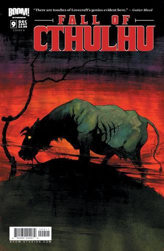
THE FALL OF CTHULHU #9
Writer: Michael Alan Nelson Artist: Pablo Quiligotti Publisher: Boom! Studios Reviewer: Squashua
As long-time readers know, I'm quite the Cthulhu-phile. I love things Lovecraftian, and you'd think that a book like FALL OF CTHULHU would be right up my alley. Well, at one time, it was.During this particular issue we follow the daughter of Nyarlathotep as she travels through the Dreamlands to the waking world, to meet with her father at his gathering. Along the way, she antagonizes some humans and we witness the Dreamlands being demonized; more knowledgeable readers will watch the fall of King Kuranes. The narration is quite poetic and the art is vibrant and colorful, pretty and horrifying at the same time, but never too serious.
In the early issues, FALL OF CTHULHU appeared to be the tale of a man thrust into a world of confusion, and Great Old Ones were vying for his soul. Since his absence as the lead character, the last few issues have focused on Nyarlathotep, a singular Great Old One or Other God, depending on who you ask. During his command of the storyline, a group of like-minded godlings began to gather under his watch for what appears to be the end of times. Unfortunately, this gathering is routinely boring.
Each of the last few issues has focused on an individual godling making his or her or its way to meet with Nyarlathotep. These are tales of horror to be sure, but they are also tales of deus ex machina. Though certainly there is potential for conflict with the Harlot of the Dreamlands as a rival force, Nyarlathotep as "Mr. Arkham" (I cannot abide by blatant labeling; might as well call him Doctor Lovecraft for all it's worth) has had everything handed to him. There is no challenge in their tales, seemingly no conflict for them to overcome, and therefore to my sensibilities, there is little interest.
I enjoy H.P. Lovecraft when he focuses on humanity struggling against insurmountable odds; tales such as "The Whisperer in the Darkness", "The Call of Cthulhu", "The Shadow Over Innsmouth", "The Shadow Out of Time", "The Case of Charles Dexter Ward", "The Dreams in the Witch House" and "The Dunwich Horror" all appeal to me. Each of those stories focuses on one or more human protagonists interacting with an aspect of the human mythos. And to me, this is where FALL OF CTHULHU fails for me. I don't want to read about omnipotent gods.
I'd prefer a book that took the Cthulhu Mythos less lightly than FALL OF CTHULHU, but in a market horribly lacking any proper alternatives, beggars can't be choosers.

BOOSTER GOLD #6
Writer: Geoff Johns Artist: Dan Jurgens and Norm Rapmund Publisher: DC Comics Reviewer: Rock-Me Amodeo
Okay, quick show of hands – how many of you people out there are really, really hoping that Booster is somehow able to bring back Ted Kord? In a universe where death has a revolving door, and lots of characters who died really should have STAYED dead, this is one where I really hope the decision gets reversed.What was good: the plot of course. Some clever dialogue. The Abbey Road visual gag (they are, after all, the Beetles.) Jaime (the current Blue Beetle) being written well, and consistent with the character I’m growing to love in his own book. The Blue and the Gold, in action again. And the conclusion—for this issue, anyway, and for as long as it lasts—was most definitely good.
What was bad: hmm…nothing was really bad. I don’t care one iota for Booster’s dim-witted relative from the present, even if he’s being approached by the bad guys. My mind just skips over his scenes because I can’t find anything likeable, let alone interesting, about him. But it’s not bad, just the absence of good.
The somewhere between: the art was on again/off again. I’m guessing there’s a reason for that beyond Jurgen’s and DC’s control, so it gets a pass. It certainly wasn’t bad. Also, future Beetle seems too convenient and too mysterious. There’s something going on with him that’s going to flip this story on its head.
Then there is the queasy feeling that, after all the pummeling regarding Batgirl’s fate, this issue was just TOO easy. I mean, Booster got it beaten into him, and we got it beaten into us, that you can’t change the past. CLEARLY that story happened for a reason.
So something’s wrong. I know it, every reader knows it, and Johns is betting we know it, too. He wins. I have to see what happens next.
NEW WARRIORS #8
Writer: Kevin Grevioux Artists: Jon Malin (pencils), Juan Vlasco (inks) Publisher: Marvel Comics Reviewer: Jinxo
Why am I still buying this book?And how can it continue to be just so “eh”?
I mean, it’s New Warriors. This is the group who triggered the entire Marvel Civil War. They should be the ultimate, exciting outlaw hero group. Seriously, this is a group where the entire Marvel universe should be falling on their heads every issue. These should be the heroes who fight the good fight while being hated and hunted by EVERYBODY. Their situation should be the classic X-Men predicament times a billion!
There is no reason this book shouldn’t just be action packed and exciting as hell. But it just isn’t. Half this issue is dinner with a bunch of kids! They should have a billion times the X-Men’s tensions but instead they have none. That said, they sure can’t stop talking about the X-Men. I’ve never wanted to actually smack a fictional character before but, *&#@!!!, Jubilee needs to shut the hell up about the X-Men. Seems like every issue she just is going on and on about them. Yes, she was a member and I guess maybe they just want to establish for new readers who she is, what her history is. Enough already. Establish who she is with some action, not with yammering about her last team.
And they keep trying to build excitement with slow reveals on mysteries. Only, if you’re going to have a slow reveal going on in the background, you need something crazy exciting going on in the foreground. That ain’t happening.
Not only that but when the mysteries ARE final revealed, the payoff isn’t so good. Oh my God! The new Night Thrasher is (gasp) exactly who you figured it was! I know old school New Warriors fans were offended by the way they were portrayed when they started the Civil War: crappy, self motivated reality TV stars. But you know what? I would rather read a book about those New Warriors. I mean at least there was something interesting to them.
The old New Warriors blow up a whole town and change the face of the Marvel Universe, the new New Warriors just blow. And given the starting point for this group, there really is just no excuse.
JUSTICE LEAGUE OF AMERICA #17
Main Story Writer: Alan Burnett Backup Story Writer: Dwayne McDuffie Main Story Artist: Ed Benes Backup Story Artist: Jon Boy Meyers Publisher: DC Comics Reviewer: Rock-Me Amodeo
I promise you, I’m really not a nitpicker, but I was thrown out of the story so often that I never could get into it, and just had to start picking this apart. The issue opens up with the exposition that Red Tornado has alerted Black Lightning that a security guard (of unknown color) has been found unconscious at the airport. Could he check it out? Now consider this set-up.A security guard has been found unconscious! Somebody call the Justice League!!!
I think at this point in the last run, the JLA has already dealt with several invading armies and various cosmic threats. That’s okay, I don’t mind seeing more mundane stuff, as long as we don’t have another cave-in issue.
Anyway, this leads to a run-in with several super-villains trying to hijack a plane. Black Lightning comments that some big guy’s density must be half a ton, which make me wonder if he’ll comment that the plane can fly at 300 miles. You see, density is a ratio, just like speed. Well, to paraphrase Jessica Rabbit, he’s not really stupid; he’s just written that way. Let’s move on.
The super-villains are scared because the Suicide Squad is making the rounds. Amanda Waller provides some answers and several uses of the phrase “wiggle room” instead of the word “latitude.” Shortly thereafter, and despite the 436 tons of titanium plates and some of the most awkward exposition I’ve seen in a while, the remaining super-villains break into the Hall of Justice so fast they make a cardboard box seem like Ft. Knox, not vice versa.
I’m not digging this. The art was nice, though it seems to be carrying the comic more than the story. I could do with half as many full page iconic poses, but it was nice. And the plot is fine, it picked up speed as the story went along. But the execution…ugh.
Fortunately, this was only the first two-thirds. The back up story, by McDuffie and Meyers, was well done and intriguing. Vixen’s powers are on the fritz and there’s a mystery a-brewin, and no easy answers. Gosh, it made me miss Ralph Dibny’s twitching nose.
I was especially touched by the naturalness of Speedy’s cry for “Uncle Hal…” I liked it. And I’m intrigued. Is it worth buying it for the backup story? This month, yes. Next month…well, we’ll see.
ANGEL: AFTER THE FALL #3
Writer:Joss Whedon (plot) & Brian Lynch (plot/writer) Art: Franco Urru Publisher: IDW Publishing Reviewer: Sleazy G
I was tentatively complimentary of the writing but hard on the art of the first issue of this title. I’d like to say things have changed, but so far I’ve seen nothing to make me rethink that stance. If anything, it seems like Brian Lynch is almost trying too hard here to throw us unexpected twists. He’s altered the status quo of so many characters so completely—taking them in direct 180’s and even switching two of the main characters’ traits with each other—that it all starts to feel out-of-character and forced. There are some interesting ideas, to be sure, but throwing so many alterations at us so quickly fails to ring true and fails to flow organically, leaving the whole thing feeling a bit hollow. There are some inspired moments, to be sure, and Lynch is getting a better handle on the character’s voices, but I’m still not completely won over by the directions he’s taking. That may change in a few issues’ time, but it’s hard to say at this point.I do have to comment again on the art as well. In the letters column of #3, IDW’s EIC (also editor on this book) Chris Ryall says that “a small percentage” of readers take exception with artist Franco Urru’s “stylized” work versus potentially “near-photographic reproductions of the characters.” He also goes on to describe the criticisms as “impassionedly non-constructive.” I think these are oversimplifications. Based on a sketch of concept art for Illyria in the letters page, I still have the same problem: the lack of lines on the various characters’ faces makes it difficult to make out the person’s features and expressions, and this has been a problem across three issues. That said, the concept art sketch looks noticeably better than any of the finished art in the three published issues thus far, so I’m willing to give Urru the benefit of the doubt: perhaps the problem lies with Jason Jensen’s coloring and not Urru’s art. Then again, that’s not Jensen’s coloring on this month’s cover, and I can’t help but notice Angel’s face still looks dimensionless and ill-defined.
I think it’s more likely a combination of mediocre work on both fronts, and I continue to have a problem with the finished product: I find the lack of depth in the panels off-putting and the poor work on the characters’ features and expressions is a serious handicap (case in point—the number of people who missed the reveal at the end of #1 on first read because they couldn’t identify the character). I don’t think it’s non-constructive to state that I expect far better finished art from IDW, especially on a major license like this book. I also think it’s constructive to point out that this work feels amateurish and undeveloped. I’ve seen far better art at IDW, and I expected to see them bringing top-notch talent to this title. I’m looking for a more professional, finished product and I’m hardly the only ANGEL fan who feels that way. Perhaps the book just needs a better inker and colorist, but some sort of change needs to happen soon before too many fans flee the title. A large number of readers of Whedon-related material come from outside the normal comics readership, and they’re not likely to stick around long for an inferior product.
I’m still sticking with ANGEL for now because I’m a longtime fan of the characters and their stories, but I don’t know how long that will last. The story hasn’t won me over yet, and the art is a major deterrent. I’m hoping IDW will take the growing criticism a little more seriously and consider making adjustments or alterations. This isn’t coming from somebody who wants the artists to trace images of the actors, or a ‘shipper jealous that his favorite slash characters aren’t portrayed the way he wants, or from somebody looking for an excuse to rip the product. This is coming from somebody who’s been reading comics for 30 years, and has seen series fail before due to distractingly bad art. I’m all for trying new styles and approaches and artists, but when something isn’t working changes need to be made before it’s too late. I’d hate to see something that had a chance to turn into a really strong title die on the vine because it chased off readers with disappointing art.

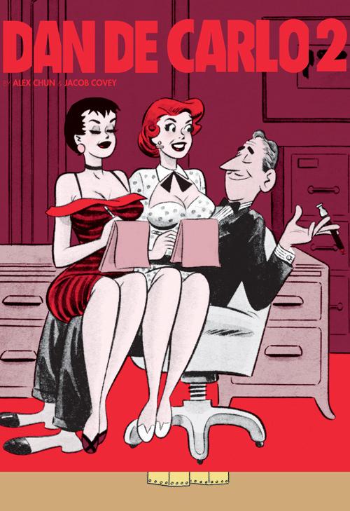
THE PIN-UP ART OF DAN DECARLO VOL 2 Fantagraphics Books
When the name Dan DeCarlo is mentioned, I'm sure a lot of today's comic book fans would exclaim a confused "Who?" Those in the know would be able to enlighten us by saying that DeCarlo was one of the definitive artists for ARCHIE COMICS, especially famous for rendering beautiful versions of Archie's alternating girlfriends Betty and Veronica. Well, to be honest, I didn't even know that. What I know now, after leafing through this volume of single panel cartoons from the artist, is that Dan DeCarlo draws some pretty curvaceous and fine looking women. Looking at cartoon ladies may not get a rise out of everyone and although the @$$Holes haven't been above reviewing comic book porn before (*ahem* Vroom's HOUSEWIVES AT PLAY review comes to mind*ahem*), I wouldn't lump this book into that category. The content is risque, but there is an air of innocence about the lusty cartoons which mostly serve to highlight DeCarlo's talent of rendering the female form in all of its buxom glory. Sure these are the types of one joke panels that are often found in mags like PLAYBOY (these in particular were found in a 50's humor mag called HUMORAMA), but there is a timeless quality to these pages. This book is chuckle inducing, especially the sheer amount of pages dedicated to "daddy spanking", but I found this book to be pretty interesting as a window into the mind of a man who clearly knew what turned him on. Over 200 panels of single page jokes and two volumes support that notion. DeCarlo is a very fine artist and yes, his ladies are quite beautiful to look at albeit their proportions would make Lady Death blush a bit. Appreciators of 50's art and the female form would do themselves a great service to seek this volume out from Fantagraphics. - Ambush Bug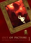
OUT OF PICTURE VOL 1 Villard Books
This is a wonderful collection of short stories from the artists and creators behind Blue Sky Studios, the same studio who brought you the animated movie ROBOTS. There is no doubt that the artists featured in this book have an abundance of talent. Each story completely engulfs the reader with imagination and wonder. I'll run through the 11 stories inside very quickly. "Noche y Dia" by Daisuke Tsutsumi is a curious trip into the mind of a child centering on a vivid battle between light and darkness. The gorgeous sketchiness of the art from Greg Couch's "Four & Twenty Blackbirds" may tread into familiar territory occupied by DC Vertigo's FABLES, but offers its own original twist to the genre. Michael Knapp exudes a sense of complete worry in his highly expressionistic "Newsbreak" that centers on the unease and comfort one can have just sitting in front of the TV set in one's own home. The circular story theme is also used by Benoit Le Pennec as we follow a man's dreams of being a giant and a child in the classically drawn "...Of Floating Holidays." "Silent Echoes" by Daniel Lopez Munoz offers a wonderful collage of color and forms on every single page. Peter De Seve's "The Mermaid" tells a sketchy, crusty, and well versed tale of danger and horror on the high seas. David Gordon provides my favorite entry in the series with "The Wedding Present", an allegory focusing on post-9/11 terrorism starring technicolor toy animals. The detailed story is disturbing and will leave its mark on your brain pan. "Yes, I Can" by Andrea Blasich reminded me of the old Disney film PETE'S DRAGON and is filled with innocence and wonder as a young adventurer teaches a dragon to fly. Vincent Nguyen melts our minds with the surreal "Domesticity" as we find out that even in the calmest of environments, imagination knows no bounds. Although all of the entries are artistic, Nash Dunnigan seems to have the firmest hold on traditional comic book storytelling in his masterful use of panels in "Night School." "Around the Corner" highlights the dangers of the big city by placing a small child and his penguin companion into the thick of it. Robert Mackenzie provides this engrossing read. The book ends with a nice gallery providing a little peek into the production of each story. But this brief jaunt through the book's contents doesn't do it the proper service. You have to check out this book to experience top notch storytelling and art. - Ambush Bug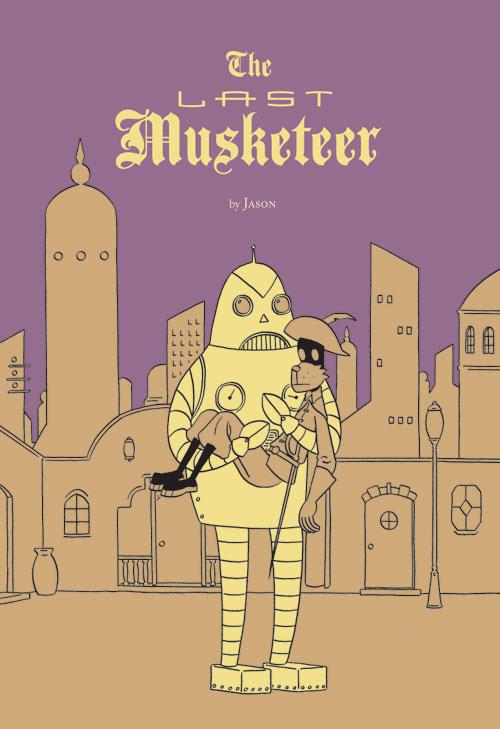
THE LAST MUSKETEER OGN Fantagraphics Books
This is the second story I have read from the artist/writer simply known as Jason. His animalistic and simplistic characters are just as entertaining and the story is just as heartfelt and engrossing as I KILLED ADOLF HITLER, his last endeavor. This one follows Athos, the last active Musketeer without a cause. He roams the streets and pubs looking for purpose and eventually finds one on a mysterious alien world. Humor is sprinkled throughout, mostly at the expense of our optimistic and naive hero. But the beauty of this story is that writer Jason makes us care about this misguided hero on this wacky adventure, so when those last panels come, you can't help but have a sense of sadness for the direction of the story and the fate of our hero. There's something about the blank stares of Jason's cat-like creatures that makes one automatically feel for these characters. Their dull eyes reflect sadness and wisdom and an innocence that you want to protect from the true life dangers the story provides. Artist Jason is truly talented in the way he places his panels to tell a story and the character designs within them. - Ambush Bug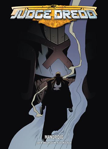
JUDGE DREDD: MANDROID TPB 2000AD
2000AD does sci fi comics better than any other publisher in the world. And at the heart of it all lies Judge Dredd and the rest of the futuristic insanity that makes up the town of Mega-City One. In this trade collection, the focus shifts to a new character, Sergeant Nate Slaughterhouse, who used to be the very best soldier until an accident on the battlefield destroyed most of his body. But Slaughterhouse (is that name Welsh?) is too tough to die and is given a cybernetic body to keep on living. Slaughterhouse decides to use his new lease on life as a vigilante in Mega-City One, but this puts him in direct contact with Judge Dredd. What stood out in this trade was Kev Walker's art in the first installment. His work reminds me of Mike Mignola. It's iconic and simplistic, focusing on the form rather than shading and grounding it in reality. Kev's panel placement is superb, making the characters pop off of the page. There's a panel where Slaughterhouse is pointing a gun towards the reader that almost makes you duck. There's the usual badassedness that you've come to expect from regular JUDGE DREDD writer John Wagner and additional and equally impressive art provided by Simon Coleby (whose art looks like Cary Nord's to me) and Carl Critchlow (which resembles Cam Kennedy's awesome pencils). This is a well written and gritty piece of sci fi. - Ambush Bug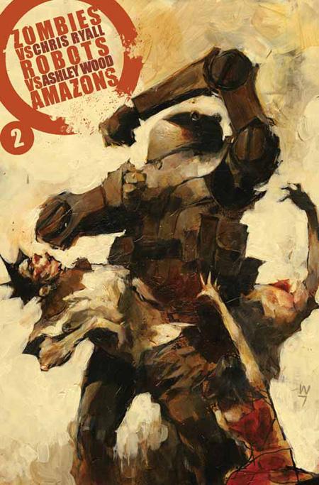
ZOMBIES VS ROBOTS VS AMAZONS #2 IDW Publishing
Madmen Chris Ryall and Ashley Wood continue their descent into kookified madness with this, the second issue of the second ZOMBIES VS ROBOTS miniseries. The art continues to be of the highest caliber. It's expressionistic and loose; filling the reader's eyes with information until they burst. Ryall and Wood seem to be implementing a "throw a bunch of shit against the wall and see what sticks" mentality with this series. The good thing is that a whole lotta shit is sticking. Next issue brings the big finale of this madcap series as the amazons and their robots team up to face the zombie menace. I just can't wait to see what other sub-group of coolness is going to be pulled into the mix. - Ambush Bug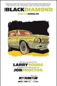
THE BLACK DIAMOND #6 AIT/Planet Lar
Now that was an ending. This issue brings Larry Young's ambitious story about fast cars, kidnapping, and danger set in a near future landscape where the government decides to build a cross-country roadway a few hundred feet in the air keeping the speeding and criminally swayed lowlifes out of the way of all of the normal folks that populate America. This story moved pretty quick. From issue to issue I found myself liking and disliking Jon Proctor's artwork. Sometimes it felt a tad sloppy. Other times, I found the guy's artistic use of iconic imagery to be astounding. In this final issue, the eye-melting pages far outweigh any I had a problem with. There are some pages that are definitely poster-worthy; they almost look like propaganda posters, with sharp lines, characters with auras, and skewed angles. Proctor definitely upped his game with this final issue as a doctor races to the finish line in order to be reunited with his kidnapped wife. Larry Young ups his game as well as the story becomes self-referential and self-conscious in the end, bringing to light the homage to 70's action movies by supplying a visible script to the intense action and wonderful final pages. The end brings a nice juxtaposition of story, art, and the craft put into making films and comics. It's one of the most original endings I've read in comics in quite a while. THE BLACK DIAMOND had a strong concept and was presented with a great eye for detail and respect for 70's action films. Along the way, I found myself steering off this road in regards to the art, but only a little bit and the final issue made up for all of that in spades. - Ambush Bug

THE IMMORTAL IRON FIST #12 Marvel Comics
I know I’m saying the same thing everybody else has said about this title but, damn, I loves me some Iron Fist. Amazing to me since I remember way back to the old Heroes For Hire days when I would have laughed if you told me an Iron Fist book would be at the top of my stack. But this book just kicks all sorts of ass. They somehow ground this book, giving it a nice reality, while at the same time flying into crazy realms of the fantastic and unreal. Nice building of mythology while also handing out solid action. Note to self: do not piss off anyone named “Prince Of Orphans”. Yikes! - Jinxo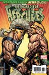
THE INCREDIBLE HERC #113 Marvel Comics
This has to be the strangest comic Marvel is publishing at the moment. So Hulk gets incarcerated. A new Hulk appears all red and written by Jeph Loeb in a new series. And the old series gets cancelled…right? Wrong. It continues with another character. A B-list Avenger and a know-it-all kid. And you know what? I kind of like it. Greg Pak is full of surprises and although the WORLD WAR HULK storyline was a little too drawn out and should have only occurred in the Hulk’s main series, I liked a lot of it. Here he teams with writer-to-watch Fred Van Lente and we get to follow the Mighty Hercules as he eludes SHIELD and takes on his asshole brother Ares. What I like about this series is that it utilizes ancient myth to tell a modern story. It’s not going the lazy route by modernizing the myths. It’s actually telling a story that plays off of the myths and deepens the character of Hercules. I’m not sure how long this series is going to last, but I’m actually liking it and if they ever want to give Herc his own title instead of having him rent space in another’s, I’d probably pick it up. - Bug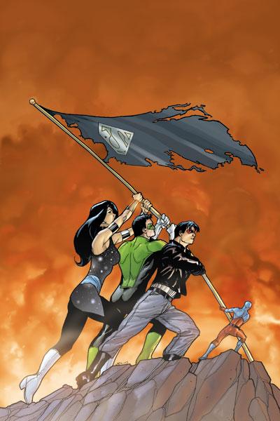
COUNTDOWN TO FINAL CRISIS #15 DC Comics
So this book has just hit the point where the covers really don’t have to have any real bearing on the story inside? “Mission Accomplished?” Um…I don’t think so? You know, unless the mission was to rip off an iconic WWII image for no good reason. Seriously, if there was a story inside that echoed Iwo Jima, that would make evoking that image make sense, that would be fine. But there just isn’t. The story itself isn’t too bad. COUNTDOWN hasn’t week to week always been hitting it out of the park but this issue does a good job of keeping things hopping. We get some solid development on Ray Palmer and his story, and interesting meetings and throw downs between various alternate reality “friends”. Ever since he came back from the dead, Jason Todd has been whining about Batman apparently having done nothing to avenge his death. The way this issue makes him face that idea and how he really feels was, for me, good stuff. Evil Superman is still all sorts of crazy too. Good stuff. None of it really related to the cover image. – Jinxo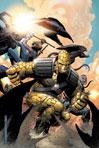
WORLD WAR HULK AFTERSMASH: WARBOUND #2 Marvel Comics
There is a sequence towards the end of this book when one of the Warbound uses his powers over the earth to form an escape tunnel for a town of people terrorized by the Leader. In this scene, our hero, Hiroim, has his back to the action. He sees the townspeople running in fear. Even his teammates are being thrown around like rag dolls. And Hiroim can’t see what’s happening and must concentrate in order to keep the tunnel open. This is the single most tense comic book sequence I’ve read all month. Writer Greg Pak knocks this one out of the park with his clever perspective, panel placement, and set-up for tension. This miniseries is a surprise and this issue secures a place for its next issue at the top of my pile as soon as I get home from my comic shop. Good reading! And Leonard Kirk’s art adds to the excellence. - Bug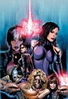
NEW EXILES #1 Marvel Comics
Meet the New Exiles. Same as the old Exiles. Sorry, I had to say it, especially when the new book will meet with sales similar to the old one for one reason: too much time spent inside people’s heads, examining motivations and affiliations between characters we barely care about. And I know, I know, maybe that’s the way we get to know them. But when Claremont used to write the X-Men all those years ago, there was lots of action and then a quiet pause. When we got into their heads, whether for a panel or an issue, those moments of introspection felt like a privilege. Here, it’s like the equation has been reversed. It’s all head games and posturing, and then a teensy bit of action, and no, a casual game of football does not count. On the plus side, Grummett does a yeoman’s job on pencils. His work is sturdy and expressive and the best thing about the book. Chris, if you’ll get your head OUT of the game, drop the clichéd and overdramatic dialogue, and simply bring the high heat for a few issues (like I KNOW you can, like you’ve PROVED you can), this book will rock. Then you can bare to us their souls all you want. - Rock-Me