| #9 | 6/20/07 | #6 |
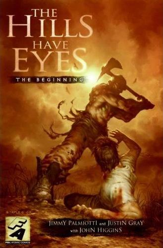
Hey folks, Ambush Bug here. Before I dive into my review of THE HILLS HAVE EYES: THE BEGINNING from Fox Atomic Comics , I want to alert you to another AICN Comics contest. Last time we had you guys whip up some logos for us and it turned out pretty damn sweet. This time around, fellow @$$hole Jinxo came up with a pretty gruesome concept that seemed to fit the tone and subject matter of this book. We have five copies of THE HILLS HAVE EYES: THE BEGINNING OGN (a massive, almost 100-page book that goes for $17.99 regularly) for the winners this time around. Click on the pics for larger pages from the comic.
 All you have to do is the following:
As a young child, I used to draw some crazy @$$ drawings with crayons and markers. It’s a wonder my parents didn’t have me committed with all of the Crayola pics of grue and carnage I used to hang on the refrigerator. Word around @$$Hole HQ is that I wasn’t the only one. Now, I know not all of you are artists, but the good part about this contest is that you don’t have to be. We want you to draw your best demented crayon masterpiece drawn in the style of a slightly-twisted child. We want pics that would make a child psychologist cringe. Lopped off heads, stabbings, murder, mayhem, scenes from your favorite horror films or comics…all done with childish glee (bonus points if they are actually drawings from your childhood!). So scan and send your “horror as if drawn by a batshit crazy kid” etchings to us here and the top five will get copies of the book I am about to review. Good luck, ghouls.
THE HILLS HAVE EYES: THE BEGINNING OGN
Writers: Jimmy Palmiotti & Justin Gray Art: John Higgins Publisher: Fox Atomic Comics Reviewer: Ambush Bug
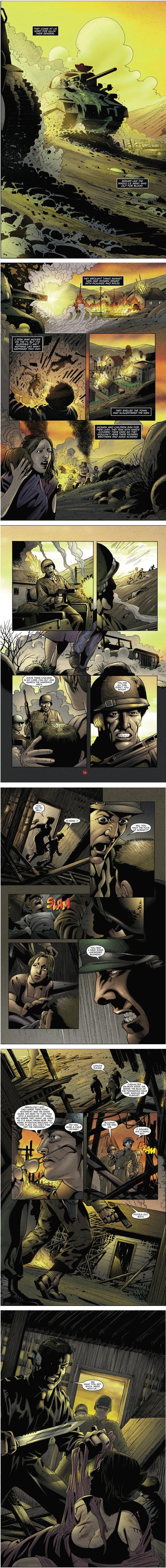
THE HILLS HAVE EYES was one of those movies that struck a raw nerve with me when I saw it as a child (we’re talkin’ about the original 70’s Wes Craven flick here, folks). It wasn’t one of those slick horror films. It was gritty and dirty. The actors weren’t squeaky clean. And the violence was as brutal as you could get. Seeing the Hill people attack and slaughter your typical American family made me squirm because, back then, my family occasionally took long road trips for vacation in a rented mobile home, so the terror of the tourist trap rung home. When I saw the recent remake of the film (I’ve yet to see its sequel), I was pleasantly surprised in that, although it could never live up to the gritty brutality of the first film, it did hold its own as a bloody tale of survival. I ended up liking the flick and have watched it a few times on cable since (something I cannot say for most of the other shitty remakes that have wasted space on movie screens in recent years).This comic, surprisingly, although a direct tie-in to the more recent movies, seems to borrow some of the more effective themes of the original film. In fact, I’d say that THE HILLS HAVE EYES: THE BEGINNING is much better than its remade predecessors. Jimmy Palmiotti and Justin Gray are responsible for writing this origin story of the people in the hills. They are no strangers to horror adaptations since they are currently writing a solidly entertaining FRIDAY THE 13TH series over at DC/WildStorm. In this book, the Hill mutants are referred to as the Sawney Bean Clan, a simple group of miners (not minors) who many years ago were approached by the military and told that they had to leave their land. Apparently, the place they called home was a prime spot for atomic bomb testing. Being a stubborn set of individuals, they were less than compliant with the military and when they refused to leave, they were attacked by the military and forced to retreat into the mines deep under the city as the bombs dropped. After many years of bomb testing, the military finally moved on, but the Clan survived. Unbeknownst to the survivors, though, the radiation of the bombs changed them radically. Through the generations, the Clan became mutated and deformed into the freaks that faced those unfortunate families in the movies.
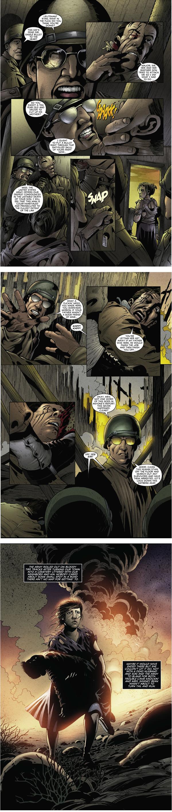 The thing I liked most about this book was the fact that it carries on the theme of family in turmoil from the atomic age. In the original film, a family is under attack by creatures spawned form atomic bomb testing. It was a nice political metaphor about the threat of nuclear war as this typical nuclear family comes under attack by a family directly birthed from a bomb. In this book, the same type of story is told, although the metaphor is much more literal in that there is an actual bomb threatening to destroy a family. This book flips the POV and casts the monsters as the people in peril. You sympathize with these freaks for all of the shit they had to endure and end up admiring them in a way because of their strength and fortitude for survival against all odds.
This is a gory read--one not for the squeamish and more suited for those gorehounds out there (you know who you are, you sick pups)--but it’s a well told yarn, made all the more effective with art by John Higgins. Done in a clean style, yet shaded and toned heavily for a more visceral effect, Higgins knows how to frame action and keep the camera angles shifting for dramatic effect. He shows a great range, from brutal battles between the military and the mutants to a gorgeous and almost romantic scene where the mother of the Sawney Bean Clan gazes out into an irradiated sky.
Textured and perfectly paced, this is one helluva good read. And it’s a girthy bastard too weighing in at 89 pages with additional production notes from the artist and a trio of nice pinup pages from Bill Sienkiewicz, Tim Bradstreet, and Greg Staples. All in all, this is another slick production from Fox Atomic Comics. These guys have been churning out some pretty impressive books with this and their previous offering 28 DAYS LATER: THE AFTERMATH. I look forward to seeing what this company has in story for us in the future.
THE HILLS HAVE EYES: THE BEGINNING OGN shambles out of the caves and into your faces next week.
HELLBLAZER #233
Writer: Andy Diggle Artist: Leonardo Manco Publisher: DC/Vertigo Reviewer: Rock-Me Amodeo
If you haven’t jumped on board yet, you better hurry up. As one character used to say, many, many issues ago: “It’s the bollocks, man.” And he meant it in a good way.I remember when Constantine came on the scene, back in the pages of Alan Moore’s SWAMP THING. Delano ran with it when Constantine got his own book, and Ennis fleshed him out—and creeped US out—giving birth to one of the best developed characters in comic book history.
But somewhere along the way, this character was drained of any enthusiasm or vigor other than a will to survive, and even THAT was just barely. He was always a creature born of pain and cynicism, but after so many losses and draconian wins, reading him was wearying exercise, so I stopped. Constantine used to bring a smarmy bit of style with him. He was the highest of the low class and the lowest of the high class, but he had some kind of class one way or another. Remember when John once had to charm himself up a necktie just to enter a certain underworld establishment? Yet for a long time, he barely seemed to bathe, let alone carry himself with any dignity, lurching along from one tragedy to the next.
Well that, my friends, has changed. Andy Diggle is a few issues into his run, and it’s obvious where he wants to go. John Constantine is not a do-gooder, never will be, but he always racked up style points even in a bad situation, and he always had a sense of justice. This is Diggle’s Constantine, and he’s on form. For the rest of this run, I expect to see him taking chances not out of desperation, but just because he’s Constantine, and that’s what he does—and rolling out more sarcasm, rudeness, and occasional brutality than one would expect from a man wearing a blue pinstripe suit.
Manco gets style points, too. His art drives the book in a gritty, macabre manner that is part illustrator, part cinematographer, with those odd angles that show up so often in British movies. It works very well. I’m big on backgrounds; I like they way that their presence storyboards a comic like a movie, and their lack leaves a subliminal emptiness. No worries here. Manco leaves nothing out.
If you have enjoyed this series before, but felt it had become a bit tired and mired, then check it out. To paraphrase John, it’s good, and he’s back.
ANNIHILATION: CONQUEST PROLOGUE #1
Writers: Dan Abnett & Andy Lanning Art: Mike Perkins Publisher: Marvel Comics Reviewer: Ambush Bug
The coolest mainstream crossover of last year was not INFINITE CRISIS or CIVIL WAR, it was ANNIHILATION, the brainchild of Keith Giffen starring almost all of Marvel’s cosmic characters. In the past ten or so years, I have been all too unimpressed with Marvel’s cosmic characters, mainly because they were almost all written by Jim Starlin, who granted kicked a good amount of @$$ with his DC miniseries MYSTERY IN SPACE, but left me feeling hollow and unsatisfied with his INFINITY CRUSADES and WARS and GAUNTLETS and WATCHES. Last year, though, Keith Giffen and a handful of writers reinvented the cosmic crossover with a threat from a power-mad bug named Annihilus and his army of insectoid destroyers, who lead a seemingly unstoppable wave of destruction across the universe. A small group of heroes, including Super Skrull, Nova, Drax the Destroyer, Ronan the Accuser, and the Silver Surfer, banded together to do battle with the evil creepy-crawly. What I admired most about the way ANNIHILATION was set up was that it started out small with a miniseries focusing on Drax the Destroyer, then teased us with a prologue (ANNIHILATION: PROLOGUE), then dove into four miniseries that spanned across the galaxy and told the tale from different perspectives, and FINALLY came together with the ANNIHILATION miniseries. This event took a lot of patience to coordinate and in the end, paid off. It was a tightly packed, exciting epic space tale filled with drama, holy shit moments, and acts of true heroism. While DC was confusing their universe with multiple earths and Marvel’s earth-bound heroes were fighting amongst themselves, the true heroes were fighting for and sacrificing their lives in the stars. Readers, do yourselves a favor and buy some of the ANNIHILATION trades. You’ll be in for a good time and you’ll be fully prepared for the subject of this review.Yes, one year later, Marvel’s cosmic heroes are at it again against a new menace. And if this PROLOGUE issue is any indication, it’s going to have something that the first ANNIHILATION event didn’t have…
HOT INTERSTELLAR LESBIAN ACTION!!!
Without revealing much of the plot (it’s pretty cool) or becoming too much of a sexist pig (too late), I have to admit the star of this issue (the new Quasar who is the daughter of Captain Marvel and brother of the most recent Captain Marvel) is one fascinating character. Like ANNIHILATION before it, at the heart of this event is a hero in search of purpose. Out of all of the characters in the previous miniseries, Nova was the one who emerged as the most heroic and most improved. He jumped into the war a kid and ended the war as a man. The new Quasar seems to be following suit. She’s got Wendell Vaughan’s Quantum Bands, a heroic lineage, and did I mention…HOT INTERSTELLAR LESBIAN ACTION!?!?!
in the form of hot girlfriend, Moondragon (the bald cutie from old issues of THE DEFENDERS). Quasar’s arc seems to be the heart of this war and I’m interested in seeing her grow as a character and…AS A HOT INTERSTELLAR LESBIAN!!!
Although I won’t reveal who the new evil beings threatening the universe are here, I will say that old school readers will get a kick out of who they are since they have ties all over the Marvel Universe and certainly do pose a serious threat. Although the threat is quite similar to STAR TREK’s Borg Assimilation routine, the retro factor makes up for that. Kind of the same way the design of the Brood makes you forget that they are an Alien knock-off.There are other cool characters in this book; one in particular may prove to be the cult hit of the year, Star Lord. Peter Quill dropped the name Star Lord long ago and now fancies himself as a grown-up who doesn’t need a superhero name. He’s the Han Solo of this space odyssey; the dashing rogue who flirts his way in and out of trouble. He’s also the star of the upcoming STAR LORD miniseries which stars Shi’ar warrior Deathcry, Micronaut Bug (no relation), and the one and only Rocket Raccoon, among others. This miniseries alone seems to have such a fun cast that only an idiot would pass it up. Abnett and Lanning write a pretty good Star Lord here, but I can’t wait to see what Keith Giffen is going to do with the character and the supporting cast.
Aside from the tie-ins to the regular NOVA ongoing, this book also spawns a miniseries called WRAITH, but neither of these characters are featured in this book. ANNIHILATION: CONQUEST seems to be following the plan of its predecessor. That event started out with a set of miniseries to help you get to know and become invested in these cosmic characters. Once the main event started, you already knew who these characters were and cared about their roles in this intergalactic space opera. The people behind this event seem to be doing the same thing and it is a mode of storytelling that was effective with the last series and seems to carry the same potential with this one. Only time will tell, but so far ANNIHILATION: CONQUEST looks good. The set-up is tight. The villains are vicious as hell. The heroes are set into motion. And lest we forget the inclusion of…
HOT INTERSTELLAR LESBIAN ACTION!!!
With all of that going for it, ANNIHILATION: CONQUEST looks to be a sequel that lives up to and surpasses the original. I can’t wait for these miniseries to begin.
MYSTIC ARCANA: MAGIK #1
Writer: Louise Simpson(Part 1)/David Sexton (Part 2) Penciler: Steve Scott (Part 1) Inker: Kris Justice (Part 1) Colorist: Pete Pantazis (Part 1) Art: Eric Nguyen (Part 2) Company: Marvel Comics Reviewer: Jinxo
I have to say, when I saw the cover to this issue, I got jazzed. Back in the day I was a big fan of both THE NEW MUTANTS. I liked the different take on mutants they had from The X-Men. The idea of kids as heroes who, really, weren’t even supposed to be out being heroes. A few years back when Marvel revived THE NEW MUTANTS, I was in. Then they went and changed them into X-Men group million six and I was out again. I also loved the solo story of their member Illyana Rasputin. A young girl raised in a hell dimension, turned into a sorceress, 3/5ths of her soul corrupted yet she fights to stay good. Actually a lot of elements being worked by Hellboy today.So I see MYSTIC ARCANA: MAGIK on the stand with Illyana on the cover in her New Mutant togs, I open it up and see Illyana and her teammate Dani Moonstar running around and I think, kickass, some old school storytelling with some of my favorite old school characters. Clearly it was a story from back in the day so it must be a “lost tale” sort of deal. I plopped down my money and was really excited to check out this issue.
That’s when things fall apart. It is sort of a “lost tale” and, you know, could have stayed that way. MYSTIC ARCANA is a four part series exploring the “four corners” of Marvel’s mystic world. Based on this issue… seeing the one corner was plenty, thanks. Based on this issue, the format would seem to be this: each issue will focus on a different magic-based Marvel character in a standalone story and a secondary continuing saga story that ties all the standalones together. Only this first standalone…it sets in place elements clearly needed for the “big story” but as a story on its own it’s kind of “so what.”
First, the story is set back in Marvel continuity. We are told up front this story takes place during NEW MUTANTS #32 when Magik and Dani were lost in time. As big a fan as I am of the NEW MUTANTS, hell if I can remember exactly what was going on in that issue without dragging those back issues out of storage. Not that it matters to the story. They cover their asses in terms of how it fits into continuity while nobody really knows about it. Part of that involves knocking Dani Moonstar right out of the story. That’s okay. Hey, a good Magik story. Fine. Only then it turns out to be more of a so-so Magik story. With limited time they try to give some personal meaning to the adventure for Magik but it still didn’t feel of any deep import to the characters IN the story. It felt more like a quick one-off role playing game adventure. Like nobody but “Todd” showed up to play so the guy running the game makes up a quick one day solo tale. And then Todd, being a dick, screws things up by finding a way to skip over half the story. Because that’s also a problem that happens in this story. Paraphrasing…
“Illyana, you must face myriad dangers and horrors and…”
“Hey, the back door is open, can I go in this way?”
“Uh… sure.”
“Hooray!”
The story is just sort of “eh” on so many levels. It doesn’t stand well on its own. It is mainly there to serve the connecting story. So then, how is that story? Is it worth the time and trouble the Magik story takes setting things up? Maybe by the end of the series, but for this issue alone I’d say no. 22 pages of story setting up to put a couple mystic plot points in place that an 11 page second story then sorta kinda touches on. Clearly these points will become important down the road but not in this issue. The secondary continuing story concerns a mystic named Ian McNee as he journeys to the four corners of the Marvel mysticism looking for talismans (set up in the main stories) while trying his best to look like John Lennon In The Sky With Diamonds.
I wanted to care. I wanted to like this comic. The art in each of the stories was solid. Enjoyed the old school New Mutant vibes from the first, appreciated the funky palette of the second. But the stories behind them for me didn’t gel. Maybe by the end of issue four everything will come together and be totally satisfying. But I wouldn’t know. I’m out. Marvel, call me for the next New Mutant revival. Or, you know, get Ilyana all demon magiked up again in a series of her own. Then I’m in.
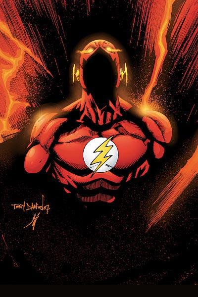
THE FLASH #13
Writer: Mark Guggenheim Art: Tony Daniel, Jonathan Glapion, & Marlo Alquiza Publisher: DC Comics Reviewer: Ambush Bug
By now, you probably all know about this issue, but in case you don’t, I’ll go ahead and slap a SPOILER tag on this entire review.Bart Allen as the Flash, we hardly knew ya, brother. Like the Spoiler’s all too brief run as Robin, Bart Allen was cut down way before he should have been. He was an established and well-liked character, and I must admit that Bart’s death in this issue left a pretty rotten taste in my mouth. It’s not so much in the way that the book was written or drawn, but at the missed opportunities for good stories that now will probably never happen.
Yeah, looks as if Mark Waid is returning to write the Flash in an all new series, but if you’ve read JUSTICE LEAGUE OF AMERICA #10, ***SPOILER II***you already know that he’s not going to be writing about Bart, but Wally West who returns from the void.***END SPOILER II*** Waid had better be on his game for the next adventures of the Flash. To kill off a character like Bart, he had better have the funnybook equivalent of a beer and a blowjob in store for all of us.
It doesn’t surprise me with the relaunch. It’s not as if this book didn’t have its problems, but I wouldn’t fault low sales on the character of Bart Allen. The writers who made this story about the fastest man alive the slowest moving read on the racks are the ones to blame. From issue one, this series started out with a fizzle. Sure, when Guggenheim came onto the book things started to pick up speed a bit, but by that time, I fear that it was too late and many readers had already jumped ship.
The issue itself isn’t a half-bad read. Bart Allen, powerless, fights the Rogues and distracts them long enough for his scientist girlfriend Val to destroy a construct that was threatening to kill thousands. Unfortunately, distracting the Rogues meant succumbing to their attacks, so Bart sacrifices his life to save the day. In the end, Bart goes out a hero. Guggenheim amps up the emotional drama with some flashbacks to some conversations between Bart and Barry Allen (his granddad and the second Flash) and some tender moments with his grandma Iris. But these scenes fall short of interesting and actually serve to unbalance the story (especially the odd scene where Bart has to knock out his own grandmother). Guggenheim does pull through in the very end as he cuts across the DCU as Bart’s friends and family find out about his death. These pages alone make this book worth buying. They are silent pages and the artists do a great job of conveying shock, disbelief, and sadness in the faces and actions of the characters in the panels.
Sidenote: Liberty Belle AKA Jesse Quick needs to change her costume a bit. Those old puffy pants she wears are not flattering. They make her look like an extra on a Sir Mix-a-lot video or a character from a Larry Stroman comic.
There’s an especially effective page as Robin finds out about Bart’s death. With the death of Bart, that makes three significant people in Robin’s life that have died (Superboy, Robin’s father, and now Bart). Unfortunately, Robin’s book is so freaking awful and in need of a reboot itself that I doubt this plot thread will be resolved with any quality or depth any time soon.
And that’s the overall problem with way too many titles at DC. It appears that, out of all the death and change that has come from IDENTITY CRISIS/INFINITE CRISIS/52/COUNTDOWN the real tragedy is the fact that there are a whole hell of a lot of DC books that I used to love, but now don’t give two shits about. HAWKWOMAN, WONDER WOMAN, AQUAMAN, ROBIN, TITANS, NIGHTWING, FLASH…all of these titles simply and thoroughly suck since all of these big events started. In the past, these were some of my favorite reads and characters. Now I don’t care at all about a giant chunk of the DCU. With Gail Simone jumping onto WONDER WOMAN and Waid due to reboot FLASH, this is a step in the right direction, but DC needs to start focusing on their big characters and stop with the events. They need to learn that when their core characters are lacking in quality, this is going to reflect on the entire DCU. I’ve always been a strong supporter of the DC icons, but I have to be honest that, right now and for the first time in many, many years, I care more about what’s going on at Marvel than at DC.
Back to Bart. The real shame is that we won’t be seeing issues dedicated to Bart trying to get into the Justice League or taking on some of the Flash’s major foes or see him grow into a heavyweight like so many witnessed Wally West do after the first Crisis. This is a missed opportunity. It saddens me that such fun stories and such a fun character had to go because the wrong writing team was assigned to the title and DC had to rush out with a piss-poor title rather than wait for the right team to come along. So while Bart’s passing in this issue was indeed sad, I fear that it was necessary. There needs to be a few shake-ups (and no, this doesn’t mean death every time) to get the DCU back in order. I want to love the DCU again. Here’s hoping Waid and Wally West can help rekindle those feelings, but I’m still going to miss Bart.

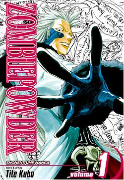
ZOMBIE POWDER VOL 1
Written and Illustrated by: Tite Kubo Published by: VIZ Media (Shonen Jump Manga) Reviewed by: superhero
When it comes to manga there's not a lot that's too different about ZOMBIE POWDER. It's a seemingly post-apocalyptic world inhabited by protagonists with spiky hairdos and wielding wildy impossible weaponry. Yes, it's true that ZOMBIE POWDER really offers nothing truly unique or different in these pages but I will say that, despite that, it's still a pretty fun little read.Now before you get all excited over the prospect of a new comic featuring zombies I hate to let you down. ZOMBIE POWDER has no masses of the lurching and hungry undead in it. At least not in this volume. It's more about a small group of characters on a quest for a mystical concoction that will bring the dead back to life or possibly grant immortality to the already living. The problem is that in order to obtain it an individual must first acquire twelve rare and magical rings called the Rings of the Dead. Needless to say, these rings aren't the easiest things to come by and that is the quest that the heroes of this book find themselves engaged in.
See, like I said, nothing too original here but it is entertaining. Much of this has to do with the storytelling skill of creator Tite Kubo. Many of you out there may know Kubo as the creator of the smash hit manga BLEACH. While I've never read BLEACH, I do know of its popularity and if it's anything like ZOMBIE POWDER, I can see why it's got such a large fanbase. Artistically speaking, ZOMBIE POWDER doesn't offer up the most detailed manga artwork (far from it actually) I've ever seen. But for what Kubo lacks in detail he makes up for with an energetic storytelling style. There's a lot of action in ZOMBIE POWDER and Kubo amps up the pace of the combat on almost every page. Sure most of the story itself is about as deep as a rain puddle but the characterizations in the book combined with the somewhat humorous and kinetic action sequences pretty much make up for any lack of depth.
If you're looking for something that's a pretty straightforward read that's just outright entertaining you could do a lot worse than ZOMBIE POWDER. I think fans of stuff like TRIGUN or even NARUTO will find something to like in these pages. ZOMBIE POWDER's just a fun little read and sometimes that's enough, right?

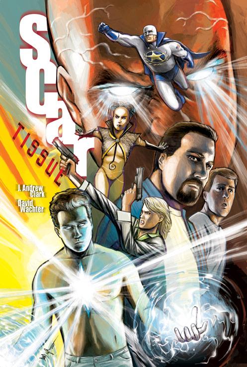
SCAR TISSUE TP
Writer: J. Andrew Clark Artist: David Wachter Publisher: Dial R Studios Reviewer: Dan Grendell
"I don't know what came over me. I'm not really myself right now."The hook for this series is a great one. Ben, who has a congenital heart defect, is waiting for a heart to come along so he can get a transplant. When he finally gets one that's compatible, it turns out to be recently deceased supervillain Lord Grundoom's. With the city's superhero the Compatriot under investigation for Grundoom's death, there's nobody to help Ben and his family when another villain comes calling, looking for the power that heart holds. Just as dangerous, Ben is starting to exhibit powers of his own, memories that belong to Grundoom, and hearing voices.
This is a story about what it means to be a hero, and what it means to be family. Clark does an excellent job of making each character into their own person and making them feel like a real person, with believable motivations and fears. His dialogue is also natural and entertaining. Wachter performs ably on art, portraying action and emotion equally well. His backgrounds, where many artists tend to skimp, are well done and interesting. It's especially interesting to watch the improvement in both writing and art from issue to issue. Clark and Wachter both improve quickly, so that it's hard to believe that it's the same team on issue five that started the series. Special mention should be given to Brent Wachter, who joined David Wachter in really bringing the book to life.
I found myself very much enjoying SCAR TISSUE, and I find it hard to believe that it hasn't found a publisher yet, but it's true. The trade is being self-published right now, and will be available for sale after San Diego Comic Con at Scar Tissue.
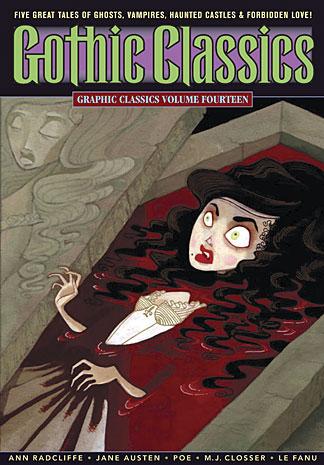
GOTHIC CLASSICS - GRAPHIC CLASSICS VOLUME FOURTEEN
Publisher: Eureka Productions Reviewer: Squashua
Being the uneducated heathen that I am, I never read any classic gothic tales. Heck, I'm sure those individuals who hang around the mall wearing black eye makeup and black clothing never read any classic gothic stories either, so I can't be damned for it, but I will say that GOTHIC CLASSICS might just be the thing to get them interested.GRAPHIC CLASSICS are anthology trade paperbacks depicting classic stories illustrated in black and white by modern comic artists. And those stories, being classic in nature, probably shouldn't be reviewed at all, least of all by someone with modern sensibilities. Then again, I've never admitted to being a sensible person.
“I've A Pain In My Head” Writer: Jane Austen Artist: Molly Kiely
Easy to miss, this single-page poem is found across from the contents page. It's a goofy ditty, and as an oddly worded period piece, I'd never have figured out that it involves a hangover without the humorous illustrations accompanying it.
“Carmilla” Writer: Joseph Sheriddan Le Fanu (adapted by Rod Lott) Artist: Lisa K. Weber
When I hear "gothic", I can't help but think of vampires, or rather White Wolf's pretentious "Vampire the Masquerade" game and an unhealthy pile of Anne Rice paperbacks. And hot Goth girls. Yum. And thanks to this book, I've discovered that "Carmilla" is probably the story to blame for all of the dark and sexy nosferatu chicks infesting raves back in the late 90's. A young, innocent girl is thrown into a world of excitement as her father is asked to board a strange, sickly girl. I guess this was the norm back then; people just dropped their daughters off with families they didn't know and promised to be back to pick them up in a month or two, hopefully without a bun in the oven.
The story is somewhat predictable, as the basic ideas and clues have been re-used in countless media since, but back in the day (or as one's first exposure) this story could have been a nail-biting mystery. Characters are drawn in a cartoon-y manner: exaggerated heads with enormous eyes, reminiscent of Tim Burton's "Corpse Bride". None of the panels appear to be inked, but rather shaded heavily in pencils, which makes for an appropriately somber tone for a dark tale. It's an excellent start to this volume.
“The Mysteries of Udolpho” Writer: Ann Radcliffe (adapted by Antonella Caputo) Artist: Carlo Vergara "Udolpho" is the meatiest story in the book, about this plain girl who goes into and out of various people's lives with extreme frequency, and everyone has a back story and there are tangents and mysteries that aren't followed up on until way later, and you're not sure if they're talking about the past or the future or the present and if it's referring to someone else who's been presented earlier or a new character altogether, or if the main storyline is progressing or if we're still discussing the main character.
I'll be honest - I would never have read "The Mysteries of Udolpho" if it hadn't been presented to me here in comic book fashion. It just goes on and on from tangent to tangent, and yet, I stuck with it because I felt so invested in it by the time I got part of the way through it, I had to see it through. With the dozens of storylines that are being juggled with “Udolpho”, I'm impressed that it was able to be properly adapted and that it ended up being completely readable, though there were a couple of missteps.
Though quite detailed, the hair styles on the characters were somewhat reminiscent of one another at times, with either black or uncolored hair being swapped, which caused a bit of confusion and head scratching, as I lost the ability to identify certain individuals. If the pages had not been black-and-white, but colored, this story might have helped in that regard. I also felt that certain "important" scenes were not emphasized enough. For example, there's a scene, infamously referred to later in the "Northanger Abbey" story, where the protagonist lifts a sheet and faints, then cuts to a discussion of her life in the castle. The sheet is referred to again, and had been completely forgotten, until the very end of the story when it's referenced as a very important plot point. I'm sure I should blame the author, but I feel that lack of graphic emphasis on something with such later importance is misleading to the reader.
“The Oval Portrait” Writer: Edgar Allan Poe (adapted by Tom Pomplun) Artist: Leong Wan Kok A Poe classic delightfully rendered in a cartoon-y manner and yet the final panel does not fail to evoke a shiver down the spine.
“Northanger Abbey” Writer: Jane Austen (adapted by Trina Robbins) Artist: Anne Timmons
The "other" long story in this book is “Northanger Abbey”, which reads as though the main character is trying to emulate the adventures of the girl from “Udolpho”. Reading the bios in the back of the book, I realized that “Northanger” is a goof on “Udolpho” and stories in kind, it's genre, and as such a tale, it succeeds. It's another entertaining and more straightforward yarn about a girl who goes off to live with people who aren't her family, falls in love, has angst about the love interest, etc. Essentially, I'd never have read it if it hadn't been presented to me as a comic; I don't think I could have made it through the book.
As with “Udolpho”, “Northanger” suffers from "look-alike-itis", where it's easy to get similar-looking characters mixed up. When you have two men, a blonde and a brunette, and the brunette suddenly has somewhat blonde hair, it tends to distract from the story. Though the eyes rendered for most every character here reminds me of those creepy Precious Moments figures and occasionally a face will drift towards "Archie Comics" quality, the art is generally finely detailed, and the backgrounds and clothing (and "finery") are well rendered.
“At the Gate” Writer: Myla Jo Closser (adapted by Tom Pomplun) Artist: Shary Flenniken
If you ever owned a dog, or even thought about owning a dog, or even wanted a dog, or petted a dog, this story will make you cry. I can't believe I have never read it before. It's a sweet tale about man's best friend waiting for his master, and thinking of my own dogs, it brought a tear to my eye. The interaction between the talking dogs is adorable, and they are lovingly rendered with clear emotions and intentions able to be perceived without even having to read the words. "At the Gate" was definitely my favorite story in this book, if not moved into one of my favorite stories of all time.
In all, I'd say that the stories in GOTHIC CLASSICS are a little more geared towards young teenage girls than anyone else, but the book is certainly an entertaining, unique, and easy way to read through the classics. I'm very impressed with the presentation and care that GRAPHIC CLASSICS took in adapting these stories to the comic medium. It's quite obvious that they appreciate the stories that they approach, and as a Cthulhu Mythos aficionado, I feel confident enough to order their earlier H.P. Lovecraft volume (GRAPHIC CLASSICS Volume Four) without a second thought.
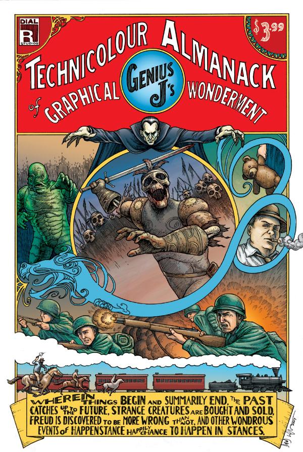
GENIUS J'S TECHNICOLOUR ALMANACK OF GRAPHICAL WONDERMENT
Writer: J. Andrew Clark Artists: Victor Cabanelas, Enzo Pertile, Art Grafunkel, Jason Whitley, David Wachter, KOEB, Chris Fason, Josh Hagler, and Jonathan A. Rector Publisher: Dial R Studios Reviewer: Dan Grendell
Wherin things begin and summarily end, the past catches up to the future, strange creatures are bought and sold, Freud is discovered to be more wrong than not, and other wondrous events of happenstance happily chance to happen in stances.As a general rule, I'm not a fan of anthology books. Usually I find myself liking a couple stories out of the bunch, and that really isn't a good enough success rate for me to feel satisfied. GENIUS J's is a happy exception. Part of that may be the linking factor of J. Andrew Clark's writing, which I find to be imaginative and clever and fun to read whatever the subject, but another part is very much the strong array of artists gathered in this collection. Not once as I read this did I feel disappointed by what I read, and that's quite an accomplishment. There's a serious pile of talent between these covers.
There's also a wide variety of stories. The book opens with a creation story with a twist, and Victor Cabanelas' use of a scratchier technique for the early gods and a more refined look for the created Earth and its animals worked quite well. The next story, a wartime love-lost set in World War Two France, was effective at setting mood and evoking emotion and was well drawn in both early and later years by Enzo Pertile. The one page poetry of heartbreak done as a two-tone sketch by Art Grafunkel is evocative and meaningful, fitting the words perfectly.
Following that comes a western that shows why you should do your research before you rob a train, with some great action and blood n' guts by Jason Whitley. Clark is really the focus of the next piece, as it's a creepy prose bit about teenage kids, but a couple color illustrations from David Wachter (from SCAR TISSUE) really set it off nicely. Next up is a beautiful watercolor painted style by KOEB, which perfectly fits a story about dreams. Really just some lovely work.
A more animated style by Chris Fason is after that, in a fun quick tale dealing with a private detective who can see ten seconds into the future. My favorite story of the collection came next, though it was hard to choose, about a Spanish missionary who encounters a pagan holiday. What really blew me away on this one was Josh Hagler's incredible art. An almost minimalist style, seemingly sketchy but actually well developed, his use of painted browns, blacks, blues, grays, and reds for color struck me and just wouldn't let go. Beautiful. The final story, about a guy who is shopping for a monster to terrorize his wife, was just plain fun, and Jonathan Rector drew those classic monsters with loving care. I love monsters, and that story just made me happy.
Like SCAR TISSUE, this book hasn't found a publisher yet somehow, but it will be available to order from Dial R Studios after San Diego Comic Con.

FALLEN SON: SPIDER-MAN Marvel Comics
So here we are, the fourth stage of grief: Dickheadedne…errr…Depression. So let’s see: Spider-Man is depressed because Captain America is dead, so he makes his daily visit to the cemetery where Uncle Ben is buried. The minute he sees the Rhino there as well, he jumps him and starts beating the shit out of him…even though the Rhino wasn’t doing anything wrong and was just standing at his mother’s grave (which Spider-Man ends up trashing—real nice, Spider-Jagoff). The Rhino asks to be left alone and asks why he’s getting beat up—fair question, considering what an asshole Spider-Man’s being. Instead of stopping and realizing he acted like a douche, Petey instead loses his mind and starts flashing back to beating up the Hulk with Cap. Thankfully, he manages to put down that big bad Rhino—that’ll teach him to visit his mother’s grave! Then, the same Wolverine who invaded an entire SHIELD Helicarrier and injured who knows how many in Chapter One of this story shows up to give Spidey some words of wisdom on how to cope with the loss of a loved one—something we’ve always seen Logan handle so well in the past. Yup, yet another phenomenally well thought out Spidey/CIVIL WAR tie-in. Y’know, it woulda made a lot more sense if the writer or editor had realized this was supposed to be the fourth stage of loss—Depression—and not Wolverine’s chapter on Anger. Hell, it’s not like mopey depressed Peter Parker hasn’t been around this summer—why not have him show up in the right place for a change? - Sleazy G
THE TEXAS CHAINSAW MASSACRE: CUT! #1 DC Wildstorm
Will Pfeifer takes a "stab" at that famous cannibalistic family from Texas. No, not the Bush Family, the Sawyer Family from the TCM flicks. This one-shot is tied to the original films and not so much to the newer remakes (although Leatherface is still missing his arm) and is set in the present. It's nice to see the demented Cook get some panel time in the comics. This well-paced thriller proved to be slightly predictable, but entertaining enough to whet my ghoulish appetite. It’s a trite entry in a series that is better than it should be. - Bug
GHOST RIDER #12 Marvel Comics
Two minutes, twelve seconds. That’s how long it took me to read this book. Despite loving the character, I haven’t picked up this book since the last overblown and overdrawn fiasco, maybe a year or two ago, where the demons were good guys and the angels were bad guys (wow! No one ever thought of THAT before!). But since we were tying into WORLD WAR HULK, I thought, “How bad could it be?” Well, the cover is the best thing about the book, and the quality drops off asymptotically after that. There are two sorta “gee whiz” panels in the whole book: one has you thinking “just how long IS this guy’s chain?” and the other has the Hulk, who has no speaking parts other than what you have heard him say before in every other issue of WWH thus far. But for a book that is mostly art, I would expect more. And other than that, we have about 90 seconds of dialogue between Blaze, a demon, and Ghost Rider: “Serve vengeance!” “No, save innocents!” “Tastes great!” “Less filling!” If I have a spare two minutes, I’ll read the next one in the aisle, just for grins, but after that, wake me if anything happens. – Rock-Me
MOON KNIGHT #11 Marvel Comics
I've just about had enough of this title. It jaunts all over the place for no real rhyme or reason. Flashbacks and inter-cutting scenes are done as if the writer has a distinct picture in his head as to how to the scene would play on a television or movie screen, but has little or no knowledge of how to translate that into comic book form. I wanted to like this title. I love the character of Moon Knight, but writer Charlie Huston's lack of knowledge of the medium (and the character) is hopelessly apparent throughout this entire mess of an issue. On top of it all, the covers of this book are misleading as hell. Iron Man doesn't show up in this book even though he’s featured on the cover. Hell, Tony Stark appears in one single panel. They pulled this a few issues ago with the Punisher and Captain America. This is a hype book that's full of hot air. The plot crawls, the covers lie to you, the art is sketchy and warped making Marc Spector look odd and brutish, and Huston's ugly rendition of the main character makes me wonder why the hell I liked Moon Knight in the first place. Bad, bad comic booking going on in this title. And it’s a damn shame since Moon Knight is a character with such potential at Marvel. - Bug
JUSTICE LEAGUE OF AMERICA #10 DC Comics
***SPOILER WARNING*** I enjoyed Brad Meltzer’s first arc on JLA, and was cautiously optimistic regarding the big crossover with the JSA, one of my favorite ongoing titles. But by the end of this issue I found I was disappointed with the outcome of the storyline for a lot of reasons. The first is that as much as I had enjoyed the Wally West-era FLASH for years, I was actually disappointed to see him back. I’ve always liked the Bart Allen character, and really felt he was treated poorly over the last years’ worth of FLASH stories. I’m annoyed that he was killed off, I’m annoyed that Wally’s back already and in this manner—but I just realized what I’m most annoyed at: that Bart’s probably still alive, but going to the 31st Century with the Legion Of Superheroes. Look: the book was pretty lame with Supergirl in it, and throwing Bart in there isn’t gonna help one bit. Moving characters that work well in the regular DCU as far away from it as possible isn’t going to help a book full of characters most people don’t know or like. In fact, I was so annoyed by the LOS grabbing Bart and leaving with him that it actually made me realize how bored I am with LOS, and I see it getting dropped in the very near future. Here’s hoping the next couple of issues of JLA are a return to form. - Sleazy G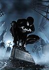
THE SENSATIONAL SPIDER-MAN #38 Marvel Comics
This was a creepy little read by Roberto Aguirre-Sacasa, a writer who has a damn fine ability to amp up the scares in mainstream superhero books. In this issue, a coincidence that you'd only find in a comic book appears (Eddie Brock happens to be admitted in the same hospital as the gunned-down Aunt May), but the tale is so creepy, this contrivance can be forgiven. Brock plans his revenge and he's clearly insane because he still speaks with the costume even though it has moved on to merge with the Scorpion over in THUNDERBOLTS. That doesn't stop Brock from ordering a cheap Black Spidey mylon costume and plotting his revenge on Peter Parker. The horror of this book is palpable and the overall sense of dread hangs in every panel. Lee Weeks provides the moody art as the cancer-ridden Brock moves ever closer to the oblivious Aunt May and Mary Jane. This story has a more down to earth scary vibe to it, partially because Brock is in such a sickened state and partially because the writer does a great job of framing and unfolding the drama. This is psychological horror in the style reminiscent of KRAVEN'S LAST HUNT. Aguirre-Sacasa has been making this Spidey title one of the few that is worthwhile reading on a regular basis. - Bug