

| #33 | 1/5/06 | #4 |
(Click title to go directly to the review)
THE EXTERMINATORS #1
AVENGERS: THE SERPENT CROWN TPB
DETECTIVE COMICS #815
TEEN TITANS #31
IRON MAN #5 & IRON MAN: THE INEVITABLE #1
Big Eyes for the Cape Guy presents…
Indie Jones presents…
CHEAP SHOTS!

THE EXTERMINATORS #1
Writer: Simon Oliver
Art: Tony Moore
Publisher: Vertigo DC Comics
Reviewer: Ambush Bug
Man, there’s been a slew of new Vertigo ongoings being released lately. Every week this month, I seem to stumble into one “new and edgy” concept after another over in the Vertigo section of my comic store. I’ve bought all of these number one issues to take a taste. I want to see if they can produce something as special as PREACHER and SANDMAN or as innovative as Y: THE LAST MAN or FABLES, or even as entertaining as HUMAN TARGET or THE LOSERS.
DMZ was first on my pick-up list and while I can understand why a concept focusing on the division of politics and beliefs set in a war torn America would be a timely topic for an ongoing, the first issue failed to grab me. I’m sticking with this one for a few more issues to see how the story turns out, but this definitely wasn’t the one that was going to blow my socks off.
Next was LOVELESS. Now, I’m an @$$-hole, not an Azz-head. So while I can understand the appeal of the uber-violent/ ultra-gritty Azz’s books, I have yet to read one that has compelled me. To me, I feel a disconnectedness in his stories. There’s an awful lot of contempt and anger in there and it’s proven to be a place where I just don’t feel like being. The stories I have read focus on very ugly concepts and I haven’t found them to be entertaining. As with DMZ, I have decided to read the first arc and then make my decision, but as of right now, with a few issues under its belt, LOVELESS doesn’t look to be on my pull list for very long.
TESTAMENT was next on the list and again, while I can understand that a modern retelling of biblical tales set against the backdrop of social consciousness and peppered with a dash of conspiracy thrown in for good measure may be appealing, I found the delivery to be dry and too heady. Kind of like Grant Morrison’s stuff without the accessible superheroes to draw you in. Again, not the Vertigo book for me.
Up until last week, I thought this new helping of number ones was going to be completely dissatisfying. Sure, the talent and quality that has been associated with Vertigo was there, it’s just that none of these new books were able to grab me by the throat and balls the way a LOSERS or a Y: THE LAST MAN or a PREACHER did from issue one. That is, until I read THE EXTERMINATORS #1.
THE EXTERMINATORS #1 follows a young man new to the exterminator business as he learns just how important the job really is to the delicately balanced war between man and nature. Issue one starts out with Henry James acting as the fresh set of eyes in this struggle. He’s newly out of prison and just landed a gig at an exterminator company called Big-Bee-Gone Co. At first, you get the feeling that these are just a bunch of guys who take their job way too seriously. We’ve all seen these types of people. They make their job out to be so important that without them doing what they do, the world would stop spinning. The thing is, as this story progresses, what first seems to be delusions of grandeur soon turns into something far more dire and real. Turns out that this ragtag group of exterminators may be humanity’s last hope.
What I liked about this issue is that I had no idea where it was going or what it was about. Whereas books like DMZ or TESTAMENT or even LOVELESS are so firmly planted in their respective genres and seem to adhere and/or twist the conventions that go with such a genre (even though I’m sure these books will push the boundaries of these conventions as most Vertigo books often do), THE EMTERMINATORS doesn’t have a specific genre that it falls into so easily. With every turn of the page, I had no idea where this story was going. Hell, if the lead would have lifted his hat revealing that he was actually a man-sized cockroach, I wouldn’t have been surprised. The sheer uncategorizable quality of this book immediately rockets this read far above the rest of other books on the shelves.
Adding to the quality of this book is Tony Moore’s amazing art. Some of you may remember Moore’s work on THE WALKING DEAD. Others won’t. But once you see this artist’s talented line work and expressive characters, you won’t forget him. Moore’s work has even improved since his TWD day, with his expansive use of “camera angles” and clever transitions from one panel to the next. And with the amazingly iconic cover image from trippy VIMANARAMA artist Philip Bond, this book has top notch artwork all around.
At the end of the day, I’m just looking for something I haven’t read before. And Vertigo is usually the place to find it. Even though some of these new Vertigo books may have their faults, they are still above and beyond most of the bland stuff on the market today. But THE EXTERMINATORS #1 blew me away and it just may be the only one of Vertigo’s new ongoings that survives the cut to my pull list. Jump onto this book now. Don’t wait for the trade. I think you’ll be as surprised as I was.

AVENGERS: THE SERPENT CROWN tpb
Written by Steve Englehart
Art by George Perez
Published by Marvel
Reviewed by Buzz Maverik
Let's start with a discussion topic for the talkbacks. Which comic story (we don't use the term "story arc" here in reviews by Buzz Maverik) or graphic novel do you feel the need to share with receptive parties? And why?
Most fans, when proselytizing, trot out the high brow stuff. Usually MAUS and WATCHMEN, things that transcend their medium, that would be powerful works no matter how they were presented. Excellent choices, recommended reads!
Fanboys used to wave THE DARK KNIGHT in non-fan faces. Usually, the non-fans were polite and frightened but the bolder ones would say enthusiastic things like, "Oh, yeah, Batman."
KINGDOM COME was another one like that. I've heard non-fans say, "Hmm. I used to watch SUPER FRIENDS when I was a kid. Neat art. I'm calling the police now."
I'm usually against forcing comics on people unless I'm already stoned because I hate missionaries. Even their position is boring. Missionaries deserve to have their heads on poles outside the hut of the tribal chief, whom in pulp fiction always turned out to be some Maverikian white guy who delved too deeply into the barbarous lands and conquered his own little kingdom.
If, like myself, you are a geek (and you're mostly straight), you've probably tried to get girls to read comics because what could be better than a comic reading girl? Well, a comic reading girl who's a beer spokesmodel and gets all the free brew you can guzzle. But that's just silly. You're lucky enough to get a girl when you're...you know, you're you. What do you do? You give her all your favorite comics to read. Do you like not getting laid or something?
"But, Buzz, I gave my girlfriend THE SANDMAN : SLEEPY SEEDS & MOUTH DROOL and she loves it. She asked me to get her THE SANDMAN: NIGHT TERRORS & STICKY SHEETS. And she goes into the comic shop with me!" you say.
Well, bubbe, she likes you. For the time being. I was on the other side of this, in one of those THREE'S COMPANY situations. I'm a closeted geek, as most geeks my age are and always have been because we know better. I had this job in a cubicle which meant that I collected a salary while writing screenplays at my desk and having the secretaries of agents and producers hang up on me for eight hours each day (I'm not sure what the hell I was supposed to be doing). A hot chick worked in the cubicle across from me. Instead of doing whatever she was supposed to be doing all day, she complained to me about her horrible boyfriend. He was into comics. He gave her THE DARK FUCKING KNIGHT for her birthday. He would read comics in bed after sex! He sent her action figures holding flowers. But he was a rich guy and as soon as she could find another rich guy...I realized he was a buddy of mine from the local comic shop. Cool guy. Spent hundreds on comics each Wednesday but would pay for beer when we geeks hit the bar down the street to talk comics. (In case yer wondering, my buddy the rich geek dumped her for an even hotter chick! Hooray! The good guys win for a change!).
The moral is: unless you're rich, you should only share your favorite comics with the truly receptive.
I'm not rich, and none of you are truly receptive but the recent tpb AVENGERS: THE SERPENT CROWN collects one of my all time favorite comic book stories. Released in 1975 and 1976, these stories feature some early Marvel art by George Perez. Mr. Perez knew how to guide our eyes, knew what to make us look at! He eschewed backgrounds but put the characters right in our faces. His figures are about half-realistic and half-stylized, which seems to work in superhero comics because they are half-exciting and half-relaxing to behold.
The story by Mr. Englehart was steeped in Marvel continuity, but we're helped along by flashbacks and editorial notes. There was a lot less continuity to deal with in those days, but these kind of stories made you want to read the earlier books, to know what had gone on. They lack pretense at realism, but I find them like real life in that events lead to further events. There's a sense of progression.
Avenger's plebe, the Beast, is attacked by an army of mercs, stemming from events in his 1972 series AMAZING ADVENTURES. Captain America is tailing the mercs for their misdeeds in his book. The mercs are a private army belonging to Marvel corporate baddies Roxxon Oil and the Beast's former employer the Brand Corporation (Englehart's sly take on real life think tank the RAND Corporation). In earlier issues of CAPTAIN AMERICA & THE FALCON, Roxxon president Hugh Jones had been captured by Krang and the Serpent Society and forced to wear the Lovecraftian Serpent Crown, which controlled his mind. He was saved by a ...uh, friend of Cap's called Nomad. But Jones remained a disciple of the Crown, simultaneously repaying Cap for help with information, while using Cap to eliminate competition from the Red Skull.
While the Beast worked at Brand, he mutated himself into the blue and furry hairball we know and love today (originally, he was black and furry but Marvel changed that after a few poor selling issues). Disoriented, he collapsed on the doorstep of his boss, schnook Buzz Baxter. Buzz' wife Patsy once had her own Marvel teen romance comic PATSY WALKER COMICS. She was obsessed with becoming a super heroine and agreed to keep Hank McCoy's secret if he would help her attain her goal.
As the Beast and Cap prepare to lead the Avengers against Brand/Roxxon, Patsy shows up. Hank decides to take her on the mission, as a ride along, to scare her straight. Too bad that Crown wearers from all the alternate universes are connected, and counter-Earth US President Nelson Rockefeller sends the Squadron Supreme to help out Jones. The Avengers are captured and imprisoned in a cage created by Dr. Spectrum.
Meanwhile, a few issues are devoted to Thor, Hawkeye and Avenger-recruit Moondragon in the Old West, teaming up with Marvel's gunslinger heroes to finally put a stop to Kang's crazy schemes. Alternate-Kang, Immortus, does the job for them.
Back at Brand, the Avengers escape. They find a super-suit that will give the woman wearing it the powers of MIA Marvel heroine, the Cat. Patsy dons the duds and becomes the Hellcat. Cap figured they needed her help against the Squadron. Yeah, if he and Iron Man and the Scarlet Witch and the Vision and the Beast got their asses kicked, Hellcat should be just the thing against Hyperion, Dr. Spectrum, the Whizzer, Lady Lark and the Golden Archer. Jones zaps them all the Squadron's Earth, where Wanda steals the Serpent Crown from President Rockefeller.
Poor Wanda. Even then, her mind was being screwed with. The Crown makes her crazy. The Vision has to track her down alone and ends up squared off against the Squadron (he kicks Hyperion's ass!). The Beast gives the Squadron a good talking to, gets them to reexamine their lives, etc. Problems still await the Avengers on the Brand end of the portal, but fortunately, Thor and Moondragon are back in the 1970s.
Suggested music: since these are '70s AVENGERS comics put on Led Zeppelin. I'm talking LZ I; II; III; ZOSO; PHYSICAL GRAFFITI, PRESENCE, HOUSES OF THE HOLY, and IN THRU THE OUT DOOR.

DETECTIVE COMICS #815
Writer: Shane McCarthy
Art: Cliff Chiang
Publisher: DC Comics
Reviewer: Ambush Bug
Because of all of the Hush and Red Hood and multi-mega-crossover crap that goes on between the Batman titles, it’s hard for me to review just one issue of a Batman comic without going into a rant focusing on what’s wrong with all of the Batman comics today. But when a comic like DETECTIVE COMICS #815 comes along and does things so right, I have to say something about it.
You see, I absolutely hated the previous arc that ran through DETECTIVE COMICS for the last year. David Lapham’s “City of Crime” had me at hello with an intriguing literary take on the city of Gotham and its dark inhabitants, but lost me just as quickly with the introduction of an ambiguous villain, a loosely threaded plot, and endless panels of monotony. When this arc came to a close last month, I gave a sigh of relief for the passing of an arc that clung to life waaay too long.
After reading the next issue blurb of issue #814, I immediately became excited for three reasons. One: because it was the beginning of a new arc. Two: because this arc promised to be simply two issues long. And most importantly, three: that this arc would focus on one of the most intriguing members of Batman’s rogues gallery, Mr. Zsasz.
I was first introduced to Mr. Zsasz back in SHADOW OF THE BAT #1. In that issue, he was just this crazy voice from a prison cell in Arkham. He was Batman’s Hannibal Lecter, captured and in the process of being punished for his crimes, but his story was relatively untold. It was this mystery that made me interested. Who was this guy? What made him tick? Why is Batman so disgusted with him? I soon came to find out that Zsasz was a serial killer with the demented habit of carving a tick mark into his flesh and scarring himself every time he killed someone. Not only was this a truly evil madness that afflicted this particular villain, but he was a visually frightening character as well since his body was covered in these tick marks. Since that first issue of SHADOW OF THE BAT, Zsasz has had a few stories dedicated to him, but he has yet to strike the fear and fascination in me as he did when I first laid eyes upon the character. That it, until now.
DETECTIVE COMICS #815 starts out with Bruce Wayne witnessing the stabbing of his butler Alfred by the notorious Zsasz. After this shocking first panel, we flash back to see who Zsasz is, what makes him tick, and how he escaped from Arkham. It’s the type of textbook storytelling that you have seen before (starting with a shockeroo, then backpedaling to set up how we got to that first panel), but in this day and age of drawn out stories, it’s good to see a story use this method of storytelling effectively, without seeming stale. I haven’t read any of Shane McCarthy’s work in the past, but he structures this story extremely well and keeps the ball rolling from cover to cover. This is a tightly packed issue, moving quick and leaving us with a cliffhanger that played right into Zsasz’s twisted methodology and highlights just why Batman is labeled the world’s greatest detective.
I really can’t wait for the conclusion to this story next issue. This isn’t one of those issues that needs a huge cast or a mega event crossover or any bells or whistles. It’s just solid storytelling which takes full advantage of the fact that it is an issue of a comic and not a chapter in a book or a snippet of a movie. I’m going to be keeping a close eye on this Shane McCarthy and an even closer eye on the final issue of this arc next month.

TEEN TITANS #31
Writer: Geoff Johns
Artists: Tony Daniel/Marlo Alquiza (TT story) & Todd Nauck/Richard Bonk (Capt. Carrot story)
Publisher: DC Comics
Reviewer: Prof. Challenger
Comics like this one just piss me off. It's not that there was anything wrong with the story itself. Basically, we have the conclusion of the fight between the Titans and Brother Blood (using his zombie Titans West) and the introduction to the series of a kind of cool "take" on the old Fawcett character Kid Eternity. We also have the conclusion of the WHATEVER HAPPENED TO CAPT. CARROT story I reviewed a few weeks back. And I know the big reveal of Alley Kat Abra as the killer of Little Cheese has basically cheesed off a bunch of us Capt. Carrot fans out here, but even that's not what pisses me off.
What pisses me off is that this comic book made it out of production and onto the stands as is. Unprofessional glitches throughout this book make me wonder why this issue was not delayed a week or two so that the fix could be put to it. The only conclusion I can come to is that either DC does not hire professional proof-readers anymore or the editorial system is content and satisfied to put out sub-standard fare with no apologies. And that is just plain unfair to the consumers who pay the $$$$ that keeps titles like this going month to month and generates ill feelings toward the publisher, which can never be good in a business like comics.
So, what am I talking about? Well, the most obvious is the fact that the cover boasts Scott Shaw! as providing the artwork for the Capt. Carrot story (as he did so brilliantly in issue 30), yet the interior art is actually done by Todd Nauck - and an apparently very rushed Todd Nauck at that. For someone like me, this is like going to a restaurant and ordering the finest filet mignon and having them bring out some meatloaf with ketchup on it and forcing me to eat it. Not that there's anything wrong with meatloaf with ketchup on it, but when you're expecting filet mignon….well…you get the drift. As a reader, I'm sitting out here pondering what's going on here. Ultimately, I wound up moseying on over to Scott Shaw's! ODDBALL COMICS discussion board to see if he could shed some light on it. Apparently some sort of production problem cropped up and HIS artwork never made it to the printer and DC must've grabbed Nauck and had him quickly knock out some replacement pages. Color me ignorant here, but in this day of digital transmission, how in the world can Shaw's! pages just be lost???? Even if the original scans disappeared, wouldn't they have some photocopies or colorist proofs or…shock…original art??? Somewhere? I just can not imagine the editorial/production ineptitude in this day and age that leads to the disappearance of 4 pages of a high-profile comic like this, and worse, that the editorial staff of probably the largest corporate comic book company would be content to allow this book to go to press with rushed second-stringer art rather than just delay the issue a few more weeks to let Shaw! work up the replacements ~ or better yet, get their collective heads out of their asses and find his frickin' artwork! Sheez! I'm pissed about this type of unprofessionalism. GAH! You'd think DC could've at LEAST run an apology on the letters page ~ oh yeah ~ "we don't do letters pages anymore." Screw you. How about a simple press release then, ya numb nuts. GUH!
Anyway, so the shock of that horridly mediocre opening page with the sledgehammer to my face screaming "NOT SCOTT SHAW! ART!", I then get to the big Kid Eternity reveal page and there's this weird little dialogue bit: "My power is opening this door. But I wasn't raised in a barn. I'd close it after I was done." To which I'm going "Huh? Maybe DukeofSpiders is right 'cause I don't have a clue." Then the very next page has a narrative balloon from Kid Eternity that says "Then one day, Chaos messed my life up again a sorcerer saying he was collecting Chaos Power killed me." Again. "Huh?" I can't tell if there's just a missing comma in there making the sentence incomprehensible or if there's actually more missing. No way to know for sure here, but it's damn annoying. I mean, we're not talking about a bunch of yokels out here chatting each other up on email, im, or message boards where incomprehensibility reigns supreme sometimes because of the lack of an edit feature *blink blink*. We're talking about comics that are supposedly completed months in advance and presumably have gone through an editor, a proofreader, and an editor again, before going to press. Jump a few pages later in the same damn comic and Brother Blood spouts off "It will all mine now." Yep. Supposed to be "It will all be mine now." But somehow this got through editorial and proofing. Come on. This isn't an indie press, this is flippin' DC Comics guys. Totally unacceptable.
What else is unacceptable is that the stupid Capt. Carrot story also reads like it's missing a page. Check this out. At the end of the third page in this installment, the remaining Zoo Crew members, plus American Eagle realize that the President knows who killed Little Cheese and they take off to pick up Alley Kat Abra so that they can take on the Government of the United Species of America. Yet the first panel of the fourth page has them just standing there announcing that Alley Kat Abra killed Little Cheese and the cops are arresting her. ???? In two issues, this was an 8-page story so there has to be a certain economy to the storytelling, but completely leaving out the entire event upon which the big reveal hinged? That was much more disappointing than the actual reveal that Alley Kat was the killer. Within the context of the storyline, I could deal with that. What I cannot deal with is the sloppy writing and editing. Even without the production problems, the dialogue was weak this time out throughout the entire issue. Conceptually, the story was top notch, but the execution was weary.
I get the feeling that Geoff Johns is, perhaps, stretched a bit too thin right now and his writing is beginning to suffer for it. I know he's writing TEEN TITANS, GREEN LANTERN, JSA, and INFINITE CRISIS and is cowriting GREEN LANTERN CORPS and 52 as we speak, not to mention he's also working as the guy trying the wrangle the whole Crisis and post-Crisis DC Universe. And that's all we KNOW he's working on. As a professional writer, he probably has a few more irons in the fire that we don't even know about. So, I'm not so down on him about this unfortunate turn of events, but I firmly believe that the editorial staff needs to step up and give the guy the support he needs and not let him go to press with an issue like this. No professional writer wants to see his name attached to a project that is full of glitches and misfires and it is the responsibility of his editor and the production team to make sure the book hits the newsstands as the best product possible. This month, they failed miserably and I'm pissed about it. Get with it, DC.

IRON MAN #5
Writer: Warren Ellis
Artist: Adi Granov
IRON MAN : THE INEVITABLE #1
Writer: Joe Casey
Artist: Frazer Irving
Publisher: Marvel
Reviewer: Ambush Bug
Next to Moon Knight, Hulk, and maybe Captain America, there isn’t a cooler character at Marvel in my book than Iron Man. There’s something about the flawed hero masquerading as his own bodyguard in a shining suit of red and gold armor that just exudes everything that I love about comic books. It’s just too bad that Marvel has handled this character so piss-poorly in recent years. When I heard that futurist writer Warren Ellis was taking over the regular writing duties of a new IRON MAN ongoing series, I couldn’t wait to see his whacked out version of the character, but this series has been anything but ongoing and therein lays my biggest beef with the current IRON MAN title.
You see, on November 17th, 2004, issue one of Warren Ellis and Adi Granov’s IRON MAN series was released to the public. I know this because our beloved Buzz Maverik reviewed it right here . That was over a year ago. Since then, we failed to review the second issue, but I reviewed issue #3 in April of last year and Dave cheap shat #4 in August. Now it’s January 2005, and the fifth issue of this series (which happens to be the fifth installment of the current and only story arc) is being released. Now I’m all for getting the best possible product out of an artist, but when it takes an artist over a year to finish five issues, that, my friends, is not a comic book artist. Adi Granov may make some dynamic panels with some beautifully textured images, but at this point, that’s beside the point. I don’t know what Adi Granov has going on. Maybe he’s had some personal issues, keeping him away from his work. Maybe his goldfish is sick. Or he has a hangnail. Maybe he’s having trouble taking time off of his day job. Or maybe his dog has a tendency to dine on his finished masterpieces. Whatever the case, looking at a comic that has taken 15 months to release five issues, especially one coming from the biggest comic book publisher in the world, I don’t care if the artwork gives me beer and a blowjob every time I look at it, the sheer unprofessionalism of it all is going to turn me off. But I guess this is what we’ve come to expect from Marvel, given the fact that not even its EIC can put out a book on time.
So you’d think that since this comic comes out about once every time @$$hole mascot Schleppy gets his seasonal deworming, writer Warren Ellis would pack every issue with as much goings on as he possibly can to make up for it. But no. Along with the delayed release schedule, Ellis’ storyline is trickling along about as fast as sloth snot. Thick mucusy sloth snot at that. In this issue, a “much needed” recap of the Iron Man origin is retold. The plot is advanced an inch, with Tony Stark absorbing this Extremis virus and modifying his relationship to his armor to the ultimate degree.
The thing is, Ellis is the guy to go to with all of the techno-future blab. Sure he makes these innovative advances to Tony’s armor and imaginative additions to Iron Man’s origin, but it’s just too bad he’s taking forever to do it. If this book were on time, it’d be somewhat disappointing, but what we’ve come to expect from a typical trade-paced Marvel book, but since the book is dragging in both plot and distribution, the final product is just a complete waste of all of our time.

A much better way to get some quality Iron Man time was released two weeks ago in the Joe Casey miniseries IRON MAN: THE INEVITABLE #1. Not only is this a clean cut superhero tale punctuated throughout with action and adventure, but it marks the return of not one, not two, but three classic Iron Man villains. Casey is a strong storyteller, able to grip you from page one and get the ball rolling. The art by Frazer Irving is beautifully colored and visually dynamic all at once. Irving’s use of color to add texture and space to his panels is a truly eye-popping sight to behold. This issue sets up an all out slugfest between Iron Man and three of his most deadly villains (villains that have been out of the limelight for way too long). More stuff happens in this issue than in the first five issues of Ellis’ series.
So if you’re interested in some Iron-Manning, skip his unreliable ongoing series and give the much more entertaining miniseries a shot instead. IRON MAN: THE INEVITABLE isn’t interested in changing the status quo or egotistically making its mark on the character or changing Tony Stark into something utterly unrecognizable. It’s just some straightforward adventure storytelling. And BONUS! It’s seems like it’s going to be released on time too.

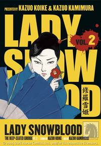
LADY SNOWBLOOD
Writer: Kazuo Koike
Artist: Kazuo Kamimura
Publisher: Dark Horse
Reviewer: Dan Grendell
Overview: Volumes 1 and 2
Reviewing this manga is tough for me. I'm a huge fan of LONE WOLF & CUB and SAMURAI EXECUTIONER, two series written previously by Kazuo Koike. In fact, LONE WOLF & CUB is my favorite manga ever. So going into LADY SNOWBLOOD, I expected to enjoy it on the same level. And I just don't. The question is, why?
Was it the difference in artists? Kamimura's art is strong, more fluid and graceful than Goseki Kojima's from Koike's earlier series, but that fits well for a book with a powerful female protagonist. His panel-to-panel storytelling isn't as practiced, but it isn't bad, either. In a few cases I had trouble following what had just occurred, but it was easy to decipher on a second read. Overall, the art works well. So no, that wasn't the problem.
Was it the story? Lady Snowblood is the daughter, born in prison, of a woman horribly wronged by four people. Conceived just to bear vengeance for her mother, she carries the burden of her hatred as her reason for living and works as an assassin to pay for ways to find those people and kill them. Okay, a revenge tale carried to extremes - but then, so is LONE WOLF & CUB. That wasn't the problem either.
Ah ha! I had it. The problem was the character herself. Lady Snowblood has no redeeming features. Ogami Itto and his son bond in LONE WOLF & CUB, they help people when they can, and you can relate to their struggles somewhat. Yamada Asaemon of SAMURAI EXECUTIONER struggles to live a life by his own code of honor and still help people as he can. He's a Samurai with a capital S. Lady Snowblood, on the other hand, hurries innocent sick women along on to their deaths to get hold of the death registry, sets fires in a city made of wood to get in nice with yakuza, and forces servants to rape their mistresses so she can blackmail them later. Why do I care about her vendetta? I don't. The manga is just a series of well-drawn, intellectually-interesting assassinations.
It may seem like I have issues with LADY SNOWBLOOD because it isn't LONE WOLF & CUB or SAMURAI EXECUTIONER, but that isn't the case. It's simply that looking at Koike's earlier works helped me realize what was missing from this one. Its lines on a page, with no heart. And it kills me to say it.

PSY-COMM
Writers: Jason Henderson and Tony Salvaggio
Penciler: Shane Granger
Inker: Jeremy Freeman
Publisher: Tokyopop
Reviewer: Dan Grendell
Corporate warfare- It's all in your mind
War is horrible, for any halfway-sane person. How much more horrible would it be if you could see a short time, just seconds even, into the future? Enough to save yourself and people around you. But you couldn't save everyone; someone, eventually, would slip through your protection. And the guilt would eat you up inside.
Meet Mark Leit, a Psychic Commando in a future where corporations rule and fight televised wars for ratings. Mark is a pre-cognitive haunted by the loss of his friend Raven years before. Partnered with telekinetic David Jerold, he is a superstar - until they infiltrate an enemy Psy-Comm school and he meets Snow Lucente, who reminds him of Raven and ignites in him a need to escape the war and everything it’s done to him. Problem is, Snow isn't very cooperative...
Henderson and Salvaggio have a great story on their hands here, a commentary on corporations, the media, war, and relationships, all wrapped in an interesting action manga with a driving plot and compelling characters. The artwork is also strong, particularly the military vehicles and battle armor, which are interesting but still look like they would actually see use on a battlefield. Granger and Freeman do great battlefield scenes as well, never leaving me wondering as to what was happening, though they did tend to focus more on small squad shots than larger ones, which tended to give the impressions that the battles were smaller in scope. The number of vehicles shown seemed to imply that wasn't the case. The facial expressions are done quite well; Mark has a haunted look, David a cocky smirk, and Snow an angry indignation that really brings their characters home.
Overall, I'm very impressed, and looking forward to another volume.

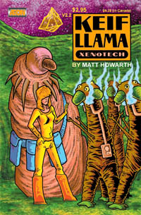
KEIF LLAMA: XENOTECH #2.2 & 2.3
Writer/Artist: Matt Howarth
Published by: MU Press
Reviewed by Dave Farabee
Issue 2.2
The cover you see in the thumbnail image up there…it nearly scared me off. Girl in a garish yellow jumpsuit looking like the one the Ninja Turtles’ gal-pal wore back in the ‘80s, combined with a big, sluggy thing whose alien head Freud would’ve loved. And that funky title…“Keif Llama”…what the hell is that all about? Looked like some kinda underground comix, and much as I like to think my comic tastes are diverse, my interest in the undergrounds only goes as far as my R. Crumb collection of Blues-themed stories.
Something, dunno what, compelled me to go ahead and take a look, though. And I struck gold, bay-bee! On the cusp of a malaise over the dwindling indie side of the biz, I found in KEIF LLAMA a reminder, a very happy reminder, of just how original and wonderfully crafted creator-owned books can be. I actually loved the damn thing.
And what KEIF LLAMA is is a sci-fi comic by Matt Howarth. Not “space opera,” which is what most comics purporting to be sci-fi are, but real, actual, no-laser-guns-or-evil-alien-empires sci-fi. The particulars of the series fall somewhere between hard sci-fi (emphasis on alien concepts, alien technology) and soft sci-fi (sci-fi as vehicle for exploring humanity and social issues), with a welcome emphasis on the former. Oh, and there’s a good bit of Dr. Seussian goofiness, so don’t fret that it ever gets too heavy-duty.
As for the funky title, “Keif Llama” happens to be the name of a the lead character (the gal in the yellow jumpsuit), and her profession is “xenotech.” As the text piece on the inside-front-cover explains, “In a galaxy overcrowded with alien cultures (some of them so different that communication between them is forever impossible), three things are required for these cultures to productively interact.” The first is faster-than-light propulsion technology (“It’s surprising how many of these there are,” quips the text piece). Second is a universal translator – those are available too. And third and most crucial is the ability to comprehend totally alien thought processes so as to put the first two items on the list to use. It’s extremely rare, but those like Keif Llama who have the gift are called xenotechs, and in her case she plies her skill for the galactic government known as the Confed.
Them’s the bare bones of what the book is about, but a bare-bones description hardly captures the charm of Howarth’s approach. His art in particular…well, I can’t say I’ve ever seen anything quite like it. Imagine Robert Crumb’s elaborately crosshatched visuals with the grungy, three-dimensionality dropped in favor of crisp, stark, geometric designs (still with the crosshatching!) and you’re getting there. Here’s a single panel. Howarth’s approach brings an abstraction to the proceedings that proves to be truly welcome in dealing with all the alien concepts. See, I think literalization of the strange and unusual can make them conventional – that’s my central issue with Alex Ross’s art – and so I found myself very taken with the approach to sci-fi that leaves something to the imagination. And in place of uber-detail on specifics, Howarth esoteric art creates an aura of strangeness that imbues everything. In that sense, KIEF LLAMA feels more alien than just about any sci-fi comic I’ve ever read.
Oh yeah, the story – don’t let me forget that in my giddiness over the concept!
The entry point for the book is that Keif’s job is just that to her – a job – and while she enjoys it and carries herself with good humor, she’s still got to deal with red tape and bureaucratic nonsense. Anyone can relate. In issue 2.2, the standalone issue I randomly picked up, she finds herself on a mission to “Narl’s Point,” an asteroid in the early stages of terraforming. Her partner’s a cranky, professorial alien (the phallic-headed dude from the cover), and one faster-than-light ride on an organic ship later, they’re there. Neat bit: they shuttle off from their ship a ways off from the asteroid so the asteroid’s gravity doesn’t damage the living ship’s cellular structure – cool! Their hosts are a trio of amusingly dopey, plant-based life forms who discovered an ancient base embedded in the asteroid while conducting geological surveys. Inside is a mysterious artifact they consider blasphemous, and the mystery is afoot.
“Mystery” being the operative word, because this issue is essentially an alien science procedural, though with a minimum of jargon and a nice jolt of energy from the action of the finale. My favorite moment has a group of the plant aliens panicking and spontaneously “popping” in their excitement, plant spores spraying everywhere. Inadvertent death becomes absurdly hilarious as Keif dashes from the room, holding her breath to avoid inhaling any of the alien “children.”
What a great surprise KEIF LLAMA is - serious sci-fi concepts delivered with wit and a style of bravura cartooning that honestly feels like nothing I’ve ever seen before. So far as I can see, even with a few of its darker turns, it’s still all-ages friendly. I’m hesitant to say this till I’ve read a few more issues, but y’know what? If ever I’ve read a comic that feels like the industry’s answer to the HITCHHIKER’S GUIDE TO THE GALAXY, this is it.
Issue 2.3
If you’re going to sample the series, I’d say the previous issue is ideal, but since 2.3 just hit this week, let’s give ‘er a quick look-see. Unlike 2.2, this is a series of short stories – mostly tongue-in-cheek and just as winning - but a better fit for someone who’s already familiar with Keif than someone just checking out her adventures for the first time. Still, you get a lot of material in its 32 pages…
The first story has Keif reluctantly trying to curry the favor of a group of xenophobic aliens at a diplomatic cocktail party. One of the aliens turns out to be suicidal for the strangest of reasons: he’s taken a drink at the party (“I have ingested non-Bunnian mass!”) and when you come from a planet that worships a set weight for its planet, that’s a major no-no. Keif wades in a with a fun solution.
The second story has Keif desperately racing through an alien landscape to find a dropped card that identifies throughout the galaxy what kind of foods she can eat safely. It has my favorite visuals of the issue and a fun musing on “rude aliens.”
Third story puts Keif in the role of negotiator between a group of plant-based planet-dwellers and the sentient plasma flows in their sun who want to tax the sunlight that sustains them. Very wry humor, as you might expect.
The last few stories feature, among other things, an alien mugging involving a gasbag creature brandishing a lizard-on-a-stick, Keif taking a bath on a long spaceflight with indeterminate gravity, and Keif musing with her girlfriend on whether guys are stranger than the aliens she interacts with.
Greart concepts, fun characters, trippy-cool artwork. I have not one bad thing to say about this series.

LIVING IN INFAMY # 1
Written by: Benjamin Raab & Deric A. Hughes
Penciled by: Greg Kirkpatrik
Published by: Ludovico Technique
Reviewer: superhero
Every once in a while there’s a comic that makes creators and fans scratch their heads and say, Damn, I wish I’d thought of that idea.
LIVING IN INFAMY is just such a book.
LIVING IN INFAMY deals with what happens when super-villains enter the witness protection program.
See? Great idea right?
Taking his lead from the final scene of the movie GOODFELLAS (even the first issue’s cover image borrows from that famous bit of cinema) writers Ben Raab and Deric A. Hughes take it to its logical next step, except that his criminals once had super powers. What we’re introduced to in the pages of this book are several individuals who once had their own bit of power but now have to live within the confines of small town Americana in a burg actually named Infamy. For the most part it seems as if most of them get by and are fully resigned to their situations but there’s enough resentment left over from the bad old days that adds some truly humorous moments to this book. The central comedic bit of this issue of LIVING IN INFAMY involves a group of ex-villains playing a game of cards and the interaction between them all is truly amusing. There’s one particular bit at the card table involving an ex-villain who appears to be host to a disembodied alien intelligence which came off as particularly funny. The great part about the scene is that no matter what amount of power they may have or have had or how much they puff their chests the scene still just comes off like a group of average joes bickering at a card table. That’s what makes this book special. It’s that these people aren’t average joes and it makes their acts of petty normalcy resonate even more than if it were just a book about, well, average joes bickering at a card table. Much in the same way that Ray Liotta made us feel at the end of GOODFELLAS that life was just never as great for him after he went into the witness protection program, the writing during this scene hit the point home that these characters are not completely enjoying having to play the part of Mr. and Mrs. Average American.
But LIVING IN INFAMY goes beyond just being a gimmick book in that there’s also something sinister going on while everyone’s trying to fit into the everyday roles they’ve been forced to assume. See, there’s a reason people go into the witness protection program and it’s no different for the villains who are hiding out in the town of Infamy. While the government has taken certain steps to make sure that these unscrupulous characters have been shielded from whomever they ratted on we all know that nothing is forever. Eventually a loophole in the shielding manifests itself during the course of the book due to something that the government and its captives never accounted for. I won’t go into what that loophole is here but it is something that makes complete sense in the scope of the book.
Penciler Greg Kirkpatric does a really good job with the art and the overall storytelling of INFAMY. His and inker John Lucas’ line work comes off looking smooth and professional. My only small criticism is that some of the dialogue scenes towards the end of the book come off as a bit stiff. It could just be me but we are talking about a book in which there’s a LOT of dialogue and little action so I’d suggest just looking into ways of making the scenes where people are relating to each other flow a bit more. Either way, the art is perfect for this sort of book and I hope that my opinion on the dialogue scenes doesn’t take away from the fact that Kirkpatric and Lucas are doing some really tight work on LIVING IN INFAMY, especially when you consider that we are talking about an indie book.
I do, however, have a bit of a problem with the coloring of the book. While colorist Allen Passalaqua does an incredibly professional job and actually makes the comic look great for the most part, the palette used on this book was a little dark for my taste. It seems like Passalaqua leaned more towards the brown end of the spectrum throughout the book and while it does add to the small town feel there are elements of the coloring job that just make certain panels and pages come off a bit too flat for the lack of a better term. It’s not that he’s doing a bad job, far from it. It’s just that I don’t think some of the images pop off the page as they should because of the overall color palette.
Despite these criticisms LIVING IN INFAMY looks to be the little indie book that could. It’s got enough of a unique idea that it’s set apart from a lot of the other books out there on the stands. While this first issue, like many other first issues, is pretty much just set up it has enough humorous and mysterious elements to keep me interested in picking up subsequent issues of the mini-series. That’s actually saying a lot for someone like me who stays away from mini-series like the plague as I prefer to wait for trade collections when looking at minis if I ever pick them up at all. LIVING IN INFAMY has got what it takes to make a really compelling story and I, for one, am looking forward to making more visits to the town of Infamy in the future.
Remember, if you have an Indie book you’d like one of the @$$holes to take a look at, click on your favorite reviewer’s link and drop us an email.
Remember, if you have an Indie book you’d like one of the @$$holes to take a look at, click on your favorite reviewer’s link and drop us an email.


DAY OF VENGEANCE: INFINITE CRISIS SPECIAL
DC Comics
What did I like about this special? Walt Simonson cover. Blue Devil getting his original trident back. The identification of all the players on the two-page spread so I didn't have to wonder who everyone was. The introduction of Rex The Wonder Dog into the magical side of the DC Universe. Ghost Patrol looking like they were drawn by Bernie Wrightson. Mary Marvel back in her dress reds and going by the name Mary Marvel instead of Capt. Marvel also. Capt. Marvel Jr. going by the name Capt. Marvel Jr. instead of CM3. Detective Chimp. Madame Xanadu. Spectre reduced in power back to a need for a human host again. The helmet of Nabu allowing "fate" to decide who will next take up the mantle of Dr. Fate. The realization that the upcoming SHADOWPACT series has the potential to kick magical ass as long as it is as well-done as this stand-alone. What did I not like about this special? Nothing. -Prof.

SABLE & FORTUNE #1 (of 6)
Marvel
I got a pretty good kick out of this first issue, teaming glam merc Silver Sable with the even more off-the-beaten path Dominic Fortune, a ‘30s pulp detective somehow still kickin’ around (or is it the original’s grandson or somesuch?). It’s a weird mix and writer Brendan Cahill is a newbie whose biggest claim to fame is a web comic, but there’s an easy lure in the painted art of John Burns. He’s a Brit artist whose art’s got a slick, ‘60s sexiness to it, his only quirk being the sheer size he gives over to Silver Sable’s hair. Fellow @$$hole Dan Grendell said she looks like a refugee from ‘80s hair band, Poison, and he’s right, but since the art’s a bit retro and the ‘60s had its share of bouffants too, it works. The premise has Sable’s mercenary agency slipping into disrepair and failures amidst rumors of a traitor in the ranks, and the sly (but less combat effective) Dominic Fortune stepping in with a plan that may be mutually beneficial. And I like the mix. Bit of action, bit of romantic repartee, and Sable’s written with a larger-than-life toughness that’s endearing in an age of boring subtlety. So far, so good. - Dave

JSA # 81
DC Comics
OK, seriously, DC Comics needs to bring back STARS AND S.T.R.I.P.E. Just bring back the damn book already and stop giving us crap books like SUPERGIRL and BATGIRL. This issue of JSA is a testament to how great Stargirl is as a character and how great Geoff Johns is at writing her. Just give Stargirl her own damn book again already! Really, if you plan it right you’ll bring in teenage girls from all over the comic book reading universe and increase your readership. I mean, really, I’m beginning to think that Johns IS a teenage girl he writes Stargirl so well. Oh, and if Eaglesham and Thibert are the new permanent art team on JSA that’d make me happy too. All around great job on this issue. Now BRING BACK STARS AND S.T.R.I.P.E.!!!!!!! - superhero

SUPREME POWER: NIGHTHAWK #5
Marvel MAX
Almost finished with the first Daniel Way written story arc I have ever read and I have to say, the guy isn’t letting me down with this miniseries. The serial killing clown continues to torment our Batman analog and as his fascination with the grim warrior of the night deepens, those around Nighthawk are in greater danger. This is a take no prisoners, no holds barred showdown between two people with nothing to lose. Next issue’s confrontation between these two arch-nemeses is bound to be a doozy. This is basically a Batman story that could end in any way. There’s no guarantee of what will happen and who will survive. Can’t wait till this wraps up next month. - Bug

SEVEN SOLDIERS: FRANKENSTEIN #2
DC Comics
Artistically, just flat out the best illustrated comic I've read this month. Frankenstein on Mars kicking evil butt to save a bunch of kids hijacked to Mars. Just plain cool. Lots of imagery surrounding the remains of Martian Manhunter's civilization establish a consistent landscape of continuity with the broader DC universe. At the same time, other bizarre Martian creatures are shown creating an eerie horror-version of John Carter, Warlord of Mars with Frankenstein in the Carter role. Villainous Melmoth pulls one of those Darth Vader moments where he tries to freak Frankenstein out by revealing that it was not the lightning that gave Frankenstein life, but a transfusion of Melmoth's own immortal blood that brought him to life. Frankenstein's no Luke Skywalker, though. Frankenstein basically just gives him the proverbial finger and tears him apart and feeds his pieces to some Martian scavengers. Frankenstein is DC's best badass this side of Jonah Hex. -Prof.

ESSENTIAL OFFICIAL HANDBOOK OF THE MARVEL UNIVERSE (TPB)
Marvel
This is it, ladies and gentlemen: the gold standard for superhero encyclopedias. The last few years have seen hordes of unworthies, with over-written entries, power graphs that rank even the likes of Aunt May on her “energy projection” (what if she has mace in her purse?), and ass-ugly visual aesthetics that include paintings alongside traditional line drawings and spastic poses alongside static poses with little rhyme or reason. Not so with the originator! Though over 20 years old and 20 years out of date with its information, the original MARVEL UNIVERSE (Or OHotMU as the acronym-happy like to call it) is a masterpiece of design. Entries are uncluttered, text quick and to the point, and the info in the write-ups clearly set the tone for all to come. What you get: Real Name, Occupation, Legal Status, Former Aliases, Identity, Place of Birth, Marital Status, Known Relatives, Group Affiliation, Base of Operations, First Appearance, Origin, Height, Weight, Eyes, Hair, Unusual Features, Powers, and Weapons. The art, while boasting talents ranging from John Byrne to Jack Kirby to Frank Miller, emphasizes conservative pose shots to best show off costumes and comparative physiques, while still giving enough artistic leeway for touches of character – the heroic stance, the villainous hunch, the slight smile, the brutal scowl. Nearly all the art is original, with only a few swiped from issues, though there are some nice insets of issue art showing some of the characters in action (the DELUXE MARVEL UNIVERSE that followed on the heels of the original 15-issue series would expand in this area). And here’s just a handful of the highlight features: the masterful technical illustrations of Elliot R. Brown, with their believable cutaway views of everything from the Avengers’ Quinjet to Moon Knight’s truncheon to the Stilt-Man’s battlesuit – he makes it look like it could work!; the maps, ranging from Asgard to the Eastern stronghold of K’un-Lun to key Marvel sites in Europe; the layout schematics of locales like Dr. Doom’s Castle and the X-mansion; the catch-all appendix of unlisted characters and Marvel terminology like “vibranium”; the full listing of Marvel’s alien races; four issues devoted to spotlighting Marvel’s dead and inactive characters; one entire issue spotlighting weapons and hardware; and last but not least…reprints in the back of how all the old covers looked when linked up (they connected!)
I don’t care if these entries are out of date. Even viewed with objectivity, the ‘80s were just a ridiculously damn great era for Marvel comics – yes, objectively better than the ‘90s or 2000s – and datedness becomes far less important when the entries were conceived in such a creatively fertile and professional era. Plus, all fourteen jam-packed issues for just seventeen bucks? Sells itself, it does. Hell, I’ve got all the original issues and I still bought it just for the awesome convenience of having ‘em all in one fat-packed volume. Highest recommendation available - they don’t make ‘em like this anymore. - Dave
