Ain't It Cool News (www.aintitcool.com)
Movie News

Wildly Spectacularly Vunderval FANTASTIC FOUR images hit online filling one with a sense of utter DOOM!!!

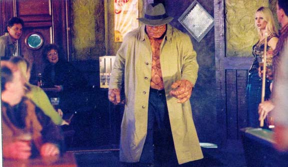
Hey folks, Harry here... I find it down right amazing how utterly shitty FANTASTIC FOUR looks - but it seems that some fan sites out there - and some folks think it just looks absolutely scrumdiddliumptious. For example - you've got Scott over at Fantastic411.com. I love his enthusiasm and excitement, hell it's kinda what I'm known for. But there is not a single element of this film that looks good to me. From the shoddy lighting, to production design that looks like it comes off some sort of cheap sitcom... I mean - look at this shot of Ben Grimm walking into what is supposed to be a Yancy Street Bar... Does that look like a Hell's Kitchen style bar? Or does that look like some sort of fucking Yuppie Spawning ground?


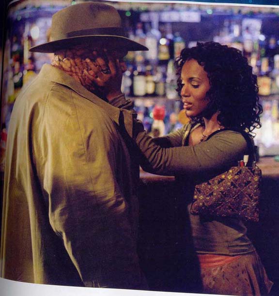
And then look at Alicia Masters. I'm so happy that Alicia spends hours and hours in front of the mirror doing her make-up and hair. I mean, this is the single most FLY blind chick... right? Doesn't she just instantly strike you as the very embodiment of Alicia Masters? Thank God they didn't cast someone like Alicia Witt or Alyson Hannigan... right?


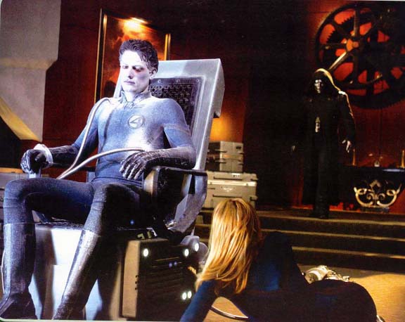
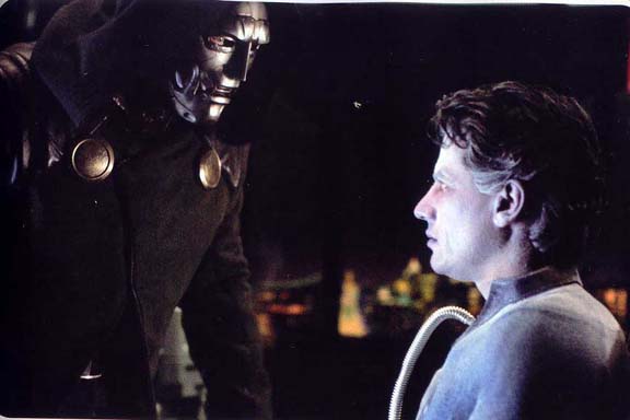
And then there's this... I can't even begin to fathom what level of schlocksploitation they pulled this rancid shit from. Look at this. It's like George Sanders or Otto Preminger are off Camera recalling the same make up done to Adam West on the old 60's BATMAN series. Hell, Gil Gerard's make-up from the beginning of BUCK ROGERS kicked the shit out of this. In my wildest nightmares of where this film was headed - I never dreamt for a second that it'd have shitty shots like this one... Bring back Corman, at least he only wasted $1 million on his bad FANTASTIC FOUR movie. Of course - maybe I'm being a tad over the top... after all Scott seems to think these two shots are like something from the end of TITANIC between Leo and Kate. Um, yeah... don't it?


The thing that just kills me is that even the new one sheet that is up over at SuperHeroHype.Com just looks dreadful. First off... the staging is all ass backwards - and is badly composed. First off - The Thing doesn't go at the back - and why have the Human Torch only partly aflame... I mean, is that actor some sort of major heart-throb that's got tweenies all gushy in lobbies across the country? And having Mr Fantastic front and center reaching for ya like Frankenstein - without any exhibition of his powers... it look ass. The poster should have Reed at the back stretching from far off in the distance to the top left corner fist oversized and clenched. Johnny needs to have left a flaming 4 off in the distant night sky - and have blazed to the top right hand corner - in full Flame On mode. Then in the midground with a car rolled into a ball in one hand ready to throw it is the Thing... and up close invisible with all the curves soft lit should be Sue. It's like they've never seen a classic FANTASTIC FOUR cover.

Well - if you've got to see all the new images head over to Fantastic411.Com and if you're dying to see this new FF poster head over to SuperHeroHype.Com! I don't mean to rain on this parade, but seriously... isn't the best thing any of us have seen regarding this film is that Magic Johnson basketball spot, that technically has nothing to do with anything in the movie? Ugh. I have heard some positive things from behind the scenes, but it almost entirely has to do with Chiklis' Ben Grimm - the rest just sounds awful though. I'd love nothing more than to be dead wrong, FF was my favorite Silver Age Superhero title. Remember what they called the reprints? MARVEL'S GREATEST. Does any of this really look like Marvel's Greatest?

Readers Talkback
comments powered by Disqus